Applying the Elements of Design to Your Kitchen
Elements of design are the building blocks of art for good reason. They also happen to work when it comes to planning and laying out your kitchen. Whether you are all about luxury or bound to the basics, awareness of these fundamentals can make all the difference.
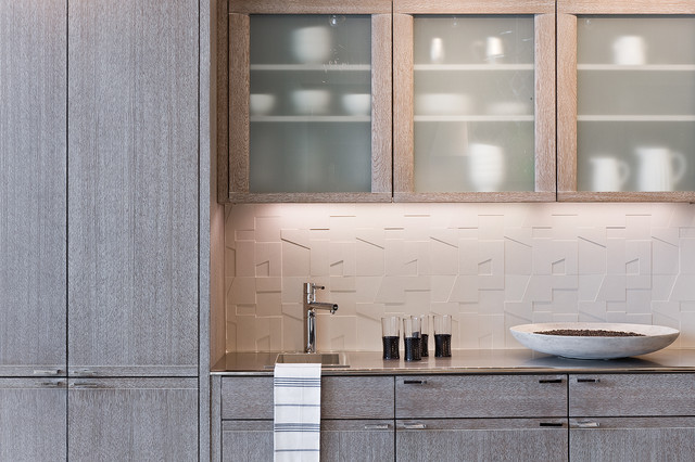
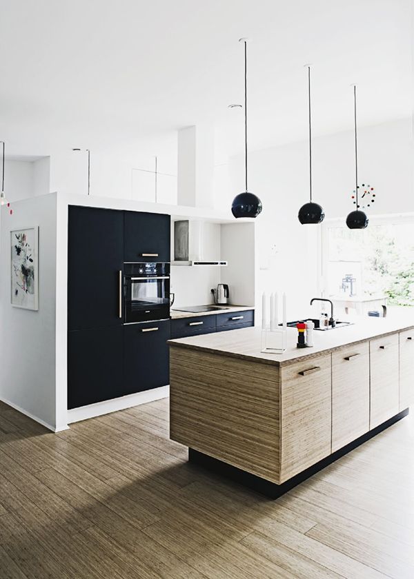 LINECabinets are essentially rectangular boxes which naturally create lines both horizontally and vertically but there are so many variations and ways they can be artfully arranged for efficiency and visual appeal.Wood grain creates lines that are most pleasing when book-matched and drawers next to each other always look better when aligned.
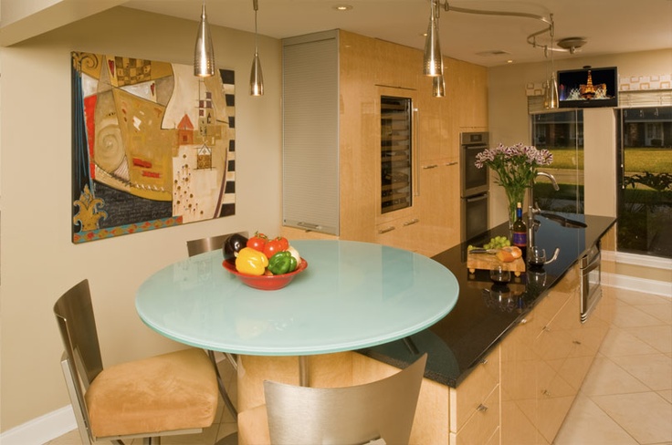 SHAPEA shape is a self contained, defined area of geometric or organic form. In a kitchen this shape could be a focal point such as a hood, cabinet hardware or an interesting island. Discerning use of shapes can be just the thing to counter the potential monotony of a line of cabinet boxes.
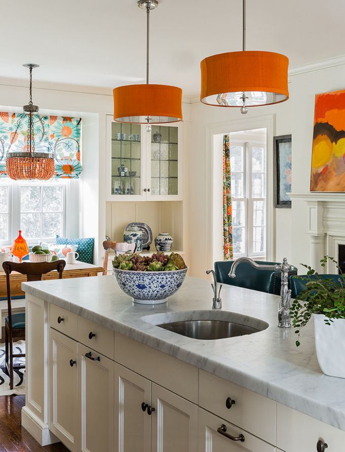 DIRECTIONMost lines that you find in the kitchen are horizontal, vertical or diagonal. Horizontal suggests calmness, stability and tranquility. Vertical lines give a feeling of balance, formality and stability. Diagonals are dynamic, suggesting movement. I definitely take advantage of vertical space if I'm designing for a home with high ceilings. I also look for other clues by studying the architecture of a home. If there are arches or angles I try to somehow incorporate those in the kitchen. If you design to the architecture of a home, rather than simply to the latest trends, your kitchen will always be "at home" in its environment.
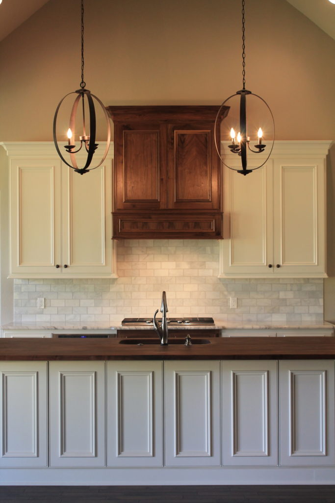 SIZEThere are many size and clearance guidelines for kitchen design prescribed by the National Kitchen & Bath Association (NKBA) and you can find them here. We definitely don't make this up! Guidelines are in place to ensure safety and efficiency so you have enough space to walk and adequate counter top surface where you need it among other things. Consult a pro "size up" your kitchen!TEXTURETexture is the surface quality of a shape - rough, smooth, soft hard glossy etc. and can be physical (tactile) or visual. Texture is very popular these days in the form of laminates, grainy woods and even contemporary high gloss finishes. A nice blend of textures is what I shoot for.
 COLORIf you know me you know I love contemporary design! That said, sometimes you risk "death by neutrality" with this style. A judicious pop of color can save the day! If you're afraid to commit consider adding your color on the walls, accessories, bar stools or anything else that can easily be changed.
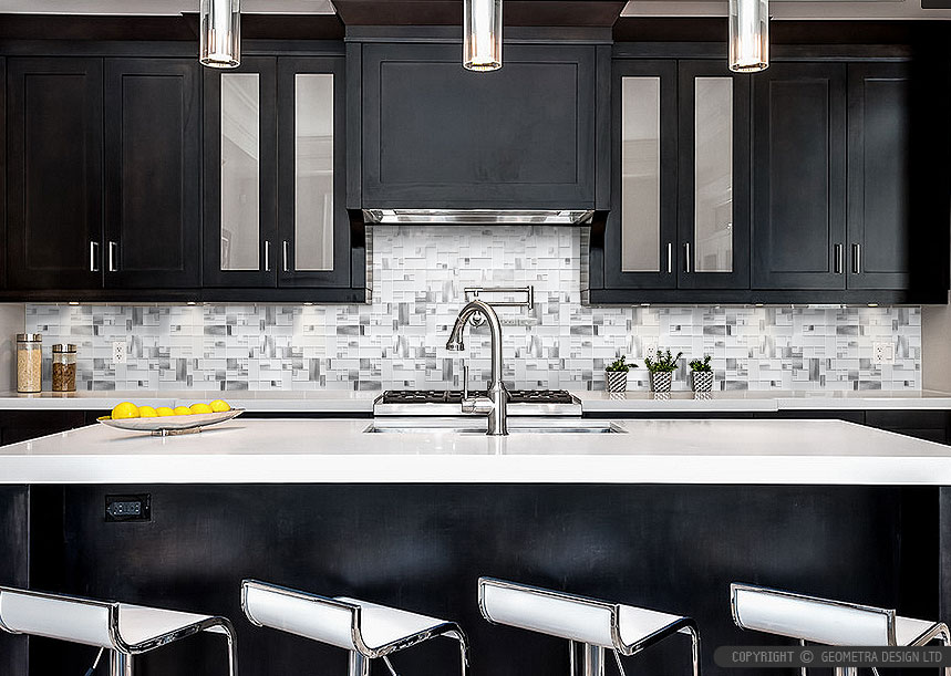
 VALUEValue is the lightness or darkness of a color. In the kitchen I also see it being about lighting. Whether to go light or dark is one of the first choices you'll have to make when planning a new kitchen. If you have little natural light but absolutely love a dark rich Espresso look for your cabinets you can still make that happen. Just be sure to include enough lighting, including lights in the ceiling, LED ribbon lights under your upper cabinets and maybe even some fun pendants over the island.
 These are the elements. We also have the principles of design but that's another blog post. If you need help sorting out your elements I'd love to hear from you. Email me at artfulkitchensbyglo@gmail.com