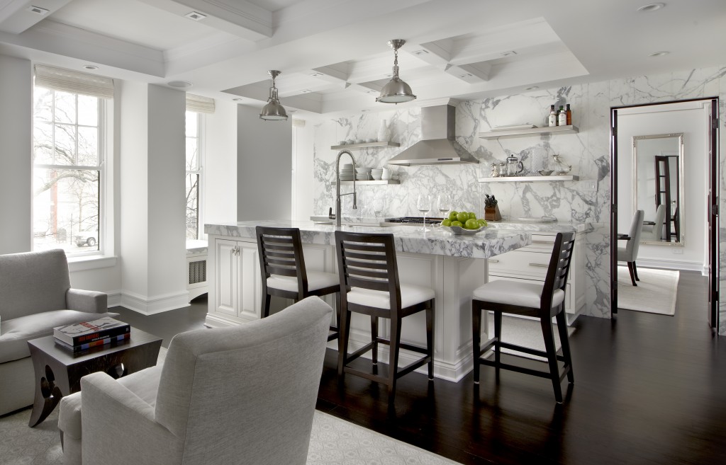
Earlier this month trade publication Kitchen & Bath Business Magazine (K+BB) unveiled their 2014 design award winners. Kitchen of the year went to Scott Dresden of Chicago firm , Dresden Design. I love it! He accomplished a masterful blending of traditional with contemporary touches that let you know it's 2014. This kitchen, located in a historic building, was no small feat to accomplish. I mean that literally, Scott's client is 6'11" tall and many of the changes were made to accommodate his height. As a designer, it's always interesting for me to learn the thought process that goes into a design so I contacted Scott who graciously agreed to be interviewed by KFL.KFL- I notice an interesting blend of Traditional and Contemporary design in this kitchen. What was your initial design inspiration?Scott- I wanted to make a modern Model A. I designed a kitchen that could have possibly been there in this 1920’s building but layered in modern nuances. I added contemporary hardware and open shelving so it doesn’t feel like your grandma’s old kitchen.
 KFL- The K+BB article mentions that you raised the ceiling height, what did you do with those very necessary AC ducts?Scott- I put ducts inside the beams.KFL- Did you have to compromise any aspect of your design to satisfy your client?Scott- No, the client gave me full creative reign- a dream client.Scott mentions there is actually nothing he would have done differently in addition, he offers us the following insights into the project and how it evolved.KFL- What exactly were your client's requirements?Scott- My client is a tall guy- 6’-11” to be exact. Much if the project was about making the space feel more expansive. We accomplished this by using whites, demolishing the existing ceiling and using fixtures that would allow enough clearance. The client, a single gentleman, wanted a stereo system that could be controlled from his i[kpad. It was also important for him to have a very smart solution for lighting. We installed a state of the art AV system and used halogens throughout with a minimum profile to allow us more vertical space.
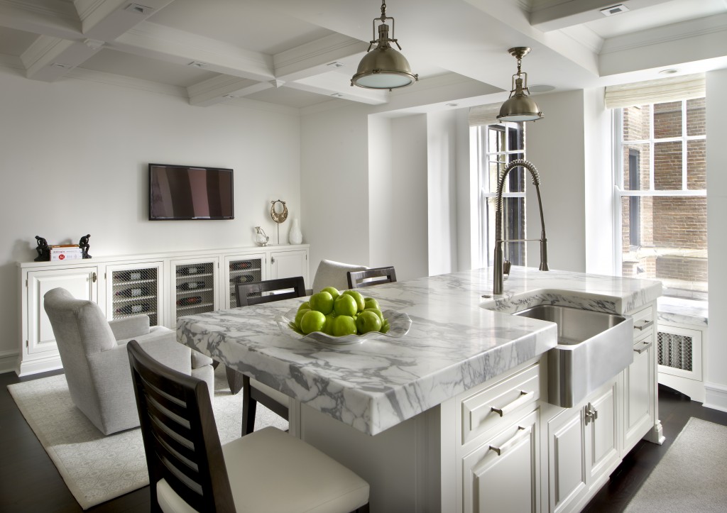
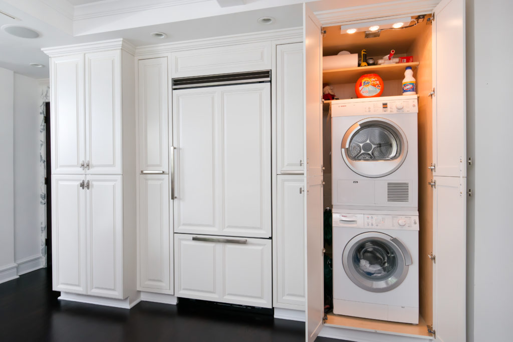
  KFL- What were some of the specific challenges and how did you overcome them? Scott- This is a very old building and there were a lot of skeletons in the closet. Every single thing had to be redone. The electrical was a mess and there was no existing laundry room or way to vent a dryer. The building located in Chicago’s Gold Coast, wasn’t able to accommodate our 2000 pound Calcutta Gold kitchen island in their freight elevator so we craned it through the living room window with an inch an a half to spare. We redid all the electrical and created cabinetry that housed a vent less washer and dryer. KFL- Sounds like you addressed all the practical aspects successfully. What are some examples of your innovative design solutions?Innovative techniques came into play with space planning. We accommodated wine storage with a 9”deep cabinet where wine bottles can lay on their sides horizontally so not to take up too much floor space in this small city kitchen. We demolished the ceiling and removed the existing 6” cans allowing us to gain additional ceiling height. We created a beam system that houses small modern halogen lighting. To avoid blocking any natural light we opted to use a Calcutta slab backsplash with floating stainless shelves as opposed to upper cabinetry. We modified decorative light fixtures to accommodate the client’s height and integrated a vent less washer and dryer into cabinetry to create a laundry room.Congrats to Scott on his big win. Not only did he create the ideal environment for his client, he's also sharing a tip or two along the way!
Street Address
Palm Beach
15612547736
Inspired Design For Artful Living
Your Custom Text Here
