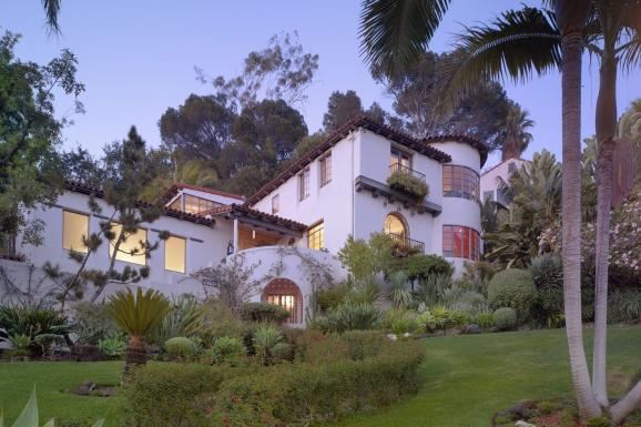
 I admit it. I'm an NPR junkie. From Morning Edition to All Things Considered in the afternoon. I get my daily dose of news, arts and culture from Public Radio, mostly while I'm on the road. Once in a while it's really really good. That happened this week. I caught a story (here) about an architect who I'd never heard of, Paul R. Williams.
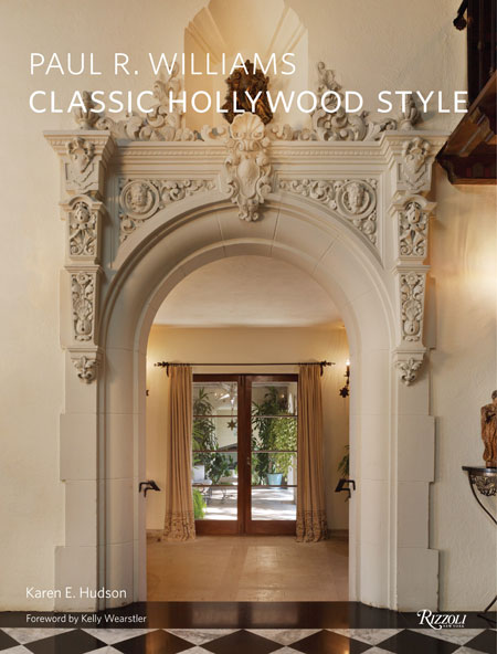
 Perhaps if you live in, or have lived in, Los Angeles you have. His work is not only notable and impressive but his story is also inspiring and intriguing to say the least. Mr. Williams was black and he was an architect at a time when those two just did not go together. In fact he was the first member of the AIA (American Institute of Architects) west of the Mississippi. His grand daughter Karen Hudson has recently written a beautiful book, Paul R. Williams: Classic Hollywood Style , about his life and projects replete with foreword by reigning Hollywood design diva Kelly Wearstler.In one word Williams' style could be described as "diverse" or maybe "eclectic". In any case, his work appears in both commercial structures such as The Beverly Hills Hotel as well as in around 2000 homes in and around the Los Angeles area.His designs range from Spanish Colonial Revival and English Tudor to Mid-Century Modern. Known for spectacular entryways and grand curving staircases, the single element present in all his work was a unparalleled attention to detail, whether he was designing a Hollywood mansion or a housing project. Williams was born in Los Angeles in 1894, orphaned by the age of 4, he was a product of his inherent positive out look on life as well as a bit of luck. Although one could argue that he created much of that luck himself.
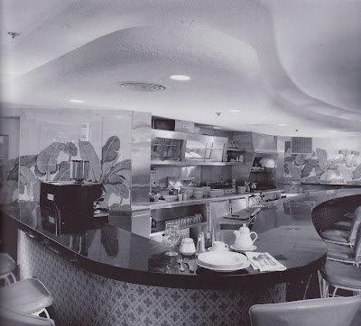
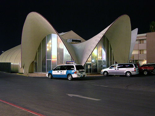 Williams is often referred to as the architect of the stars and he was. He designed homes for Lucille Ball and Desi Arnaz, Frank Sinatra and Cary Grant among others. The irony is that at this time, early to mid-century, he was prohibited by law from even staying overnight in many of the neighborhoods he worked in. In his mind, he felt his designs were opening the doors for future generations. Williams developed a handy knack for rendering upside down. This was so, being a black man, he could sit across rather than next to prospective clients! Despite these hardships he left his mark and he left his gifts as a legacy and reminder of how anything is possible.
SHOW SOME SKIN IN YOUR KITCHEN
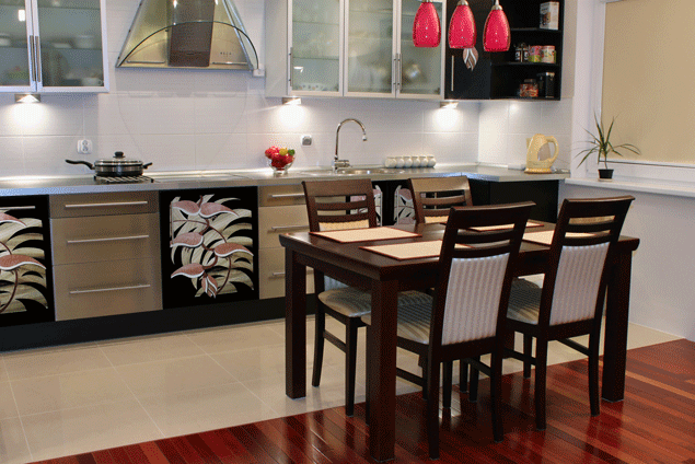
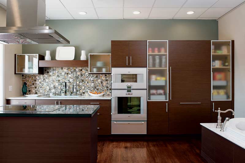 Don't get excited. Skins are what we sometimes call wood veneers, or super thin sheets of material used to cover cabinet doors or panels instead of using solid wood. As clean lines and contemporary styling continues to increase in popularity, surfaces themselves become the ornamentation and focal interest in a kitchen. The use of interesting wood grain veneers which are both beautiful and unique, is an excellent way to make a simple slab door stand out.
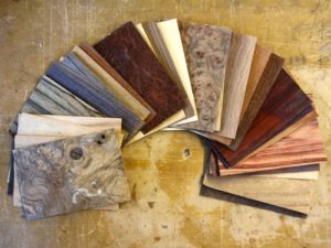
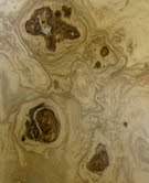 Many of my clients are surprised to learn that this is can actually be a more expensive option compared to a solid wood door. There are a couple of reasons for this. One is that these veneers, or skins, are often made from exotic wood and secondly this can be a labor intensive process, thus the increased cost. The advantage being you can "control" the wood grain, so to speak, creating patterns that match up with each other. So if the unexpected randomness of natural wood grain makes your pits sweat this could be a good alternative for you.Another option if exotic wood veneers are too rich for your blood is something called "engineered wood veneers". These are man made skins that replicate the exotics using not-so-exotic woods. The material cost is a lot less and in many cases it's hard to tell the difference.
 If you still love more traditional styling, veneers can still be useful for you. A traditional 5 piece door benenfits greatly from a center panel that is veneer rather than solid wood. The reason is that the veneer is applied to a dense MDF substrate that will not expand and contract the way solid wood does, thus the center panel will not ever swell cracking open the seams or shrink resulting in a lose rattling center panel.One of my favorite traditional doors made here at Brendan Donovan Furniture & Cabinet Co. is this Sapele Mahogany door with a Rosewood veneer center panel.Another way to get the look without blowing your budget is to mix it up. Just use the veneer on, for example, your upper cabinet doors. The more intricate the graining the stronger the statement. In other words, a little goes a long way. Too much and it becomes busy and you lose the concept of focal point.
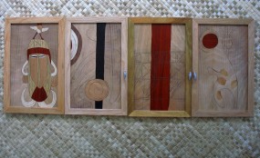
 If your kitchen design involves round radius shapes it's going to involve wood veneer which can be bent and moulded to conform as needed. Another beautiful effect can be achieved through the use of marketry, or inlay. In researching this post I came across the amazing work of Juli Morsella. Talk about adding a little art to your kitchen! In addition, Juli is committed to using reclaimed woods, eco-friendly materials and she donates 10% of her earnings to environmental causes.
 If you're interested in using wood veneers (or not) for your kitchen I would love to hear from you! Congrats to Amy Parrag of Eye See Pretty. She is the winner of the Orgaline drawer organizer giveaway!
ART IN THE KITCHEN?
Colorful paint along with many handmade touches makes this kitchen pop with whimsy and a generally good to be alive vibe! Photo courtesy of paula@pavelkadesign.com


