2018 The Year In Review

2018 was a year of fun and exciting projects which challenged and sparked my creativity! White kitchens continued to be the hot ticket sometimes with an artful mix of natural wood or with deep rich blues.

2018-6.jpg

I call this the "new traditional kitchen". I had fun working with HW Interiors on this one.

There were difficult situations but always solutions. This video gives you a snapshot of the vast variety of spaces and projects that came my way throughout the year. When you work with me I create these 3D renderings in Chief Architect Interiors X10 so you can get a sense of the space because visuals are everything! I am deeply grateful to my clients for placing their trust in me. Wishing all my readers the best in 2019. Maybe this will be the year we create your new space! xoxo


Kitchen Design Case Study: Awkward Angles

Every time I think I've seen it all  I'm challenged to create a kitchen design that seems impossible! Such is the case with this recent project.  This home is located in Palm Beach Gardens, Florida and features not only a stunning view but also the strangest shaped kitchen! Sometimes I wonder what architects are thinking.  

coastal kitchen watercolor render blue island chief architect kitchen design

coastal kitchen watercolor render blue island chief architect kitchen design

Step 1- Let there be walls

(to scale and correctly angled)

I can't even begin to design until I can get the walls drawn to scale.  I had a physical blueprint which (after some quick research) I was able to trace over in my design program (Chief Architect).  Once I did this I discovered those angles are 30 and 60 degrees, not the typical 45!  There was no possibility of changing the shape of this kitchen.

blue print kitchen with angles

blue print kitchen with angles

Step 2- Embrace the Space

One thing I have learned is that you will never win by trying to fight the space you're designing.  Honor it, whatever it is, if you can't change it. That is the only way to end up with a design that is timeless and looks like it has always "lived" in the space. In this case, that means embracing the angled main wall while allowing ample and efficient flow.

Step 2- How to make it better

Once I had the walls accurately represented I evaluated the current layout keeping my client in mind.  He loves to cook and he and his girlfriend love to entertain.  Here are my observations:

-Cabinets are too low, not taking advantage of the high ceiling and limiting storage

-The big POINT on the island has to go! That just jumped right out at me and called for correction

-We are in need of an update and new appliances that are up to the task of my client's cooking endeavors

-The shape of the island does allow for lots of storage but also lots of walking.  The sink is pretty far from the main wall.

-With the boat docked outside and observing everything else about the home I knew my clients' style is casual, Florida-Coastal and they are much more "comfortable" than contemporary.

a boat in the back with pool and canal palm beach gardens

a boat in the back with pool and canal palm beach gardens

Step 3- The Solution

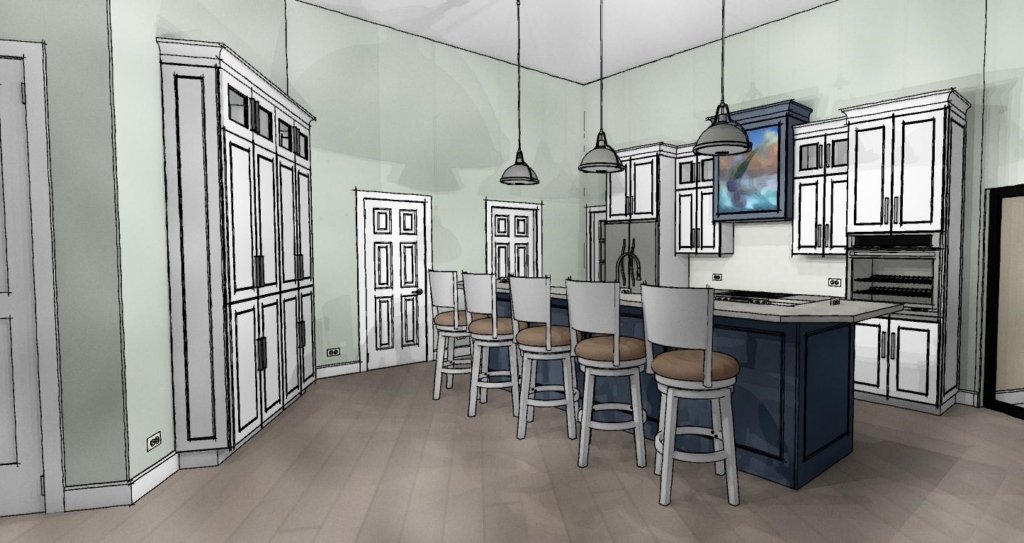
The first thing I did was the back wall.  I knew it had to accommodate the refrigerator and the new wall oven my client selected.  The fridge and stove were already there so no need to reinvent the wheel.  Remember it saves money when you can keep your major appliances in the same, or close to the same location.  In the new design cabinets are now eight and a half feet high plus crown molding.  The upper, hard to access area, features glass doors to add a bit of style and aesthetic appeal which incidentally the homeowner mentioned he wanted.  This is the perfect spot for showcasing a collection and you can change the flavor by changing the contents when the spirit moves you.  Versatility is always an important aspect of my designs.  We've also got generous counter space next to the fridge, on each side of the stove and next to the ovens, a must!  That was the easy part.

white kitchen Palm Beach Gardens coastal style white cabinets blue accent kitchen design

white kitchen Palm Beach Gardens coastal style white cabinets blue accent kitchen design

Now for that island.  Hmmm.  Since I'm updating that means I'm simplifying.  I'll honor that angle but I think simplicity will calm the "angle noise".  It's a popular trend these days to keep an island all at one height but I didn't think it was the right solution for this project.  It turns out I was right and my client was so relieved!  This island is really a serious cleanup and prep space and with such an open space a little buffer was needed.  The raised bar also makes me think of the captain behind the wheel, it's sort of boat-like. Pulling the island closer to the main wall (still allowing 48") not only reduces the chef's steps but discourages unwanted traffic from congregating behind the island and getting underfoot. Now our island contains all the essentials but, not gonna lie, we've lost a little storage.  To compensate I added a section of full height cabinets to balance out the kitchen. Glass panes at top reference those on the main wall.  We're keeping these at 15" deep to keep the space open.  Another benefit of shallow tall cabinets is that you will do just fine with adjustable shelves whereas, in a deeper, 24"cabinet, you'll probably need roll outs or stuff gets lost and is hard to access in the back.  Roll outs really add to the price of your cabinets too. 

Step 4- More About Those Aesthetics

Now that the layout is solved I think, what can I do to make this kitchen design stand out and fit my client's personality? A deep nautical blue island and coordinating hood of course!  I also loved the idea of creating a spot for an ocean scene front and center on the hood itself.  This is a great place to add a painting you love and, again, you can change it up! Voila

awkward angle kitchen floor plan view kitchen design

awkward angle kitchen floor plan view kitchen design

What do you think of this kitchen design? Are there any elements here you can apply to your own situation? This project is now underway and I look forward to sharing the outcome!

5 Ways to Make Any Kitchen Your Own Stylish Sanctuary

Do you get frustrated looking at all the beautiful images on Houzz and Pinterest? If only, right?  The good news is you don't always have to shoot the budget to have a kitchen that is your own unique design statement.  This means you're going to have to forgo the temptation to slavishly emulate the trend of the moment in exchange for investing in a look that is authentically your own.  Yes! Inject your own personality, make it versatile to allow for your moods and you will have something timeless that will always give you joy. Read on and I'll show you how.

5 Ways to Make Any Kitchen Your Own Stylish Sanctuary

5 Ways to Make Any Kitchen Your Own Stylish Sanctuary

Own Your Color

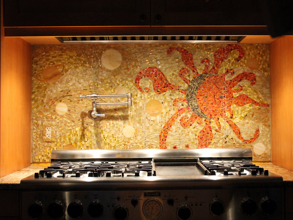
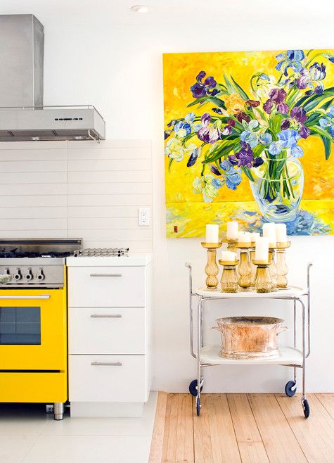
A favorite color is one way to create a personal statement in your kitchen.  Perhaps you embrace all color bright an bold.  If this is your cup of tea allow yourself open space and glass front cabinets to show your true color in all its glory.  I recommend keeping the fixed elements such as flooring and countertops neutral so you can play more with color in ways that are versatile. This would include paint, dishes, artwork and decorative items.   A nice crisp white is always a great backdrop to vibrant hues. If you are an adventurous soul because that's your personality, create a focal point like this beautiful back splash using your favorite color.  Just keep it over one area such as the stove.  Less is more and you don't want to dilute the power of the statement, right?

5 Ways to Make Any Kitchen Your Own Stylish Sanctuary

5 Ways to Make Any Kitchen Your Own Stylish Sanctuary

5 Ways to Make Any Kitchen Your Own Stylish Sanctuary

5 Ways to Make Any Kitchen Your Own Stylish Sanctuary

"Artful detail can literally be art such as paintings and sculpture but it can also be beautiful hand made utilitarian items, family treasures or books."

Embrace Your Architecture

Believe me, I have tried to "correct".  Sometimes you can but often it just doesn't work. I have had much better results when I embrace the fixed conditions I am faced with when creating a new design.  These issues can include angles, bump outs, ceiling height differences and last but not least the age and era in which a home was built.  Your space should look like it belongs.  This happens when you match the style of your design to your home.  In fact, I always try to look for clues such as arches and fixed architectural elements that I will repeat in the design. If your kitchen "goes with" your home it will always be right.

5 Ways to Make Any Kitchen Your Own Stylish Sanctuary

5 Ways to Make Any Kitchen Your Own Stylish Sanctuary

In this kitchen which you can read more about here, we were stuck with some of the angles (yes there were more) as they are exterior walls. What we did do was move the refrigerator. It used to be where the hood is. It opens up space and gives us a focal point. We also eliminated angles on both the island and the peninsula. Now my client has a kitchen that makes sense and functions perfectly for her lifestyle.

Go Within

The way you customize your cabinet interiors is always based on the way you live.  Think about it.  Is there one particular item that just doesn't have a home with enough space in your kitchen? It could be food storage containers, pots or even trash!  It's different for everybody. Even if you have a small kitchen you can maximize function.  There are solutions.

Dish drawer, dish pegs, black plates, drawer cabinet

5 Ways to Make Any Kitchen Your Own Stylish Sanctuary

If you're short (like me;-) or you're just short on upper cabinets, this drawer insert featuring dish pegs can be used to customize your dish storage. Food storage containers are so necessary but can be a PIA, if you know what I mean. You may even be able to retrofit one of your cabinets with one of these handy pull out organization systems by Revashelf.  These are just two examples but there are so many options.

5 Ways to Make Any Kitchen Your Own Stylish Sanctuary

5 Ways to Make Any Kitchen Your Own Stylish Sanctuary

Customize Work Centers

Every kitchen has a work center for food prep, clean up and cooking. Sometimes in small kitchens, they overlap but those are the basics.  Add your own as needed to customize your kitchen.  Think media center or beverage center to house your coffee or tea stash and accoutrements. Those are two popular ones that come to mind.  How about a pet center? It could be as easy as designating a certain space or cabinet and tricking out the inside. It can be planned in a new kitchen or created in your existing space.

5 Ways to Make Any Kitchen Your Own Stylish Sanctuary

5 Ways to Make Any Kitchen Your Own Stylish Sanctuary

A media center in a drawer! Measure your devices and make sure you have enough USB outlets and  you're good to go.  Sometimes it's nice to put the phone away.  Who knows what could happen ;)

5 Ways to Make Any Kitchen Your Own Stylish Sanctuary

5 Ways to Make Any Kitchen Your Own Stylish Sanctuary

This is WoodMode's version of a pet center.  They call it a Pet Parlor and you can create this with most cabinetry

Artful Detail 

Artful detail can literally be art such as paintings and sculpture but it can also be beautiful hand made utilitarian items, family treasures or books.  If you have the room I encourage you to try and leave some open space to display such items and change them out as the mood strikes you.  This is perhaps the easiest way to make a neutral space very personal and joyful to be in.

5 Ways to Make Any Kitchen Your Own Stylish Sanctuary

5 Ways to Make Any Kitchen Your Own Stylish Sanctuary

Many kitchens have a wall on at least one end which is a perfect place for a small gallery of paintings, floating shelves or one big piece of art.

5 Ways to Make Any Kitchen Your Own Stylish Sanctuary

5 Ways to Make Any Kitchen Your Own Stylish Sanctuary

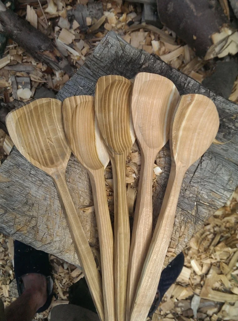
These hand-carved spoons could be considered "working sculpture" in my book.  Speaking of books, I think they enhance every space.  I love my well-worn cookbooks that probably contain bits of all the meals cooked from them!

5 Ways to Make Any Kitchen Your Own Stylish Sanctuary

5 Ways to Make Any Kitchen Your Own Stylish Sanctuary

This is a home run for me books + art!!  I love it and if you do too we'd probably get along :) 

COMING SOON!

My quarterly newsletter is coming soon.  See what I've been up to in my real life Palm Beach County projects along with new products and where you can shop locally for the best selections and value. Subscribe below so I can keep you in the loop! xoxo

The New Farmhouse Kitchen

If you're a die-hard traditionalist the trend towards contemporary and transitional design may leave you feeling lost for fresh new inspiration in the familiar classic look you love, but no more!

4-kitchens-ideas-modern-designers-Tom-Howley

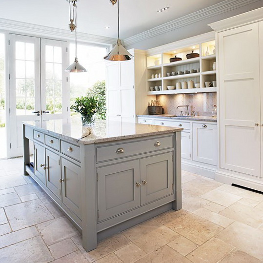
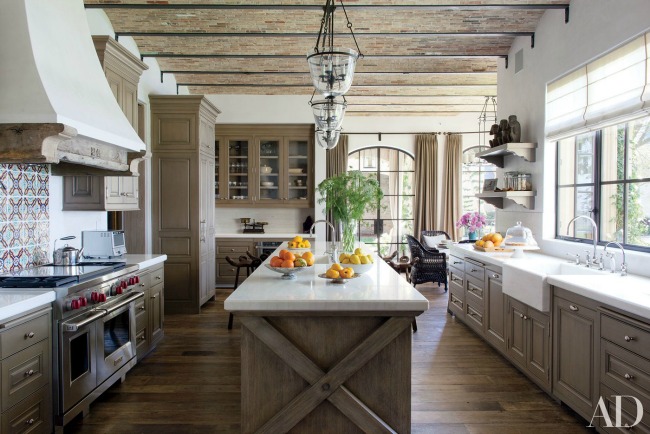
As they say, everything old is new again and that couldn't be more true for Traditional design. If you yearn for that farmhouse feel you're right in step with what's going on in the design world right now.  Today's country kitchen has been reinvented with design details that reflect the cleaner lines and stepped-up function of today with the welcoming warmth you want.  Here's how you can update without selling the farm.


New Direction for Paneling

Traditional beadboard runs vertically.  It's called beadboard because in between each plank there is this detail which is called a bead in molding lingo.


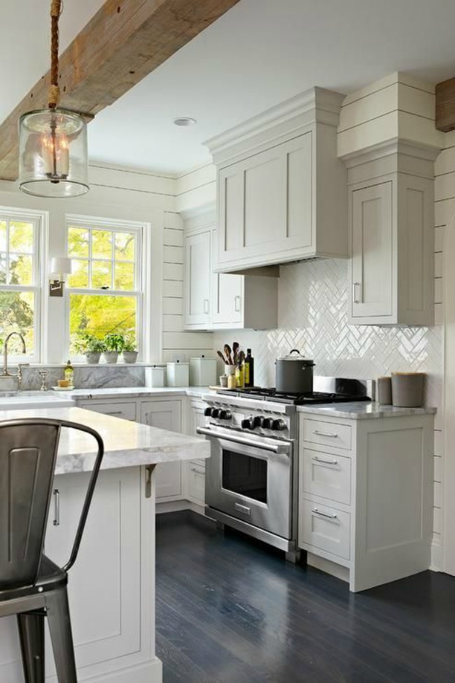
The new look is called shiplap and it goes horizontal instead of vertically for a fresh new interpretation.  For a cleaner look, you can even remove the bead and have a v-groove or a nickel sized space between planks.  This works for coastal looks too since it's actually inspired by ship design details, thus the name shiplap.

Aprons Rule

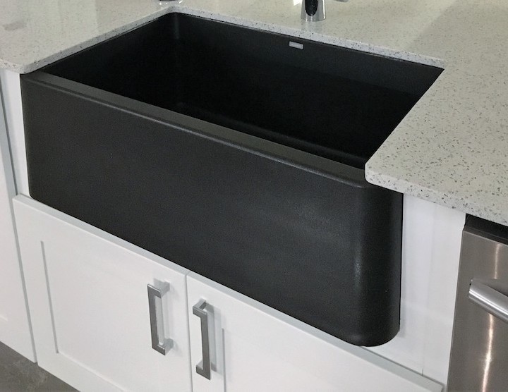
Apron sinks, also called farmhouse sinks, are all the rage and they come in a large variety of materials from the original cast iron and clay to the newer stainless steel and granite composite versions.  They can also be under mounted so you can wipe those crumbs right off the counter and into the sink. Don't overlap the sink edge though or you'll have a concealed seam underneath between sink and counter that can get pretty gross and be hard to clean.

ArtfulKitchensIKONsmall


Less is More

One of the hallmarks of a traditional farmhouse kitchen is lots of moldings, legs, bun feet etc. It used to be the more the merrier but that has changed.  You can still have your legs and even corbels but they are simplified and clean lined.  Speaking of clean, these less detailed versions of the originals are much easier to keep clean.  Less detail can also be easier on the wallet. Win win!

modern farmhouse-Architectural Digest

Time for Recess

Attractive and innovative framed doors are the perfect choice for the new farmhouse kitchen and we are seeing flat recessed panel doors as a popular alternative to the traditional raised panel styles.  In fact simply switching from a raised panel door to what we call a flat panel door is an instant update.  If you want to take it even further consider a flat, or slab drawer front which allows you complete freedom when it comes to selecting your pulls or knobs.

Decorpad-modern farmhouse kitchen

More Inspiration

I found these books which are right on topic.  Add them to your library if you are looking for more tips and inspiration on how to achieve the new farmhouse look in the kitchen and other areas of your home. A Touch of Farmhouse Charm: Easy DIY Projects to Add

a Warm and Rustic Feel to Any Room features easy DIY projects for all parts of your home. The Farmhouse: New Inspiration for the Classic American Home has great examples how to add updated farmhouse details to new or existing homes.  Last but not least City Farmhouse Style: Designs for a Modern Country Life is my personal favorite as it adds a touch of sophistication that could make your farmhouse look totally at home in city or country. This book is not out for a few months yet but if you can't wait, check out Kim Legget's website for a preview.


Now for the Cow

Art can also be a style defining element of your kitchen. Nothing says farmhouse like the quintessential cow.  Are you cow A, or are you the more minimalist modern version that is cow B ? 

The Farmhouse cows are available through my affiliate Dot & Bo.  The books can be found on Amazon. Purchases through the links above can help fund my blog. If you choose to indulge I thank you for your support. 


Please keep in mind this is one approach and is reflective of what I'm seeing in the design world.  The best advice I can give you is to always design to the style of your home and your heart that way you will never go wrong.  It's your investment and you get to choose what you like and leave the rest.  I can help you make the best choices for your own unique situation and would love to hear from you. Email me at Gloria@ArtfulKitchens.net to explore how we can work together.

Coming Friday: Parts III & IV of The Big Move  

Subscribe above to catch all the episodes!


Artisan Shares Creative Vision with Mosaics

"Mosaic is the art of creating images with an assemblage of small pieces of colored glass, stone, or other materials." -WikipediaMosaics by Ariel  At the intersection of "skilled artisan" and mosaic art" you will find Ariel Shoemaker.  Actually this talented artist found me.  She makes original art in a traditional or contemporary style utilizing the ancient technique of mosaic.  This tile style art, which dates back 4,000 years, is accessible today through her beautiful work.  She recreates the mosaic craft with a fresh new spin to make unique works that perfectly reflect her clients.   Ariel has a thriving business which she runs out of her home studio outside of Boston, MA.    It is my pleasure to introduce her to you so, without further ado, here is my interview with Ariel and some very artful kitchens featuring lovely examples of her work.Mosaics by Ariel Artful Kitchens:    What is your background? How did you get into creating with mosaic art?
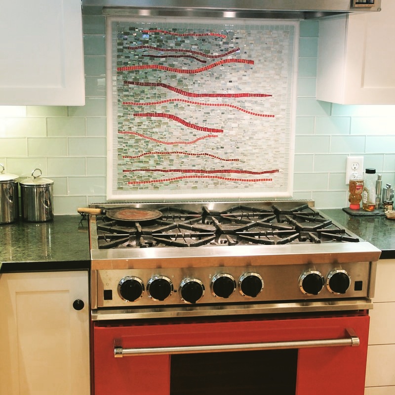
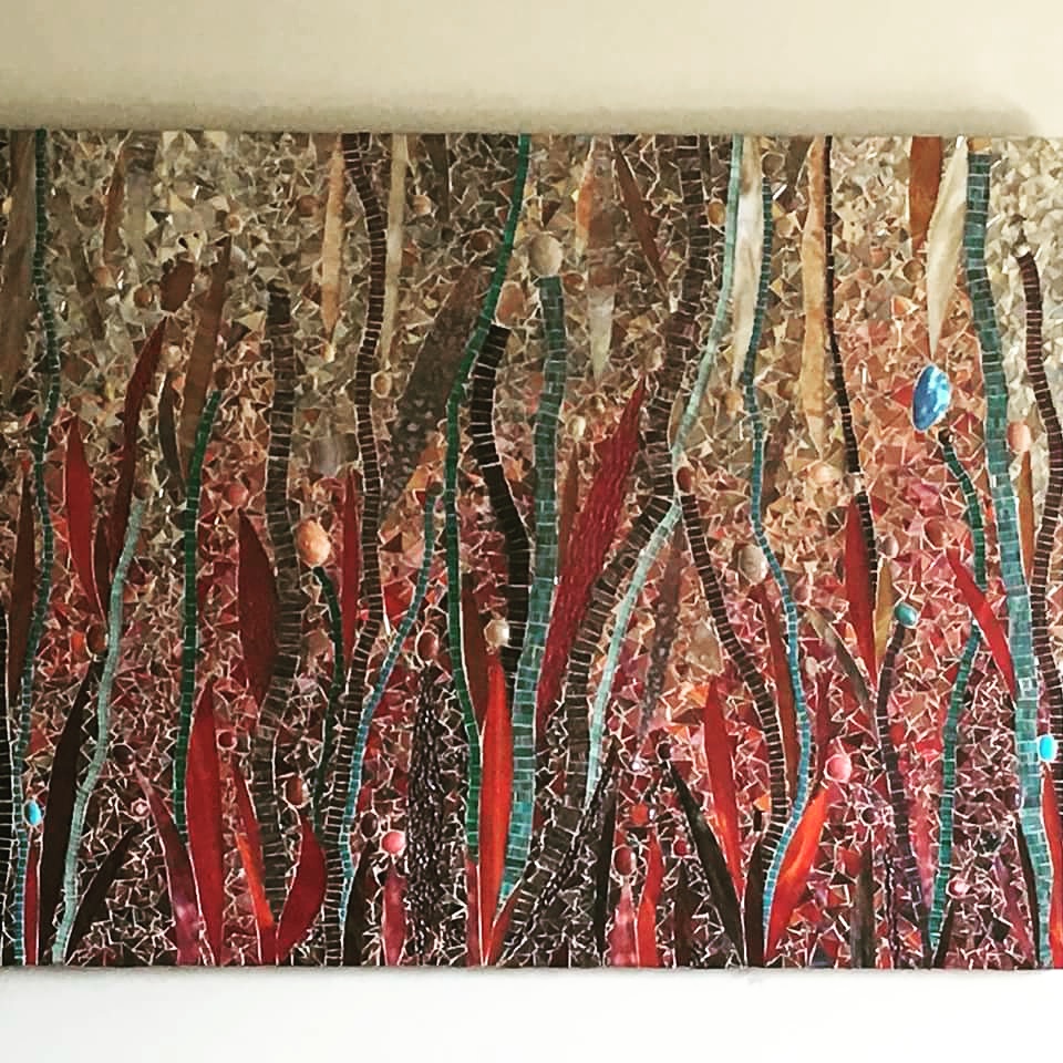
 Ariel:  I earned my BFA in Writing Literature & Publishing from Emerson College in 2000, and my M.Ed in Arts in Education from Harvard’s Graduate School of Education in 2004.  From the moment I began tinkering with bits of glass in March of 2002, I was hooked.  It was satisfying to create and also a nice relaxing diversion from the monotony of the everyday.  Constructing art pieces from tiny pieces of broken glass and “found” objects 14 years ago, as a hobby, was also a way to distract me from the haunting memories of 9/11 and  the seriousness of the world.  I never in a million years thought that it would become a career, then friends, family and a small co-op gallery in Cambridge began to notice my work--and after years of marketing, developing a “brand”, a “signature style”, making connections and making work that truly comes from my heart, I can say I have a career as a Mosaic Artist.

Artful Kitchens: What has been your favorite project and why?Ariel: I actually don’t have a favorite, but I think that might be fairly typical for someone who LOVES what they do.  Each project is unique, and I love that about my work.

Mosaics by Ariel

Artful Kitchens:  What do you do when you're not beautifying homes with your work?Ariel: I work nearly full time during the week while my children are in school and daycare (our boys, Simon & Max are 9 and 7 years old, respectively, and our daughter, Josie, is nearly 2 years old). And then there are many nights and weekends that I work to make deadlines, meet with prospective and current clients amd complete administrative tasks.  Fortunately, my husband is an incredible dad, and his working hours as an eighth grade math teacher gives him flexibility after school to be with the kids when I need to work.  We’ve developed a balanced partnership parenting our kids--and over the years, we’ve managed to work out most of the kinks.  Having three kids and a career is truly a balancing act.  I meditate every day and do yoga often.  Both keep me a saner, calmer, and more focused mommy/artist/creative entrepreneur.Artful Kitchens:  How do you come up with your ideas? What is the source of your inspiration?

Ariel: I am inspired by nature, music and other artist's work.  I root myself In the colors I choose before setting out to design a piece, or to develop organically formed patterns that become the mosaic work. The results are unique, complex works that endlessly change with the light and one’s vantage point. Some evoke images of Gustav Klimt’s and Georgia O'keefe's more luminous works of art.
Artful Kitchens:  Please include anything else you would like peeps to know about you and all the info we need to get in touch.
 Ariel: In a nutshell, I create the highest quality customized mosaic art pieces and backsplashes for the residential, hospitality or corporate environment.  I love working with interior designers, architects and home owners.  We collaborate to devise a piece that will bring them the most joy.  Please check out my testimonials on Houzz

To find out more about the process and the price to commission a custom mosaic piece of your own contact me via cell: 617-905-6629 or email: ariel@mosaicsbyariel.com


Kitchen Inspired At Art Basel

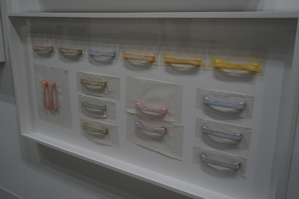
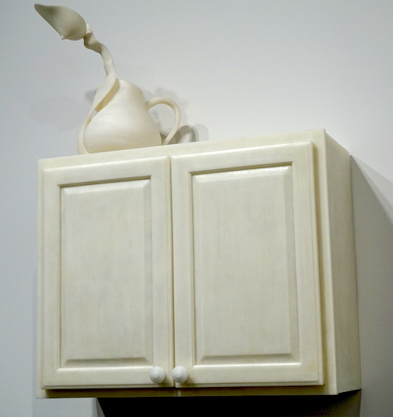
Where has the time gone? 2016 is off to a great start.  I'll soon be heading to the annual Kitchen & Bath Industry Show in Las Vegas (KBIS) to immerse myself in everything new the industry has to offer.  Today I'll finish up my pondering of events during Art Week in Miami by segueing back into the kitchen realm.If you read my previous post you know that last month we experienced THE major annual South Florida art happening, known as Miami Art & Design Week.  Art Basel Miami is the main event but  it's actually much more than that.  It's fairs, performances and gallery openings all over Miami.  I promised to share with you my finds from Context and Art Basel Miami Beach but today I thought I'd make a pit stop in the kitchen because, after all, that's what I do!  It's not surprising that elements of the kitchen can inspired artistic expression.El Proceso y el Azar VII, 2014 by Asier Mendizabal Particleboard and melamine 74 X 210 X 84cmCooking implements, cabinetry etc. are symbolic representations of our past, childhood memories, emotional connections and especially the heritage of women. The above sculptural installation by Spanish artist Asier Mendizabal features a beautiful Zenish looking pattern, on closer inspection it is a garden variety laminate top with the surface stripped off in spots to create this effect. I bet you never thought of doing this to an old counter top, but how beautiful! Mendizabal is noted for his use of a wide variety of materials from fabric to wood to metal and, yes, laminate.From the Rubbing/Loving series by Do Ho Suh, 2015 STPI Creative Workshop & GalleryI immediately recognized this work by Korean artist Do Ho Suh to be cabinet pulls! I, of course, am loving the repetition and the lovely color palette but what's it all about?  Contemporary art publication Daily Serving explains the Rubbing/Loving series perfectly, "the work records the artist’s former New York apartment through a series of painstakingly executed rubbings. By covering every surface of his apartment with sheets of tracing paper and rubbing it with blue colored pencil, Suh and his team meticulously documented the various textures and patterns of the floors, walls, and built-in appliances. The entire process is chronicled in a short film on the series, also on display in the gallery." In this case he used pastels instead of colored pencil.to quench, 2015 by Janine Antoni Polyurethane resin 43" x 30 1/2" x 14 1/2" Janine Antoni's sculpture, to quench, come under the category of feminist art in my opinion.  A graceful breast over seeing the kitchen and also a lovely balance of rectangular form and soft curves.  Doesn't it also make you wonder what is in the cabinet?Ok so this is straight up conceptual art but art that you love can be a big element of the artful kitchen.  I would like to invite you to add that artistic element to your own kitchen. What better place than the heart of the home to locate something you love to gaze upon! Are you game?Art in the Kitchen Apartment TherapyIf so I'd love to help you, kitchens and art are my passions. Whether it's the ideal spot for a beloved painting or a sculpture gracing a perfectly placed opening we can do it and we can make it totally you.  Take a peek at my "Kitchen Art" Pinterest board for some creative inspiration. Whether you already have the artwork or are looking for the perfect piece it would be my pleasure to work with you. Let's connect and create!  Email me at ArtfulKitchensbyGlo@gmail.com