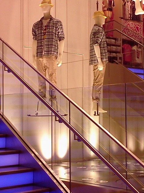
 Yesterday I took a break from the show to indulge Diva Daughter Sabrina in her favorite activity, shopping. My sister Pam, Sabrina and I hit the road running beginning our day on famous 34th Street where we visited Lush, Desigual and Uni Qlo. Lush is the smell good spa experience gone wild, I fell in love with the signature looks at Spanish retailer Desigual and was impressed with the merchandising, quality and value for money at Japan based Uni Qlo. Click on the links and check them out.

 It was a long fun day and we ended it in the East Village at the Yaffa Cafe'. The Village has to be my favorite part of New York. If I ever lived here in a past life, this was the spot.
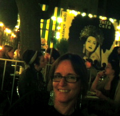 The food was good and the company made it even better. Today we returned to the AD Show and visited ArtExpo. Stay tuned for today's recap in the next post.
DAY ONE AT ARCHITECTURAL DIGEST SHOW
Day one began with a little networking at the Marys and Mimosas event sponsored by Modenus. This is where I was hoping to meet some of the other bloggers. I did run into Veronika of Modenus and Linda Merrill of Surroundings as well as meeting Saxon Henry for the first time. Of course, Mimosas and Bloody Marys were on the menu but the temperature was hot, hot, hot and I just couldn’t at 11AM! Tasty treats were also on hand for those who were so inclined. Everyone was very friendly but I couldn’t weight to tuck into all the enticing displays.
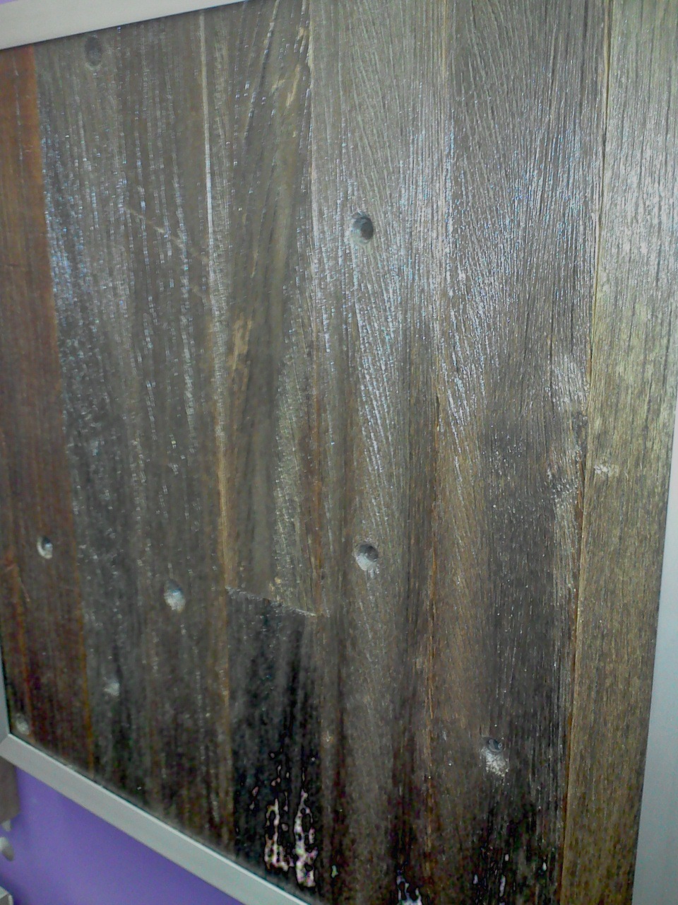
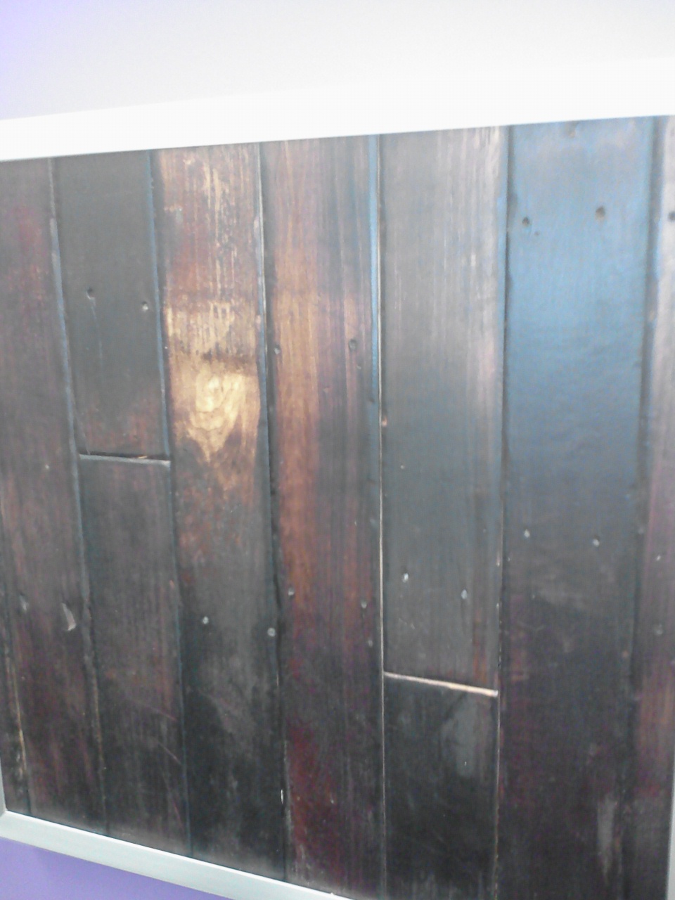
First off I roamed the area featuring kitchen related products and there were some really awesome offerings. Reclaimed wood is THE thing in flooring. I loved the finishes at Tennessee Wood Flooring. Wouldn’t this be awesome in a kid’s room? This company’s products are stained through and through, well at least a couple millimeters so that sanding and repairs won’t compromise the finish color. I also fell in love with a company called Manhattan Forest Products whose tagline is “reclaiming New York City”. That’s exactly what they’re doing. Their flooring and wood paneling is made from wood reclaimed from the old Coney Island boardwalks, the old wood water towers that used to top many old buildings among other places. If it’s old wood in New York City, they can make magic with it. Just think, your floor could be “green” AND have its very own story.
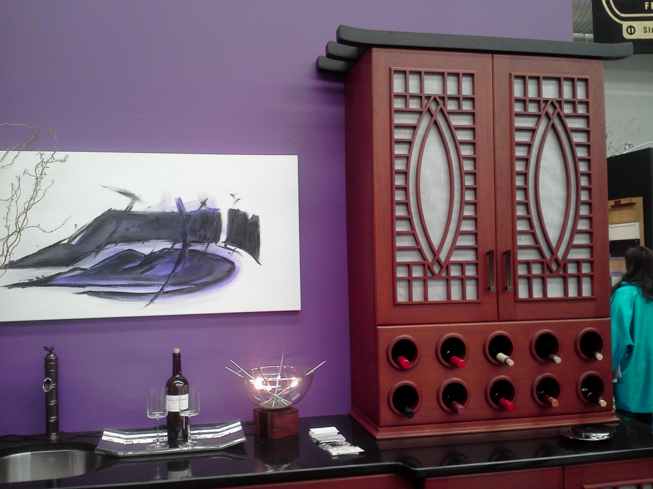
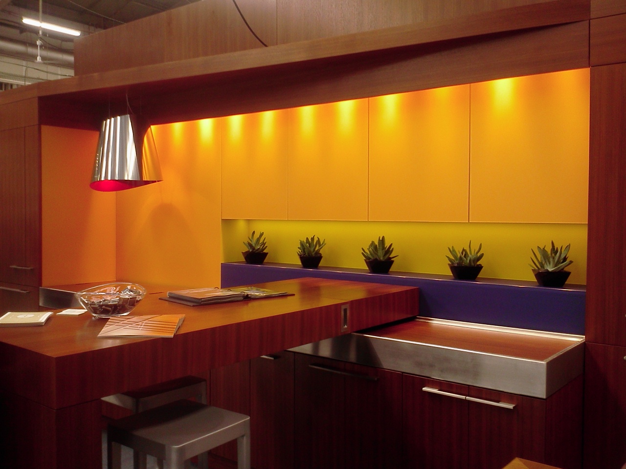
 Of course I’m always on the hunt for interesting cabinet designs and these cabinets by Rutt certainly fit that criteria. These are made of Sapele Mahogany and Rutt wants you to know that they will provide you with “chain of custody certification” when you purchase cabinets from them. No, it’s not a warrant for your arrest, rather it’s a trail of proof that green practices were employed in the manufacture of your cabinetry from start to finish.
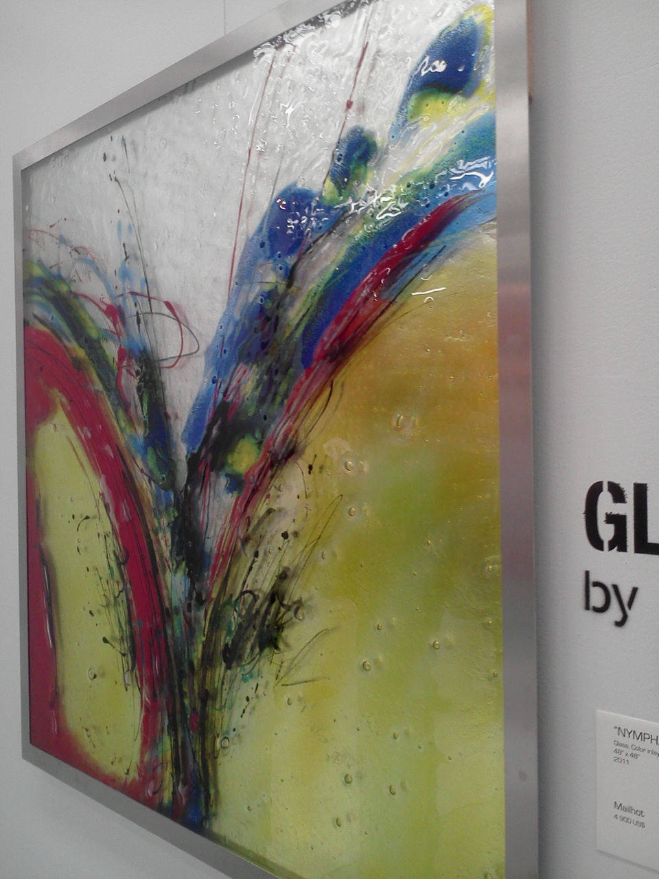
 Now you remember Think Glass. I wrote about them here. The painted glass is beautiful in person. The paint is not on the surface but is, in fact, embedded between layers of glass! Stunning.
 Many appliances were on show including Sub Zero Wolf, ULine, Best and Liebherr who has a kicking 48” refrigerator freezer that is half fridge and half freezer. I love the symmetry of it and the fact that their products are a TRUE 24” deep with no muss, no fuss. I enjoyed chatting with ventilation hood specialists at ModernAire and at Faber regarding a tricky design dilemma I’m working with at the moment.
  Compass Ironworks are iron forgers in with old world attention to details and I got to see a demo on the spot. Yes it was hot.
 I also enjoyed one of the featured events of the day which was a talk entitled: Globe Trotting: Inspiration Through Travel. Yes, I agree that incorporating artifacts and mementos from our travels, wherever they may be, certainly make for unique and personal interiors. It was a special treat to hear Juan Montoya speak as a part of the panel.All this crazy fun to be continued tomorrow but tonight my sis and I will see the Merce Cunningham dance company. The production is called “4 Walls Doubletoss Interludes” and if you know anything about modern dance this is a very big deal indeed.
HIGH END FOR LESS, SCAM OR REALITY?
There is a topic entitled "High End for Less" floating around on one of my Linked In groups on line. As a result of the changing economy, many consumers seem to be under the impression that we in the kitchen and bath industry, are so desperate we will cut them some wild unrealistic deal. Some of this is in fact due to misleading advertising. You know the ads, COMPLETE KITCHEN WITH GRANITE COUNTER TOPS FOR $1,500! Perhaps they think we love our business so so much that the love is enough for us to pay our bills. Please don't spend a penny without doing your homework. You can start your exploration using the internet and magazines but the next step is to share your thoughts and research with a qualified professional who you can collaborate with to achieve an end product that will stand the test of time. This professional is a critical part of your kitchen investment.We don't expect to hire an architect, interior designer, doctor, therapist, life coach, tutor etc. for nothing. However as a kitchen designer, it is so common to encounter potential clients who expect us to give up all our ideas, for nothing. It is realistic to expect that for a well thought out professional design that fits your needs you will have to pay for it. It's only right. You get what you pay for still rules, even now. I've often heard a theory that goes something like this: Three considerations on any project are good quality, quick service and low price. Realistically you get to pick two of those. You won't get three. Think about it. On a lighter note, check out this YouTube video that PERFECTLY illustrates my point. (I can feel you kitchen designers out there smirking;) http://youtu.be/R2a8TRSgzZY
TROPICAL MEETS TRADITIONAL
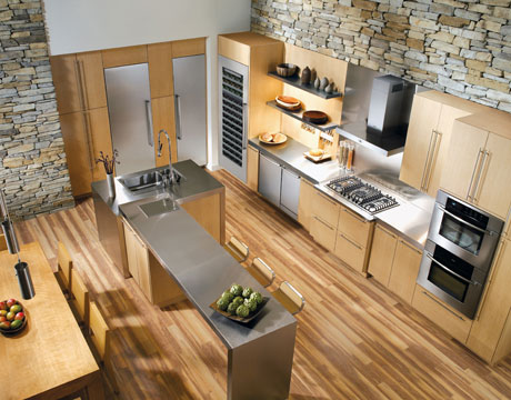 Here in my little corner of South Florida the pendulum has swung , of late, to more contemporary designs in the kitchen. This means less ornate with clean lines. I love it but I realize it's not for everyone. What if your whole house is more classic and traditional? Your kitchen should always work with the architecture and theme of your home. This is exactly the case with a job I am working on now. This Florida home has a kitchen open on two sides, the dining room and the family room. Here's what it looks like now.
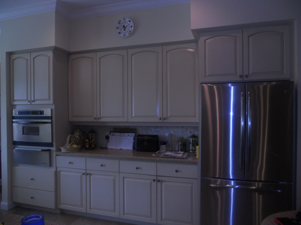
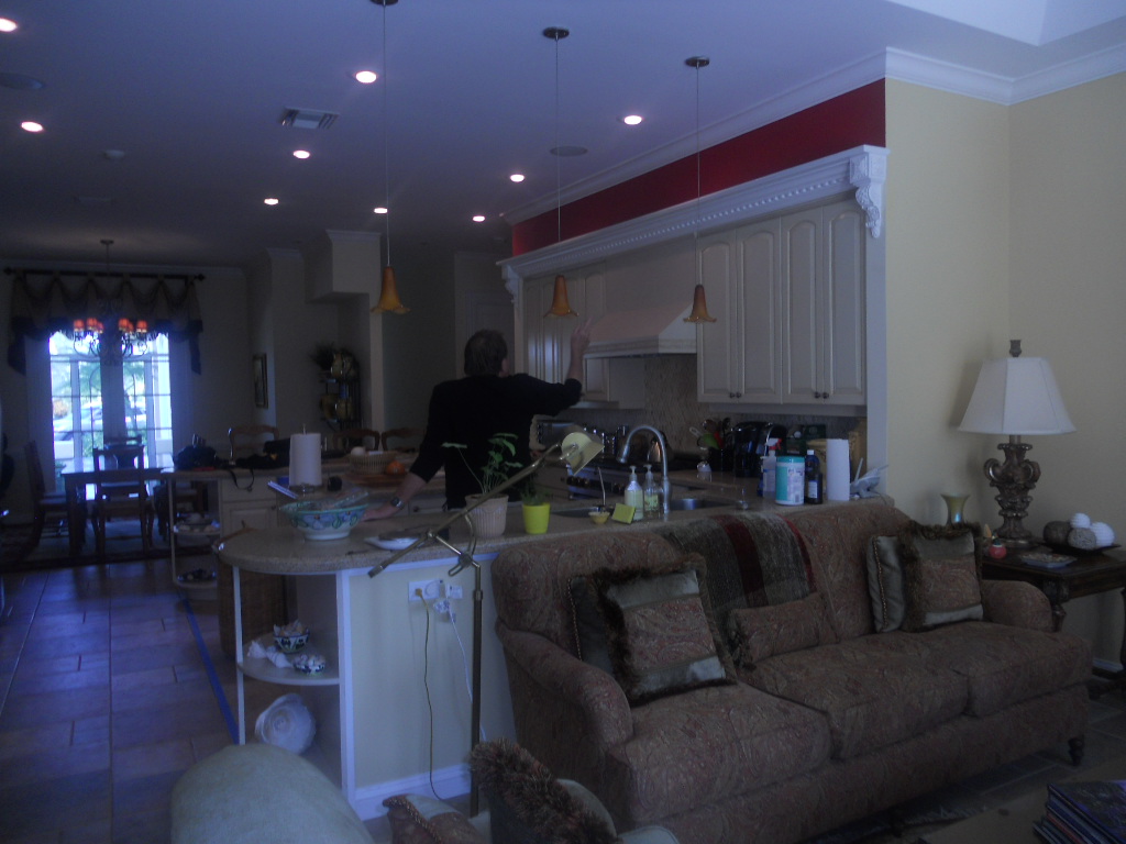 She's selected appliances which are slightly different and will be integrated into the new plan. Because the kitchen is smack dab in the center of the home there is not much natural light, so no dark finishes. We have about 95" to the soffits. Last but not least, because the kitchen is so open and visible we need WOW!If you blend the tropical locale of this beautiful home with its traditional decor you find that British Colonial or Bermuda Style is the perfect solution. During the reign of Queen Victoria, British subjects stationed in the British Colonial outposts of the Empire that included Singapore, East Africa, India and the British West Indies, brought with them their language, principles of government, architecture and furniture. There was just one little issue, climate. Certain details had to be modified to accommodate the heat! Some of these details were the use of light airy fabrics, lots of big tall windows and high ceilings. In addition to this they had to take advantage of local resources like mahogany, cane and bamboo. So here's what we're gonna do!1) MOVING ON UP- We're going to remove the soffits so we can take advantage of the high ceiling.2) LET THERE BE MORE LIGHT- We're going to add lights above cabinets, wherever possible and more efficient fixtures in the ceiling and under the upper cabinets. Cabinets will be a combination of medium and light stains with some cane detailing.
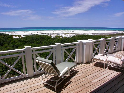
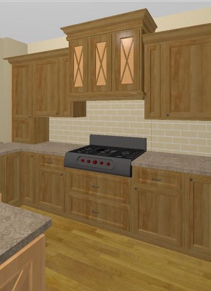
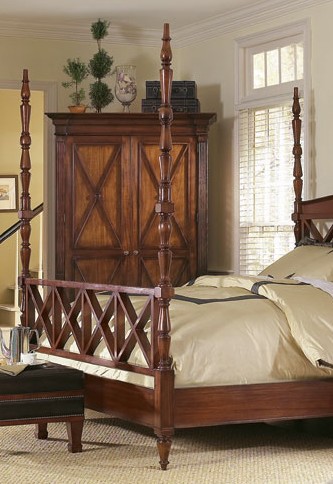 3) X MARKS THE SPOT- You will frequently see the X motif as a part of the BC style so we are incorporating it into the design.4) A LUSH TROPICAL ISLAND- This tropical island has to grow. We have the space to make it bigger and more funtional but we don't have the space to add the columns or legs that would make it look like a piece of furniture. Instead we'll raise it off the floor and add some furniture feet and moulding.
 5) CROWNING DETAILS- Nothing says traditional like crown molding, columns and pilastersSee a working elevation below. Notice with the X detail, less is more equals WOW. We're still fine tuning the details but I'll Keep you posted!
IKEA'S LIVING STAGE
So it's January again and everybody's writing great posts about new trends (open shelves, fewer upper cabinets, the color orange, horizontal wood grains), and resolutions (already lost 4lbs YAY). Not moi. I'm in the mood for scanning the globe for home/kitchen related tidbits and what locale could be better than my new favorite, PARIS! That famous cheap yet hip ready-to-assemble furniture company, yes, IKEA stays edgy and current by coming up with new innovative marketing schemes. The latest took place in the Paris commuter train station Auber R.E.R. A 581 square foot apartment was erected,and five young stylish occupants were recruited to live in it for 6 days (January 9-14). Oh, and commuters could peak in the windows to witness "hip" living in all its glory!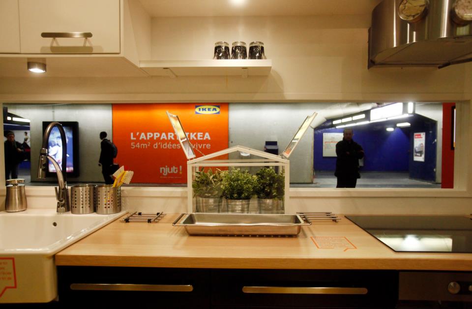 The purpose of the marketing campaign was to demonstrate how IKEA products work for small spaces in real life. Each of the days is documented via video on the IKEA France Facebook page. Here are the highlights:
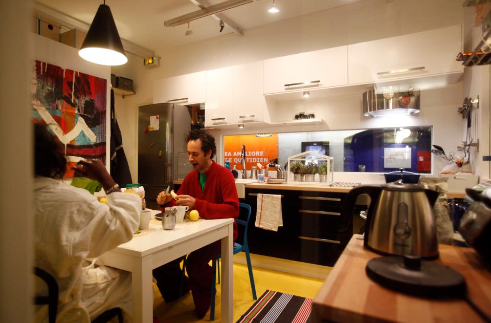 1) Day 2-Take out sushi delivery (FOUL! I wanted them to cook in that kitchen! Okay it sort of looked like they cooked on Day 1.)2) Day 3- Twister (A good game choice for small spaces.)3) Day 3-Some guy really into his pink ukulele (This is actually pretty hip as ukueles are making a big comeback. Click here.)4) Day 1 -Sewing clothes with sewing machine and everything (Really?)5) Day 4, below, features a bang up birthday bash! (This must be the coolest cake ever.) This was creative, attention grabbing marketing, a statement about the relationship between form and function. Did they succeed? Has social media made marketing more important than product?
2012 DREAM
 Last night I had a dream. Before I share it, let me back up a bit and set the scene. One of the nicest, no actually the BEST thing that has come out of this blog for me is to have been chosen by Brizo Faucets to attend Fashion Week in September 2010 as one of the "illustrious" members of the Blogger 19. This was followed by a trip to Toronto in January 2011, as a member of the Blanco Design Council, to attend IDS (International Design Show). I not only became acquainted with cutting edge state-of-the-art products but also with many talented folks in the blogging community.
 Now Modenus, a go-to site for design dreamers as well as professionals, is sponsoring Blog Tour 2012. Veronika Miller, who I had the pleasure of sitting next to at the Jason Wu fashion show is the mastermind behind this venture. They are currently selecting the blogger line up for some new design adventures. All this must have been lurking in the outer recesses of my mind when I went to sleep. To sleep perchance to dream!Hubs and I arrive at a hotel and check in. We are down in the lobby where I discover that a great meeting is about to take place. It's an advance gathering of potential candidates for the 2012 Blogger World Tour! Lo and behold, in walks in the King of Kitchen Bloggers, Paul Anater along with Nick from Cupboards, who I've never actually met. We all fall into a big group hug and I am swept into the event. Wow. All "potentials" are handed a "blog critique" and mine is pretty complimentary, actually. Paul leads the group which now also includes Erin Lochner of Design for Mankind. As the meeting unfolds I begin to see how unprepared I am. Yikes! I'm dropping pens, struggling to keep up when it occurs to me that I need to take pictures and blog about this! I must go to the room and get my camera. (It never occurs to me to call Hubs and ask him to wait for me even though he's being really good and waiting for me on the sidelines.) I feel the big brass room key in my pocket. I pull it out and it says 27. (I dream a lot in numbers.) I locate a very helpful bell hop who helps me figure out what floor that's on. He consults a chart which tells us that 27 is actually 7151 which means I'm on the 7th floor. Now I can grab my camera and get back to the group. The bell hop senses my sense of urgency and puts me on the closet elevator which is for freight. Did I mention he's wearing a hairnet?Everyone knows dreams are meant to be exploited for shameless self-promotion. So there you have it, just a lil wish for the new year. If I don't get that I'll settle for health, prosperity and another great year for Kitchens for Living where my dream is to motivate, inspire or help you create your own DREAM KITCHEN. Happy new year!


