Tear Sheet Tuesday: Summer recipes, NYC X Design & Furniture Porn

Welcome to another edition of the occasional series I call Tear Sheet Tuesday.  We launched last Tuesday.   If you want to catch up you can do that right here.  In a nutshell, I tear what strikes my fancy throughout the week and I share that with you here.  It could really be anything. It's all inspiration!

TearSheetTuesday


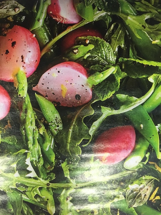
Perhaps today's tears will inspire you to cook, lounge by the pool or get busy creating an office you really want to work in!  Let's get started.  First off, my Cooking Light hit this week.  I wanted to be good and feature this...

TearSheetTuesday TheArtoftheSalad CookingLight

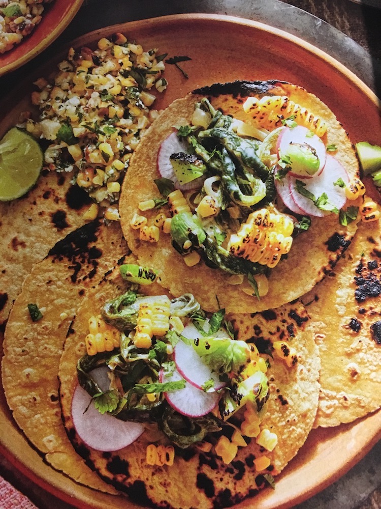
However, THIS is what really looks yummy to me.  Both are super summer meal inspirations and can be found in the current May 2017 issue of Cooking Light.

Cooking Light, Creamy Poblano Tacos TearSheetTuesday

In addition to recipe fantasies you can indulge in a little design dreaming this week if you happen to be in the Big Apple.  NYC X Design is going on right now and it's open and free to the public through May 24th.  This is the fifth year of this international event where you can attend talks, product launches, exhibitions and more all over NYC.  For more info click here

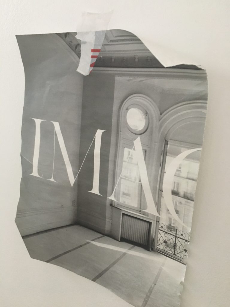
Needless to say I have plucked some coolness from the pages of The Official Guide to NYC X Design, from the Editors of Metropolis.


I guess I'm into the walnut wood  finishes with a little lounging mixed in these days.  Mark my words, beautiful stained wood grains will be the next big cabinet look, as soon as white Shaker runs its course (which could be never). 

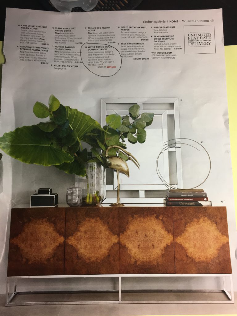
Last but not least, I know you didn't forget the furniture porn I promised you ;).  I have been eyeing this incredibly beautiful burled wood console for a really long time.  This week's sale catalog from Williams Sonoma came in the mail and BAM!! There it is on sale.  Should I? I really love it.

Williams Sonoma, Wythe burled wood console

So that's what I have for you this week.  Please send me YOUR tears so that I can see what's inspiring you and feature it right here. Also, don't forget to leave a comment.  I'm getting lots of emails and I'd love for you to share your kind words right here.

Don't miss a post.  Sign up (upper right) to have them personally delivered to your inbox.


AND THEN THERE'S SHOPPING

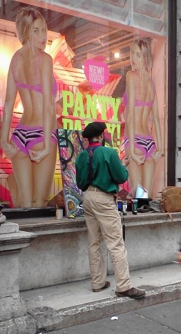
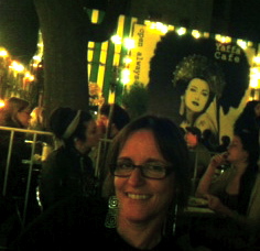
Yesterday I took a break from the show to indulge Diva Daughter Sabrina in her favorite activity, shopping.  My sister Pam, Sabrina and I hit the road running beginning our day on famous 34th Street where we visited Lush, Desigual and Uni Qlo.  Lush is the smell good spa experience gone wild,  I fell in love with the signature looks at Spanish retailer Desigual and was impressed with the merchandising, quality and value for money at Japan based Uni Qlo.  Click on the links and check them out.It was a long fun day and we ended it in the East Village at the Yaffa Cafe'.  The Village has to be my favorite part of New York.  If I ever lived here in a past life, this was the spot.          The food was good and the company made it even better.  Today we returned to the AD Show and visited ArtExpo.  Stay tuned for today's recap in the next post.

NEW YORK BOUND FOR AD SHOW & ARTEXPO

Happy Monday peeps!  Looking forward to a great week visiting New York City’s home of fashion, art and design events,  Piers 92/94.  I’ll be arriving Wednesday evening in time to attend opening Trade Day at the Architectural Design Show.  I’m really looking forward to seeing many fellow bloggers and designers I met through the Blogger 19 Fashion Week event sponsored by Brizo and also meeting others who I follow and admire for the first time.  Look for updates and coverage of my unique take on all the action.

Friday I’ll be heading over to the other pier for ArtExpo NYC so that I can indulge in my other passion, art!  As an added bonus you’ll get a “teenager’s take” as I roam the city that never sleeps with my 16 year old "diva daughter" in toe (spring break).  It should be fun.  Don’t forget to check back!

DIESEL POWER IN THE KITCHEN!

That's not diesel as in engine but Diesel as in the sexy jeans and apparel manufacturer.  Yes, they have teamed up with that Italian maker of cabinet beauty, Scavolini.  You'll remember I wrote about them on my last NYC adventure here.The global denim brand, ambassador of the “successful living” lifestyle, and the Italian leader of furnished kitchens, with an export network in more than 50 countries worldwide, are collaborating on a new perspective in kitchen design.Check out this video introducing the Successful Living Kitchen sent to me by my pal Daniele at Scavolini NYC.The purpose of this project is to appeal to the needs of younger (I like to think young in age AND young at heart) consumers throughout their global markets.  Scavolini fits the bill because of their ability to incorporate function, safety, durability and style.  The Diesel style is represented in this "Successful Living Kitchen" with industrial appeal and retro elements through use of materials such as wood, steel, glass and concrete distressed and treated to lend a vintage feel.  What an interesting combo!  Pieces are both modular and free-standing.  If you'd like to check it out in person you'll have to visit the EuroCucina Show in Milan Italy April 17-22.   I'll be back in NYC at the end of the month for Architectural Digest 2012 Show. Ciao! 

DESIGN AND THE MODERN KITCHEN


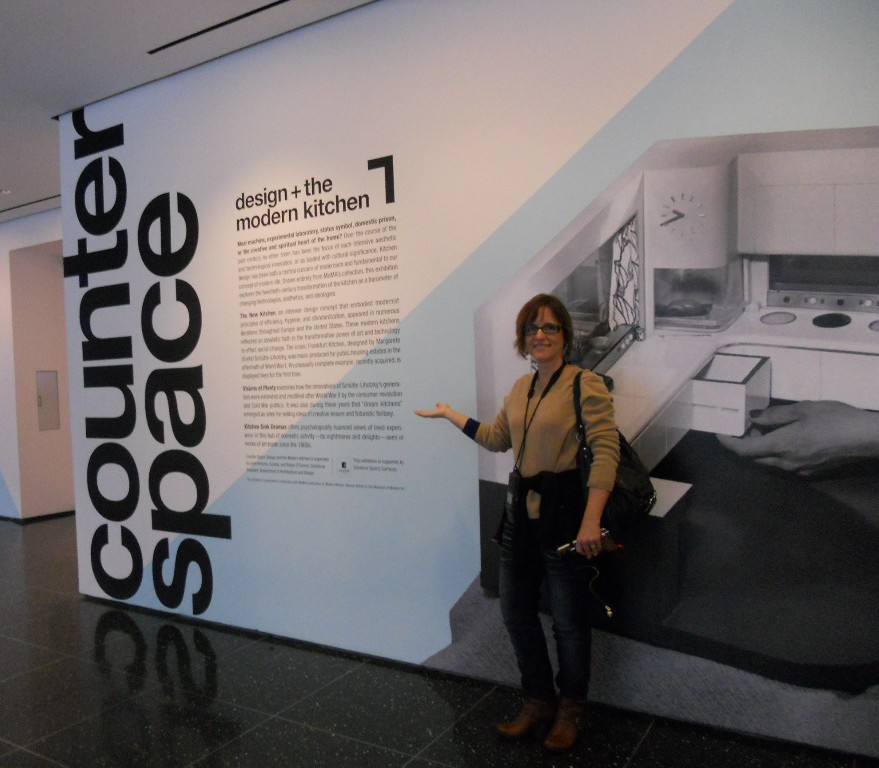
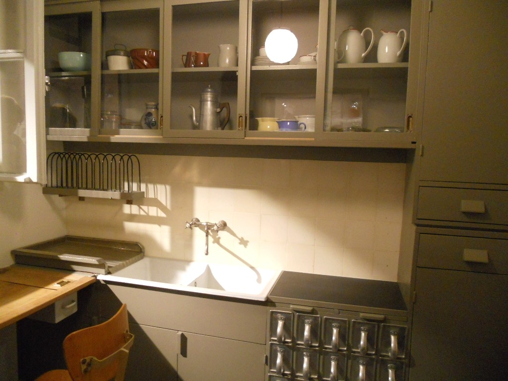
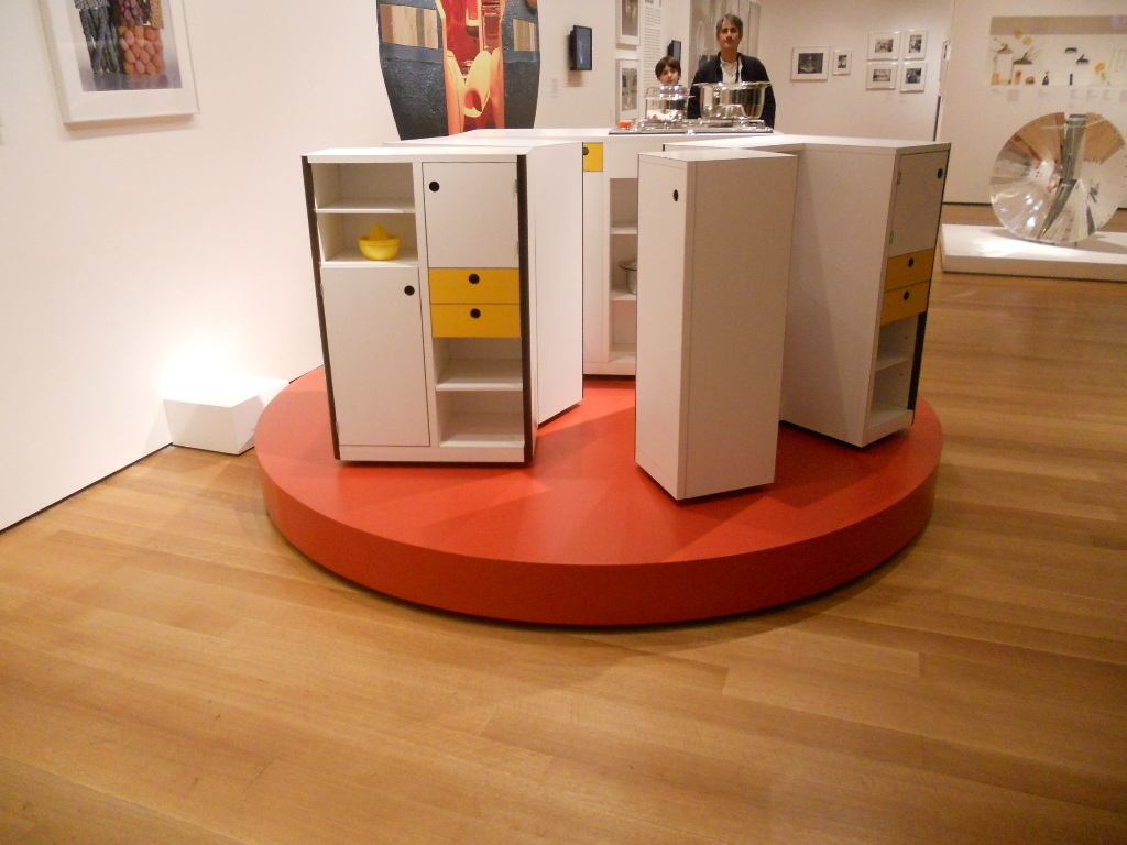
Granted I'm biased, but I have to say that Counter Space:   Design and the Modern Kitchen is the most engaging exhibit I have had the pleasure of attending.  It opened at the Museum of Modern Art September 15th and closes on March 11th.  The thing about this show is that we can all identify and connect with the topic of kitchens.  They are an integral part of how we live but we seldom give thought to exactly how they came about.  You can find just about all there is to know right here.


The only critique I have is that I wish they would have included commentary post midcentury.  The concepts of the kitchen are so dynamic and there is a lot to be said with regard to the last half of the 20th century.   Nevertheless, especially for a kitchen professional or enthusiast this is an absorbing and engaging experience.  The exhibit is divided into three main segments.


"Toward the Modern Kitchen" examines the early research in efficiency and time management that culminated in the design of the Frankfurt kitchen in 1928 by Margrete Schutte Lihosky.   A post World War I housing crisis provided the impetus for such reasearch resulting in what is thought to be the first "modern" kitchen.  You can read more about this history on a previous post here.     It was believed that by transforming daily life at the level of he kitchen behavioral change and social well being would result.  Good old German efficiency and practicality were at the heart of these inventions and it was two women in particular who made the biggest contributions, researcher Christine Frederick, as well as architect Margrete Schutte Lihosky.


The second part of the show is "Visions of Plenty"  and deals with the post-war kitchens in America.  It was then that the ergonomic considerations begun by Ms. Lihosky were further refined and a standard counter height of 36" was established.  This was based on the average height of a woman at the time.  Kitchens also began to evolve into living areas at this time and were very influenced by food restrictions brought about by the second world war.In addition myriad everyday objects are on display throughout the show.  We never think about where the things we use everyday come from but they have a history and were shaped by our culture and time.The final part of the exhibit is entitled "Kitchen Sink Dramas" which deals with kitchens as they are portrayed in the media as a rich subject for artistic expression.If you would like to know more about this exhibit and rich history you can purchase a hard cover edition catalogue of Counter Space produced in conjunction with the exhibit and available by clicking here One final note that I have not seen mentioned is that this show was  sponsored by Silestone Quartz Surfaces.  I'm headed back home to the drawing board today with visions of tupperware and proto-type kitchens dancing in my head!

NOTES ON A SATURDAY IN NEW YORK

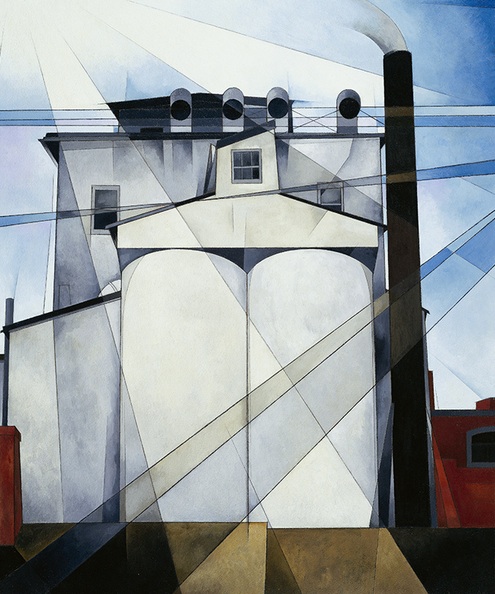
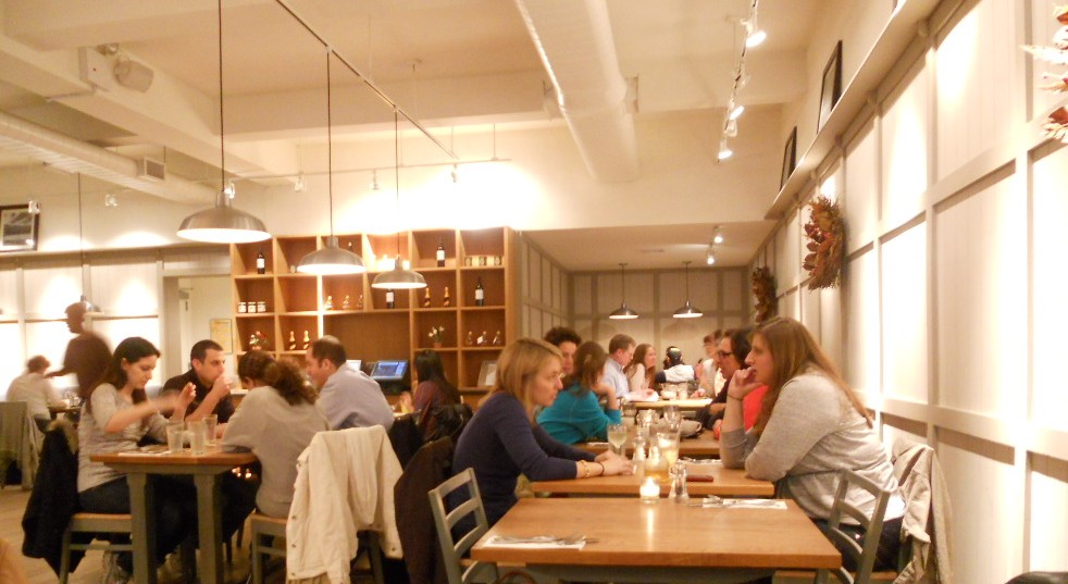
Yesterday we were supposed to go to the Armory Art Show but due to a late start we ended up at the Whitney instead.  The late start was worth it, however as my brother-in-law made us salmon eggs benedict which I highly recommend! We found the recipe here at my fave recipe source allrecipes.com.  Right now the Whitney is featuring a special exhibition on Edward Hopper.  The Whitney Museumis only a fraction of the size of the Met, admission is $18 and the staff is grumpy and surly at best.  I digress, back to Edward.  Here's what Wiki has to say about him:  Edward Hopper was a prominent American realist painter and printmaker. While most popularly known for his oil paintings, he was equally proficient as a watercolorist and printmaker in etching. In both his urban and rural scenes, his spare and finely calculated renderings reflected his personal vision of modern American life.  I guess when I think of him I think of the rural American scene and was not so familiar with his urban themes.  I enjoyed seeing these and the works of other artists who, as his contemporaries and peers, were influenced and inspired by him.   I'd show you some pix but they were verboten so here's an example of one I Googled.  After that we wandered over to the Time Warner Center at Columbus Circle which is basically a huge mall.  The thing about NYC is that you will find something intriguing at every turn, whether it is a character on the street or something like this totally unexpected Salvador Dali sculpture at Time Warner! This woman, almost entirely composed of flames, combines two of Dali's favourite obsessions: fire, and a female figure interspersed with drawers. Dali found flames fascinating because they seem to have a life of their own, exerting an almost hypnotic influence on the observer.  Read more about her hereRight across from the Time Warner Center we stopped at a cool Scandanavian cafe' called AKCafe.  Our snacks were yummy and I enjoyed soaking in the hip decor.  I especially love the linen colored paneling, so Scandi!  So today will be the big adventure, the reason I came to NY.  Next post, Counter Space: Design and the Modern Kitchen.