On the Road in New York-ICFF, Art & Great Food

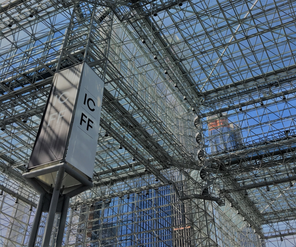
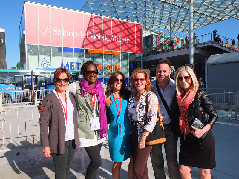
This year my birthday coincided with Design Week so I thought what the heck, it's time for another On the Road episode, this time to the Big Apple for ICFF.  The International Contemporary Furniture Fair was held at the Jacob K. Javits Center May 20-23 and is known as the North American platform for Luxury International Design showcasing the latest in exclusive interiors, contemporary design and high-end furniture.   However, it's much more than furniture. Naturally, I wanted to home in on the latest and greatest for the kitchen and bath. Read on to see my discoveries.


ICFF New York

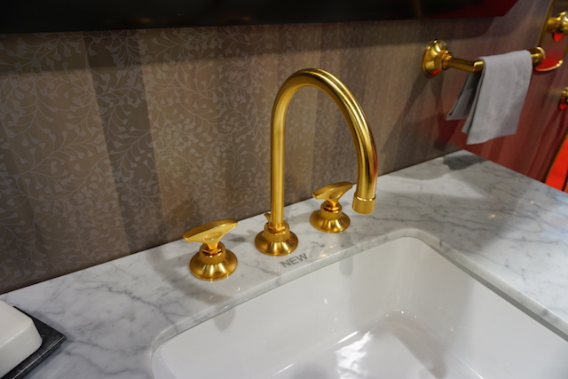
I found lots of beautiful plumbing fixture booths featuring all types of sculptural free standing tubs and faucets in the widest variety of metal finishes ever!  Admittedly the innovative furniture was the star of the show with an emphasis on bentwood designs and mid-century modern styling.  I also loved the "International aspect and one of my favorite sections was the Hand Made in Germany booth.  There was a lot of Bauhaus inspired design and I especially loved a minimalist work center.  So clever! Push play and you'll see what I found at the show.

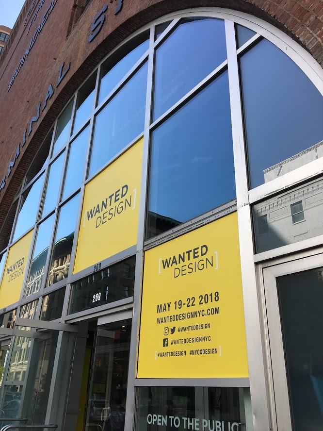
At the same time another show, Wanted Design, was happening right down the street in the Terminal Stores located in an up and coming area by the waterfront.  The venue was old warehouse chic and the show was even younger and edgier than the main event at ICFF. There was a global focus here as well.

wanteddesign,terminalstores,newyork


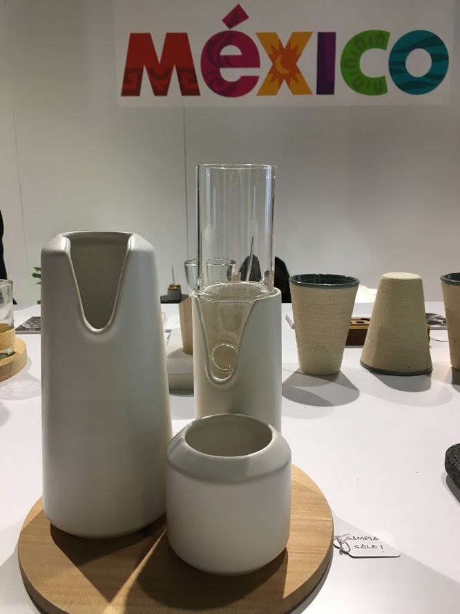
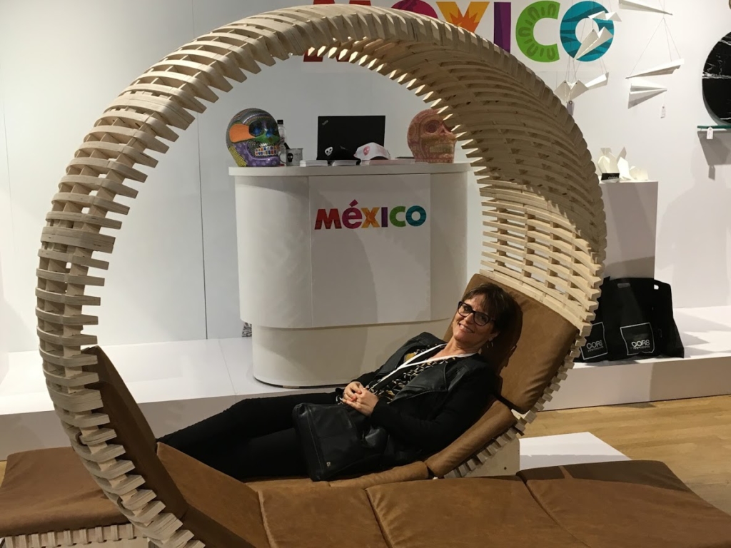
I found the Mexican contingent filled with creative and visionary youth.  There was product design, jewelry, furniture and even a line of bar ware based on Mexican cocktails made out of sustainable materials! That's quite specific and remarkable, don't you think? For now, these are one of a kind but I think it's a testament to creative thinking in the future.


Wanted Design, newyork


Wanted Design was also the venue for Modenus Talks sponsored by Lixil and hosted by Modenus and Design Milk.  This regular series of talks is held in different locations usually in conjunction with trade events. They are always so informative and relevant.  The one we attended was Sustaining the Sustainable Home moderated by Modenus Media CEO Veronika Miller and featuring materials expert Grace Jeffers. It's always great to have more knowledge about the materials I am specifying and to educate the public about  safety and sourcing. Do you know the number one thing you can do to reduce pollution in the home? I'll tell you because you'll never guess,  It's removing your shoes at the front door.  Your shoes track in not only dirt but also carbon monoxide! Who knew? Honestly even though some really relevant information was shared it was also very scary.


Wanted design, new yori

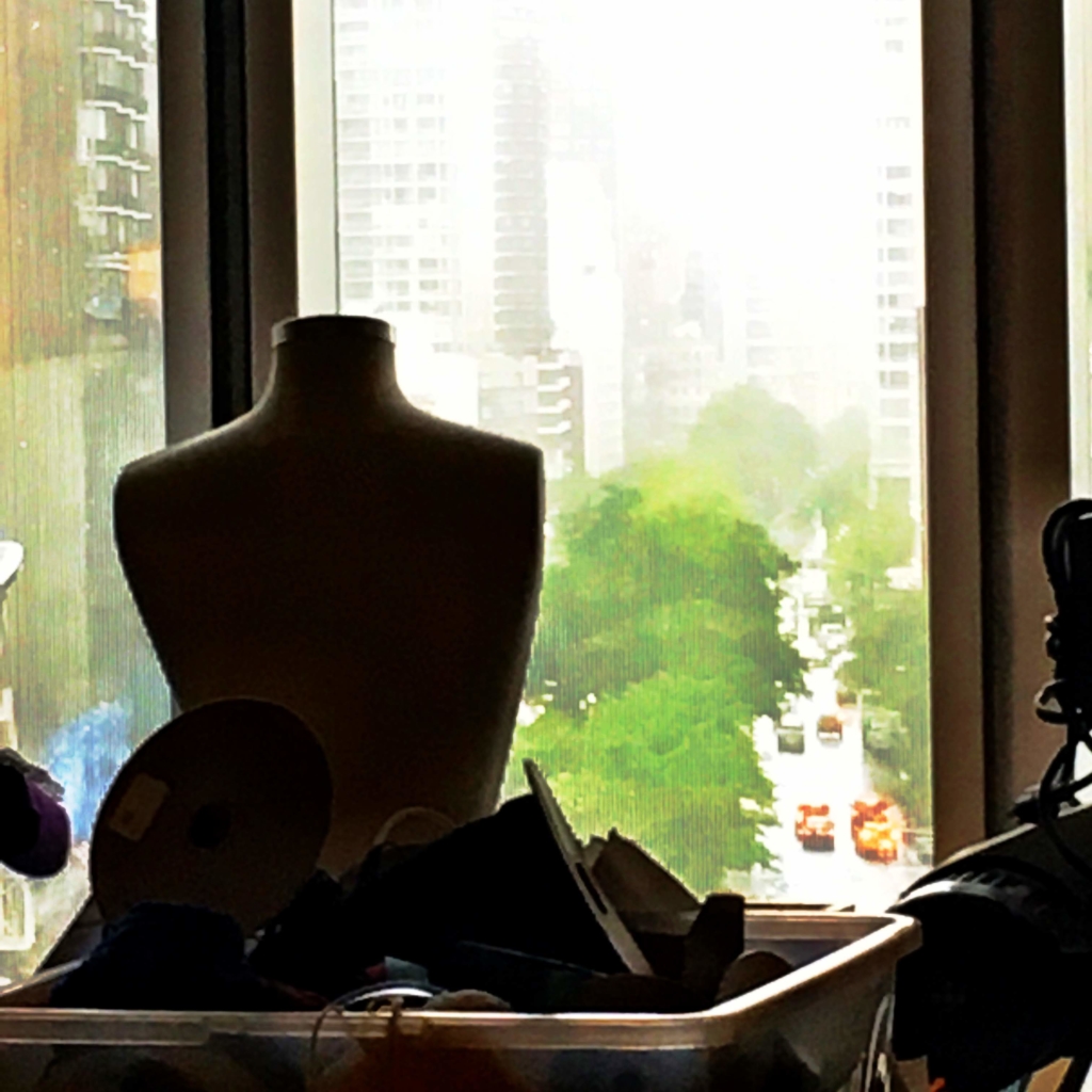
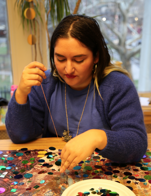
If you know me you know that no trip to NY is complete without an "art fix". My savvy New Yorker sister and brother-in-law suggested the Noguchi Museum which did not disappoint. Noguchi was a stone sculptor among other things. He's also famous for those fabulous paper lamps. It was very inspiring and I even bought the T-shirt. I'll be making another video about my Noguchi Museum visit.  Subscribe below and stay tuned.  Part two of the art experience was The Museum Of Art & Design which is a satisfying combination of craft and fine art.  This was my second visit and I must say my favorite part is the sixth floor where you can see and talk to artists in residence. It was quiet on this rainy afternoon but I did meet textile artist Emily Oliveira.

MuseumofArtandDesign, new york Emily Oliveira, textileartist, museumofartanddesign

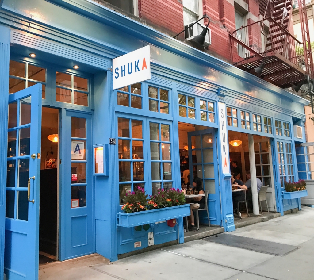
ShukaNewYork

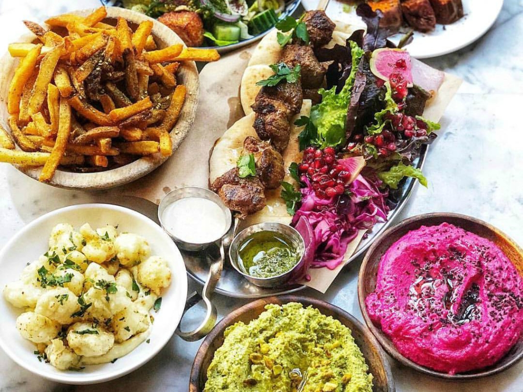
shuka-spread-1

.All in all it was a great trip topped off by a birthday dinner courtesy of my dear sister and brother in law at Shuka in the Village. OMG what an amazing feast!  Executive chef  Ayesha Nurdjaja  has a knack for flavorful combinations which feel Middle Eastern to me and are described as Eastern Mediterranean. The service was top notch too, even though it was packed for a Tuesday evening.  Maybe everyone knew it was my birthday ;) Back to work now but at least I have some great memories to savor. 

The Big Move Part V Progress Not Perfection

It's time for Part FIVE!!! I know how patiently you've all been waiting for this new installment of The Big Move.  It's been a challenging week including a meltdown that turned a Phase two project into a Phase NOW situation.

The Big Move Artful Kitchens


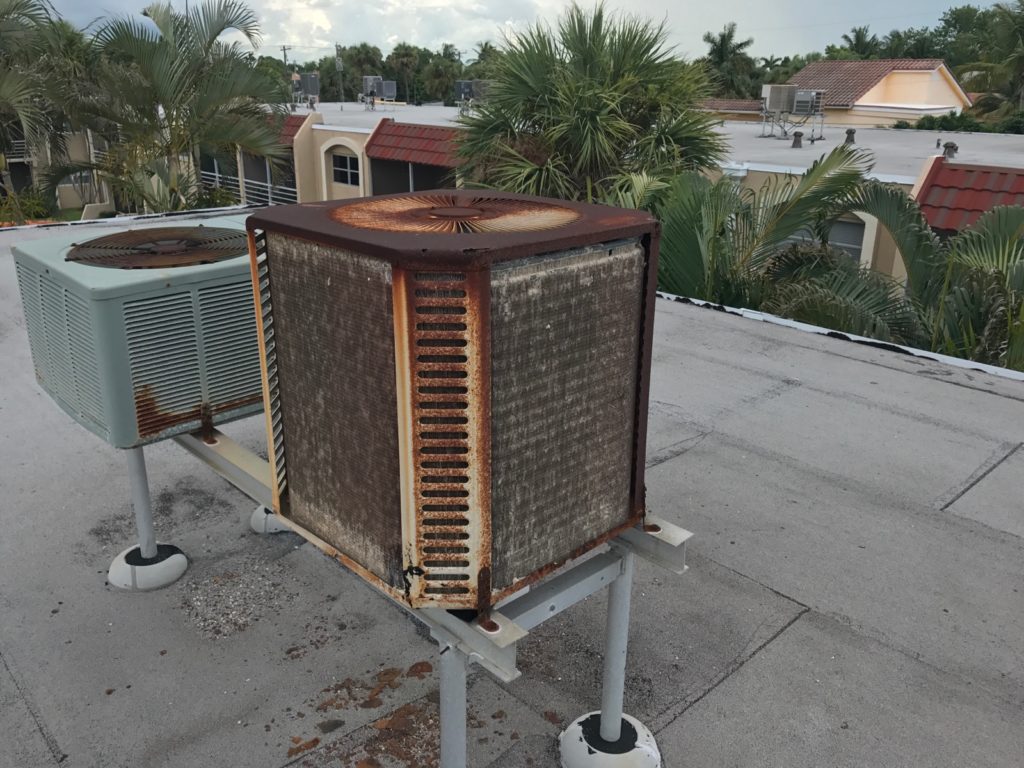
It's July in FLA and we just had to address the AC situation so as not to lose our dearly beloved labor force (Bob).  The result of the first service call yielded a $99 bill and no relief from the heat.  Granted the AC unit, we've discovered, looks like THIS!  

We need a new 2 1/2 ton unit and were quoted $6,500.  Next up, the second service call.  For this one, we called a smaller company who we have worked with in the past and guess what?  He's actually got the current unit working for the time being.  In fact, it's been cooling for about 5 days and counting so Bob is cool for now and we'll see what number two's estimate is.   I have high hopes since this AC guy is apparently a miracle worker.  I digress.  This week I promised a peek into what exactly is going on in the bedroom and master bathroom, which, to be sure, is a mini master.  Check out the tricks, tips and snarky commentary by editor Joe and see what we are doing to make small work in a big way.


As promised, here are the products we're using as mentioned in The Big Move Part V:


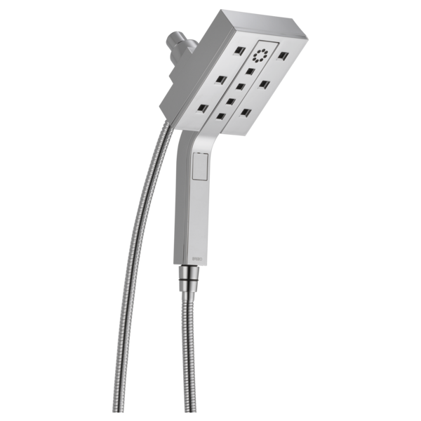
Brizo Euro Square Hydrati 2 in 1 showerhead Artful Kitchens


In the spirit of full disclosure, this showerhead was gifted to me by the lovely peeps at Brizo faucet a few years back.  It's our style, works great and we love it so it's moving with us.  The center portion pops out for hand held function.   It comes in chrome (above) and polished nickel.  Brizo is a part of Delta Faucets offering some really cutting edge design options but I actually love what Delta offers in their main line and it's what we chose for the shower and sink faucets.


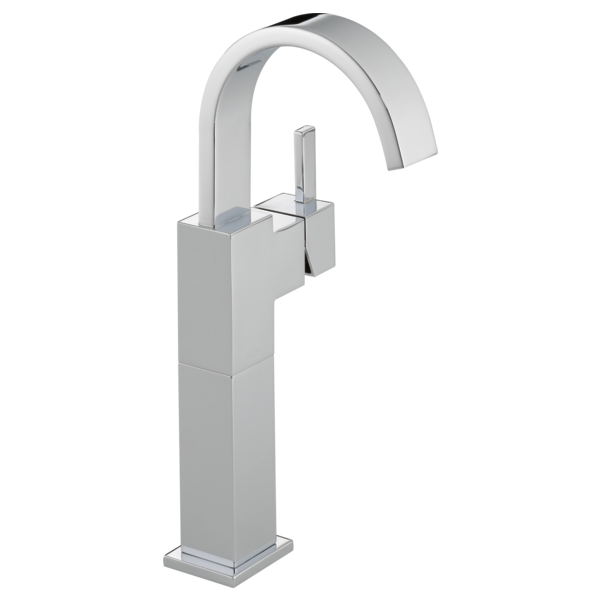
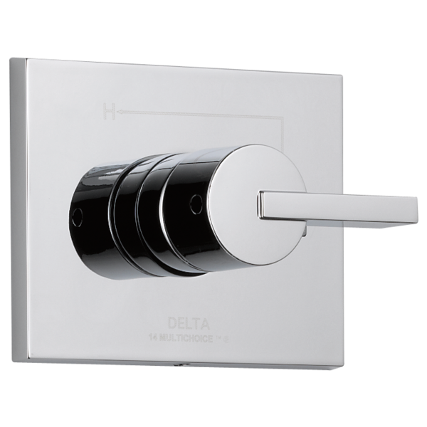
Vero faucet Delta single hole Artful Kitchens The Big Move

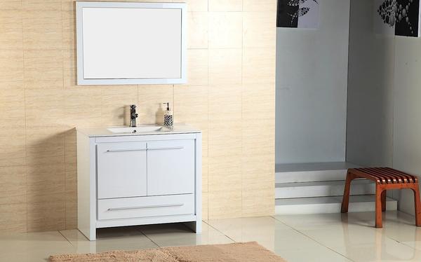
We went with a single hole/handle model as it is what will work with our furniture vanity which is pre drilled and looks like this.

Alexa 30" vanity by Adornus The Big Move Artful Kitchens


It comes with matching mirror and is a high gloss white finish which will look great with the shiny shower tiles.  Furniture vanities can be a great solution if they work with your space as you have the counter top and sink already done and included in the total price of your vanity.  The shower also will have the matching Vero design. I love the Vero styling because it incorporates square clean lines as well as the softness of the circle. I want it all!

Delta's Vero shower valve in chrome The Big Move Artful Kitchens


We didn't want to sacrifice any precious space for a shower bench but a girl's gotta shave her legs, right?  I plan to get this cute shower stool. I love the fact that you can move it.

Dahlia Gloss Resin Bath Stool


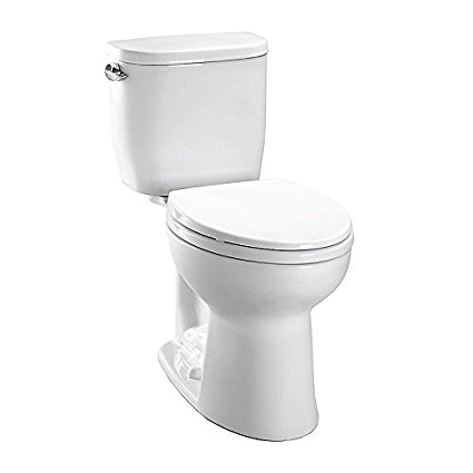
So now for the toilet.  As Joe so accurately pointed out, we did not, in fact, end up with a skirted toilet.  I thought that's what we ordered but it wasn't.  I'm okay with this and truthfully just thrilled to have a Toto toilet.  It is, however, a compact model just perfect for small spaces with a tank that measures just 14 1/2".  Incidentally, we also had an outlet put in right next to the bowl for a future Washlet and if you don't know what that is you should and you can read all about it here.

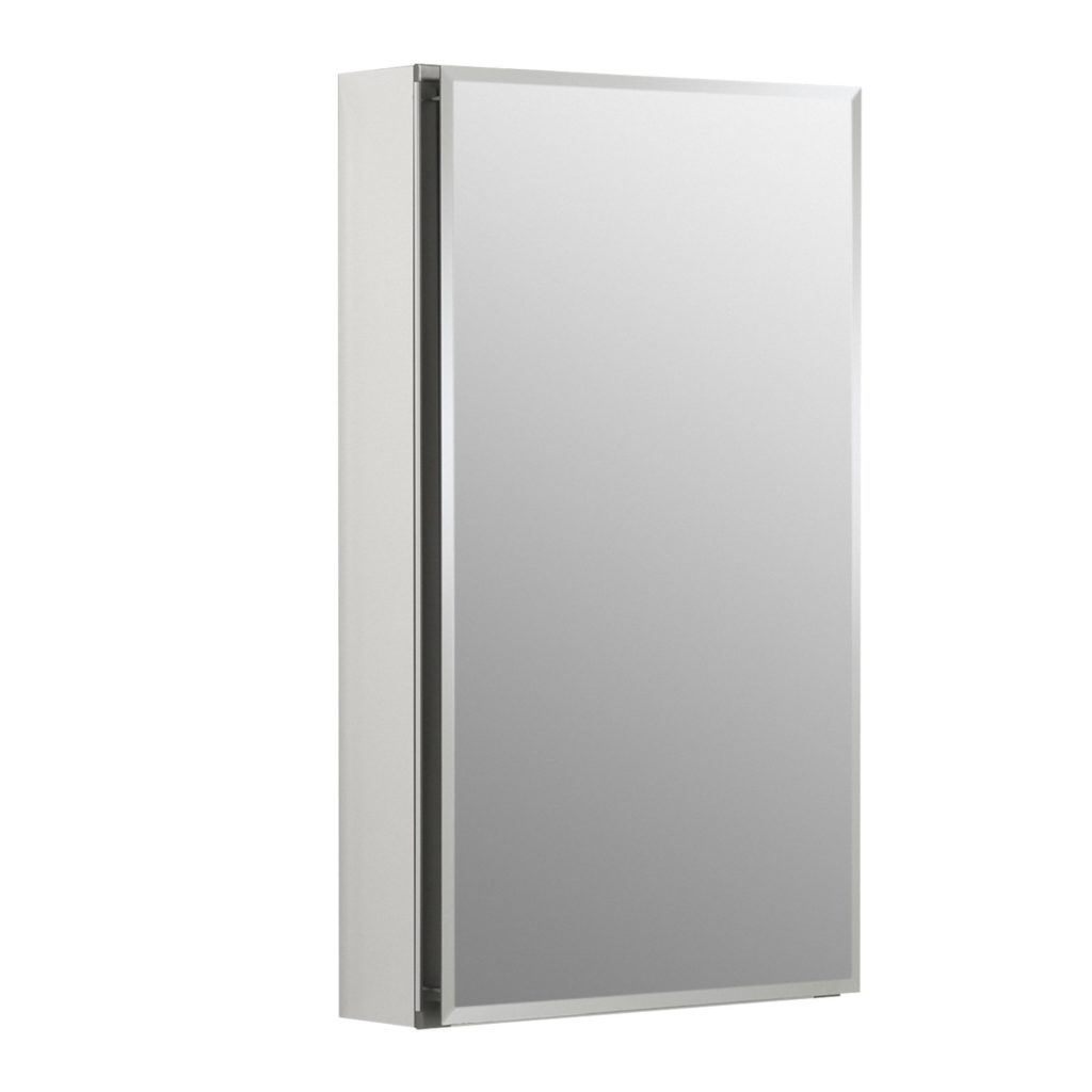
Since storage is at a premium we're going to include this mirrored medicine cabinet over the toilet. 


15" by 26" Aluminum Single door mirrored medicine cabinet The Big Move Artful Kitchens

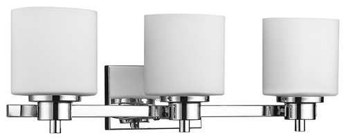
Last but certainly not least is the light.  I thought this lovely fixture was just the right style and size to illuminate this artful mini master bath. 


Solbi 3-Light Chrome Finish Bath Vanity Wall Fixture White Alabaster Glass 24"


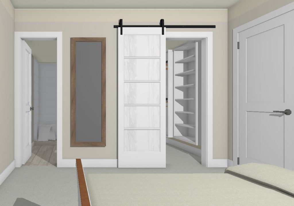
The barn door was an excellent solution for two doors that didn't get along very well!  So there you have it!  Please feel free to comment.  I'd love to hear your thoughts and don't forget to subscribe to the blog for more tips tricks and some upcoming behind the scenes revelations of this Artful Kitchen designer. xoxo


The Best of KBIS 2016

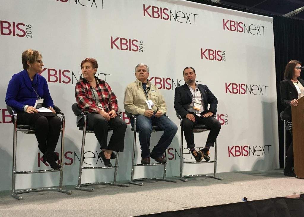
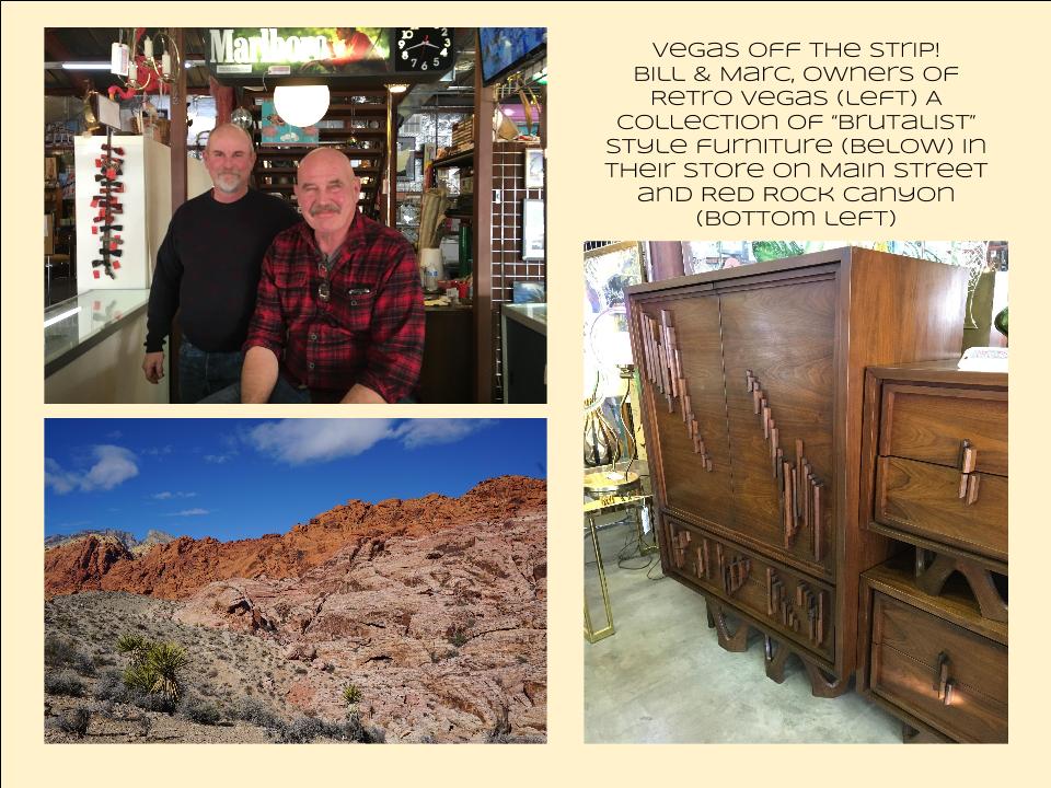
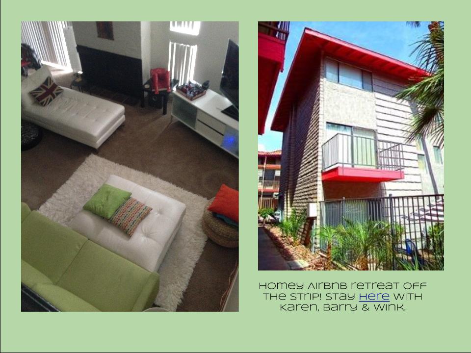
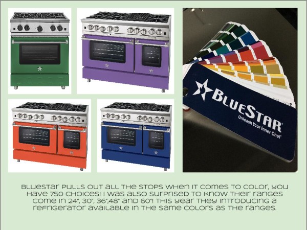
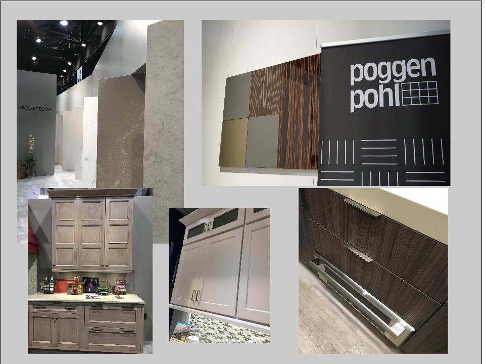
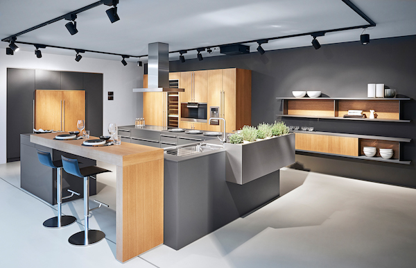
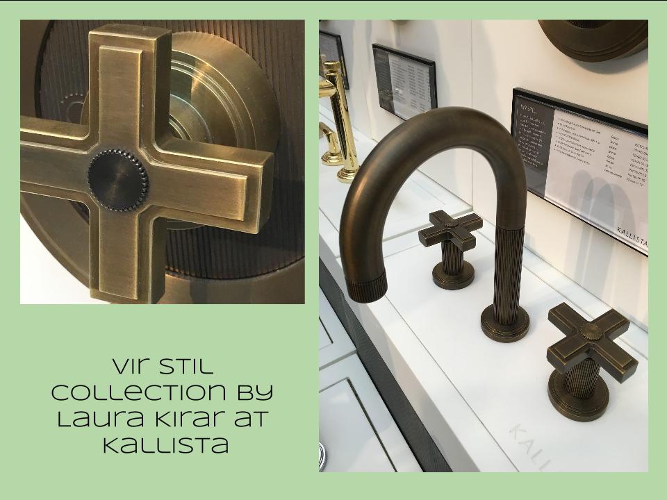
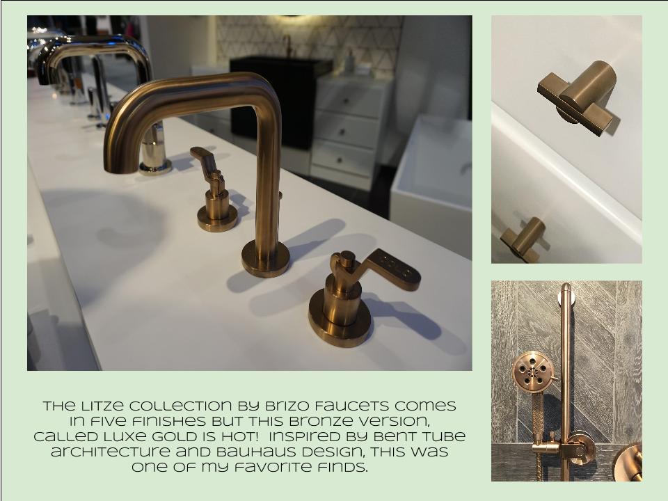
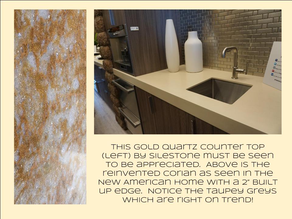
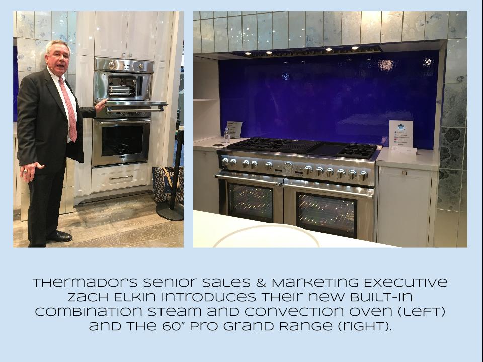
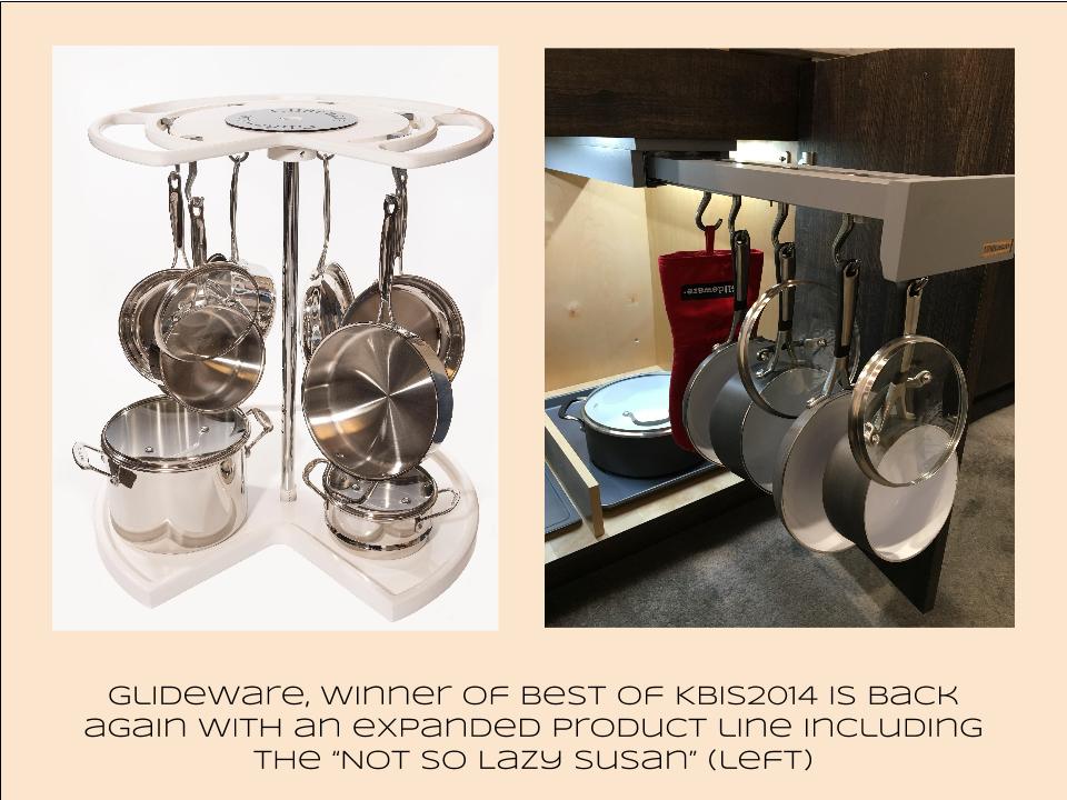
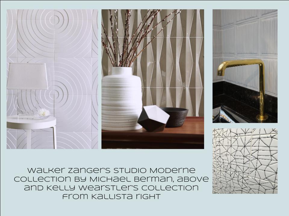
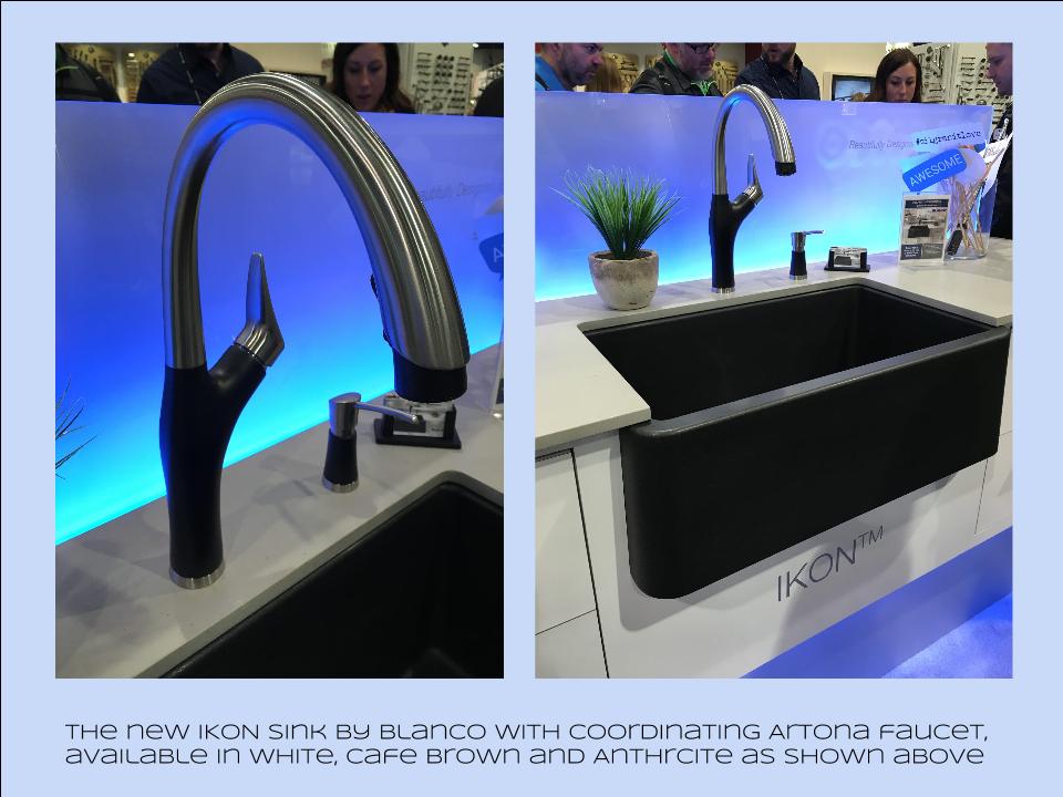
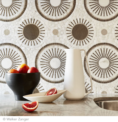
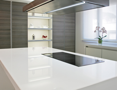
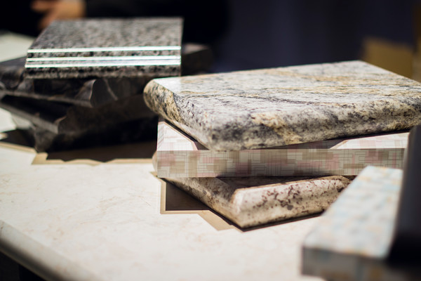
Bam!  Another show is in the books and although it's been a busy week "back at the ranch", I've been dying to share my finds with you right here on Artful Kitchens.2016-01-19_184543141_4F428_iOS (2)Las Vegas was host to three days of networking and education for the best of the Kitchen & Bath industry.  As a member of the Kitchen & Bath Business Magazine's Advisory Board,  I had the pleasure of appearing on the KBIS Next stage as a part of the panel discussion entitled Trials & Tribulations-Solutions to Your Biggest Kitchen & Bath Challenges. It was an exciting exchange of ideas between both the pros on the panel as well as a savvy and engaged audience.Vegas Off the Strip Karen (1)I also had the opportunity to spend some time in the Las Vegas I like best, off the strip! I hiked in the Red Rock Canyon and visited my friends at Retro Vegas on Main Street. My digs for this trip were with my dear pals Karen, Barry & Wink.  They live in a midcentury modern gem that, rumor has it, was briefly home to Lucille Ball!  They are avid Airbnb'ers and wonderful hosts.  Check it out if you find yourself in Vegas. This location is so convenient to the Convention center I could walk, which I did, once.  Mostly I Ubered. Enough walking happens on the show floor!  So without further ado, here's my recap of the biggest and most notable trends and products that caught my eye at KBIS2016. ColorWhite still reigns.  In fact paint giants Benjamin Moore and Sherwin Williams have both selected shades of white as their color of the year.  You know I am a huge white fan. It is always the best backdrop for art and design. It also continues to be the favorite cabinet color in my area.  Remember white is not just white, there are an infinite number of varieties you can have fun with.  If you need more punch in your kitchen you could find some great options at the big show.  I saw bright saturated colors in several appliance brands including Bertonazzi, Viking and BlueStar which offers 750 colors!  color (2)Grey has not left the stage.  The newest versions are warm, venturing into taupe territory. Textured wood grains such as cerused oak are really popular. Wood-Mode showed both traditional and contemporary versions of ribbon Mahogany.Cabinets Poggenpohl_Diamond Grey_Oak Honey BrownThe Perfect TouchTouch latch technology was EVERYWHERE!  If you prefer a sleek, uninterrupted look for your cabinets and appliances this is for you, a gentle nudge will open your cabinets. This is nothing new but it's taken off.  I also loved the button that allows you to close this cabinet when you're done without resorting to dangerous acrobatics (I'm short).Untitled drawing (5)Feeling BrassyActually brass, copper, bronze and myriad versions are hot for plumbing fixtures and hardware.  My favorites were the new BauHaus inspired Litze collection by Brizo Faucets. and Kallista's Vir Stil collection.LitzeNot Your Grandma's CorianIf you're like me Corian has been dead to you since about 1998.  That sentiment has now ended in my book.  I saw a 2"thick sleek contemporary version of Corian that was perfectly at home in The New American Home.  The other exciting thing I saw in counter tops was this quartz by Silestone.  Yes, it's GOLD!  I just wish the photo could capture it's sparkly beauty.CountersThrills from ThermadorAppliance brand Thermador held a press conference on the show floor to introduce a couple of impressive new products, the 60" pro range available with steam and a double oven featuring steam and convection.  These are firsts in the industry.ThermadorOrganize ItJust when I thought we had it all the category of organization it goes to the next level. There was a great representation of brands ranging from Hafele to Rev-A-Shelf to Hardware Resources but Glideware is taking the market by storm.  If you've got a mess lurking somewhere I guarantee there's a way to make it neat and accessibleRev A ShelfGlidewareTile StyleMy two tile favorites were Michael Berman's Collection from Walker Zanger and, of course, Ann Sacks who are featuring a new line by L.A. design maven Kelly Wearstler. Love!Tile (1)I can IKONIf you read my blog you know I love me my Silgranit sinks, meet IKON the apron front version which easily works in any style kitchen from Traditional to Contemporary. Their Artona  faucet perfectly complements the Silgranit sink.-BlancoStikwood Rocks!

Stikwood’s line of lightweight, real-wood planking offers designers and DIYers a peel-and-stick solution to achieve that perfect, sought-after blend of rustic and modern. It can be used on walls and ceilings and comes in tons of colors, even prints! I'm thinking this could be great on the back of a kitchen island.

stikwood

Believe me, all this is just the tip of the proverbial iceberg.  There was so much more to see and learn about at KBIS 2016.  Check out this year's winners of Best of KBIS for more info and of course if you'd like any more info on what you see here email me at artfulkitchensbyglo@gmail.com

An Artful New Adventure!

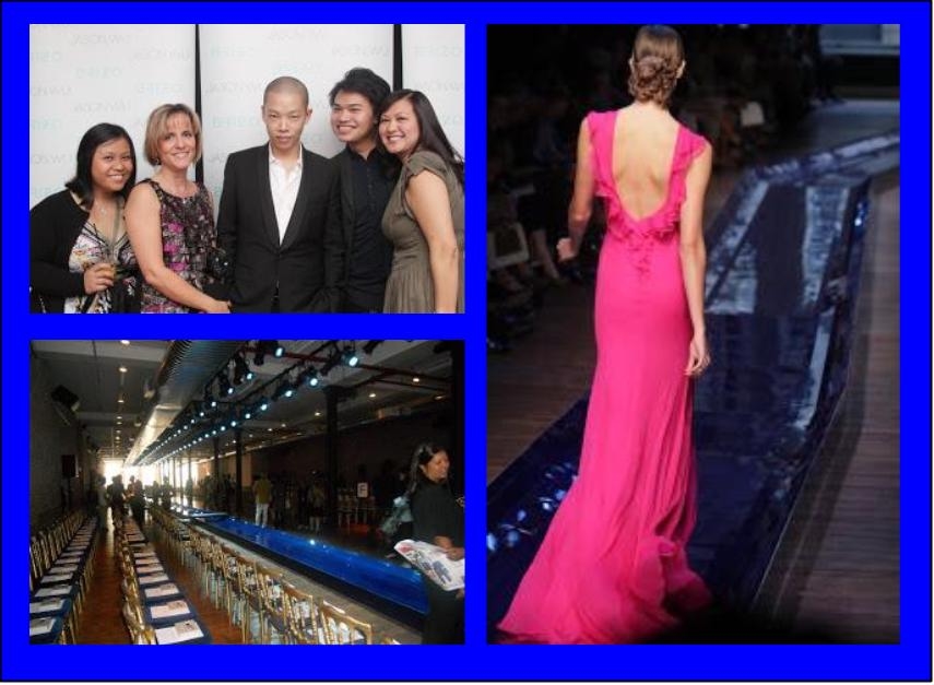
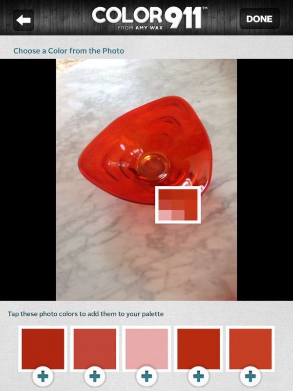
Let’s face it, things change.  As we navigate those twists and turns of fate we can only hope to move forward, seeing new things with a fresh eye. Like it or not, change is a constant.  You can dread it (understandable) or you can choose to embrace it.  That said, it has been more than five years since I began my adventure as Kitchens for Living.Jason Wu 2 (2) I believe I have been true to my promise to share the latest design trends and product info for the heart of your home. We have frequently ventured out of the kitchen and even around the globe! I am so grateful for all the wonderful and talented kindred souls I have met along the way, fellow bloggers, designers and great organizations such as Modenus, Blanco, Brizo, Tile of Spain and many more.  This blog has afforded me the opportunity to travel and bear witness to marvelous destinations and inspiring trade shows. Before this starts sounding too sad, let me tell you I have never felt so excited about the future and eager to explore new opportunities. DSCF9449-L This will be the last post for Kitchens for Living.  From now on I will be able to merge two of the things I love,  kitchen design and art with my new site, Artful Kitchens.  A big THANK YOU to Leslie Carothers of The Kaleidoscope Partnership for her guidance and insight which lead me to discover a new path full of promise and possibilities. tangent_astral88_Square_01Artful Kitchens will focus on all the ways you can use  creativity to personalize your kitchen. Artful spaces reflect who you are and the way you live.Blanco, Residences at Mandarin Oriental, Modenus Blog Tour, #blogtourvegasThe stunning tile above,  by Walker Zanger, was featured at KBIS 2015 which I had the pleasure of attending with The Modenus Blog Tour Vegas. Wilsonart is introducing quartz counter tops!New products like this perfectly white quartz by Wilsonart enhance the kitchen with a feeling of crisp clean freshness!297b3d62-06a8-5ab9-e9d3-5e0d7b88ef14  Color is a primary element of the Artful Kitchen. We'll be talking a lot about that in an upcoming interview with Amy Wax of Color 911Color 911 is an app that allows you to create color schemes with ease!We will continue to incorporate new products and technologies as they emerge and we will explore all the artful ways of creating a kitchen that reflects who you really are. I’m so excited, I hope you’ll join me and spread the word.  Last but certainly not least, whether you are a brand or a consumer, I want to collaborate with you! 2015-02-12 10.56.28Continue the conversation on Face Book or email me at ArtfulKitchensbyGlo@gmail.com 

Big Trends from KBIS Part II

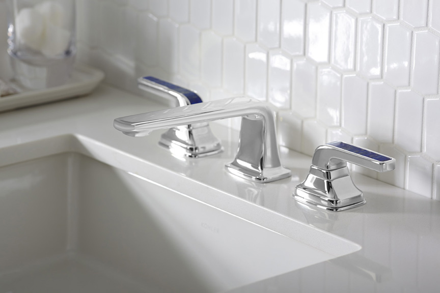
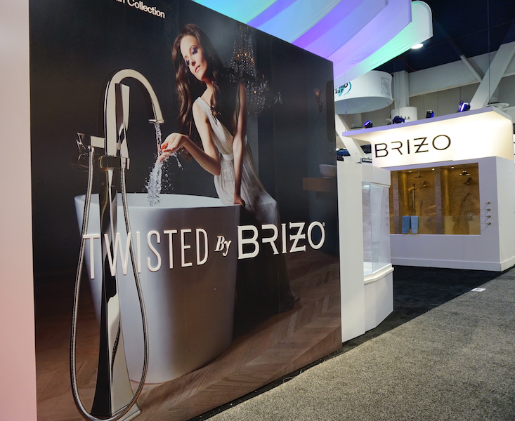
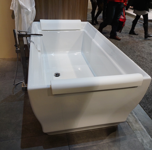
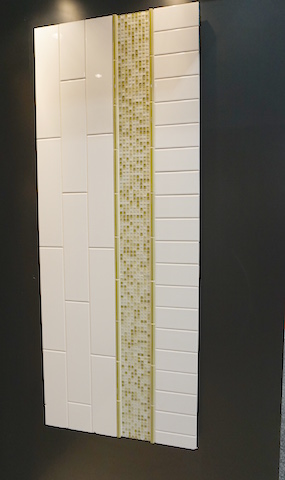
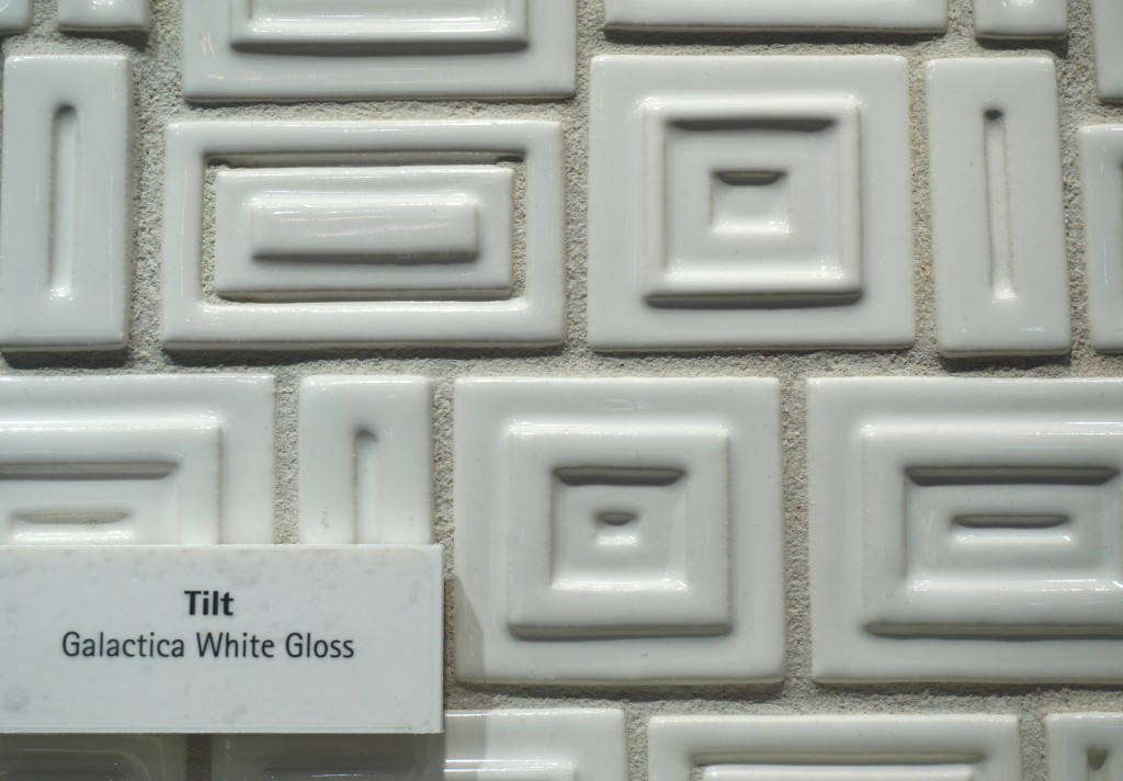
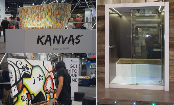
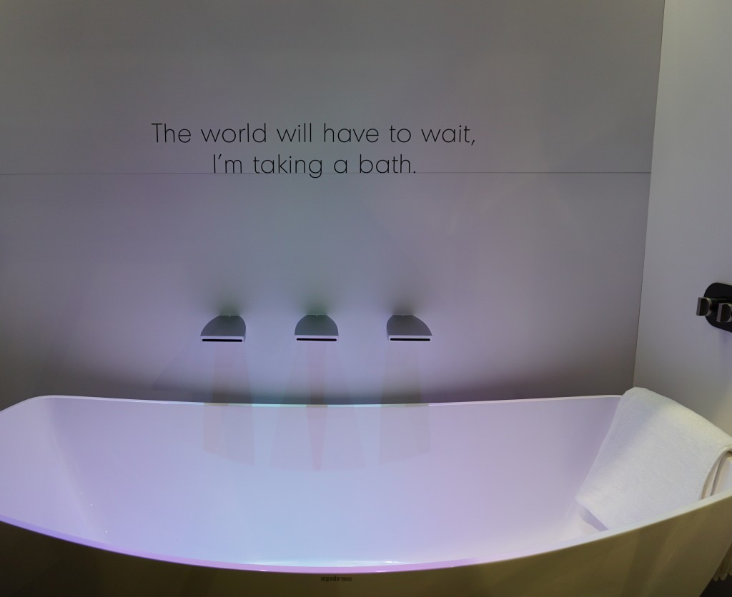
The Modenus Blog Tour recaps continue! Last post I shared some of my kitchen trend discoveries from KBIS2015, the 51st Kitchen & Bath Industry Show held last month in LasVegas.  Today I've got the scoop on what's trending in the bath.Gorgeous sculptural free-standing tub by Clark Architectural I have to say it, personalization is also at the top of the list for bathroom style and function.  I saw lots of new options for faucet finishes.  Were you getting tired of brushed nickel? Nice to see something new in that arena.2015-01-20 00.40.52 I saw a lot of contemporary design for the bath, minimal clean lines, simplicity but with quality materials.Affordability is definitely achievable.  For example you can have the quality of Kohler with their basic Sterling line or luxury of their exclusive Kallista line.Ensemble_60x32Black Crystal, Mother of Pearl, Calcedonia Azul, Lapis Lazuli (shown below), Tiger Eye, and Malachite.Brizo introduced its new Rook collection for the bath, with a subtle reference to chess.  Its their latest suite of luxury faucets, fittings and accessories for the bath. This collection combines a low spout architecture and crisp octagonal details for a stately yet modern design.2015-01-20 00.42.46Brizo also has something for you if you're a little "twisted" and I love it.  It's the Virage Collection 2015-01-20 00.42.31Free standing tubs and tub fillers-  The popularity of free-standing tubs created a whole new plumbing fixture, the tub filler.  They were everywhere!Comfy tub by Villeroy & Boch with TOTO tub filler as seen on the show floor at TOTOCreativity with tile- It's not just subway tile anymore although there are even a lot of interesting variations on this popular style.Something a bit different but with a subway tile vibe by Florida Tile Tilt by Walker Zanger is mid-century inspiredI can't leave you today without a nod to the number one booth in my opinion.  I wasn't alone as it was also voted most innovative booth of the show.  The award went to AquaBrass for their Buckminster Fuller inspired geodesic dome.  This innovative concept wowed me but they went all the way with my favorite combination art + design.  With and artist on site creating beautiful artful bathtubs!  This was to introduce their new Kanvas collection.  It brings art to the bathroom in a limited series of hand-painted freestanding bathtubs, each one signed by the artist. The tubs are stone resin and offer a choice of three hand-painted exteriors: bright and bold Graffiti has a youthful, urban edge; nature-inspired Pax invites bathers to a soothing Zen-like experience; and architectural Mosaik brings timeless elegance with its classic yet modern look.aquabrassAquabrass also introduced something that's going right on my dream list. The Aquazone,  a revolutionary shower and bath concept that provides the best of both worlds. Molded into a single, space-saving wet zone unit requiring only 60"X60" of space. North American-built, its strong, one-piece construction is solid Lucite acrylic with a reinforced base. And with two integrated wheels and six adjustable levelers, it rolls into place easily, saving time, materials and labor costs.DSC00093Not only was the  booth full of great new products and finishes with the occasional thoughtfully placed message, they thought outside of the box and into the dome!! Kudos to the creators and congrats.Up next: We're not done in the bathroom yet! Here's the Jeopardy question: "The number one plumbing fixture supplier in the world" Who is ??????

BigTrends from KBIS2015 Part I

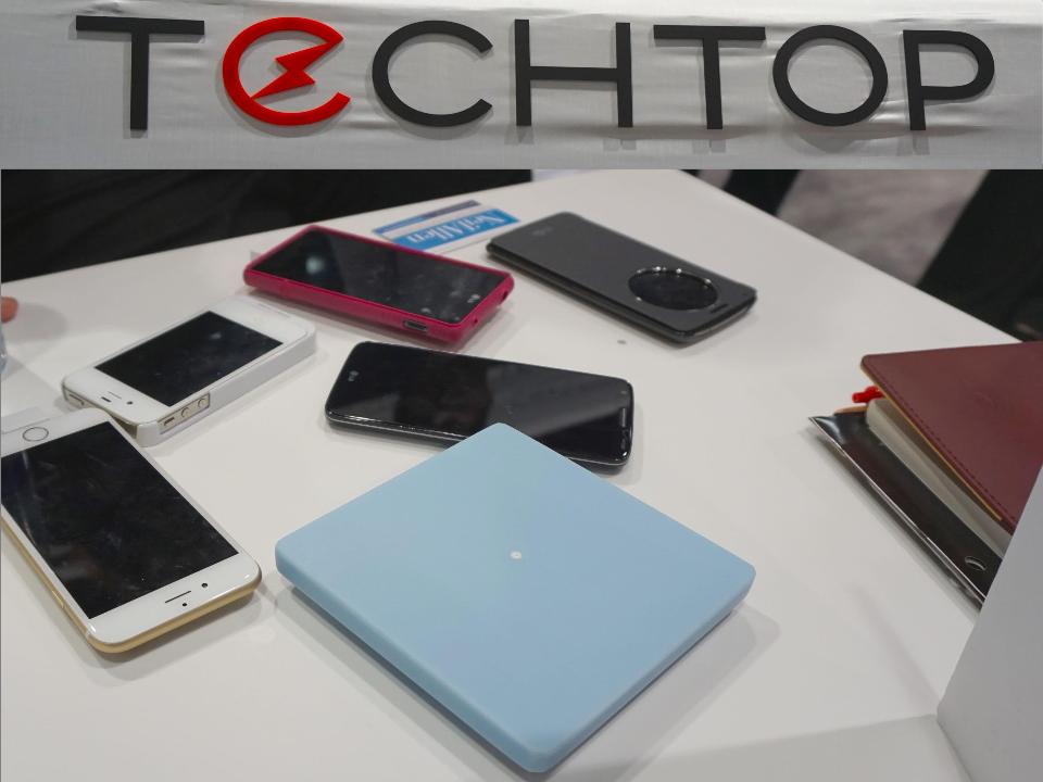
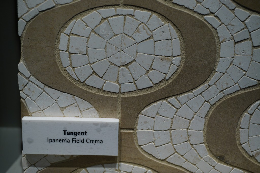
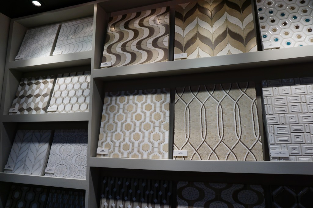
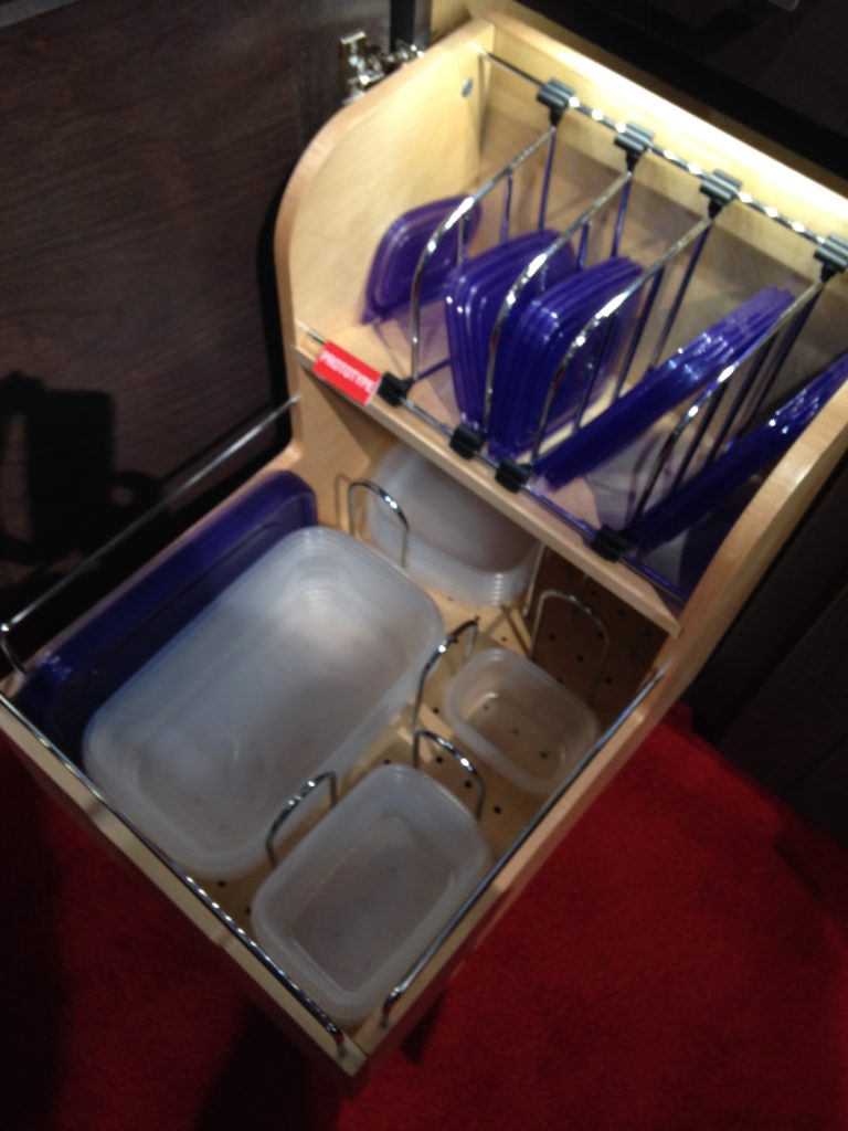
Day two of the Modenus Blog Tour was opening day for the  51st annual Kitchen and Bath Industry Show (KBIS).  The Bloggers were given an inside peek into many of the booths at the show and as we toured,  trends most certainly did emerge.New laminates by Wilsonart are not your grandma's counters! "There is a three year lag between Europe and North America when it comes to trends", says Warren Ramsland, President of Top Knobs. Taking that into account, there were many differences between what I saw here and what I witnessed in Italy at Euro Cucina last year.  Perhaps the biggest European influence that continues to pick up steam is contemporary design for both the kitchen and bath.KBIS2015,Wilsonart,#blogtourvegas,ModenusLaminates are enjoying a serge in popularity.  This material is more widely used and experimented with by our friends across the pond but we're picking up speed.  I was wowed by the offerings at Wilsonart who debuted their "Spirit of Mindfulness" collection of  27  exciting laminate colors and textures.   Also introduced were a line of quartz counter tops in a great assortment of neutral, workable hues.  By late spring, a selection of 50 patterns will showcase a full range of colors, textures and four structures: Fine and Small Scale, Medium Scale, Large Scale, and Veining and Movement. That is one of the things I love about quartz, the wide variety of pattern, or no pattern at all! I was impressed not only by the innovative product development at Wilsonart but also their philosophy.  This press release statement says it all:"Fueled in part by a turbulent economy, today’s more budget-savvy and eco-conscious consumers have responded by making their homes the calm eye in the storm of life. For many, this translates to finding a spirit of mindfulness within themselves and expressing it in their surroundings."Wilsonart Quarts, blogtourvegas,modenus,kbis2015One of the new Wilsonart quartz options showing beautiful veining. Photo courtesy of WilsonartCheck out the Wilsonart Visualizer to help you pick your counter top color.  It's easy, fun and very helpfulTechnology is also taking the kitchen and bath world by storm.  There were numerous examples but two stood out for me.  A company called TechTop took home the Best In Show Award for their counter top charging technology.  Simply place your phone, tablet etc. on the counter top and viola' it will charge, no plug-in required.  Untitled drawing (2)This great idea is from LG Hausy, yes it's the same "Life's Good" LG that makes appliances.  They make counter tops too. I also loved this Solna articulating faucet by one of my favorite brands, Brizo.  How convenient, right?!Fifty Shades of Gray has moved on to what I call "greige".  It's the new warm toned beigey-gray which I saw everywhere! Palettes are definitely neutral.  A great example is the Tangent collection by Walker Zanger.  Love the mid-century inspiration which I also saw a lot of at the show. This is Ipanema from the Tangent stone mosaic collection by Walker ZangerWalker-Zanger  deals in tile, marble and stone artistry.  Their collections are arguably the most innovative I've seen.  Case in point is their Sterling Row collection, inspired by menswear and a favorite at the show.   I found it to be extremely sophisticated, eye catching and innovative.  The collection was a favorite at the show. Walker Zanger was rocking the neutrals with innovative patterning and designSterling Row Collection, porcelain tile by Walker ZangerWe saw more of the Sterling Row Collection later on the blog tour in The New American Home, so there's more to come!Perhaps the BIGGEST trend of the show was personalization.  I mentioned this in the last post about Thermador but they were not alone.  Here are a few more pics highlighting the concept.  Frigidaire's SpaceWise Custom Flex refrigerators allow you to totally customize the shelves inside by moving the drawers and shelving to your desired configuration.2015-01-20 11.27.20 How about this great storage system by Rev-A- Shelf?  I know we all want this level of organization in our lives, yes? Right now this is a prototype but the response from the industry was good so I think we can expect to see this in the coming year.RevaShelf's prototype organizerEnough for now?  Well there's more to come.Up next:   KBIS 2015 Part II where I'll tell you about all my great finds for the bath and more.