Happy (Kitchen Design) Endings

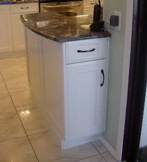
It's been one of those weeks.  I'm happy to be busy but struggling to keep up!  I have been working on a big traditional kitchen design for a client trying to recreate her favorite kitchen back in Toronto.  Since lots of walls are being removed to create a large open space we ended up with a situation which will locate the end of the refrigerator in the hallway! One of the most unsightly kitchen endings would be the side of a refrigerator.  Who wants to look at that?
With the enduring popularity of the open kitchen plan we are faced with including a seamless transition between the "kitchen proper" and the adjacent living area.  Even if you opt to spend a little extra for a decorative finish to the sides or backs of cabinets that are fully exposed there are some other creative solutions.  This got me thinking about how to end it all, in a happy way, of course.  I decided to employ a technique I have used previously.
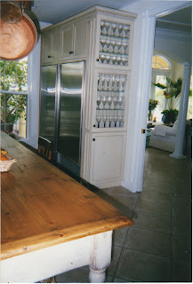
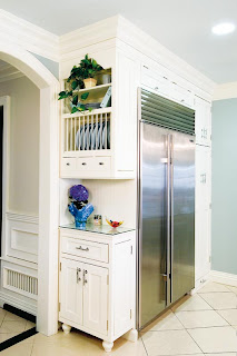
We accomplished this fine ending with less than 12" of spaceI will use this solution in my new design

If you're short on space, you can implement this solution with only 6" of extra space.  Make the top doors glass for a place to display a collection or if you can squeeze out 12" in depth, use solid doors and you have a handy pantry. Don't forget you'll have to finish side of the end cabinet so it looks great from the front too.
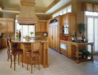
Photo courtesy of Holiday Kitchens

This traditional example by Holiday Kitchens, becomes warm and inviting with the addition of an attractive end unit which, not only creates a beautiful spot to display that special something, but it's also a great way to transition from kitchen to living area.
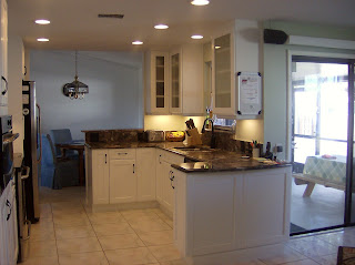
Mini peninsula placed at the end adds counter, storage and visual appeal

Easy access to BBQ tools from porch

Here's a handy solution for a client with a smallish kitchen who was looking for a little extra counter space as well as a handy place to store his barbeque paraphanalia.  The back of the cabinet opens right at the opening to a sliding glass door leading to his barbeque on the porch.  It also visually defines the end of the kitchen.
This solution by Holiday Kitchens uses 12" deep cabinets and offers a little extra counter space

THE KENNEDY GREEN HOUSE

Kennedy Green House: Designing an Eco-Healthy Home from the Foundation to the Furniture
For many years I have been pleased to work with cabinetry by Holiday Kitchens, Inc.  The Robin Wilson Home Custom Cabinetry by Holiday has been incorporated in the renovation of the private residence of Robert F. Kennedy Jr. The cabinets are featured in three spaces including the kitchen, kitchenette and main laundry room.  The Kennedy Green House includes maximum energy and water efficiency fixtures, low VOC paints, reclaimed building materials and durable goods with low impact on the environment and indoor quality.  Robin Wilson is a bright and innovative designer who I had the pleasure of meeting at last year's Kitchen & Bath Industry Show (KBIS).  She has written a book about the experience called Kennedy Green House: Designing an Eco-Healthy Home from the Foundation to the Furniture. If you're looking for some green alternatives Holiday Kitchens  is a great resource for cabinets! Click here to see a video about the project 
PEACE IN SIMPLICITY

From sushi to soduko Asian is all the rage.
Look at any design magazine and you’ll discover that the west is looking to the east for design inspiration.  Kitchens and baths have found new expression and streamlined function through the clean lines of Zen design.  (Think sushi bar?). the simplicity and organic features of zen design are at the forefront of kitchen design today.  The newest appliances are integrated in dark rich woods and exotic wood veneers such as Wenge and Zebra Wood.with Asian details including metal and shapes reminiscent of the pagoda.  An emphasis on natural materials such as stone and bamboo, exotic woods and simple symmetry are the order of the day.
Ken Charbonneau, a color marketing consultant whose clients include Benjamin Moore Paint says, "More people are looking to create Zen-like spaces.  To achieve this means to use carefully edited color palettes, pare down the excess and use the color to bring out the true essence of a room instead of letting it dominate a space." There is another added benefit to paring down and that is saving money.  If you have a place for everything it’s perfectly acceptable, even desirable to leave a little open space. 
The Japanese architectural aesthetic is one of straight lines, no muss, no fuss.  It’s pure, simple and elegant.  But can a zen kitchen work in your Mediterranean-style home or a Lake Worth cottage-style?  The good news is no matter what your style you can incorporate the simplicity, organization and organic finishes that make zen design so appealing today.    If your house is a Mizner showpiece you can still pare down in the kitchen.  The trick to making it work is to include a common element.  For example you could keep the same palette but just simplify the details for a more uncluttered feeling of simplicity.  De-cluttering is something we can all do to reap the benefits of the  Zen aesthetic in the kitchen.  Organize it.  Put it away with state of the art cabinet accessories that pull out divide and categorize for convenience and high function.


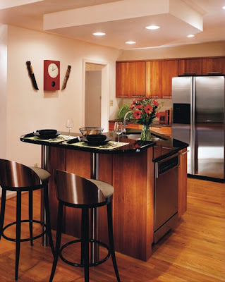
This kitchen by Holiday Kitchens, Inc. exemplifies the zen principles of simplicity and straight line.
High art and function coexist with the peaceful ambiance of Zen design. Next post: Quickies for your kitchen