"People First Innovation" is the guiding principle behind Toto, the world’s largest manufacturer of bathroom fixtures and fittings. TOTO is an un paralleled luxury brand creating beautiful and functional fixtures for the bath. What really impresses me is that at the same time the are heavily focused on water conservation, a leading global concern that needs more attention here in the US.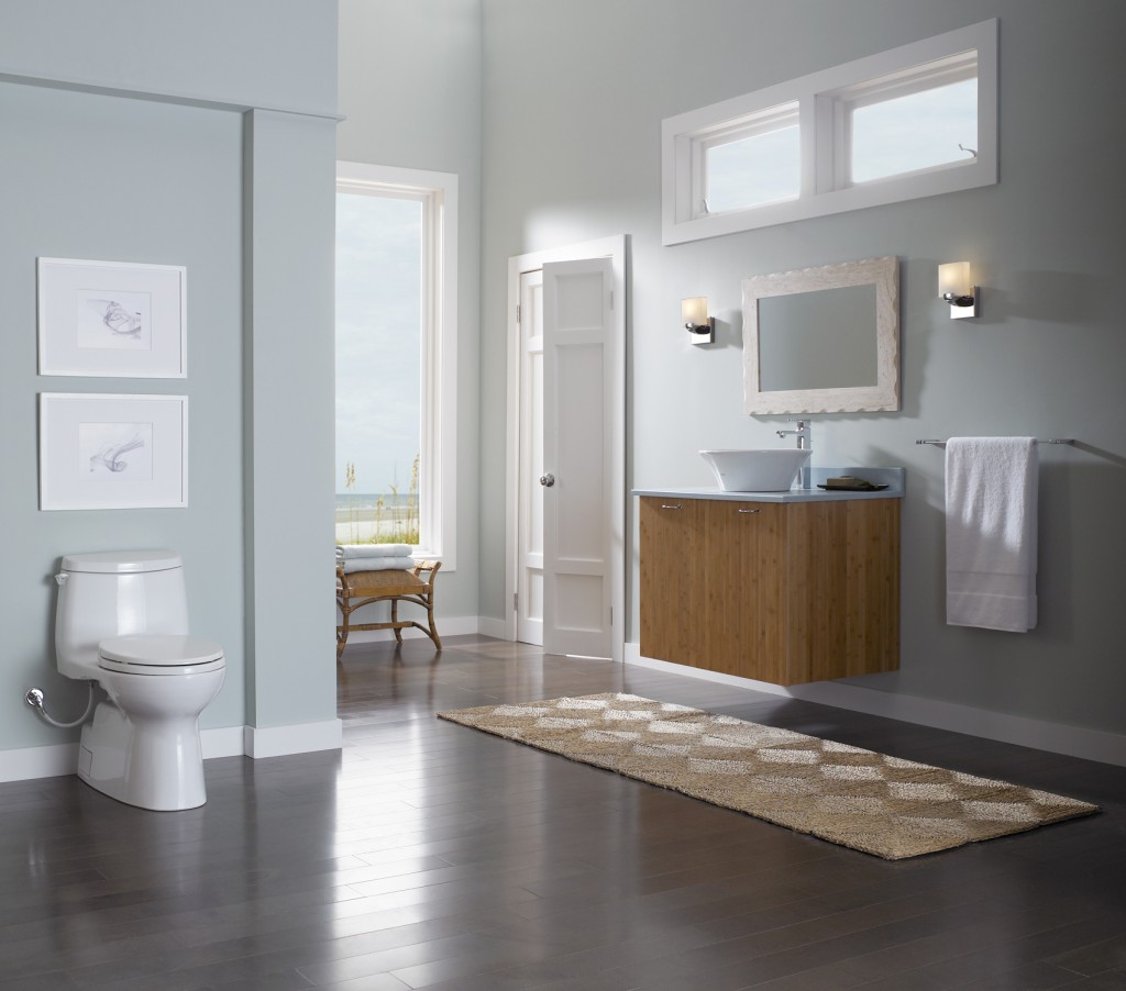 In 1989, in response to the state’s dramatic drought conditions and the growing need for water conservation, TOTO USA was established in California. Today they operate three manufacturing facilities in the US. I was amazed to know that 80% of all toilets on the Las Vegas strip are, you guessed it, TOTO! The brand first started nearly one hundred years ago in Japan. Today there is still a zen aesthetic to both the design and experience of the product.
 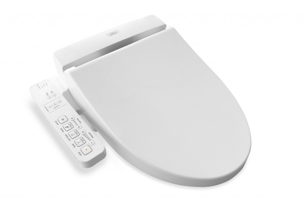 The Washlet is a must have in my opinion. There are lots of choices to make when creating a new bathroom. A few judiciously selected "special items" can make your bathroom awesome and this is one I'd pick. TOTO reinvented the toilet seat by creating the Washlet, which gives people a new way to be cleaner and more comfortable every day. Washlet seats can be installed on virtually any toilet and use pure, clean water –along with several TOTO technologies – to make their users cleaner and more refreshed. Ok we're taking personalization to a new level here but you must admit... In case you're wondering, there are many public restrooms you can visit and see for yourself. Here's where they are. If you do, get back to me. It would make a great blogpost ;) Speaking of blog posts, I also found this great post by engadget.com A Westerner's Guide to Japanese Toilets .In addition to this, TOTO uses a lot of technology designed to preserve both the environment as well as your water and energy bill. This even includes something called SanaGloss. TOTO’s patented, super smooth glaze that repels visible and invisible waste, making it difficult to adhere to porcelain. I'm all for less toilet cleaning!
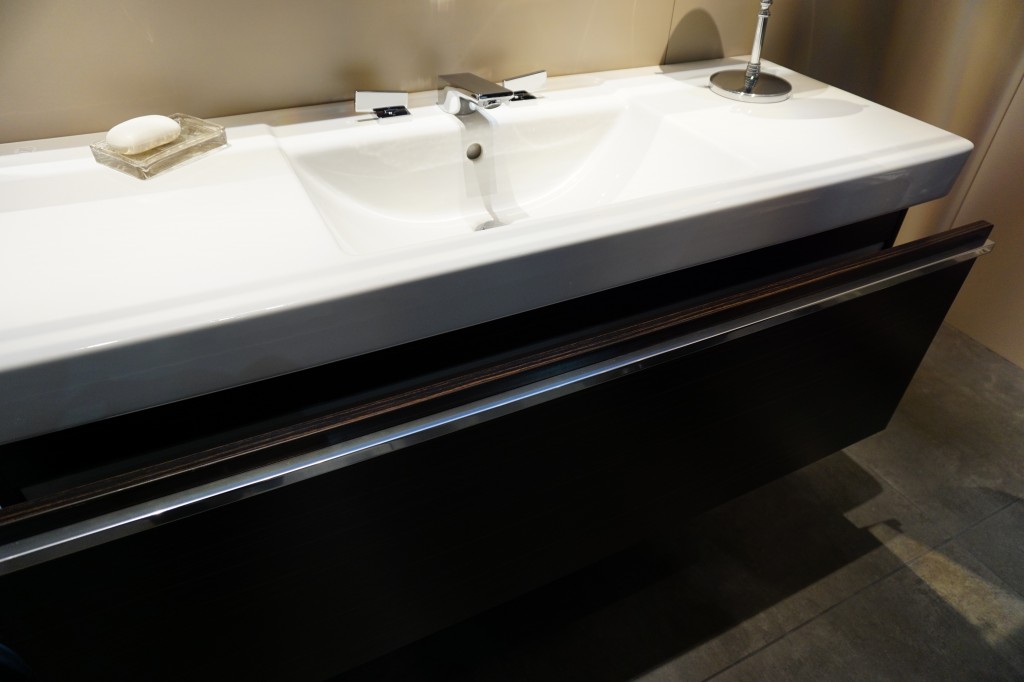
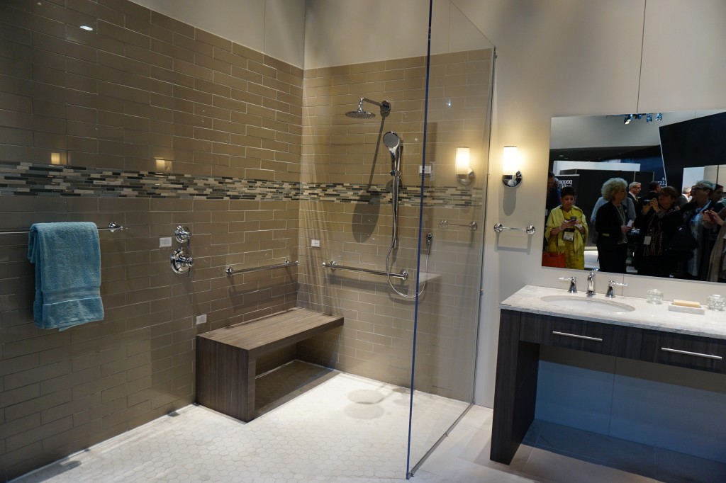 Accessible design and real showers were a part of TOTO's interactive booth at KBIS2015!
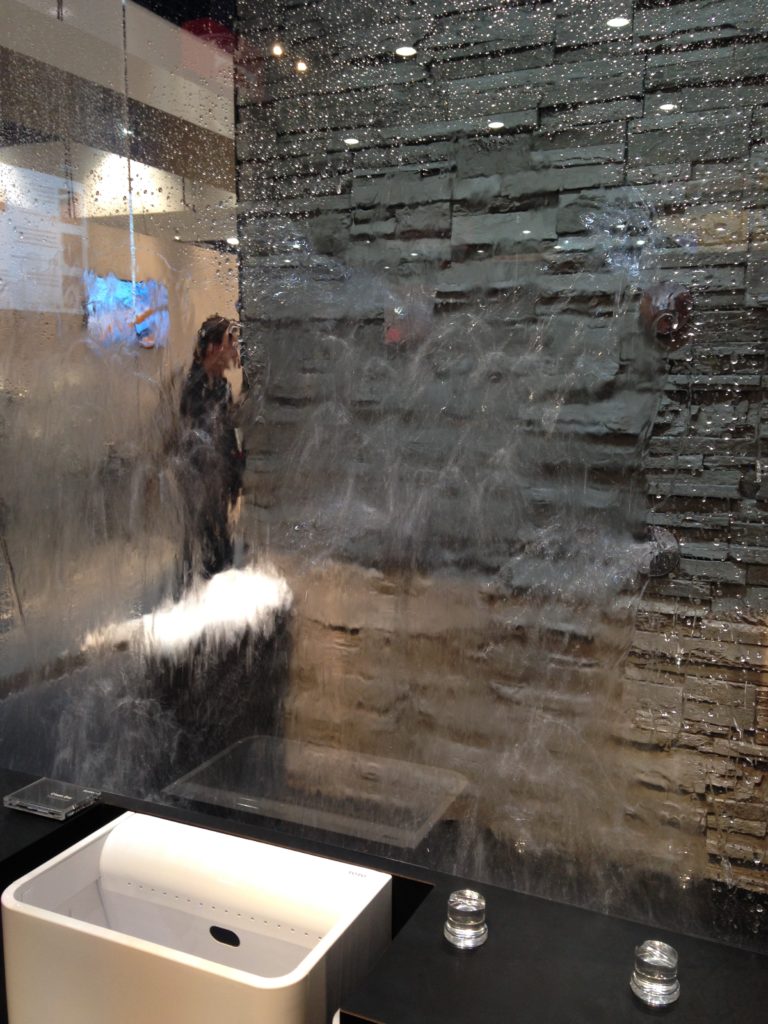
 Up next: The other item not to be missed for your bath, Mr. Steam! You can easily plan it into your bathroom renovation.
ONE SEXY FAUCET
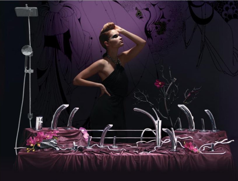 I know my last post was all about the plumbing but I'm not done yet. As I peruse my ever growing roster of press releases this little tidbit caught my eye. It's a sleek beautiful sexy faucet with one hell of a marketing strategy.
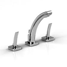 The new Salome faucet by Riobel is going to be unleashed upon an unsuspecting public on June 7th at Koko Bar and Restaurant in Montreal, should you be in the area. What makes it so special you ask? Check it out. Need I say more? I just love it when art history intersects with design. I think it just adds a whole other layer.
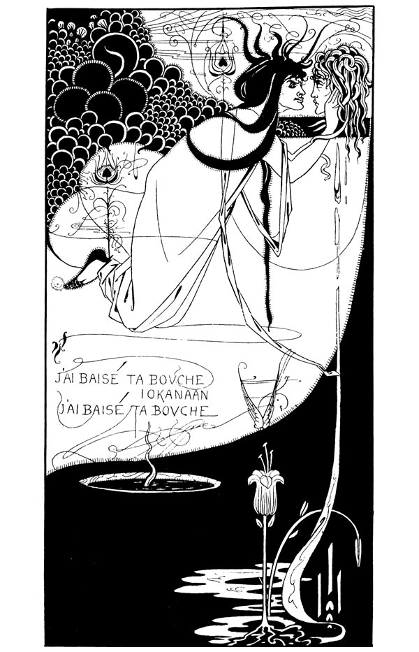 Yes it's all about the looks, you know a faucet can never be too thin or
 rich expensive, which I'm sure it is. The marketing brilliance is in the name and inspiration for this design. She's (yes this faucet is a girl) called Salome' after the work of Aubrey Beardsley, the 19th century bad boy famous for his erotic Art Noveau illustrations. Here's what Riobel has to say in their press release:
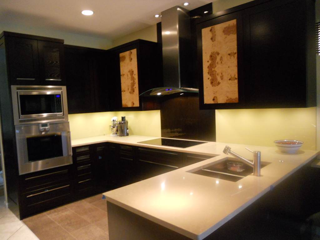
Elements Converge In Dream Kitchen
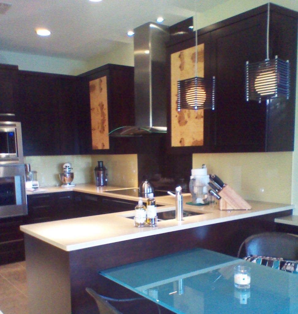 Another year is winding down. We have been blessed again with many interesting projects. As we are in “finishing up mode” I thought I’d share with you one of the best of 2011. This project was a true collaboration. Our clients, a couple of sweet snowbirds from Chicago, were very hands on which made it fun to see this kitchen take shape. The existing space was on the small side, the cabinets a little dated.
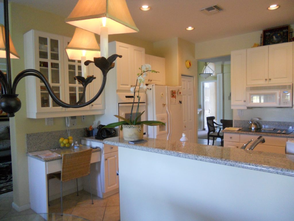
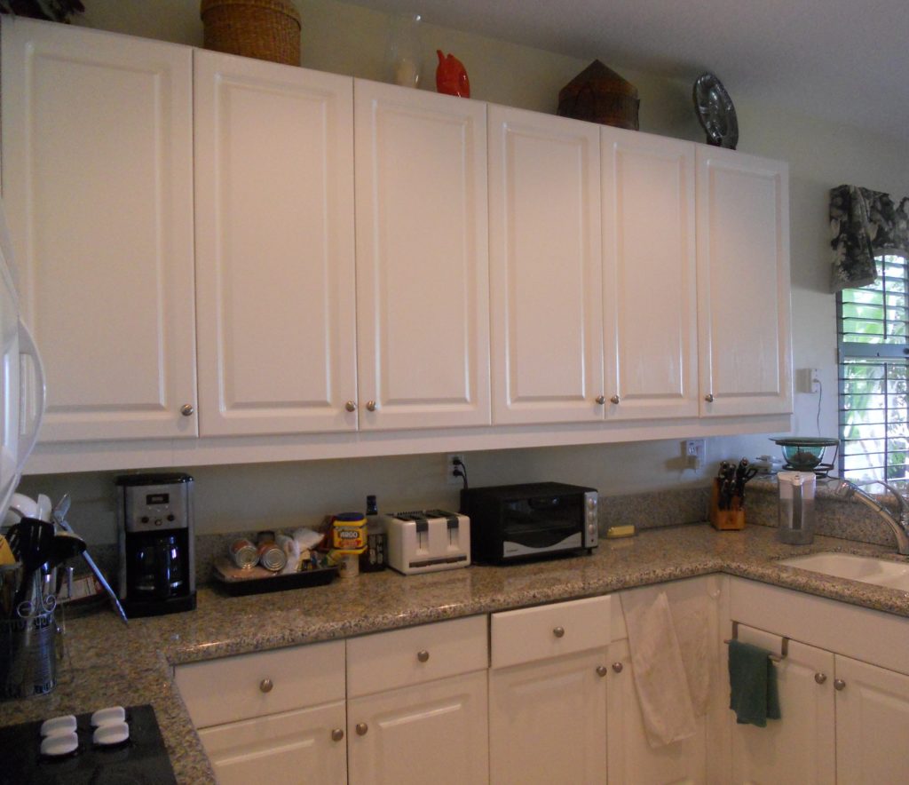 Our assignment was to add a whole range of state-of-the-art appliances and a clean unique contemporary feel that would flow into the existing family room. Naturally storage and function were also of the utmost importance but the real challenge was in fitting it all in!!
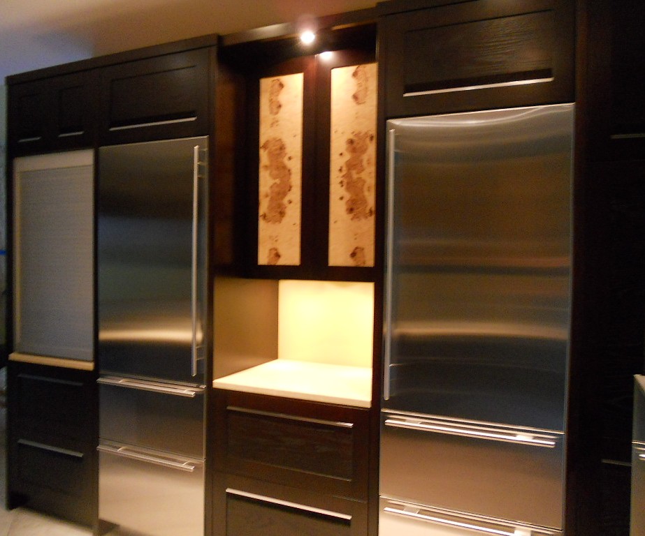
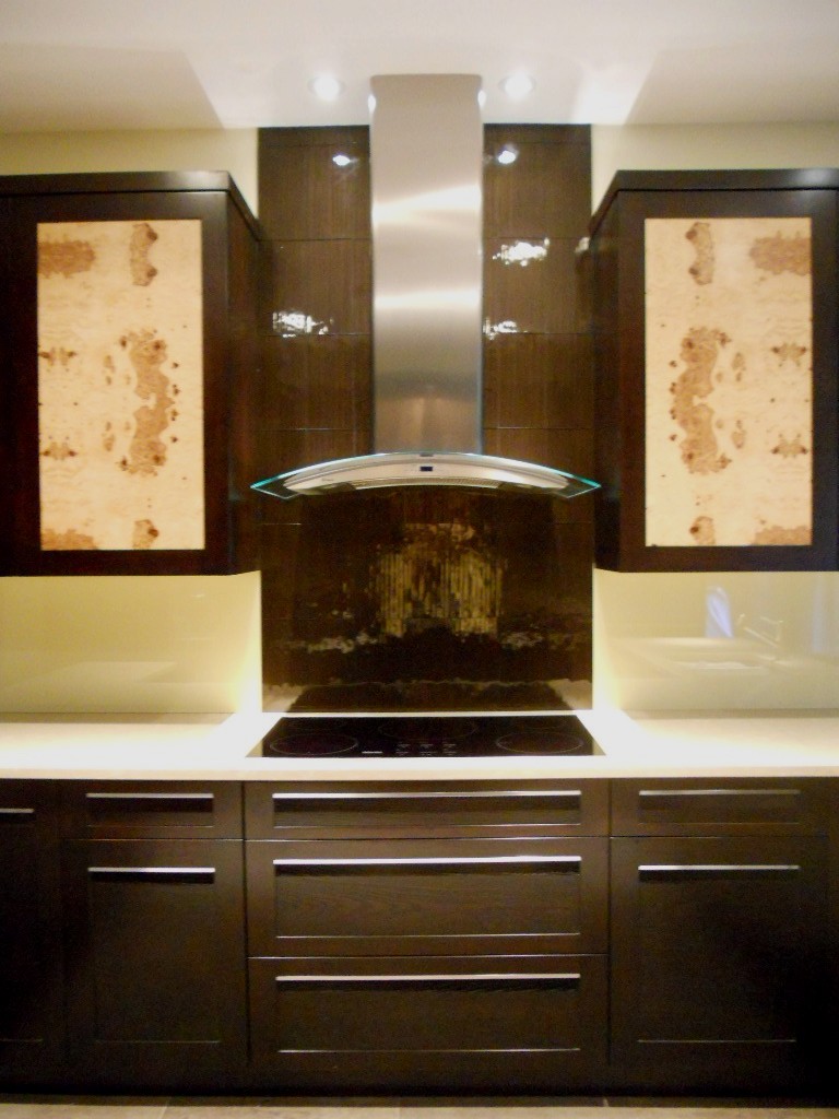
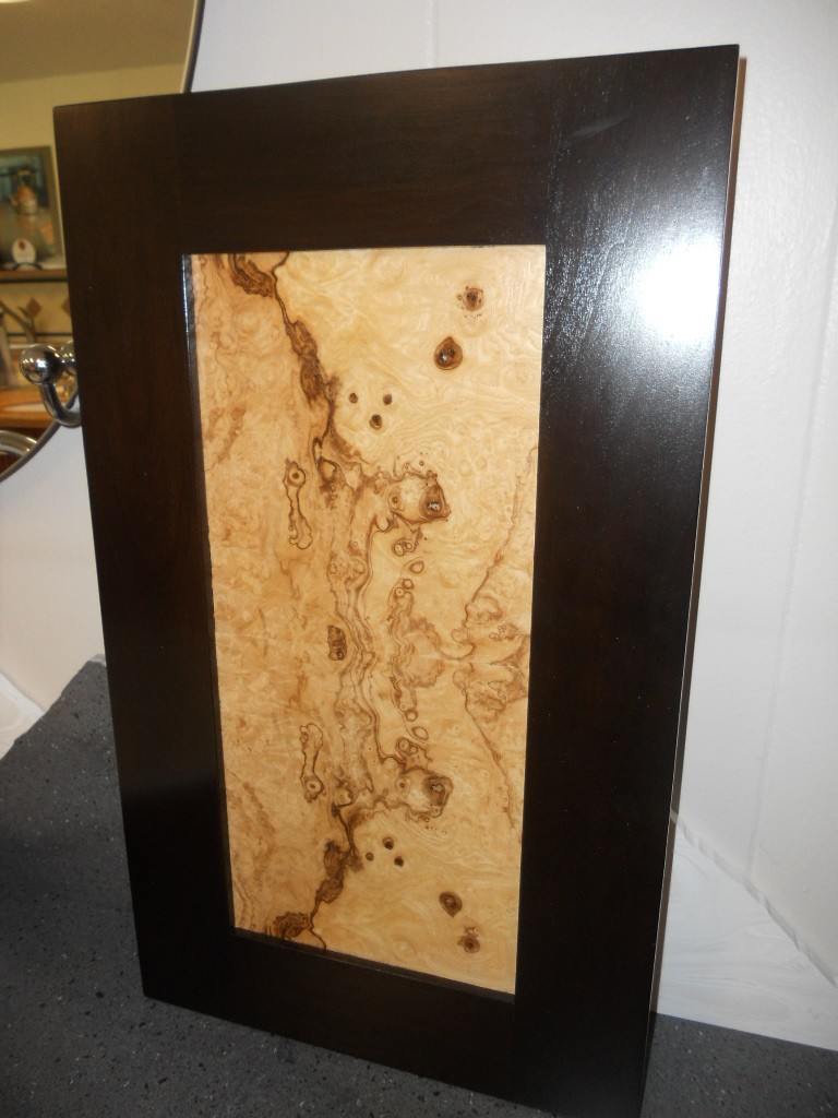
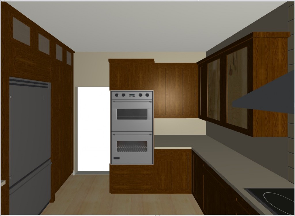 They chose a rich coffee bean stain for the cabinets to match existing cabinetry in the family room. The cabinet fronts were not ordinary doors, no way. Together, with our clients, we designed the Soldono and the Soldono Pacifica Doors just for this job. The Soldono custom door features a cherry frame around a horizontal grained oak center panel all stained in a rich espresso color. The center panel is beveled on one end with stainless steel grip strip inset on the frame. No hardware sticking out in this kitchen! A select few of the upper cabinets sport the Soldono Pacifica custom door which received center panels in olive ash burl veneer for a huge shot of “unique”.
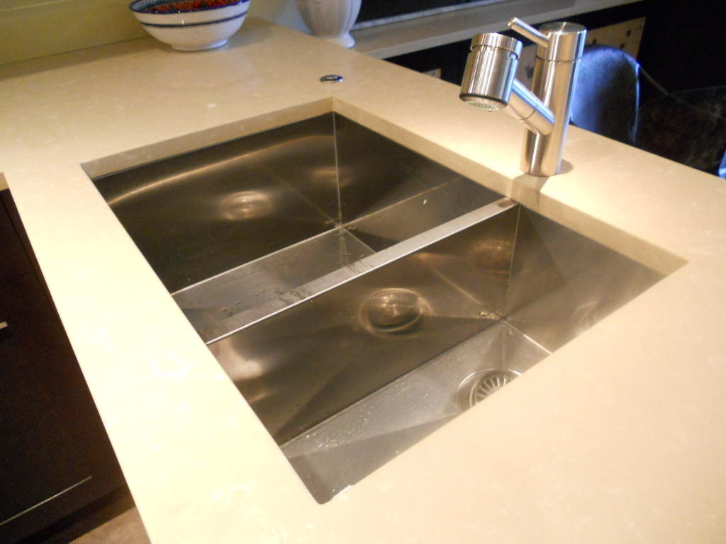
  Stainless steel serves as an accent finish and is found in the appliances and in the monster-multi-functional Hafele appliance garage. Refrigerators are Subzero, ovens are by Gaggenau, cooktop is by Miele and the dishwasher drawers are by Fisher Paykel. Thank you to Linda Roberts at House of Appliances for her guidance. Counter tops are Caesarstone quartz by Stone Palace and the backsplash is painted glass by Florida Shower Door & Mirror, Inc. Clearly they do much more that shower doors! Perhaps the "piece de resistance" however is the glass tile behind the hood. It truly looks like water cascading down the wall behind the hood! The sink is a Precision by Blanco and the glass theme is picked up again with the glass table. You can find a listing of all the trades on the Local Resources page here at Kitchens for Living.
NAUTICAL ZEN KITCHEN
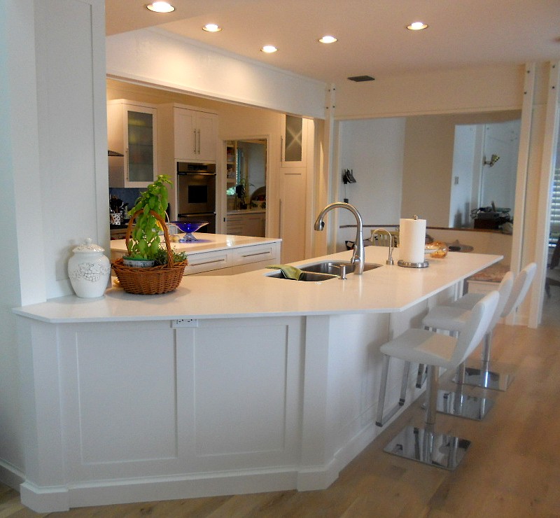
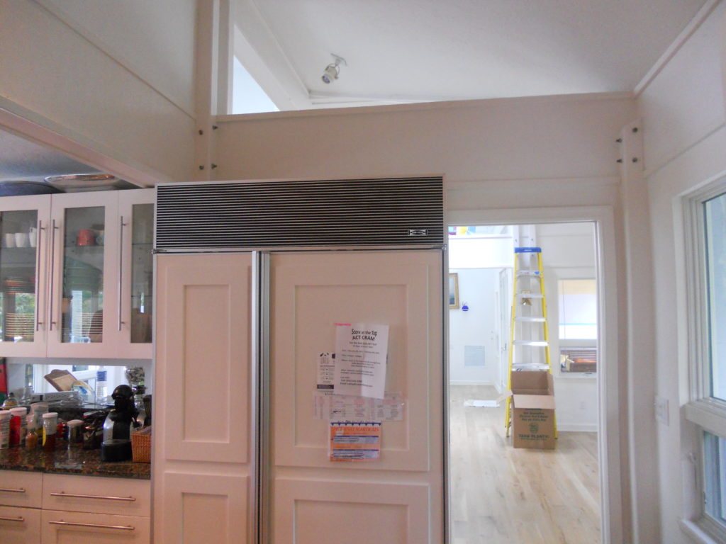
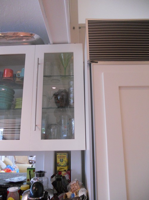
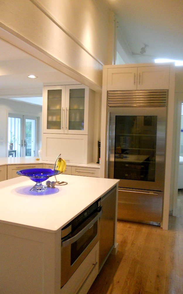
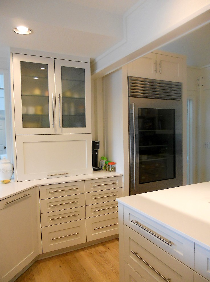
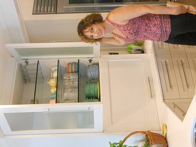
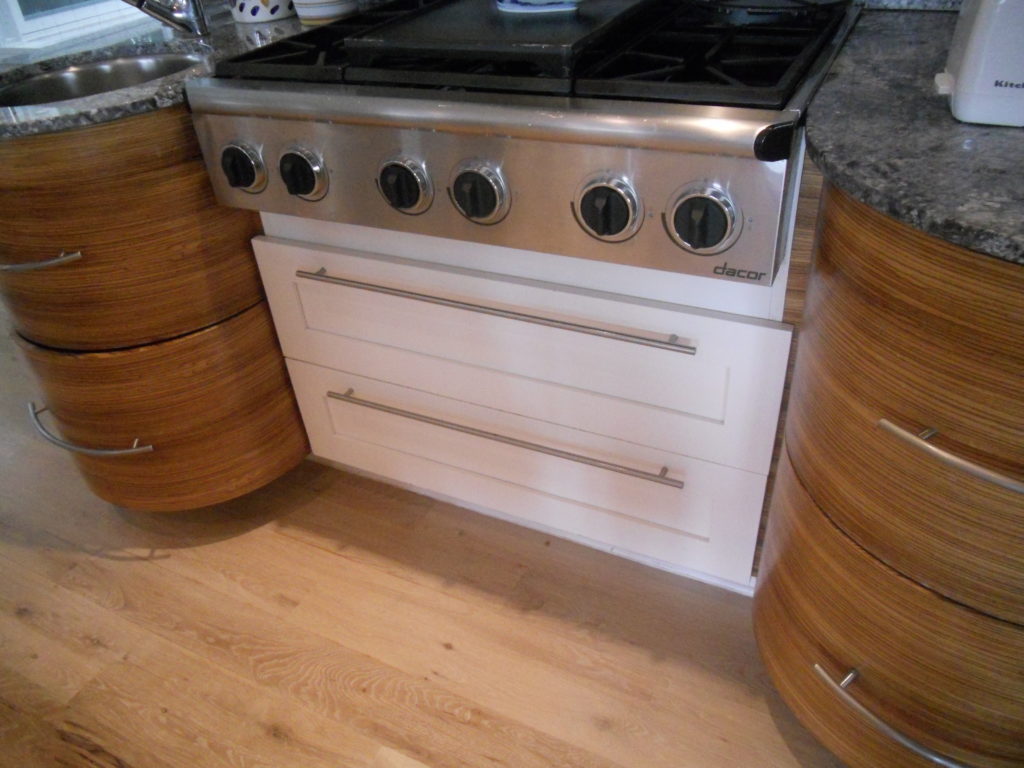
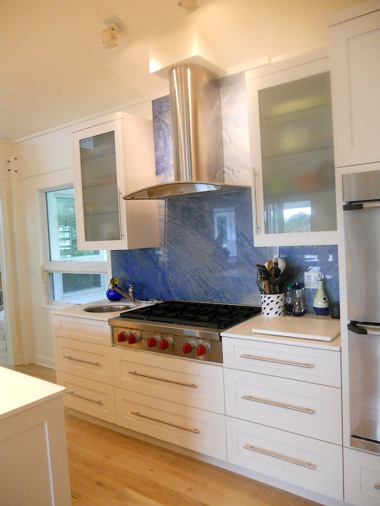
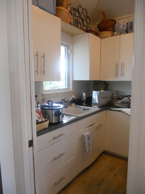
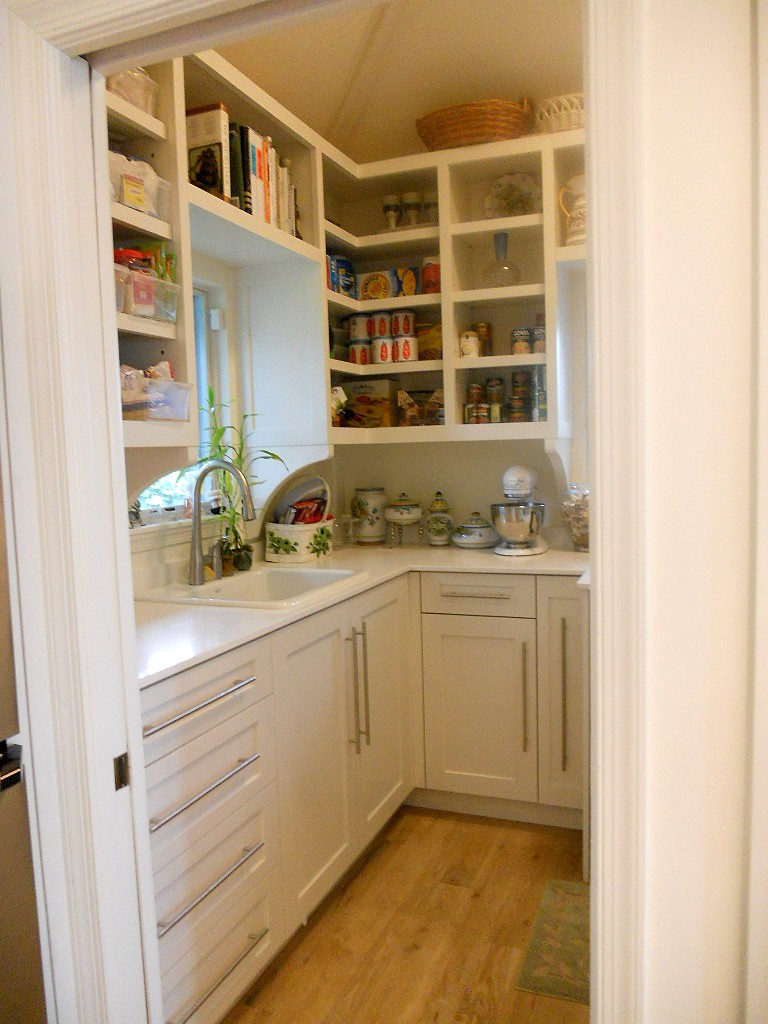
Ta daaaaa! Another beautiful kitchen is complete, and yes it’s white with Shaker doors. Surprise! Not. There were two main challenges about working in this home. First of all the architecture is very unique and is an integral part of the space. It’s comprised of posts and beams, angles and open lofts which remind me of a ship. The second challenge was a lack of unity with way too much going on visually. The existing kitchen had three different types of counter tops, two different types of cabinets and more stuff than space. In addition, hinges and drawer slides were failing and paint was chipping.The homeowners came equipped with the most valuable of traits, an open mind. They were willing to see their kitchen and laundry area in a new way. Every step of the design process we would ask ourselves “does this unify and simplify”? Think “nautical zen”!First off I decided to make peace with the posts and beams. The layout remained the same and we didn’t even change the door style or color! What we did was improve the fit and function. Using all white counters unified the space and allowed the blue granite back splash to be the star of the show. Here are some “before” pix and “after” solutions which will pave the way for smooth sailing in this new kitchen.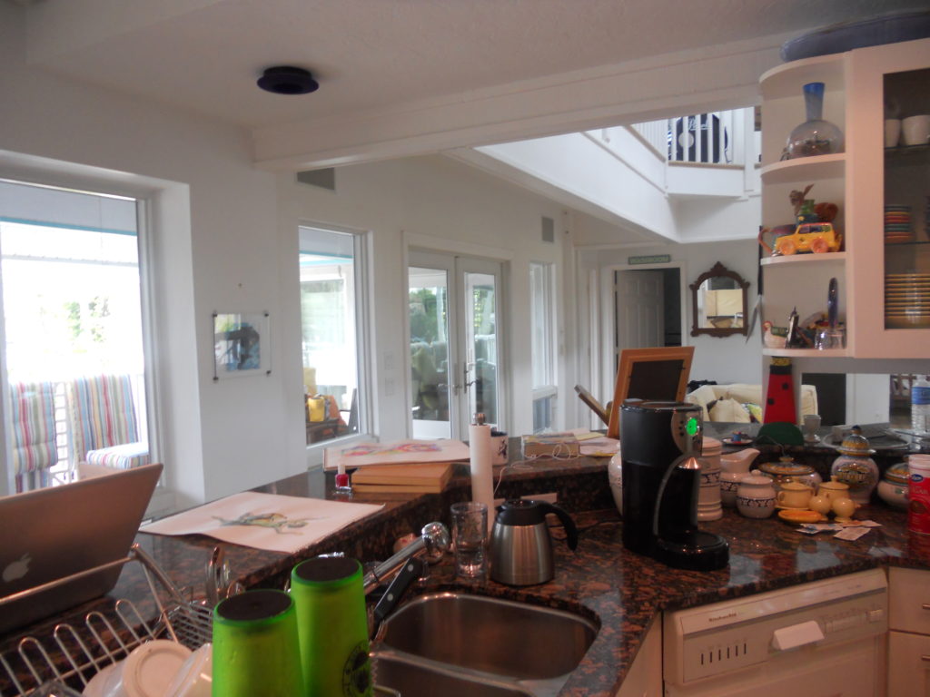
WINNING WITH CONTEMPORARY
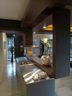
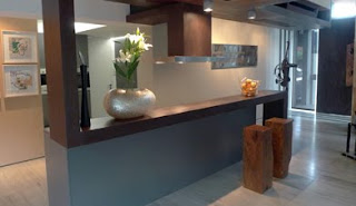
Every year high end appliance manufacturer Subzero Wolf sponsor a kitchen design contest. This year's winner is Jose Eduardo Calma of Lor Calma & Partners, Makati City, Phillipines. I must confess I LOVE this! The juxtaposition of materials and calm yet sublime use of color puts me in a Zen state of mind. Well done, Jose! If traditional styling is more your cup of tea, stay tuned. My next post will show you the winner in the traditional category. Photo is courtesy of Subzero Wolf.
PEACE IN SIMPLICITY
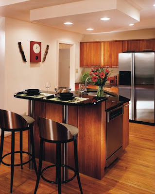
This kitchen by Holiday Kitchens, Inc. exemplifies the zen principles of simplicity and straight line.

