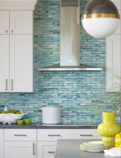
If your new kitchen is going to be an expression of who you are and how you live it’s helpful to have a little inspiration. One of the things I frequently mention is the benefit of something I call “kitchen scrapbooking”.
Read more2018 The Year In Review
2018 was a year of fun and exciting projects which challenged and sparked my creativity! White kitchens continued to be the hot ticket sometimes with an artful mix of natural wood or with deep rich blues.
I call this the "new traditional kitchen". I had fun working with HW Interiors on this one.
There were difficult situations but always solutions. This video gives you a snapshot of the vast variety of spaces and projects that came my way throughout the year. When you work with me I create these 3D renderings in Chief Architect Interiors X10 so you can get a sense of the space because visuals are everything! I am deeply grateful to my clients for placing their trust in me. Wishing all my readers the best in 2019. Maybe this will be the year we create your new space! xoxo
Kitchen Design Case Study: Awkward Angles
Every time I think I've seen it all I'm challenged to create a kitchen design that seems impossible! Such is the case with this recent project. This home is located in Palm Beach Gardens, Florida and features not only a stunning view but also the strangest shaped kitchen! Sometimes I wonder what architects are thinking.
Step 1- Let there be walls
(to scale and correctly angled)
I can't even begin to design until I can get the walls drawn to scale. I had a physical blueprint which (after some quick research) I was able to trace over in my design program (Chief Architect). Once I did this I discovered those angles are 30 and 60 degrees, not the typical 45! There was no possibility of changing the shape of this kitchen.
Step 2- Embrace the Space
One thing I have learned is that you will never win by trying to fight the space you're designing. Honor it, whatever it is, if you can't change it. That is the only way to end up with a design that is timeless and looks like it has always "lived" in the space. In this case, that means embracing the angled main wall while allowing ample and efficient flow.
Step 2- How to make it better
Once I had the walls accurately represented I evaluated the current layout keeping my client in mind. He loves to cook and he and his girlfriend love to entertain. Here are my observations:
-Cabinets are too low, not taking advantage of the high ceiling and limiting storage
-The big POINT on the island has to go! That just jumped right out at me and called for correction
-We are in need of an update and new appliances that are up to the task of my client's cooking endeavors
-The shape of the island does allow for lots of storage but also lots of walking. The sink is pretty far from the main wall.
-With the boat docked outside and observing everything else about the home I knew my clients' style is casual, Florida-Coastal and they are much more "comfortable" than contemporary.
Step 3- The Solution
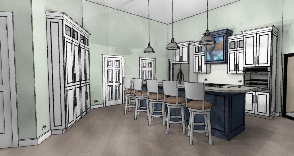
The first thing I did was the back wall. I knew it had to accommodate the refrigerator and the new wall oven my client selected. The fridge and stove were already there so no need to reinvent the wheel. Remember it saves money when you can keep your major appliances in the same, or close to the same location. In the new design cabinets are now eight and a half feet high plus crown molding. The upper, hard to access area, features glass doors to add a bit of style and aesthetic appeal which incidentally the homeowner mentioned he wanted. This is the perfect spot for showcasing a collection and you can change the flavor by changing the contents when the spirit moves you. Versatility is always an important aspect of my designs. We've also got generous counter space next to the fridge, on each side of the stove and next to the ovens, a must! That was the easy part.
Now for that island. Hmmm. Since I'm updating that means I'm simplifying. I'll honor that angle but I think simplicity will calm the "angle noise". It's a popular trend these days to keep an island all at one height but I didn't think it was the right solution for this project. It turns out I was right and my client was so relieved! This island is really a serious cleanup and prep space and with such an open space a little buffer was needed. The raised bar also makes me think of the captain behind the wheel, it's sort of boat-like. Pulling the island closer to the main wall (still allowing 48") not only reduces the chef's steps but discourages unwanted traffic from congregating behind the island and getting underfoot. Now our island contains all the essentials but, not gonna lie, we've lost a little storage. To compensate I added a section of full height cabinets to balance out the kitchen. Glass panes at top reference those on the main wall. We're keeping these at 15" deep to keep the space open. Another benefit of shallow tall cabinets is that you will do just fine with adjustable shelves whereas, in a deeper, 24"cabinet, you'll probably need roll outs or stuff gets lost and is hard to access in the back. Roll outs really add to the price of your cabinets too.
Step 4- More About Those Aesthetics
Now that the layout is solved I think, what can I do to make this kitchen design stand out and fit my client's personality? A deep nautical blue island and coordinating hood of course! I also loved the idea of creating a spot for an ocean scene front and center on the hood itself. This is a great place to add a painting you love and, again, you can change it up! Voila
What do you think of this kitchen design? Are there any elements here you can apply to your own situation? This project is now underway and I look forward to sharing the outcome!
Applying the Elements of Design to Your Kitchen
Elements of design are the building blocks of art for good reason. They also happen to work when it comes to planning and laying out your kitchen. Whether you are all about luxury or bound to the basics, awareness of these fundamentals can make all the difference.
Read moreOpen Shelves Add Function and Style
Open shelves, especially floating shelves happen to be all the rage at the moment, should you or shouldn’t you? I often hear concerns about neatness. Do we really want to see it all? Maybe we do. Open shelves can greatly increase efficiency in the kitchen. Having our most used dishes, utensils and ingredients displayed and at our finger tips is very tempting! This is how the chefs do it and there is even a term for it in French.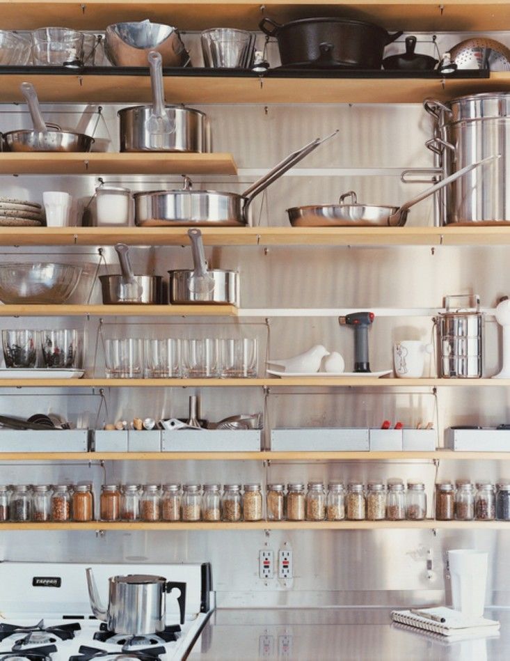 Mise en place is a French culinary phrase which means "putting in place", as in set up. It is used in professional kitchens to refer to organizing and arranging the ingredients and items that a cook will require for preparing the menu items of the day. We can also apply this concept in our own kitchens. Here's an interesting story I came across on NPR about Mise en place. Listen and you will discover the perfect French pronunciation!
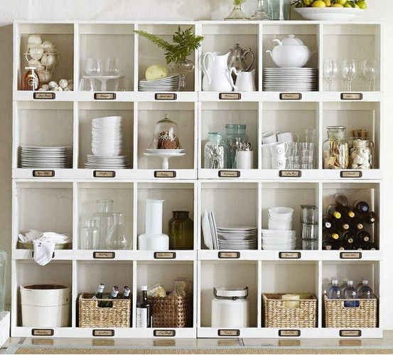 Usually storage space in the kitchen is too dear to squander on an area strictly for show so I urge you to incorporate an open shelf or open cabinet only if it will be useful as well as visually interesting. When you get right down to it, kitchens are comprised of boxes and row after row of doors can get pretty boring. I like to add some variety with open shelves and glass doors.
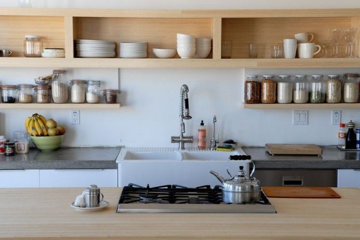 That said, if you do have a collection that you love to gaze upon and showcase , open shelves are perfect is hard to reach areas such as high up or on the far side of a peninsula
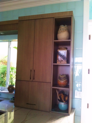 This client is a talented potter. What better way to show off her work? Easy to get to for dusting when you’re on the other side of the peninsula but this area is not really accessible when you’re on the working side of the kitchen.
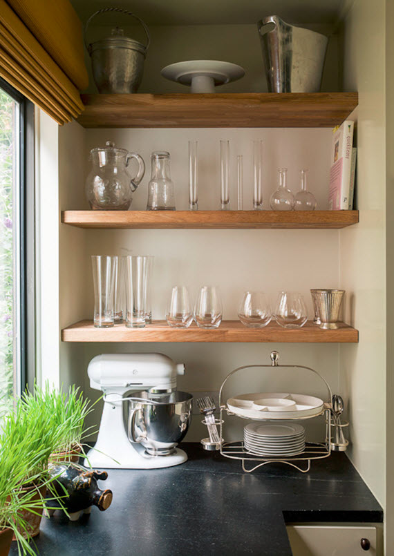 http://www.shelterness.com/pictures/open-shelves-on-a-kitchen-30.jpeg
The Artful Kitchen: Permission to Dream
Welcome to Artful Kitchens! I have so much to share with you in the world of art and design and especially how you can successfully merge the two to find your own personal style in the kitchen. Thank you to Leslie Carothers of The Kaleidescope Partnership and Brian McDaniel of bkmacdaddy designs for their excellent help! In the coming posts I will be writing about color, elements of design, the art and artists that inspire me and much more. Please share, share, share and help me spread the word! Oh, and I would love to collaborate with YOU!! Email me at: ArtfulKitchensbyGlo@gmail.com
The first step in creating an artful kitchen is to give yourself permission to dream. Doesn't that sound wonderful? As a kitchen designer I have several priorities in mind when I begin a kitchen plan. Aesthetics, lifestyle and especially function come into play. All are critical components. I also have observed that the most effective and complex kitchen creations are the result of evolution. The details reveal themselves from each decision that has come before. That said, you still need a starting place, one that will hopefully evolve into your own unique personal statement. The buzzword today is personalization and it’s here to stay. That’s where dreaming comes in.
 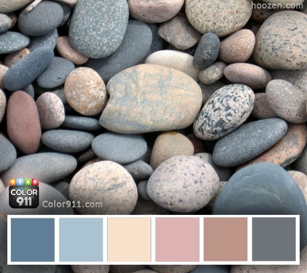 These color schemes from Color911 are inspired by nature. If you love them they go in your “dream file”. Don’t worry about “the hows” just yet.
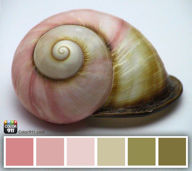 Just think if you could take function out of the equation! Heck, what if you didn’t even have space parameters? What would you like to see if you could do ANYTHING? With no editing allowed, at least not yet, you would get to the essence of your of personal style.
 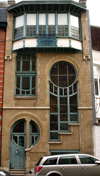 This is step one. Have fun with it. The only rule is that you enjoy the process. Only the things that please and excite you are allowed. Seriously. it doesn’t even have to be a kitchen!! Use good old paper and colored pencils, crayons, markers, paint, a computer or Pinterest. It’s all good. Don’t think too much just dive in and do it!
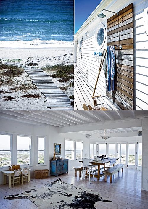 Share your vision with me and if you are chosen you may see your own artful kitchen come to life right here on my blog. Email me at artfulkitchensbyGlo@gmail.com Next in this series: Creating An Artful Kitchen, Step Two: Defining the Essence


