KBIS2017 Part III-Exploring Surfaces

This is Part III of my KBIS2017 recap.  You can find Part I  here and Part II here

Ok where were we?  Ah yes, I believe I promised you something to do with rhino poop and a surprise inside the shower.  In Part III, the final installment of my Kitchen & Bath Industry Show (KBIS2017)  recap, I’m going to deliver just that as I share with you two really cool surface manufacturers  that are game changers in the world of design.  The first is from the tradition of Ripley’s Believe It or Not!


MohawkFlooring,KBIS2017


Mohawk Flooring, known largely for their carpet, actually manufactures a wide variety of products including tile, hardwood, laminate and luxury vinyl.  The star of their show this year was SmartStrand Silk Reserve carpet which MUST be felt to be believed. The story is not only about the ultimate in comfort and beauty, but also unbelievable cleanability.  


To test this new generation of carpeting they had a rhino, yes a rhinoceros, live on it for two weeks! That includes peeing, pooping and God knows what.  This experiment compared SmartStrand Silk Reserve to other leading carpets.  The results were impressive. With the Pet Protection Warranty there’s never any worry about a little occasional cat puke. Here’s a little video so you know I’m not lying.


Not only did SmartStrand Silk Reserve stand up to the rhino test, it was also a welcome respite for the tired feet of 24 or so bloggers and social media influencers.  We got to enjoy the silky soft  experience at the Ritz, no less. It’s really really soft!

MohawkFlooring,SmartStrandSilkReserve,Carpet


Since we’re talking about cleaning, let’s move on the the shower.  That’s where Wilsonart comes in.  Wilsonart is a leader in engineered surfaces such as laminates, quartz, solid surfaces and even interesting wall paneling which is a look that has been so popular.


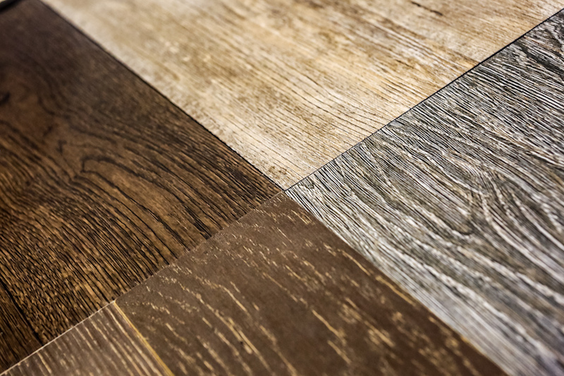
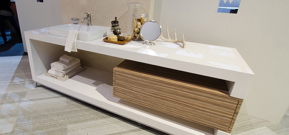
I love how they are always coming up with something new that is so relevant and on trend.  One such item is Wilsonart VDL Artfully Repurposed Woods (above left).  Yes these are laminates, no splinters here, soft as a baby’s butt (well nearly).  I digress. Let’s get back to the shower on show at KBIS2017.  This seamless laminate shower wall (below)  is easy to clean with no grout lines and they assure me it’s water friendly.  I also love the sleek contemporary look.


Wilsonart, KBIS2017,BlogTourKBIS

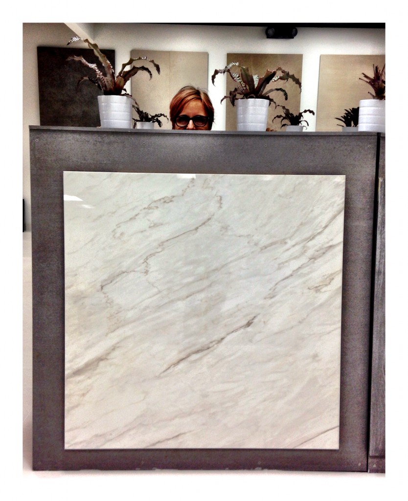
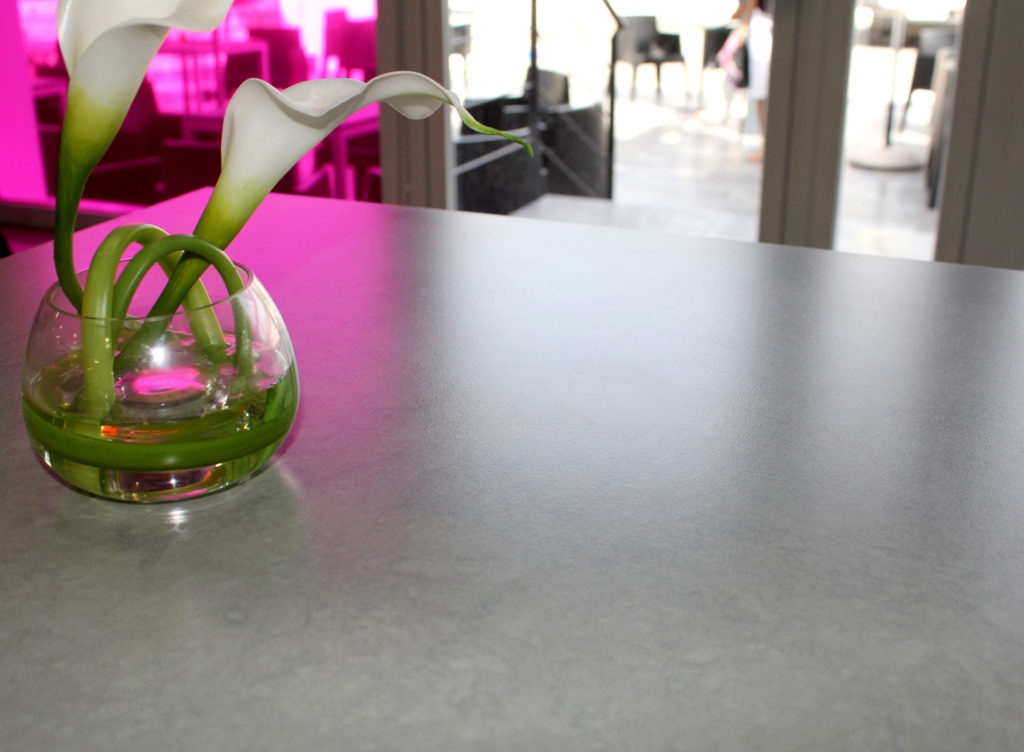
Wilsonart is also offering their own brand of quartz.  I often have clients who seek a pristine white counter top.  This one (Niwa Q1002) certainly fits the bill.   Quartz is a very popular choice these days because of it's durability and stain resistance. Check out their website here for more on the wide variety of products you can find at Wilsonart.

Wilsonart, WilsonartQuartz, BlogTourKBIS, KBIS2017, designhounds


There you have it!  Thank you so much to Modenus and all the sponsors of BlogTour KBIS.  It’s such a treat to have access to all this in depth knowledge that I can share with you.  All editorial content is entirely my own opinions and perspectives.


Getting Creative at Cavastone

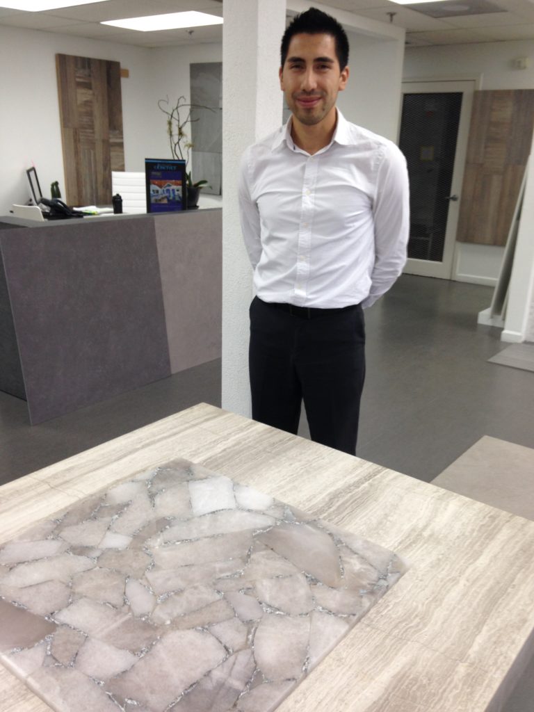
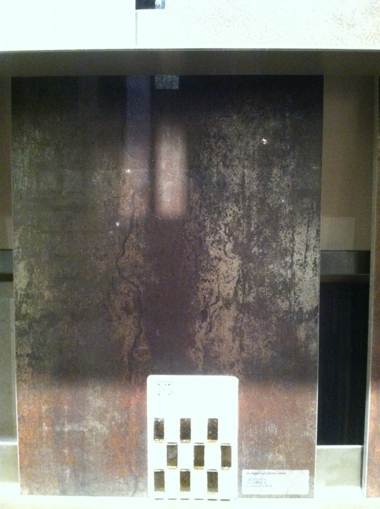
Time to switch from "turkey talk" to tile!  Hope you had a great holiday.  If you haven't found the new Kitchens for Living page on Facebook, please check it out and give me some love (ok I'll settle for a like). Today I'd like to highlight  a local resource that you should definitely know about if you live in South Florida.CavastoneCavastone is located in Boca Raton.  I've worked with them before but I was recently in the neighborhood so I decided to make a pit stop and check out the latest in the world of tile.   The showroom is stunning, sophisticated, and well lit which allows you to view the products to their full advantage.  I was most impressed with the options they have for porcelain tile but there is also a large assortment of granite and marble slabs.CavastoneThe tile above is gorgeous! It's a natural semi-precious stone accented with silver! Makes me think of a decadent boudoir or dressing area.Basically a porcelain tile slab, 118" by 49", this can be installed as a veneer over an existing counter. CavastoneDigital printing technology allows for an infinite number of options when it comes to porcelain tile.  They've got the natural look down!  The nice thing is if you ever need more it can be made for you. Those large sizes (see top) also come in 25" by 25" in case your abode is not quite that large. They call this the "in and out" tileThis dimensional look is also a big trend, used for walls in both interior and exterior applications.  You can find all Cavastone info right here on the Kitchens for Living Local Resources page. If you've got a great local resource clue me in.  I'd love to hear about it!

Trend Spotting at KBIS 2013

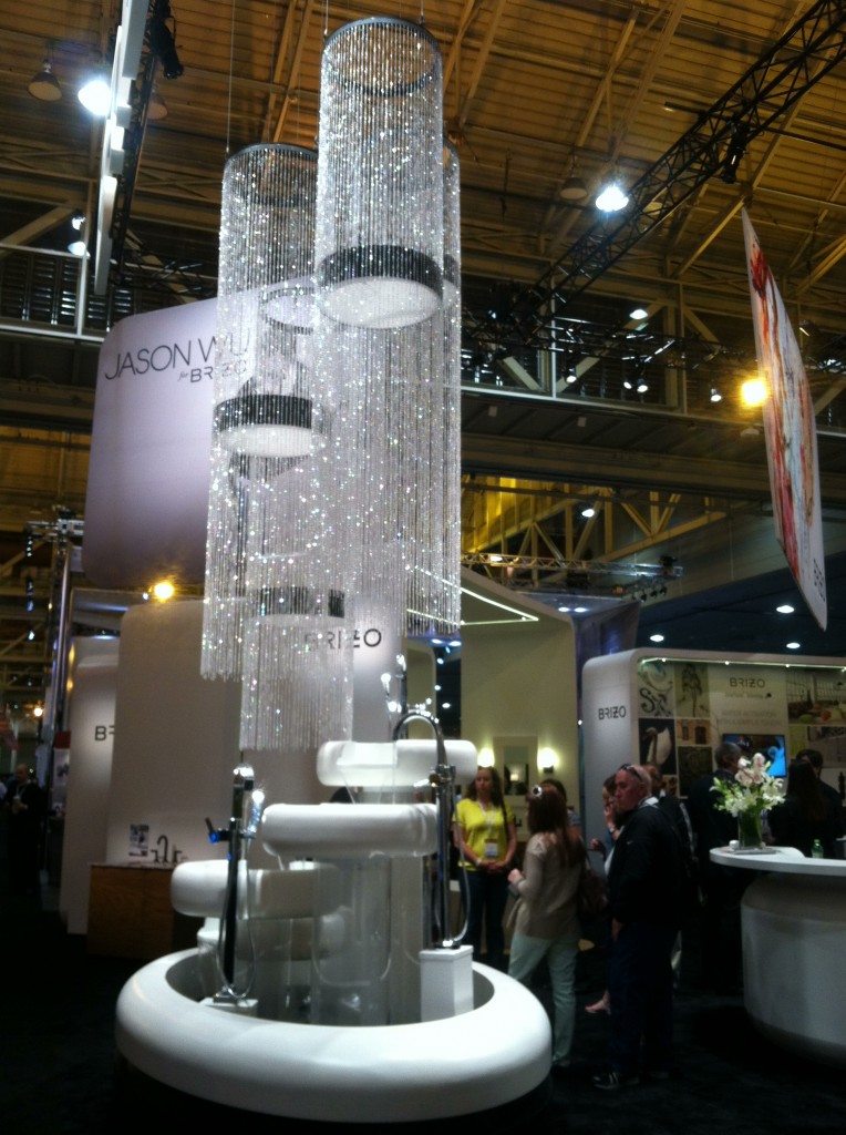
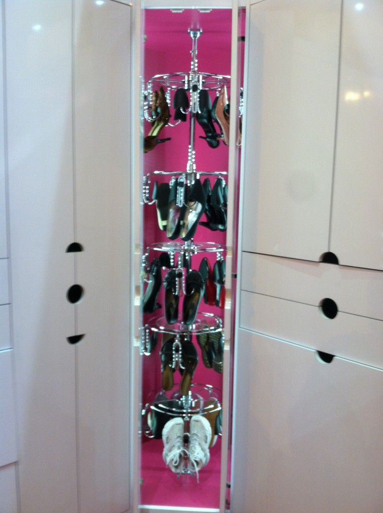
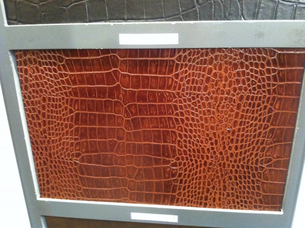
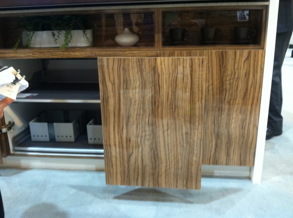
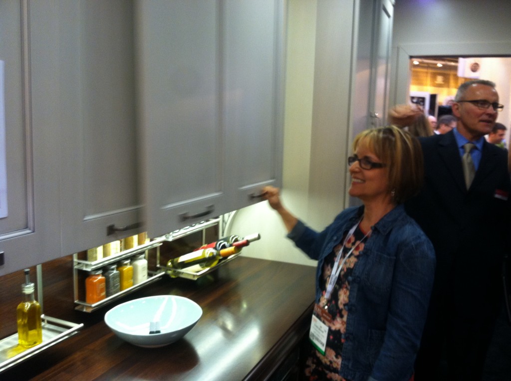
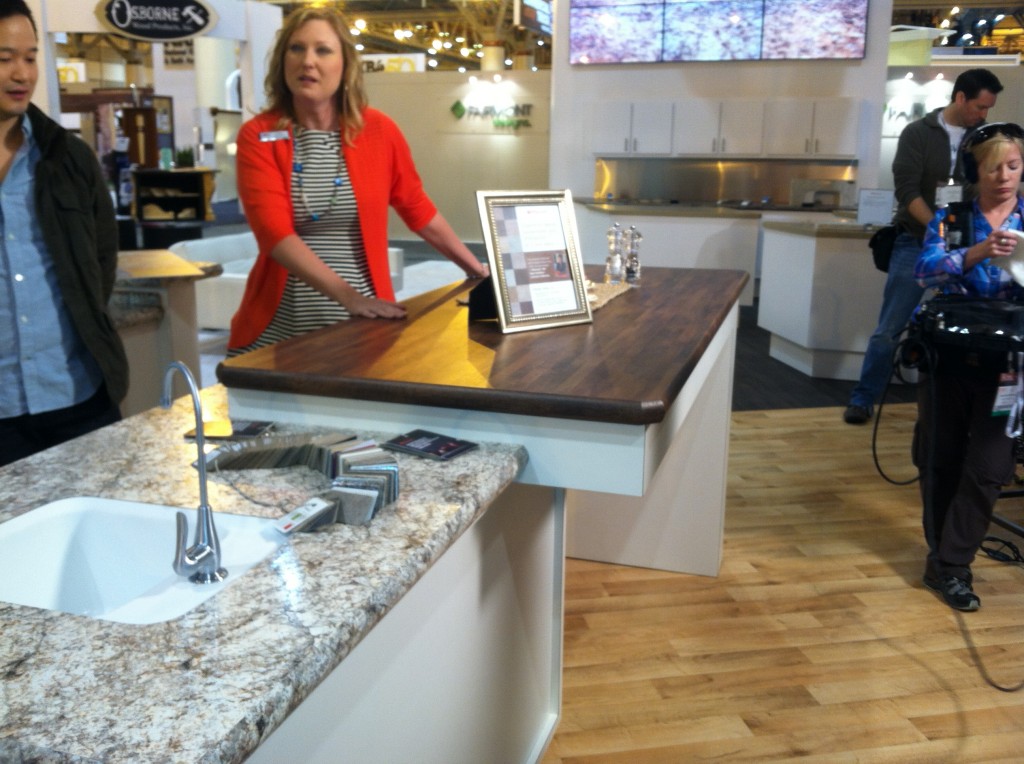
Show stopping booth by Brizo who introduced their new line of floor mounted tub faucets.The last two days of my exciting visit to New Orleans with the Modenus Blog Tour centered around the Kitchen & Bath Industry Show (KBIS).  This annual trade show is produced by the National Kitchen & Bath Association which is celebrating 50 years as the industry leader (more on that later).  I love to attend the show as it allows me to see the trends emerging in the American market and keeps me up to date with products and technology.  This year I had an additional behind-the-scenes perspective as a member of the Tour.  We were there for opening day, Friday April 19th and enjoyed a whirlwind tour of products followed by time for solo exploration and networking on Saturday.  Every year has a theme and this year I thought it was particularly appropriate. The show as all about the concept of "evolution".  This is really a common theme across the board as it applies to everything from design and products and how we are evolving the way we do business in 2013.  Here are some of my discoveries:Let there be lightLighting always plays a crucial role in kitchen and bath design but this year it was all about the light within.  Why didn't we think of this before?   LED lights inside cabinetry, particularly closets is a great idea!  My shoes are dying for a home like this.  In fact they won't shut up! The interior of this cabinet features LED lighting.  No more confusion with navy and black. The look of leatherLeathery textures made a big appearance.  Silestone by Cosentino debuted  their new Suede line of quartz counter tops.  Gator Mills ( a very local Louisiana company)  showed leather (and leather look ) vanities and Richelieu is offering recycled, reconstituted leather veneer.  Silestone's Suede finish blends a honed look with the durability of quartz. Photo by Cosentino. Yes that's REAL alligator in the center.  It's by Gator Mills. (This must be their mascot cabinet).  Oh and you can get the center door in a variety of leathers.  This one retails for about $8,000Reconstituted leather from RichelieuSliding doorsCabinet doors no longer have to swing out due to new hinging technologies that allow doors to slide.  Hafele calls theirs Frontino2013-04-20 12.58.56Frontino sliding doors by Hafele.Glaminates take the stageIt's not your grandma's laminate anymore!  Taking a cue from our friends across the pond, American laminate manufacturer Wilsonart has upped their game introducing two new seamless edge details and increased durability and sustainability. A new no-line edge profile from Wilsonart.  Can you tell this is laminate?Wilsonart's high definition laminates are layered for added durability, hard to penetrate wear and scratch scuff resistance. You can also get an integrated sink with your laminate top.Blingy to sculptural When it comes to handles you can go for the bling or the sculptural.  Cabinet hardware manufacturer  Duverre  is all about very artful sculptural shapes and while I saw a lot of matte finishes, very shiny made an appearance too. This faucet by Rohl sports Swarovski crystal handles.    Off Set by Erin Adams for Duverre, The Hardware Co.2013-04-20 13.49.36Look, no hands!Hands free faucet technology has quickly become the norm across the industry and was shown by not only the original, Brizo but also  Rohl, Kohler and Moen and Delta Faucets.2013-04-20 10.41.16This year's best in show award went to Toto for their awesome Neorest 550H toilet.  Believe me when I tell you it can just about do anything but drive you to work!  Stay tuned for an entire post about Toto and the Neorest 550The Best in Show, Toto's Neorest 550HIn a nutshell KBIS2013 was largely about technology and texture.  Cabinet manufacturers are touting what's inside more than ever as they maximize the ease of living in the kitchen.  White cabinets, cleaner lines and pops of natural and engineered wood veneers are strong trends.Next up:  Poggenpohl, the cutting edge in kitchen cabinet design, inside and out  

WALKER ZANGER WOWS NKBA MEETING!

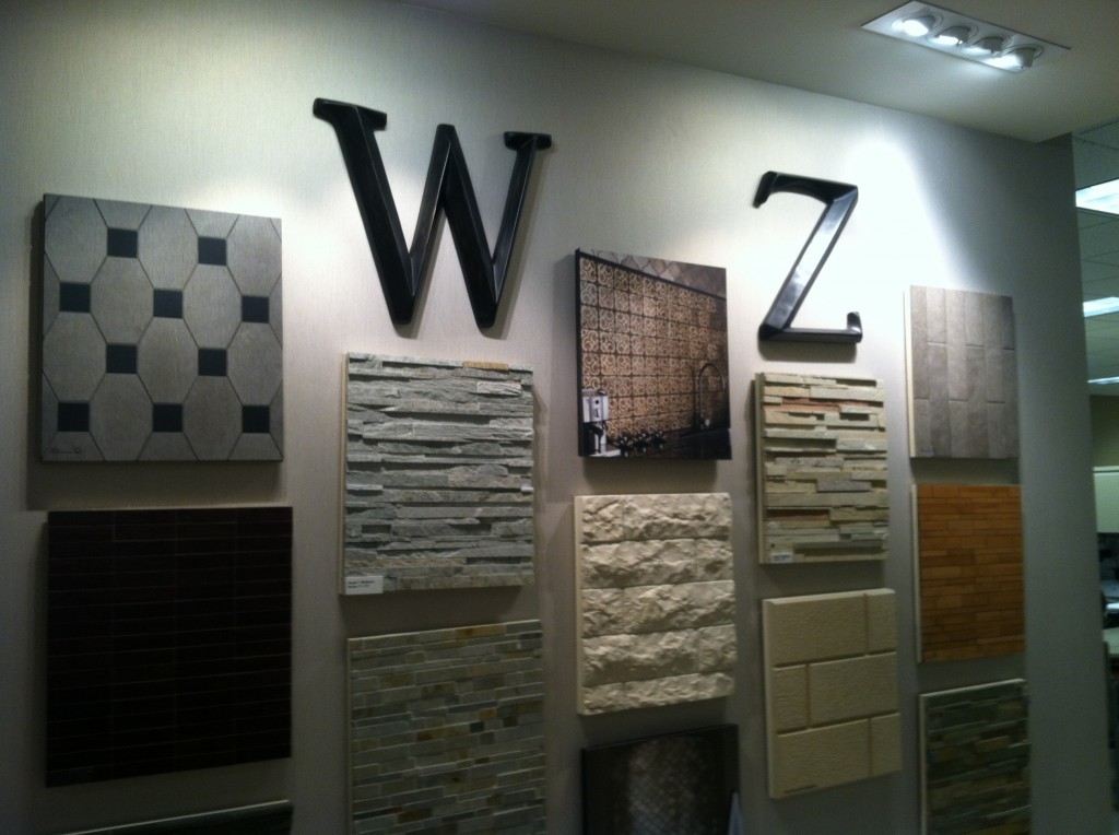
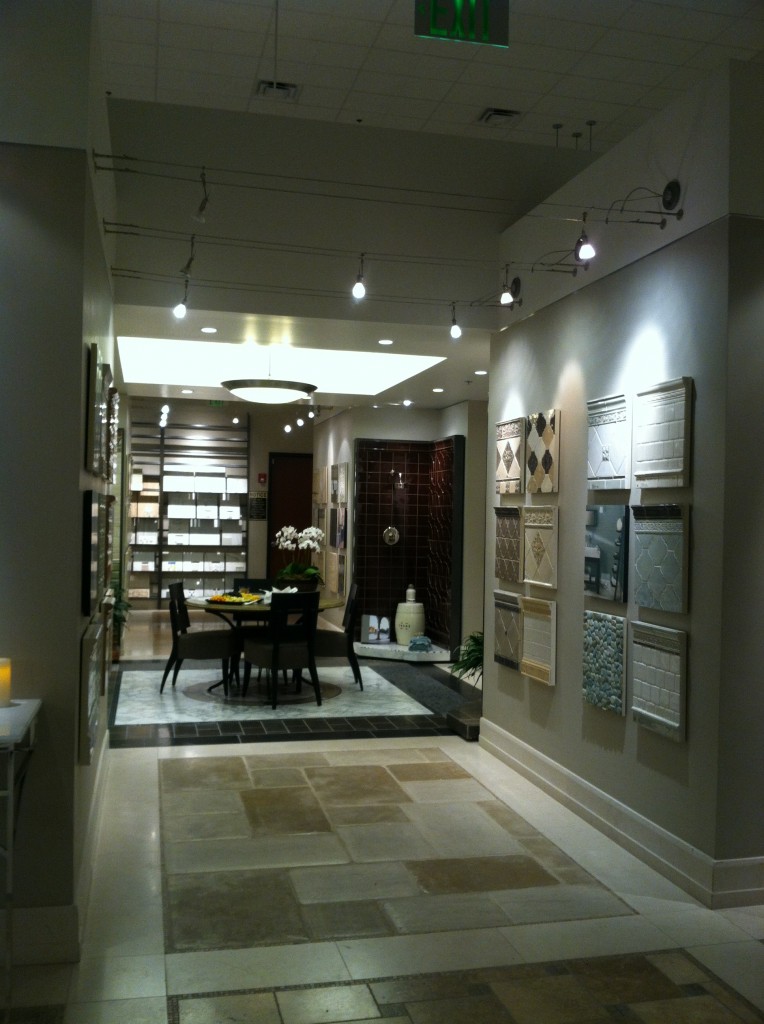
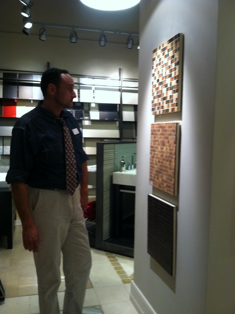
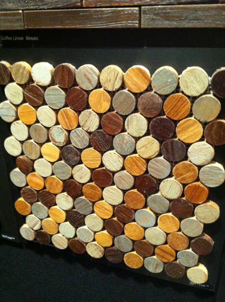
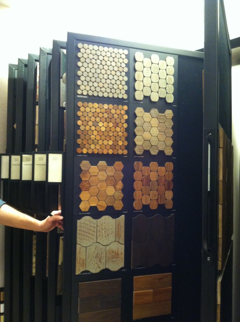
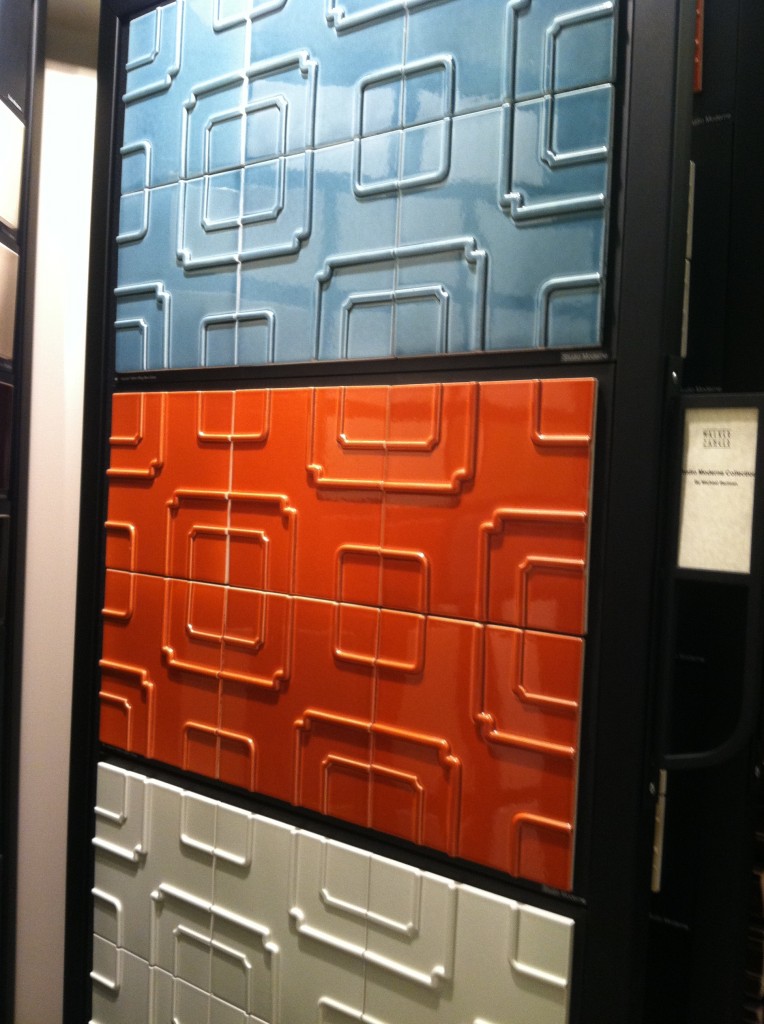
Walker Zanger Showroom in Cypress Creek, FloridaOne week ago I had the pleasure of attending the first South Florida Chapter NKBA meeting of 2013.  I was fired up by motivational speaker  Dawnna St. Louis   and her presentation about how to give your clients what they really want.    I’m looking forward to more great events this year and to working with the enthusiastic board on the communications committee.Kind of like an art gallery for tile...2013-01-16 19.41.09Not only was it fun to get together once again with all my old kitchen friends but the beautiful venue was an added treat.We met at the amazing Walker Zanger showroom in Coconut Creek Florida.  Walker Zanger is filled with designer eye candy!  As soon as I walked in I felt an irresistible desire to explore every nook and cranny.  Then I decided, if I were to do that, why not nab a tour guide?  I found just that in Branch Manager, Drew Rust.Branch Manager, Drew Rust gives the grand tourHe explained that Walker Zanger has been around about 61 years beginning as a maker of marble tops  evolving into a chain (15 ) of designer showrooms offering all types of tile and stone slabs from around the world.  Their products can be seen at the Bellagio in Las Vegas as among many other notable locations.  The showroom featured beautiful examples of glass, marble and all the usual materials we’re used to seeing tiles made out of.  So I asked him, “what’s new”?This is what's new, reclaimed Balinese teak tiles.  This is the "penny tile" version.Some more of the AnTeak Collection at Walker Zanger He promptly introduced me to the AnTeak Collection which is, you guessed it, tile made out of teak!  It’s new, gorgeous and can be used in both flooring and wall applications.  In addition to this they are working on a surface treatment that will allow it to be used on shower walls! Gorgeous, I can see a border out of this.  The white field tile makes it pop!The offerings at WZ are upscale to be sure but the nice thing is that often a little goes a long way.  Consider a border or an accent tile and you could get a lot of bang for the buck.  Sometimes less is more.  Speaking of budgets, WZ does offer some more affordable options as little as 2.50 per square foot.These interesting three dimensional tiles are designed by Michael Bergman, known for his "old Hollywood moderne" style.The price is right for this interesting tile that can be used on floors or walls if you want that 1000 year old look.  I happen to think it's very interesting and Bohemian, no? Hours are Monday-Friday 8:30-4:30.  You are welcome to have a look around but bring your designer if you want to seal the deal.  I'm sure Showroom Manager Deanna Dolfi would be happy to show you around!

5 WAYS TO CREATE A SEXY KITCHEN

The new sexy isn’t always sexual. In fact the Brits have coined the term “sex it up!” meaning to make something more interesting, attention grabbing or appealing. So, guess what? Now you can “sex up” your kitchen by updating and refreshing the look and function. Here are some tricks:

1) Roll outs Want easier access? Install shelves that roll out. These are great in the lower cabinets as well as in your pantry.

2) Open shelves can be extremely functional allowing you to view and easily grab and go.  I also love them for cookbooks and they break up the monontony of too many cabinet doors.
3) Color and texture  What's more seductive than color and texture?  Think sleek stainless steel paired with a rustic tumbled marble backsplash or a RED quartz counter top in the midst of a clean white kitchen.  

4) Dimmable light fixtures above your cabinets can create a subtle glow.  Add them under your upper cabinets and they double as task lighting when turned up. 

5) Art is One of my favorite additions to any kitchen.  It's a great way to personalize your kitchen and create visual interest.  (See my  3/18 post).


What are you passionate about in your kitchen? Dying to know and hoping you'll share.