FASHION WEEK, BEHIND THE SCENES

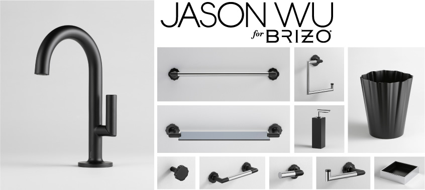
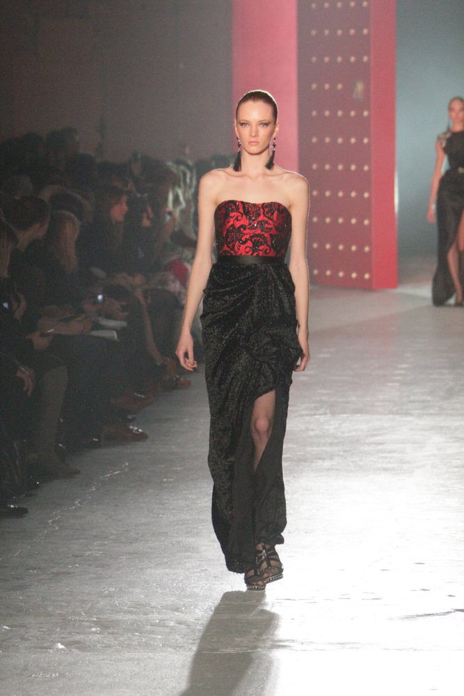
I'll never forget attending fashion week in September 2010 courtesy of Brizo Faucets.  It was an honor, to say the least, to have been invited to become a member of the illustrious "Blogger 19".  Brizo goes way back with fashion's Golden Boy, Jason Wu.   Since 2006, the two have joined in a unique collaboration, showing the world that high style can be achieved both at home and on the red carpet. The partnership began with Brizo's sponsorship of Jason's Spring 2007 Collection during Fashion Week in New York City in September 2006. Jason designed a dress exclusively for Brizo that was auctioned off in 2007 with proceeds benefiting DIFFA (Design Industries Foundation Fighting AIDS).  Jason's involvement with Brizo now includes his own Jason Wu for Brizo Collection comprised of lavatory faucet and accessories for the well appointed Powder Room.

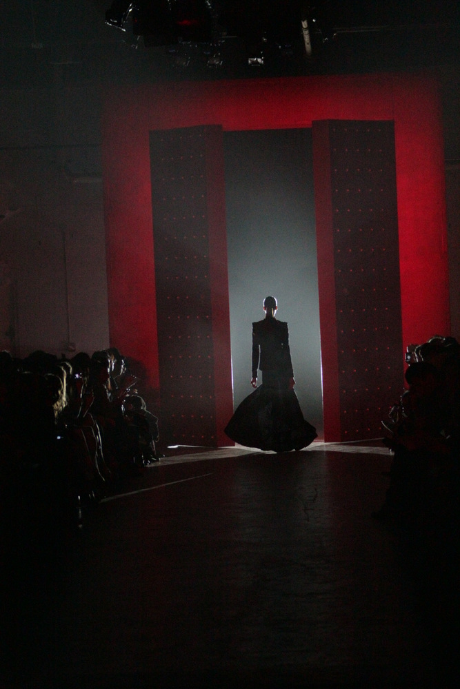
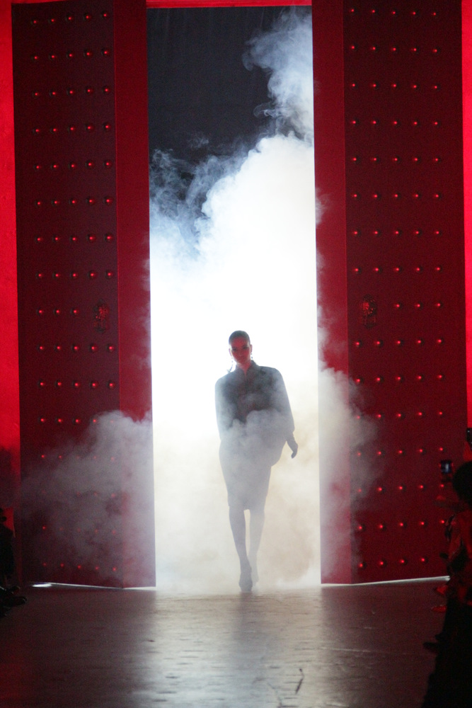
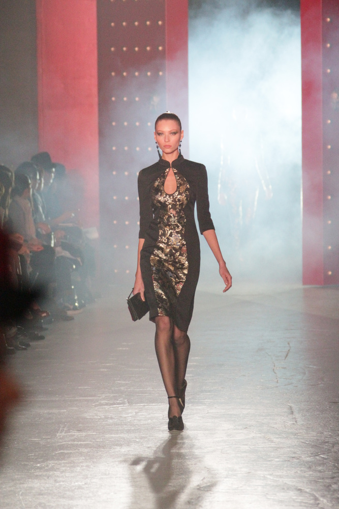
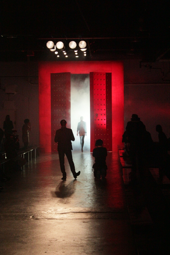
I attended the Jason Wu Spring 2011 show, got to learn a little about Brizo and met many fabulous bloggers who I am honored to have been included amongst.  As an alumnus,  I'm the lucky recipient of all the latest Brizo/Jason buzz.  So for your enjoyment today I present a little eye candy, photos from Fashion Week held last week in NYC.  All photos courtesy of  photographer Jayme Thornton.  If you'd like to view the rest of the photos click here


Elements Converge In Dream Kitchen

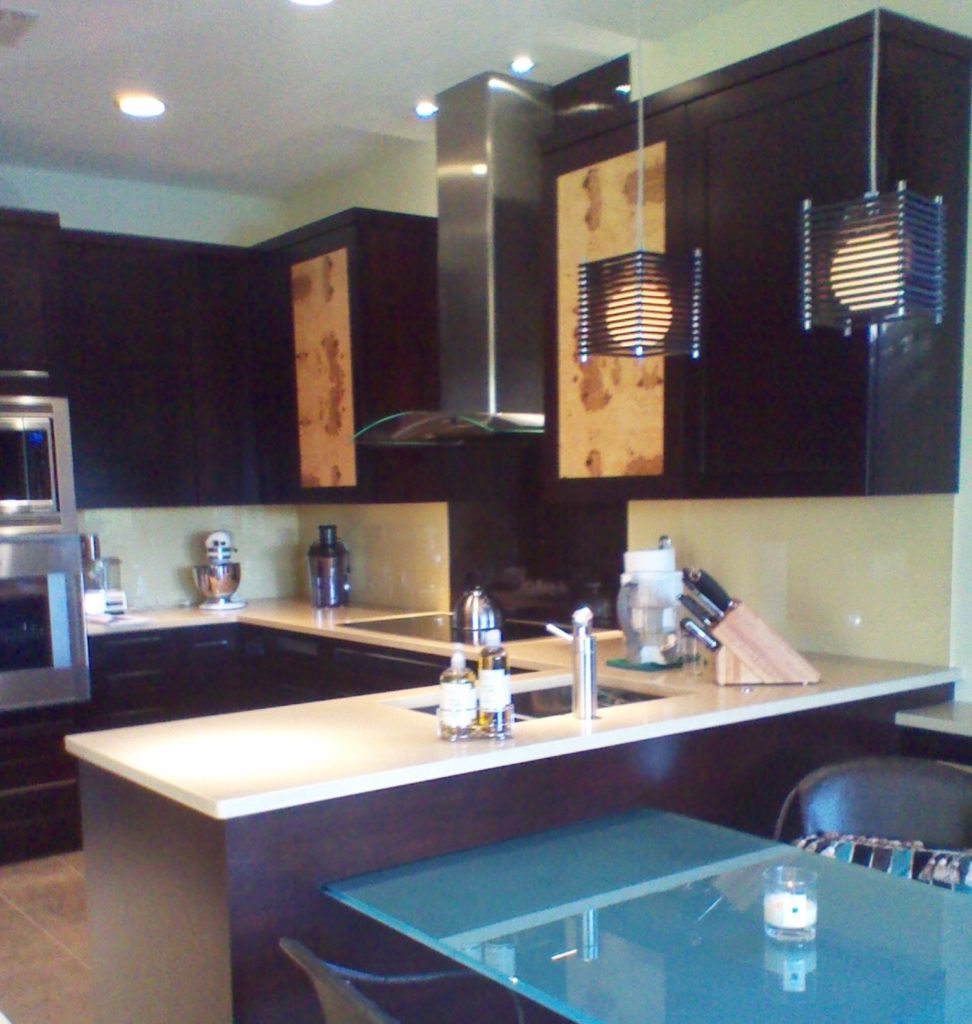
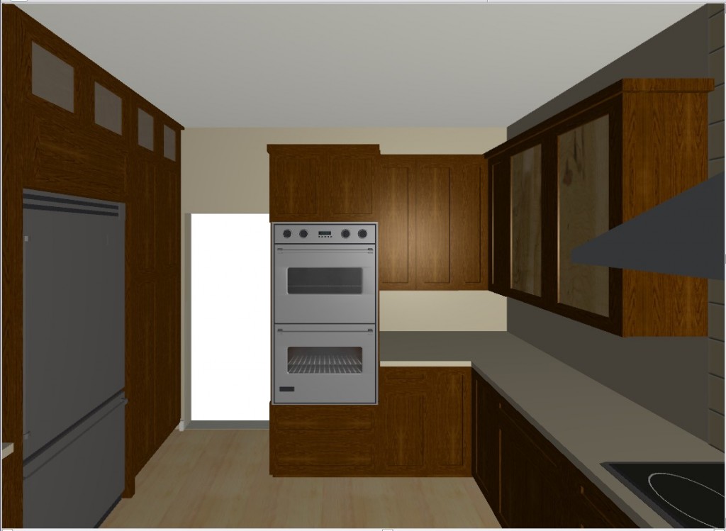
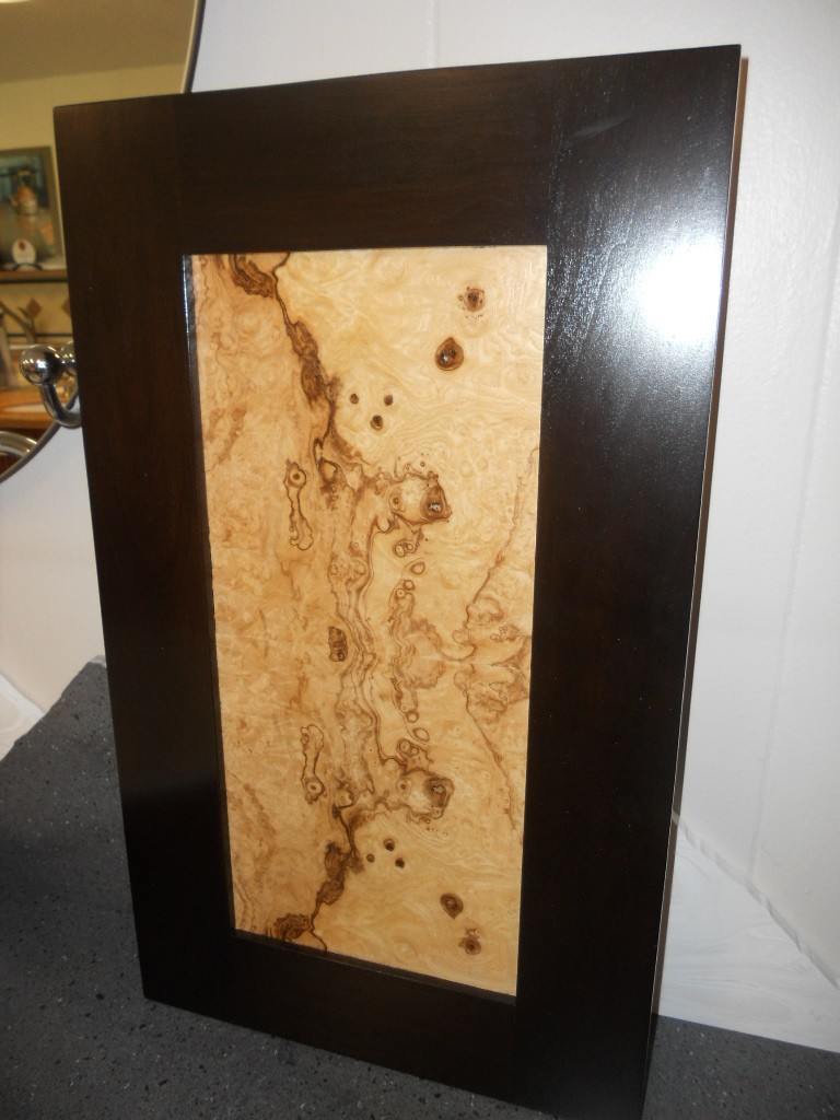
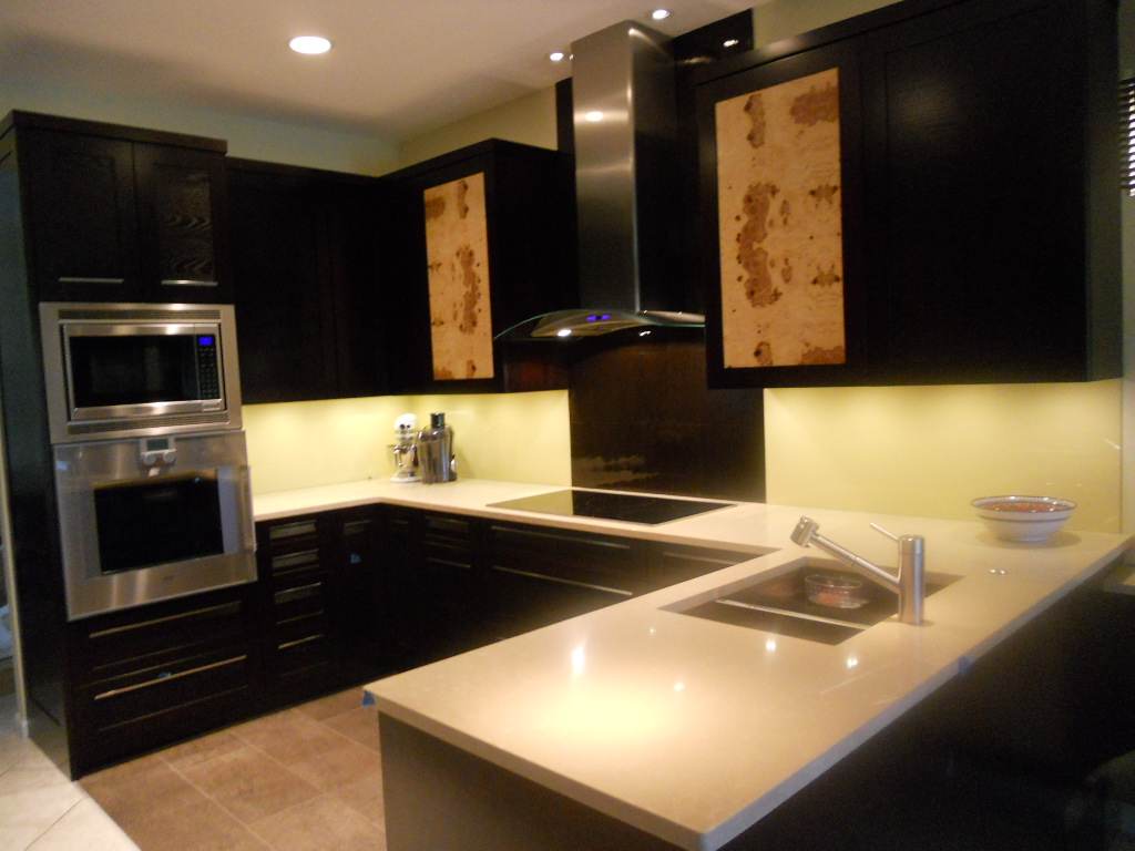
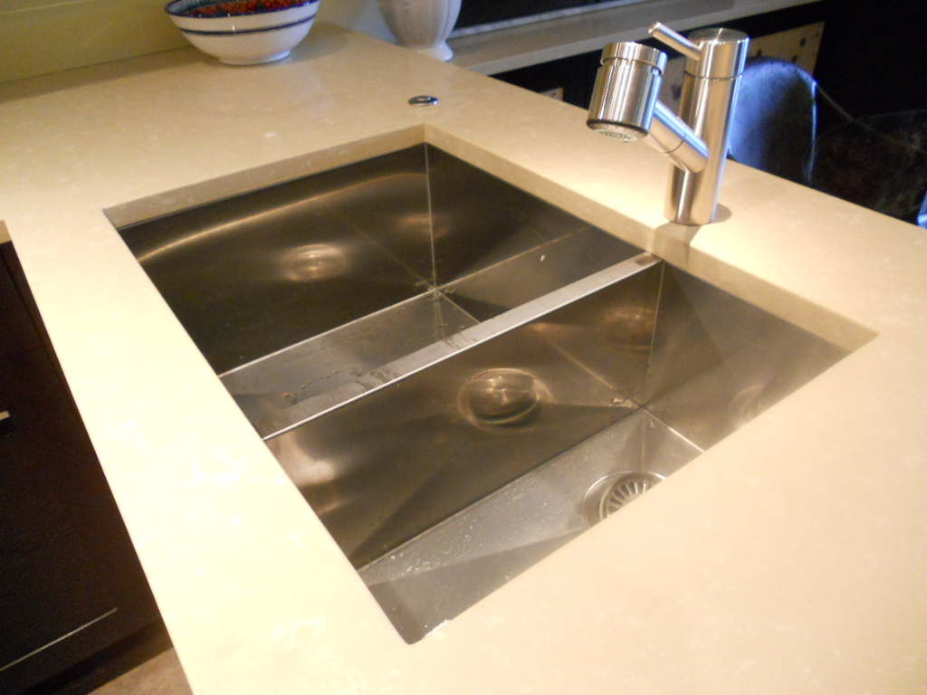
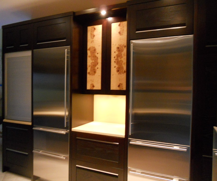
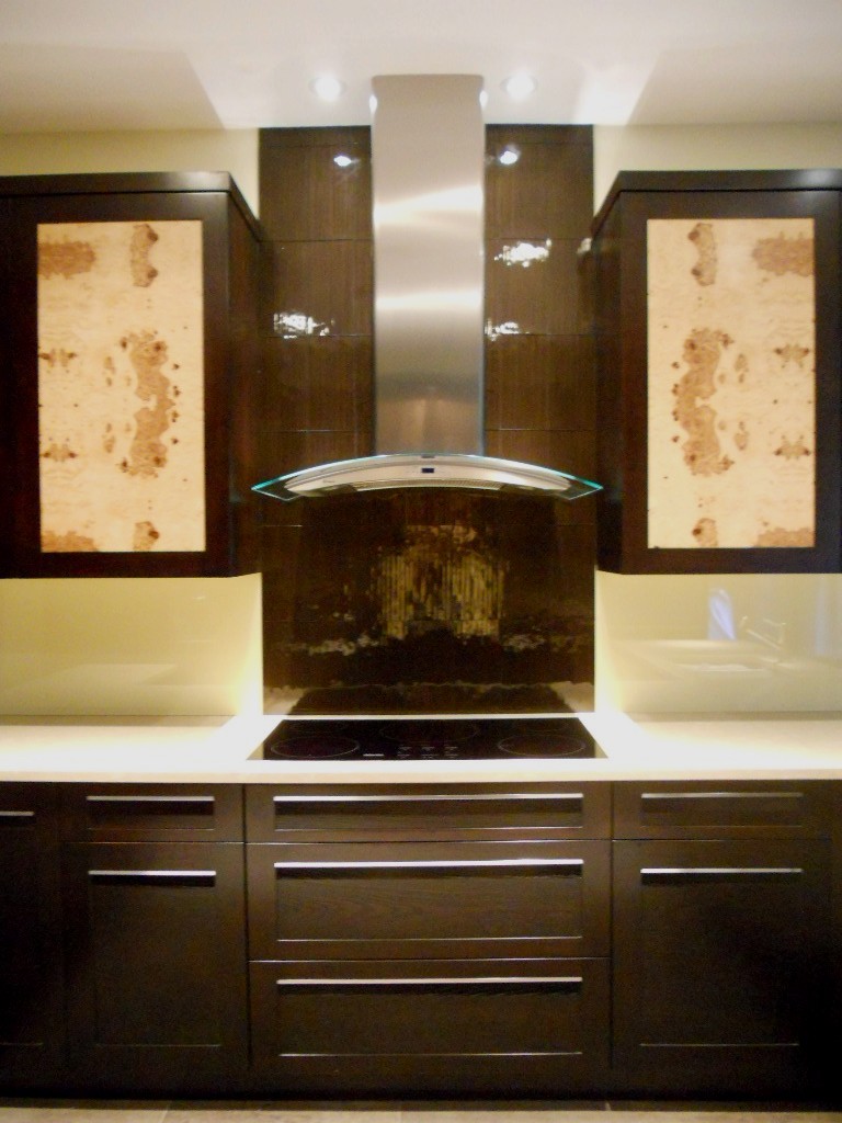
Another year is winding down.  We have been blessed  again with many interesting projects.  As we are in “finishing up mode” I thought I’d share with you one of the best of 2011.  This project was a true collaboration.  Our clients, a couple of sweet snowbirds from Chicago, were very hands on which made it fun to see this kitchen take shape.  The existing space was on the small side, the cabinets a little dated. Our assignment was to add a whole range of  state-of-the-art appliances and a clean unique contemporary feel that would flow into the existing family room.  Naturally storage and function were also of the utmost importance but the real challenge was in fitting it all in!!They chose a rich coffee bean stain for the cabinets to match existing cabinetry in the family room.  The cabinet fronts were not ordinary doors, no way.  Together, with our clients, we designed the Soldono and the Soldono Pacifica Doors just for this job.  The Soldono custom door features a cherry frame around a horizontal grained oak center panel all stained in a rich espresso color.  The center panel is beveled on one end with stainless steel grip strip inset on the frame.  No hardware sticking out in this kitchen! A select few of the upper cabinets sport the Soldono Pacifica custom door which received center panels in olive ash burl veneer for a huge shot of “unique”. Stainless steel serves as an accent finish and is found in the appliances and in the monster-multi-functional Hafele appliance garage.  Refrigerators are Subzero, ovens are by Gaggenau, cooktop is by Miele and the dishwasher drawers are by Fisher Paykel.  Thank you to Linda Roberts at House of Appliances for her guidance.   Counter tops are Caesarstone quartz by Stone Palace and the backsplash is painted glass by Florida Shower Door & Mirror, Inc. Clearly they do much more that shower doors!  Perhaps the "piece de resistance" however is the glass tile behind the hood.   It truly looks like water cascading down the wall behind the hood!  The sink is a Precision by Blanco and the glass theme is picked up again with the glass table.  You can find a listing of all the trades on the Local Resources page here at Kitchens for Living.


THE BEST OF KBIS

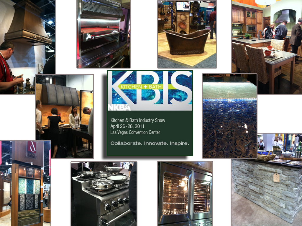
Our annual Kitchen & Bath Industry Show known as KBIS  was held last month in Las Vegas.  I’m hearing that attendance was much improved over the anemic showing of the last couple years.  This show is traditionally where new products and design trends for the kitchen and bath are introduced to the world at large.  Here are some of my new faves from the show!


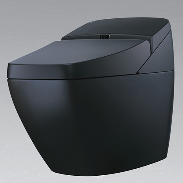
One of the most exciting debuts this year is  Bornholm Cabinets,  conceived of and created by fellow blogger Susan Serra and her daughter.     They are a couple of smart cookies who know what’s both hot now as well as basic and unique enough to be timeless.  The line is Scandanavian inspired but American made.  Simple yet elegant and designed to blend into and enhance any environment.  I think we’ll be seeing more of this.  You can see more here.I also love this beautiful bit of black.

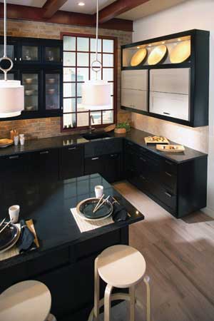
Yes it’s a toilet!  When it comes to commodes the Japanese have definitely got it going on and this example is no exception.   We all know what a "smart" phone is, well meet the "smart" toilet!  The REGIO by Inax  features a sound system, heated seat, double power deodorizing, automatic seat and flushing, and dual nozzle bidet. Geez, what more could you want?  Oh, yeah it’s also environmentally responsible. Check it out here Here’s a new fun way to add a little glow to that backsplash area between your cabinets and counter top.The °eluma RGB DecoSplash illuminated backsplash is the first fully customizeable color changing LED backsplash.  You can change your color as you change your mood from fuschia to lime green!  This LED light is dimmable and you even have your choice of decorative inserts.  Find out more here.Dark rich wood finishes continue to be a popular choice.  I just love the Asian vibe (of course!) of this kitchen by Wellborn Cabinets.Click here to see the rest of The Best of KBIS!

SANCTUARY IS ASIAN, ARCHITECTURAL & AWESOME!

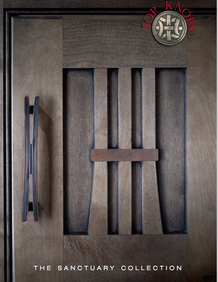
So here I am.  It's another hump day.  I'm checking the email under the delusion that I will catch up with my inbox when BAMMM I get this awesome press release from Ad-Maven Lori Dolnick of Frank Advertising.  Wowser!   I LOVE this new cabinet hardware collection, Sanctuary,  by Top Knobs, Inc.  It's modern, Asian, architectural and everything I long for (almost).   You can see the whole line and download a catalogue of your very own here.  Just one question, where can I get that door?   Isn't it stunning?  I'm going to have to put Brendan to work on it.  It looks like a must have for our new showroom.

DO YOU WANT A DIRTY KITCHEN?

The advent of the internet has allowed us to trade influences with other cultures at lightening speed.  Many of today's western designs borrow aspects of the Zen aesthetic incorporating organic materials, clean lines and a natural color pallette.  The ancient practice of Feng Shui goes beyond aesthetics addressing the importance of function as well. 

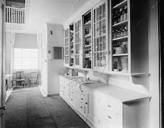
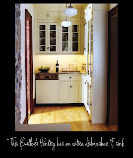
Recently I  uncovered a little known Asian concept known as "the dirty kitchen".  How un-American, you may say.  Maybe not.  A dirty kitchen is basically a smaller kitchen separated from your main kitchen. It is usually behind closed doors.  Sometimes, in an older home, we call this a Butler's Pantry which essentially is the same thing and can be highly functional if you have a small space adjacent to your kitchen.  Or maybe not so small, as in this photo of the White House Butler's Kitchen circa 1920!  I guess it is American afterall.

A dirty kitchen can be used for food preparation, secondary storage and for staging when entertaining.  It’s also a good idea  to have a second sink and even a dishwasher (as in this photo by ABCDDesign.com) or extra refrigeration in your dirty kitchen.  During a party, this secondary space comes in handy if you have an open kitchen. Guests can socialize and eat hors d’oeuvres in and around the main kitchen while the real work goes on behind the scenes- in the dirty kitchen!

Thank you to my bright and beautiful daughter, Sabrina for researching this post!