2018 The Year In Review

2018 was a year of fun and exciting projects which challenged and sparked my creativity! White kitchens continued to be the hot ticket sometimes with an artful mix of natural wood or with deep rich blues.

2018-6.jpg

I call this the "new traditional kitchen". I had fun working with HW Interiors on this one.

There were difficult situations but always solutions. This video gives you a snapshot of the vast variety of spaces and projects that came my way throughout the year. When you work with me I create these 3D renderings in Chief Architect Interiors X10 so you can get a sense of the space because visuals are everything! I am deeply grateful to my clients for placing their trust in me. Wishing all my readers the best in 2019. Maybe this will be the year we create your new space! xoxo


The Big Move: Episode 8 The Big Reveal

Yes, it certainly has been a while since our last episode but guess what? The Big Move is complete and it's time for THE BIG REVEAL. We are done for the most part.  I guess the truth is the homeowner is really never done.


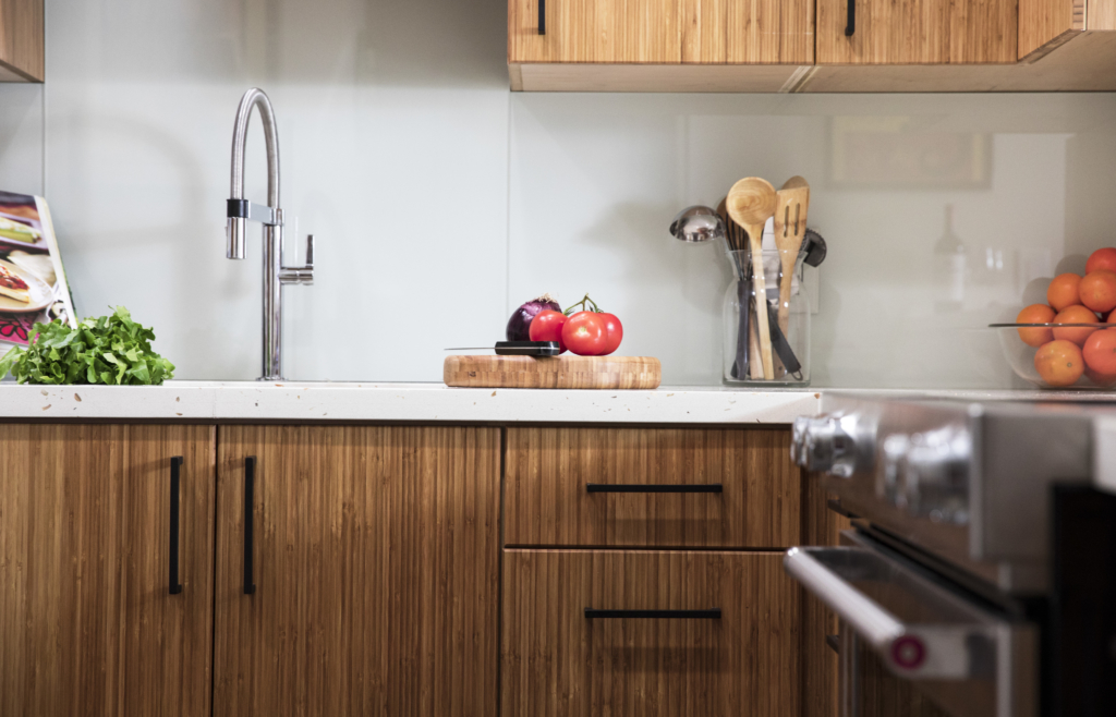
bamboo, painted glass backsplash, quartz counter top, Blanco faucet, Culina, matte black,

There's always something, right? Anyway, we are enjoying our new home immensely and in this episode I will give you a tour of the kitchen, show you some of the of the work we've been up to since we met last, share some final words of wisdom and then THE BIG REVEAL!!! Please comment and let me know what you think.  I think the final result is so Glo&Joe.  You'll see my art and Joe's music represented.  Then there's Mac. =^..^= These personal touches are what make a house a home.  Special THANK YOU for following our adventure we are so grateful to all the generous souls who contributed to making it happen.  Without further ado, THE BIG REVEAL


If you just happened to find my video, there are seven more on my YouTube channel. You can tag along with me, a South Florida kitchen and bath designer, as I, with my husband, transition from suburban family living to a cozy condo by the water. As new empty nesters, we're downsizing, minimalizing and taking a property with potential from sad to fab. Follow The Big Move series as I encounter all the choices and issues my own clients face from the other side!

Join me in my upcoming kitchen design workshops in 2018 if you're thinking about a new kitchen in the new year.  Email me at Gloria@ArtfulKitchens.net and I'll let you know the dates and locations.

Going Topless...In Your Kitchen

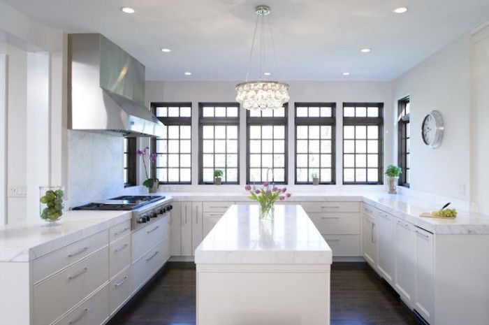
Unless you've been living under a rock you know that the less-is-more look of the topless kitchen is hot!! When I say topless I mean no upper cabinets. There are certainly pluses and minuses to this design decision. But "how can I live without half my kitchen", you ask.  Fear not. Today we will examine the possibilities.

white kitchen, traditional kitchen, stainless steel hood, island, white countertop, kitchen windows, crystal chandelier,no upper cabinets

white kitchen, traditional kitchen, stainless steel hood, island, white countertop, kitchen windows, crystal chandelier,no upper cabinets

Less is Now

No complaining if you haven't done a thorough kitchen purge in the last year.  We all have "stuff" and if it never sees the light of day it's stagnant energy taking up real estate that could be otherwise useful or beautiful.But what about dishes? They always go in the upper cabinets. Actually, dishes work perfectly in drawers if you have this drawer peg system.  You'll find that they're easier to access too, particularly if you're short like me ;)

Dish drawer, dish pegs, black plates, drawer cabinet

Dish drawer, dish pegs, black plates, drawer cabinet

Clever Corners

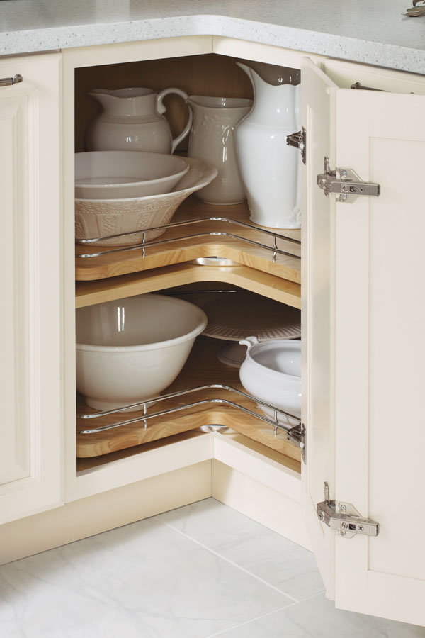
Another way to maximize the space you have below deck is to use the corner space.  My favorite way to do this is with a base lazy susan cabinet. It's versatile storage for almost anything. Just be sure to get this type, without the pole.  With trays mounted on shelves, you won't lose things to the Twilight Zone if they fall over.  (Chrome rails are optional) The only caveat is that you will need 36" on both sides of the corner to make this work.

base corner cabinet with lazy susan chrome rails

base corner cabinet with lazy susan chrome rails

If you can't swing the 36" in each direction you can perhaps use the Cloud which fits in a blind corner cabinet.  We can discuss more when you call me to help you with your new kitchen.

white cabinets, contemporary, chrome, blind corner cabinet, revashelf

white cabinets, contemporary, chrome, blind corner cabinet, revashelf

Ultimate Simplicity

The most simple solution of all is the open shelf.  They are both feared and widely popular.  Some feel like it would look way too messy but I say it doesn't have to be all or nothing.  A few open or floating shelves can add a lot of lightness and visual interest as well as storage above the counter in lieu of cabinets.

farmhouse kitchen, HGTV, white cabinets, apron sink, open shelves

farmhouse kitchen, HGTV, white cabinets, apron sink, open shelves

Artful Arrangement

In the photo below, they actually did not eliminate uppers entirely but it feels like it.  Here they are using the shortened uppers for remote storage, i.e. the stuff you don't need to access every day. The "go to" storage is in tall pantry cabinets.  That's right, you don't have to use the pantry only for food, they are great for everything.  If your pantry is full depth, like these, rollouts work great for easy access and to avoid items getting lost in the back. If you're observant you'll also notice the last cabinet sits on top of the counter.  If you have the counter space this is a great way to conceal countertop items for less clutter.

contemporary kitchen Dekton wood cabinets pantries

contemporary kitchen Dekton wood cabinets pantries

Creative Compromise

As we've seen, one does not necessarily need to banish the upper cabinet entirely to score an updated and functional result.  Here is a loft kitchen I recently designed.  My clients were in love with the idea of floating shelves and this look worked for their urban vintage style. Since space was at a premium in this condo we did opt to keep a few good sized upper cabinets.  The look is actually a blend of contemporary and transitional. A full pantry also would've worked to the right of the refrigerator but my clients preferred this arrangement which is very symetrical and offers a bit of extra counter space.  Hey, I always say the best jobs are good collaborations. :)

ArtfulKitchens 3DRendering kitchendesign

ArtfulKitchens 3DRendering kitchendesign

.

No matter what your situation, creativity can offer you choices. In over 20 years I have found that there is always a solution that will work in your space and I would love to help you find it.

Sex Up your Kitchen with Matte Black

In the fashion world, black always has an air of hipness and sophistication, as in the ubiquitous "little black dress".  Now, in kitchens and home decor, matte black is all the rage, it's neutral but also works as a stunning accent when used sparingly.   
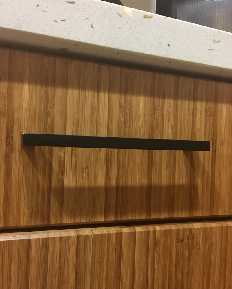
 

carbonized bamboo cabinetry, black matte cabinet pulls by Top Knobs, Sunny Pearl Quartz


Appliance manufacturers have been turning to black matte or something called black stainless as an alternative to the stainless steel finishes that have been a standard for so long. You can also opt to use matte black for your cabinet hardware and mix it in with stainless or chrome.  That's exactly what I did in my new sexy kitchen which will be revealed soon in Episode VIII of The Big Move.  This is a little preview
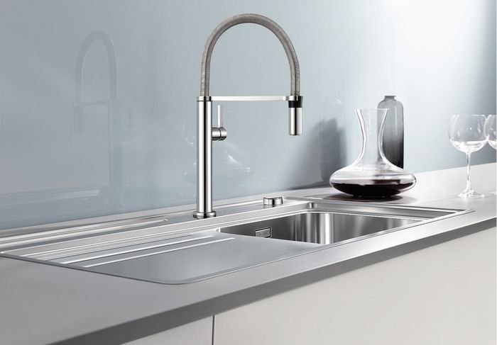
CulinaMiniFaucet,chrome,glassbacksplash


Check out my faucet, courtesy of Blanco, and I love it.  I cheated though, that is not my kitchen as the backsplash isn't in yet.  It will, however,  be very similar to the one you see above. Below IS a sneak peek.  Those are my luscious bamboo cabinets with quartz countertop featuring real shells! For more, you'll just have to wait for VIII.

(By the way, I have curated many of the items shown in this post on my new Amazon page. There is even a surprise "look for less" item included. In each future post, I will add more items to it.  Yes, I could possibly get coffee money from these links but I only post the products I either have or really love. I'm just curating them there for you.)

The more I thought about it, the more I saw black matte in art and nature too.  I encourage my clients to include images like these as they begin to consider options for a new kitchen or bath.  I'm fun like that ;) These are the things that make your space personal and reflect your style.  I will help you edit and translate the essence so that it works seamlessly in your new space.
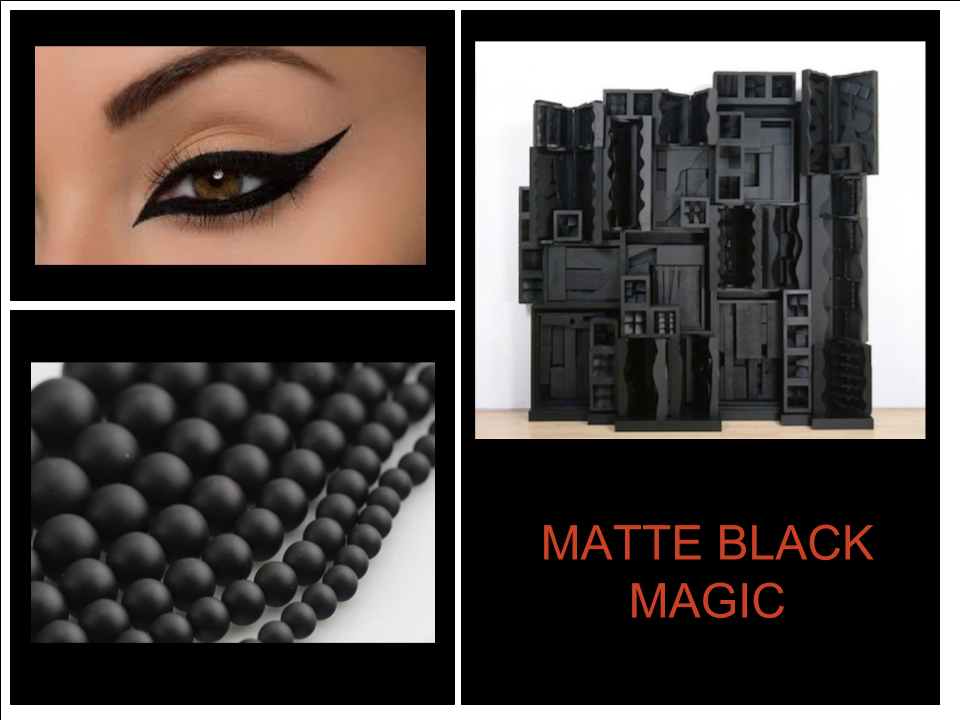
matte black, beads, eyeliner, Louise Bougeous

I love this look as an alternative to stainless steel.  If you decide to be bold with black appliances, it's a good idea to buy the whole package so everything matches.  The black appliance finishes from different manufacturers are not all the same.  If you want to get a different brand dishwasher or refrigerator you can always put cabinet panels on them as another solution.
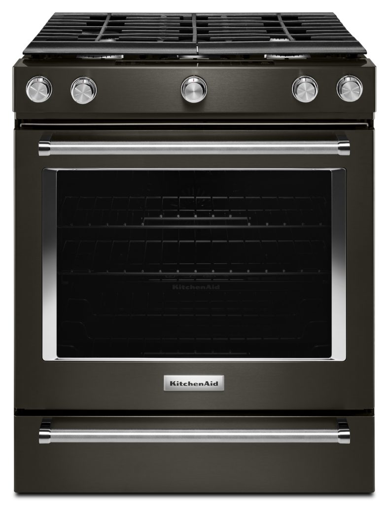
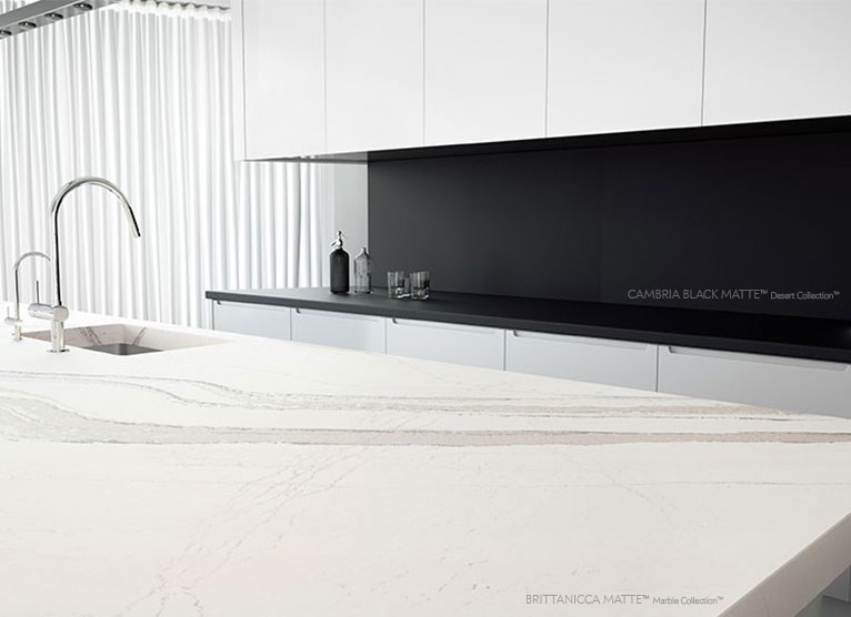
Artful Kitchens,KitchenAid 30- Slide-In 5-Burner Convection Range quartz countertop brittani

Many quartz countertop manufacturers are offering matte finishes. Above is Cambria's black matte as a backdrop to their mega-popular Brittanicca, also in matte finish. If you are thinking of doing a full height backsplash, as shown here, make sure to plan on using 2cm material which is 3/4" thick.  The other option of 3cm would be too thick.
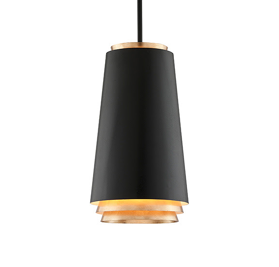
Farenheit Troy Lighting black pendant light fixture

Don't you love this pendant light fixture? I am enthralled with the streamlined cylindrical shape.  It's a series of nested and tiered cones that allow light to seep down in a cool way.  The outside is textured black and the inner surfaces are finished with hand-applied gold leaf. 
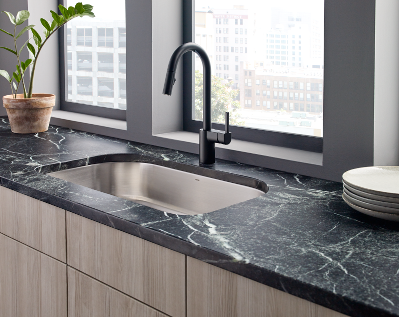
Moen kitchen faucet matte black stainless single undermount sink matte finishes contemporary


The clean contemporary lines of this black matte kitchen faucet by Moen caught my attention. Note the matte finish on the countertop and how nicely the black matte works with the stainless sink.  You can definitely mix metals!
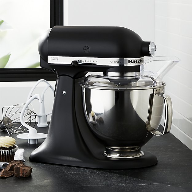
kitchenaid-artisan-matte-black-stand-mixer

Last but definitely not least, think how stylish you'll feel throughout the holidays cooking with this sleek chic mixer by KitchenAid. What do you think about the look and versatility of matte black? Let's start a conversation! Oh and in case I distracted you, don't forget to vote for Artful Kitchens right here. Thanks! :)


The Best of KBIS 2016

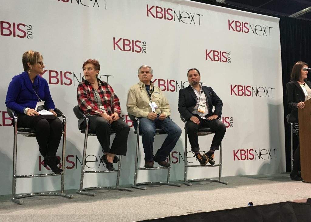
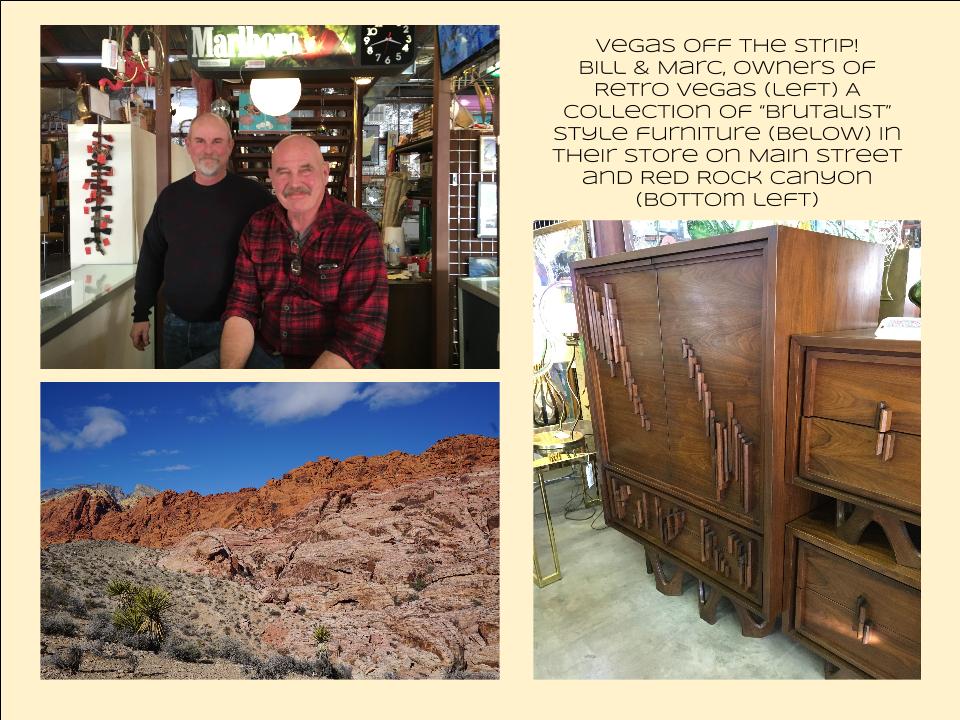
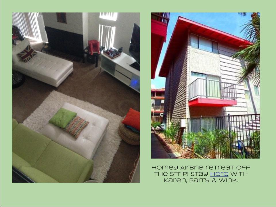
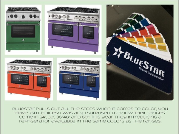
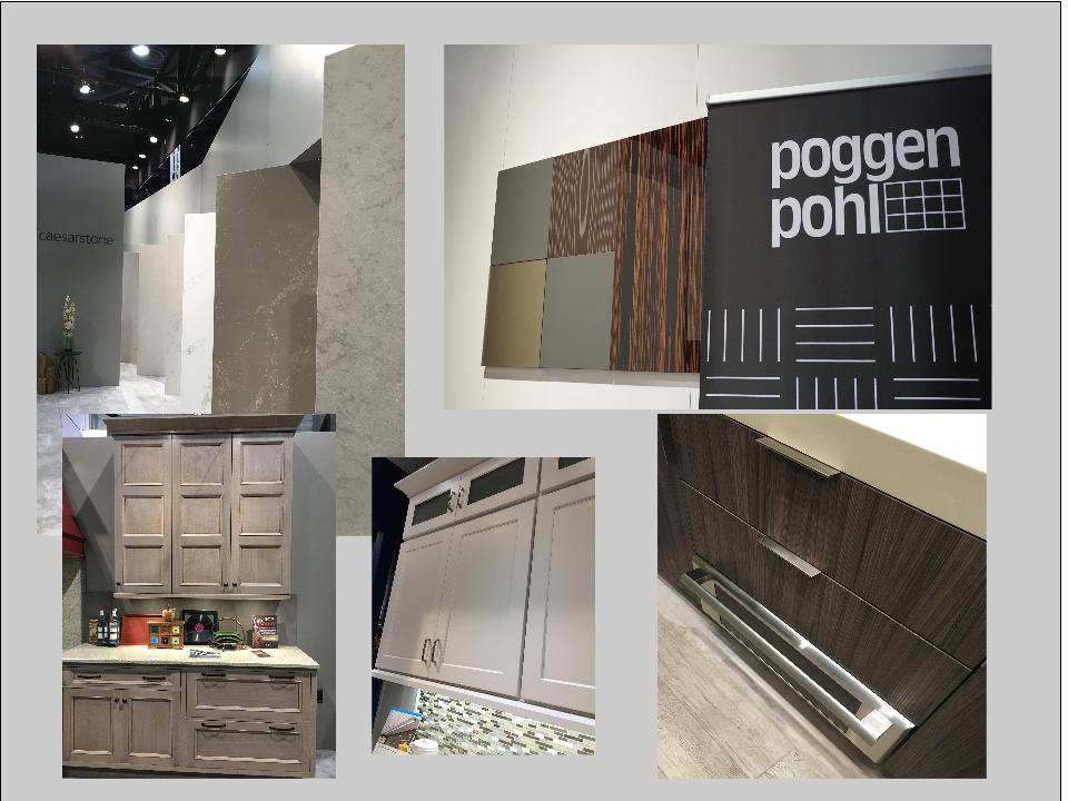
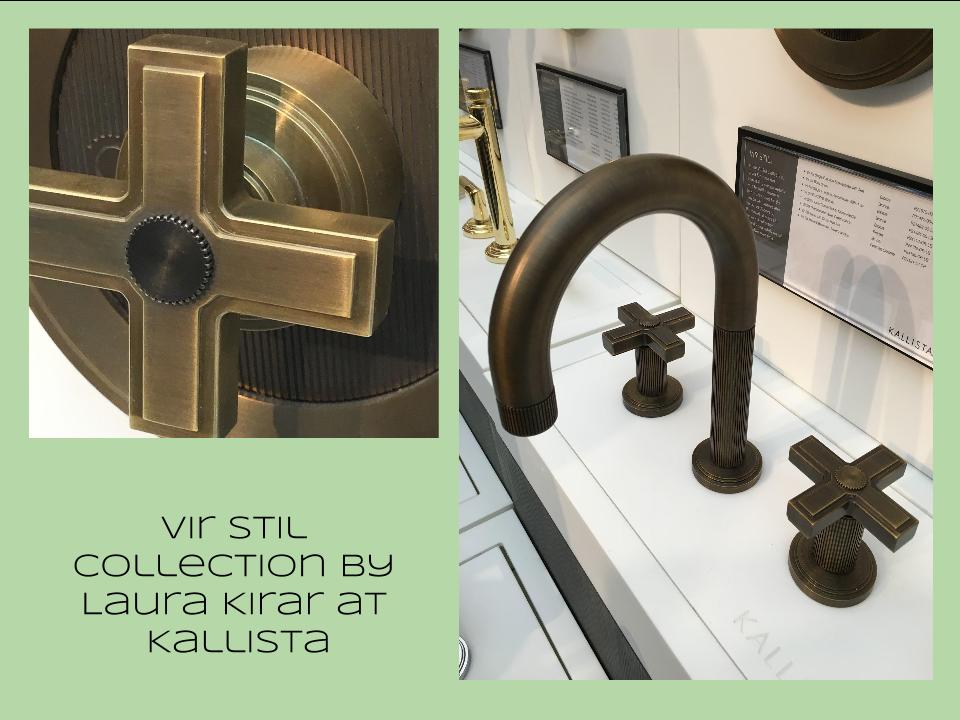
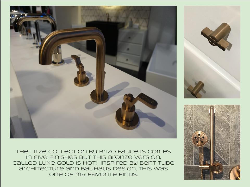
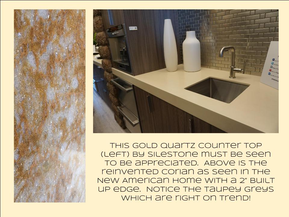
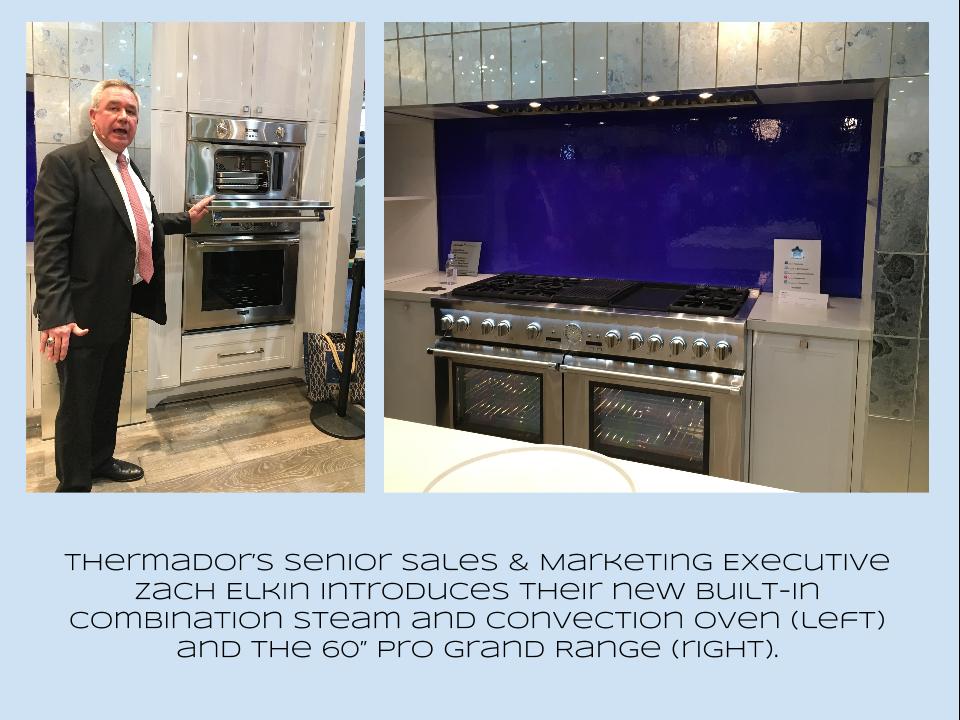
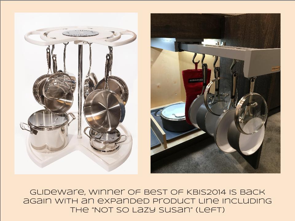
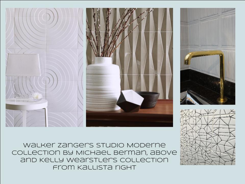
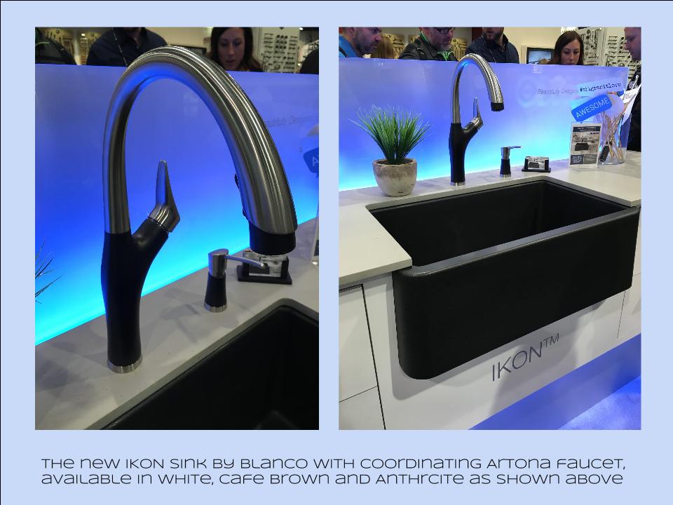
Bam!  Another show is in the books and although it's been a busy week "back at the ranch", I've been dying to share my finds with you right here on Artful Kitchens.2016-01-19_184543141_4F428_iOS (2)Las Vegas was host to three days of networking and education for the best of the Kitchen & Bath industry.  As a member of the Kitchen & Bath Business Magazine's Advisory Board,  I had the pleasure of appearing on the KBIS Next stage as a part of the panel discussion entitled Trials & Tribulations-Solutions to Your Biggest Kitchen & Bath Challenges. It was an exciting exchange of ideas between both the pros on the panel as well as a savvy and engaged audience.Vegas Off the Strip Karen (1)I also had the opportunity to spend some time in the Las Vegas I like best, off the strip! I hiked in the Red Rock Canyon and visited my friends at Retro Vegas on Main Street. My digs for this trip were with my dear pals Karen, Barry & Wink.  They live in a midcentury modern gem that, rumor has it, was briefly home to Lucille Ball!  They are avid Airbnb'ers and wonderful hosts.  Check it out if you find yourself in Vegas. This location is so convenient to the Convention center I could walk, which I did, once.  Mostly I Ubered. Enough walking happens on the show floor!  So without further ado, here's my recap of the biggest and most notable trends and products that caught my eye at KBIS2016. ColorWhite still reigns.  In fact paint giants Benjamin Moore and Sherwin Williams have both selected shades of white as their color of the year.  You know I am a huge white fan. It is always the best backdrop for art and design. It also continues to be the favorite cabinet color in my area.  Remember white is not just white, there are an infinite number of varieties you can have fun with.  If you need more punch in your kitchen you could find some great options at the big show.  I saw bright saturated colors in several appliance brands including Bertonazzi, Viking and BlueStar which offers 750 colors!  color (2)Grey has not left the stage.  The newest versions are warm, venturing into taupe territory. Textured wood grains such as cerused oak are really popular. Wood-Mode showed both traditional and contemporary versions of ribbon Mahogany.Cabinets Poggenpohl_Diamond Grey_Oak Honey BrownThe Perfect TouchTouch latch technology was EVERYWHERE!  If you prefer a sleek, uninterrupted look for your cabinets and appliances this is for you, a gentle nudge will open your cabinets. This is nothing new but it's taken off.  I also loved the button that allows you to close this cabinet when you're done without resorting to dangerous acrobatics (I'm short).Untitled drawing (5)Feeling BrassyActually brass, copper, bronze and myriad versions are hot for plumbing fixtures and hardware.  My favorites were the new BauHaus inspired Litze collection by Brizo Faucets. and Kallista's Vir Stil collection.LitzeNot Your Grandma's CorianIf you're like me Corian has been dead to you since about 1998.  That sentiment has now ended in my book.  I saw a 2"thick sleek contemporary version of Corian that was perfectly at home in The New American Home.  The other exciting thing I saw in counter tops was this quartz by Silestone.  Yes, it's GOLD!  I just wish the photo could capture it's sparkly beauty.CountersThrills from ThermadorAppliance brand Thermador held a press conference on the show floor to introduce a couple of impressive new products, the 60" pro range available with steam and a double oven featuring steam and convection.  These are firsts in the industry.ThermadorOrganize ItJust when I thought we had it all the category of organization it goes to the next level. There was a great representation of brands ranging from Hafele to Rev-A-Shelf to Hardware Resources but Glideware is taking the market by storm.  If you've got a mess lurking somewhere I guarantee there's a way to make it neat and accessibleRev A ShelfGlidewareTile StyleMy two tile favorites were Michael Berman's Collection from Walker Zanger and, of course, Ann Sacks who are featuring a new line by L.A. design maven Kelly Wearstler. Love!Tile (1)I can IKONIf you read my blog you know I love me my Silgranit sinks, meet IKON the apron front version which easily works in any style kitchen from Traditional to Contemporary. Their Artona  faucet perfectly complements the Silgranit sink.-BlancoStikwood Rocks!

Stikwood’s line of lightweight, real-wood planking offers designers and DIYers a peel-and-stick solution to achieve that perfect, sought-after blend of rustic and modern. It can be used on walls and ceilings and comes in tons of colors, even prints! I'm thinking this could be great on the back of a kitchen island.

stikwood

Believe me, all this is just the tip of the proverbial iceberg.  There was so much more to see and learn about at KBIS 2016.  Check out this year's winners of Best of KBIS for more info and of course if you'd like any more info on what you see here email me at artfulkitchensbyglo@gmail.com

Cambria Celebrates Launch of Two New Additions

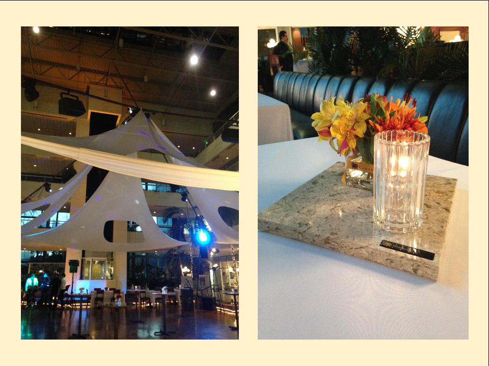
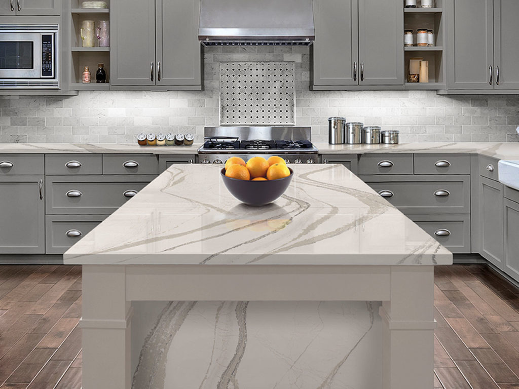
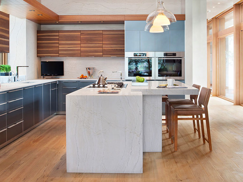
Have I ever mentioned how much I love quartz countertops?  If not, I have been remiss.  Quartz tops, composed of 93% quartz and 7% resins, are the ultimate in durability, come in a variety of looks and are so easy to care for.  What could be better?  My favorite brand when it comes to quartz counter tops is Cambria.  I love their selection of patterns and colors plus they make it so easy, all the colors are the same price!  I was thrilled to be invited, earlier this month,  to the local launch of two new additions to their luxurious Marble Collection, Ella and Brittanicca.CambriaThe event was held at the Pavillion Grille in Boca Raton.  The stage was set with style, elegance and a chance to view the two new offerings up close and personal.  It's easy to see that these latest marble looks were inspired by the seashore.  Crazy beautiful veining brings to mind patterns created on the sand. Pavillion Grille,Boca Raton,Cambria Launch Here is a quote from Cambria describing one of the new colors.  "Vast and expansive, Brittanicca™ offers a velvety marbled background of neutral white that provides a stage on which gray streams meander among intertwining ashen veins dotted with veiled charcoal sparkles." It's perfectly poetic, yes? Brittanicca by Cambria The second star of the evening, Ella, has a finer pattern but is also reminiscent of marble.  The background is rich and creamy.  Both of these options are a great way to get the opulent look of marble with easy to care for durability.Ella by Cambria Both new finishes are a part of Cambria's Oceanic Collection.