 One of my favorite magazines, Cooking Light, contains a very interesting article that I love this month. It’s about something called “mindful eating”. I agree that we, as a culture, me included, eat way too much because we don’t do it mindfully. Simply put it just means that if you make yourself 100% present and focused at the task at hand (eating) during mealtime you will enjoy your food more and you won’t feel the need to eat as much. I happen to believe that you can easily carry this concept over to the kitchen design and remodel process. These days when we are trying to get the most out of every dollar we want to know that every aspect of the complicated process of remodeling a kitchen has been well thought out. Here are five ways you can do it.
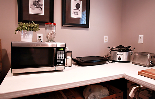 3) Prepare for the downtime- Always insist on a schedule for your project. This is NOT to say it won’t have to be tweaked from time to time but it’s always best to have a starting point. It helps keep all the players on the same page. A big part of this is to plan how you’re going to get by when you’re without a kitchen. Where are you going to put the refrigerator? Do you have convenient place to put your microwave? How close is your temporary set up to a sink? Keep most used cups and utensils easy to access.
  4) Pick your battles- Everyone has a budget and most of us can’t have it all. That said, there are usually a couple of areas in which a judicious splurge can make all the difference. One biggie is springing for a counter depth model refrigerator which is nearly flush with your counter top. This makes a big difference in a small space. Although they’re more expensive they’re still a lot less than the super high end true built-in models.
  5) Don’t rush to judgement- If you are living on site during your remodel, resist the impulse to go into a seizure over every nick or crooked drawer front. Again, it’s a process with a million details and steps. At this point you should be trusting (if you did step 2) your professionals to do what they do. Typically all doors and drawer fronts will be aligned before your installation is finished. It is also typical practice for you and your designer to get together on a punch out list so all concerns, including touch ups are addressed before completion.If you have a question about your kitchen design or remodel I’d love to hear from you!
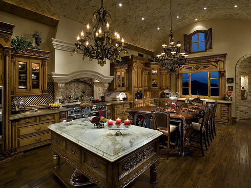
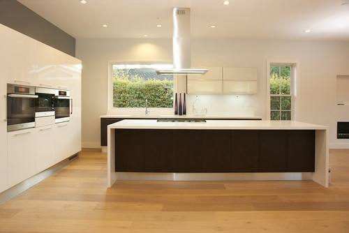
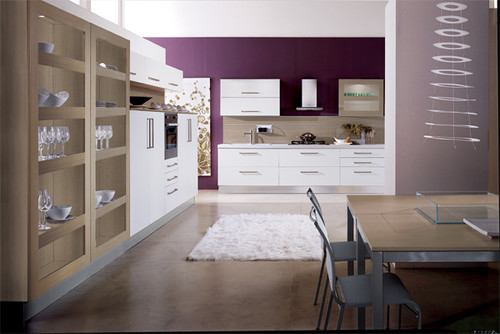
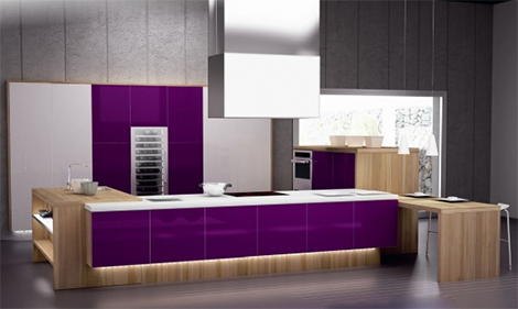


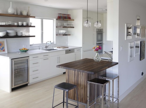
 A beautifully appointed kitchen boasts a lovely kitchen island paired with white leather and brad trimmed counter chairs. Wouldn’t it be so nice to take a seat and visit with the chef while he or she cooks?
 This rustic, gray island is given an industrial feel by equipping it with rollers. Another industrial element can be found in the aluminum work stool pulled up to the island.
 A massive kitchen island seats no less than six people. This is the perfect space for any meal. The woven chairs are so unusual and gorgeous. Getting any
  A Tuscan kitchen features an extra large island flanked on either end by a traditional style lamp. For its size, it could accommodate more seating than just the three counter stools shown here.
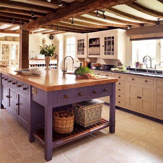
 Love, love, love this style of kitchen island. It looks as if they took a small sideboard and just added an extended wood top to accommodate seating and an eating area. Lots of decorating ideas can be found here.
 Count them, not one but two islands! I love this look and would be as happy as apple pie to be the home chef of this kitchen. Does this inspire any decorating ideas?
 Wouldn’t you love to cook up your favorite recipe in this sleek and crisp white kitchen? The island and cabinetry feature the current design trend of brass hardware.
 This ornate kitchen island is as gorgeous as it is useful. The carving and robin’s egg blue of the ‘legs” fits so nicely with the rest of the tile and cabinetry in the space. Many of my favorite