KBIS2017 Part II- Color Splash!

This is Part II of my KBIS2017 recap.  You can find Part I  here.

If you've read part one you know that I was off meeting old and new friends earlier this month at our big annual trade show known as KBIS2017.  One of the best perks of being on Modenus Blog Tour is always the people.  What a huge source of friends this whole blog adventure has been for me!  Now back to the trends you need to know. 

BlogTourKBIS, Modenus

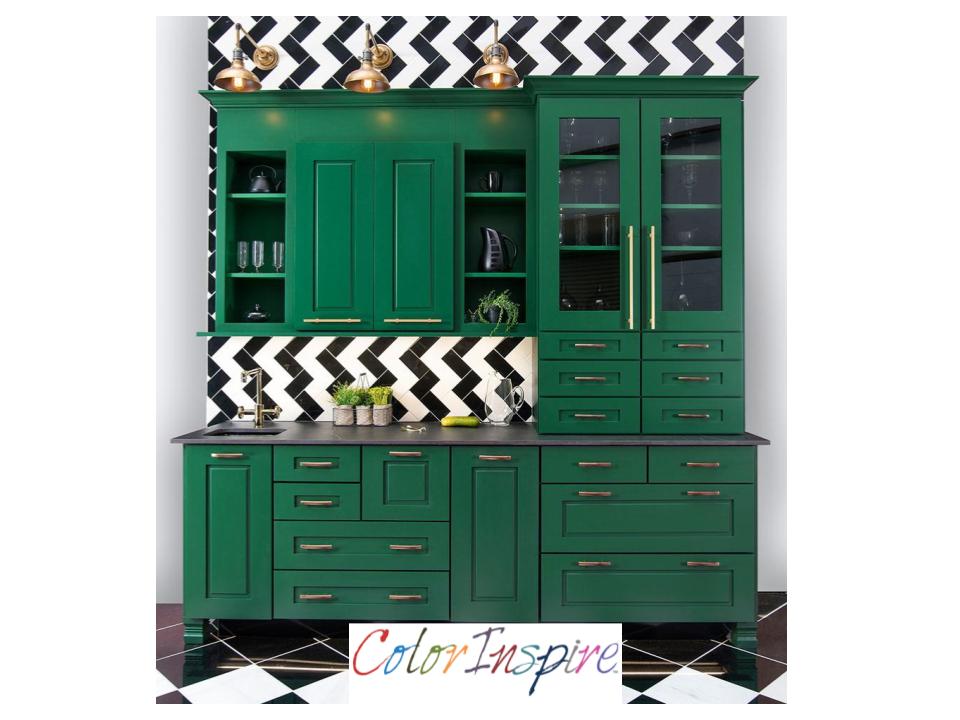
One of the huge trends at the recent Kitchen & Bath Show (KBIS2017)  in Orlando was bold brilliant color. I saw bright color across all product lines including cabinets, appliances and even faucets.  Cabinet Manufacturer Wellborn was no exception.  This vibrant  green was a big hit and showcases their custom color options.   The Color Inspire program offers a broad selection of hues from Sherwin Williams, Benjamin Moore, and Valspar. The possibilities are only limited by your imagination. 


ColorInspireWellborn

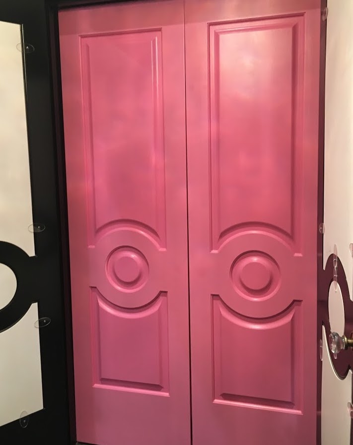
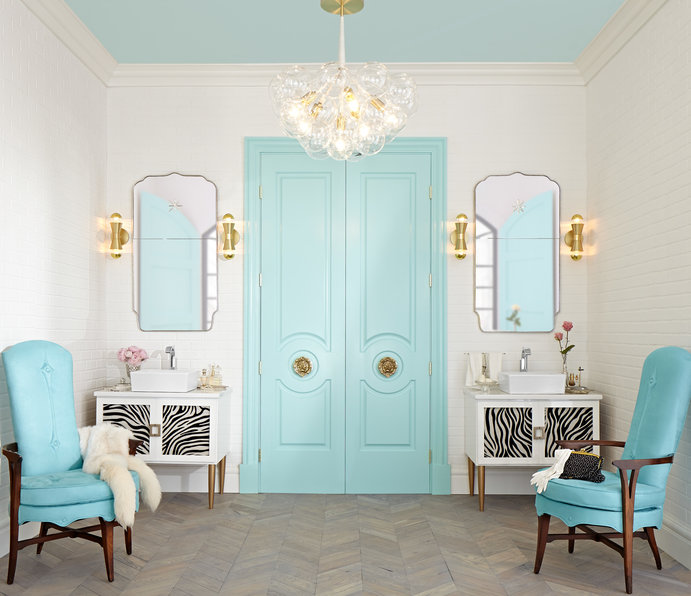
Color was also the star of the show for me at Metrie, North America's largest solid wood and MDF moulding company.  These stunning pink doors are a part of their Then & Now Finishing Collections.  This is actually a great concept that allows you to take a boring space and make it sing with character.  They have curated perfectly coordinated mouldings and interior doors to create "the look".  The styles range from the cutting edge "Fashion Forward", to girly "French Curves", to Minimalism with "Pretty Simple".  There are even a few more.  It's an awesome option for designers as it saves time spent hunting for the right crown to go with the perfect base board etc.  It's a one stop shop for  beautiful millwork and moulding details.

Metrie,KBIS2017,BlogTourKBIS


Just think of the chic "chick pad" you could create with Metrie...and then there were shoes.  I'm sorry my attention wanders sometimes.  Who can blame me for loving these shoes worn by Christine DaCosta aka Glamamama.

Grohe,Essence semi pro faucet, KBIS2017


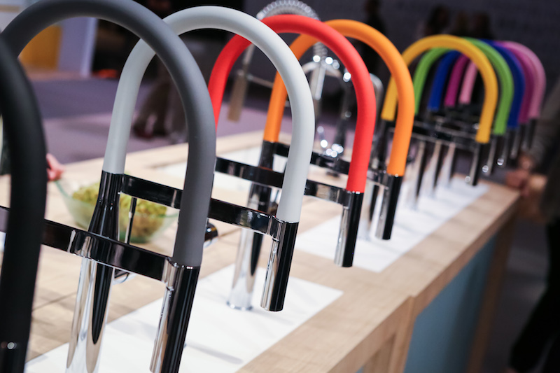
I've got more color!  Check out these faucets by Grohe.  This is the Essence Semi Pro Faucet, available April 2017.  Notice the extended spout for added convenience in the kitchen.  The display is showing limited edition brightly colored silicon hoses. Change your mind, change your faucet, just like a chameleon!

American Standard exhibited this smart faucet that actually measures water for you. Just think, it’s easy, accurate and environmentally friendly.  Turn the dial and you get the perfect amount every time.  So simple. Kudos to the team at American Standard for thinking of it.  Speaking of good ideas, what could be better than a self cleaning toilet? The ActiClean toilet features a turbo type flush system that they call VorMax, with a fully integrated self-cleaning system. The CleanCurveRim omits that rim cavity and holes inside the bowl where dirt gets trapped and EverClean antimicrobial surface helps everything stay clean longer.  Egaads!! I'm just the messenger but it's a good thing.  I'm all for minimal toilet cleaning time.

Modulus, DXV,KBIS2017,BlogTourKBIS


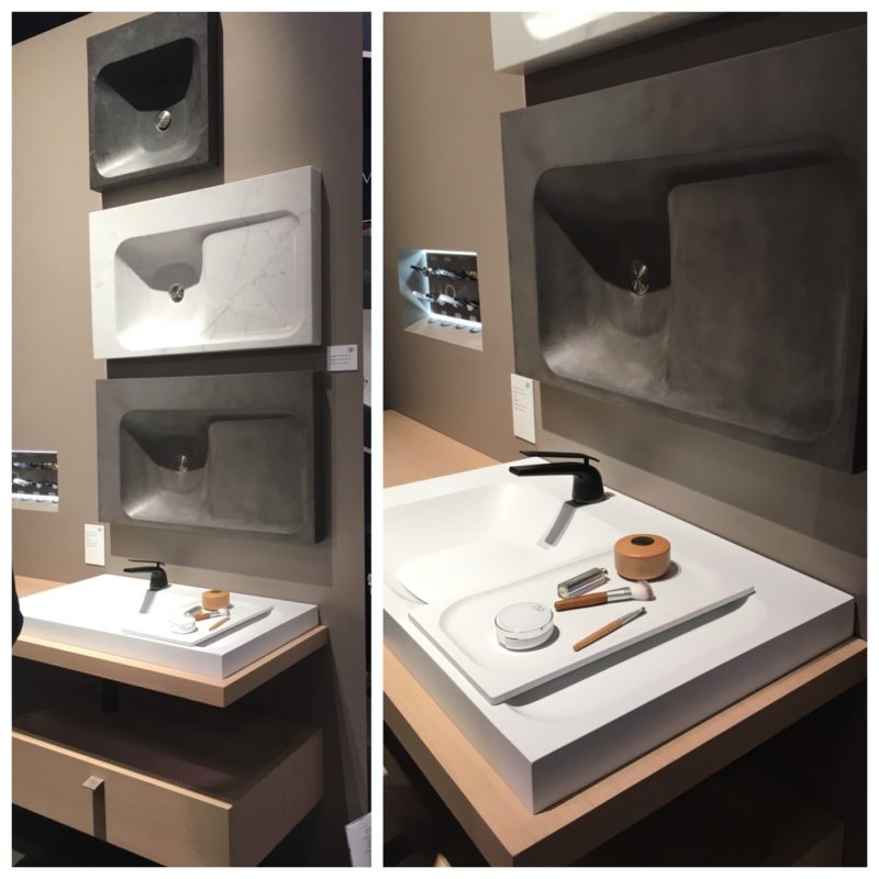
Another American Standard company, the luxury line DXV showed their Modulus line for the bath.  I loved the sensuous sculptural line of these vanity tops BUT how cool is this tray? it fits perfectly on the top and then tucks away in it’s own spot underneath when you’re done. Voilá!

   Guess what folks? I've got more. Stay tuned for KBIS III -Just a hint, it has to do with rhino poop and a surprise in the shower (but not together)

L                   

KBIS 2017 Countdown- Newest in Kitchen and Bath Design

I don’t know about you (actually I might) but I’m ready for a fresh new start so I’m welcoming 2017 with open arms.  I’m excited about all the new adventures in store. First up is the always inspiring and exciting Kitchen & Bath Industry Show (KBIS)


KBIS 2017


This year KBIS takes place in Orlando, Florida and will host 500+ leading brands in the kitchen and bath industry, including over 100 NEW companies.  Once again I am proud to be one of 24 design bloggers and social media influencers included in the Modenus Blog tour.  Modenus, in case you don’t know, is all about design connections.  Through their website and blog tours Modenus  connects design pros, brands, media and savvy homeowners.


Metrie, DXV, Lisa Mende


You can follow along as we provide “real time” coverage on Instagram, Twitter and FaceBook.  Just follow the hashtag #BlogTourKBIS

Wilsonart laminates

You can find me here on Instagram, Twitter and  Facebook.  Follow me if you haven't already.  This is a great way to find the perfect products and design details if you're thinking of a new kitchen or bath in the new year.

KBIS is where I source the latest industry designs, products and technology and bring them to my readers and clients. This trade show is a part of Design & Construction Week and takes place from January 10th -January 12fth at the Orange County Convention Center.  The Modenus Blog Tour is an all expense paid trip however I retain control over all editorial content. I only recommend products or services I  believe will be good for my readers and clients.

Using the Holidays for Kitchen Planning

'Tis the season, although definitely not the season to begin tearing your kitchen apart to begin a renovation.  However if you’re kitchen planning for the new year  holidays can be a very helpful tool.

Silestone by Cosentino, kitchen planning, red countertops, quartz countertop

Think about it.  We are probably using our kitchens the most from Thanksgiving through the new year.  Guests are visiting and there’s a lot of cooking, entertaining and eating going on. Now is the time to pay attention.  What’s working for you?  What do you long for? Supplying this type of information to your design pro is invaluable.  I always say the best projects are tight collaborations between client and designer.  We’re good but we’re only as good as what you give us.  This doesn’t mean you have to know the solutions, give us your problems and we can figure them out.  As we roll through the holidays, here are some questions to ask yourself and  things you may want to consider when kitchen planning. 

  1. Are your counters a top priority?  
  • Do you have enough counter top space and is it located where you need it?
  • If you need more, where do you need it? Are you short on space for food preparation or would you love a buffet top for serving? Do you have a place to put groceries down before you put them away?
  • Is you counter top material working for you? Is it easy to clean?

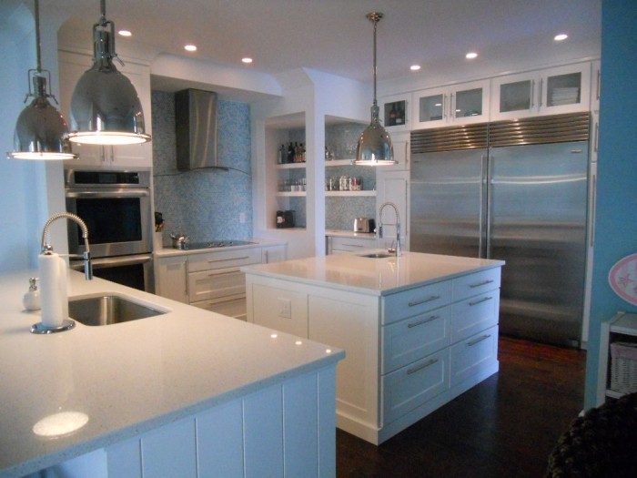
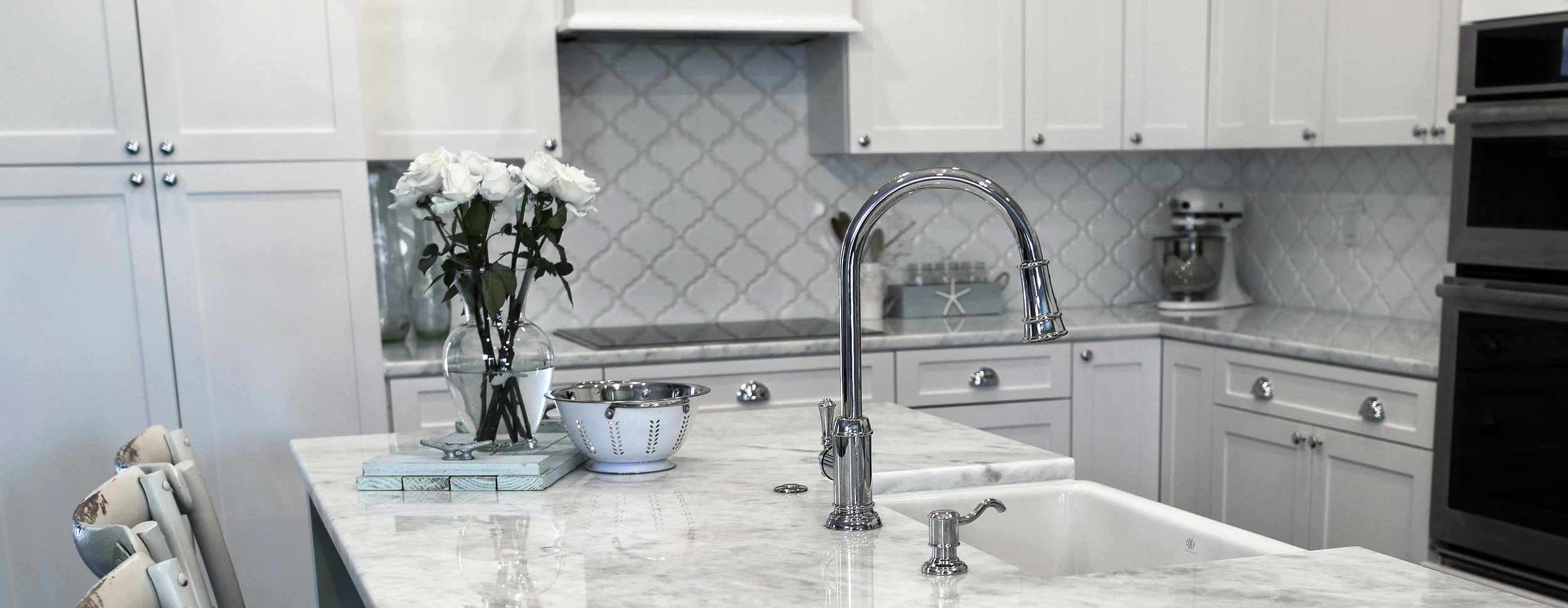
white shaker, florida kitchen, quartz countertop, subzero, kitchen planning

       2.  Moving and grooving

  • Can you move easily around your kitchen without tripping over someone or something?
  • Do you have defined work centers, one for food preparation, cooking and cleanup? There could be additional work centers but these are the minimums.


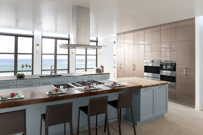
  • WoodMode, oceanside, beach kitchen, kitchen planning

       3.    Storage 

  • Granted you’ll be needing the most storage through the holidays. Do you have enough? If you can say yes right now you’re probably golden for the rest of the year too.
  • Remember there is storage and then there is accessible storage.  Shoot for both.  You need certain items everyday but others only once a year. Is there a certain item you always have to hunt for?  Is there a place for all your stuff and does your stuff go back there when not in use?
  • modern-kitchen, white cabinets, contemporary kitchen, high gloss cabinets, red accents, LED lighting, kitchen planning

       4.   Make it Safe

  • When kitchen planning this is important for everyone but especially children and physically handicapped people.
  • Is your floor slippery? Do you have enough space on either side of the stove so that pot handles don’t stick out? Are knives located in a place that’s easy for you to access but hidden from little ones? A “touch on” faucet can reduce the risk of accidental scalding.

    5.  Let there be Light

  • Can you see what you’re doing? Consider adequate overall light as well as task lighting which focuses on your work areas.  Do you need to add more or better lighting underneath your upper cabinets to illuminate the counter? Does the room get enough natural light or do you need to bump it up with some recessed ceiling lights or pendants?

This is only the beginning!  You can create a really helpful kitchen planning list from answering these questions. A kitchen is a big investment so it only makes sense to invest in planning carefully before you begin.  I'd love to hear from you!


Reinventing White Shaker Cabinets

There's a reason why white Shaker  cabinets are so hot; it's because they are so versatile, just like pasta, the final result depends on what you put with it.  Not only can you get this style in any price point but you can make it work with your own unique design style. Today I thought we'd take a look at some very different successful results all using garden- variety white Shaker cabinets.

Traditional to Transitional white Shaker cabinets with 2 1/4" frame (stiles and rails)


First of all, in case you've been off somewhere living in a cave, Shaker cabinets feature what we call flat panel doors. There's a flat panel in the center surrounded by a frame.  That frame is typically 2 1/4" wide which will give you a traditional look or 3" wide which is a bit more contemporary.  A word of caution, if your kitchen will have small doors (less than 15" wide) and you're going to be using glass in the center, go with the 2 1/4" or the glass section will be too small.


Encyclopedia of Shaker Furniture


The modern Shaker style gets its name from the original Shaker furniture.  "Shaker furniture is a distinctive style of furniture developed by the United Society of Believers in Christ's Second Appearing, commonly known as Shakers, a religious sect that had guiding principles of simplicity, utility and honesty. Their beliefs were reflected in the well-made furniture of minimalist designs.- Wikipedia  American Shaker furniture originated in the 1700s and has changed little since then. Original Shaker doors typically had natural wood finishes but today white is all the rage.  Fast forward to the twenty-first century where all that white simplicity can get a bit  boring and generic.  With the big movement towards personalization and custom design you can rock that Shaker look and make it your own.  Here are just a few examples:

                                                                                                                                              Los Gatos kitchen

                                                                                                                                                  Photo by Margot Hartford Photography - Discover kitchen design ideas -Houzz
 
                                                                                                                                              Los Gatos kitchen
                                                                                                                                                    Photo by Margot Hartford Photography - Browse kitchen ideas - Houzz


21st Century Victorian

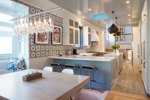
The kitchen above is situated in an 1892 Queen Anne Victorian home in California and features a totally different take on white Shaker.  Accents include a luscious blue color for the peninsula and gorgeous Mamounia tile from  the Martyn Lawrence Bullard Collection for Ann Sacks. I love the mixture of natural wood, white, the pattern of the tile and that perfect shade of blue.

                                                                                                                                           Los Gatos kitchen
                                                                                                                                                                        Photo by Margot Hartford Photography - More kitchen ideas - Houzz


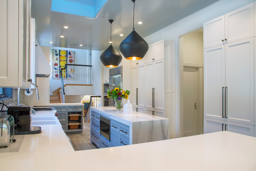
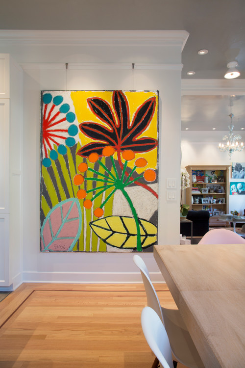
Since white Shaker cabinets are pretty much a blank canvas, they offer a great opportunity to showcase bold colorful art!  This painting installed in the kitchen/dining area is by Gordon Hopkins.

Mad for Mid-Century Mod

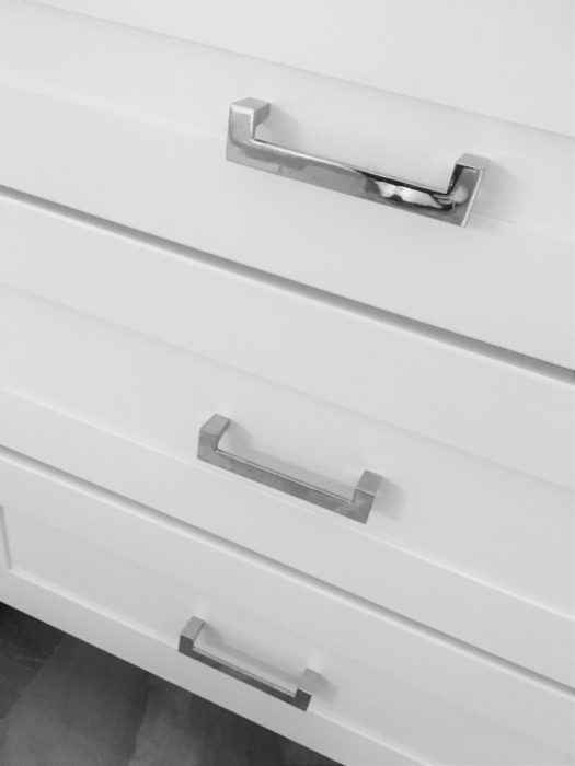
This new white Shaker kitchen is in a 1950's Mid-Century home in South Florida.  The homeowners wanted to retain certain elements such as this original planter and room divider to retain the fifties feel.  I always love to honor that concept when choosing finishing touches for the kitchen.  These handles complement the room divider perfectly and the Cambria quartz top emulates the original refurbished terrazzo floor in the main part of the home.   You don't have to retain all the original details but it can be very striking to tie a few elements together like we did here.

   white shaker cabinets, chrome cabinet pulls, chrome handles, midcentury modern, south florida kitchen


Cool Contemporary

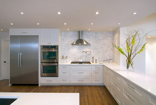
If you have embraced the clean crisp appeal of contemporary design,  you can also have that with white Shaker cabinets.  The example below from Houzz shows achieves a chic contemporary effect through long sleek bar pulls on the cabinets, the clean look of no upper cabinets and stainless steel accents.  The rich wood floor lends warmth to the space.  

                                                                                                                       Raleigh Hills Kitchen
                                                                                                                                              Photo by Rockwood Cabinetry - Browse transitional kitchen ideas- Houzz


There you have it! I would love to help you "shake things up" with your own white Shaker cabinets. Email me at artfulkitchensbyglo@gmail.com  If you would like to have Artful Kitchen blog posts conveniently delivered to your inbox, please subscribe by entering your email in the sidebar.


Natural Stone 101

Natural stone is sexy.  There, I've said it.  If you want a countertop that makes a unique statement with lots of movement and natural variations I recommend natural stone.


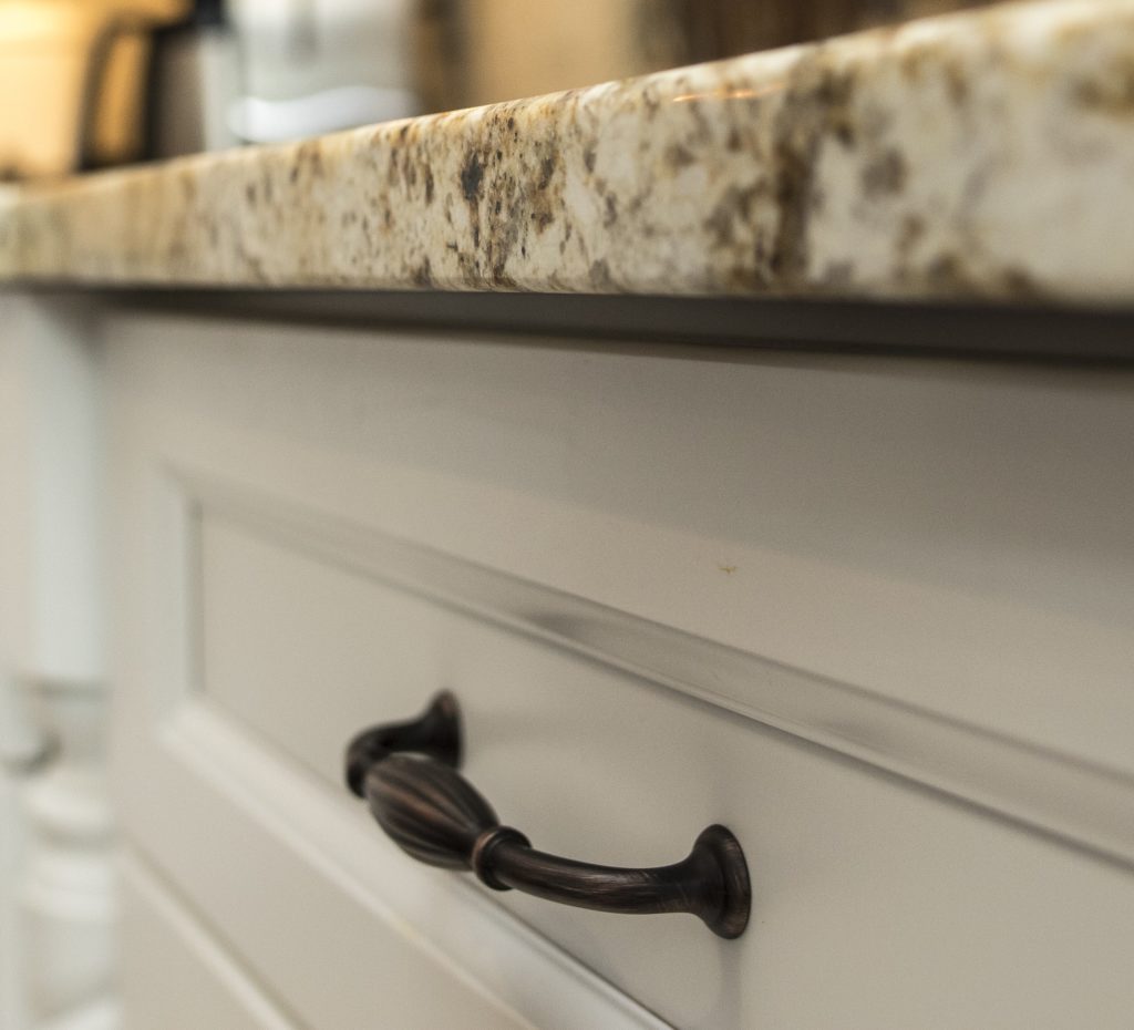
granite countertop detail, oil rubbed bronze handle, white cabinets


A big part of your new kitchen investment lies in the countertop material you decide to use. It’s definitely one of the key players both in terms of function and aesthetics.  It is your work surface and it is one of the most visible features of your kitchen.   In terms of user friendliness and durability it usually comes down to natural stone or man made products such as quartz. There's nothing wrong with the other options, I love them too in the right applications, but if you're looking to personalize your kitchen and be, wait for it, DIFFERENT, go natural.   When I say natural stone I mean granite, quartzite, marble, limestone, soapstone, slate and onyx.  There are a variety of choices that can be used in various applications.  So what’s the difference and what’s the best option for you?


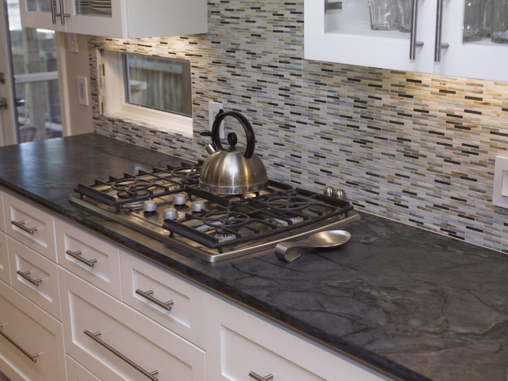
Dorado soapstone by Latera Architectural Surfaces

Soapstone-  This is a very viable option for both indoor and outdoor countertops.  It’s unaffected by heat, acid and alkalis.  It’s also non-porous which means it is inherently antibacterial and won’t stain. On the other hand it is soft and can scratch but can be sanded and repaired.  Colors are pretty much limited to greys, greens, blues and blacks with subtle lighter veining.  Like with all natural stone, price is largely determined by how close you are to the source (quarry or port).  You can expect to pay at least as much as you would for granite in most places.

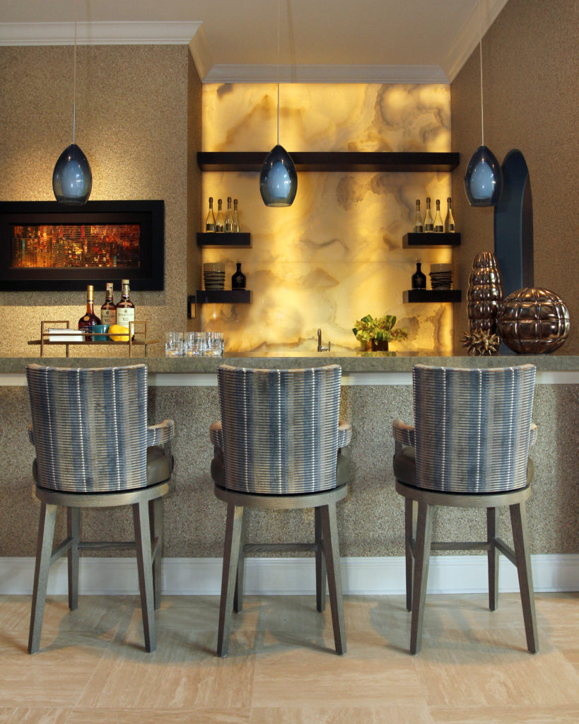
Backlit onyx is a dramatic backsplash for this bar! Source

Onyx- The biggest appeal of onyx is its beauty.  It’s absolutely gorgeous! If it’s a statement you’re after this could be it.  It’s found in a variety of colors,  known for its translucent quality and is frequently enhanced with back lighting. It’s not particularly durable but could be a good choice for a dramatic powder room or bar top.  This is also one of the most expensive of the natural stone choices.

Granite- This is the natural stone that you are probably the most familiar with.  It is found in a wide variety of patterns and colors.  It is typically heat resistant and non porous although less so than quartzite.  This stone is usually offered at various price levels, 1 being the most inexpensive and easy to come by and 5 being at the pricier end.  

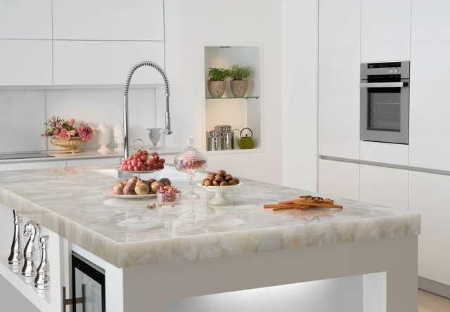
Quartzite- Not to be confused with quartz which is a man-made product, quartzite is the Rolls Royce of natural stone tops.  It’s the ultimate in both beauty and durability which is why it is so expensive.  It is also extremely hard, requiring a diamond saw to fabricate.

white quartzite counter Marble of the World

Marble-At the moment, nothing is more popular than the look of white Calacatta marble.  It is beautiful but sadly it is not the best choice for your kitchen countertop.  Marble is porous which means it will stain and etch.  If you throw caution to the wind and decide to use it anyway, make sure you seal it regularly and  just expect it to season with time like something you’d find in an old French bistro. Oui?

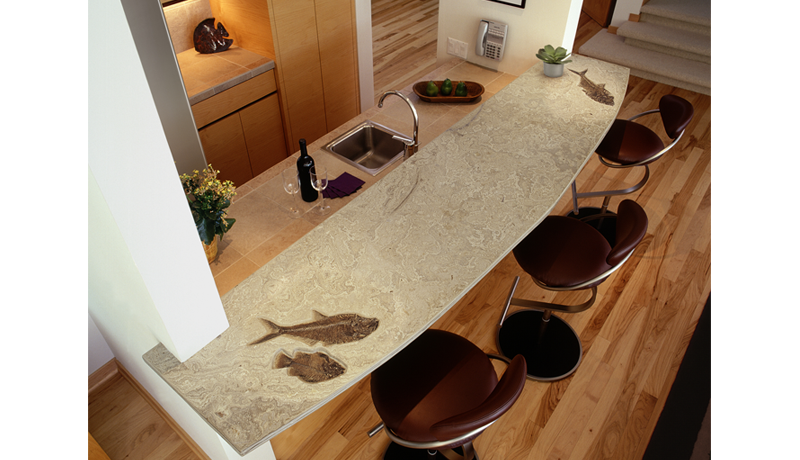
Limestone countertop with honed finish features 50 million year old fossils

Limestone-  This is a very “Florida” look, great for floors and walls but it’s going to require maintenance if you decide to use it for a countertop..  It is very porous and must be maintained regularly with a sealer.  I do love the look of embedded shells and fossils you can get with some limestone. Choices include beiges to soft browns.

Slate-This is another stone that’s great for flooring and exterior as well as interior applications. It can be rustic or modern and is usually found in dark colors like blacks and grays. 

There you have it, natural stone 101.  I’d like to thank the folks at MIA+BSI: The Natural Stone Institute who sponsored this post.  You can find more info at  www.usenaturalstone.com.