Reinventing White Shaker Cabinets

There's a reason why white Shaker  cabinets are so hot; it's because they are so versatile, just like pasta, the final result depends on what you put with it.  Not only can you get this style in any price point but you can make it work with your own unique design style. Today I thought we'd take a look at some very different successful results all using garden- variety white Shaker cabinets.

Traditional to Transitional white Shaker cabinets with 2 1/4" frame (stiles and rails)


First of all, in case you've been off somewhere living in a cave, Shaker cabinets feature what we call flat panel doors. There's a flat panel in the center surrounded by a frame.  That frame is typically 2 1/4" wide which will give you a traditional look or 3" wide which is a bit more contemporary.  A word of caution, if your kitchen will have small doors (less than 15" wide) and you're going to be using glass in the center, go with the 2 1/4" or the glass section will be too small.


Encyclopedia of Shaker Furniture


The modern Shaker style gets its name from the original Shaker furniture.  "Shaker furniture is a distinctive style of furniture developed by the United Society of Believers in Christ's Second Appearing, commonly known as Shakers, a religious sect that had guiding principles of simplicity, utility and honesty. Their beliefs were reflected in the well-made furniture of minimalist designs.- Wikipedia  American Shaker furniture originated in the 1700s and has changed little since then. Original Shaker doors typically had natural wood finishes but today white is all the rage.  Fast forward to the twenty-first century where all that white simplicity can get a bit  boring and generic.  With the big movement towards personalization and custom design you can rock that Shaker look and make it your own.  Here are just a few examples:
                                                                                                                                              Los Gatos kitchen

                                                                                                                                                  Photo by Margot Hartford Photography - Discover kitchen design ideas -Houzz
 
                                                                                                                                              Los Gatos kitchen
                                                                                                                                                    Photo by Margot Hartford Photography - Browse kitchen ideas - Houzz


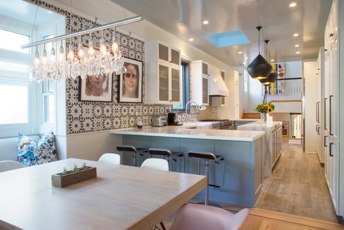
21st Century Victorian

The kitchen above is situated in an 1892 Queen Anne Victorian home in California and features a totally different take on white Shaker.  Accents include a luscious blue color for the peninsula and gorgeous Mamounia tile from  the Martyn Lawrence Bullard Collection for Ann Sacks. I love the mixture of natural wood, white, the pattern of the tile and that perfect shade of blue.

                                                                                                                                           Los Gatos kitchen
                                                                                                                                                                        Photo by Margot Hartford Photography - More kitchen ideas - Houzz


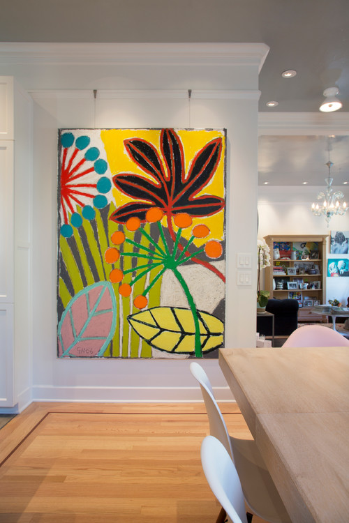
Since white Shaker cabinets are pretty much a blank canvas, they offer a great opportunity to showcase bold colorful art!  This painting installed in the kitchen/dining area is by Gordon Hopkins.

Mad for Mid-Century Mod

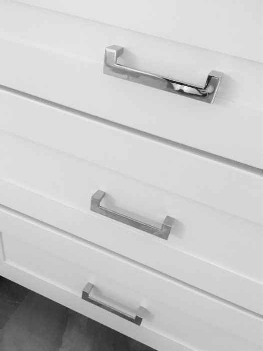
This new white Shaker kitchen is in a 1950's Mid-Century home in South Florida.  The homeowners wanted to retain certain elements such as this original planter and room divider to retain the fifties feel.  I always love to honor that concept when choosing finishing touches for the kitchen.  These handles complement the room divider perfectly and the Cambria quartz top emulates the original refurbished terrazzo floor in the main part of the home.   You don't have to retain all the original details but it can be very striking to tie a few elements together like we did here.

   white shaker cabinets, chrome cabinet pulls, chrome handles, midcentury modern, south florida kitchen


Cool Contemporary

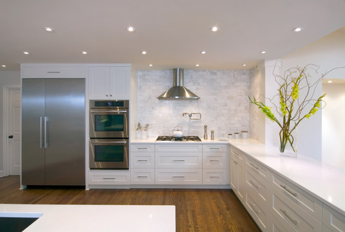
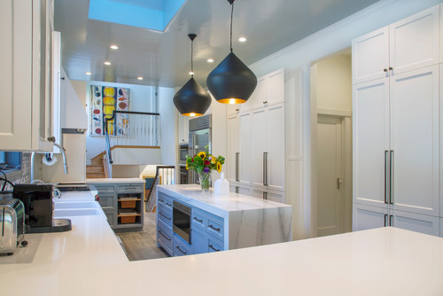
If you have embraced the clean crisp appeal of contemporary design,  you can also have that with white Shaker cabinets.  The example below from Houzz shows achieves a chic contemporary effect through long sleek bar pulls on the cabinets, the clean look of no upper cabinets and stainless steel accents.  The rich wood floor lends warmth to the space.  

                                                                                                                       Raleigh Hills Kitchen
                                                                                                                                              Photo by Rockwood Cabinetry - Browse transitional kitchen ideas- Houzz


There you have it! I would love to help you "shake things up" with your own white Shaker cabinets. Email me at artfulkitchensbyglo@gmail.com  If you would like to have Artful Kitchen blog posts conveniently delivered to your inbox, please subscribe by entering your email in the sidebar.



The Best of KBIS 2016

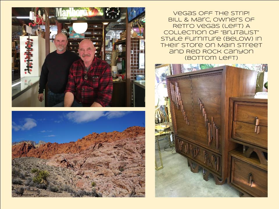
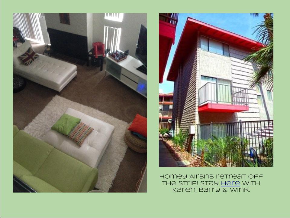
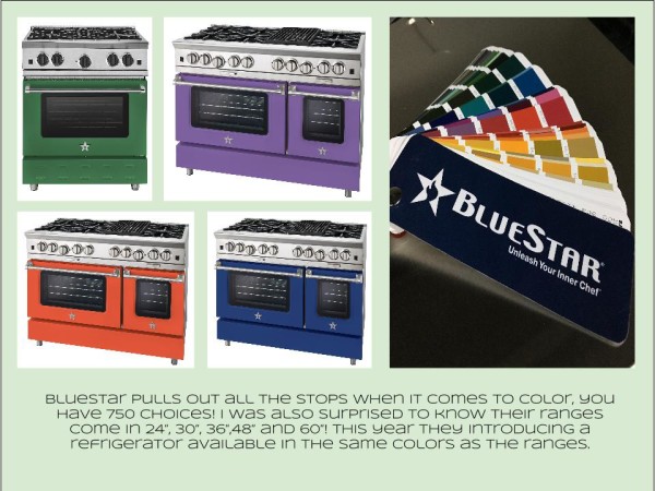
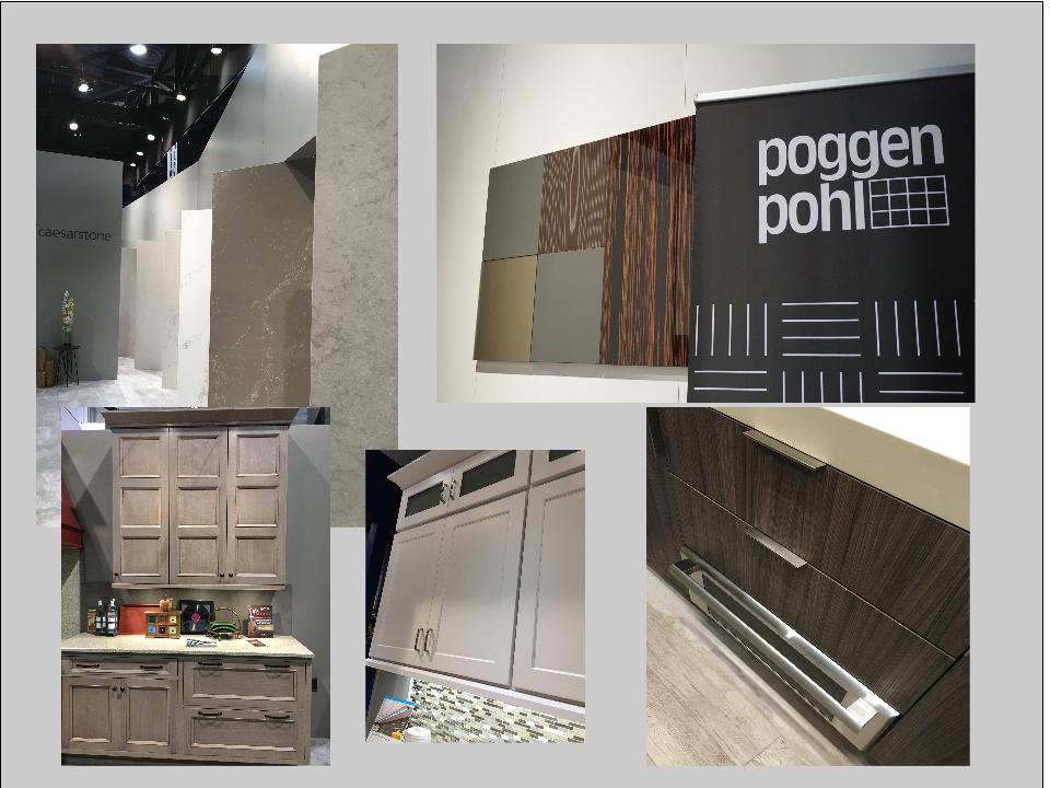
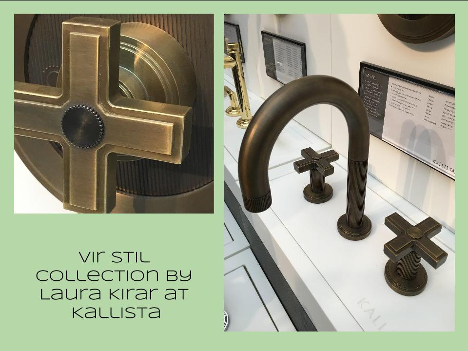
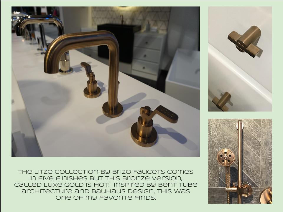
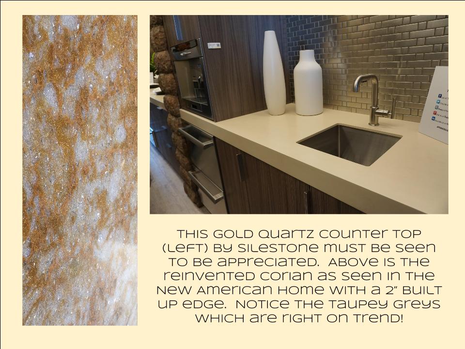
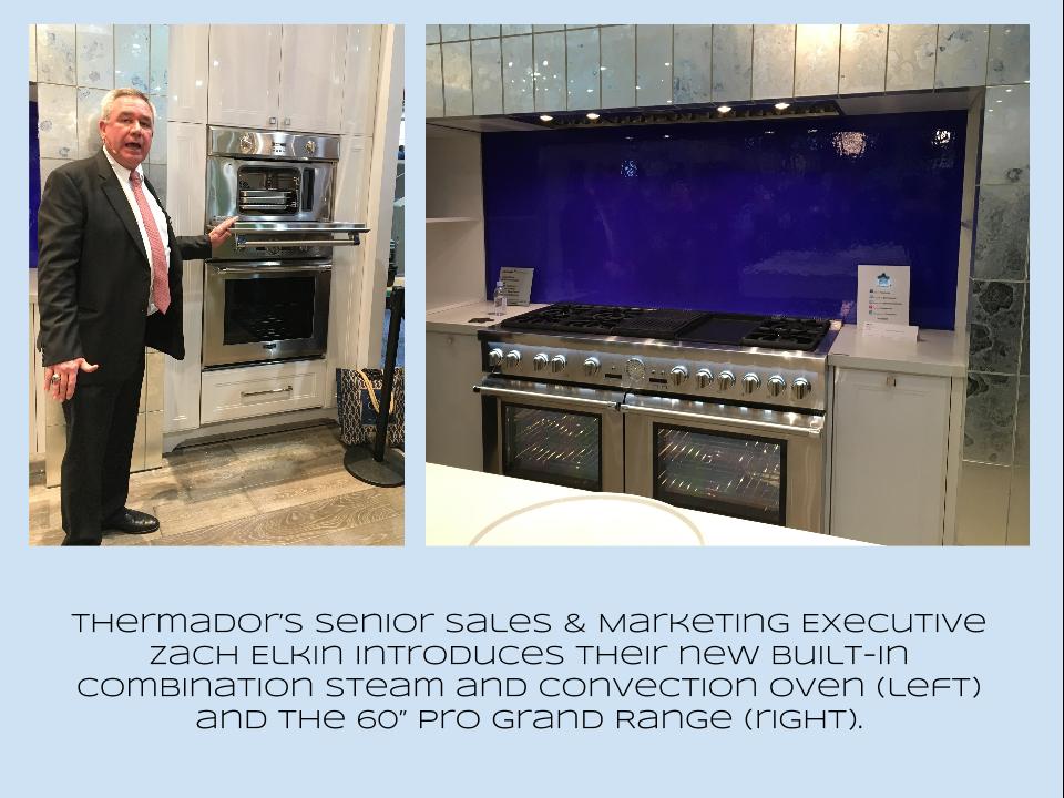
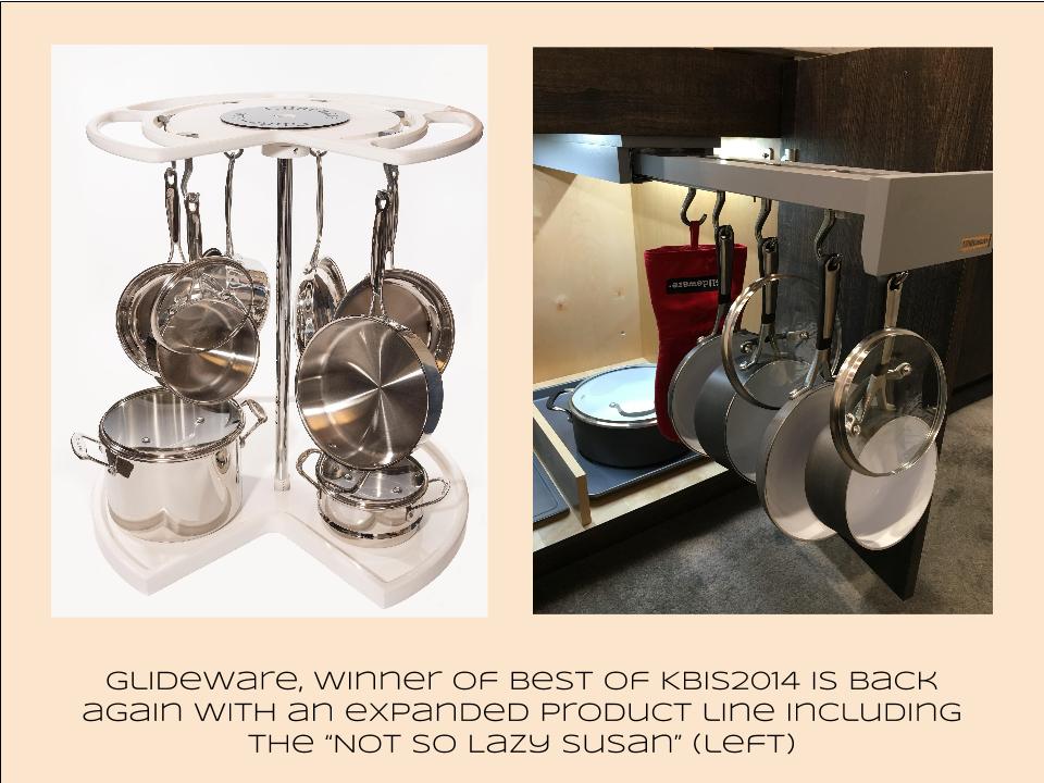
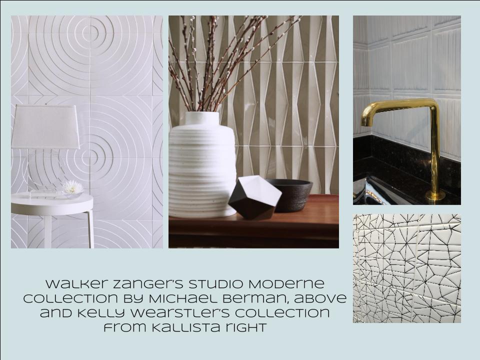
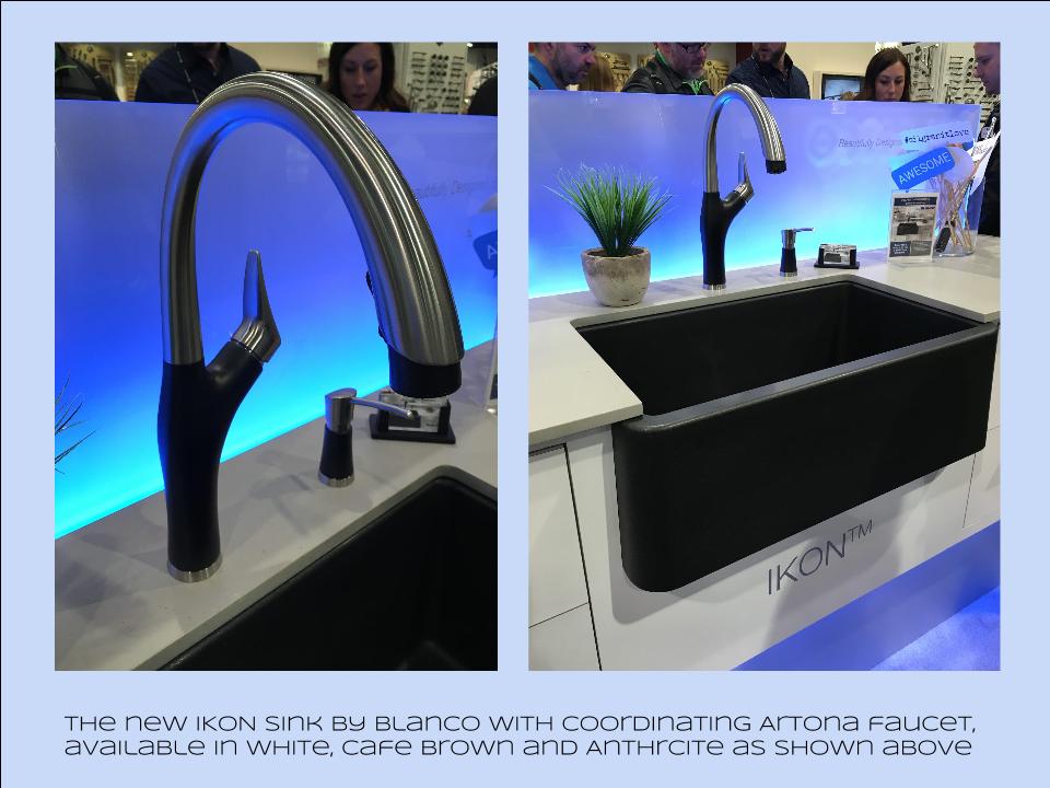
Bam!  Another show is in the books and although it's been a busy week "back at the ranch", I've been dying to share my finds with you right here on Artful Kitchens.2016-01-19_184543141_4F428_iOS (2)Las Vegas was host to three days of networking and education for the best of the Kitchen & Bath industry.  As a member of the Kitchen & Bath Business Magazine's Advisory Board,  I had the pleasure of appearing on the KBIS Next stage as a part of the panel discussion entitled Trials & Tribulations-Solutions to Your Biggest Kitchen & Bath Challenges. It was an exciting exchange of ideas between both the pros on the panel as well as a savvy and engaged audience.Vegas Off the Strip Karen (1)I also had the opportunity to spend some time in the Las Vegas I like best, off the strip! I hiked in the Red Rock Canyon and visited my friends at Retro Vegas on Main Street. My digs for this trip were with my dear pals Karen, Barry & Wink.  They live in a midcentury modern gem that, rumor has it, was briefly home to Lucille Ball!  They are avid Airbnb'ers and wonderful hosts.  Check it out if you find yourself in Vegas. This location is so convenient to the Convention center I could walk, which I did, once.  Mostly I Ubered. Enough walking happens on the show floor!  So without further ado, here's my recap of the biggest and most notable trends and products that caught my eye at KBIS2016. ColorWhite still reigns.  In fact paint giants Benjamin Moore and Sherwin Williams have both selected shades of white as their color of the year.  You know I am a huge white fan. It is always the best backdrop for art and design. It also continues to be the favorite cabinet color in my area.  Remember white is not just white, there are an infinite number of varieties you can have fun with.  If you need more punch in your kitchen you could find some great options at the big show.  I saw bright saturated colors in several appliance brands including Bertonazzi, Viking and BlueStar which offers 750 colors!  color (2)Grey has not left the stage.  The newest versions are warm, venturing into taupe territory. Textured wood grains such as cerused oak are really popular. Wood-Mode showed both traditional and contemporary versions of ribbon Mahogany.Cabinets Poggenpohl_Diamond Grey_Oak Honey BrownThe Perfect TouchTouch latch technology was EVERYWHERE!  If you prefer a sleek, uninterrupted look for your cabinets and appliances this is for you, a gentle nudge will open your cabinets. This is nothing new but it's taken off.  I also loved the button that allows you to close this cabinet when you're done without resorting to dangerous acrobatics (I'm short).Untitled drawing (5)Feeling BrassyActually brass, copper, bronze and myriad versions are hot for plumbing fixtures and hardware.  My favorites were the new BauHaus inspired Litze collection by Brizo Faucets. and Kallista's Vir Stil collection.LitzeNot Your Grandma's CorianIf you're like me Corian has been dead to you since about 1998.  That sentiment has now ended in my book.  I saw a 2"thick sleek contemporary version of Corian that was perfectly at home in The New American Home.  The other exciting thing I saw in counter tops was this quartz by Silestone.  Yes, it's GOLD!  I just wish the photo could capture it's sparkly beauty.CountersThrills from ThermadorAppliance brand Thermador held a press conference on the show floor to introduce a couple of impressive new products, the 60" pro range available with steam and a double oven featuring steam and convection.  These are firsts in the industry.ThermadorOrganize ItJust when I thought we had it all the category of organization it goes to the next level. There was a great representation of brands ranging from Hafele to Rev-A-Shelf to Hardware Resources but Glideware is taking the market by storm.  If you've got a mess lurking somewhere I guarantee there's a way to make it neat and accessibleRev A ShelfGlidewareTile StyleMy two tile favorites were Michael Berman's Collection from Walker Zanger and, of course, Ann Sacks who are featuring a new line by L.A. design maven Kelly Wearstler. Love!Tile (1)I can IKONIf you read my blog you know I love me my Silgranit sinks, meet IKON the apron front version which easily works in any style kitchen from Traditional to Contemporary. Their Artona  faucet perfectly complements the Silgranit sink.-BlancoStikwood Rocks!

Stikwood’s line of lightweight, real-wood planking offers designers and DIYers a peel-and-stick solution to achieve that perfect, sought-after blend of rustic and modern. It can be used on walls and ceilings and comes in tons of colors, even prints! I'm thinking this could be great on the back of a kitchen island.

stikwood

Believe me, all this is just the tip of the proverbial iceberg.  There was so much more to see and learn about at KBIS 2016.  Check out this year's winners of Best of KBIS for more info and of course if you'd like any more info on what you see here email me at artfulkitchensbyglo@gmail.com

TILE STYLE

Today I thought I'd continue with the eye candy theme.  You see I'm actually helping you.  I parade all types of enticement across my blog so you can formulate your own kitchen creation strategy. So take note!  Today's yumminess comes in the form of Ann Sacks Tile, one of  the most cutting edge and innovative suppliers of tile, stone and plumbing fixtures today.  It all began in 1980 when Ann Sacks discovered a box of Mexican Talavera tiles being sold as trivets.  These inspired her to start her own company and open her first showroom in the living room of her home!  The rest is history.
The Kiss by Gustav Klimt
Fritza by Ann Sacks

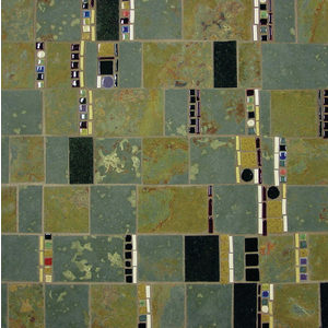
Inspired by the art of Gustav Klimt, Ann Sacks has recently introduced Fritza, a colorful mosaic run between strips of tetra slate and black granite. This is a great way to add a little art to your kitchen.  What a great backsplash this would make!

Another one of my favorites is this tile from the Forms collection by Angela Adams (left).  This is perfect if you're going for a mid-century modern appeal. 
 
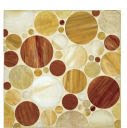
Erin Adam's Facet Mosaic features a circle design in tones that blend beautifully with just about any wood grain


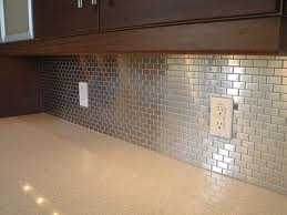
The stainless steel look is another interesting backsplash treatment for your kitchen.