Art for the Kitchen & Bath

If you know me you know I'm always thinking about art and artfulness. When it comes to incorporating creativity into the home, I love finding paintings and ways to showcase sculpture and artisan items in a seamless way, especially in kitchens and baths. I recently attended ICFF Florida (International Contemporary Furniture Fair) in Fort Lauderdale and right off the bat I noticed the amazing work of Lee Brock! She makes original digital paintings directly on metal which makes them a natural for the heart of the home. I thought it would be fun to get to know her.

paris_rain_dkbl_rest_web.jpg

Paris Rain from Lee Brock Art & Design Paris Collection

AK- What is your inspiration?

Music, culture, history, nature, science, good design and other artists. Making art centers me, like meditation, it is cleansing for me.

AK- Do you accept custom commissions? What is the process for this type of order?

Yes, I do. At this time I am only offering commissioned work with the digital process. The digital images in my catalogs can have custom color themes applied to them, with outcomes dependent on the file type. A discussion in person is always a great way to get a commission started. My studio is in Fort Lauderdale and is a good place for a meeting. That said, communication can also be over the internet. The biggest hurdle with the digital files is getting the colors correct. It is important that samples from the print company I am working directly with are actually seen - in the clients hands - during the process. These are printed on PVC and are part the overall cost. I am always open to creating new designs for clients who have some particulars in mind. 

box_of_winter_bath-1024x783.jpg

"Box Full of Winter" It's not what you think it is!

AK- Do you have a favorite piece?

Right now it is “Box Full of Winter” (above). Most viewers see a bouquet of flowers, which is fine, but it is really about air-conditioning. For me it portrays that feeling of coming into a lovely air-conditioned building after being out in the hot tropical weather of South Florida. 

Lee Brock, she also does works on paper. Here she is with her silkscreen prints

AK- What is your background and how did you get into making prints on aluminum?

I grew up in the US and in Europe. I had a natural ability to draw realistically early on. In my teens I discovered abstract expressionism and have been exploring it in many mediums ever since. However, I pursued cooking as a career and not art. I spent some 30 years making art with food. Privately I continued to paint and draw. I left cooking in 2012 and got an associate degree in graphic design at Broward College in Fort Lauderdale. Three years ago I started painting digitally on an iPad while I was traveling. Printing these digital images on the white aluminum came about from exploring the commonly used substrate options available. None of the other finishes created the clean modern look I wanted. One day I was discussing options at a print company I work with and I saw a white aluminum sign blank, the kind that is used for street signs. Eureka! The bright white gloss finish reflects ambient light and color, adding a subtly changing effect into the printed design. I choose images that will work well with this effect. Being waterproof and washable are added benefits I hadn’t thought of. 

riverside_d_dining36.jpg

Riverside from the New York Collection

AK- I have seen your beautiful catalog.   Do you work on any other materials besides aluminum? 

Yes I do. I love painting and drawing on paper. I often like to work fast and automatically and paper is perfect for that. I am not painting on canvas with oil at this time because of space restraints. I am painting on canvas with acrylic. I adore making monoprints, etchings and screen prints. I have a screen print project I want to get started with soon. I am also a photographer.

You can find more of Lee's beautiful work in her catalog right here.

Materials at Play- ICFF South Florida 2018

Every now and then it's fun and inspiring to venture away from the drawing board to get out and about.  I didn't have to travel far for my latest adventure which took me to the  International Contemporary Furniture Fair (ICFF) Florida. 

ICFF South Florida 2018

ICFF South Florida 2018

This small tradeshow was held at the Fort Lauderdale Convention Center December 4-6.   The next ICFF happens May 19-22 at the Javits Center in New York City. It was clear to me at once that the theme for this year was materials. Whether it was innovations, original usage, mixing, texture etc. it was all about materials and combinations.   Speaking of materials, there were three separate exhibits showcasing natural wood with resin furniture and  "live edge" tables. Vendors were global with strong European as well as domestic representation.  I attended on opening day and exhibitors were eager to chat and show off their wares.    They say a picture is worth a thousand words,  If that is true, just think what a video is worth! That is why I had great fun creating this visual recap of ICFF for you.  Tell me what your favorites are and let's create something together!! xoxo

For a complete list of vendors exhibiting at ICFF South Florida click here.

Kitchen Design Case Study: Awkward Angles

Every time I think I've seen it all  I'm challenged to create a kitchen design that seems impossible! Such is the case with this recent project.  This home is located in Palm Beach Gardens, Florida and features not only a stunning view but also the strangest shaped kitchen! Sometimes I wonder what architects are thinking.  

coastal kitchen watercolor render blue island chief architect kitchen design

coastal kitchen watercolor render blue island chief architect kitchen design

Step 1- Let there be walls

(to scale and correctly angled)

I can't even begin to design until I can get the walls drawn to scale.  I had a physical blueprint which (after some quick research) I was able to trace over in my design program (Chief Architect).  Once I did this I discovered those angles are 30 and 60 degrees, not the typical 45!  There was no possibility of changing the shape of this kitchen.

blue print kitchen with angles

blue print kitchen with angles

Step 2- Embrace the Space

One thing I have learned is that you will never win by trying to fight the space you're designing.  Honor it, whatever it is, if you can't change it. That is the only way to end up with a design that is timeless and looks like it has always "lived" in the space. In this case, that means embracing the angled main wall while allowing ample and efficient flow.

Step 2- How to make it better

Once I had the walls accurately represented I evaluated the current layout keeping my client in mind.  He loves to cook and he and his girlfriend love to entertain.  Here are my observations:

-Cabinets are too low, not taking advantage of the high ceiling and limiting storage

-The big POINT on the island has to go! That just jumped right out at me and called for correction

-We are in need of an update and new appliances that are up to the task of my client's cooking endeavors

-The shape of the island does allow for lots of storage but also lots of walking.  The sink is pretty far from the main wall.

-With the boat docked outside and observing everything else about the home I knew my clients' style is casual, Florida-Coastal and they are much more "comfortable" than contemporary.

a boat in the back with pool and canal palm beach gardens

a boat in the back with pool and canal palm beach gardens

Step 3- The Solution

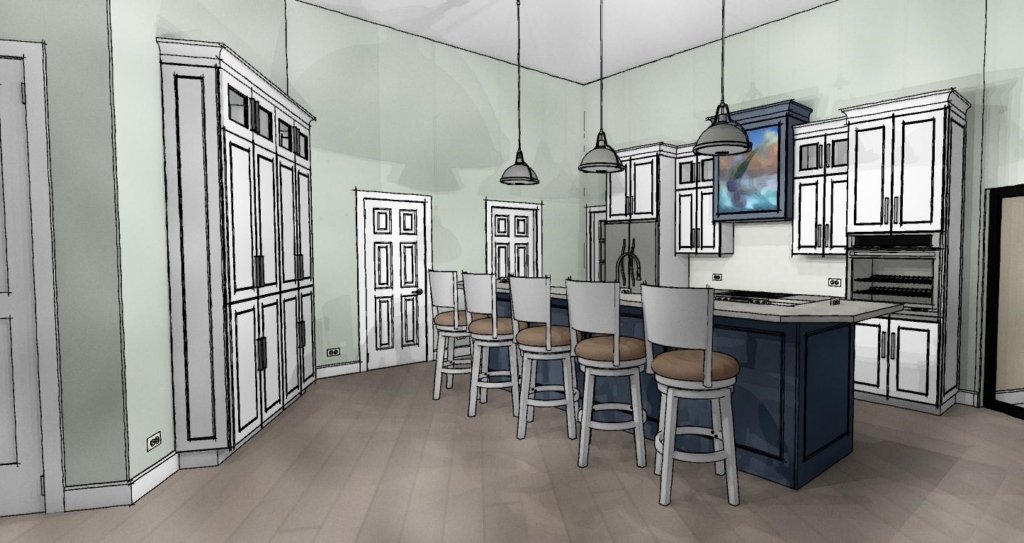
The first thing I did was the back wall.  I knew it had to accommodate the refrigerator and the new wall oven my client selected.  The fridge and stove were already there so no need to reinvent the wheel.  Remember it saves money when you can keep your major appliances in the same, or close to the same location.  In the new design cabinets are now eight and a half feet high plus crown molding.  The upper, hard to access area, features glass doors to add a bit of style and aesthetic appeal which incidentally the homeowner mentioned he wanted.  This is the perfect spot for showcasing a collection and you can change the flavor by changing the contents when the spirit moves you.  Versatility is always an important aspect of my designs.  We've also got generous counter space next to the fridge, on each side of the stove and next to the ovens, a must!  That was the easy part.

white kitchen Palm Beach Gardens coastal style white cabinets blue accent kitchen design

white kitchen Palm Beach Gardens coastal style white cabinets blue accent kitchen design

Now for that island.  Hmmm.  Since I'm updating that means I'm simplifying.  I'll honor that angle but I think simplicity will calm the "angle noise".  It's a popular trend these days to keep an island all at one height but I didn't think it was the right solution for this project.  It turns out I was right and my client was so relieved!  This island is really a serious cleanup and prep space and with such an open space a little buffer was needed.  The raised bar also makes me think of the captain behind the wheel, it's sort of boat-like. Pulling the island closer to the main wall (still allowing 48") not only reduces the chef's steps but discourages unwanted traffic from congregating behind the island and getting underfoot. Now our island contains all the essentials but, not gonna lie, we've lost a little storage.  To compensate I added a section of full height cabinets to balance out the kitchen. Glass panes at top reference those on the main wall.  We're keeping these at 15" deep to keep the space open.  Another benefit of shallow tall cabinets is that you will do just fine with adjustable shelves whereas, in a deeper, 24"cabinet, you'll probably need roll outs or stuff gets lost and is hard to access in the back.  Roll outs really add to the price of your cabinets too. 

Step 4- More About Those Aesthetics

Now that the layout is solved I think, what can I do to make this kitchen design stand out and fit my client's personality? A deep nautical blue island and coordinating hood of course!  I also loved the idea of creating a spot for an ocean scene front and center on the hood itself.  This is a great place to add a painting you love and, again, you can change it up! Voila

awkward angle kitchen floor plan view kitchen design

awkward angle kitchen floor plan view kitchen design

What do you think of this kitchen design? Are there any elements here you can apply to your own situation? This project is now underway and I look forward to sharing the outcome!

5 Ways to Make Any Kitchen Your Own Stylish Sanctuary

Do you get frustrated looking at all the beautiful images on Houzz and Pinterest? If only, right?  The good news is you don't always have to shoot the budget to have a kitchen that is your own unique design statement.  This means you're going to have to forgo the temptation to slavishly emulate the trend of the moment in exchange for investing in a look that is authentically your own.  Yes! Inject your own personality, make it versatile to allow for your moods and you will have something timeless that will always give you joy. Read on and I'll show you how.

5 Ways to Make Any Kitchen Your Own Stylish Sanctuary

5 Ways to Make Any Kitchen Your Own Stylish Sanctuary

Own Your Color

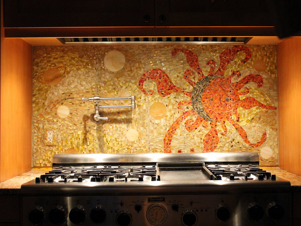
A favorite color is one way to create a personal statement in your kitchen.  Perhaps you embrace all color bright an bold.  If this is your cup of tea allow yourself open space and glass front cabinets to show your true color in all its glory.  I recommend keeping the fixed elements such as flooring and countertops neutral so you can play more with color in ways that are versatile. This would include paint, dishes, artwork and decorative items.   A nice crisp white is always a great backdrop to vibrant hues. If you are an adventurous soul because that's your personality, create a focal point like this beautiful back splash using your favorite color.  Just keep it over one area such as the stove.  Less is more and you don't want to dilute the power of the statement, right?

5 Ways to Make Any Kitchen Your Own Stylish Sanctuary

5 Ways to Make Any Kitchen Your Own Stylish Sanctuary

5 Ways to Make Any Kitchen Your Own Stylish Sanctuary

5 Ways to Make Any Kitchen Your Own Stylish Sanctuary

"Artful detail can literally be art such as paintings and sculpture but it can also be beautiful hand made utilitarian items, family treasures or books."

Embrace Your Architecture

Believe me, I have tried to "correct".  Sometimes you can but often it just doesn't work. I have had much better results when I embrace the fixed conditions I am faced with when creating a new design.  These issues can include angles, bump outs, ceiling height differences and last but not least the age and era in which a home was built.  Your space should look like it belongs.  This happens when you match the style of your design to your home.  In fact, I always try to look for clues such as arches and fixed architectural elements that I will repeat in the design. If your kitchen "goes with" your home it will always be right.

5 Ways to Make Any Kitchen Your Own Stylish Sanctuary

5 Ways to Make Any Kitchen Your Own Stylish Sanctuary

In this kitchen which you can read more about here, we were stuck with some of the angles (yes there were more) as they are exterior walls. What we did do was move the refrigerator. It used to be where the hood is. It opens up space and gives us a focal point. We also eliminated angles on both the island and the peninsula. Now my client has a kitchen that makes sense and functions perfectly for her lifestyle.

Go Within

The way you customize your cabinet interiors is always based on the way you live.  Think about it.  Is there one particular item that just doesn't have a home with enough space in your kitchen? It could be food storage containers, pots or even trash!  It's different for everybody. Even if you have a small kitchen you can maximize function.  There are solutions.

Dish drawer, dish pegs, black plates, drawer cabinet

5 Ways to Make Any Kitchen Your Own Stylish Sanctuary

If you're short (like me;-) or you're just short on upper cabinets, this drawer insert featuring dish pegs can be used to customize your dish storage. Food storage containers are so necessary but can be a PIA, if you know what I mean. You may even be able to retrofit one of your cabinets with one of these handy pull out organization systems by Revashelf.  These are just two examples but there are so many options.

5 Ways to Make Any Kitchen Your Own Stylish Sanctuary

5 Ways to Make Any Kitchen Your Own Stylish Sanctuary

Customize Work Centers

Every kitchen has a work center for food prep, clean up and cooking. Sometimes in small kitchens, they overlap but those are the basics.  Add your own as needed to customize your kitchen.  Think media center or beverage center to house your coffee or tea stash and accoutrements. Those are two popular ones that come to mind.  How about a pet center? It could be as easy as designating a certain space or cabinet and tricking out the inside. It can be planned in a new kitchen or created in your existing space.

5 Ways to Make Any Kitchen Your Own Stylish Sanctuary

5 Ways to Make Any Kitchen Your Own Stylish Sanctuary

A media center in a drawer! Measure your devices and make sure you have enough USB outlets and  you're good to go.  Sometimes it's nice to put the phone away.  Who knows what could happen ;)

5 Ways to Make Any Kitchen Your Own Stylish Sanctuary

5 Ways to Make Any Kitchen Your Own Stylish Sanctuary

This is WoodMode's version of a pet center.  They call it a Pet Parlor and you can create this with most cabinetry

Artful Detail 

Artful detail can literally be art such as paintings and sculpture but it can also be beautiful hand made utilitarian items, family treasures or books.  If you have the room I encourage you to try and leave some open space to display such items and change them out as the mood strikes you.  This is perhaps the easiest way to make a neutral space very personal and joyful to be in.

5 Ways to Make Any Kitchen Your Own Stylish Sanctuary

5 Ways to Make Any Kitchen Your Own Stylish Sanctuary

Many kitchens have a wall on at least one end which is a perfect place for a small gallery of paintings, floating shelves or one big piece of art.

5 Ways to Make Any Kitchen Your Own Stylish Sanctuary

5 Ways to Make Any Kitchen Your Own Stylish Sanctuary

These hand-carved spoons could be considered "working sculpture" in my book.  Speaking of books, I think they enhance every space.  I love my well-worn cookbooks that probably contain bits of all the meals cooked from them!

5 Ways to Make Any Kitchen Your Own Stylish Sanctuary

5 Ways to Make Any Kitchen Your Own Stylish Sanctuary

This is a home run for me books + art!!  I love it and if you do too we'd probably get along :) 

COMING SOON!

My quarterly newsletter is coming soon.  See what I've been up to in my real life Palm Beach County projects along with new products and where you can shop locally for the best selections and value. Subscribe below so I can keep you in the loop! xoxo

Going Topless...In Your Kitchen

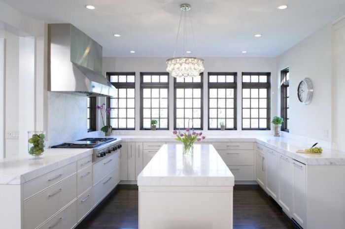
Unless you've been living under a rock you know that the less-is-more look of the topless kitchen is hot!! When I say topless I mean no upper cabinets. There are certainly pluses and minuses to this design decision. But "how can I live without half my kitchen", you ask.  Fear not. Today we will examine the possibilities.

white kitchen, traditional kitchen, stainless steel hood, island, white countertop, kitchen windows, crystal chandelier,no upper cabinets

white kitchen, traditional kitchen, stainless steel hood, island, white countertop, kitchen windows, crystal chandelier,no upper cabinets

Less is Now

No complaining if you haven't done a thorough kitchen purge in the last year.  We all have "stuff" and if it never sees the light of day it's stagnant energy taking up real estate that could be otherwise useful or beautiful.But what about dishes? They always go in the upper cabinets. Actually, dishes work perfectly in drawers if you have this drawer peg system.  You'll find that they're easier to access too, particularly if you're short like me ;)

Dish drawer, dish pegs, black plates, drawer cabinet

Dish drawer, dish pegs, black plates, drawer cabinet

Clever Corners

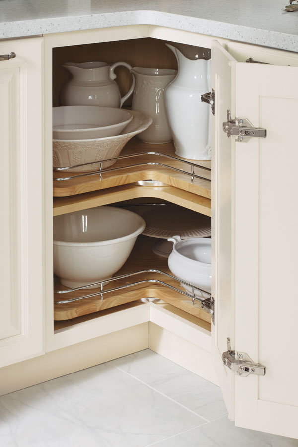
Another way to maximize the space you have below deck is to use the corner space.  My favorite way to do this is with a base lazy susan cabinet. It's versatile storage for almost anything. Just be sure to get this type, without the pole.  With trays mounted on shelves, you won't lose things to the Twilight Zone if they fall over.  (Chrome rails are optional) The only caveat is that you will need 36" on both sides of the corner to make this work.

base corner cabinet with lazy susan chrome rails

base corner cabinet with lazy susan chrome rails

If you can't swing the 36" in each direction you can perhaps use the Cloud which fits in a blind corner cabinet.  We can discuss more when you call me to help you with your new kitchen.

white cabinets, contemporary, chrome, blind corner cabinet, revashelf

white cabinets, contemporary, chrome, blind corner cabinet, revashelf

Ultimate Simplicity

The most simple solution of all is the open shelf.  They are both feared and widely popular.  Some feel like it would look way too messy but I say it doesn't have to be all or nothing.  A few open or floating shelves can add a lot of lightness and visual interest as well as storage above the counter in lieu of cabinets.

farmhouse kitchen, HGTV, white cabinets, apron sink, open shelves

farmhouse kitchen, HGTV, white cabinets, apron sink, open shelves

Artful Arrangement

In the photo below, they actually did not eliminate uppers entirely but it feels like it.  Here they are using the shortened uppers for remote storage, i.e. the stuff you don't need to access every day. The "go to" storage is in tall pantry cabinets.  That's right, you don't have to use the pantry only for food, they are great for everything.  If your pantry is full depth, like these, rollouts work great for easy access and to avoid items getting lost in the back. If you're observant you'll also notice the last cabinet sits on top of the counter.  If you have the counter space this is a great way to conceal countertop items for less clutter.

contemporary kitchen Dekton wood cabinets pantries

contemporary kitchen Dekton wood cabinets pantries

Creative Compromise

As we've seen, one does not necessarily need to banish the upper cabinet entirely to score an updated and functional result.  Here is a loft kitchen I recently designed.  My clients were in love with the idea of floating shelves and this look worked for their urban vintage style. Since space was at a premium in this condo we did opt to keep a few good sized upper cabinets.  The look is actually a blend of contemporary and transitional. A full pantry also would've worked to the right of the refrigerator but my clients preferred this arrangement which is very symetrical and offers a bit of extra counter space.  Hey, I always say the best jobs are good collaborations. :)

ArtfulKitchens 3DRendering kitchendesign

ArtfulKitchens 3DRendering kitchendesign

.

No matter what your situation, creativity can offer you choices. In over 20 years I have found that there is always a solution that will work in your space and I would love to help you find it.

Kitchen Case Study: Tips and Products that Can Bring Your Design to the Next Level

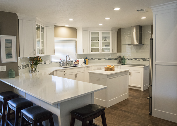
Designing a kitchen is a bit like solving a puzzle, eventually all the pieces come together and it all makes sense from both a visual as well as a functional perspective.  This new kitchen design in Wellington Florida is a great example of that. Today I'd like to share with you an inside peek at the process and how we got from drab to amazing in ten million easy steps.

White Shaker Cabinets,Style My Faucet, Kitchen Design, Kitchen Makeover


I jest, it was really only eight million.  Here's where we began.  Check out these before images.  As you can see the old kitchen was outdated and just didn't work from a layout point of view.  The challenge we faced was to create something light, modern and very user friendly for my client who loves to cook for her family.

Befores

First Things First: Layout Challenges

Kitchens generally work a lot better without too many angles so although we were stuck with the exterior angled walls, we could straighten out that peninsula.  Then there was the island in the center.  All the angles were affecting the usable storage inside so I wanted to square that up too.  Next up was that oppressive soffit at the top!  It was like a heavy weight pushing down on the kitchen.  Removing it would allow taller cabinets and a much more open feeling.  The refrigerator was crowded next to the stove so I really wanted to relocate it if possible.  Last but not least, where the fridge used to be is our new focal point,  a modern hood and beautiful reflective glass tile.


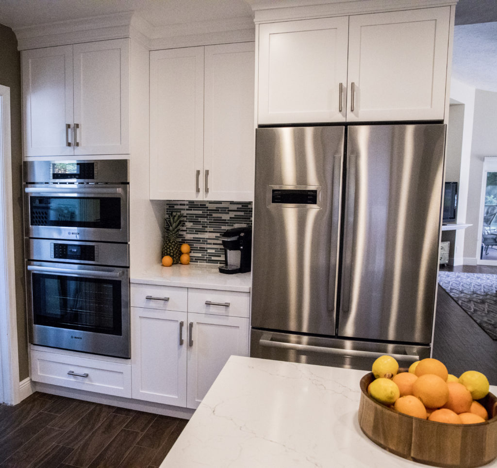
The above plan shows how it all panned out.  We accomplished all of our objectives.  The soffit was removed, peninsula reshaped with the addition of a beverage center, the island became a baking center with no angles and storage for a mixer lift.  We extended the pantry wall and created the perfect home for a new refrigerator and combination wall and microwave ovens with convenient counter space in between.

White Shaker Cabinets,Style My Faucet, Kitchen Design, Kitchen Makeover

Star Elements & The Power of Collaboration

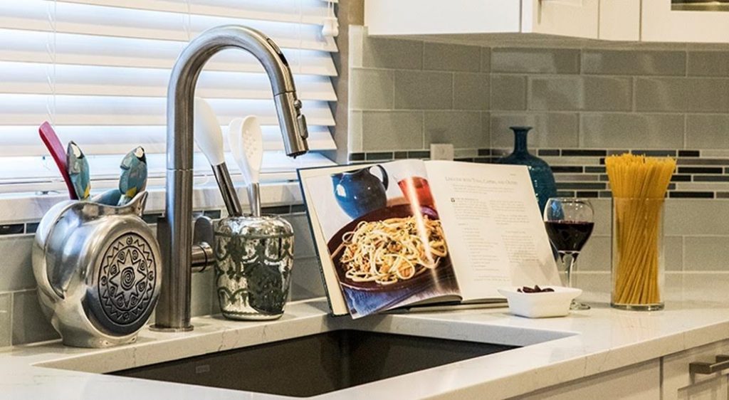
I always say the best projects are great collaborations and that is exactly what we had here.  My client didn't think she knew what she wanted but she really did.  She gave me lots of feedback and clues as to what is most important to her and her family.  The result was an appliance package by Bosch including an induction cooktop, all wood white Shaker style cabinets by Holiday Kitchens and Brendan Donovan Furniture & Cabinet Co., an undermount Silgranit kitchen sink by Blanco and the Beale Touchless Kitchen Faucet by American Standard.  This was the first kitchen I've done using this particular faucet.  In exchange for the faucet, American Standard offered me the opportunity to participate in a really fun project called Style My Faucet.  Designers all over the country played too.  We had fun staging the Beale and got some great shots.  Flowers and veggies had already been beautifully featured so we did pasta! 

"The best advice I can give my clients is to invest in a quality faucet."


Beale Touchless Kitchen Faucet, AmericanStandard,StyleMyFaucet


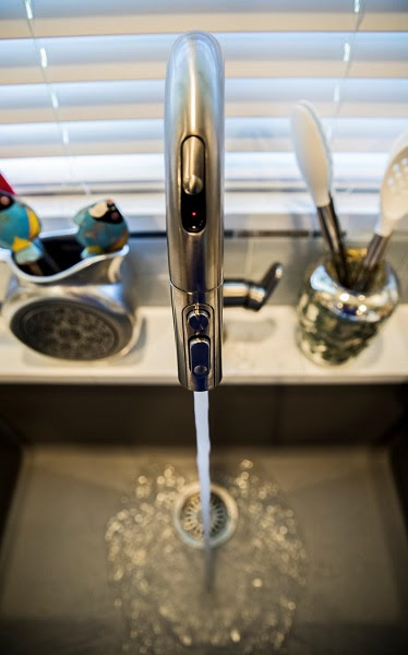
The Beale Touchless Kitchen Faucet was very easy to install,  the battery for the  Selectronic hands-free sensor is conveniently located below in the cabinet.  You can opt to leave it on manual mode too if you prefer.  Just slide the sensor door on the front and you can operate with a wave of your hand.  This is so nice to have when you're preparing things like raw chicken, right? I was also impressed with the Dock-Tite spray head docking system.  It feels really nice and secure.  I've seen faucets that dangle when they're not supposed too.  Yuck.  The best advice I can give to my clients is to invest in a quality faucet.  I will definitely be specifying the Beale again because I am impressed with not only the quality but also the sleek  styling that works so well with contemporary and transitional designs, just like this one.

White Shaker Cabinets,Style My Faucet, Kitchen Design, Kitchen Makeover


There you have it.  It's a wrap.  Drop me a line  at artfulkitchensbyglo@gmail.com and let's get started on your kitchen!

 This is a sponsored blog post.  All editorial content is entirely my own opinions and perspectives.