IT'S ALL CREATIVE
 One thing I discovered during my Bosch Blanco Bloggers' Retreat is that creativity cannot be contained. It spills out of the box in all sorts of interesting ways. It was a great experience. It's exciting and inspiring to learn about all the products, both the history and origins, as well as the very latest technologies. Most of all, I loved hearing about the design process and how these products come into being. I enjoyed interacting, not only with the creatives at Bosch and Blanco, but also with my peers. Whenever I could, I asked them about their typical days, how they work and what they do in their off time. What I found is that there is no off time for a creative. I should know that, right? I discovered an editor who loves to knit, a kitchen designer who's passion is ballroom dancing and a much admired kitchen blogger who loves to photograph roses. She confesses to having literally thousands of rose photos lurking in her hard drive! The creative process is also a big part of what I learned about during our two days at the BSH Design Center in Irvine, California.
 The process of developing new products begins with colored pencils and adventurous minds. The team at Bosch endeavors to achieve just the right combination of precision German engineering and the latest technology to address the needs of the consumer.
 Sometimes these needs are apparent but often they can be situations (observed and researched) that we may not even be aware of! This is what makes the folks at Blanco and Bosch such a great team. They have a similar approach which understands that everything's connected in our world and it all informs what we need to function comfortably and efficiently in our homes. Kudos to them and thanks for the memories!
IKEA'S LIVING STAGE
So it's January again and everybody's writing great posts about new trends (open shelves, fewer upper cabinets, the color orange, horizontal wood grains), and resolutions (already lost 4lbs YAY). Not moi. I'm in the mood for scanning the globe for home/kitchen related tidbits and what locale could be better than my new favorite, PARIS! That famous cheap yet hip ready-to-assemble furniture company, yes, IKEA stays edgy and current by coming up with new innovative marketing schemes. The latest took place in the Paris commuter train station Auber R.E.R. A 581 square foot apartment was erected,and five young stylish occupants were recruited to live in it for 6 days (January 9-14). Oh, and commuters could peak in the windows to witness "hip" living in all its glory!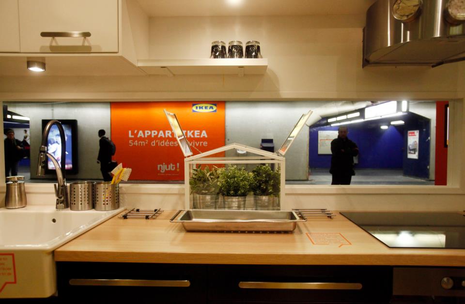 The purpose of the marketing campaign was to demonstrate how IKEA products work for small spaces in real life. Each of the days is documented via video on the IKEA France Facebook page. Here are the highlights:
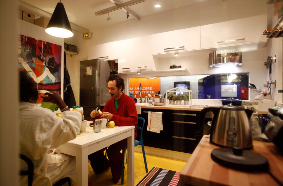 1) Day 2-Take out sushi delivery (FOUL! I wanted them to cook in that kitchen! Okay it sort of looked like they cooked on Day 1.)2) Day 3- Twister (A good game choice for small spaces.)3) Day 3-Some guy really into his pink ukulele (This is actually pretty hip as ukueles are making a big comeback. Click here.)4) Day 1 -Sewing clothes with sewing machine and everything (Really?)5) Day 4, below, features a bang up birthday bash! (This must be the coolest cake ever.) This was creative, attention grabbing marketing, a statement about the relationship between form and function. Did they succeed? Has social media made marketing more important than product?
NAUTICAL ZEN KITCHEN
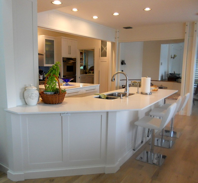
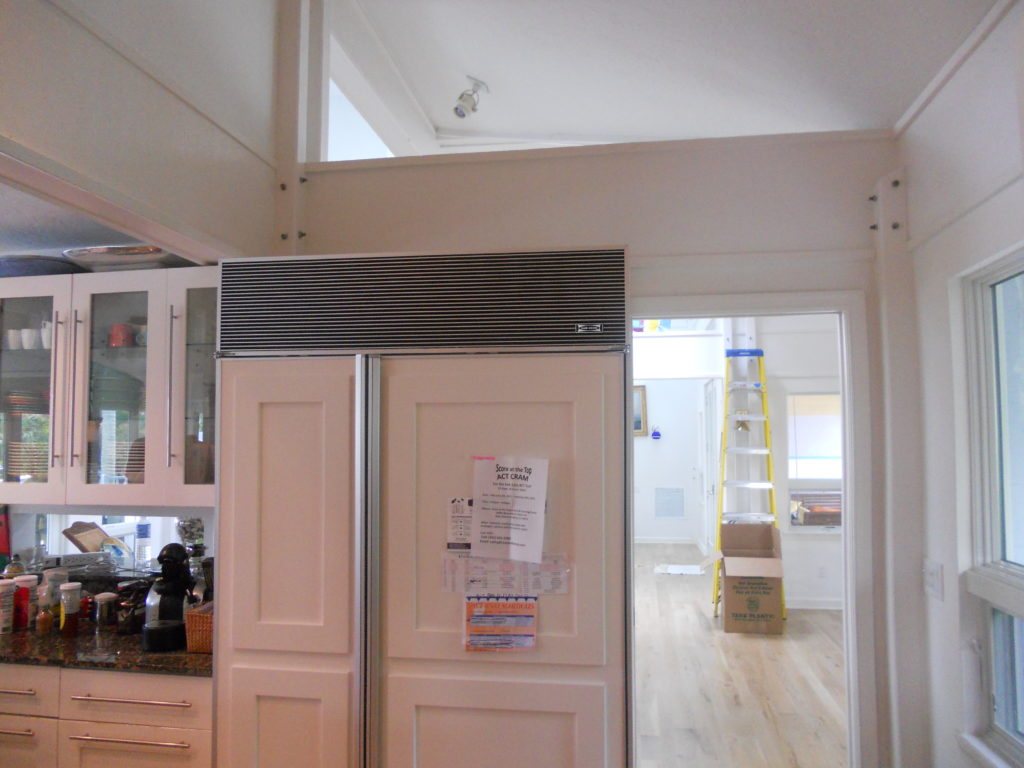
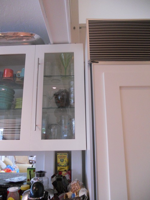
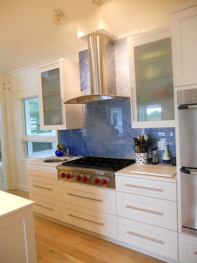
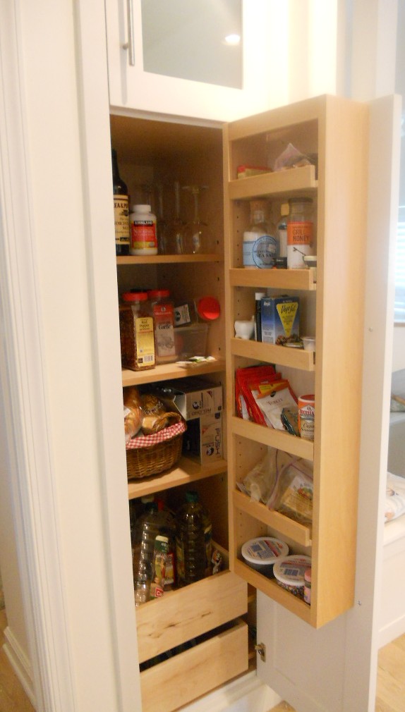
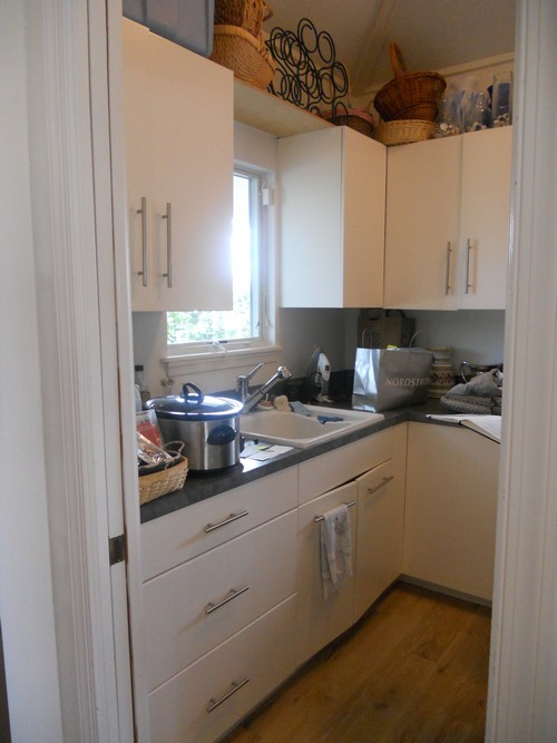
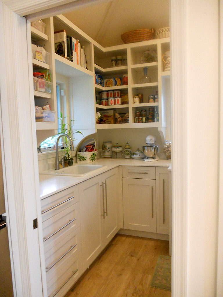
Ta daaaaa! Another beautiful kitchen is complete, and yes it’s white with Shaker doors. Surprise! Not. There were two main challenges about working in this home. First of all the architecture is very unique and is an integral part of the space. It’s comprised of posts and beams, angles and open lofts which remind me of a ship. The second challenge was a lack of unity with way too much going on visually. The existing kitchen had three different types of counter tops, two different types of cabinets and more stuff than space. In addition, hinges and drawer slides were failing and paint was chipping.The homeowners came equipped with the most valuable of traits, an open mind. They were willing to see their kitchen and laundry area in a new way. Every step of the design process we would ask ourselves “does this unify and simplify”? Think “nautical zen”!First off I decided to make peace with the posts and beams. The layout remained the same and we didn’t even change the door style or color! What we did was improve the fit and function. Using all white counters unified the space and allowed the blue granite back splash to be the star of the show. Here are some “before” pix and “after” solutions which will pave the way for smooth sailing in this new kitchen.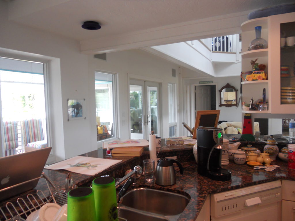
KITCHEN MOVING TIPS
 One subject we have not delved into at KFL is the dreaded MOVE. Yes, moving pretty much sucks. Even if you’re fortunate enough to be “movin’ on up”, the actual moving process is not fun. In particular, moving the contents of your kitchen can be a real “kitchen nightmare”. Jeremy, one of my readers from “down-under” just happens to work for a removalist in Sydney that specializes in just such an endeavor and has generously offered to share with us his professional expertise. It’s always an excellent idea to hire an expert if you can but here are some invaluable tips you can put to use if you are a DIY mover. Here’s Jeremy!Your kitchen contains some of the most fragile and difficult to handle things. Whether it’s your new dinner set or a collection of rare glass bowls, you need to pay extra attention packing the contents of your kitchen when relocating to a new home. Items such as large serving platters as well as little forks and spoons all need to be wrapped with utter care, particularly if you are moving a great distance.Before you begin to pack make a list of the things you really don’t want to carry to your new home. Improvise ideas for getting rid of them well ahead of moving. You could have a garage sale or donate to the needy. If an item has seen better days it could make more sense to get rid of it and then replace it after the move. If you are too busy to find the time for packing, a professional moving company can come to the rescue.If you are doing it without a professional help, here are a few tips for packing the contents of your kitchen.
  Make an inventoryCreating an inventory is the first step towards packing your kitchenware successfully, with minimal or no harm. Review everything in your cabinets and drawers, like utensils, containers and cutlery. Make a list of all the items you decide to carry to your new abode. Remember to consider the weight if it is a factor in your moving expenses, for example if you are moving overseas.Packing kitchen devicesWhile packing electrical appliances such as coffee makers, juicers or blenders, it is better to pack them in their original cartons if you have them. Clean and dry these items thoroughly before packing as any spillage or residue left can make for an unpleasant surprise at the other end. Disassembling the appliances can make packing easier an help prevent breakage.Packing food itemsYou can pack dried and canned foods if you are traveling a short distance but make sure to check their expiration dates, prior to packing. Avoid carrying sauces and liquids that may break open on the way to your new home and spoil rest of the things.Packing dishesThere are special cartons available for packing fragile items such as dishes, glasses and other breakables. Bubble wrap these items carefully. The trick is to fill up all the empty space in your box with newspaper or any other filler to prevent breakage.Label, label, labelTowards the end of the process it becomes tempting to throw it all in a box but you’ll save a lot of time and confusion on the other end it you pack like items together and always label the boxes with general content description and room location.If you are moving overseas, look for a trustworthy removal company to help you. Different countries have varying guidelines you may be unaware of.About the Author:Jeremy is a longtime associate of Aussie Man Removals in Sydney, Austrailia which specializes in helping to select the best service provider for a safe and hassle-free move.
MY DESIGN PROCESS: A CASE STUDY
I write about a lot of varied things on this blog. Today I'm going to open my mind to you so you can step inside the creative (or whatever you want to call what goes on in there) process, as it pertains to cabinet design. The thing about designing kitchens and baths is that it doesn't only require vision in the aesthetic sense but also in the functional sense. We have to be creative in terms of the space constraints while being very aware of function.
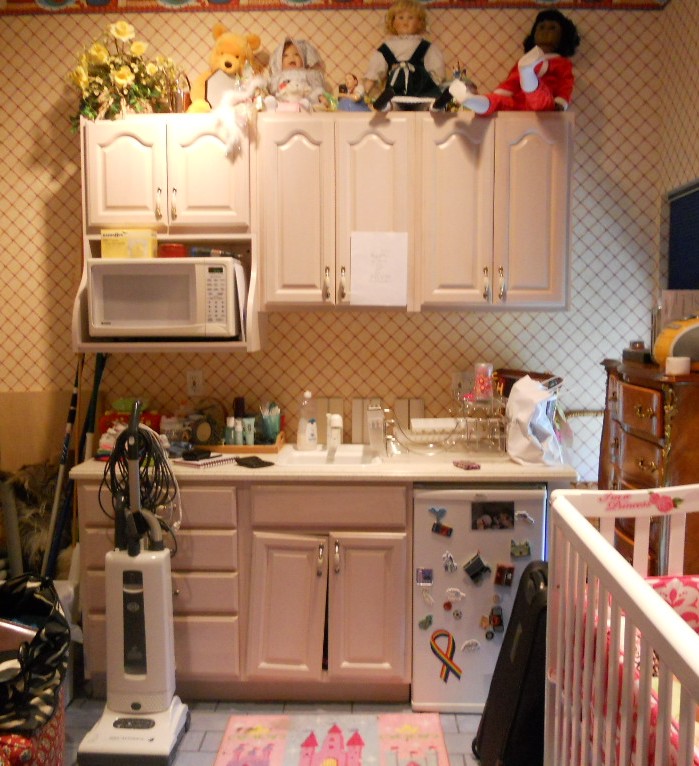 WHAT HAVE WE HERE? This is a nursery equipped to serve the nanny. She's got an under the counter refrigerator to store bottles, baby food and
 wine whatever she wishes for herself. In addition there is a small sink and a microwave. There is also storage and counter top work space (underneath all the debris). That's a lot of function packed into less that six lineal feet! The lucky owners of this oceanfront abode are away for the summer, as is the custom in Palm Beach.MY ASSIGNMENTI have been asked to replace this set up but to keep the same foot print and function. The cabinets are to be more in keeping for this traditionally styled beach house.MY OBSERVATIONSThe backsplash (area between counter and upper cabinets) is really high, about 22". Not only does this mean less cabinet space but it's a bit of a stretch unless you're a very tall nanny. In addition, there is nothing tying the upper cabinets to the lower cabinets and since they do not go wall to wall it looks as if the uppers are just hanging out, hovering over the base cabinets, not a great look. In general the layout is off kilter. The microwave requires a deeper cabinet and it sticks out unattractively on the left.WHERE DO I START?The appliances are old and will appear even older surrounded by new cabinets. Remember that if you are investing in a new kitchen it's penny wise and pound foolish to try to build your new cabinets around your older appliances. I will suggest that we replace the microwave with a small built-in model in stainless steel. For this I know I must use a minimum of 24" out of the 70" I have available. The refrigerator is important too. This one is old and it's an odd size, about 19". The new one will have to be 24" and I will reccommend that we build it in for a more custom look and to unify the small space. These types of built-in panel- accepting- under- the- counter refrigerators are either 15" wide or 24" wide. I certainly can't detract from the function by going smaller so I will give them more refrigerator space by going with 24" wide. Now that I know what I'm doing with the appliances I will work the cabinet layout around that. Here's phase one showing the larger ref, a built-in micro and an attempt to even things up and connect the uppers to the bases but it's still not quite there yet. I usually draw a free-hand sketch to work out my initial thoughts. The final solution (I drew it using Chief Architect) is to use 42" upper side cabinets instead of the existing 30" uppers. Then since the microwave needs a deeper cabinet (15"), I moved it to the middle and raised it up to create some design interest and to take advantage of the tall ceiling. I made the side backsplashes 16" high with the center at 19". I centered the 24" upper microwave over a 21" wide sink cabinet which allows the bigger refrigerator on the right and does not lessen the size of the existing drawers on the left. I'll need a minimum of 3/4" panel to the right of the ref. That makes a total of 24 3/4" with ref and panel. I will duplicate that on the left making the 4 drawer cabinet 24 3/4" wide as well. This allows the upper side cabinets to be equal at 23 1/4" each. Last but not least, I am going to suggest using matching wood beadboard above the 4" backsplash to tie the uppers to the lowers and add a small crown moulding on the top to finish it off.
 PRODUCTSHere are the goods and why I picked them:Kholer faucet K7342 in brushed nickel finish- It's a traditional faucet in a finish that will blend with the stainless steel of the microwave. The height makes it user friendly yet it will fit perfectly in the space.
Kohler undermount entertainment sink K5848- I love the shape of this sink. I double checked the size and it fits in our 21" wide cabinet. It's a more updated undermount model but it's still cast iron. I'm specifying Biscuit to go with the cabinets but I will also suggest a stainless option which would also work.
SHARP R1214OVER THE COUNTER MICROWAVE- This model fits into our 24" wide space. It requires a 15" deep cabinet, check. It has a light below and I happen to know that Sharp makes a kick-ass microwave. CABINETS BY HOLIDAY KITCHENS- flat panel with applied moulding. Finish, selected by designer, to be Snowdrift paint with Mink Wash. I chose Holiday cabinets because we have some custom size requirements and I can order Holiday in fractional increments. They also offer a wide array of finishes and door styles which is important in a higher end application.
 U-Line Under the counter refrigerator - This model offers an overlay trim kit option which will allow us to apply a door panel to match the cabinets.What do you think? You see there's no mystery behind the magic of design. Those are the steps in a nutshell. I would love to walk you through the steps of your own potential magic. It's really a lot of fun when it all comes together, kind of like solving a puzzle AND you get to continue to enjoy it everyday!


