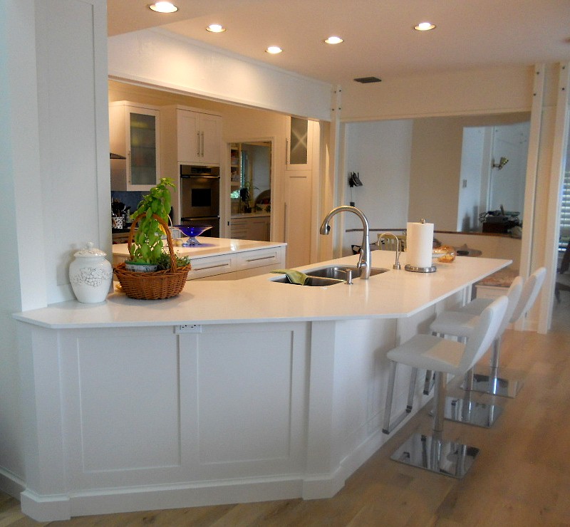
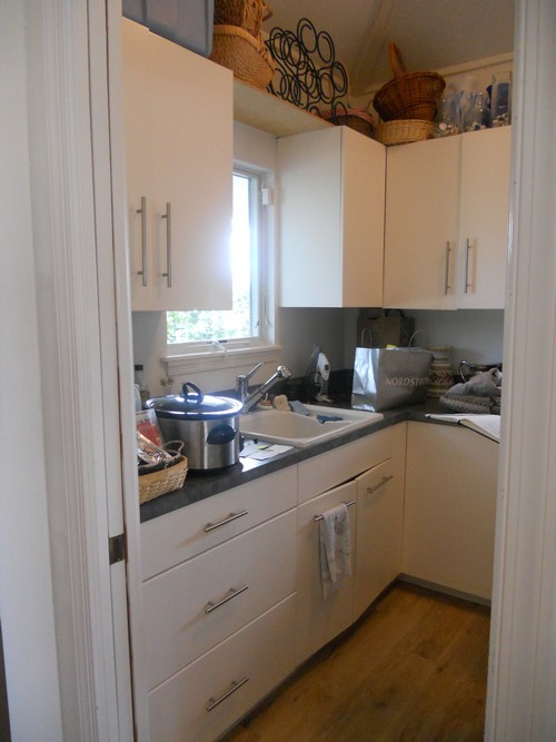
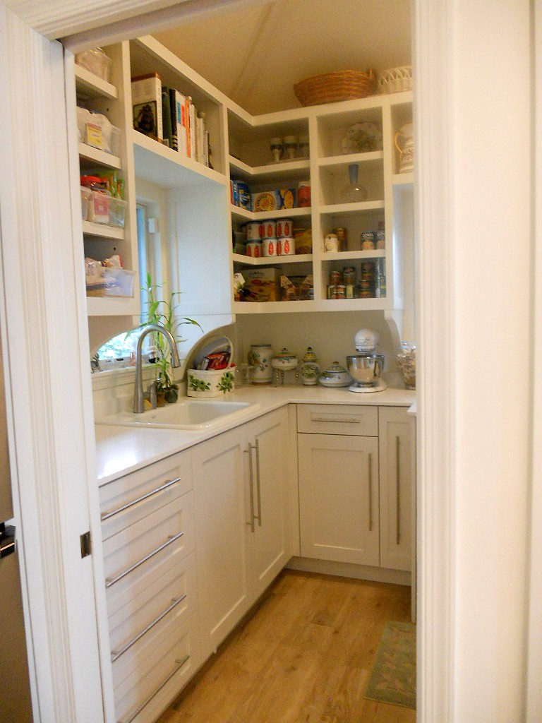
Every time I think I've seen it all I'm challenged to create a kitchen design that seems impossible! Such is the case with this recent project. This home is located in Palm Beach Gardens, Florida and features not only a stunning view but also the strangest shaped kitchen! Sometimes I wonder what architects are thinking.
Step 1- Let there be walls
(to scale and correctly angled)
I can't even begin to design until I can get the walls drawn to scale. I had a physical blueprint which (after some quick research) I was able to trace over in my design program (Chief Architect). Once I did this I discovered those angles are 30 and 60 degrees, not the typical 45! There was no possibility of changing the shape of this kitchen.
Step 2- Embrace the Space
One thing I have learned is that you will never win by trying to fight the space you're designing. Honor it, whatever it is, if you can't change it. That is the only way to end up with a design that is timeless and looks like it has always "lived" in the space. In this case, that means embracing the angled main wall while allowing ample and efficient flow.
Step 2- How to make it better
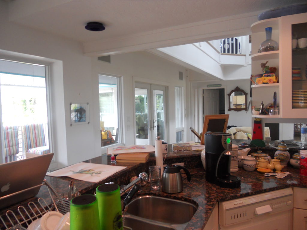
Once I had the walls accurately represented I evaluated the current layout keeping my client in mind. He loves to cook and he and his girlfriend love to entertain. Here are my observations:
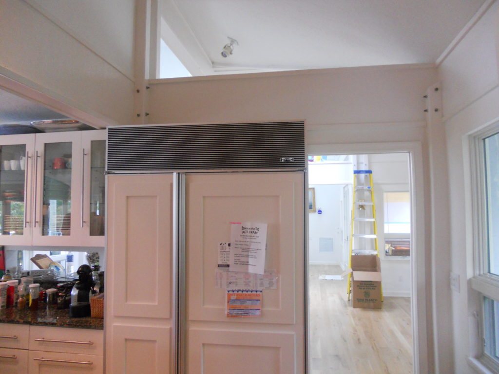
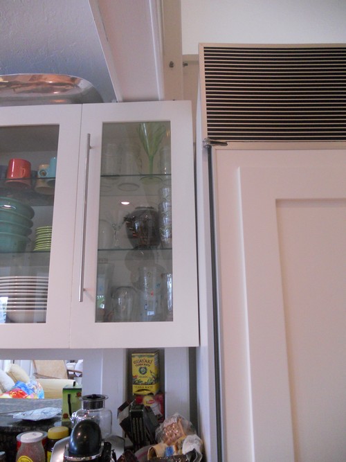
-Cabinets are too low, not taking advantage of the high ceiling and limiting storage
-The big POINT on the island has to go! That just jumped right out at me and called for correction
-We are in need of an update and new appliances that are up to the task of my client's cooking endeavors
-The shape of the island does allow for lots of storage but also lots of walking. The sink is pretty far from the main wall.
-With the boat docked outside and observing everything else about the home I knew my clients' style is casual, Florida-Coastal and they are much more "comfortable" than contemporary.
Step 3- The Solution
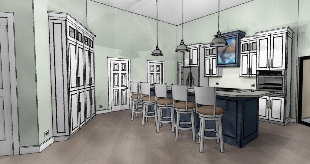
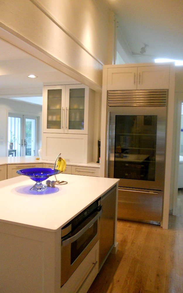
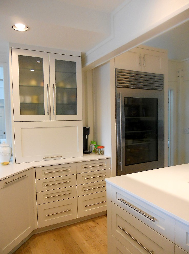
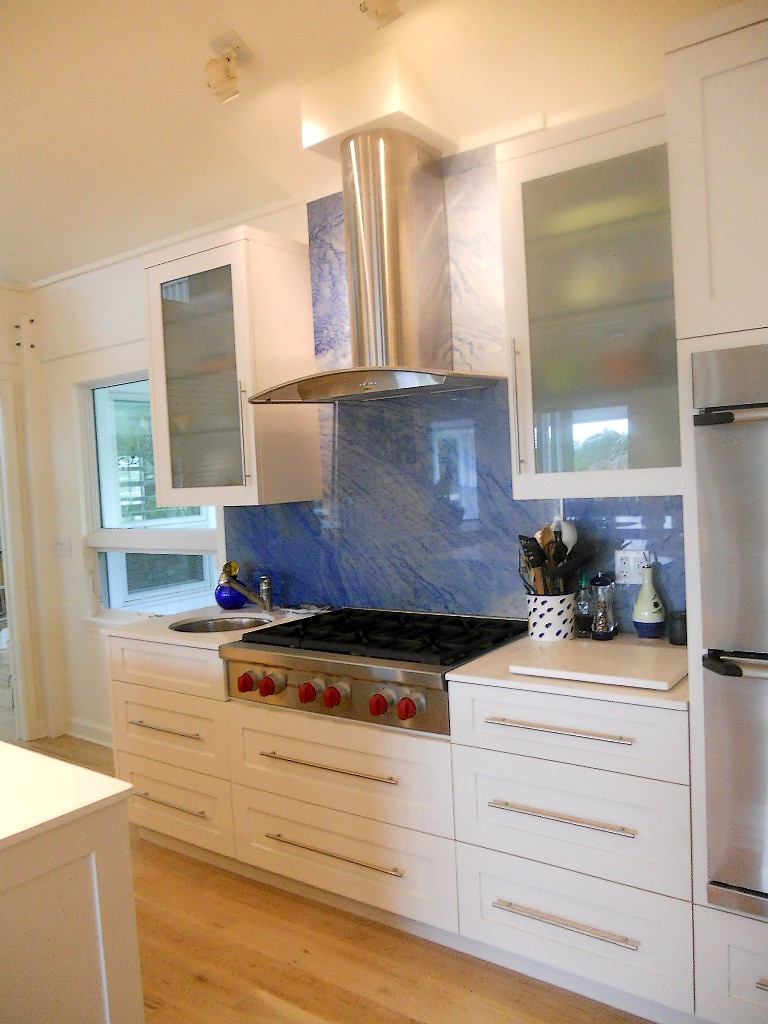
The first thing I did was the back wall. I knew it had to accommodate the refrigerator and the new wall oven my client selected. The fridge and stove were already there so no need to reinvent the wheel. Remember it saves money when you can keep your major appliances in the same, or close to the same location. In the new design cabinets are now eight and a half feet high plus crown molding. The upper, hard to access area, features glass doors to add a bit of style and aesthetic appeal which incidentally the homeowner mentioned he wanted. This is the perfect spot for showcasing a collection and you can change the flavor by changing the contents when the spirit moves you. Versatility is always an important aspect of my designs. We've also got generous counter space next to the fridge, on each side of the stove and next to the ovens, a must! That was the easy part.
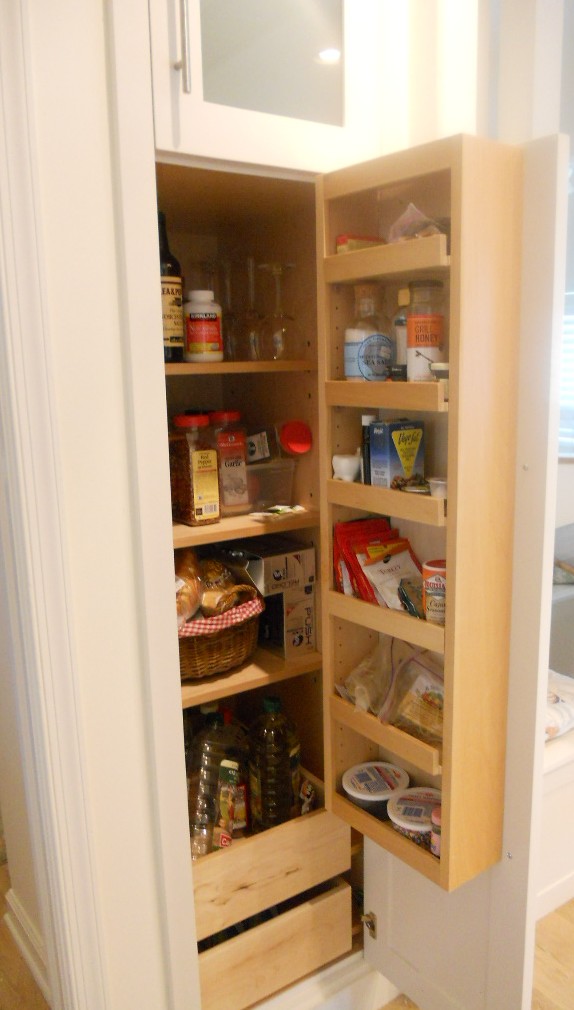
Now for that island. Hmmm. Since I'm updating that means I'm simplifying. I'll honor that angle but I think simplicity will calm the "angle noise". It's a popular trend these days to keep an island all at one height but I didn't think it was the right solution for this project. It turns out I was right and my client was so relieved! This island is really a serious cleanup and prep space and with such an open space a little buffer was needed. The raised bar also makes me think of the captain behind the wheel, it's sort of boat-like. Pulling the island closer to the main wall (still allowing 48") not only reduces the chef's steps but discourages unwanted traffic from congregating behind the island and getting underfoot. Now our island contains all the essentials but, not gonna lie, we've lost a little storage. To compensate I added a section of full height cabinets to balance out the kitchen. Glass panes at top reference those on the main wall. We're keeping these at 15" deep to keep the space open. Another benefit of shallow tall cabinets is that you will do just fine with adjustable shelves whereas, in a deeper, 24"cabinet, you'll probably need roll outs or stuff gets lost and is hard to access in the back. Roll outs really add to the price of your cabinets too.
Step 4- More About Those Aesthetics
Now that the layout is solved I think, what can I do to make this kitchen design stand out and fit my client's personality? A deep nautical blue island and coordinating hood of course! I also loved the idea of creating a spot for an ocean scene front and center on the hood itself. This is a great place to add a painting you love and, again, you can change it up! Voila
What do you think of this kitchen design? Are there any elements here you can apply to your own situation? This project is now underway and I look forward to sharing the outcome!

