The Future Lies Beneath the Counter Top

They say that what's inside is what counts.  That couldn't be more true when it comes to some of the newest technology for your kitchen.  The counter top is one of the most integral parts of your kitchen.  Besides being a major visual element running right through the center, it is also a functional element.  Did I say function?  How about a counter top that is also a cooktop?

SapienStone,PorcelainCountertop,SmartSlab,KBIS2017


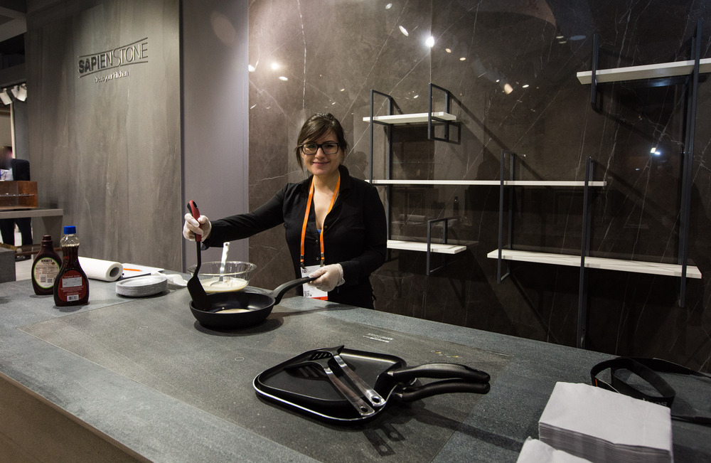
Earlier this year at the Kitchen & Bath Industry Show in Orlando, SapienStone served pancakes on their ultra thin ceramic slab.  The Smart Slab incorporates adjustable heating and cooling elements below the surface.  The material, which is porcelain, is also microb-resistant. I don't know if Smart Slab is the start of something we'll all have some day but I do know that you should be considering porcelain as a very viable option for your kitchen counter top. It comes in a variety of textures and looks and is perfect if you are looking for a more matte finish.  It's also anti-microbial and can be fabricated to give you a chunky or skinny look.  I still love my quartz and natural stone, in the right applications, but this is another option.


Smart Slab with embedded heating and cooling can also be used for a dining table as shown here.  Seems SO futuristic, no?  The cooking and plate warming are one thing but there's also an option in case you need to chill- your beverage, that is. Check it out! Besides the function I also love the seamless minimalist-friendly look. Can you see this in your future?

FTK: Latest in Appliances on Show at EuroCucina

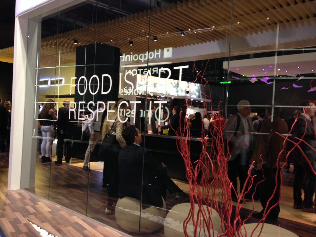
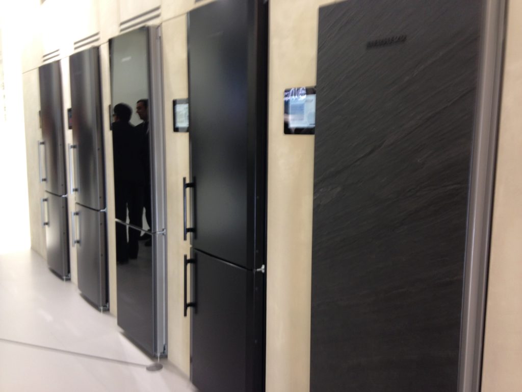
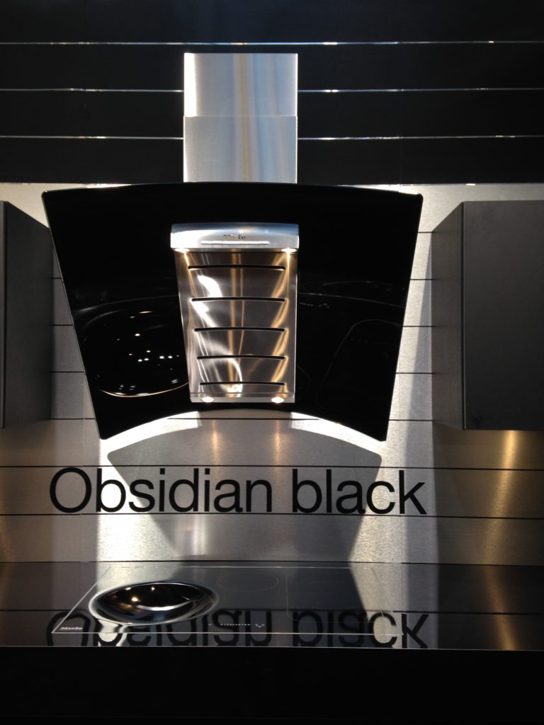
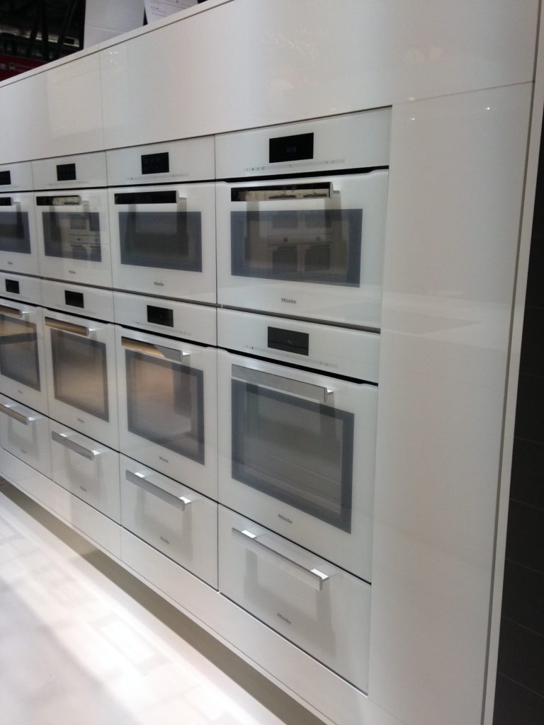
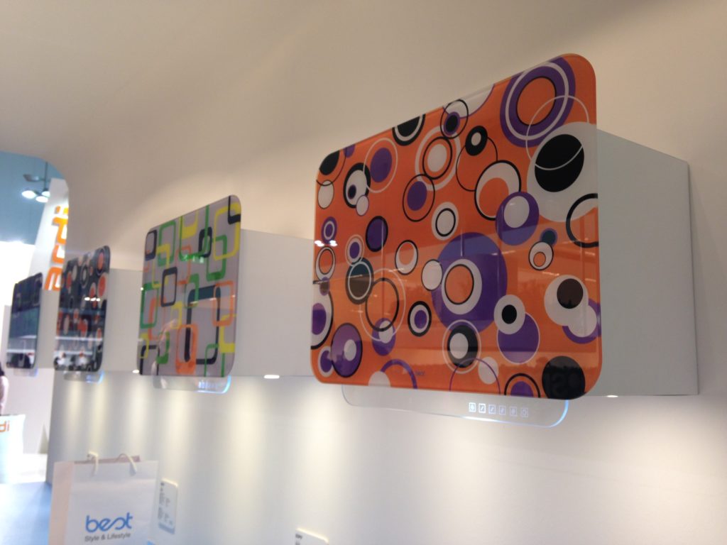
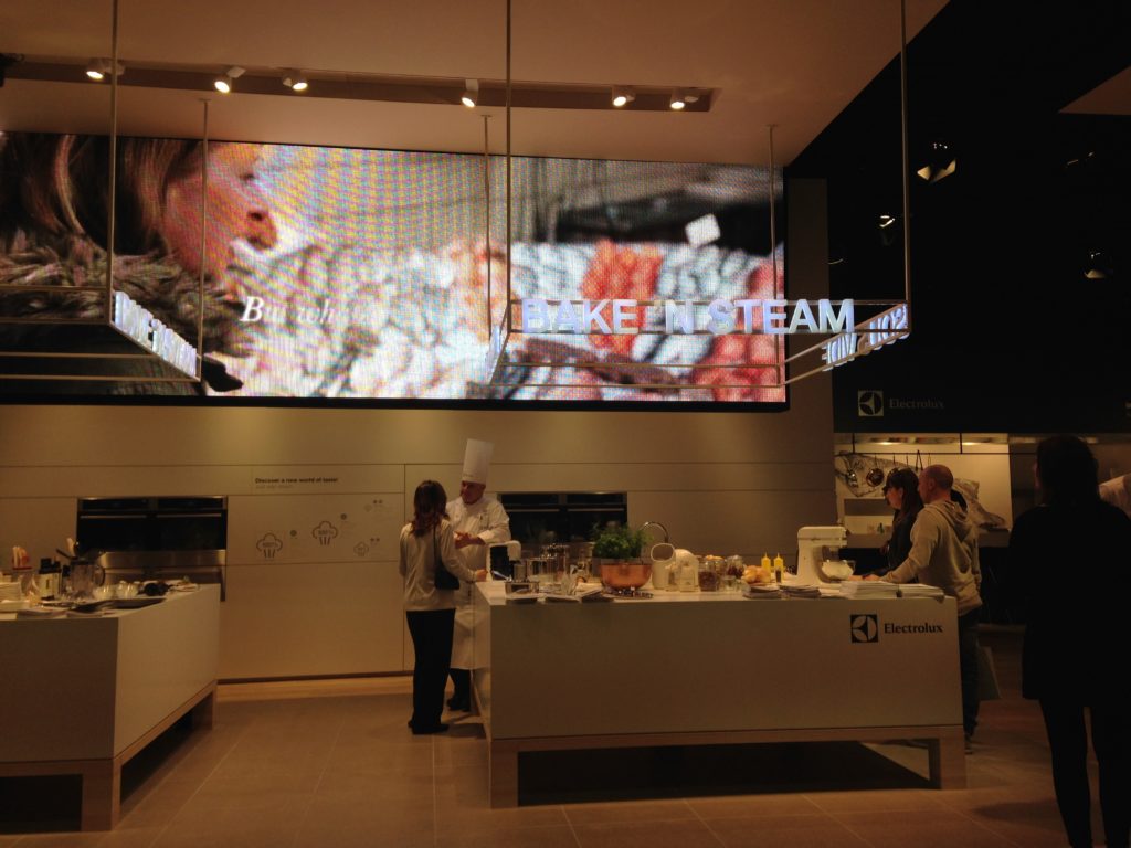
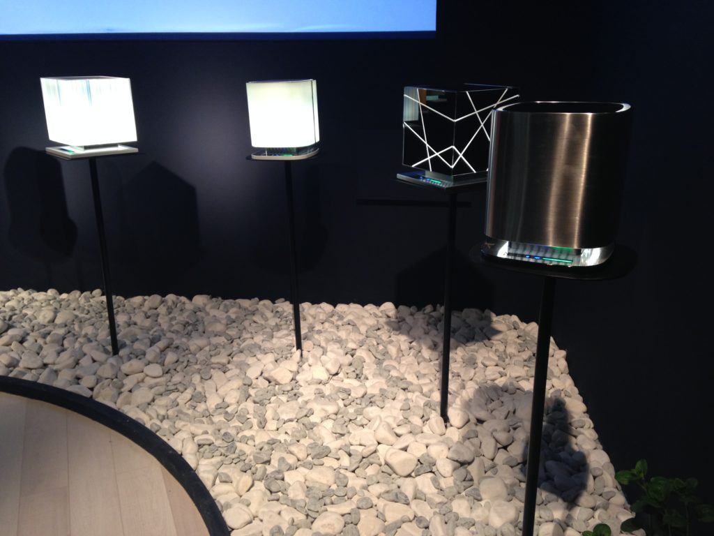
Let’s see.  Where were we?  Ah, yes.  I was going to tell you about FTK at iSaloni.  If you don’t know about my trip to Milan with the Blanco Design Council during Design Week, you’ve got some catching up to do!  Anyway, FTK, or Technology for the Kitchen, is a showcase for innovation in the category of domestic appliances. SubzeroWolf, EuroCucina2014, FTK  The focus is on the seamless integration of cooking and refrigeration technology in the kitchen.   It is a world event so I saw names I am familiar with such as Miele, Electrolux and for the first time at this show, Subzero Wolf (above).  I also saw many unfamiliar brands such as Turkey’s Arcelik (Beko) Group which was also making its debut at EuroCucina 2014. Liebherr, compact refrigerators, FTK, EuroCucina2014In Europe we Americans have a reputation for embracing BIG! This includes cars, portions and, yes, refrigerators.  Did you know  what we call a standard refrigerator is referred to as an “American Refrigerator” in Europe?  This is a misconception as there are many  NYC apartment owners who I'm sure would warmly embrace their kitchen luxury a bit scaled down! Am I right?  Compact sizing was a popular offering along with ease of operation and low energy consumption. 2014-04-09 16.15.02I saw new color choices for appliances such as the return of black and white for high end appliances, as featured at Miele.Miele ovens, white appliances, FTK, EuroCucina Ventilation was perhaps the “design star” at FTK with all kinds of sculptural sexy hood choices on show.  All the appliances were design oriented as well as efficient, offering consumers products that meet technical demands while holding their own in the “looks department”.  This means appliances for the home have taken on new shapes, colors and materials in addition to being light, compact, ergonomic and extremely appealing. EuroCucina2014,FTK iSaloni,ventilation hoodsBest, Ventilation hoods, art hoods, Eurocucina2014,FTK Steam and induction cooking continue to take the industry by force.  They’re not going away peeps! Electrolux, steam cooking, steam ovens, Eurocucina2014, FTKContemporary lifestyles and increasingly open floor plans require versatile, multi-purpose solutions. In some areas of the globe, not only is fresh water a precious commodity, but so is fresh air.  Check out these interesting air purifiers.  2014-04-09 15.58.47Next up:  What's going on in the bathroom? Salone Internazionale del Bagno.  If you'd like to see all my photos from Design Week Milan, I've got you covered.  Just click here.

Kitchen Love, Italian Style at Acheo and Poggenpohl

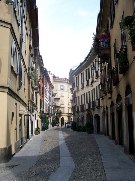
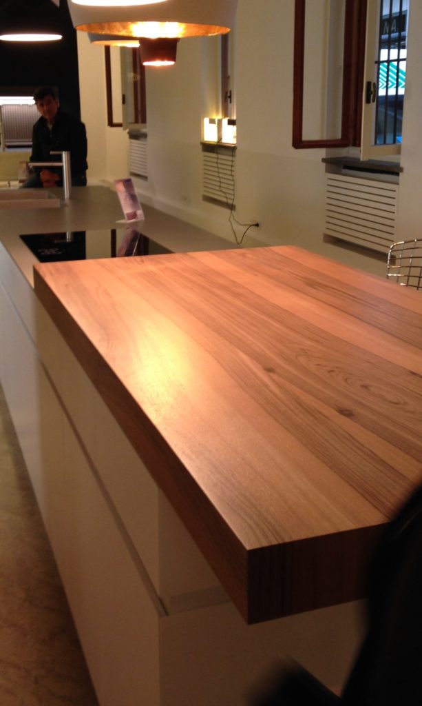
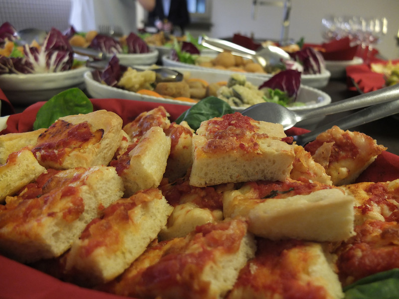
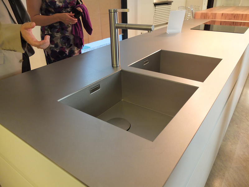
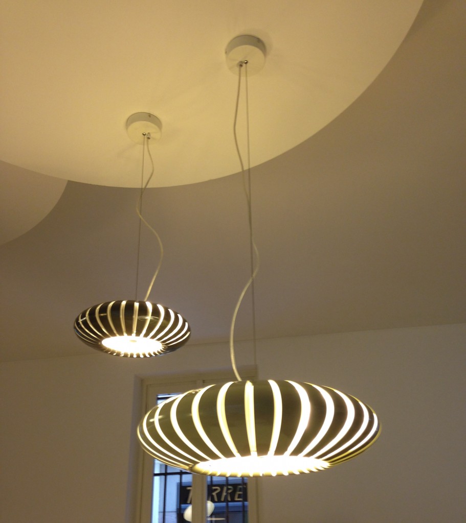
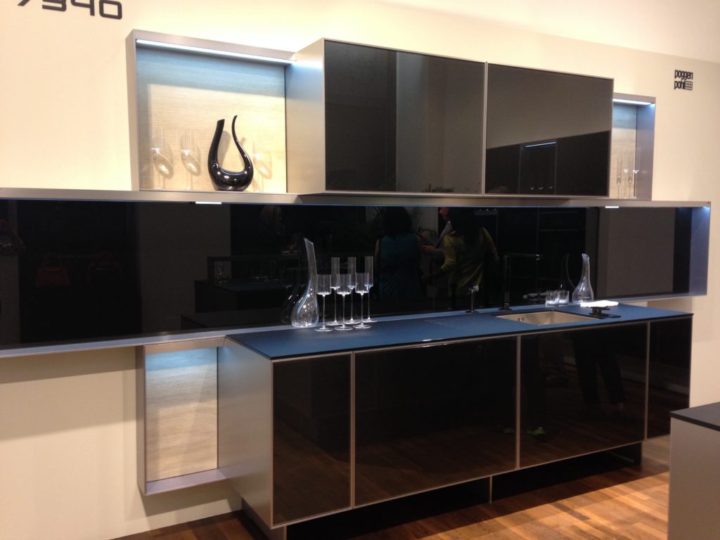
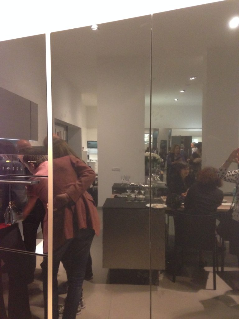
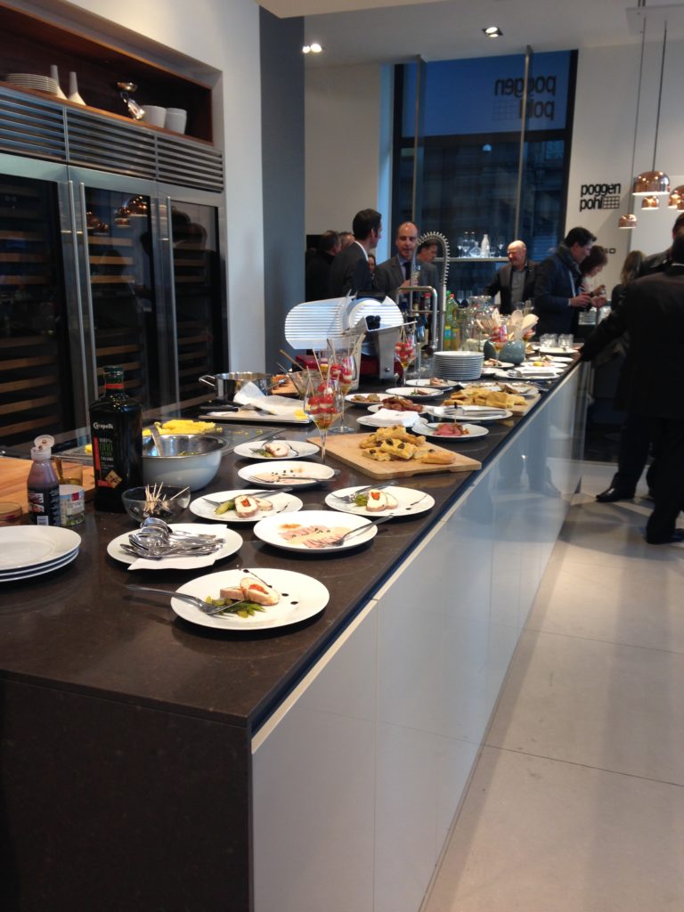
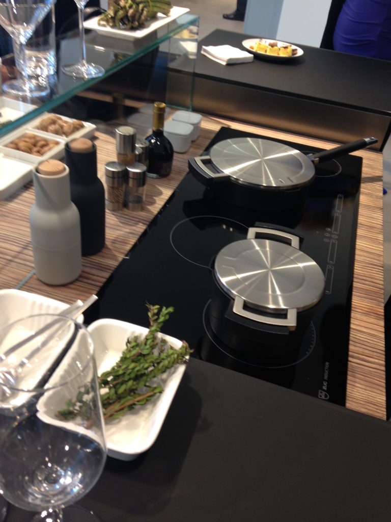
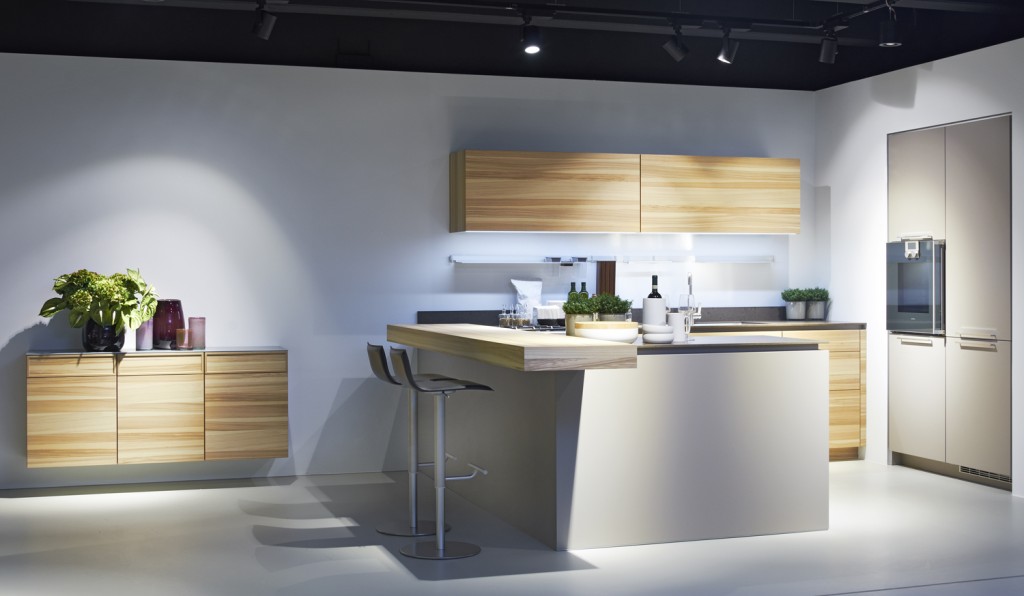
Ok so you got me, Poggenpohl is not Italian.  They are German, except when they're in Milan, then they're Italian.  Good enough? I can hardly believe I’ve been home for over a week!  Images and impressions are still swirling around in my head from the wonderful time I spent with Blanco and some fellow members of the Blanco Design Council in Milan.  Design Week was not limited to the extensive exhibition at the Rho Fairgrounds but also included events all over town.  We visited two memorable and cutting edge showrooms on our visit. 450px-5275MilanoViaMadonnina   The first was Acheo (pronounced AH-kee-oh), located in the Brera district.  Brera is also known today as the design district.  It is also one of the few really old areas of Milan which saw 80% destruction during WWII.  Acheo opened it’s showroom there in 2010.  Today they are a showcase of quintessential contemporary Italian design for the kitchen.Acheo,Milan,woodtops,blancoThey put on an impressive pre-dinner spread for us and the peeps from Modenus Blogtour Milan.food2acheo-LAll through our trip we saw many products not available here in the US.  Some will become available, perhaps in other versions.  One such item is this Durinox work top and sink (below) which is a part of the Blanco Steel Art collection.  Think stainless steel on steroids!!  Seriously, it is made with a finishing process used in the auto and aerospace industries so it is super scratch resistant and more than twice as hard as stainless steel.  It is available, as shown, in Europe from Blanco in Germany.  The sinks only will be available for undermount installation here in the US.BLANCOsink Acheo Showroom-LWe found that in Milan you could miss half the experience if you failed to look up!  Look at these cool light fixtures at Acheo!Acheo, Italianlightfixtures, milanThe other showroom we had the pleasure of visiting during our visit was Poggenpohl.  I think you could argue that they set the bar when it comes to innovation in contemporary cabinet design.  As I mentioned, Poggenpohl is a German company and they claim to be the oldest kitchen brand in the world! Poggenpohl, porschekitchen, milan Some years ago Poggenpohl  teamed up with the Porsche Design Studio to develop the P'7340 line of cabinets. Both companies focus their concentration on the overall line as well as  providing unsurpassed quality of product. Above is a Porsche Design Kitchen P'7340 by Poggenpohl.  It's hallmark is the aluminum frame which surrounds each box. Originally designed with men in mind, it has evolved into a brand appealing to discerning contemporary design devotees of either sex.  Chief Poggenpohl designer Manfred Junker was on hand to explain the intricacies of design detail that go into the product including their trademark, no handle, fronts.  In fact, he claims, they are the first to offer touch control on the refrigerator and dishwasher.  Here's what they have to say about that on their website: "Handleless fronts emphasize the clean, uncompromised lines of the kitchen furniture."Poggenpohl,touchcontrolrefrigerator, milanPoggenpohl took care of our tummies too.   After all, design spotting can work up one hell of an appetite!Poggenpohlmilan     This newest version of P'7340 (see below) features a contrasting counter top inset made of solid New Zealand pine with a wire brushed finish.Poggenpohl.PorscheDesignKitchen,P'7340,milanNext up:  FTK (Technology for the Kitchen)  This was the section of iSaloni featuring the latest trends and products in kitchen appliances.Click here for a peek at all my Milan photos!own and automatically completes the closing cycle

Kitchen Case Study: Update and Integrate

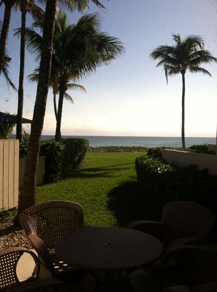
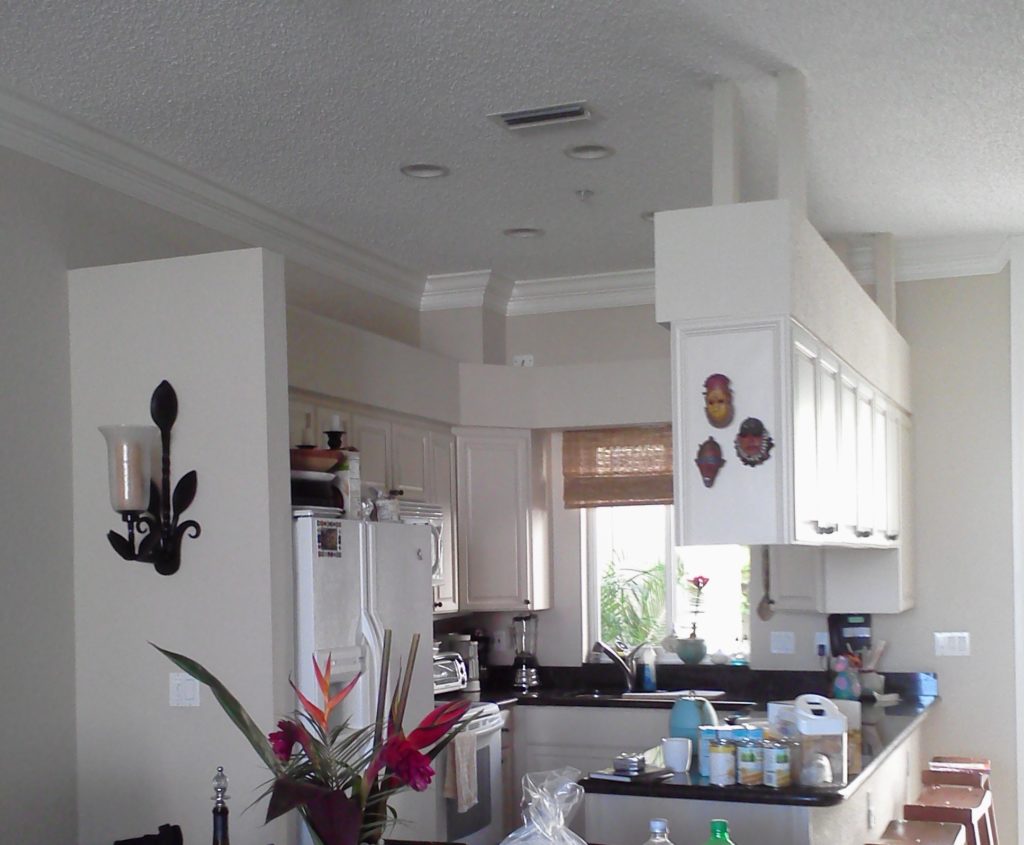
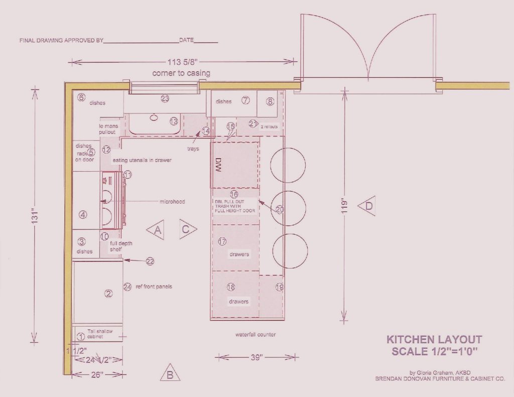
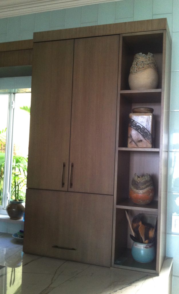
This is what we're dealing with, view out the back of the townhouse  One of the perks (not twerks) of my job is that I get to work in lovely homes on the beach.  If I'm having a "design panic moment" all I have to do is look out the window at the ocean and all is well.  This townhouse project came to me as a referral and is actually a winter home on the ocean in Delray Beach.  This homeowner is a potter with a keen eye for design and finishes.The kitchen was outdated and not very  functional.  My client enjoys cooking and entertaining and was seeking  to integrate her open kitchen with the stylish and artful adjacent dining and living room.The ChallengeMy first thought was that even though we would lose cabinets, the soffit structure had to go.  We could make up that loss of storage by going higher with the cabinets and by adding a tall cabinet to the left of the refrigerator. I wanted to open up the space yet ensure that it was integrated with adjoining areas.  The ceiling is so high we were able to increase the height of the cabinets without having to go all the way up which would have disrupted the existing crown molding.   We also gained storage by adding the two end cabinets on either side of the seating area.  The cabinet to the counter is also great storage and the open shelving to the right was included to showcase some of my client's pottery pieces.  Scroll down to see the solution.blogplan2-page-001 (1)


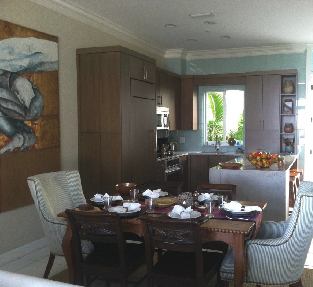
 THE SOLUTION!We used a warm stained bamboo with a subtle blue-green tint for the cabinetry.  The back wall is aqua glass tiles to reflect the ocean.  There is a pantry with touch latches to the left of the built-in refrigerator.  An appliance garage conceals toaster oven to the right of the sink and open shelves feature my clients beautiful pottery creations.

2013-01-18 10.01.34

My design was custom built by Brendan Donovan Furniture & Cabinet Co.  Cabinet  hardware is Top Knobs Sanctuary Collection in German Bronze. Refrigerator is Subzero with flush installation.  The rest of the appliances are by Jenn Air.  For this project we selected the Blanco Quatrus medium single sink  because it fit the space as well as the styling of the kitchen so well.  The faucet is Blanco Kontrole.  Again this stylish Blanco faucet provided the look and pull out functionality we needed. In addition,  the scale was appropriate for the space.  Counter tops are  grey granite from Cavastone fabricated by Stone Palace.  They feature a contemporary "waterfall" detail at the end of the peninsula.All in all I would say mission accomplish and my clients agree!

Poggenpohl, Ultimate Form and Function

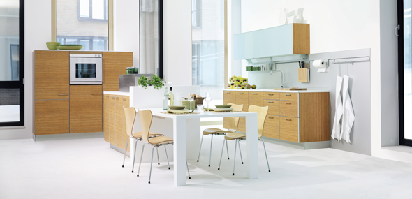
Poggenpohl new ash wood veneerWhether your in the market for a new kitchen or you're in the business of selling kitchens one of the first questions that comes up is, “what’s your style?” Are you traditional, transitional or contemporary?  If the answer is contemporary, the elements to look for include seamless integration, totally efficient function and clean sleek lines.  These happen to be the standards at Poggenpohl, founded over 120 years ago as the first German kitchen brand and now  the best known kitchen brand in the world – present in more than 70 countries around the globe.  Poggenpohl can show you what true European contemporary design is all about.1892_01Today they continue to think outside the box (pun intended) to offer some of the   most cutting edge cabinetry in the industry.          

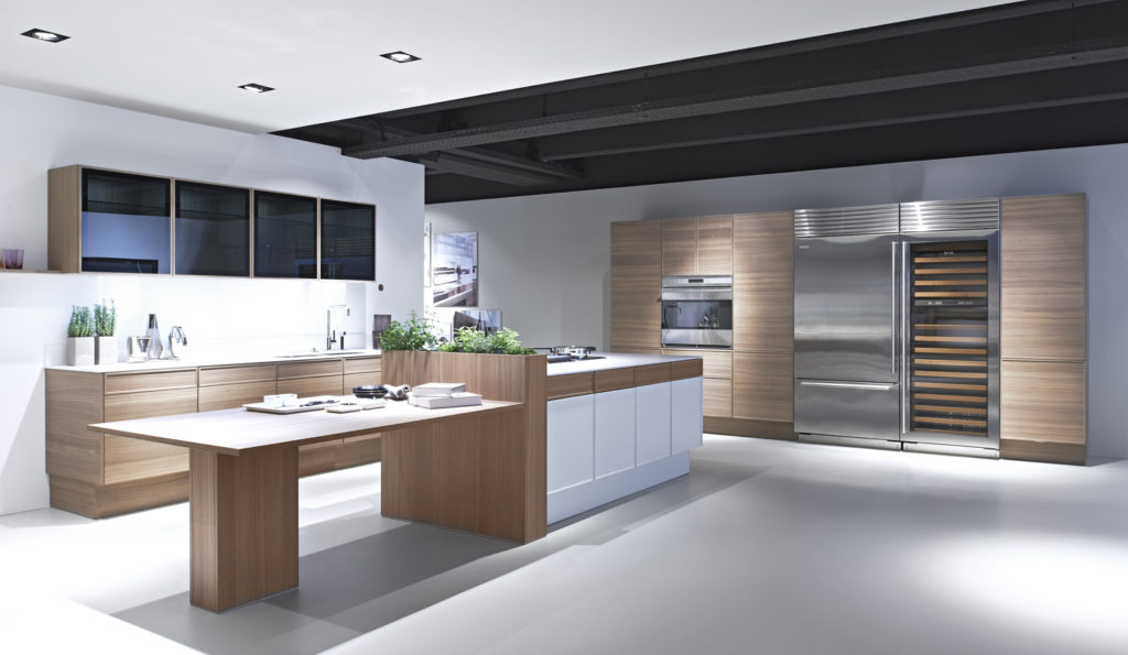
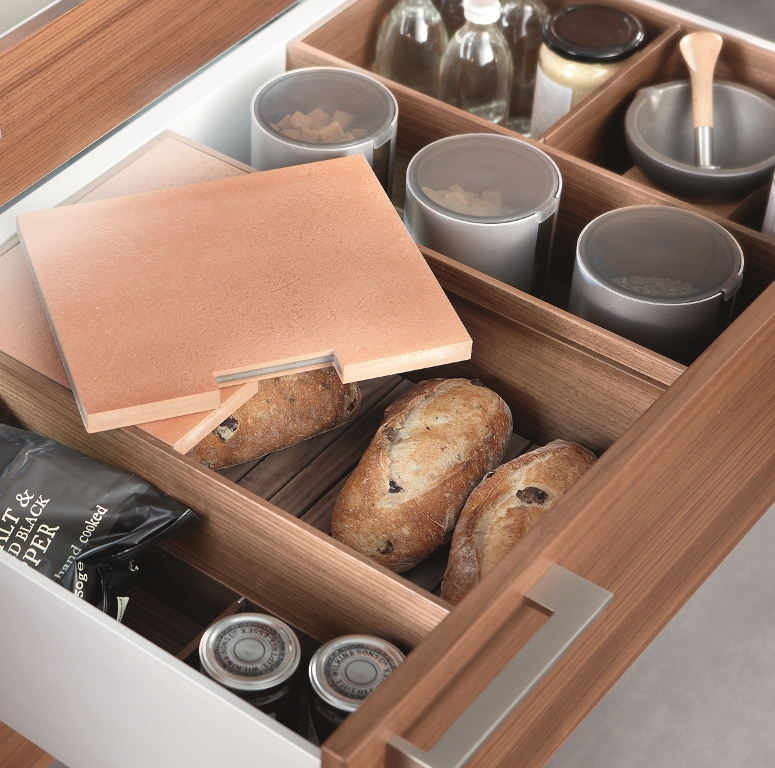
The new +EDITION collection from Poggenpohl combines the best of both worlds, crisp clean white lacquer with warm natural walnut wood veneer.  It is available in flat panel or thin frame detail door styles. New black glass upper wall cabinets include the same thin frame details with finished interiors and LED lighting.Behind the scenes storage is also a Poggenpohl hallmark.  A wide range of  available drawer inserts can be customized to your needs.  These kitchens are not designed, they’re engineered!  This includes not only cabinets but thin counter tops, offered in glass or stone, and even integrated glass front cooking appliances!  One can be sure that their kitchens are as pleasurable to look at as they are to work in.  I also love that although the elements are integrated they seem to also stand alone as individual sculptural statements.  (Spoken like a true kitchen designer channeling her inner artist.)A tricked out backsplash eliminates counter clutterA modern European kitchen utilizes the easy to reach back splash area under the upper cabinets.  Other elements to notice include horizontal graining, mid-height cabinetry and a mix of texture and materials. I enjoyed learning about Poggenpohl and their design philosophy as a part of the Modenus Blog Tour New Orleans.Next up:  We’re gonna get steamy at KFL!  Adding luxury and health benefits to your bathing experience with Mr. Steam

A Kitchen With A Happy Ending!

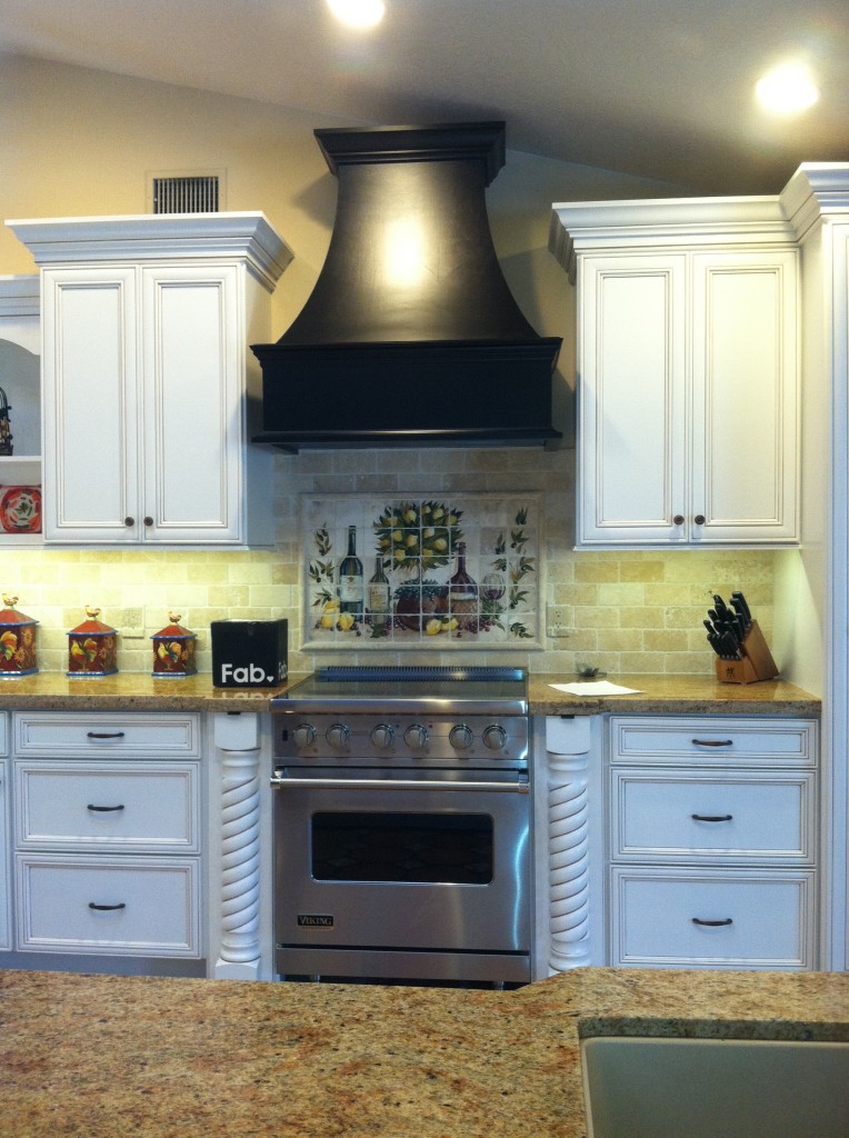
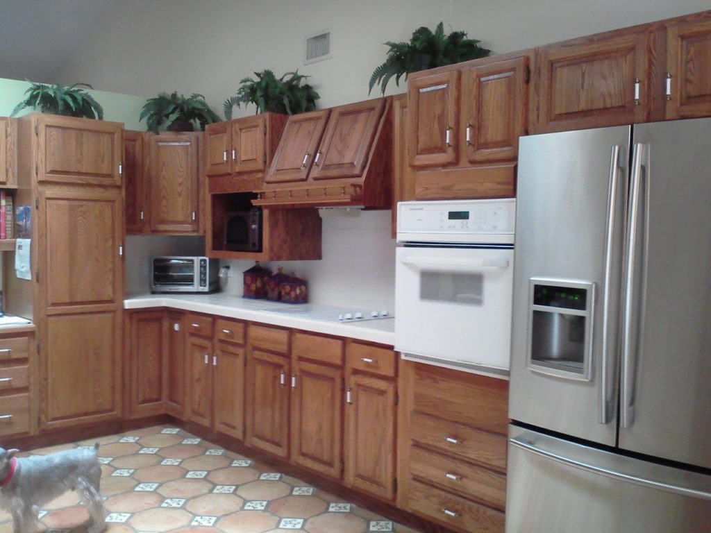
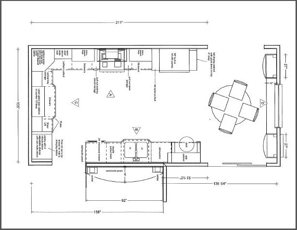
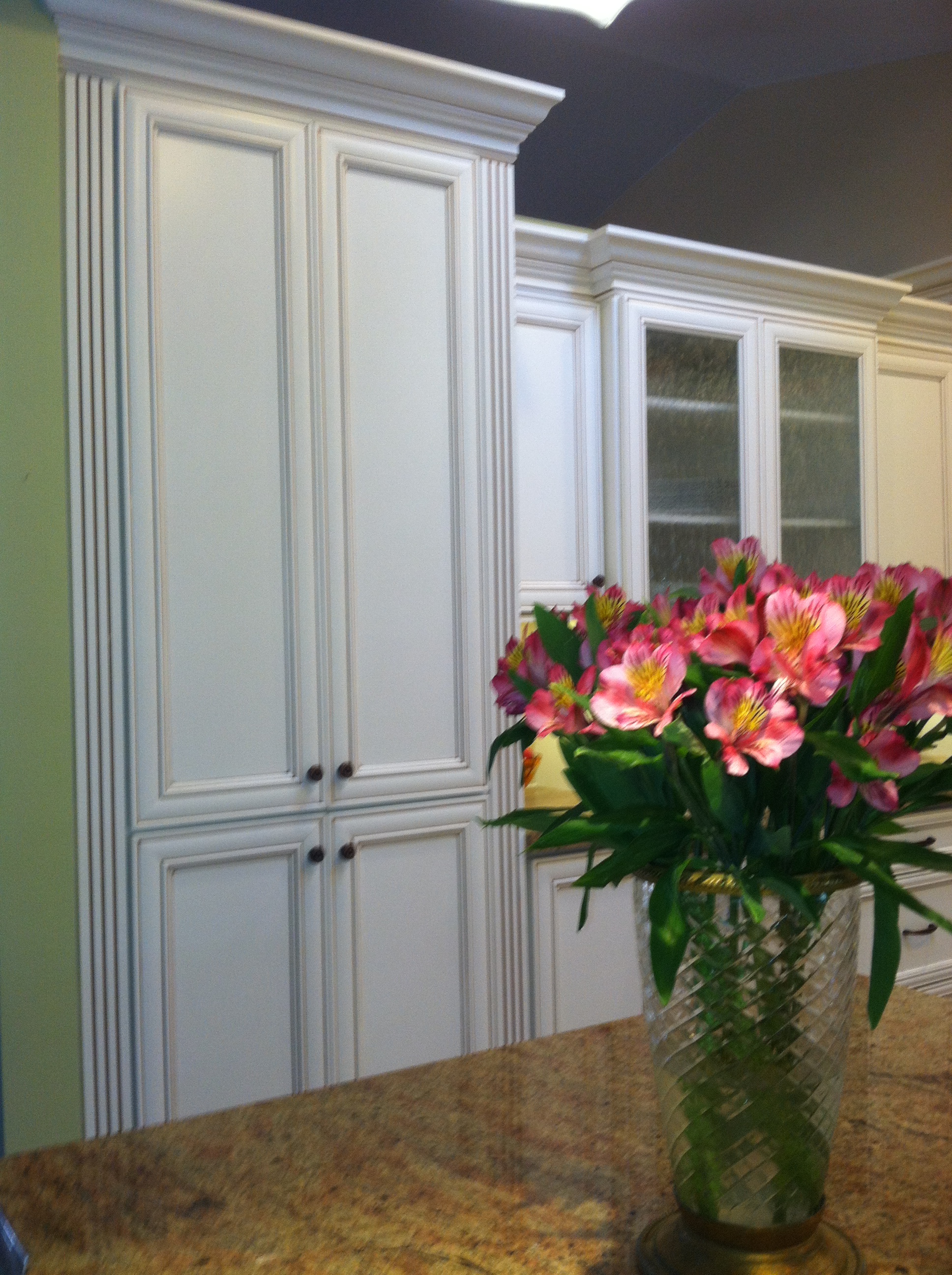
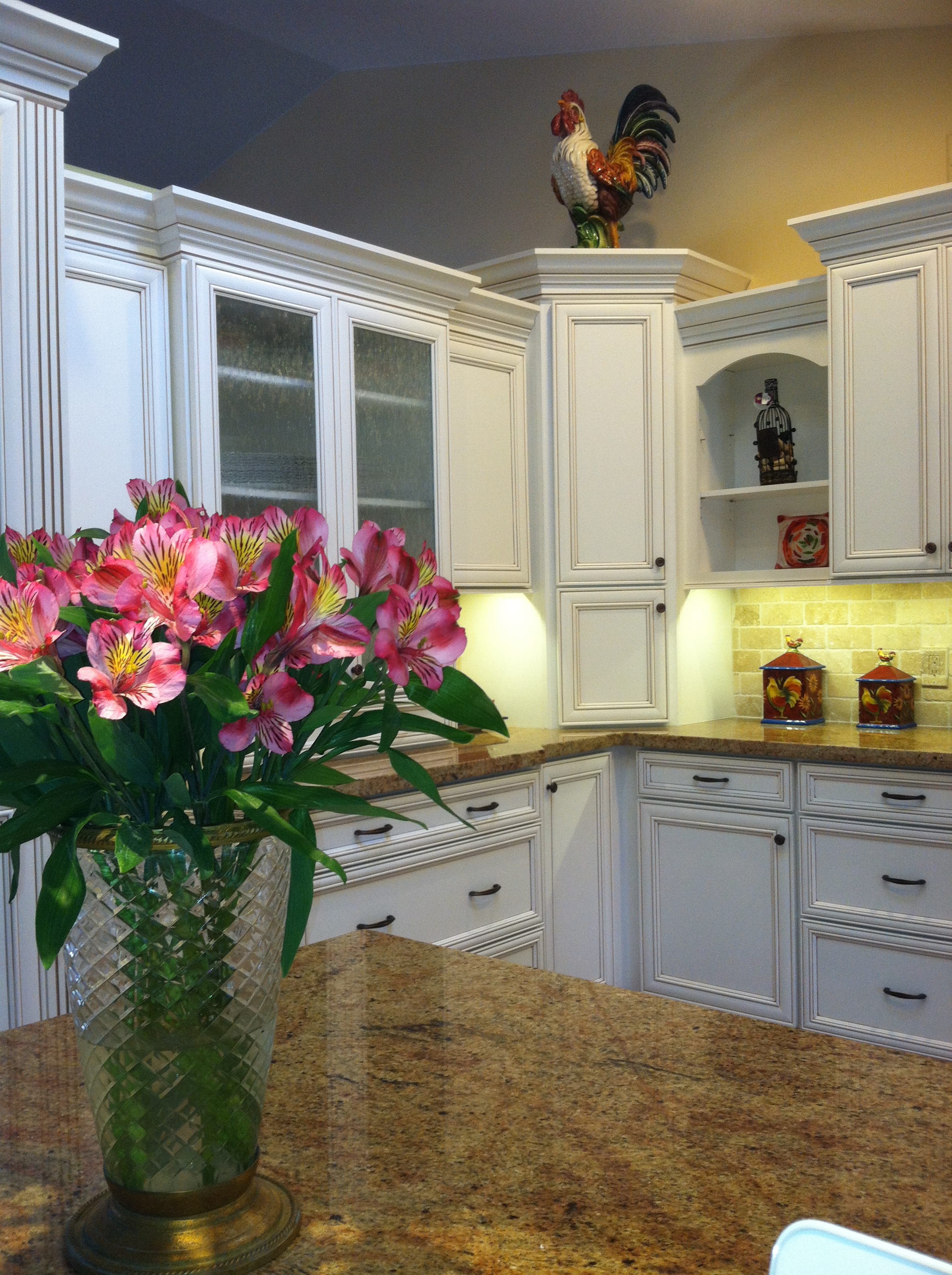
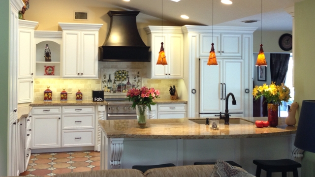
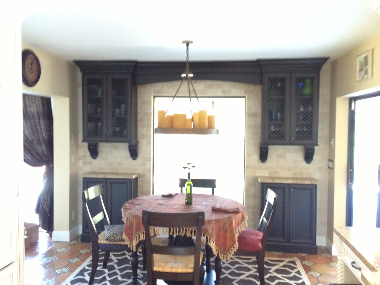
This was my client's vision.Today we wrapped up some final details in this new kitchen.  The client was going for a Mediterranean vibe, elegant but at the same time warm and inviting.  She loves to entertain so the kitchen had to be a focal point for her guests and it had to tell the story of her vision.  All these bells and whistles can really run up the price of your cabinets but we were able strike a good deal with Kith Cabinets.  Here's what she had.  We knew we could improve the function, incorporating her appliance wish list in the style she was dreaming of.  An added challenge was that we had to incorporate the existing floor because it had to stay.  She selected white painted cabinets with a warm brown glaze which really worked well.Here's the planWe were able to include a range by Viking, a Dacor microwave drawer, a beautiful Silgranit sink by Blanco, and some really nifty accessories including a mixer lift which she uses to store her juicer.  We devoted one roll out in the pantry to be used as a charging station and a place to throw the mail so the lovely counter can remain clutter free.  Notice that we also incorporated some gentle curvy shapes with the counter top and the wood hood.This pantry has the charging station as well as racks on the doors for can storage.2013-01-23 09.42.18

IMG_7653That FAB box on the counter is a nifty gift for our client, gourmet salts that magnetically attach to pull out next to range.  They are something like this.IMG_5935This client had a clear direction from day one which really helped keep the project on track.  This very traditional design comes with a maximum of detail and I'm happy to say we have left a very happy couple to enjoy years of romantic dinners in their new kitchen.Design was a collaboration between the client and myself.  Cabinets by Kith Kitchens, counter tops by Stone Palace, appliances by House of Appliances and installation by Brendan Donovan Furniture & Cabinet Co.  See local resources for more info and contact details.