I write about a lot of varied things on this blog. Today I'm going to open my mind to you so you can step inside the creative (or whatever you want to call what goes on in there) process, as it pertains to cabinet design. The thing about designing kitchens and baths is that it doesn't only require vision in the aesthetic sense but also in the functional sense. We have to be creative in terms of the space constraints while being very aware of function.
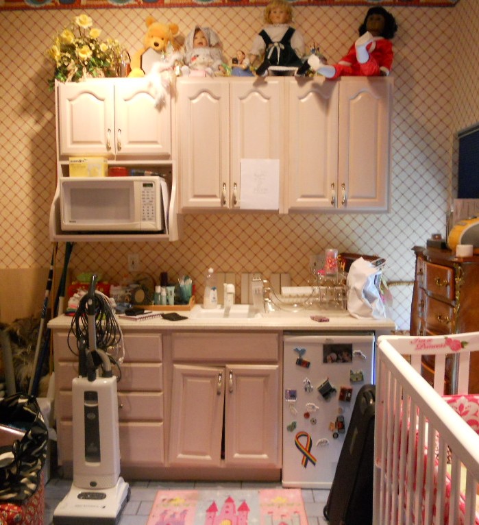
 WHAT HAVE WE HERE? This is a nursery equipped to serve the nanny. She's got an under the counter refrigerator to store bottles, baby food and
 wine whatever she wishes for herself. In addition there is a small sink and a microwave. There is also storage and counter top work space (underneath all the debris). That's a lot of function packed into less that six lineal feet! The lucky owners of this oceanfront abode are away for the summer, as is the custom in Palm Beach.MY ASSIGNMENTI have been asked to replace this set up but to keep the same foot print and function. The cabinets are to be more in keeping for this traditionally styled beach house.MY OBSERVATIONSThe backsplash (area between counter and upper cabinets) is really high, about 22". Not only does this mean less cabinet space but it's a bit of a stretch unless you're a very tall nanny. In addition, there is nothing tying the upper cabinets to the lower cabinets and since they do not go wall to wall it looks as if the uppers are just hanging out, hovering over the base cabinets, not a great look. In general the layout is off kilter. The microwave requires a deeper cabinet and it sticks out unattractively on the left.WHERE DO I START?The appliances are old and will appear even older surrounded by new cabinets. Remember that if you are investing in a new kitchen it's penny wise and pound foolish to try to build your new cabinets around your older appliances. I will suggest that we replace the microwave with a small built-in model in stainless steel. For this I know I must use a minimum of 24" out of the 70" I have available. The refrigerator is important too. This one is old and it's an odd size, about 19". The new one will have to be 24" and I will reccommend that we build it in for a more custom look and to unify the small space. These types of built-in panel- accepting- under- the- counter refrigerators are either 15" wide or 24" wide. I certainly can't detract from the function by going smaller so I will give them more refrigerator space by going with 24" wide. Now that I know what I'm doing with the appliances I will work the cabinet layout around that. Here's phase one showing the larger ref, a built-in micro and an attempt to even things up and connect the uppers to the bases but it's still not quite there yet. I usually draw a free-hand sketch to work out my initial thoughts. The final solution (I drew it using Chief Architect) is to use 42" upper side cabinets instead of the existing 30" uppers. Then since the microwave needs a deeper cabinet (15"), I moved it to the middle and raised it up to create some design interest and to take advantage of the tall ceiling. I made the side backsplashes 16" high with the center at 19". I centered the 24" upper microwave over a 21" wide sink cabinet which allows the bigger refrigerator on the right and does not lessen the size of the existing drawers on the left. I'll need a minimum of 3/4" panel to the right of the ref. That makes a total of 24 3/4" with ref and panel. I will duplicate that on the left making the 4 drawer cabinet 24 3/4" wide as well. This allows the upper side cabinets to be equal at 23 1/4" each. Last but not least, I am going to suggest using matching wood beadboard above the 4" backsplash to tie the uppers to the lowers and add a small crown moulding on the top to finish it off.

 PRODUCTSHere are the goods and why I picked them:Kholer faucet K7342 in brushed nickel finish- It's a traditional faucet in a finish that will blend with the stainless steel of the microwave. The height makes it user friendly yet it will fit perfectly in the space.

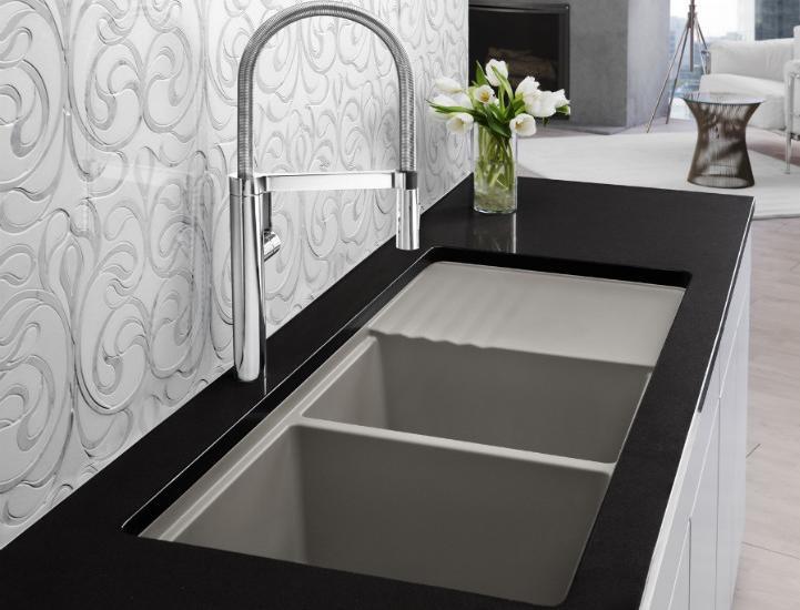
Kohler undermount entertainment sink K5848- I love the shape of this sink. I double checked the size and it fits in our 21" wide cabinet. It's a more updated undermount model but it's still cast iron. I'm specifying Biscuit to go with the cabinets but I will also suggest a stainless option which would also work.

SHARP R1214OVER THE COUNTER MICROWAVE- This model fits into our 24" wide space. It requires a 15" deep cabinet, check. It has a light below and I happen to know that Sharp makes a kick-ass microwave. CABINETS BY HOLIDAY KITCHENS- flat panel with applied moulding. Finish, selected by designer, to be Snowdrift paint with Mink Wash. I chose Holiday cabinets because we have some custom size requirements and I can order Holiday in fractional increments. They also offer a wide array of finishes and door styles which is important in a higher end application.
 U-Line Under the counter refrigerator - This model offers an overlay trim kit option which will allow us to apply a door panel to match the cabinets.What do you think? You see there's no mystery behind the magic of design. Those are the steps in a nutshell. I would love to walk you through the steps of your own potential magic. It's really a lot of fun when it all comes together, kind of like solving a puzzle AND you get to continue to enjoy it everyday!
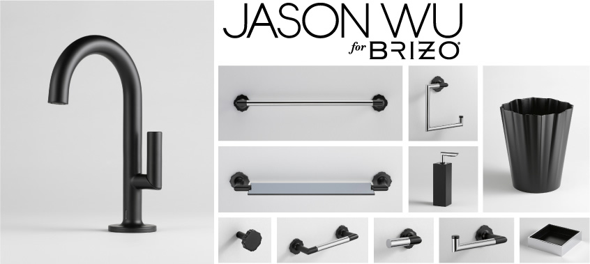
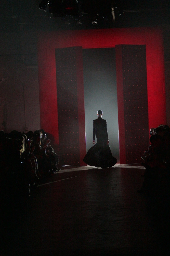
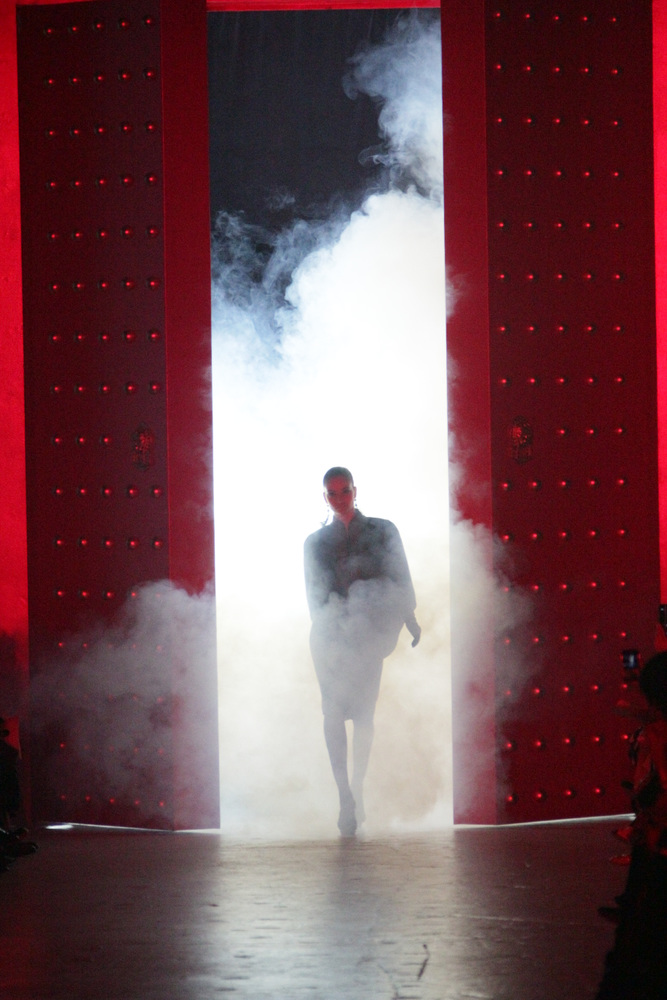
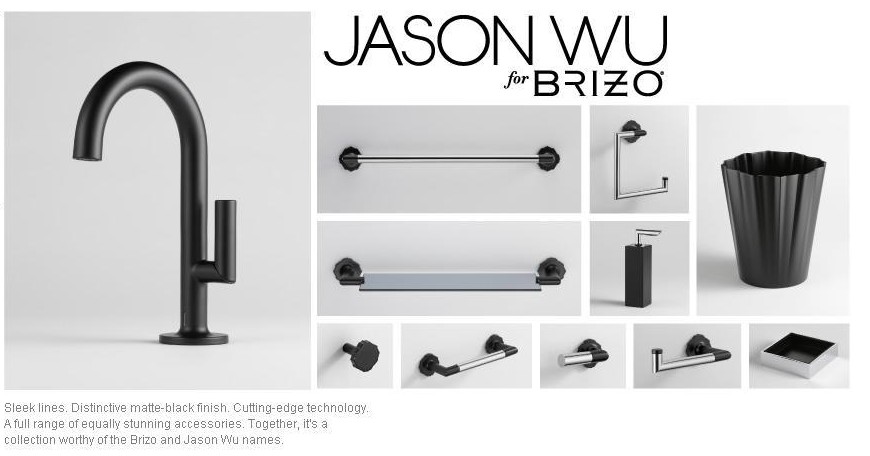
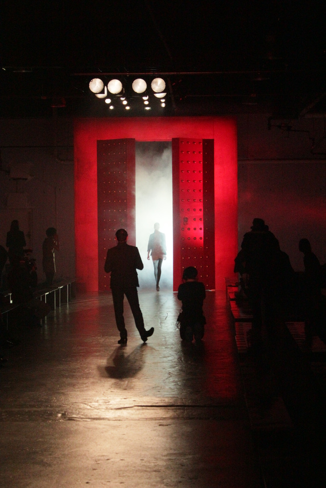 I'll never forget attending fashion week in September 2010 courtesy of Brizo Faucets. It was an honor, to say the least, to have been invited to become a member of the illustrious "Blogger 19". Brizo goes way back with fashion's Golden Boy, Jason Wu. Since 2006, the two have joined in a unique collaboration, showing the world that high style can be achieved both at home and on the red carpet. The partnership began with Brizo's sponsorship of Jason's Spring 2007 Collection during Fashion Week in New York City in September 2006. Jason designed a dress exclusively for Brizo that was auctioned off in 2007 with proceeds benefiting DIFFA (Design Industries Foundation Fighting AIDS). Jason's involvement with Brizo now includes his own Jason Wu for Brizo Collection comprised of lavatory faucet and accessories for the well appointed Powder Room.

