The Big Move Part V Progress Not Perfection

It's time for Part FIVE!!! I know how patiently you've all been waiting for this new installment of The Big Move.  It's been a challenging week including a meltdown that turned a Phase two project into a Phase NOW situation.

The Big Move Artful Kitchens


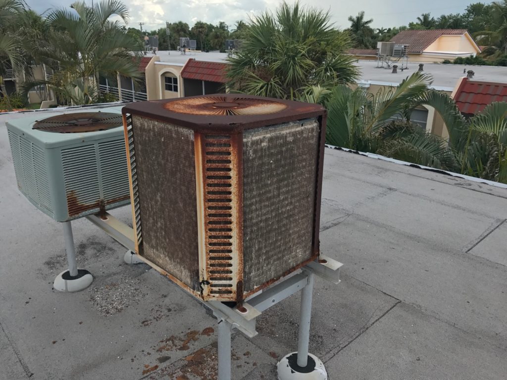
It's July in FLA and we just had to address the AC situation so as not to lose our dearly beloved labor force (Bob).  The result of the first service call yielded a $99 bill and no relief from the heat.  Granted the AC unit, we've discovered, looks like THIS!  

We need a new 2 1/2 ton unit and were quoted $6,500.  Next up, the second service call.  For this one, we called a smaller company who we have worked with in the past and guess what?  He's actually got the current unit working for the time being.  In fact, it's been cooling for about 5 days and counting so Bob is cool for now and we'll see what number two's estimate is.   I have high hopes since this AC guy is apparently a miracle worker.  I digress.  This week I promised a peek into what exactly is going on in the bedroom and master bathroom, which, to be sure, is a mini master.  Check out the tricks, tips and snarky commentary by editor Joe and see what we are doing to make small work in a big way.


As promised, here are the products we're using as mentioned in The Big Move Part V:


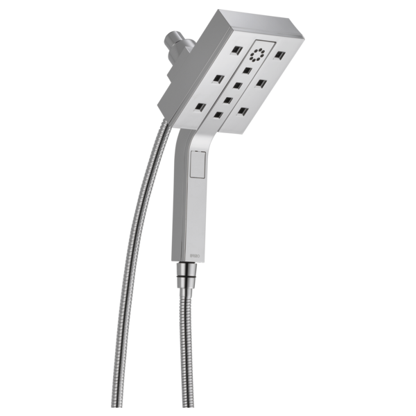
Brizo Euro Square Hydrati 2 in 1 showerhead Artful Kitchens


In the spirit of full disclosure, this showerhead was gifted to me by the lovely peeps at Brizo faucet a few years back.  It's our style, works great and we love it so it's moving with us.  The center portion pops out for hand held function.   It comes in chrome (above) and polished nickel.  Brizo is a part of Delta Faucets offering some really cutting edge design options but I actually love what Delta offers in their main line and it's what we chose for the shower and sink faucets.


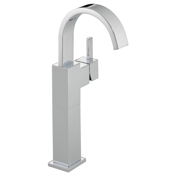
Vero faucet Delta single hole Artful Kitchens The Big Move

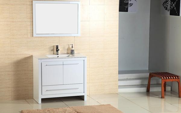
We went with a single hole/handle model as it is what will work with our furniture vanity which is pre drilled and looks like this.

Alexa 30" vanity by Adornus The Big Move Artful Kitchens


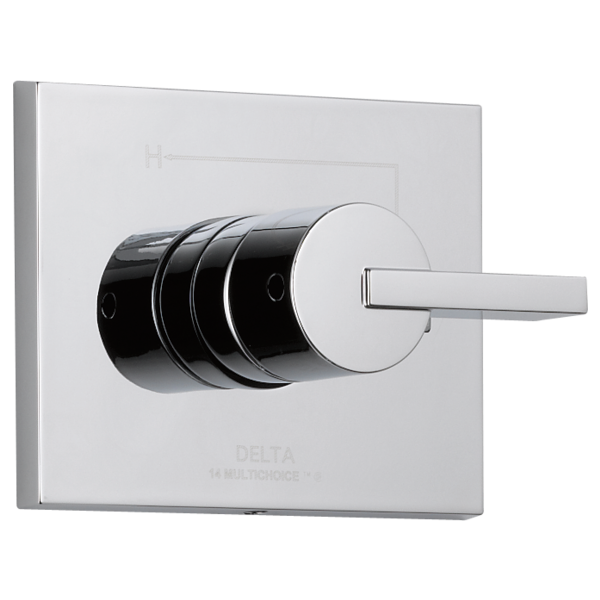
It comes with matching mirror and is a high gloss white finish which will look great with the shiny shower tiles.  Furniture vanities can be a great solution if they work with your space as you have the counter top and sink already done and included in the total price of your vanity.  The shower also will have the matching Vero design. I love the Vero styling because it incorporates square clean lines as well as the softness of the circle. I want it all!

Delta's Vero shower valve in chrome The Big Move Artful Kitchens


We didn't want to sacrifice any precious space for a shower bench but a girl's gotta shave her legs, right?  I plan to get this cute shower stool. I love the fact that you can move it.

Dahlia Gloss Resin Bath Stool


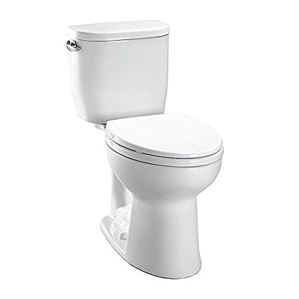
So now for the toilet.  As Joe so accurately pointed out, we did not, in fact, end up with a skirted toilet.  I thought that's what we ordered but it wasn't.  I'm okay with this and truthfully just thrilled to have a Toto toilet.  It is, however, a compact model just perfect for small spaces with a tank that measures just 14 1/2".  Incidentally, we also had an outlet put in right next to the bowl for a future Washlet and if you don't know what that is you should and you can read all about it here.

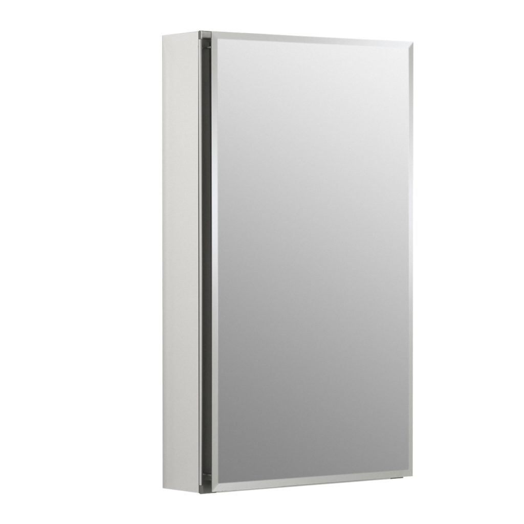
Since storage is at a premium we're going to include this mirrored medicine cabinet over the toilet. 


15" by 26" Aluminum Single door mirrored medicine cabinet The Big Move Artful Kitchens

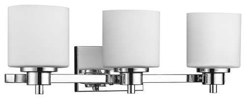
Last but certainly not least is the light.  I thought this lovely fixture was just the right style and size to illuminate this artful mini master bath. 


Solbi 3-Light Chrome Finish Bath Vanity Wall Fixture White Alabaster Glass 24"


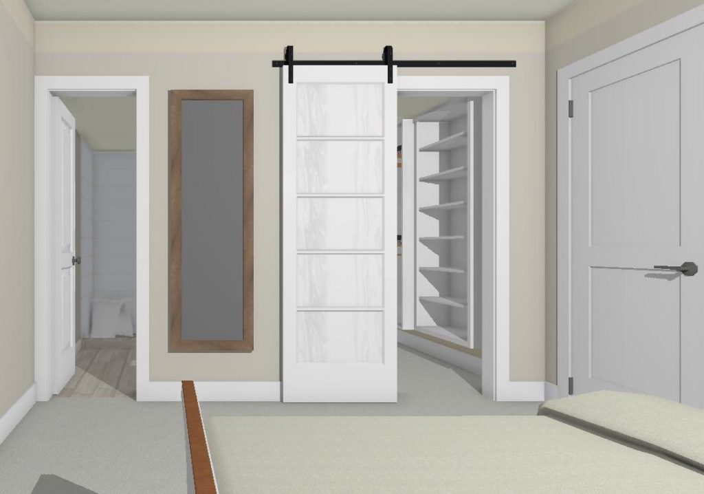
The barn door was an excellent solution for two doors that didn't get along very well!  So there you have it!  Please feel free to comment.  I'd love to hear your thoughts and don't forget to subscribe to the blog for more tips tricks and some upcoming behind the scenes revelations of this Artful Kitchen designer. xoxo


The Best of KBIS 2016

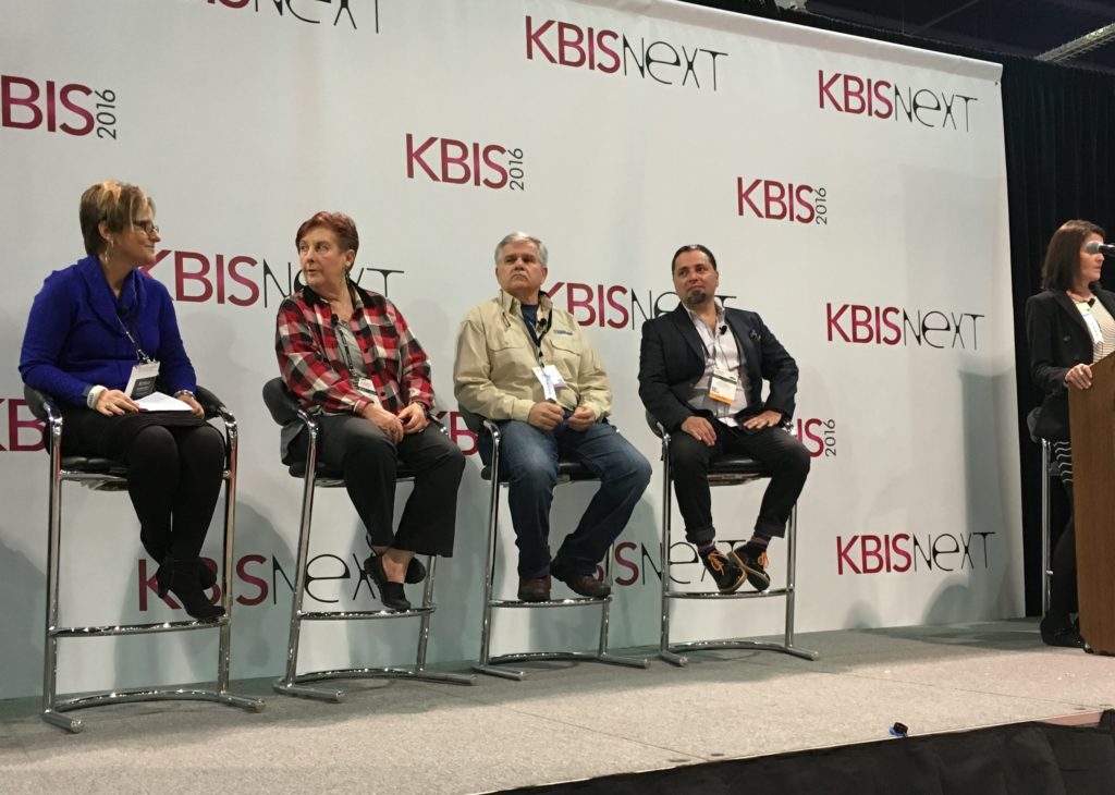
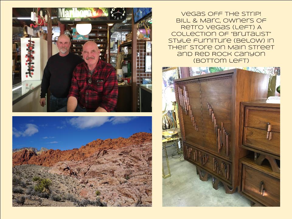
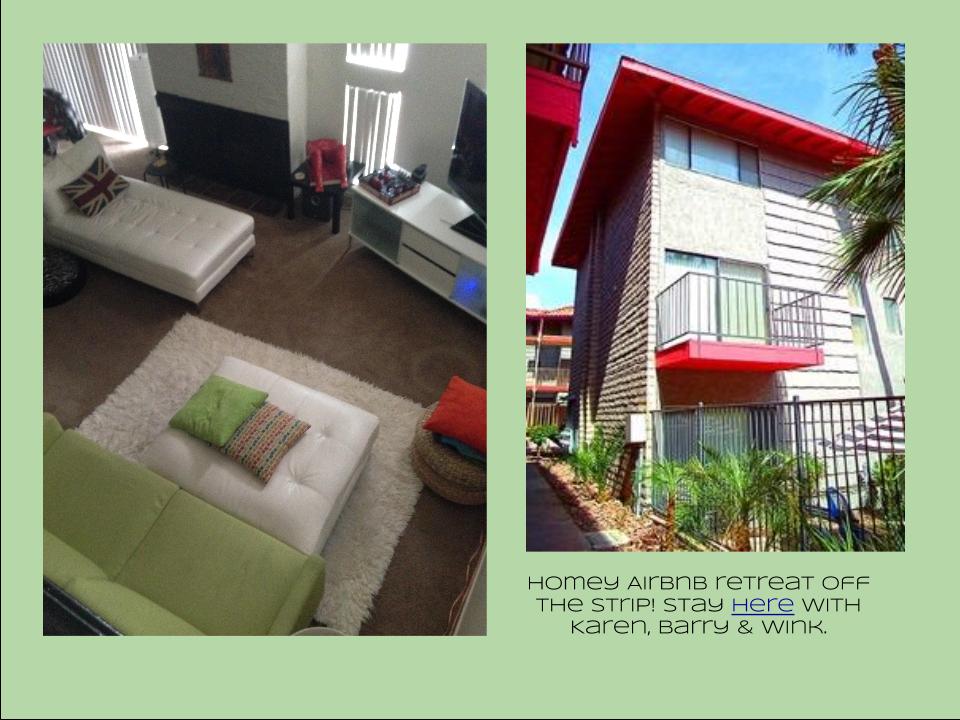
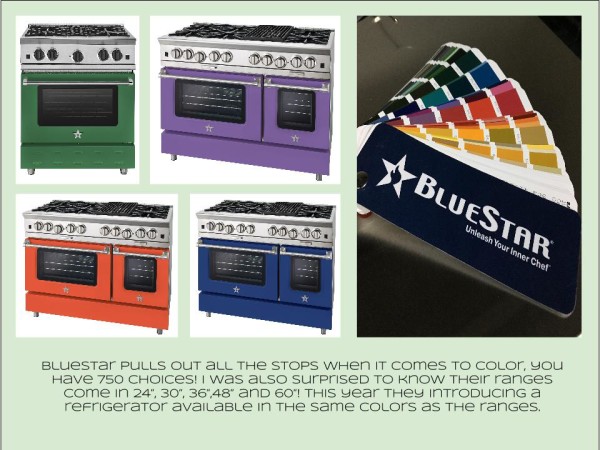
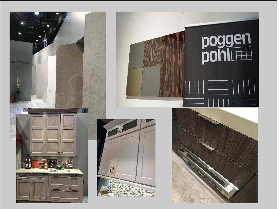
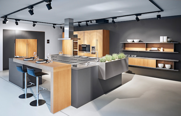
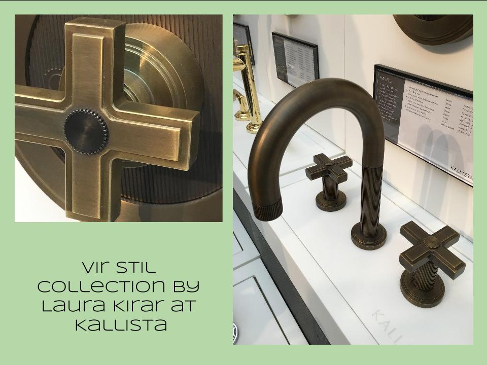
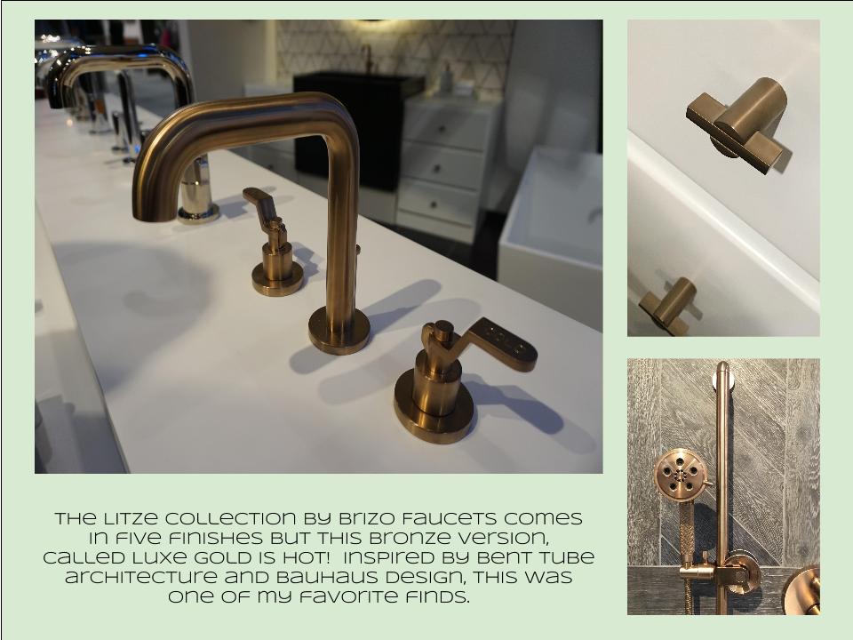
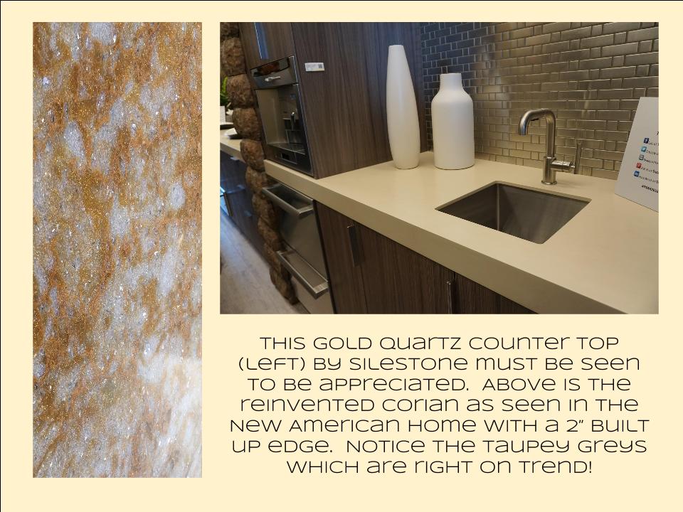
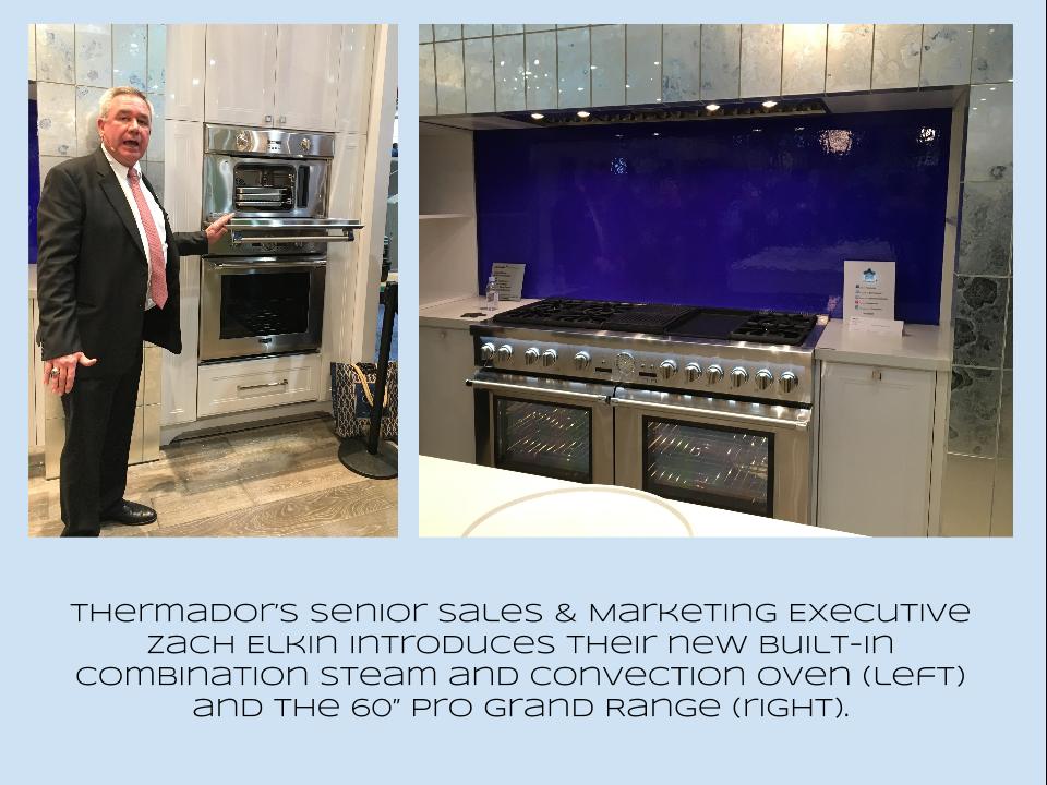
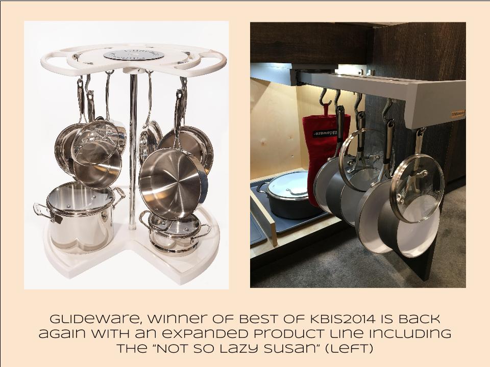
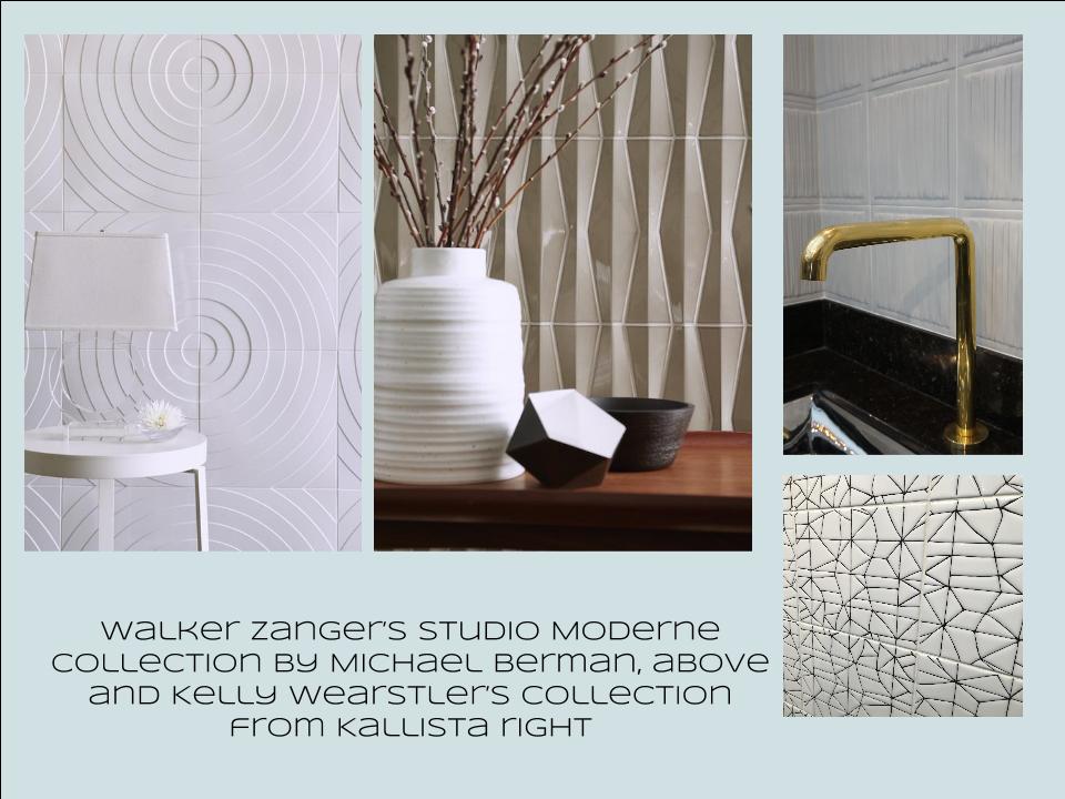
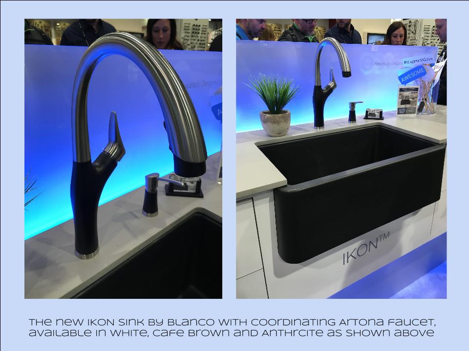
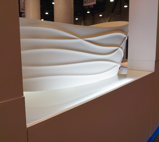
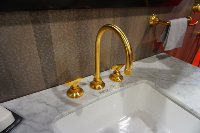
Bam!  Another show is in the books and although it's been a busy week "back at the ranch", I've been dying to share my finds with you right here on Artful Kitchens.2016-01-19_184543141_4F428_iOS (2)Las Vegas was host to three days of networking and education for the best of the Kitchen & Bath industry.  As a member of the Kitchen & Bath Business Magazine's Advisory Board,  I had the pleasure of appearing on the KBIS Next stage as a part of the panel discussion entitled Trials & Tribulations-Solutions to Your Biggest Kitchen & Bath Challenges. It was an exciting exchange of ideas between both the pros on the panel as well as a savvy and engaged audience.Vegas Off the Strip Karen (1)I also had the opportunity to spend some time in the Las Vegas I like best, off the strip! I hiked in the Red Rock Canyon and visited my friends at Retro Vegas on Main Street. My digs for this trip were with my dear pals Karen, Barry & Wink.  They live in a midcentury modern gem that, rumor has it, was briefly home to Lucille Ball!  They are avid Airbnb'ers and wonderful hosts.  Check it out if you find yourself in Vegas. This location is so convenient to the Convention center I could walk, which I did, once.  Mostly I Ubered. Enough walking happens on the show floor!  So without further ado, here's my recap of the biggest and most notable trends and products that caught my eye at KBIS2016. ColorWhite still reigns.  In fact paint giants Benjamin Moore and Sherwin Williams have both selected shades of white as their color of the year.  You know I am a huge white fan. It is always the best backdrop for art and design. It also continues to be the favorite cabinet color in my area.  Remember white is not just white, there are an infinite number of varieties you can have fun with.  If you need more punch in your kitchen you could find some great options at the big show.  I saw bright saturated colors in several appliance brands including Bertonazzi, Viking and BlueStar which offers 750 colors!  color (2)Grey has not left the stage.  The newest versions are warm, venturing into taupe territory. Textured wood grains such as cerused oak are really popular. Wood-Mode showed both traditional and contemporary versions of ribbon Mahogany.Cabinets Poggenpohl_Diamond Grey_Oak Honey BrownThe Perfect TouchTouch latch technology was EVERYWHERE!  If you prefer a sleek, uninterrupted look for your cabinets and appliances this is for you, a gentle nudge will open your cabinets. This is nothing new but it's taken off.  I also loved the button that allows you to close this cabinet when you're done without resorting to dangerous acrobatics (I'm short).Untitled drawing (5)Feeling BrassyActually brass, copper, bronze and myriad versions are hot for plumbing fixtures and hardware.  My favorites were the new BauHaus inspired Litze collection by Brizo Faucets. and Kallista's Vir Stil collection.LitzeNot Your Grandma's CorianIf you're like me Corian has been dead to you since about 1998.  That sentiment has now ended in my book.  I saw a 2"thick sleek contemporary version of Corian that was perfectly at home in The New American Home.  The other exciting thing I saw in counter tops was this quartz by Silestone.  Yes, it's GOLD!  I just wish the photo could capture it's sparkly beauty.CountersThrills from ThermadorAppliance brand Thermador held a press conference on the show floor to introduce a couple of impressive new products, the 60" pro range available with steam and a double oven featuring steam and convection.  These are firsts in the industry.ThermadorOrganize ItJust when I thought we had it all the category of organization it goes to the next level. There was a great representation of brands ranging from Hafele to Rev-A-Shelf to Hardware Resources but Glideware is taking the market by storm.  If you've got a mess lurking somewhere I guarantee there's a way to make it neat and accessibleRev A ShelfGlidewareTile StyleMy two tile favorites were Michael Berman's Collection from Walker Zanger and, of course, Ann Sacks who are featuring a new line by L.A. design maven Kelly Wearstler. Love!Tile (1)I can IKONIf you read my blog you know I love me my Silgranit sinks, meet IKON the apron front version which easily works in any style kitchen from Traditional to Contemporary. Their Artona  faucet perfectly complements the Silgranit sink.-BlancoStikwood Rocks!
Stikwood’s line of lightweight, real-wood planking offers designers and DIYers a peel-and-stick solution to achieve that perfect, sought-after blend of rustic and modern. It can be used on walls and ceilings and comes in tons of colors, even prints! I'm thinking this could be great on the back of a kitchen island.

stikwood

Believe me, all this is just the tip of the proverbial iceberg.  There was so much more to see and learn about at KBIS 2016.  Check out this year's winners of Best of KBIS for more info and of course if you'd like any more info on what you see here email me at artfulkitchensbyglo@gmail.com

Big Trends from KBIS Part II

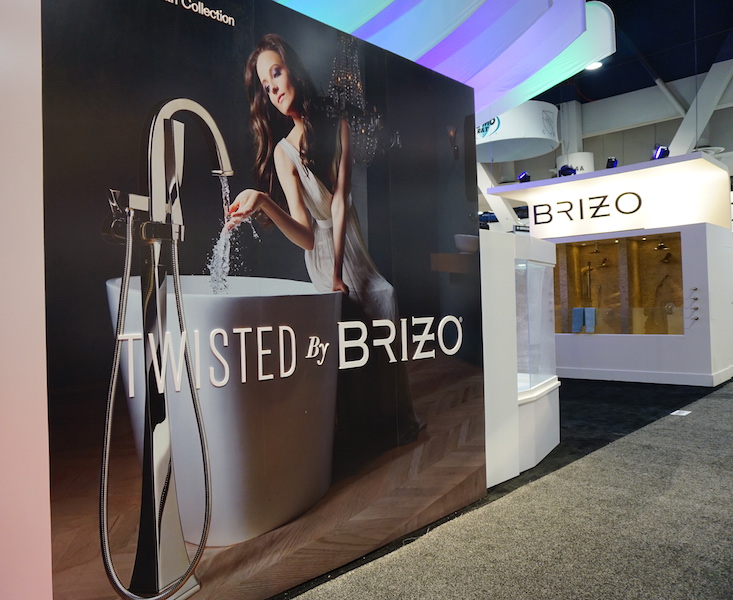
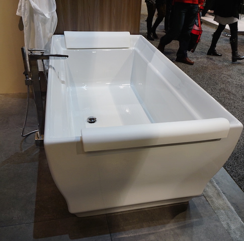
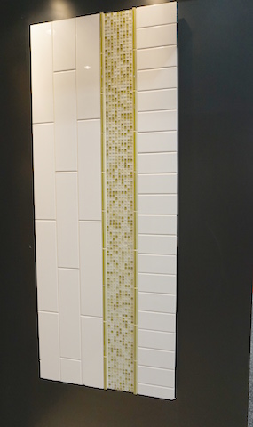
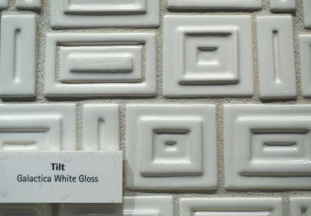
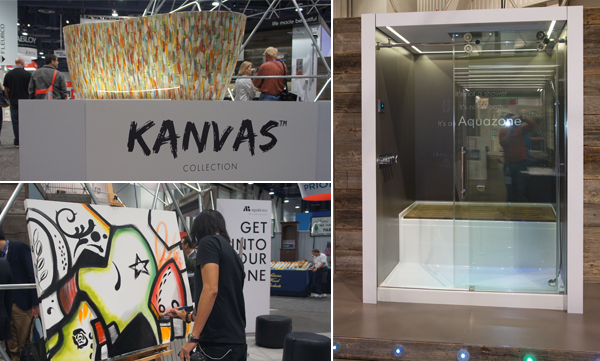
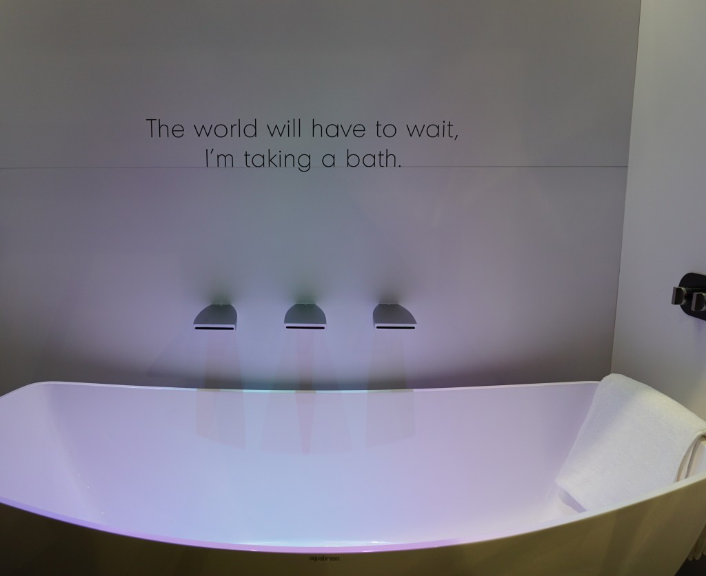
The Modenus Blog Tour recaps continue! Last post I shared some of my kitchen trend discoveries from KBIS2015, the 51st Kitchen & Bath Industry Show held last month in LasVegas.  Today I've got the scoop on what's trending in the bath.Gorgeous sculptural free-standing tub by Clark Architectural I have to say it, personalization is also at the top of the list for bathroom style and function.  I saw lots of new options for faucet finishes.  Were you getting tired of brushed nickel? Nice to see something new in that arena.2015-01-20 00.40.52 I saw a lot of contemporary design for the bath, minimal clean lines, simplicity but with quality materials.Affordability is definitely achievable.  For example you can have the quality of Kohler with their basic Sterling line or luxury of their exclusive Kallista line.Ensemble_60x32Black Crystal, Mother of Pearl, Calcedonia Azul, Lapis Lazuli (shown below), Tiger Eye, and Malachite.Brizo introduced its new Rook collection for the bath, with a subtle reference to chess.  Its their latest suite of luxury faucets, fittings and accessories for the bath. This collection combines a low spout architecture and crisp octagonal details for a stately yet modern design.2015-01-20 00.42.46Brizo also has something for you if you're a little "twisted" and I love it.  It's the Virage Collection 2015-01-20 00.42.31Free standing tubs and tub fillers-  The popularity of free-standing tubs created a whole new plumbing fixture, the tub filler.  They were everywhere!Comfy tub by Villeroy & Boch with TOTO tub filler as seen on the show floor at TOTOCreativity with tile- It's not just subway tile anymore although there are even a lot of interesting variations on this popular style.Something a bit different but with a subway tile vibe by Florida Tile Tilt by Walker Zanger is mid-century inspiredI can't leave you today without a nod to the number one booth in my opinion.  I wasn't alone as it was also voted most innovative booth of the show.  The award went to AquaBrass for their Buckminster Fuller inspired geodesic dome.  This innovative concept wowed me but they went all the way with my favorite combination art + design.  With and artist on site creating beautiful artful bathtubs!  This was to introduce their new Kanvas collection.  It brings art to the bathroom in a limited series of hand-painted freestanding bathtubs, each one signed by the artist. The tubs are stone resin and offer a choice of three hand-painted exteriors: bright and bold Graffiti has a youthful, urban edge; nature-inspired Pax invites bathers to a soothing Zen-like experience; and architectural Mosaik brings timeless elegance with its classic yet modern look.aquabrassAquabrass also introduced something that's going right on my dream list. The Aquazone,  a revolutionary shower and bath concept that provides the best of both worlds. Molded into a single, space-saving wet zone unit requiring only 60"X60" of space. North American-built, its strong, one-piece construction is solid Lucite acrylic with a reinforced base. And with two integrated wheels and six adjustable levelers, it rolls into place easily, saving time, materials and labor costs.DSC00093Not only was the  booth full of great new products and finishes with the occasional thoughtfully placed message, they thought outside of the box and into the dome!! Kudos to the creators and congrats.Up next: We're not done in the bathroom yet! Here's the Jeopardy question: "The number one plumbing fixture supplier in the world" Who is ??????

Hip To Be Square, Or Not

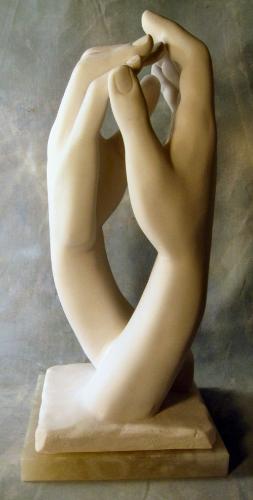
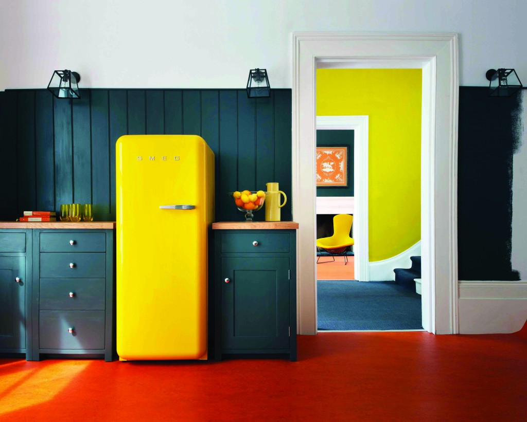
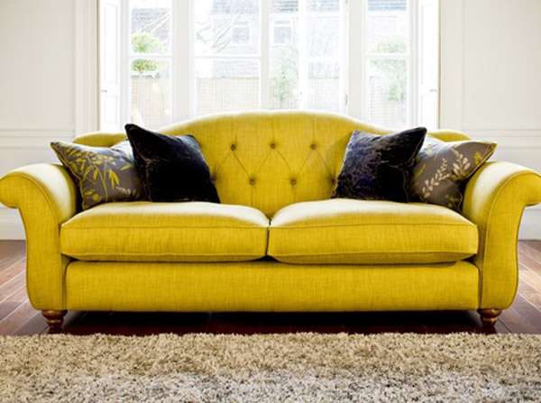
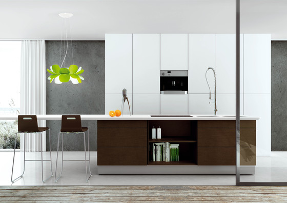
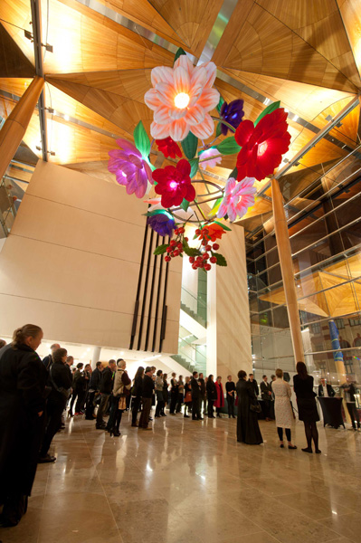
I've heard the saying " it's hip to be square" but that’s not always true, sometimes curvaceous qualifies.  Here are three of my fave new products that sport some cool contours and are far from square. THG Pure faucetsculpture cathedralhands rodin                Sometimes just the slightest suggestion of a curve is enough  to soften a silhouette.  This beautiful faucet by THG Paris is available in, get this, 35 finishes! The French excel when it comes to subtly, oui?Refrigerator by SmegThis is what you would call a "statement refrigerator"!  Smeg is an Italian company largely known for these cool retro-style fridges.  The other new colors just introduced are white and a highly anticipated Union Jack pattern (who knew?).  The soft rounded corners are all about the 1950s.  The 9.22 cubic foot capacity is a little more Euro than American but who can resist those sinuous lines and vibrant colors combined with cutting-edge technology?yellow sofa freesharing.orgI even found you a  sofa to partner with your new yellow Smeg :) Not bad, I must say.   Last but in no way least is Infiore by Estiluz.  It's a beautiful stylized flower sculpture masquerading as a lamp.  This one is a pendant but it also comes as a floor or table lamp.  The petals are available in different colors and sport a collection of bi-injected polycarbonate petals.  I have no idea what that means but I do know it means the lamps feature an interesting two-color lighting effect.  These are available at LightingbyGregory.comInfiore Flower LightThe organic curves of Infiore add a whimsical softness to this very linear contemporary kitchen (which I love)  The larger-than-life scale also makes these flowers fun! I rest my case, curves are a beautiful thing ;)Auckland City Art gallery foyer and flower sculpture 

Jet Set for the Bath

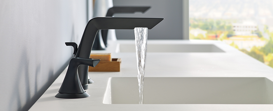
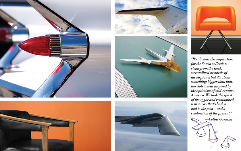
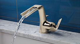
In my world of kitchen and bath design, just when I think I’ve seen it all, I realize that’s very far from the truth.  Luckily, I see all the drool worthy newness hot off the press via the myriad news releases I receive every day.  Here is one new product I recently learned about.  I think you'll agree it's not to be missed!Sotria,BrizoFaucets Not only do I love the dependable functionality of the Delta/Brizo brand, but I’m always intrigued in the creative process they use in coming up with new design.  Brizo Faucets has outdone themselves again with their new Sotria Collection.  Think mid-century-jet-set-streamlined-fins-you get the picture.  The sleek angular lines call to mind the days when the iconic Pan American World Airlines ruled the sky.  At the risk of dating myself bigtime, I'll admit my dad actually worked for Pan Am so I was a lucky enough to be a jet-setting tot! Sotria inspirations courtesy of Brizo Playing off the Sotria collection’s mid-century inspiration, Adele Young, of VDL Interiors, infused colors and shapes popular in the 60’s throughout this space. The result? A beautiful room brimming with modernity while hinting at the retro age of “Pan Am” airlines. Sotria,Brizo,AdeleYoung,VDL InteriorsPanAm Boeing 737 courtesy of planespotters.net Sotriafaucet, chrome   

The New Brass

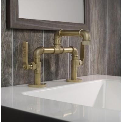
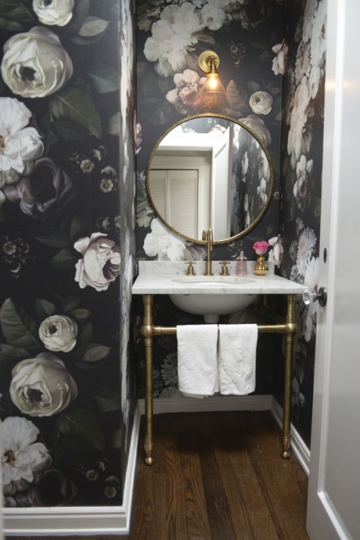
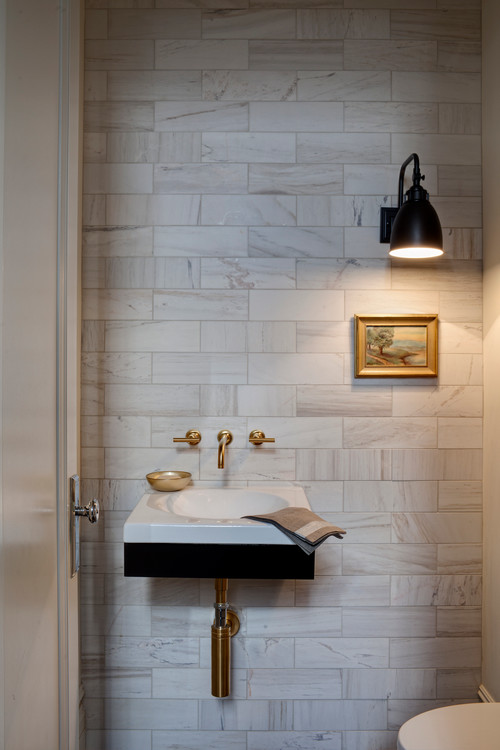
As you can probably imagine, I see my fair share of stainless steel and brushed nickel finishes in plumbing fixtures and cabinet hardware.  It's pretty much been the "go to" finish for ages.  Some clients will go for shiny chrome, which I happen to love as it enhances any contemporary design very nicely, thank-you-very-much.  It's also usually less expensive.  However today I would love to invite you to consider another option that has captured my attention of late.Watermark-Elan-Vital-02 It's what I call "the new brass".  There is just something about the look that appeals.  Perhaps it's because it's such a complete departure from stainless?  New brass looks like old brass which is its charm and it's definitely more at home in traditional types of design.  Classic design can be fresh new and yes, even modern.  The Elan Vital faucet, by Watermark Designs, shown above, features their New Age Brass finish and you can customize it however you wish, sort of like a Tinker Toy!  It's also available in 38 other finishes.powder-room-final-520x779There is just something about this little ensemble that I love.  It's greater than the sum of its parts.  You can find out all the deets here.A word of advice, if you're loving this look too and considering brass, make sure to specify "un-lacquered brass".  This finish will change over time developing a patina.  If you're not up for that, you can get lacquered brass which has a protective coating and keeps the finish stable.The following pic, courtesy of  Houzz.com is what I mean about traditional design crossing over into modern territory.  The marble, brass and even the artwork are all traditional elements arranged in a lean simplicity that screams (ok perhaps it whispers) modern. 

Note the door hardware is chrome and that's ok!  There is a perfect balance of brass.