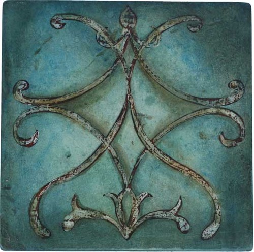
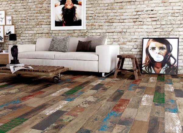
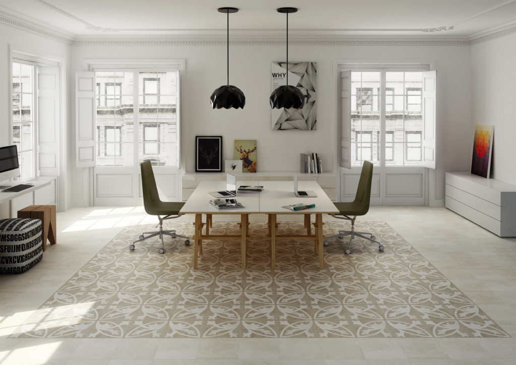
Before we get too crazy with the art here (I'm so sure we will!) I wanted to share some solid info about tile from the man who knows it best, Ryan Fasan. I had the pleasure of meeting "THE tile man" on my recent trip to the trade show Cevisama with Tile of Spain. Ryan is a professional consultant for all things tile related and also spoke this past week at the trade show Coverings in Orlando. Explaining and sharing his vision and understanding of ceramic tile is what he does best and he has graciously agreed to dish his knowledge here with us at Artful Kitchens. Take it away, Ryan! (For your viewing pleasure I am including some photos from some of the Spanish tile brands seen at Cevisama15)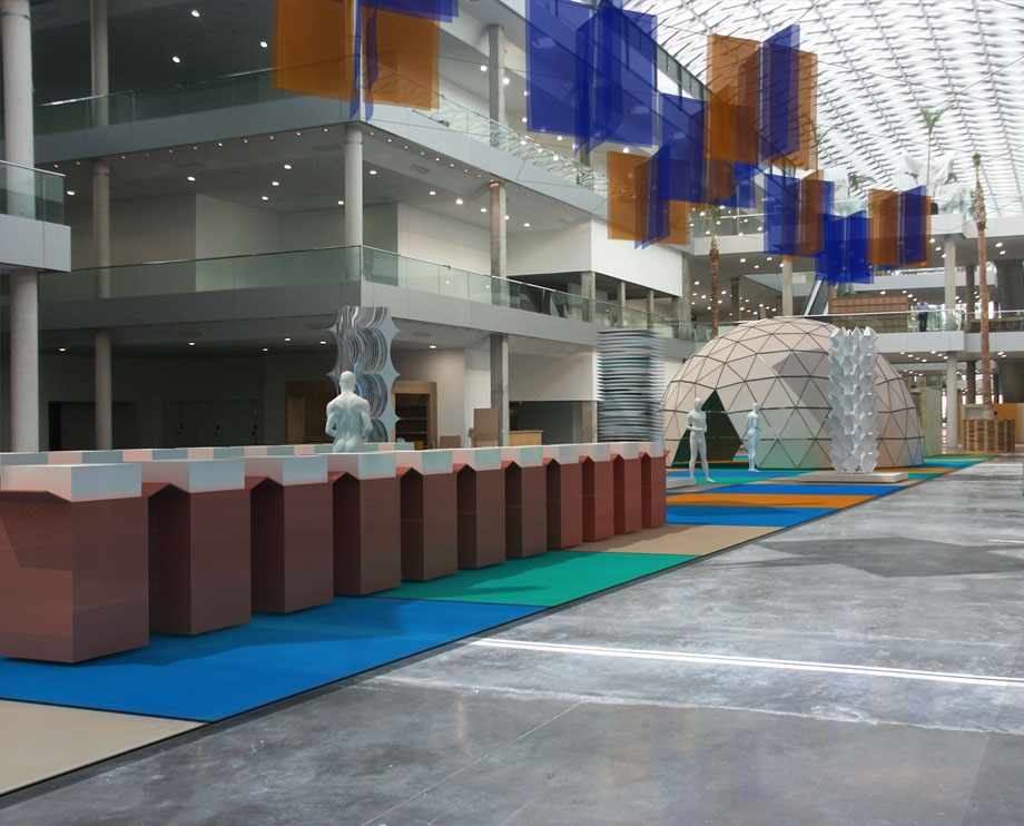 AK: What’s the difference between porcelain and ceramic tile? Ryan: Porcelain (who’s technical term is impervious tile) is a classification of ceramic tile. There are four types of tile, each classified by its water absorption capabilities. Impervious or porcelain tile happens to be the densest with a porosity of 0.5% or less. It is important to note that densest does not mean “best” in every application. The industry makes four types of tile for a reason and each type has an optimal area of use. When selected and installed properly any type of tile can last for decades if not centuries.AK: Is it true that porcelain tile is the same color all the way through?Ryan: Well there is "through-body" porcelain and colored body porcelain which is probably what you're referring to. Through-body is a heavy duty commercial product that is unglazed and extremely durable with very low water absorpbtion, usually around 0.01%In residential design you're more likely to encounter colored body porcelain which has some type of glaze. The body of the tile is then colored to match the glaze but the wear layer is still just in the glaze, so no, it's not "the same" all the way through.
 AK: Do I have to use grout?Ryan: Even though this is often the wording used, the real question is do I have to leave a joint or can I just put the tile tightly together (called a butt-joint)? The answer is yes, you do have to have a joint. Our buildings are not as solid or perfect as we often think they are. Joints allow for natural expansion and contraction.AK: I know that all tile is made of white or red clay. Is one better than the other?Ryan: Absolutely not! A good factory will make quality tile from any color of clay. Often the most cost-effective and environmentally responsible decision is to use whatever color of clay is locally available and modify it as required. Price is most likely dictated by the proximity of the clay source.
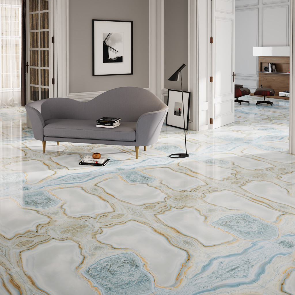 AK: What benefits are there to “rectified” tile?Ryan: Rectification is the cutting grinding of all 4 sides of the fired tile to ensure that all sides are square and the entire surface area is flat. By removing the sides, we get rid of the characteristic “pillow” in a ceramic which makes for much more realistic stone or wood reproductions. This can allow for a joint as small as 1/16"! However remember to ask if a tile is mono-calibre before specifying that small of a joint.
 Wow! Just think how knowledgeable you are going to be next time you go tile shopping! Thanks again to Ryan for taking the time to answer my probing tile questions.Continue the conversation on FaceBook. Is there something more you'd like to know about tile or a fact that you'd like to share?
Tile Tuesday: In Valencia Art is a Way of Life
Welcome to today's installment of Tile Tuesday! The second half of my adventure with Tile of Spain took us to Valencia, location of Cevisama the annual trade show held to showcase the latest innovations introduced by the Spanish tile industry.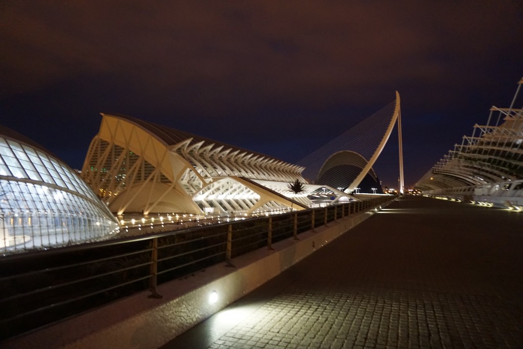 We traveled by train east from Sevilla to Valencia, which is situated on the coast about 300 miles south of Barcelona. At first glance Valencia appears to be very modern with a predominance of what I call “the new Spanish architecture” featuring waves, curves and a visually interesting asymmetry.
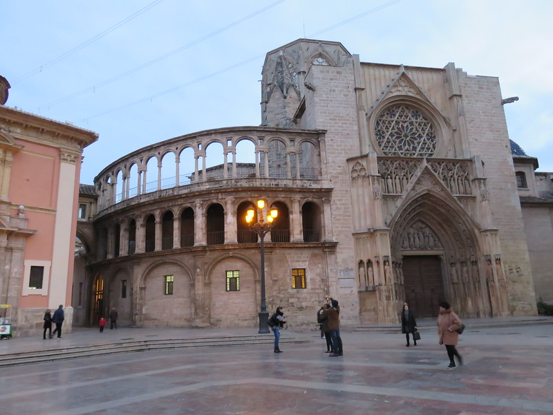 But there is an older Valencia to explore as well. The heart of the city features structures such as The “Iglesia de San Juan del Hospital” which dates back to the 1200s! The current city grew from this center. What a crazy combination of styles! You can see Roman, Gothic, Renaissance and more because different sections were constantly added to the original structure.
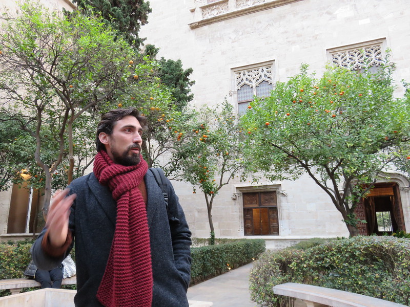 Again we had a passionate knowledgeable tour guide who did not allow us to leave one inch of Valencia uncovered!
 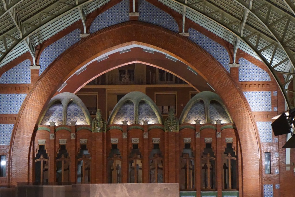 One of my favorite spots was the Mercado de Colón, a beautiful example of the Art Nouveau style. Glass and tile adorn this early twentieth century marketplace, now a gathering place full of interesting bars and restaurants.
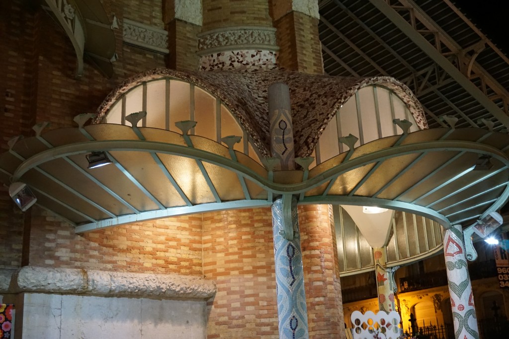 Hallmarks of the Art Nouveau style include free flowing organic shapes, rich earth tones and lots of tile! At the turn of the nineteenth century there was no aspect of living that was not touched by the movement. It was a global trend as well. In Germany it was known as Jugendstil, in Spain Arté Joven and Secession in Austria. The American version evolved into the what we know as the Arts and Crafts Movement, a simplified, more linear version. According to Art Nouveau philosophy, art should be a way of life. No wonder I'm always intrigued by it!
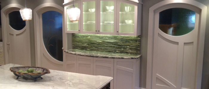 If you're looking to "Nouveau" your kitchen here are somethings you can include:-Rich brown wood stains-Green, green and green
-Some curvy shapes (more affordable to do this with your counter top than with cabinets)-Oak wood floors or cabinets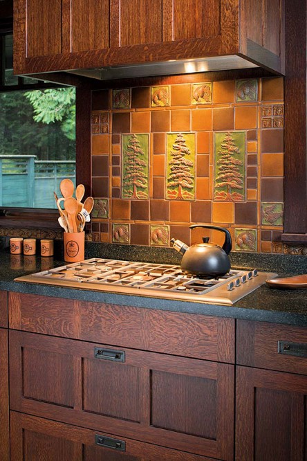 -Certain flora and fauna like the dragonfly, the ginko leaf and the thistle are all images often seen in Art Nouveau styling-Ceramic tile backsplashes (preferably with the above motifs)Next Tile Tuesday: More Cevisama and the future of tile.
Tile Tuesday: Parente to Parasol, Old Tradition-New Expression
Welcome to the second installment of the Tile Tuesday series! If you missed part one you can find it right here. If there is one big takeaway from last week's post it is that there are two sides to Sevilla, the constant play between old and new.We were able to really dig in to both aspects on our Tile of Spain tour of Sevilla led by architect Gonzalo Cantos.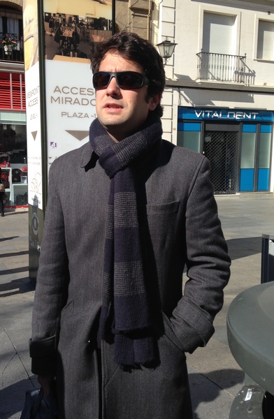 As we explored not only tile but the culture from which it originates, we were constantly presented with old and new, separate but not entirely mutually exclusive. What came before certainly influences the contemporary production.
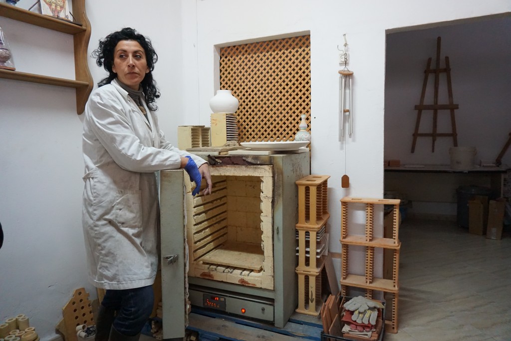
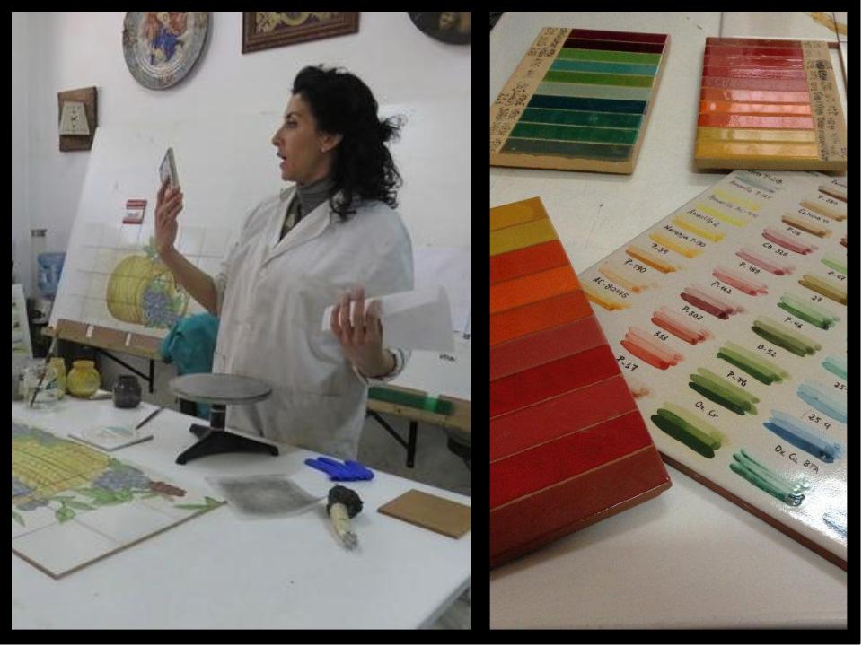 Later in the series we will take a look at modern state-of-the- art tile production in Spain but today I want to introduce you to a true old world style artisan, living and working in Sevilla. Meet Isabel Parente. We visited the studio where she creates her handmade tile and custom glazes. By the way, did you know that most ceramic glazes used today come from Spain?
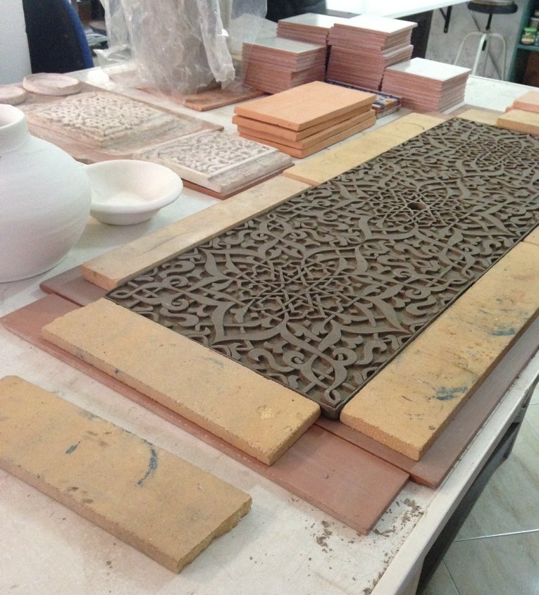 Isabel is mostly self-taught but briefly attended art school in Sevilla, followed by an internship in Perugia, Italy. She demonstrated a few different traditional methods including hand painting. Her practice includes the creation of new commissions as well as restoration.
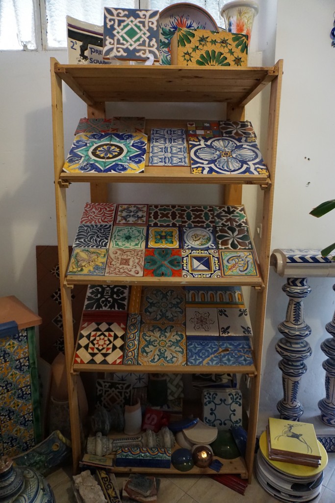 It is interesting to note that with old world techniques (she doesn't even utilize a computer), Isabel is addressing the very current trend towards personalization. You can't get much more custom than what she does!
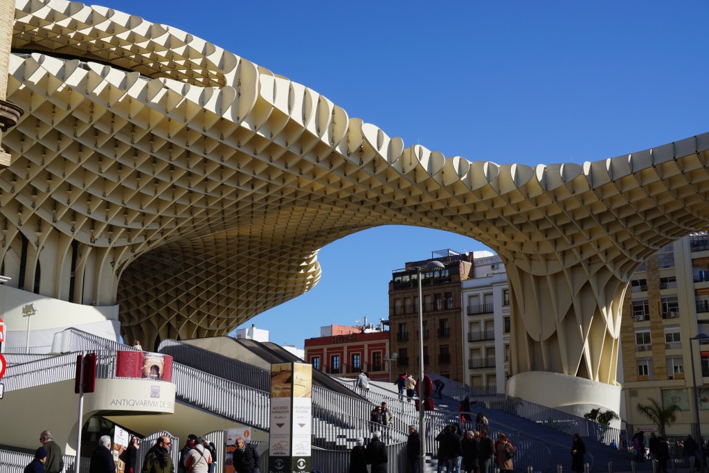
 Just about a five minute walk from Isabel's studio you will find Encarnacion Square, the oldest part of Seville and home to one of its most controversial residents, Metropol Parasol. I posted our visit to Parasol in real-time. If you were one of those who wondered exactly what this was, today's your lucky day.
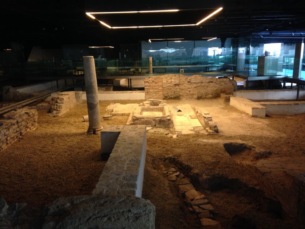
  Encarnacion Square was home to a neighborhood market starting in the 19th century up until the 1970s when the area began to languish. Excavation to create a parking lot in the 1990s uncovered ancient Roman ruins below!
  It wasn't until 2004 that the city decided to develop the property. Architect Jurgen Mayer-Hermann was selected and his Metropol Parasol was completed in 2011 at approximately double the 50 million Euro budgeted for the project. Part of the expense was due to technical flaws in his design that had to be overcome. This paired with the fact that its unexpected dramatic presence rubs "traditionalists" the wrong way, is what makes the Parasol a continuing subject of controversy.
 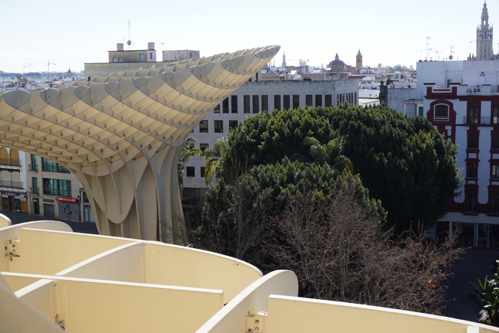 Here's
 my another perspective. Mayer-Hermann's inspiration came from the cathedral vaults of nearby Seville cathedral as well as from the large shade producing ficus trees of a neighboring park. In fact shade from the sweltering summer sun was one of his major objectives. In this way it does reference its location quite well. The project is an excellent example of the modern Spanish architecture of undulating curves and waves. Sevillanos refer to it as "Las Setas"(The Mushrooms). Giant "waffles" are made of birch hardwood with a polyurethane finish. 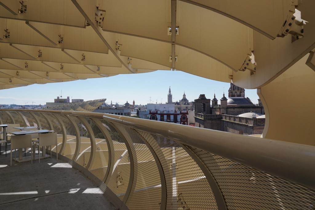 The excavation and restoration of the ruins below continue. On level zero you will find an Antiquarium where you can walk among old Roman buildings. The Parasol above is wholly supported on 8 points so as not to disturb the ruins below. On level one there is, once again, a market. The upper levels house restaurants and a meandering walkway offering various views of the city below.I will say that because of the design of the structure, I felt safely embraced on these walkways, sort of nice if you have a fear of heights!
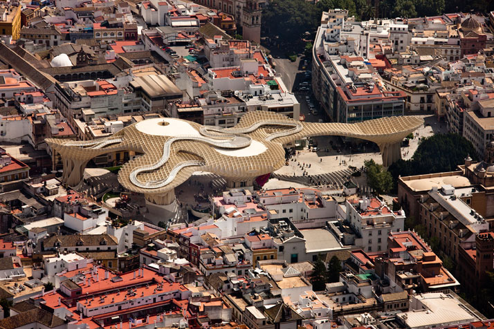 So what's your take? Ugly intrusion or a dramatic blending of old and new concepts exemplifying the new Spanish architecture?Before we leave Seville I want to share my pics with you. In addition to what I have written about here, and in part one, photos include: Plaza de España, Alfonso XIII Hotel, Royal Alcazar of Seville and Seville Cathedral. Now go grab some sangria, kick back and enjoy the sights.Next Tile Tuesday: On to Valencia and what I learned about tile and trends I saw at Cevisama 2015
Tile Tuesday: The Inspiration of Antiquity
Welcome Tile Tuesday! This is the first installment of a series inspired by my discoveries exploring Seville and Valencia, Spain with Tile of Spain. Not only did we attend Cevisama, the renowned trade fair showcasing the best of the Spanish tile industry, we also explored two cities, their history, culture and architecture with two very passionate local architects. Along the way I learned a lot about ceramic tile in general and that was one of my goals for this trip. Each Tuesday I will be sharing something interesting about tile and the cities we visited. Ceramic tile is the product of the culture in which it is made. Whether you’re talking 1300s or today, tile really is an artefact of the time in which it was produced.
 Even the examples we saw of cutting edge 21st century Spanish tile manufacturers such as Peronda, Inalco, Aparici and more have their roots in a much older tradition. What better place to begin than at the beginning. Our adventure started in Seville with a visit to Centro Ceramica Triana, a ceramic museum which was once a tile factory.
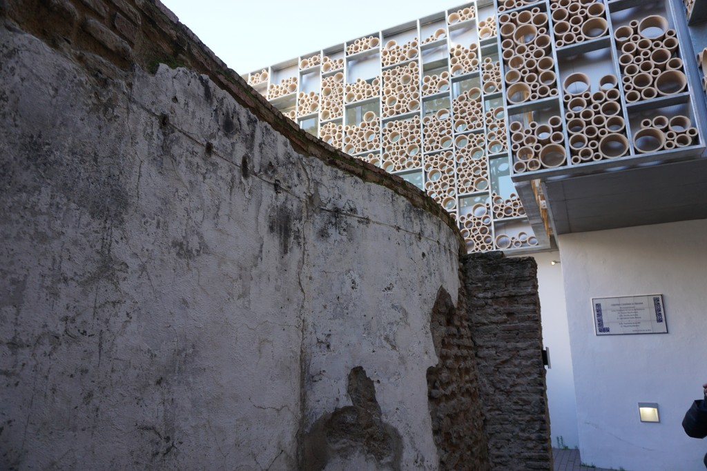
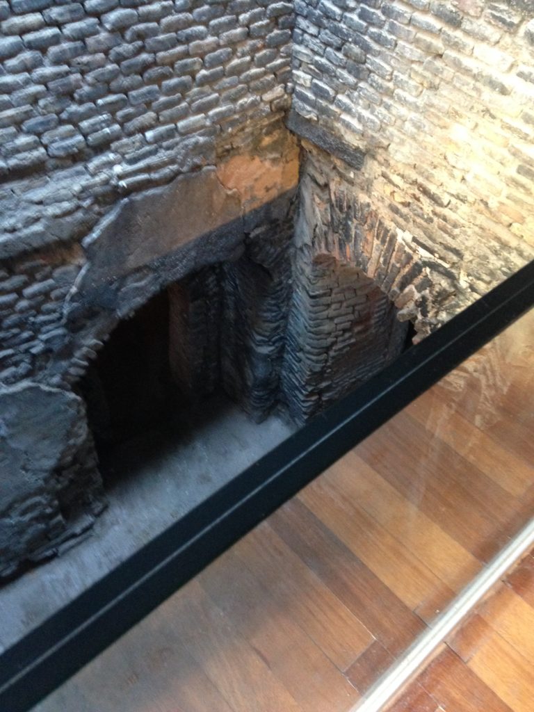
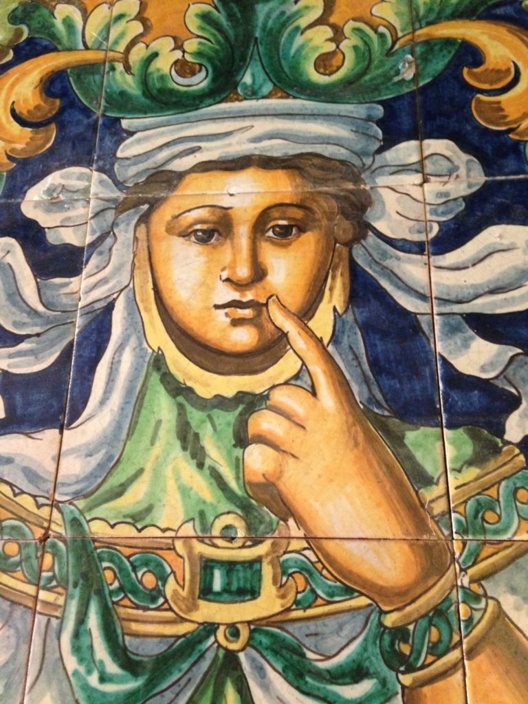 Several years ago the city of Sevilla wisely decided to preserve and showcase the old Santa Ana Ceramic Factory, which itself was built upon centuries old prior factories.Last year it was opened to the public. What intrigued me the most is that this museum is a structure consisting of layers. You can find antiquity dating back to the 16th century on the bottom followed my those of the following centuries above it. Architecture is honored. What has come before is respected and preserved. The new lives together with the old throughout Spain and this museum is a perfect example of that.
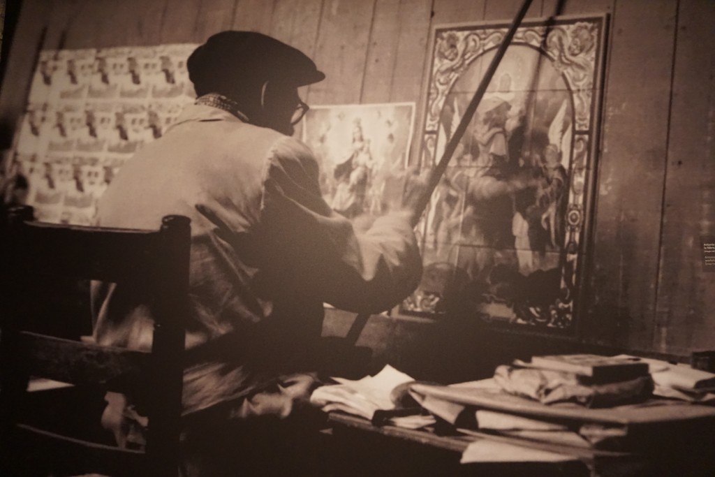
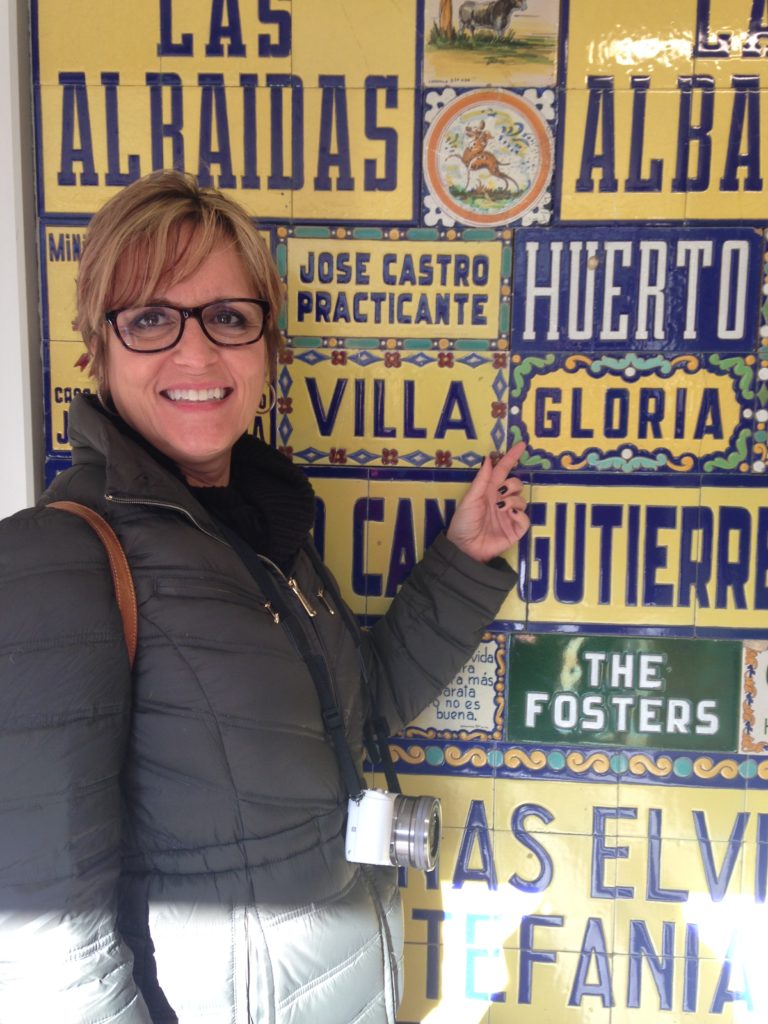
 Run by Enrique Rodgriguez Garcia, Santa Ana was still a productive factory up until the seventies. They survived up until that point selling all genres of ceramics including murals, shop signs, pottery, lettering, and religious items. Garcia passed away in 2005 but has left his artisan legacy to his descendants.
 The barrio of Triana sits on the banks of the River Guadalquivir. The ceramic industry, which dates back to Roman times, grew here, in this neighborhood, due to the proximity of natural clay resources. In addition, it is interesting to note that most ceramic glazes come from Spain. This film, by Direccion TVArq, gives you a real feel for the space, outlining the blend between the modern museum and the antiquity revealed below. Note the original 16th century kilns and if you are fortunate enough to speak Spanish you will hear about the history of the site and the process of creating the current museum.
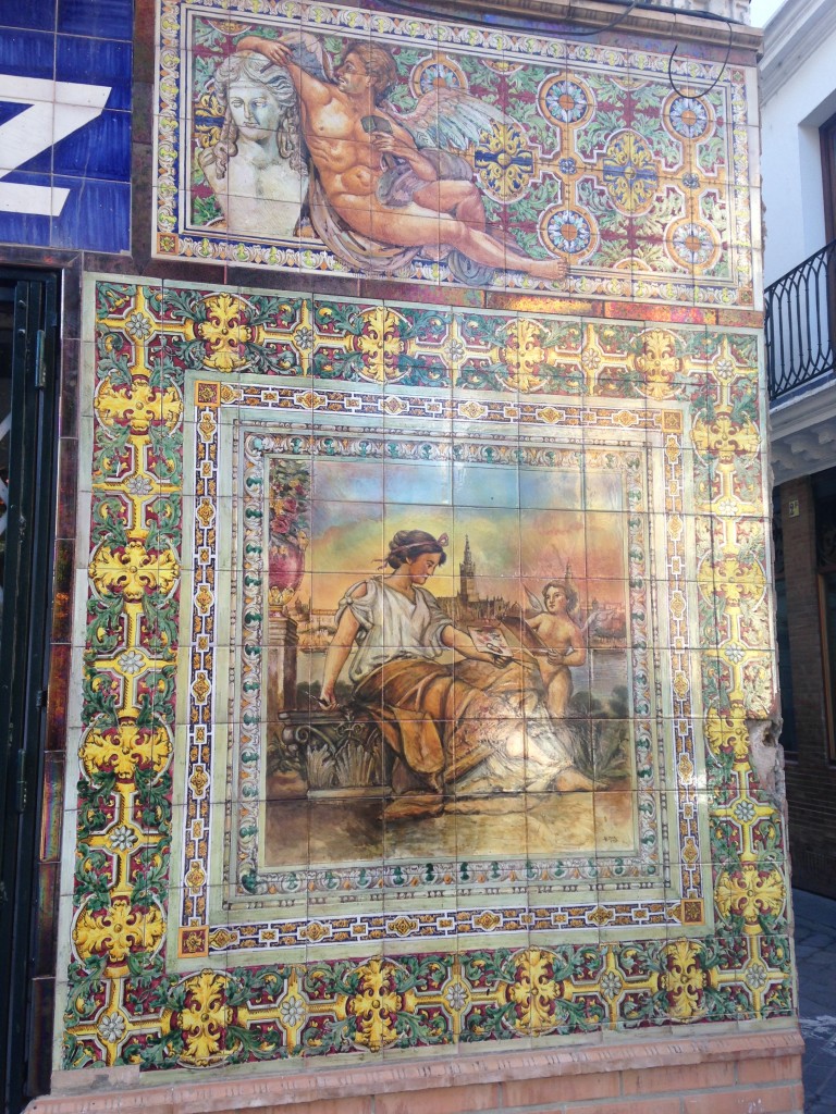
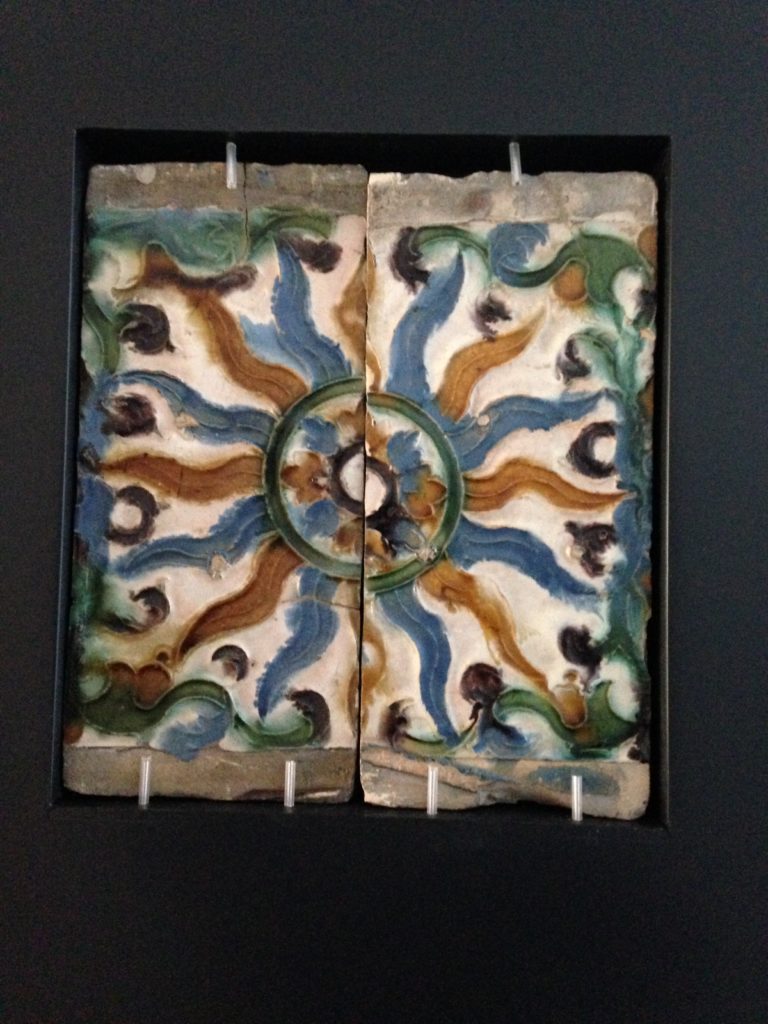 There are many ways to form and decorate clay to create ceramic tile. Niculoso Francisco Pisano, born and trained in Italy, lived and worked in Triana in the early 1500s. He devised a way of mass producing tiles. This is piece circa 1529 is one of the examples from his workshop.
 Ceramic tile is a creation of clay, earth, water, air and fire, a perfect balance of elements. I felt a soulfulness about this place, a passion for artisanship that lingers.Next Tile Tuesday: A look at Metropol Parasol, feat of engineering or folly?https://www.facebook.com/kitchensforliving
Spanish Style 2015
As you are reading this I'm probably winging my way across the Atlantic, heading to the Passport to Creativity 2015 event courtesy of Tile of Spain. We will be exploring Seville and then on to Valencia to attend Cevisama, Spain's international tile trade fair showcasing the latest in tile products and design trends. Follow me on FaceBook, Instagram and Twitter for live reports and I'll be recapping all right here upon my return. For now, here's a sneak preview of some of what we'll be seeing (just to get you in the mood).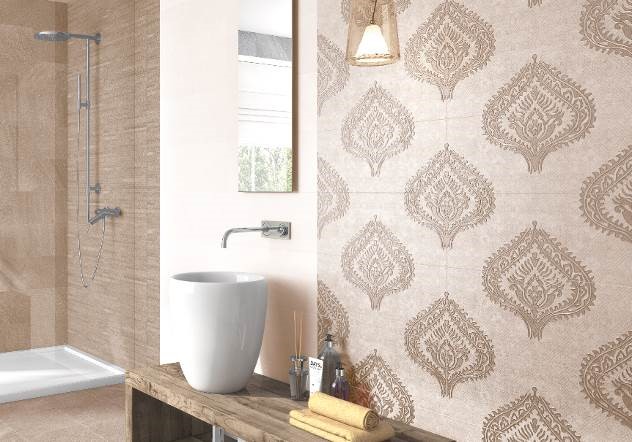
Color palettes include monochromatic color schemes where one hue is carried throughout with subtle changes in texture and pattern. This is a great way to tie a room together creating a harmonious whole. Looks like "greige" strikes again here!
But if you're not so subtle there are lots of bright color choices too! I'm loving the originality, not to mention the forgiving nature of this new porcelain tile! Organically inspired tile is taking a cue from nature for a very authentic wood look. In addition, there are lots of choices for mosaics. The point is all the elements are there for you to make a unique and very personal statement with tile.
Click here for more info about Tile of Spain and where you can get the latest tile.
Big Trends from KBIS Part II
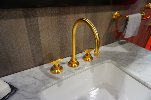
The Modenus Blog Tour recaps continue! Last post I shared some of my kitchen trend discoveries from KBIS2015, the 51st Kitchen & Bath Industry Show held last month in LasVegas. Today I've got the scoop on what's trending in the bath.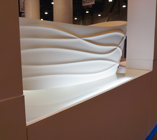 I have to say it, personalization is also at the top of the list for bathroom style and function. I saw lots of new options for faucet finishes. Were you getting tired of brushed nickel? Nice to see something new in that arena.
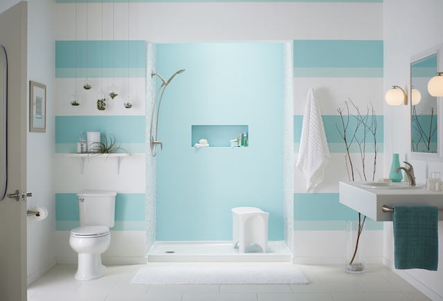
 I saw a lot of contemporary design for the bath, minimal clean lines, simplicity but with quality materials.Affordability is definitely achievable. For example you can have the quality of Kohler with their basic Sterling line or luxury of their exclusive Kallista line.
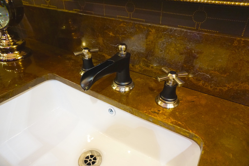
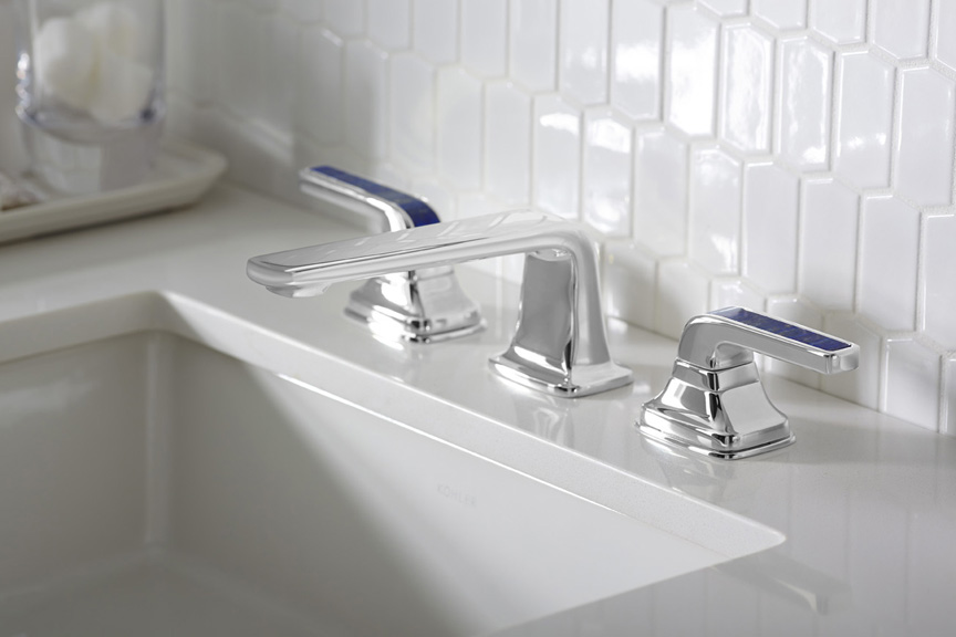 Brizo introduced its new Rook collection for the bath, with a subtle reference to chess. Its their latest suite of luxury faucets, fittings and accessories for the bath. This collection combines a low spout architecture and crisp octagonal details for a stately yet modern design.
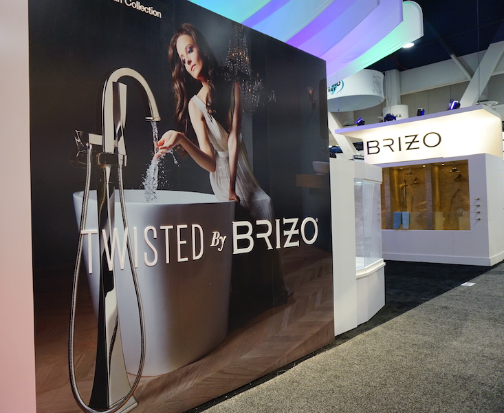
 Brizo also has something for you if you're a little "twisted" and I love it. It's the Virage Collection
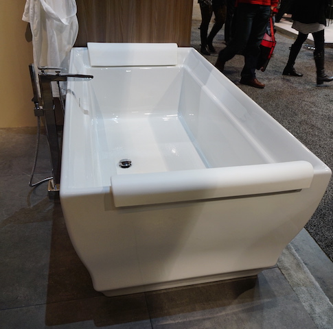
  Free standing tubs and tub fillers- The popularity of free-standing tubs created a whole new plumbing fixture, the tub filler. They were everywhere!
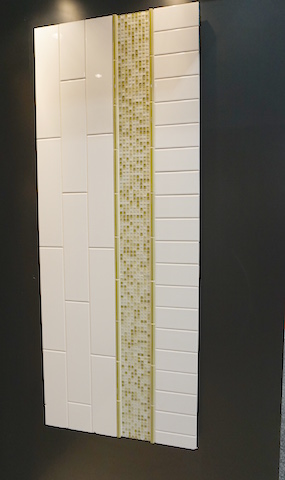
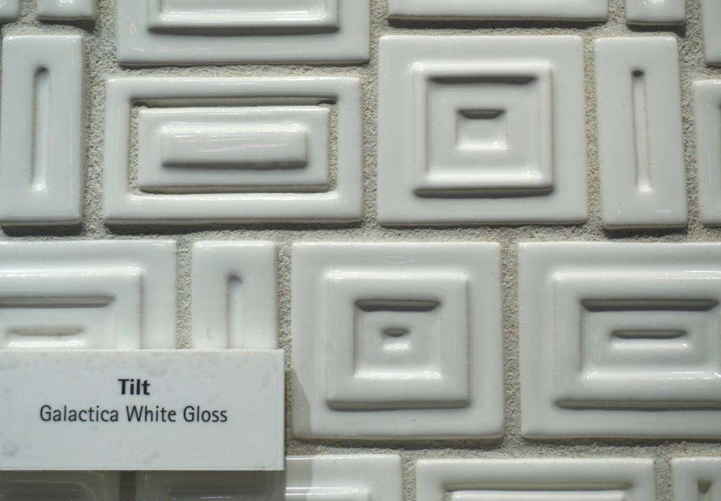
 Creativity with tile- It's not just subway tile anymore although there are even a lot of interesting variations on this popular style.
 I can't leave you today without a nod to the number one booth in my opinion. I wasn't alone as it was also voted most innovative booth of the show. The award went to AquaBrass for their Buckminster Fuller inspired geodesic dome. This innovative concept wowed me but they went all the way with my favorite combination art + design. With and artist on site creating beautiful artful bathtubs! This was to introduce their new Kanvas collection. It brings art to the bathroom in a limited series of hand-painted freestanding bathtubs, each one signed by the artist. The tubs are stone resin and offer a choice of three hand-painted exteriors: bright and bold Graffiti has a youthful, urban edge; nature-inspired Pax invites bathers to a soothing Zen-like experience; and architectural Mosaik brings timeless elegance with its classic yet modern look.
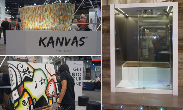 Aquabrass also introduced something that's going right on my dream list. The Aquazone, a revolutionary shower and bath concept that provides the best of both worlds. Molded into a single, space-saving wet zone unit requiring only 60"X60" of space. North American-built, its strong, one-piece construction is solid Lucite acrylic with a reinforced base. And with two integrated wheels and six adjustable levelers, it rolls into place easily, saving time, materials and labor costs.
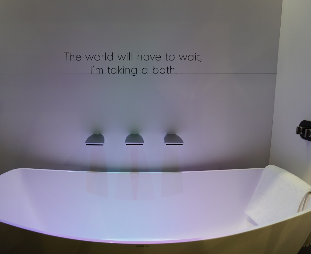 Not only was the booth full of great new products and finishes with the occasional thoughtfully placed message, they thought outside of the box and into the dome!! Kudos to the creators and congrats.Up next: We're not done in the bathroom yet! Here's the Jeopardy question: "The number one plumbing fixture supplier in the world" Who is ??????

