Whether you are a design professional or an educated homeowner you’ve probably heard the term “kitchen work triangle”. In fact it’s probably one of the first things you learn when endeavoring to create a new kitchen. Who thought this up? It is actually the result of a study made at the University of Illinois in the 1950s! If you’re wondering if it could be outdated, just think of how much kitchens have changed since then in terms of products, appliances and how we use them.The National Kitchen and Bath Association (NKBA) defines the kitchen “work triangle” an imaginary straight line drawn from the center of the sink, to the center of the cook top, to the center of the refrigerator and finally back to the sink. The NKBA suggests the following guidelines for determining a work triangle:- The sum of the work triangle's three sides should not exceed 26 ft. and each leg should measure between 4 ft. and 9 ft.
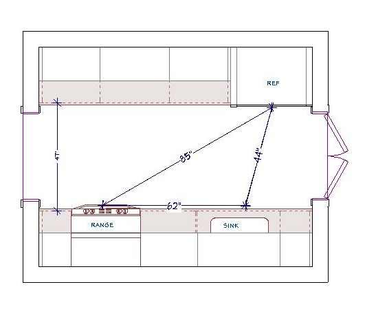 - The work triangle should not cut through an island or peninsula by more than 12 inches.- If the kitchen has only one sink, it should be placed between or across from the cooking surface, preparation area or refrigerator.Yes, this makes kitchen design sound a bit like solving a puzzle and, actually, it really is. I know my design is “right” when the layout works from every angle in terms of safety, ease of function and, of course, aesthetics.
 Some of the design solution is just good sound common sense but much of it should be directed by the individual needs of the client. I don’t “do” the triangle as a rule. Today we have multiple cook kitchens and no end of possible appliances. Modern kitchens are so unlike those of 60 years ago, so I use the more updated concept of “work centers”. The basic ones are food prep, cooking, clean up and storage.
  So while efficiency is still at the forefront, the thinking is a bit more evolved to address twenty first century needs.In a perfect world, work centers should be situated to allow someone to work in one area without getting in the way of someone using another. However, let’s face it, in a very small kitchen that is just not going to happen! The focus then is twofold: enough storage and enough counter space.
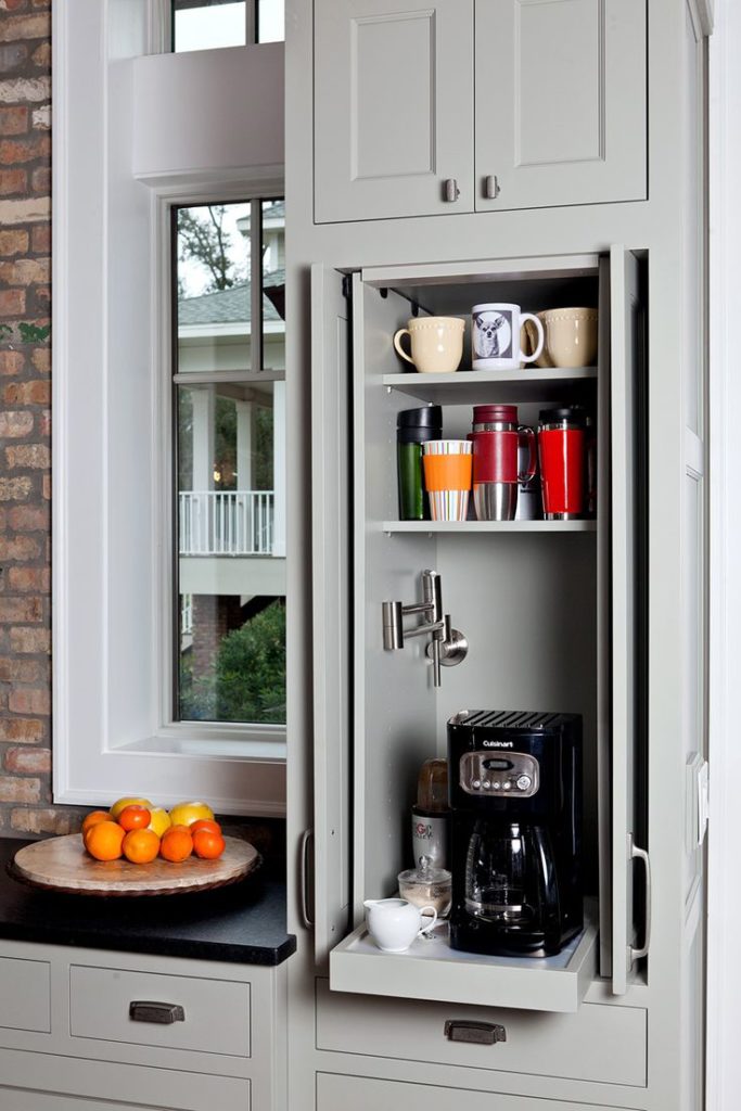 The types of work centers you can have is only limited by your imagination. Here are some good ones:-Beverage center- It can be coffee/tea, smoothies, wine or cocktails-Media center-It can be sit down area for menu planning, computer, charging station or TV-Baking center- You can trick this area out with customized storage for bake ware, bowls, utensils and a marble top for rolling dough.
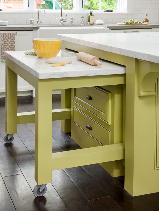 Remember that an “artful kitchen” employs what I call “practical creativity”. Function is the infrastructure, beauty comes next, the art is getting both just right.
The New American Home, Inspired by the Possibilities
In some ways, although it was all fantastic, the Modenus Blog Tour saved the best for last. On our final day we made a trip to Henderson, Nevada to visit The New American Home.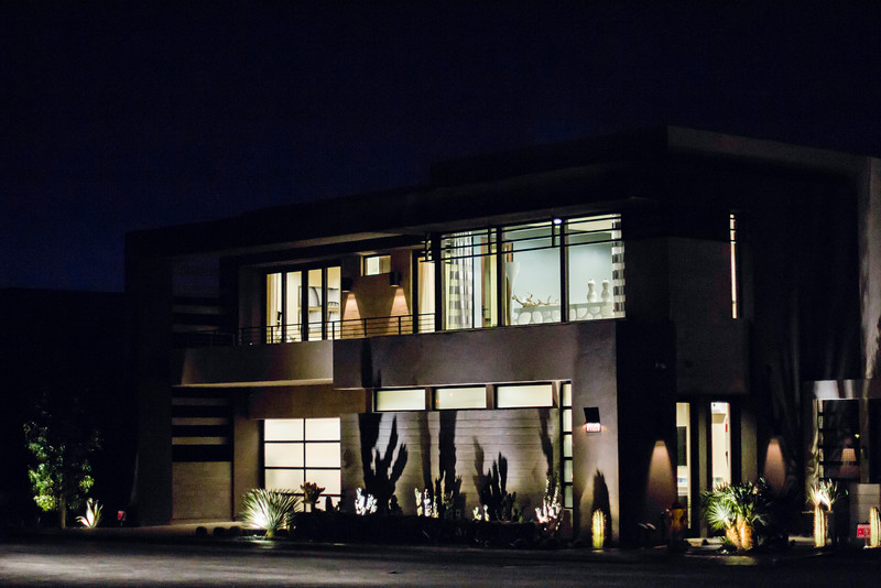 This project was to showcase the latest technology in home building and featured flooring by Mohawk Flooring and Karastan, a division of Mohawk.
 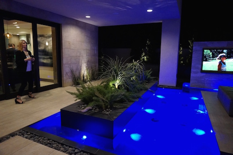 Believe it or not this is not a custom home but a production model in the Sky Terrace community. The purpose is to showcase what can be done with different finishes and technologies for varying budgets so that it feels custom to the homeowner. In my opinion, that's where creative design comes into play. I love to be inspired by the finest and be able to translate that for a specific lifestyle and budget. I know it can be done.
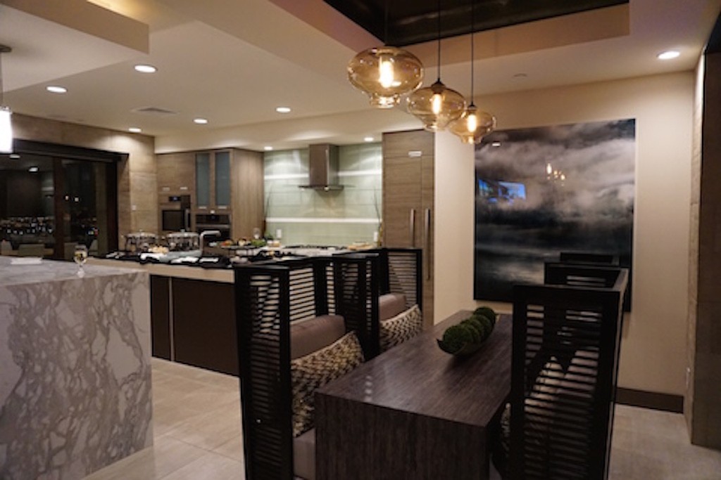
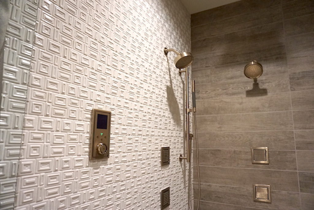
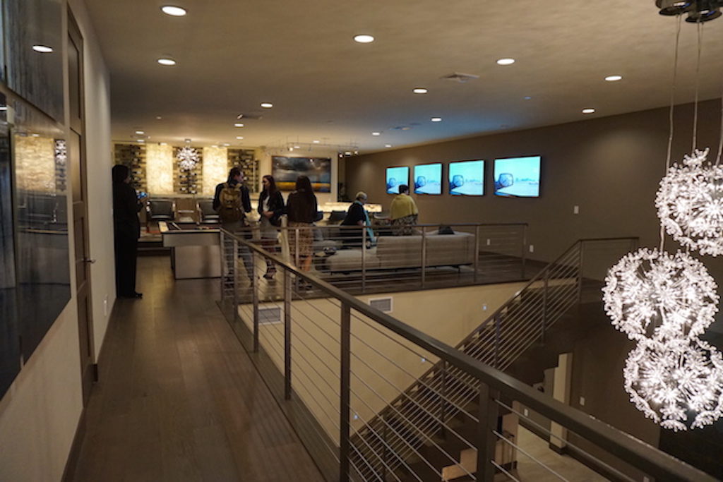 Notice how the neutral color palette reflects the desert landscape.
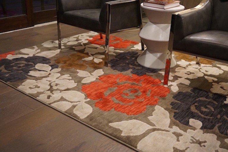 It wasn't all eye candy and hors d'oeuvres, we also learned about Mowhawk and Karastan's SmartStrand made from 37% corn product. This bio-based material is eco-friendly and stands up to stains! The protection is there for life because it's built into the fibers. SmartStrand can be found in both Mohawk and Karastan carpets. They have a fun and interactive website here.
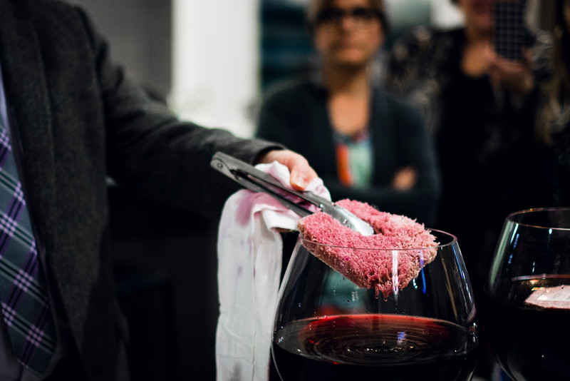 Thanks for following along on my adventures with Modenus Blog Tour Vegas. For more coverage check out what all the bloggers had to say. You can find them here. Stay tuned for recaps of my trip with Tile Of Spain to Cevisama. It's all about tile, with maybe a little sangria in the mix ;). I'll be on the road from Friday February 6-13. Follow along on FaceBook, Instagram and Twitter!
Wood-Mode and Top Knobs, Makings of a Dream Kitchen
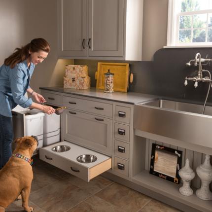
If you've spent any time researching cabinets for your new kitchen or bath you've probably come across then name Wood-Mode. It's the nation’s largest manufacturer of custom cabinetry for kitchens, baths and other rooms throughout the home and they've been around for 42 years. I learned that Wood-Mode has great name recognition in the industry for good reason. Their booth at KBIS was impressive and fun! Four yellow Lab pups were on hand to demonstrate one of their lifestyle concepts, The Pet Parlor. There's a place for everything from food storage, food bowls, bathing and more. Great idea, yes? To highlight it Wood-Mode had the most interesting gig going at the show. For all selfies posted with the dogs they donated $5 to the Susquehanna Service Dogs. This will be an ongoing partnership. They call it a PAWSitive partnership. You can read more about it here.
 Wood-Mode's newest lifestyle concept, Oceanside, is right after my own heart. This coastal style is a modern fresh mix of contemporary and transitional. The subtle aqua and sandy shades of beige are on point. The Oceanside approach includes a very open plan with efficient hidden storage. I see this as a reflection of the trends I saw in Italy last year, fewer or no upper cabinets but high function tall cabinets instead. The combination of materials and finishes add lots of visual interest.
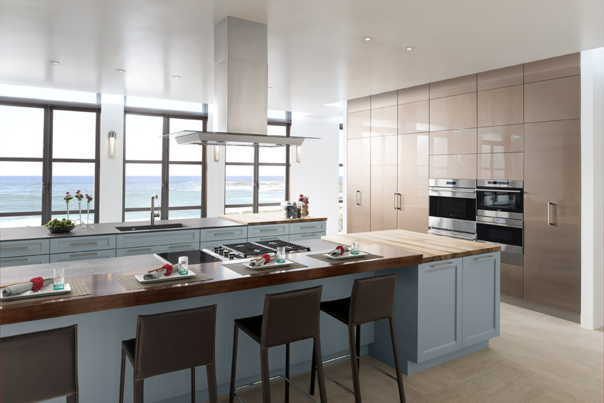 With over 200 doors to choose from as well as furniture finishing techniques and options for built-in storage, Wood-Mode can create the perfect solution for your lifestyle, whether is be Coastal, pet-perfect or both!
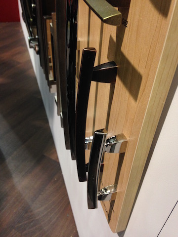 If you're going to be needing cabinets, you're also going to need to get into them. That's where Top Knobs comes in. Another brand with great name recognition, TopKnobs specializes in fine decorative hardware for the kitchen and bath. You can tell the quality of a cabinet knob or handle by the weighty feel of it and I have always noticed that about TopKnobs products. The other important thing the finish which they guarantee for life!
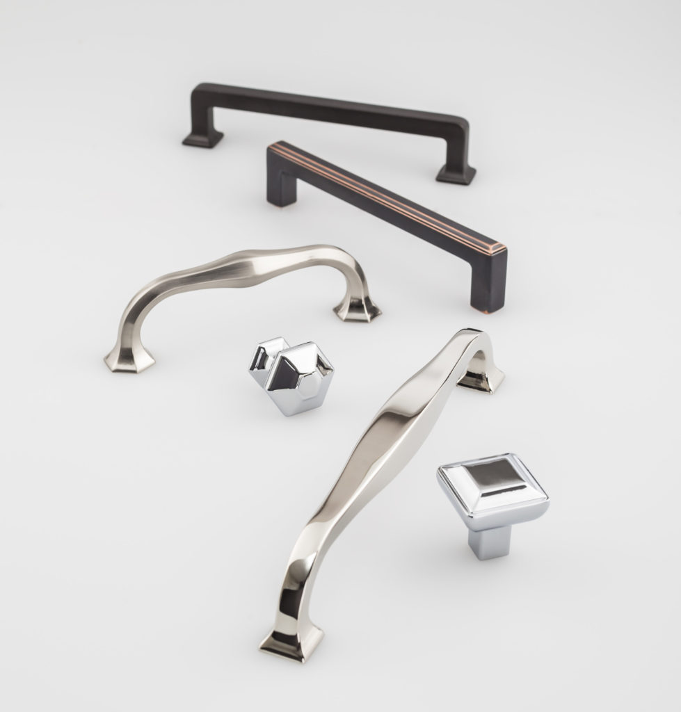 They introduced the Transcend Collection at KBIS. This includes the Podium, Ascendra and Contour Series which come in Brushed Satin Nickel, Polished Chrome, Polished Nickel, Sable and Umbrio.
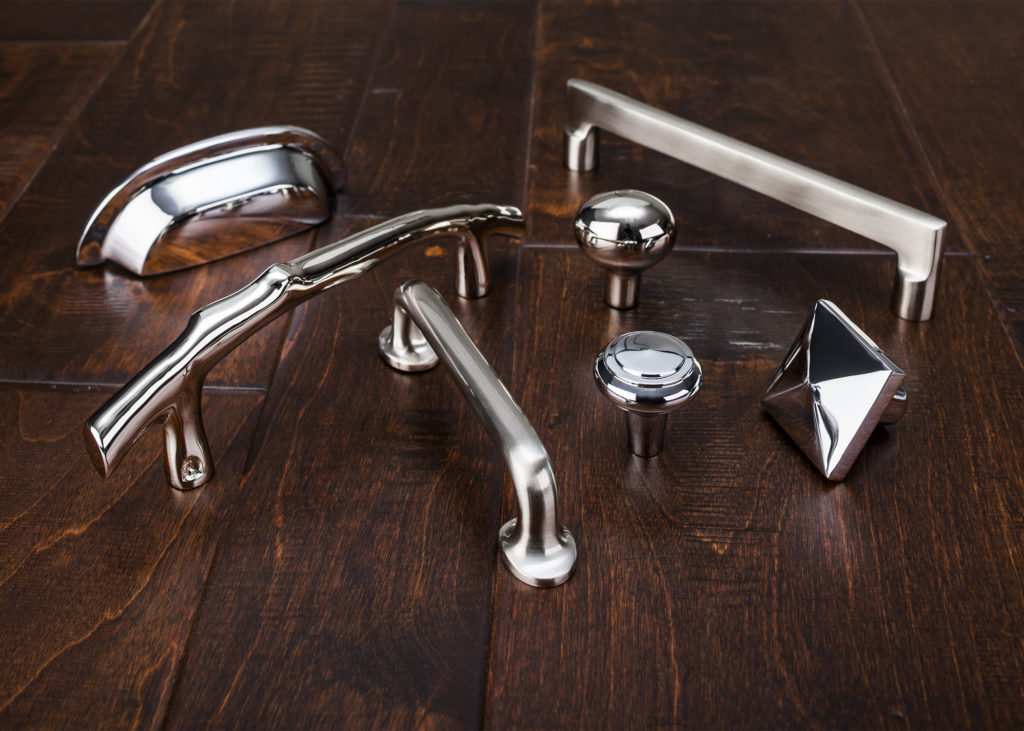 Also new at the show was Aspen II in three finishes, Polished Chrome, Polished Nickel and Brushed Satin Nickel. “The Aspen II collection combines old-world shape and style with contemporary finishes,” states Christine Zimmer, product manager for Top Knobs. “They bring to the market a unique look that designers can use in transitional spaces. Made with solid castings of artisan grade bronze, you can feel the quality of Aspen II in the palm of your hand.”With Wood-Mode and Top Knobs your dream kitchen can come to life!
Seduced by Mr.Steam
Have you ever stopped to think about how design impacts your health and well-being? Design is just not working if it doesn't make you feel good and that is what Mr. Steam is all about. One of my experiences on the Modenus Blog Tour Vegas was to attend Modenus Talks. This was a day long, interactive meeting of design minds and it is where I heard Martha Orellana, AKA Mrs. Steam, seduce us with the physical and mental benefits of steam. Perhaps you already know too much about me. You know that my dream bath is going to include the TOTO Washlet but the other big must have is, of course, steam. I will find a way and, according to Mr. Steam, it's not so hard to do. But first, a word (ok a few) about what's in it for you. Steam is great for your skin but also for your whole respiratory system and is recommended for the relief of symptoms from colds, flu, sinusitis, bronchitis, allergies, asthma, throat irritation, arthritis and more. Sore, tired muscles? Rigid joints? Steam eases the pain. It also acts as a natural detox (which we all need now and then).
  Steam therapy is nothing new. The Greeks and Roman indulged and so did the Japanese and even Native Americans. Check here for more about this interesting tradition.
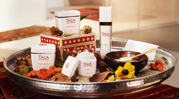
 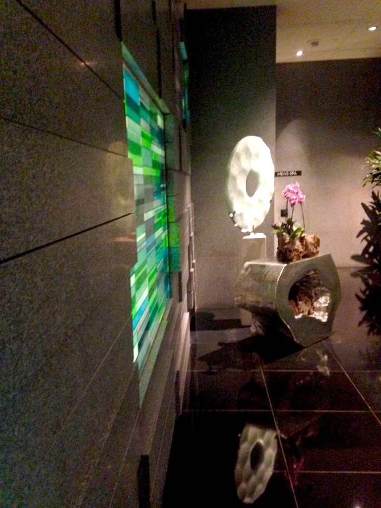 We got to bathe in the steam at the Aria Spa courtesy of Mr. Steam. A lovely experience made even better with Tala. Tala Bath & Body is a new discovery for me and is a line of essential oils, clays, scrubs and soaps. Mrs. Steam traveled to Morocco to research and develop these products. The Arabic word for "bath" is "hammam" and there is a beautiful ritual associated with it that you can follow with Tala.
 So now you're probably curious about what it would take to get steamy. Basically you need an enclosed shower area around 8' high with a slightly sloped ceiling (because of condensation). You'll need a water line, drain line and electric for the generator. A seat is a good idea and then you're ready for ten minutes of bliss. That's all it takes.
 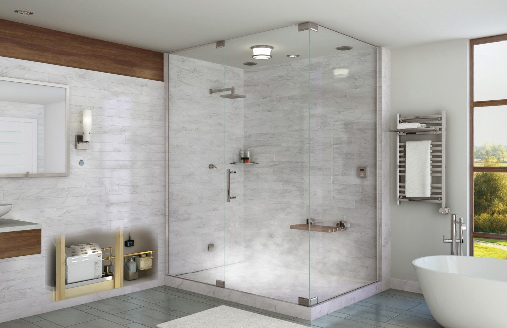 Steam showers do not require special ventilation. With the shower door closed, very little steam escapes. At the end of a steam shower session, simply turn on the shower to condense the remaining steam in the enclosure before opening the door. Voila'! Next Up: Taking personalization to the kitchen with Wood-Mode and TopKnobs!
Honor Mother Nature with Style at TOTO
"People First Innovation" is the guiding principle behind Toto, the world’s largest manufacturer of bathroom fixtures and fittings. TOTO is an un paralleled luxury brand creating beautiful and functional fixtures for the bath. What really impresses me is that at the same time the are heavily focused on water conservation, a leading global concern that needs more attention here in the US.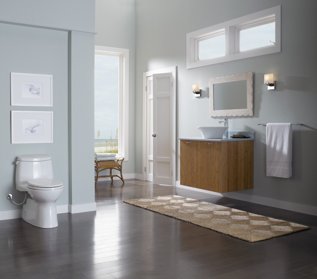 In 1989, in response to the state’s dramatic drought conditions and the growing need for water conservation, TOTO USA was established in California. Today they operate three manufacturing facilities in the US. I was amazed to know that 80% of all toilets on the Las Vegas strip are, you guessed it, TOTO! The brand first started nearly one hundred years ago in Japan. Today there is still a zen aesthetic to both the design and experience of the product.
 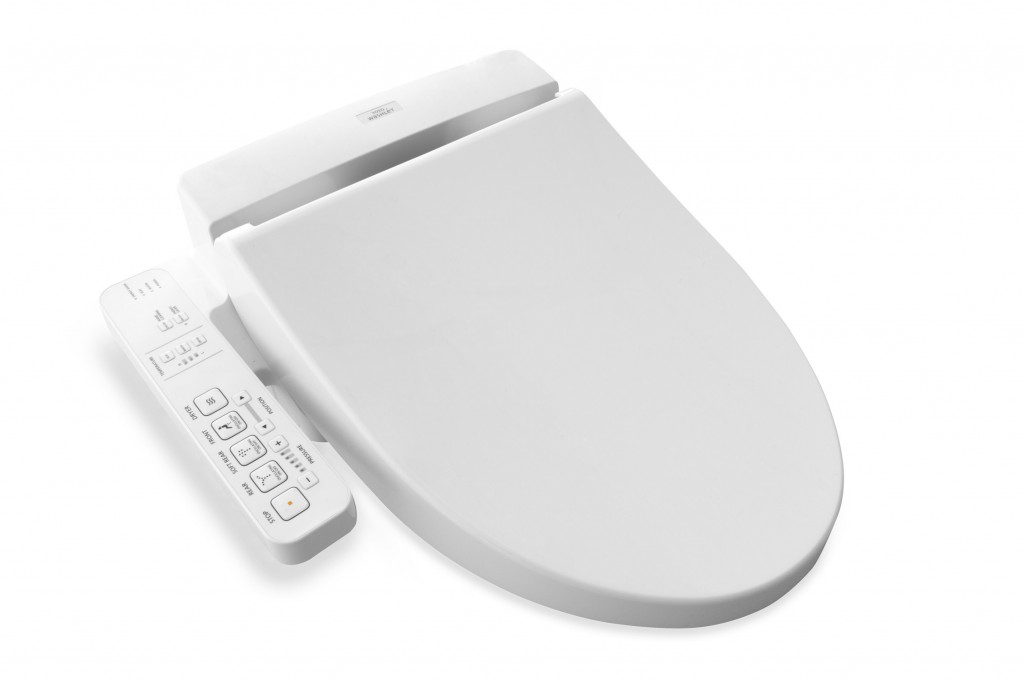 The Washlet is a must have in my opinion. There are lots of choices to make when creating a new bathroom. A few judiciously selected "special items" can make your bathroom awesome and this is one I'd pick. TOTO reinvented the toilet seat by creating the Washlet, which gives people a new way to be cleaner and more comfortable every day. Washlet seats can be installed on virtually any toilet and use pure, clean water –along with several TOTO technologies – to make their users cleaner and more refreshed. Ok we're taking personalization to a new level here but you must admit... In case you're wondering, there are many public restrooms you can visit and see for yourself. Here's where they are. If you do, get back to me. It would make a great blogpost ;) Speaking of blog posts, I also found this great post by engadget.com A Westerner's Guide to Japanese Toilets .In addition to this, TOTO uses a lot of technology designed to preserve both the environment as well as your water and energy bill. This even includes something called SanaGloss. TOTO’s patented, super smooth glaze that repels visible and invisible waste, making it difficult to adhere to porcelain. I'm all for less toilet cleaning!
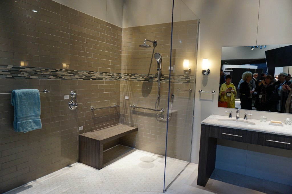 Accessible design and real showers were a part of TOTO's interactive booth at KBIS2015!
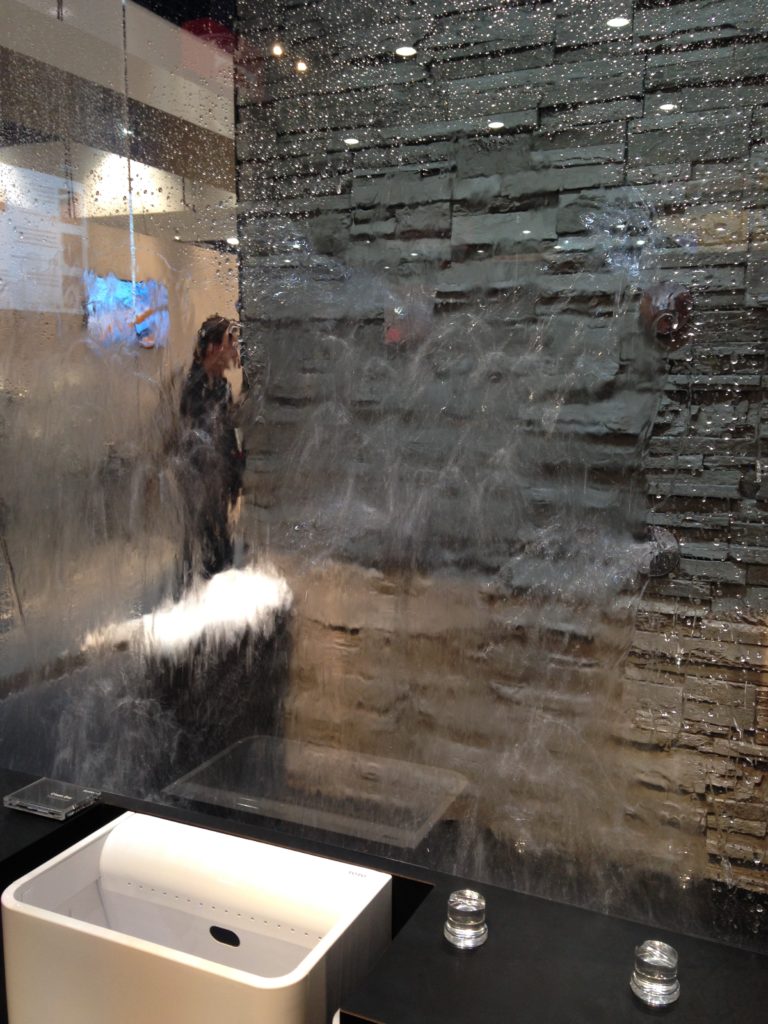
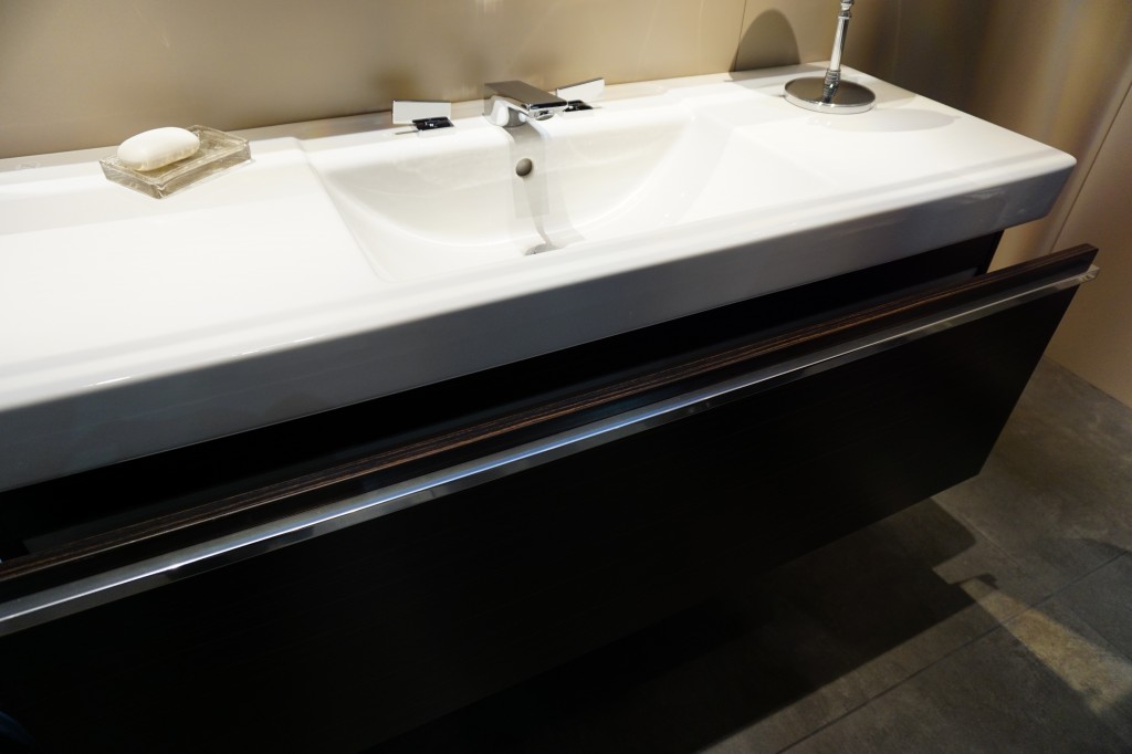 Up next: The other item not to be missed for your bath, Mr. Steam! You can easily plan it into your bathroom renovation.
Big Trends from KBIS Part II
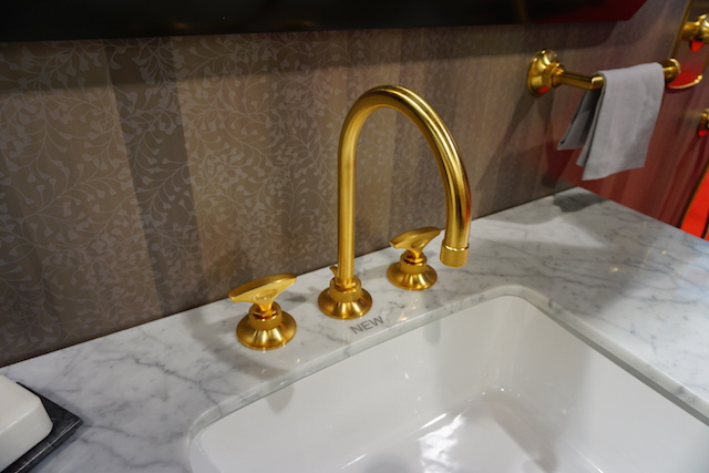
The Modenus Blog Tour recaps continue! Last post I shared some of my kitchen trend discoveries from KBIS2015, the 51st Kitchen & Bath Industry Show held last month in LasVegas. Today I've got the scoop on what's trending in the bath.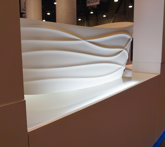 I have to say it, personalization is also at the top of the list for bathroom style and function. I saw lots of new options for faucet finishes. Were you getting tired of brushed nickel? Nice to see something new in that arena.
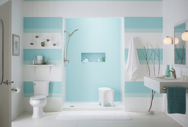
 I saw a lot of contemporary design for the bath, minimal clean lines, simplicity but with quality materials.Affordability is definitely achievable. For example you can have the quality of Kohler with their basic Sterling line or luxury of their exclusive Kallista line.
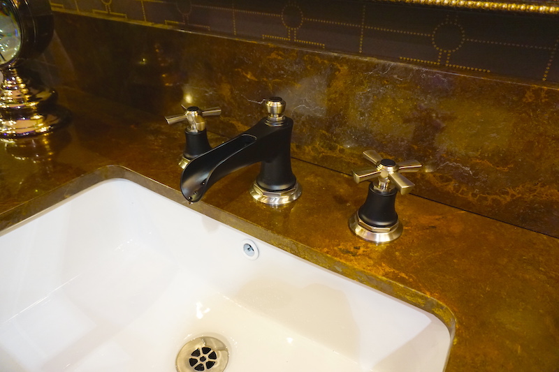
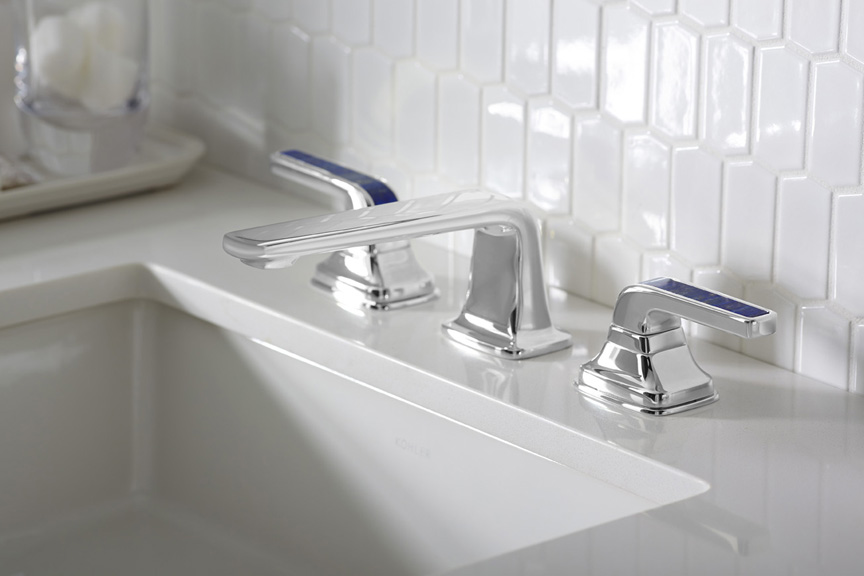 Brizo introduced its new Rook collection for the bath, with a subtle reference to chess. Its their latest suite of luxury faucets, fittings and accessories for the bath. This collection combines a low spout architecture and crisp octagonal details for a stately yet modern design.
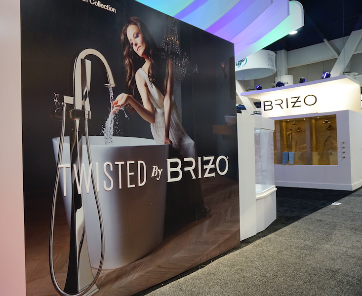
 Brizo also has something for you if you're a little "twisted" and I love it. It's the Virage Collection
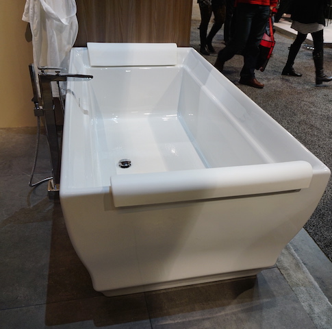
  Free standing tubs and tub fillers- The popularity of free-standing tubs created a whole new plumbing fixture, the tub filler. They were everywhere!
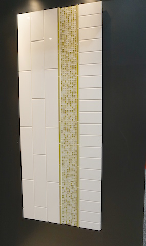
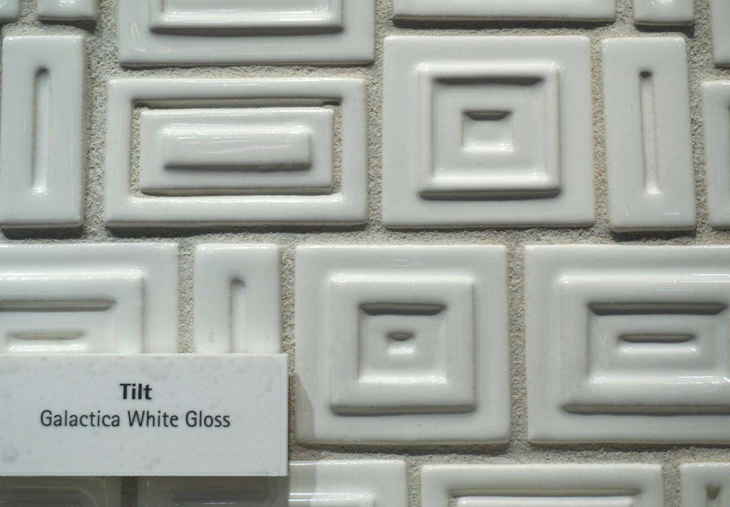
 Creativity with tile- It's not just subway tile anymore although there are even a lot of interesting variations on this popular style.
 I can't leave you today without a nod to the number one booth in my opinion. I wasn't alone as it was also voted most innovative booth of the show. The award went to AquaBrass for their Buckminster Fuller inspired geodesic dome. This innovative concept wowed me but they went all the way with my favorite combination art + design. With and artist on site creating beautiful artful bathtubs! This was to introduce their new Kanvas collection. It brings art to the bathroom in a limited series of hand-painted freestanding bathtubs, each one signed by the artist. The tubs are stone resin and offer a choice of three hand-painted exteriors: bright and bold Graffiti has a youthful, urban edge; nature-inspired Pax invites bathers to a soothing Zen-like experience; and architectural Mosaik brings timeless elegance with its classic yet modern look.
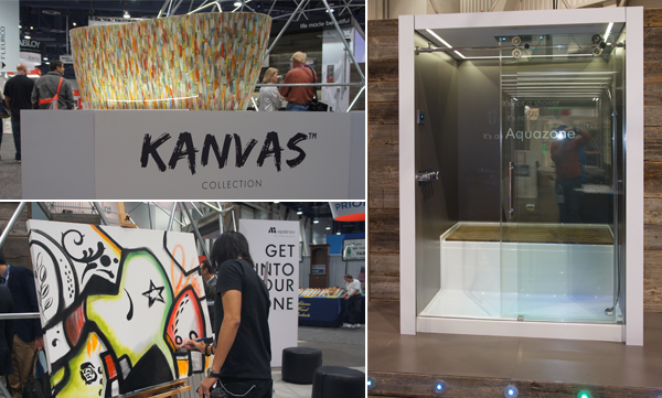 Aquabrass also introduced something that's going right on my dream list. The Aquazone, a revolutionary shower and bath concept that provides the best of both worlds. Molded into a single, space-saving wet zone unit requiring only 60"X60" of space. North American-built, its strong, one-piece construction is solid Lucite acrylic with a reinforced base. And with two integrated wheels and six adjustable levelers, it rolls into place easily, saving time, materials and labor costs.
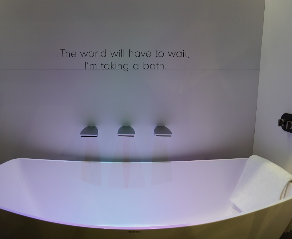 Not only was the booth full of great new products and finishes with the occasional thoughtfully placed message, they thought outside of the box and into the dome!! Kudos to the creators and congrats.Up next: We're not done in the bathroom yet! Here's the Jeopardy question: "The number one plumbing fixture supplier in the world" Who is ??????
