You know how much I love my white walls and the uber sleekness of contemporary design. Today I came across a post at deZeen.com and discovered the world of Japanese product designer Naoto Fukasawa. He makes accessible, functional and simply gorgeous small appliances for your kitchen under the brand name Muji. There are no sharp corners here, it's all minimal, voluptuously curvy and white. The series includes toasters, electric kettles (I want one!) rice cookers and more. Muji is crazy popular in Japan not just for the innovative styling of its products but also for their affordability. This line retails from $95-$195 and will be available in the UK and select USA (whatever that means) stores at the end of the year.
 Fukasawa is a creative thinker who also designs furniture and intuitive interfaces for cell phones . The comment element is it's minimal, highly functional and always artful!
CREATING AN INSPIRING WHITE KITCHEN
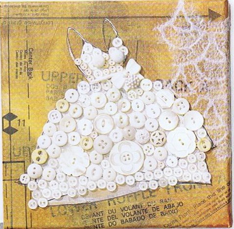 Today's Let's Blog Off topic queries the source of our ideas. Where does creativity reside? Is it within or is it outside and all around awaiting discovery? For me the answer is both. Yes, it's all around us, for sure, but it also requires the eye of the beholder to breathe life into it. Here is a recent example in my life of something I saw which inspired a blog post.You may have the panache to pull off a monochrome white room that invites and stimulates the senses but for most of us going all the way with white runs the risk of BORING. Since white is so "white hot" at the moment, especially in the kitchen, I’m going to share with you the secret of how to make white pop.One thing to remember is white is a team player, it’s all about the colors around it. As you know, I love art (a big source of inspiration). I recently came across this image in Cloth Paper Scissors Magazine which is a perfect example of how white can glow when surrounded by the right color. I see it work time and again. White cabinets plus color equals stunning. If your taste runs more to the conservative think camels, taupes or warm beige walls to create the contrast.
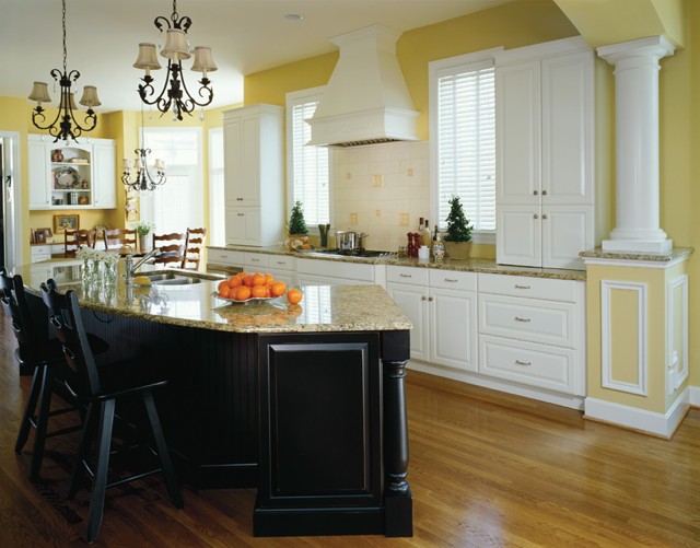 If you’re more daring go for Apple Martini Green or Sky Blue. The nice thing is if you want to go for the gusto paint is a safe bet. It’s one thing you can change fairly easily and reasonably.
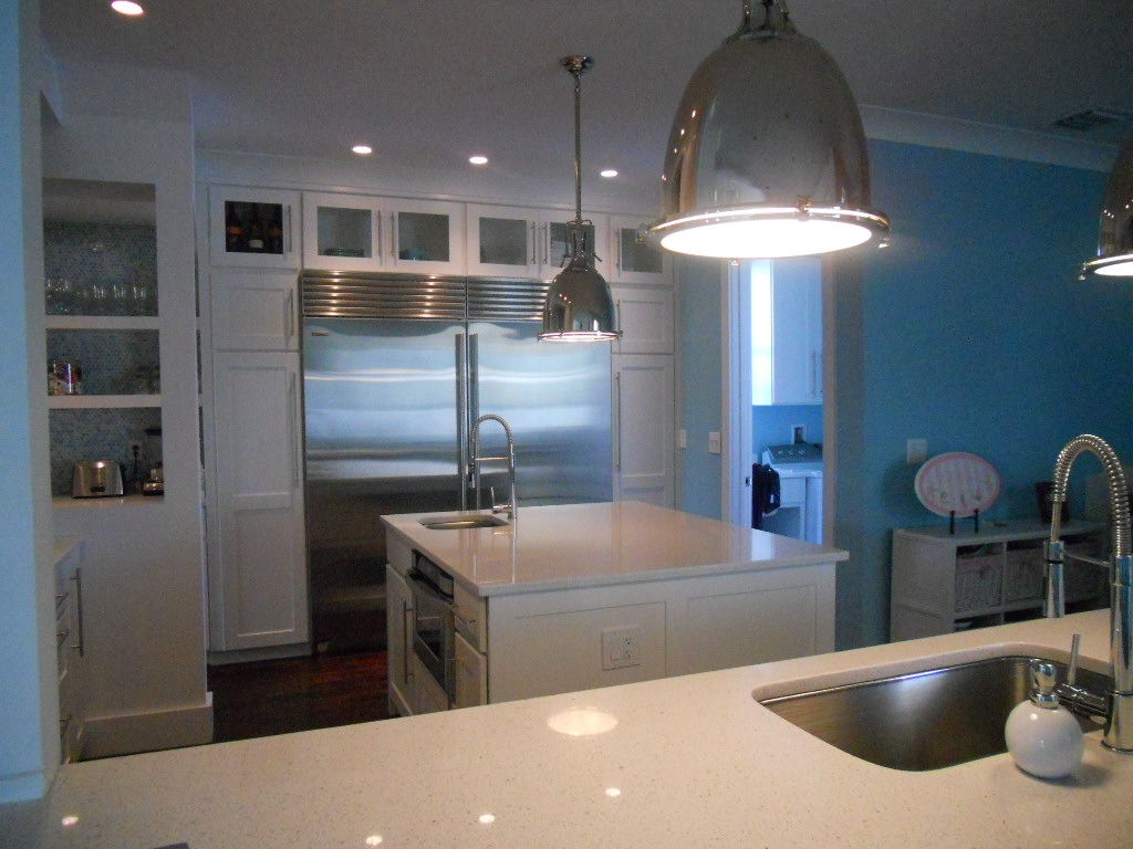 Another thing to remember about white is that it’s just not white. There are probably hundreds of whites and they all read differently depending on your lighting and location. The lesson here is to test your whites on site. Consider the color for a full 24 hours so you can see how it looks as lighting changes throughout the day.
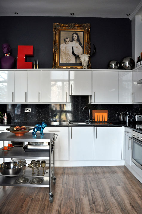 Many times wherever you find white you will also find black. You can tastefully mix black and white cabinets or if you have guts and great lighting the walls could be black, as in this example. This photo also serves as a great inspiration for many of the newer homes we have in my area with cathedral ceilings but short stumpy cabinets (thank you Mr. Builder). If you can't afford to change the cabinets take advantage of the great space above for art. Here, it carries the eye upwards taking attention away from shorty cabinets.
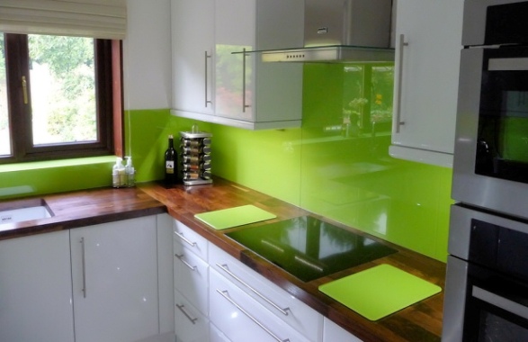 This stunning Apple Green back splash looks like glass but it's actually a colored plastic by Opticolor! So there you have it, inspiration of the day all inspired by a whimsical little piece of art!
