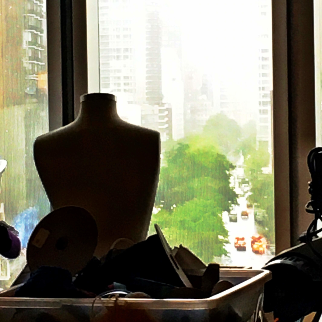
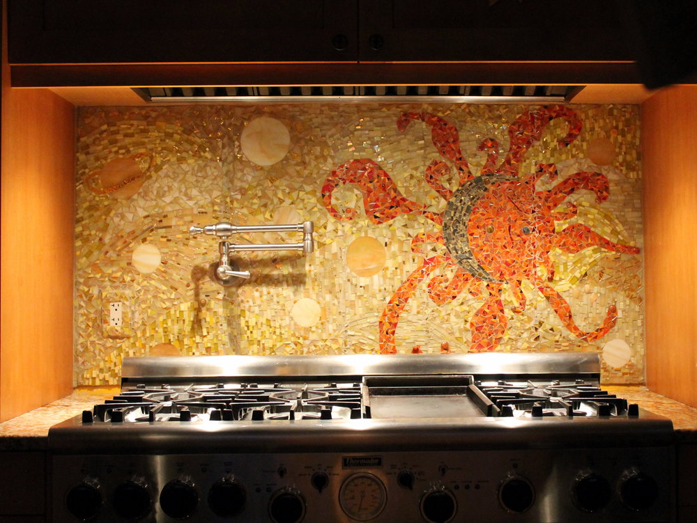
If your new kitchen is going to be an expression of who you are and how you live it’s helpful to have a little inspiration. One of the things I frequently mention is the benefit of something I call “kitchen scrapbooking”.
Read more2018 The Year In Review
2018 was a year of fun and exciting projects which challenged and sparked my creativity! White kitchens continued to be the hot ticket sometimes with an artful mix of natural wood or with deep rich blues.
I call this the "new traditional kitchen". I had fun working with HW Interiors on this one.
There were difficult situations but always solutions. This video gives you a snapshot of the vast variety of spaces and projects that came my way throughout the year. When you work with me I create these 3D renderings in Chief Architect Interiors X10 so you can get a sense of the space because visuals are everything! I am deeply grateful to my clients for placing their trust in me. Wishing all my readers the best in 2019. Maybe this will be the year we create your new space! xoxo
On the Road in New York-ICFF, Art & Great Food
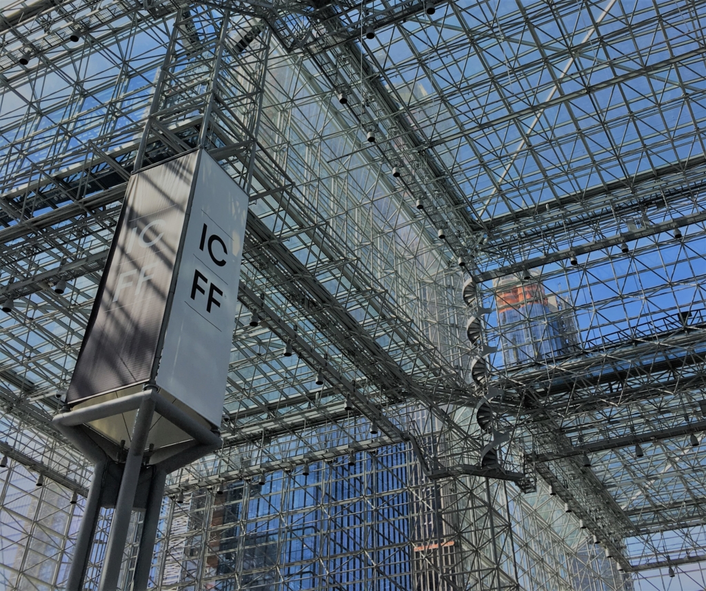
This year my birthday coincided with Design Week so I thought what the heck, it's time for another On the Road episode, this time to the Big Apple for ICFF. The International Contemporary Furniture Fair was held at the Jacob K. Javits Center May 20-23 and is known as the North American platform for Luxury International Design showcasing the latest in exclusive interiors, contemporary design and high-end furniture. However, it's much more than furniture. Naturally, I wanted to home in on the latest and greatest for the kitchen and bath. Read on to see my discoveries.
I found lots of beautiful plumbing fixture booths featuring all types of sculptural free standing tubs and faucets in the widest variety of metal finishes ever! Admittedly the innovative furniture was the star of the show with an emphasis on bentwood designs and mid-century modern styling. I also loved the "International aspect and one of my favorite sections was the Hand Made in Germany booth. There was a lot of Bauhaus inspired design and I especially loved a minimalist work center. So clever! Push play and you'll see what I found at the show.
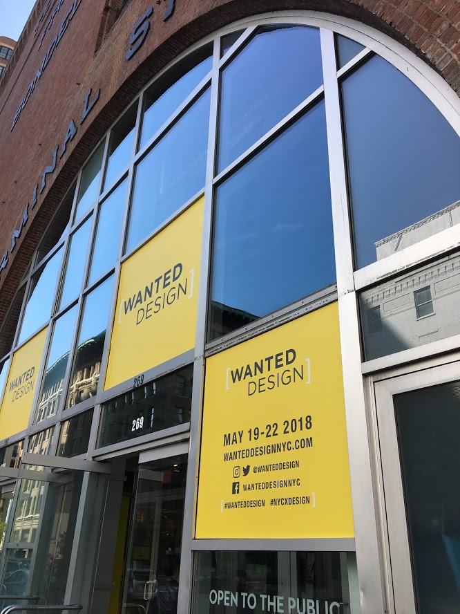
At the same time another show, Wanted Design, was happening right down the street in the Terminal Stores located in an up and coming area by the waterfront. The venue was old warehouse chic and the show was even younger and edgier than the main event at ICFF. There was a global focus here as well.
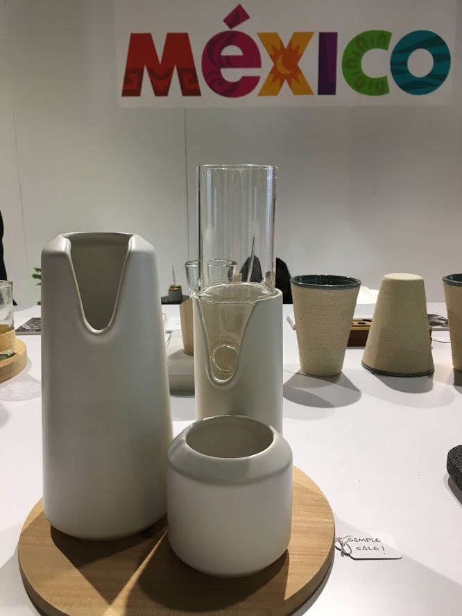
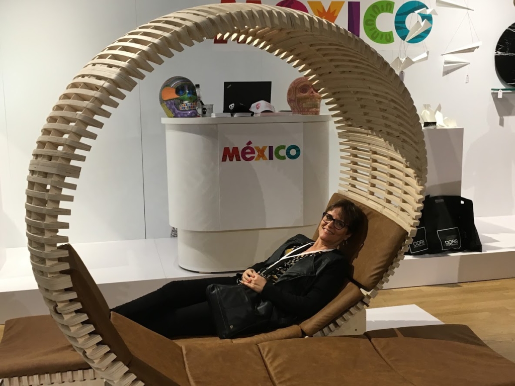
I found the Mexican contingent filled with creative and visionary youth. There was product design, jewelry, furniture and even a line of bar ware based on Mexican cocktails made out of sustainable materials! That's quite specific and remarkable, don't you think? For now, these are one of a kind but I think it's a testament to creative thinking in the future.
Wanted Design was also the venue for Modenus Talks sponsored by Lixil and hosted by Modenus and Design Milk. This regular series of talks is held in different locations usually in conjunction with trade events. They are always so informative and relevant. The one we attended was Sustaining the Sustainable Home moderated by Modenus Media CEO Veronika Miller and featuring materials expert Grace Jeffers. It's always great to have more knowledge about the materials I am specifying and to educate the public about safety and sourcing. Do you know the number one thing you can do to reduce pollution in the home? I'll tell you because you'll never guess, It's removing your shoes at the front door. Your shoes track in not only dirt but also carbon monoxide! Who knew? Honestly even though some really relevant information was shared it was also very scary.
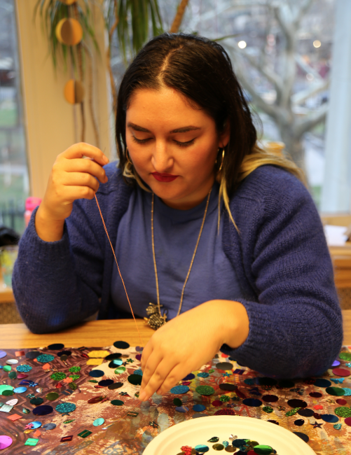
If you know me you know that no trip to NY is complete without an "art fix". My savvy New Yorker sister and brother-in-law suggested the Noguchi Museum which did not disappoint. Noguchi was a stone sculptor among other things. He's also famous for those fabulous paper lamps. It was very inspiring and I even bought the T-shirt. I'll be making another video about my Noguchi Museum visit. Subscribe below and stay tuned. Part two of the art experience was The Museum Of Art & Design which is a satisfying combination of craft and fine art. This was my second visit and I must say my favorite part is the sixth floor where you can see and talk to artists in residence. It was quiet on this rainy afternoon but I did meet textile artist Emily Oliveira.
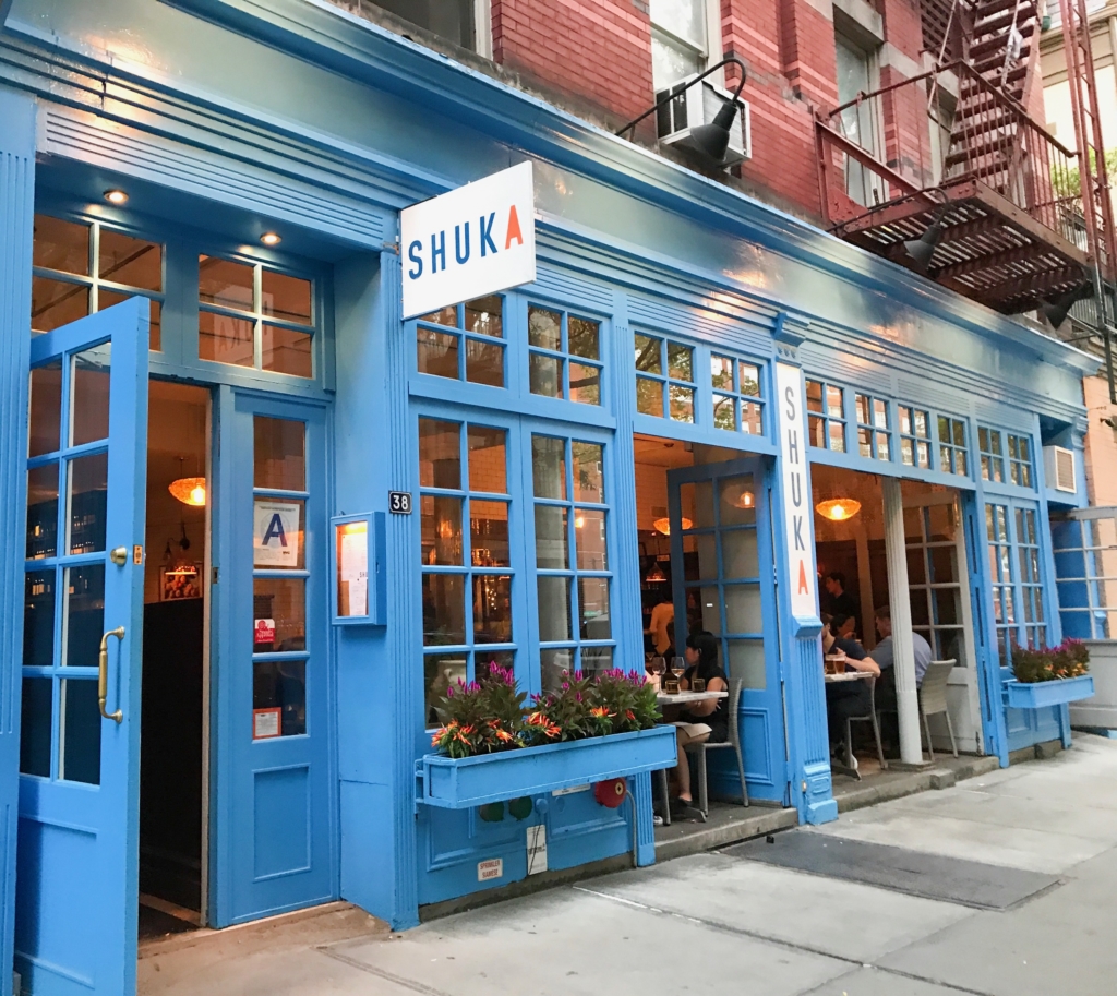
.All in all it was a great trip topped off by a birthday dinner courtesy of my dear sister and brother in law at Shuka in the Village. OMG what an amazing feast! Executive chef Ayesha Nurdjaja has a knack for flavorful combinations which feel Middle Eastern to me and are described as Eastern Mediterranean. The service was top notch too, even though it was packed for a Tuesday evening. Maybe everyone knew it was my birthday ;) Back to work now but at least I have some great memories to savor.
5 Ways to Make Any Kitchen Your Own Stylish Sanctuary
Do you get frustrated looking at all the beautiful images on Houzz and Pinterest? If only, right? The good news is you don't always have to shoot the budget to have a kitchen that is your own unique design statement. This means you're going to have to forgo the temptation to slavishly emulate the trend of the moment in exchange for investing in a look that is authentically your own. Yes! Inject your own personality, make it versatile to allow for your moods and you will have something timeless that will always give you joy. Read on and I'll show you how.
Own Your Color
A favorite color is one way to create a personal statement in your kitchen. Perhaps you embrace all color bright an bold. If this is your cup of tea allow yourself open space and glass front cabinets to show your true color in all its glory. I recommend keeping the fixed elements such as flooring and countertops neutral so you can play more with color in ways that are versatile. This would include paint, dishes, artwork and decorative items. A nice crisp white is always a great backdrop to vibrant hues. If you are an adventurous soul because that's your personality, create a focal point like this beautiful back splash using your favorite color. Just keep it over one area such as the stove. Less is more and you don't want to dilute the power of the statement, right?
"Artful detail can literally be art such as paintings and sculpture but it can also be beautiful hand made utilitarian items, family treasures or books."
Embrace Your Architecture
Believe me, I have tried to "correct". Sometimes you can but often it just doesn't work. I have had much better results when I embrace the fixed conditions I am faced with when creating a new design. These issues can include angles, bump outs, ceiling height differences and last but not least the age and era in which a home was built. Your space should look like it belongs. This happens when you match the style of your design to your home. In fact, I always try to look for clues such as arches and fixed architectural elements that I will repeat in the design. If your kitchen "goes with" your home it will always be right.
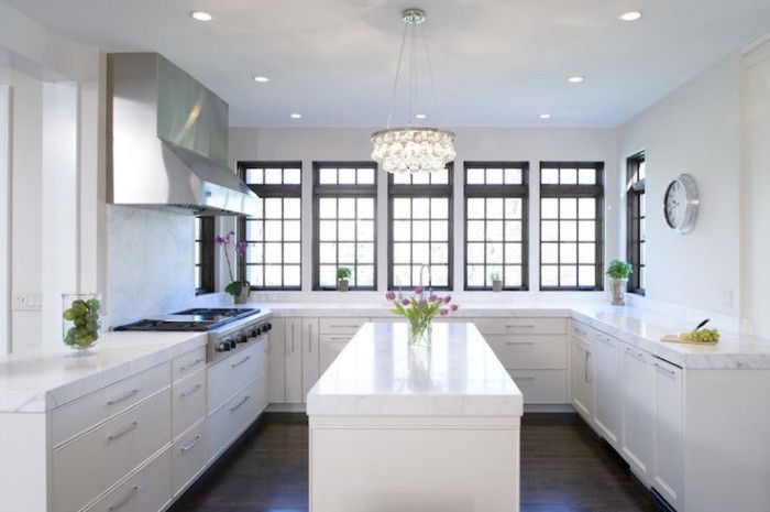
In this kitchen which you can read more about here, we were stuck with some of the angles (yes there were more) as they are exterior walls. What we did do was move the refrigerator. It used to be where the hood is. It opens up space and gives us a focal point. We also eliminated angles on both the island and the peninsula. Now my client has a kitchen that makes sense and functions perfectly for her lifestyle.
Go Within
The way you customize your cabinet interiors is always based on the way you live. Think about it. Is there one particular item that just doesn't have a home with enough space in your kitchen? It could be food storage containers, pots or even trash! It's different for everybody. Even if you have a small kitchen you can maximize function. There are solutions.
If you're short (like me;-) or you're just short on upper cabinets, this drawer insert featuring dish pegs can be used to customize your dish storage. Food storage containers are so necessary but can be a PIA, if you know what I mean. You may even be able to retrofit one of your cabinets with one of these handy pull out organization systems by Revashelf. These are just two examples but there are so many options.
Customize Work Centers
Every kitchen has a work center for food prep, clean up and cooking. Sometimes in small kitchens, they overlap but those are the basics. Add your own as needed to customize your kitchen. Think media center or beverage center to house your coffee or tea stash and accoutrements. Those are two popular ones that come to mind. How about a pet center? It could be as easy as designating a certain space or cabinet and tricking out the inside. It can be planned in a new kitchen or created in your existing space.
A media center in a drawer! Measure your devices and make sure you have enough USB outlets and you're good to go. Sometimes it's nice to put the phone away. Who knows what could happen ;)
This is WoodMode's version of a pet center. They call it a Pet Parlor and you can create this with most cabinetry
Artful Detail
Artful detail can literally be art such as paintings and sculpture but it can also be beautiful hand made utilitarian items, family treasures or books. If you have the room I encourage you to try and leave some open space to display such items and change them out as the mood strikes you. This is perhaps the easiest way to make a neutral space very personal and joyful to be in.
Many kitchens have a wall on at least one end which is a perfect place for a small gallery of paintings, floating shelves or one big piece of art.
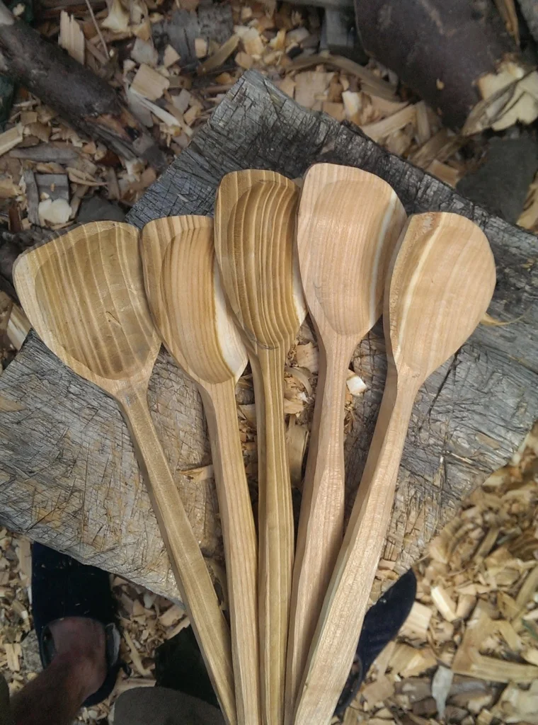
These hand-carved spoons could be considered "working sculpture" in my book. Speaking of books, I think they enhance every space. I love my well-worn cookbooks that probably contain bits of all the meals cooked from them!
This is a home run for me books + art!! I love it and if you do too we'd probably get along :)
COMING SOON!
My quarterly newsletter is coming soon. See what I've been up to in my real life Palm Beach County projects along with new products and where you can shop locally for the best selections and value. Subscribe below so I can keep you in the loop! xoxo
Going Topless...In Your Kitchen
Unless you've been living under a rock you know that the less-is-more look of the topless kitchen is hot!! When I say topless I mean no upper cabinets. There are certainly pluses and minuses to this design decision. But "how can I live without half my kitchen", you ask. Fear not. Today we will examine the possibilities.
Less is Now
No complaining if you haven't done a thorough kitchen purge in the last year. We all have "stuff" and if it never sees the light of day it's stagnant energy taking up real estate that could be otherwise useful or beautiful.But what about dishes? They always go in the upper cabinets. Actually, dishes work perfectly in drawers if you have this drawer peg system. You'll find that they're easier to access too, particularly if you're short like me ;)
Clever Corners
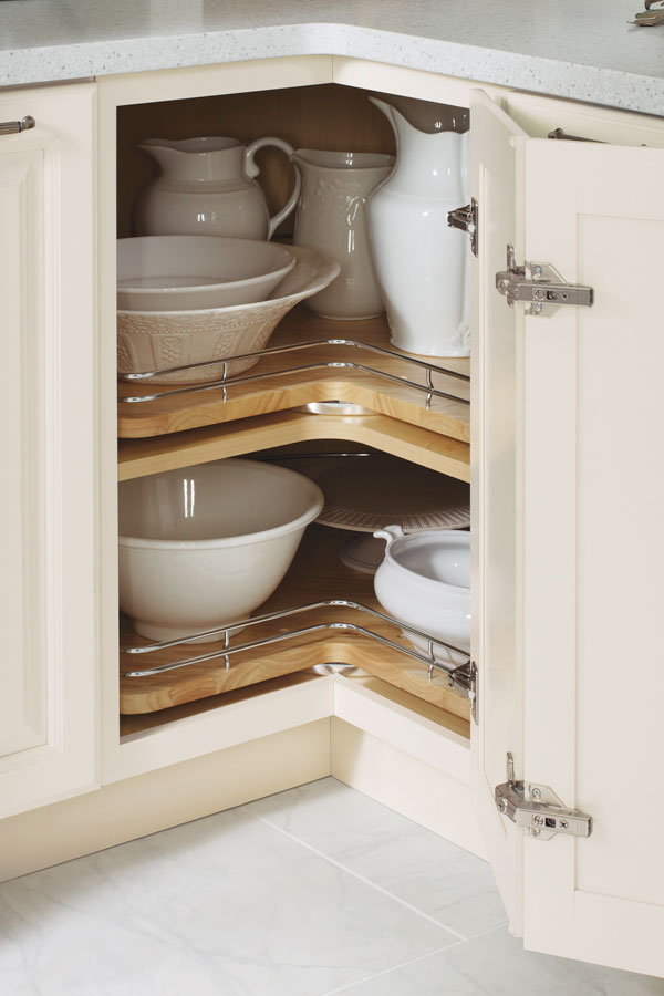
Another way to maximize the space you have below deck is to use the corner space. My favorite way to do this is with a base lazy susan cabinet. It's versatile storage for almost anything. Just be sure to get this type, without the pole. With trays mounted on shelves, you won't lose things to the Twilight Zone if they fall over. (Chrome rails are optional) The only caveat is that you will need 36" on both sides of the corner to make this work.
If you can't swing the 36" in each direction you can perhaps use the Cloud which fits in a blind corner cabinet. We can discuss more when you call me to help you with your new kitchen.
Ultimate Simplicity
The most simple solution of all is the open shelf. They are both feared and widely popular. Some feel like it would look way too messy but I say it doesn't have to be all or nothing. A few open or floating shelves can add a lot of lightness and visual interest as well as storage above the counter in lieu of cabinets.
Artful Arrangement
In the photo below, they actually did not eliminate uppers entirely but it feels like it. Here they are using the shortened uppers for remote storage, i.e. the stuff you don't need to access every day. The "go to" storage is in tall pantry cabinets. That's right, you don't have to use the pantry only for food, they are great for everything. If your pantry is full depth, like these, rollouts work great for easy access and to avoid items getting lost in the back. If you're observant you'll also notice the last cabinet sits on top of the counter. If you have the counter space this is a great way to conceal countertop items for less clutter.
Creative Compromise
As we've seen, one does not necessarily need to banish the upper cabinet entirely to score an updated and functional result. Here is a loft kitchen I recently designed. My clients were in love with the idea of floating shelves and this look worked for their urban vintage style. Since space was at a premium in this condo we did opt to keep a few good sized upper cabinets. The look is actually a blend of contemporary and transitional. A full pantry also would've worked to the right of the refrigerator but my clients preferred this arrangement which is very symetrical and offers a bit of extra counter space. Hey, I always say the best jobs are good collaborations. :)
.
No matter what your situation, creativity can offer you choices. In over 20 years I have found that there is always a solution that will work in your space and I would love to help you find it.
Sex Up your Kitchen with Matte Black
In the fashion world, black always has an air of hipness and sophistication, as in the ubiquitous "little black dress". Now, in kitchens and home decor, matte black is all the rage, it's neutral but also works as a stunning accent when used sparingly.
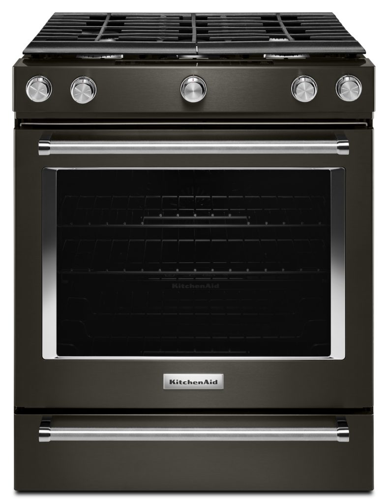
Appliance manufacturers have been turning to black matte or something called black stainless as an alternative to the stainless steel finishes that have been a standard for so long. You can also opt to use matte black for your cabinet hardware and mix it in with stainless or chrome. That's exactly what I did in my new sexy kitchen which will be revealed soon in Episode VIII of The Big Move. This is a little preview
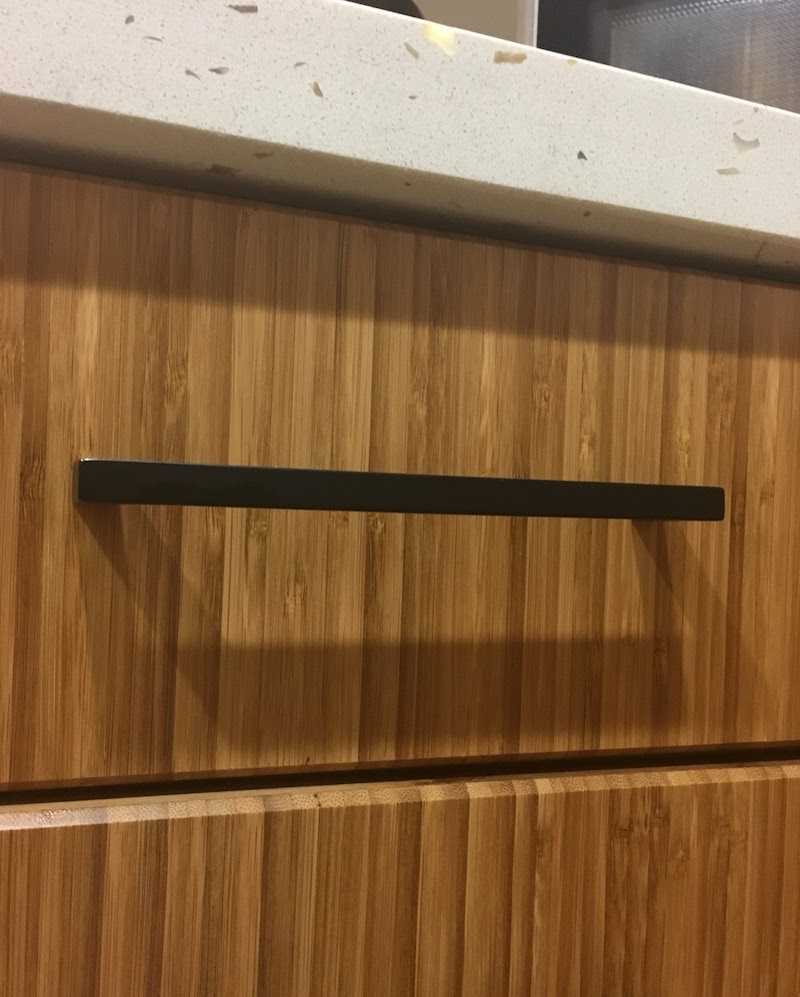
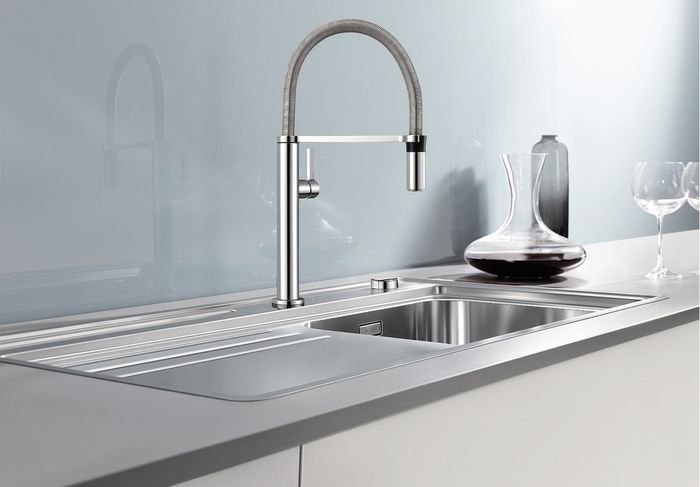
Check out my faucet, courtesy of Blanco, and I love it. I cheated though, that is not my kitchen as the backsplash isn't in yet. It will, however, be very similar to the one you see above. Below IS a sneak peek. Those are my luscious bamboo cabinets with quartz countertop featuring real shells! For more, you'll just have to wait for VIII.
(By the way, I have curated many of the items shown in this post on my new Amazon page. There is even a surprise "look for less" item included. In each future post, I will add more items to it. Yes, I could possibly get coffee money from these links but I only post the products I either have or really love. I'm just curating them there for you.)
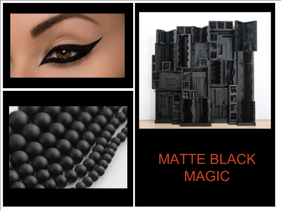
The more I thought about it, the more I saw black matte in art and nature too. I encourage my clients to include images like these as they begin to consider options for a new kitchen or bath. I'm fun like that ;) These are the things that make your space personal and reflect your style. I will help you edit and translate the essence so that it works seamlessly in your new space.
I love this look as an alternative to stainless steel. If you decide to be bold with black appliances, it's a good idea to buy the whole package so everything matches. The black appliance finishes from different manufacturers are not all the same. If you want to get a different brand dishwasher or refrigerator you can always put cabinet panels on them as another solution.
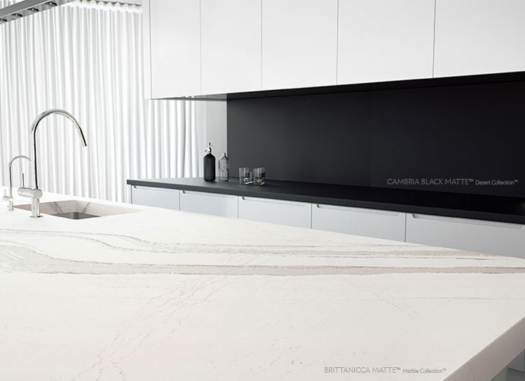
Many quartz countertop manufacturers are offering matte finishes. Above is Cambria's black matte as a backdrop to their mega-popular Brittanicca, also in matte finish. If you are thinking of doing a full height backsplash, as shown here, make sure to plan on using 2cm material which is 3/4" thick. The other option of 3cm would be too thick.
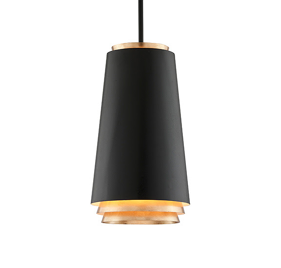
Don't you love this pendant light fixture? I am enthralled with the streamlined cylindrical shape. It's a series of nested and tiered cones that allow light to seep down in a cool way. The outside is textured black and the inner surfaces are finished with hand-applied gold leaf.
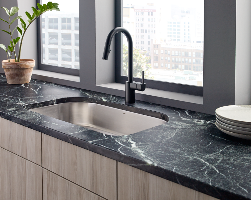
The clean contemporary lines of this black matte kitchen faucet by Moen caught my attention. Note the matte finish on the countertop and how nicely the black matte works with the stainless sink. You can definitely mix metals!
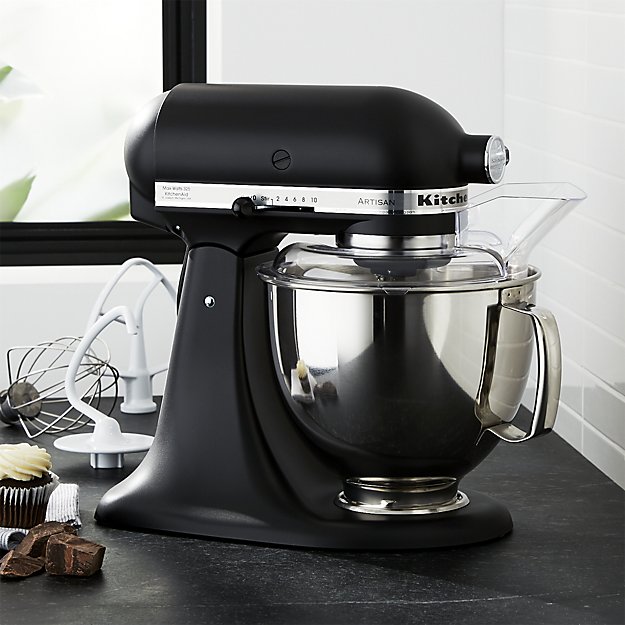
Last but definitely not least, think how stylish you'll feel throughout the holidays cooking with this sleek chic mixer by KitchenAid. What do you think about the look and versatility of matte black? Let's start a conversation! Oh and in case I distracted you, don't forget to vote for Artful Kitchens right here. Thanks! :)


