BEAUTY IS SKIN DEEP ON NEW VENEER DOORS

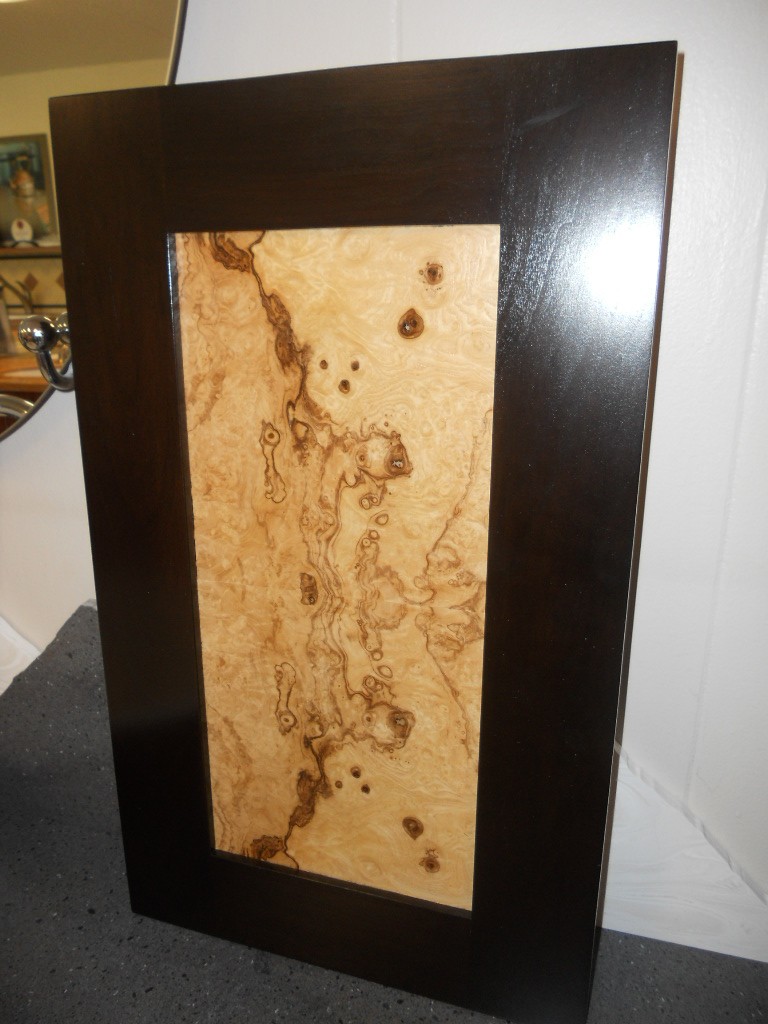
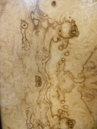
Brendan has done it again!  One of our favorite clients has been exploring exotic wood veneers as a way to add unique beauty to their new dream kitchen. (See previous post about wood veneers here).  They chose Olive Ash  Burl veneer and here are the doors we've come up with.  The first is a dark stained cherry frame around a natural Olive Ash Burl veneer center panel.

The swirls of the burl are stunning.  They stimulate the imagination.  With every glance a new shape emerges.  Maybe this would be a good tool for psychlogists! Keep in mind that a little goes a long way here.   I probably wouldn't use these for every single door in your kitchen.  Use them as a focal point.  Not only will it have just the right amount of impact but you'll save money by mixing it up with a basic.The second door is slab-styled with a dark stained Olive Ash Burl veneer face.  The edge banding is a smooth dark stained cherry to match.  They are going to become part of our standard offering here at Brendan Donovan Furniture & Cabinet Co. and shall be named!  Any good ideas?  I'm open to suggestions.  Oh and by the way, this veneer comes from various parts of Europe, in case that influences your decision.Don't forget to check out the Tip of the Day at Blanco by Design as we count down to Earth Day.  You can find mine featured today!

ONE FLORIDA KITCHEN WITH A TWIST

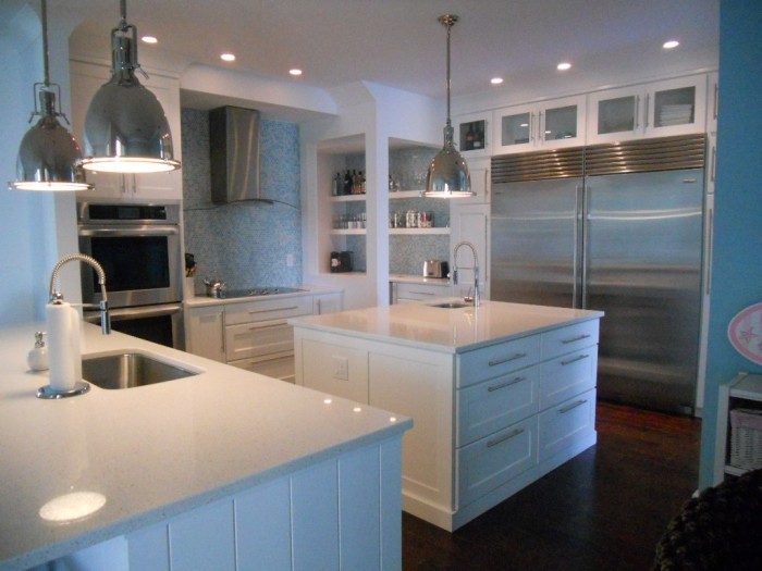
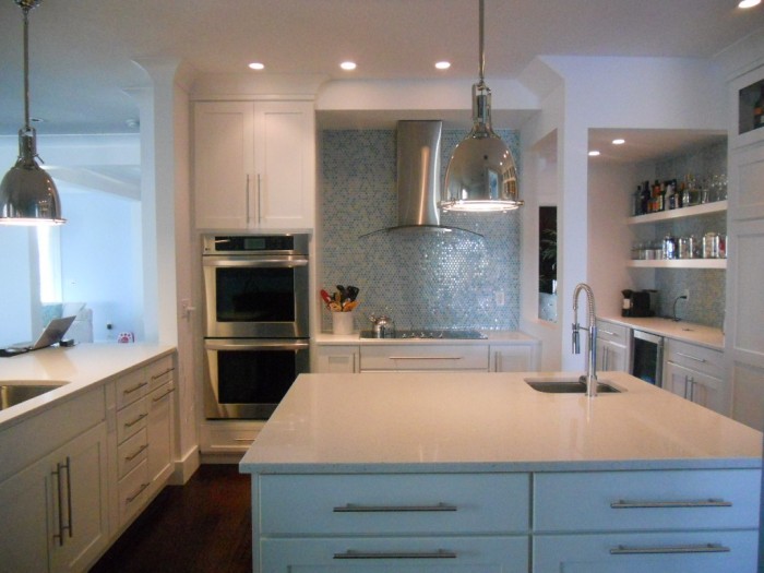
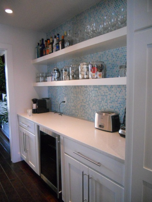
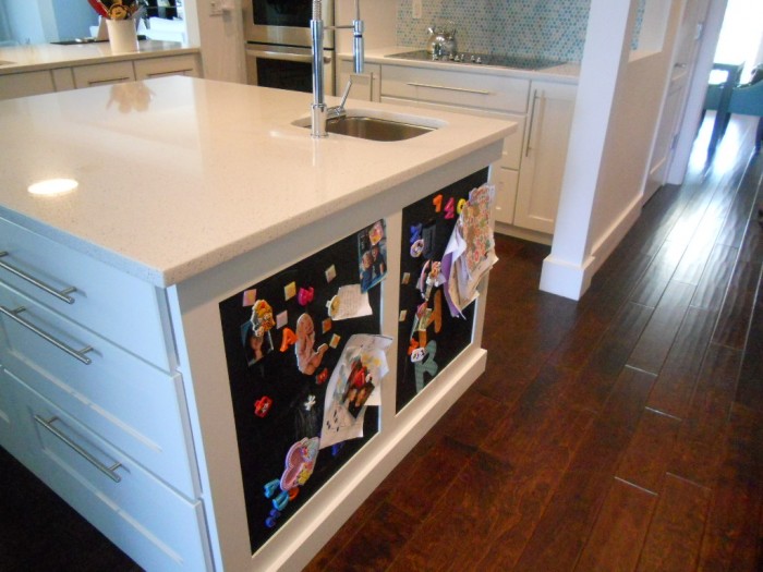
I can’t believe I’ve been back a week already!  I guess it’s time to refocus on Florida.  What better way than to share this kitchen from my portfolio? Yes, it is the quintessential “Florida” kitchen but you don’t have to live in Florida to have one.  If you have a yearning for the tropics year-round, this could be the perfect storm (poor choice of words) solution for you.   This combination of white, stainless and shades of blue green that call to mind the ocean make this a Florida dream kitchen that you can apply to your own home.I always say the best projects are the result of great collaboration and this beautiful kitchen was certainly the result of that.  The house is located in a new development and came with a builder-grade offering of unremarkable cabinetry.  The new design includes a few tweaks.   One priority for this young mom was to have a very open feel to her kitchen.  We even wanted to remove the wall between the kitchen and butler’s pantry.  That was not to be as it turned out to be structural.  Plan two was to open it up so that you could at least see through it.  I think you’ll agree it worked really well.


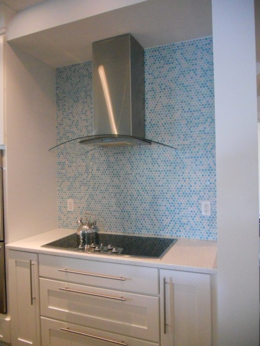
 The cabinetry is by Holiday Kitchens, Inc.  The door style is called Seattle and it is wood with white paint.  Counter tops are white quartz and the dramatic backsplash is penny tile.  A penny tile is a round penny-sized mosaic tile that comes in sheets for easy installation.  Appliances include a full sized 36” refrigerator and freezer by SubZero, a built-in wall oven and a handy microwave drawer by Sharp.  Now all you need is a sturdy pair of flip flops and a stylin pair of  shades to complete the ensemble.


KITCHEN FUN IN NEW YORK (AGAIN)!

 That's right. Today I'm back in the BA (big apple but you should know that). If you recall, I was here only 6 months ago during fashion week courtesy of  Brizo Faucets. Click here for a journey 6 months back in time. Wouldn't you know it, the amazing exhibit Counter Space: Design and the Modern Kitchen at MOMA opened within days of my departure necessitating a return trip before it closes on March 11th.  Some savvy bloggers wrote about it on the front end so I'm going to wrap it up for you and send it out with a bang.   I'll be there on Sunday. Tomorrow I'll be visiting the new super slick Scavolini showroom in Soho.  I hear it's not to be missed so I will also be bringing you the latest in Italian kitchen design from this progressive cabinet manufacturer.  Now if you know me, you'll know I have to fit in a little art and guess what's happening this weekend? Yes that's right, the Armory Art ShowNEWSFLASH!!! You can now subscribe to Kitchens for Living on your Kindle!  Check it out here.If you're paying attention you'll notice yet another badge on my sidebar.   I am now officially an "expert" at EzineArticles.com with one published article and loads more to come,  as soon as I have time.    More from New York tomorrow.PS.   If there's anything you think I should check out while I'm there drop me a comment and I'll try to squeeze it in. Cheers!  

SPIRAL WINE CELLARS?

I received an email from one of my fave clients the other day.  She is contemplating a dream kitchen for 2011 (Maybe you should too!) Anyway she sent me some of these amazing photos. Check out this dreamy spiral-trapdoor-otherworldly-cool wine cellar!  Was this an internet hoax, an urban legend, I wondered?

NO!  It's for real and you can check out the UK firm that builds them here.  The appeal is not only novelty but efficient design.  The concept was designed in 1978 by a Frenchman (of course).  It's not a basement, as I first thought, but an actual hole in the ground!

It's not only space efficient but it's Green as well.  They claim the temperature stays constant at 55 degrees.  Ok, so it's probably still only a dream for us in Florida.  If you dug that deep under my kitchen you'd have an undersea wine cellar.  Now there's an idea!

FLORIDA KITCHEN CHARM

Thank you  for the out pouring of love and concern for our family.  No matter what happens the sun always rises again and we begin another day.


As you guys up in the northern regions are beginning to crank up the heat,  I thought I'd share a little warmth from down here in sunny Florida.  If you love warm tropical beaches, even when there's snow (instead of sand) on the ground, here's how you can bring this ambiance to your "anywhere" kitchen.

Blue & White will give you an instant feel of sun and surf.  White cabinets are hot!  Blue calls  to mind the ocean and may be added to your backsplash, walls or even used as  accent color for an island or hutch cabinet.


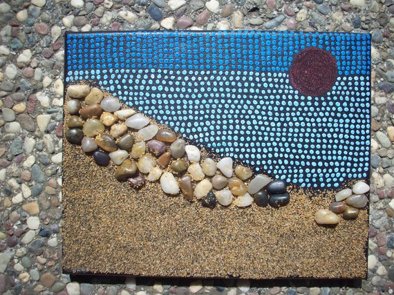
A sea view is a must and you can have one even if you don't live by the sea.  Think art!  That way you can choose the sea view of your choice.  It can be a painting, a photograph or even something more abstract like a mixed media work of art.

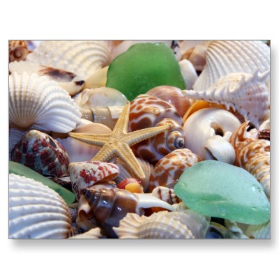
Gifts from the Sea are fun ways to add a beachy feel.  Shells, starfish or even bits of beach glass are great accents.  Try using a shiny glass tile backsplash for a watery feel or tiles with more of a honed finish look like glass that has been eroded by the sand over time.

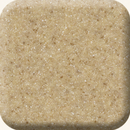
Burled Beach Corian countertop by Dupont

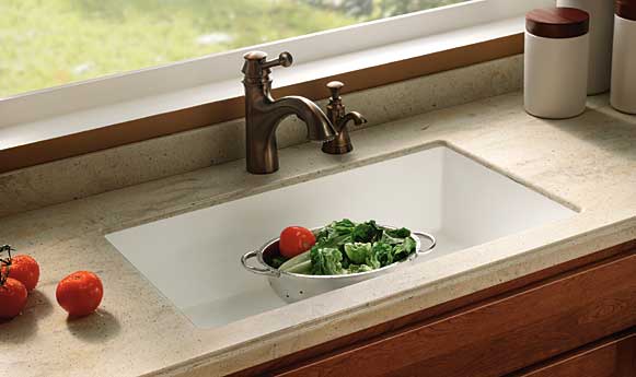
Throw some sand into the mix with solid surface counter tops in colors like Dijon from the Elements collection by Denova or Burled Beach by Dupont's Corian.

The nice thing is you can add a little or you can pull out all the stops.  If you have "Floridified" your kitchen sent me pix.  I would love to show and tell.  Oh, and by the way, it's nice to be back!


5 TIPS TO IMPROVE THE LIGHTING IN YOUR KITCHEN

Friday afternoon I had the pleasure of sipping a Starbucks pumpkin spice soy latte while chatting with my favorite local lighting expert Marcia (that’s MAR-see-uh) Exelrud .  (Click here for previous guest post by Marcia.) As we discussed how to save the world from poor kitchen design and bad lighting , I asked her to come up with  a list of the TOP 5 Lighting Fixes for your kitchen. Here's what she had to say:


1. Replace trims and bulbs in existing recessed fixtures. New trim will give you a fresh updated look.  Replace bulbs so that they are all the same type for uniform and even lighting. Remember that the most up to date fixtures and bulbs will usually also be more energy efficient.  The initial investment is greater but they more than pay for themselves and save you time and aggravation in the long run.

2. Move or add fixtures to add direct light where you need it. Take a moment to study your kitchen both during the day and at night with the lights on.  Does your current arrangement work or do you need to make some changes?


3.  Add cove lighting with an LED or xenon strip light fixture. Do you have space above your cabinets?  This is a perfect opportunity for cove lighting.  LED or Xenon strips are perfect for this area.


4. Remove unsightly dropped ceilings.   You know what I’m talking about, those plastic squares set into a metal grid concealing fluorescent tubes.  Yeah that’s them.  Remove them and you instantly create an open feeling!  Replace those tube lights with some recessed high hats for better light. Welcome to 2010!  A word of caution, if you have a concrete ceiling you may have to lower it just enough to recess lights.  If that’s not in the budget consider a surface mounted fixture.


5. Install lighting under the upper cabinets and above islands.. Never install open fixtures such as pendants, spot lights or recessed lights witout lenses directly over cooking areas.

If you have questions about any type of lighting you can contact Marcia at

http://marcia@brightlightdesigns.net/

You can also find her listed under LOCAL RESOURCES  at Kitchens for Living