FLORIDA KITCHEN CHARM

Thank you  for the out pouring of love and concern for our family.  No matter what happens the sun always rises again and we begin another day.


As you guys up in the northern regions are beginning to crank up the heat,  I thought I'd share a little warmth from down here in sunny Florida.  If you love warm tropical beaches, even when there's snow (instead of sand) on the ground, here's how you can bring this ambiance to your "anywhere" kitchen.

Blue & White will give you an instant feel of sun and surf.  White cabinets are hot!  Blue calls  to mind the ocean and may be added to your backsplash, walls or even used as  accent color for an island or hutch cabinet.


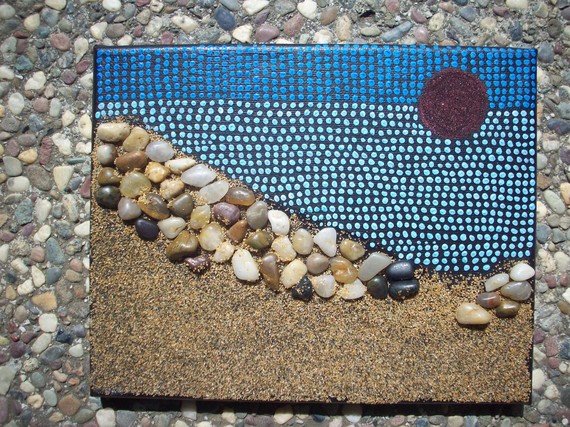
A sea view is a must and you can have one even if you don't live by the sea.  Think art!  That way you can choose the sea view of your choice.  It can be a painting, a photograph or even something more abstract like a mixed media work of art.

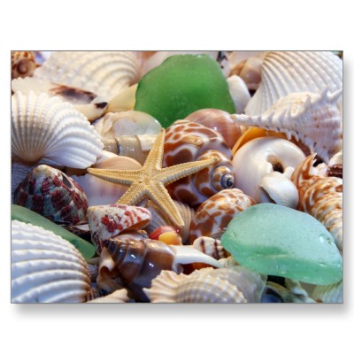
Gifts from the Sea are fun ways to add a beachy feel.  Shells, starfish or even bits of beach glass are great accents.  Try using a shiny glass tile backsplash for a watery feel or tiles with more of a honed finish look like glass that has been eroded by the sand over time.

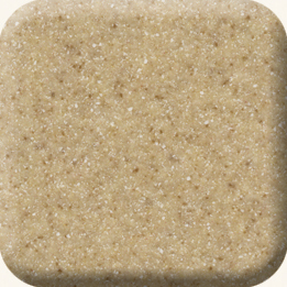
Burled Beach Corian countertop by Dupont

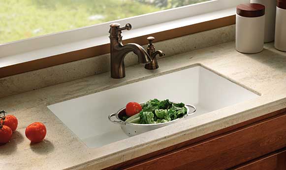
Throw some sand into the mix with solid surface counter tops in colors like Dijon from the Elements collection by Denova or Burled Beach by Dupont's Corian.

The nice thing is you can add a little or you can pull out all the stops.  If you have "Floridified" your kitchen sent me pix.  I would love to show and tell.  Oh, and by the way, it's nice to be back!


SPELL IT OUT IN THE KITCHEN


Lately I've been reading a lot about something called TYPOGRAPHY which is  the art and technique of arranging type, type design and generally playing around with letters, numbers and symbols.  It's bold and exciting and can define your kitchen in a new way.  You can buy unfinished letters which can be painted  and creatively arranged to add a little intrigue to the heart of you home. Here are just a few ways you can bring typography into the mix for minimal investment.


Fun with food!  There's nothing like a giant letter garnish to start a dinner conversation.


Just a few BIG letters strategically placed on a shelf or hung on the wall may be all you need.


How about an art print featuring your lucky number or favorite phrase?


Use a good old fashioned black board if you want to write your own text.  This allows you to change it up.  Invite the family to contribute.  Heck, it could even be your grocery list.  The point is that the writing is the decorative element.  Make your own blackboard with chalkboard paint by Benjamin Moore.

Drop me a line and let me know your decorating type! (Sorry)

5 TIPS TO IMPROVE THE LIGHTING IN YOUR KITCHEN

Friday afternoon I had the pleasure of sipping a Starbucks pumpkin spice soy latte while chatting with my favorite local lighting expert Marcia (that’s MAR-see-uh) Exelrud .  (Click here for previous guest post by Marcia.) As we discussed how to save the world from poor kitchen design and bad lighting , I asked her to come up with  a list of the TOP 5 Lighting Fixes for your kitchen. Here's what she had to say:


1. Replace trims and bulbs in existing recessed fixtures. New trim will give you a fresh updated look.  Replace bulbs so that they are all the same type for uniform and even lighting. Remember that the most up to date fixtures and bulbs will usually also be more energy efficient.  The initial investment is greater but they more than pay for themselves and save you time and aggravation in the long run.

2. Move or add fixtures to add direct light where you need it. Take a moment to study your kitchen both during the day and at night with the lights on.  Does your current arrangement work or do you need to make some changes?


3.  Add cove lighting with an LED or xenon strip light fixture. Do you have space above your cabinets?  This is a perfect opportunity for cove lighting.  LED or Xenon strips are perfect for this area.


4. Remove unsightly dropped ceilings.   You know what I’m talking about, those plastic squares set into a metal grid concealing fluorescent tubes.  Yeah that’s them.  Remove them and you instantly create an open feeling!  Replace those tube lights with some recessed high hats for better light. Welcome to 2010!  A word of caution, if you have a concrete ceiling you may have to lower it just enough to recess lights.  If that’s not in the budget consider a surface mounted fixture.


5. Install lighting under the upper cabinets and above islands.. Never install open fixtures such as pendants, spot lights or recessed lights witout lenses directly over cooking areas.

If you have questions about any type of lighting you can contact Marcia at

http://marcia@brightlightdesigns.net/

You can also find her listed under LOCAL RESOURCES  at Kitchens for Living

TAP INTO YOUR CREATIVE ZONE

I live in a hectic family household  but Sundays are sacred.  Joe is off at work and kids sleep late, sometimes really late.  That is when I am blessedly alone.  That is when my spirit flies.  I catch up with all the blogs I haven’t been able to read during the busy week, maybe I do a little art and I dream.  Despite all my financial responsibilities,  my parenting realities and my work I get into a place where, for a moment,  I think just because I’m alive I can do ANYTHING.  Here are some things I become capable of on Sunday morning:

1. Going back to India to take up where I left off.


2. Buy and decorate a hip Mid-Century modern apartment in Miami


3.Become a full time artist exploring and developing my many ideas and musings at my leisure. This is one of my collages.  If you want to see more visit www.papermoongoddess.blogspot.com


4. Go back to California to study more art


Ok, you get the picture.  When you want to create or remodel your own kitchen or design a kitchen for a client this is a very good space to be in.  Get in the mood and the ideas will come.  This is truly the first step in the Intuitive Kitchen process. When you have returned to earth you can edit.  Trust me it works.  Now tell me, don't be shy (that's counter intuitive). How do you get in the zone?

Add Wearstler Hollywood Kitchen Design Appeal

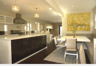
Mixed Materials are featured in this design by Wearstler's protoge Lara Fishman
Did you happen to catch this morning's CBS Morning story on Hollywood designer Kelly Wearstler? She is described as the "new Dorothy Draper", the original Hollywood Design Diva.   Wearstler sports a theatric edgy personal style that flows into her work as an interior designer. There it is again, fashion informing design and vice versa.  Wearstler shared 6 tips on kitchen design with Food & Wine magazine.
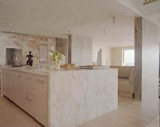
A kitchen carved in stone by Kelly Wearstler
Be bold with white.  Yes, she is partial to the cooler sleeker finishes such as stone, marble and stainless steel.  White works with these materials to create a clean open sensibility.  Plus, let's face it, for those of us in Florida, white will always have a place.  Play with color and pattern. This is a great way to personalize your space and make it your own.  How about a punch of red with that white?  Open up cabinets.  Open book cases and glass doors are a great way to break up what can be a monotony of cabinet doors.  Consider using mirrored glass for a Hollywood look.  
Mixed materials, glass doors and chandelier light fixture in Gwenyth Paltrow's kitchen by Kelly Wearstler
Mix materials.  I'm often asked if it's OK to mix materials in the kitchen.  The answer is yes!  My advice is to include one unifying element such as color or texture.  Use pendant lighting.  If you're up for the drama, this lighting option is the way to go, just like jewelry for the kitchen. Gotta have a chandelier, daaahling!  Last but not least, hide those paper towels.  They are a glamor killer.   
Paper towel solution is handy and hidden


How do you add drama to your kitchen?