 Sometimes I’m called upon to do the impossible, or almost. It's easy for a home owner to blow the budget when purchasing a new residence or fixing up an old one. Trust me, everything always costs more than you think it will! If you're starting out remember to pad that budget. Sometimes I’ll get a perfect storm consisting of a very custom architectural arrangement and a homeowner who chooses to spend a minimal amount. That means custom cabinetry is out. No fear! I had a situation recently in which this exact thing happened. In fact I often have to make stock cabinets work to meet the budget. It’s sort of like a puzzle, a cabinet box rubiks cube, if you will. There are three basic components to a cabinet job and they all have to be friends with each other. They are:1) Design2) Product3) InstallationIn this case I had to come up with a design for a wet bar in this area utilizing stock sized cabinets and then, most importantly, our professional installer had to make it work which did require some fancy bladework. Here’s how we solved this one.
 We utilized two 30” high 12” by 12” upper cabinets as bases (on the bottom) in order to avoid the nasty angles in the back. These cabinets are fine at 12” deep as they will be used to store liquor bottles. (You definitely don’t need to be losing your booze in the backside of an oddly shaped cabinet!) We used a 24” wide sink base cabinet to accommodate the bar sink and since there is no room for drawers in the layout we’re adding a roll out shelf on the bottom underneath the plumbing.The top is where it gets tricky. We used a standard glass door cabinet over the sink, raised a bit to lend a little more spaciousness over the sink. Our installer altered the two upper cabinets on either side to accommodate those angles and I ordered an extra panel of interior cabinet material to finish the remade interior. Crown moulding and moulding under the uppers to conceal undercabinet lights finish off the traditional look. Yes, in this case the installation is a bit more expensive than normal but the savings from using stock cabinetry more than made up for it.
 One thing I say is that there is always a solution and this is a prime example. We had to give up a little space by going stock but custom base cabinets would have been an awkward shape and I'm not sure the benefit would have been worth the extra cost. The example you see here included cabinets, assembly, delivery, the remaking of the upper cabinets, installation and glass. The price was $3,400. Counter tops, lighting and plumbing fixtures were by others.
TROPICAL MEETS TRADITIONAL
 Here in my little corner of South Florida the pendulum has swung , of late, to more contemporary designs in the kitchen. This means less ornate with clean lines. I love it but I realize it's not for everyone. What if your whole house is more classic and traditional? Your kitchen should always work with the architecture and theme of your home. This is exactly the case with a job I am working on now. This Florida home has a kitchen open on two sides, the dining room and the family room. Here's what it looks like now.
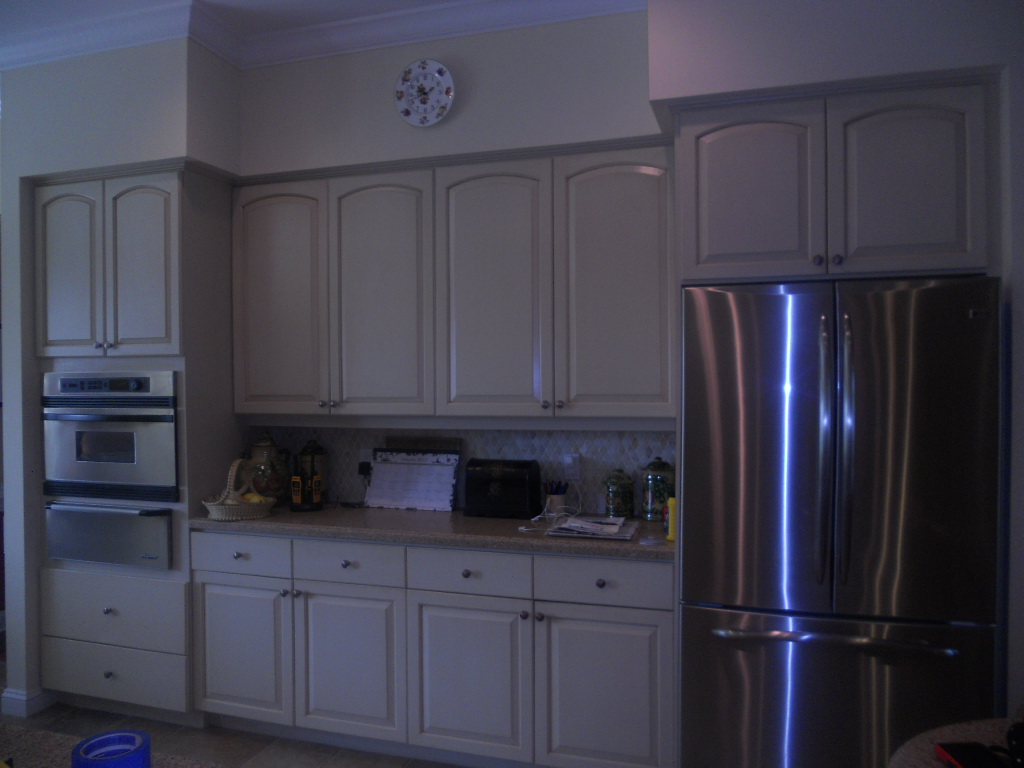
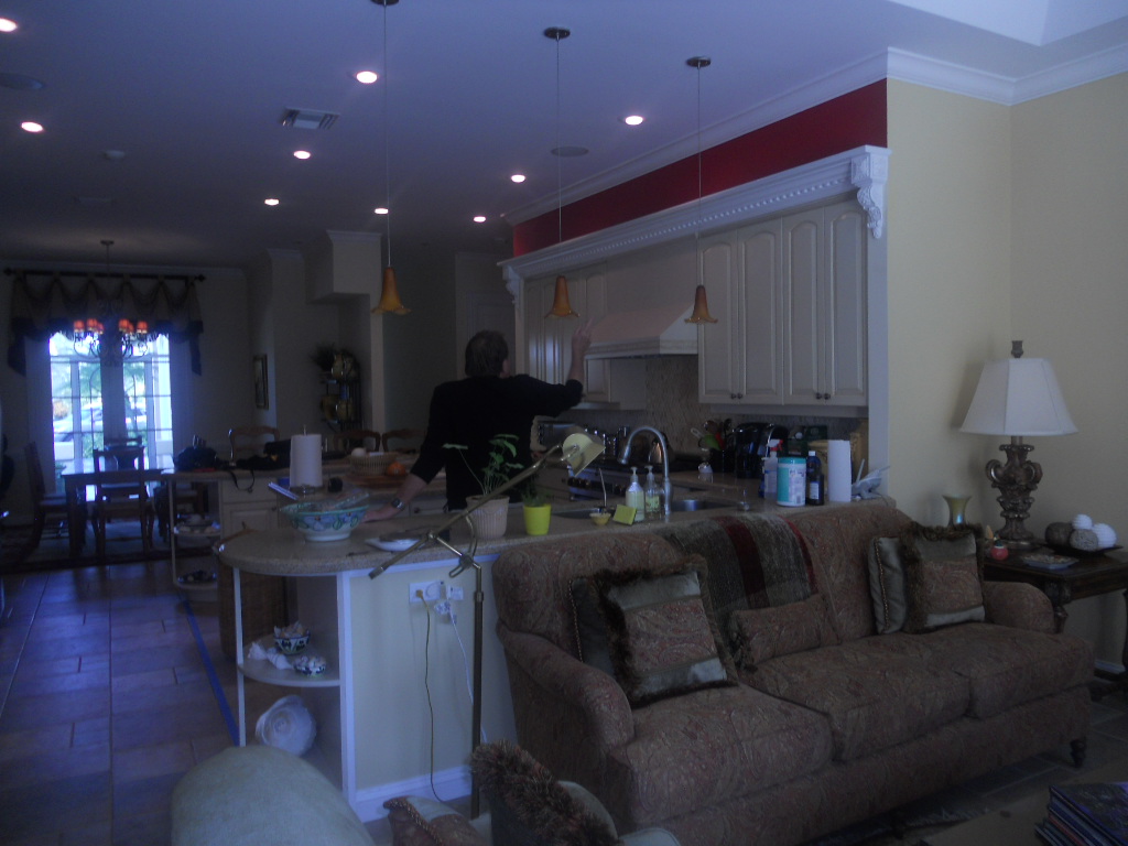 She's selected appliances which are slightly different and will be integrated into the new plan. Because the kitchen is smack dab in the center of the home there is not much natural light, so no dark finishes. We have about 95" to the soffits. Last but not least, because the kitchen is so open and visible we need WOW!If you blend the tropical locale of this beautiful home with its traditional decor you find that British Colonial or Bermuda Style is the perfect solution. During the reign of Queen Victoria, British subjects stationed in the British Colonial outposts of the Empire that included Singapore, East Africa, India and the British West Indies, brought with them their language, principles of government, architecture and furniture. There was just one little issue, climate. Certain details had to be modified to accommodate the heat! Some of these details were the use of light airy fabrics, lots of big tall windows and high ceilings. In addition to this they had to take advantage of local resources like mahogany, cane and bamboo. So here's what we're gonna do!1) MOVING ON UP- We're going to remove the soffits so we can take advantage of the high ceiling.2) LET THERE BE MORE LIGHT- We're going to add lights above cabinets, wherever possible and more efficient fixtures in the ceiling and under the upper cabinets. Cabinets will be a combination of medium and light stains with some cane detailing.
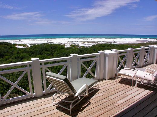
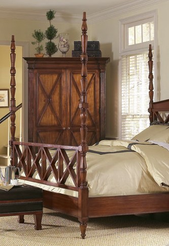 3) X MARKS THE SPOT- You will frequently see the X motif as a part of the BC style so we are incorporating it into the design.4) A LUSH TROPICAL ISLAND- This tropical island has to grow. We have the space to make it bigger and more funtional but we don't have the space to add the columns or legs that would make it look like a piece of furniture. Instead we'll raise it off the floor and add some furniture feet and moulding.
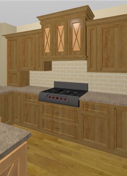
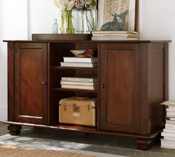 5) CROWNING DETAILS- Nothing says traditional like crown molding, columns and pilastersSee a working elevation below. Notice with the X detail, less is more equals WOW. We're still fine tuning the details but I'll Keep you posted!
KITCHEN FAVORITES GUEST POST
Today’s guest post is from Susi, a writer for Arcadian Lighting, a must-shop resource for beautiful light fixtures. Susi is sharing some favorite kitchens, from traditional to contemporary, cottage to penthouse. There is a wide range of styles, fixtures, cabinets, flooring and lighting in these kitchens. We hope you see something that will inspire you. What is your favorite kitchen?

Pinterest via
Love the greenhouse feeling to this kitchen. The cream cabinets and countertops blend seamlessly with the architecture. Pantry & appliances are tucked further back so they don’t disrupt the view.

Pinterest via
This cottage kitchen is one of our favorites because of the island that feels like a farmhouse table. Classic white subway tiles are classic for a reason…they’re timeless.

Apartment Therapy via
Small doesn’t mean unstylish. Love this eat-in-kitchen that is small on space but large on style. High gloss cabinets reflect the light to make the room feel bigger. The pendant light over the table adds a stylish touch.

Fresh Home via
Colored cabinets are not a new trend but we love the high gloss aqua on these metal cabinets. Everything feels sleek and polished in this contemporary kitchen.

House and Home via
Luxury finishes and quality materials make this kitchen a favorite. Dramatic dark cabinets and contemporary lighting make this kitchen feel sophisticated.

Abode Love via
This white kitchen is anything but sterile. Grey veined white marble, dark floors and punches of orange from the counter stools keep it lively. Love the kitchen pendant lights.

Shatter Boxx via
While many of our favorite kitchens are light and airy, we do love the drama of dark cabinets paired with dark floors. The island sink also makes this a fave, as does the professional range.

A Note on Design via
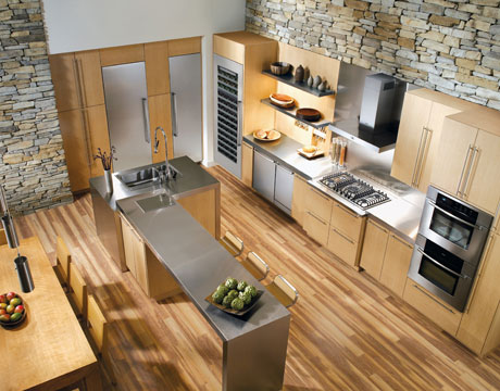
This contemporary farmhouse kitchen is a gorgeous blend of new and old. Love how the design incorporates the stone wall with contemporary cabinets and pendant lightsContent provided by Arcadian Lighting, a site that specializes in top quality lighting fixtures at extremely affordable prices. If you like this post, be sure to stop by the Arcadian Lighting blog and let us know you saw us here!
MY DESIGN PROCESS: A CASE STUDY
I write about a lot of varied things on this blog. Today I'm going to open my mind to you so you can step inside the creative (or whatever you want to call what goes on in there) process, as it pertains to cabinet design. The thing about designing kitchens and baths is that it doesn't only require vision in the aesthetic sense but also in the functional sense. We have to be creative in terms of the space constraints while being very aware of function.
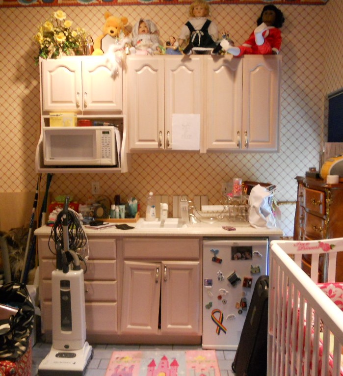 WHAT HAVE WE HERE? This is a nursery equipped to serve the nanny. She's got an under the counter refrigerator to store bottles, baby food and
 wine whatever she wishes for herself. In addition there is a small sink and a microwave. There is also storage and counter top work space (underneath all the debris). That's a lot of function packed into less that six lineal feet! The lucky owners of this oceanfront abode are away for the summer, as is the custom in Palm Beach.MY ASSIGNMENTI have been asked to replace this set up but to keep the same foot print and function. The cabinets are to be more in keeping for this traditionally styled beach house.MY OBSERVATIONSThe backsplash (area between counter and upper cabinets) is really high, about 22". Not only does this mean less cabinet space but it's a bit of a stretch unless you're a very tall nanny. In addition, there is nothing tying the upper cabinets to the lower cabinets and since they do not go wall to wall it looks as if the uppers are just hanging out, hovering over the base cabinets, not a great look. In general the layout is off kilter. The microwave requires a deeper cabinet and it sticks out unattractively on the left.WHERE DO I START?The appliances are old and will appear even older surrounded by new cabinets. Remember that if you are investing in a new kitchen it's penny wise and pound foolish to try to build your new cabinets around your older appliances. I will suggest that we replace the microwave with a small built-in model in stainless steel. For this I know I must use a minimum of 24" out of the 70" I have available. The refrigerator is important too. This one is old and it's an odd size, about 19". The new one will have to be 24" and I will reccommend that we build it in for a more custom look and to unify the small space. These types of built-in panel- accepting- under- the- counter refrigerators are either 15" wide or 24" wide. I certainly can't detract from the function by going smaller so I will give them more refrigerator space by going with 24" wide. Now that I know what I'm doing with the appliances I will work the cabinet layout around that. Here's phase one showing the larger ref, a built-in micro and an attempt to even things up and connect the uppers to the bases but it's still not quite there yet. I usually draw a free-hand sketch to work out my initial thoughts. The final solution (I drew it using Chief Architect) is to use 42" upper side cabinets instead of the existing 30" uppers. Then since the microwave needs a deeper cabinet (15"), I moved it to the middle and raised it up to create some design interest and to take advantage of the tall ceiling. I made the side backsplashes 16" high with the center at 19". I centered the 24" upper microwave over a 21" wide sink cabinet which allows the bigger refrigerator on the right and does not lessen the size of the existing drawers on the left. I'll need a minimum of 3/4" panel to the right of the ref. That makes a total of 24 3/4" with ref and panel. I will duplicate that on the left making the 4 drawer cabinet 24 3/4" wide as well. This allows the upper side cabinets to be equal at 23 1/4" each. Last but not least, I am going to suggest using matching wood beadboard above the 4" backsplash to tie the uppers to the lowers and add a small crown moulding on the top to finish it off.
 PRODUCTSHere are the goods and why I picked them:Kholer faucet K7342 in brushed nickel finish- It's a traditional faucet in a finish that will blend with the stainless steel of the microwave. The height makes it user friendly yet it will fit perfectly in the space.
Kohler undermount entertainment sink K5848- I love the shape of this sink. I double checked the size and it fits in our 21" wide cabinet. It's a more updated undermount model but it's still cast iron. I'm specifying Biscuit to go with the cabinets but I will also suggest a stainless option which would also work.
SHARP R1214OVER THE COUNTER MICROWAVE- This model fits into our 24" wide space. It requires a 15" deep cabinet, check. It has a light below and I happen to know that Sharp makes a kick-ass microwave. CABINETS BY HOLIDAY KITCHENS- flat panel with applied moulding. Finish, selected by designer, to be Snowdrift paint with Mink Wash. I chose Holiday cabinets because we have some custom size requirements and I can order Holiday in fractional increments. They also offer a wide array of finishes and door styles which is important in a higher end application.
 U-Line Under the counter refrigerator - This model offers an overlay trim kit option which will allow us to apply a door panel to match the cabinets.What do you think? You see there's no mystery behind the magic of design. Those are the steps in a nutshell. I would love to walk you through the steps of your own potential magic. It's really a lot of fun when it all comes together, kind of like solving a puzzle AND you get to continue to enjoy it everyday!
THE TRADITIONAL WINNER
As promised, by yours truly, may I present this year's Subzero Wolf Traditional Kitchen Design winner, Vasi Ypsilantis of The Breakfast Room Ltd., Manhasset, New York. I find it interesting that both contemporary (see last post) and traditional winners used the color blue and incorporated dark stained wood into their designs even though they are at opposite ends of the design spectrum. Notice how the architectural detail in the ceiling is repeated with the hood. This kitchen has a very authentic turn of the century appeal. In traditional styling it is all about the attention to detail.
TRADITIONAL & FUNCTIONAL TRANSFORMATION
This homeowner was originally interested in refacing their existing cabinets (photo with tired white cabinets). However when they decided that for just a little more they could improve the function of their kitchen and get all new cabinetry, they were sold! The new River Run cabinets are traditional raised panel with applied moulding in birch wood with a stain and glaze. We added spice pull outs on either side of the cooktop and transformed a little used desk area into a functional and attractive nook! Click on our Flickr photo album for more about this great kitchen remodel.


