As you know by the last couple of posts I’m deeply in love with all things contemporary but then again I’m certainly no “one trick pony”. I have always been intrigued with Craftsman Design. Think bungalows, organic forms and warm rich woods. 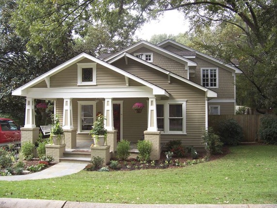
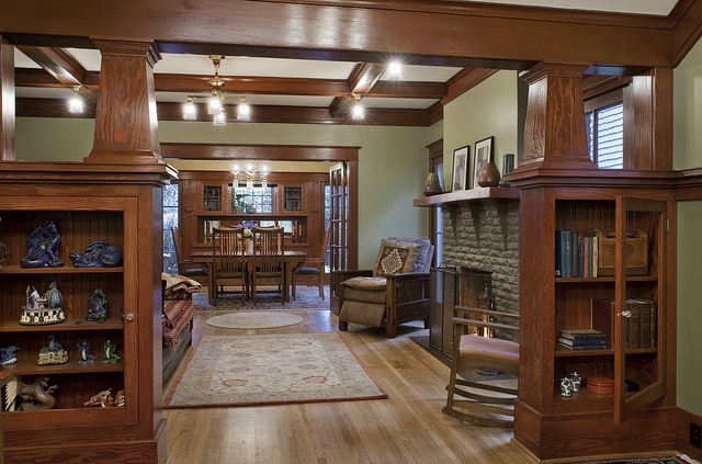
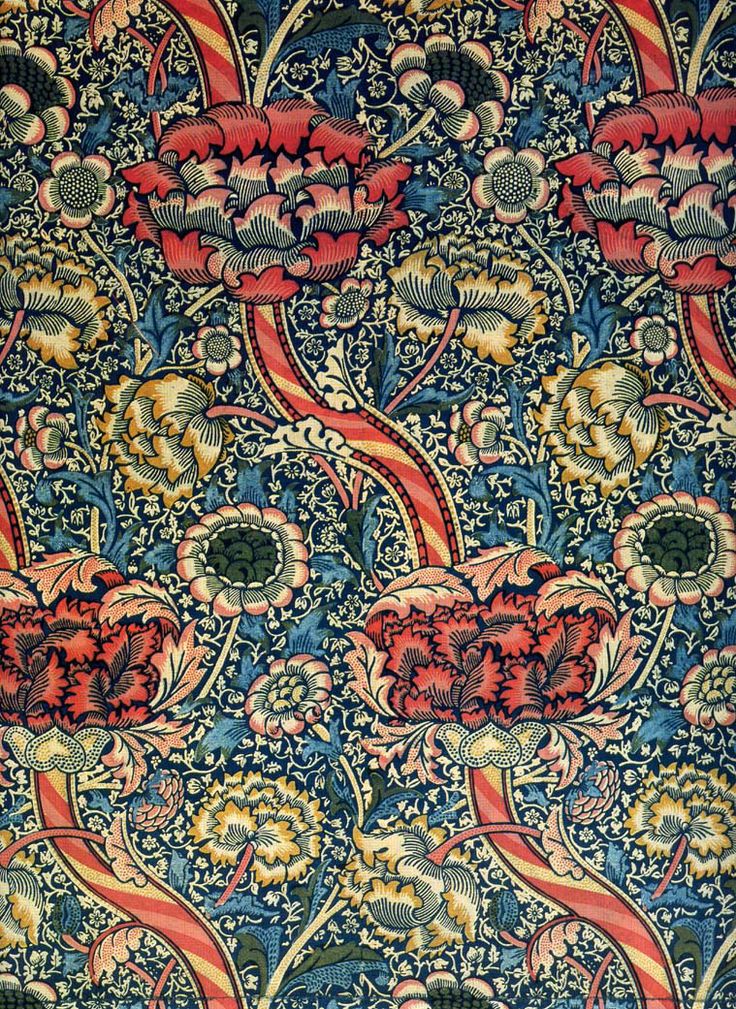 The Arts and Crafts Movement which occurred at the turn of the last century, was a response to the blossoming industrial age. Mass production was coming into its own and a few intrepid souls were missing the personal human touch of household objects made by hand. The leading proponent was William Morris, also known for his beautiful stylized floral prints.
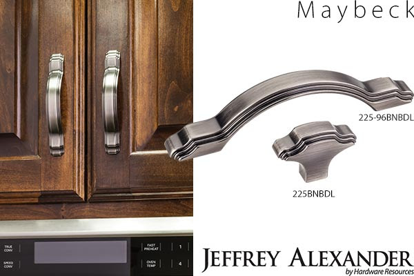 One of my “go to” hardware suppliers, Hardware Resources, has just unveiled cabinet hardware inspired by the period. Named after Arts & Crafts architect Bernard Maybeck, these selections are a great way to jazz up existing cabinets and give you "the look". Since they’re only inspired by, and not reproductions of, the Arts & Crafts Movement, the design is fresh and new as well as being a stylized nod to the Craftsman style. One beautifully styled knob and 3 cabinet pulls will be available in 5 trending finishes. In addition to the Maybeck design, by Jeffrey Alexander, they will be introducing the Brenton (Elements) and the Royce (also Jeffrey Alexander) at the upcoming KBIS (Kitchen & Bath Industry Show).
 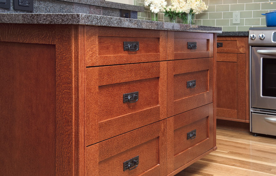 Emulating this look in cabinetry is easy. The Shaker door style, which is all the rage, can be transformed to reflect the Arts & Crafts look by the addition of appropriate hardware. You can get handles like these here.Here's your opportunity to get crazy with a tile back splash. You will see a couple of motifs that scream A&C including the dragonfly and the ginko leaf. Add some green to the mix and you've got it!
 If you're interested in this look or a stylized version of it I'd love to hear from you!
Tip #5: To Glass or Not To Glass?
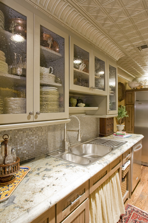
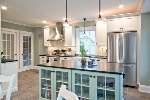
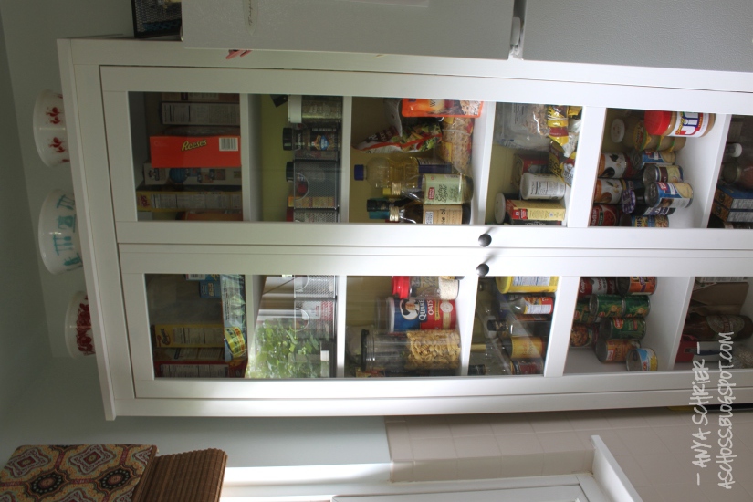
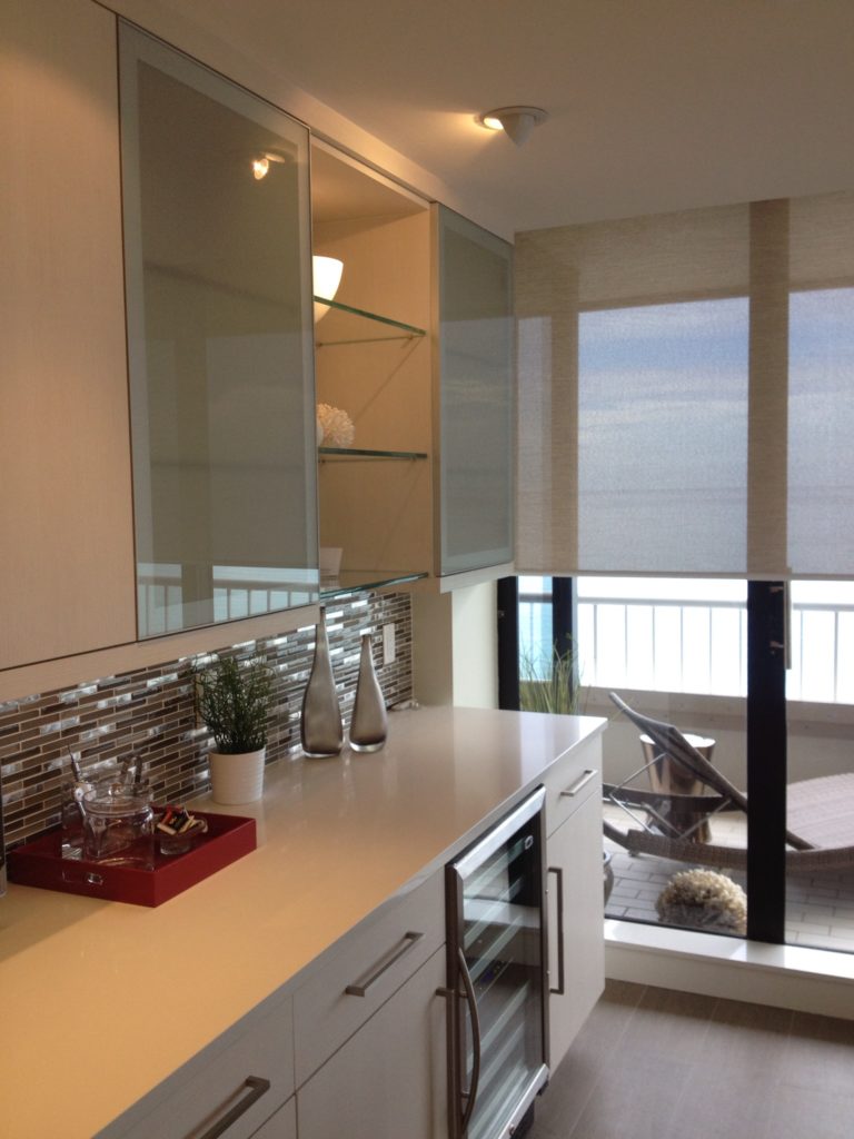 Of course I always welcome questions from inquiring minds but today we’ll cover the final fifth question of the top five I get from my clients. They want to know, “can I have glass doors on my cabinets if I’m not exactly tidy”? I say YES!! I love the look of glass doors on cabinets and there are so many different choices. I even think that glass doors on food cabinets can be interesting and very "Parisian bistro looking". I know most of you won’t go that far but for your dish storage they’re great. You can see what’s where and score a little visual interest at the same time.
  Still not comfortable? You don’t have to go clear. There are lots of patterned or frosted (acid etched) glass that “hide a little”. If you’re traditional you might like the look of seeded glass whereas acid etched is definitely more contemporary.
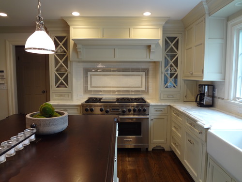
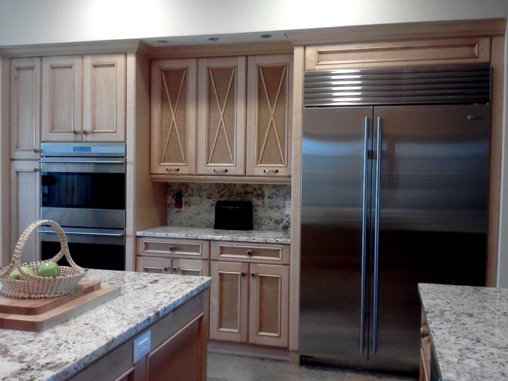
Mullions? What are these things? They are the little strips of wood that divide the glass opening. This treatment is usually more traditional. I usually prefer no mullions. If you’re going for glass, go all the way. Mullions can be visually busy and conflict with the shelves inside the cabinet if they don’t line up with the horizontal members.Mullions can get creative too. For example the X shape will give you a design detail reminiscent of a British Colonial Bermuda style.
 Adding a glass door to your cabinet can be a little more expensive because we typically have to finish the interior of the cabinet to match the outside and that is an upcharge for most cabinet manufacturers. One or two shouldn't break the bank however.Glass doors are best added to upper cabinets for safety reasons. You can add them to a lower cabinet but just remember to spend the extra money for tempered glass.Starting next month I will be answering more consumer questions over at The Sun Sentinel. Send me yours and you may get a reply in print!
A Kitchen With A Happy Ending!
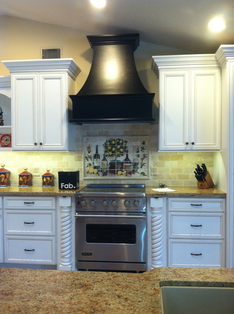 Today we wrapped up some final details in this new kitchen. The client was going for a Mediterranean vibe, elegant but at the same time warm and inviting. She loves to entertain so the kitchen had to be a focal point for her guests and it had to tell the story of her vision. All these bells and whistles can really run up the price of your cabinets but we were able strike a good deal with Kith Cabinets.
 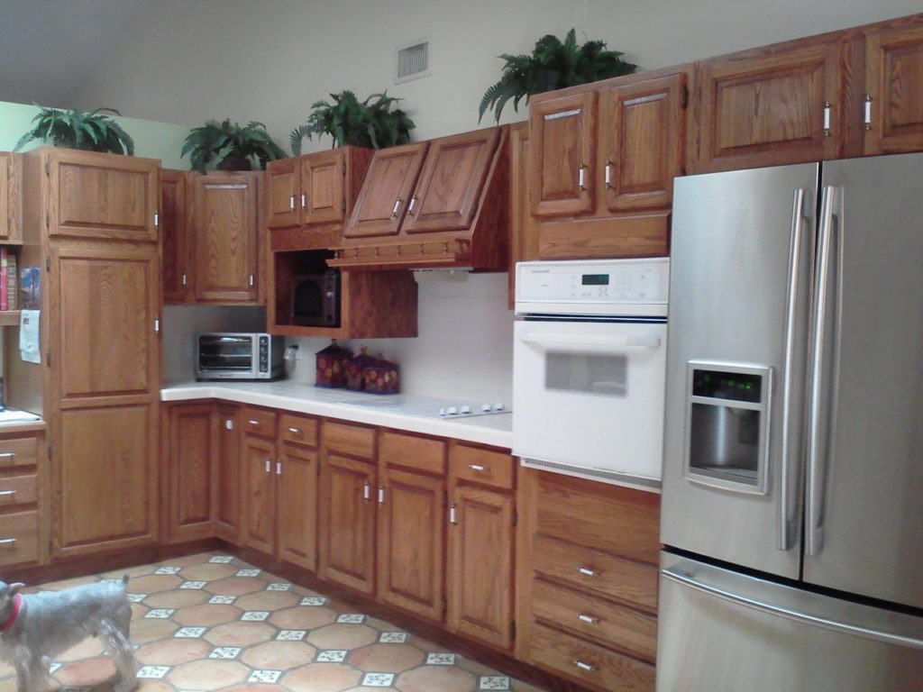 We knew we could improve the function, incorporating her appliance wish list in the style she was dreaming of. An added challenge was that we had to incorporate the existing floor because it had to stay. She selected white painted cabinets with a warm brown glaze which really worked well.
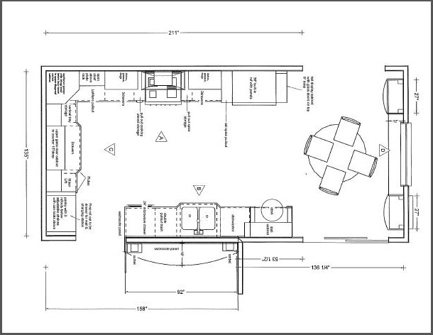 We were able to include a range by Viking, a Dacor microwave drawer, a beautiful Silgranit sink by Blanco, and some really nifty accessories including a mixer lift which she uses to store her juicer. We devoted one roll out in the pantry to be used as a charging station and a place to throw the mail so the lovely counter can remain clutter free. Notice that we also incorporated some gentle curvy shapes with the counter top and the wood hood.
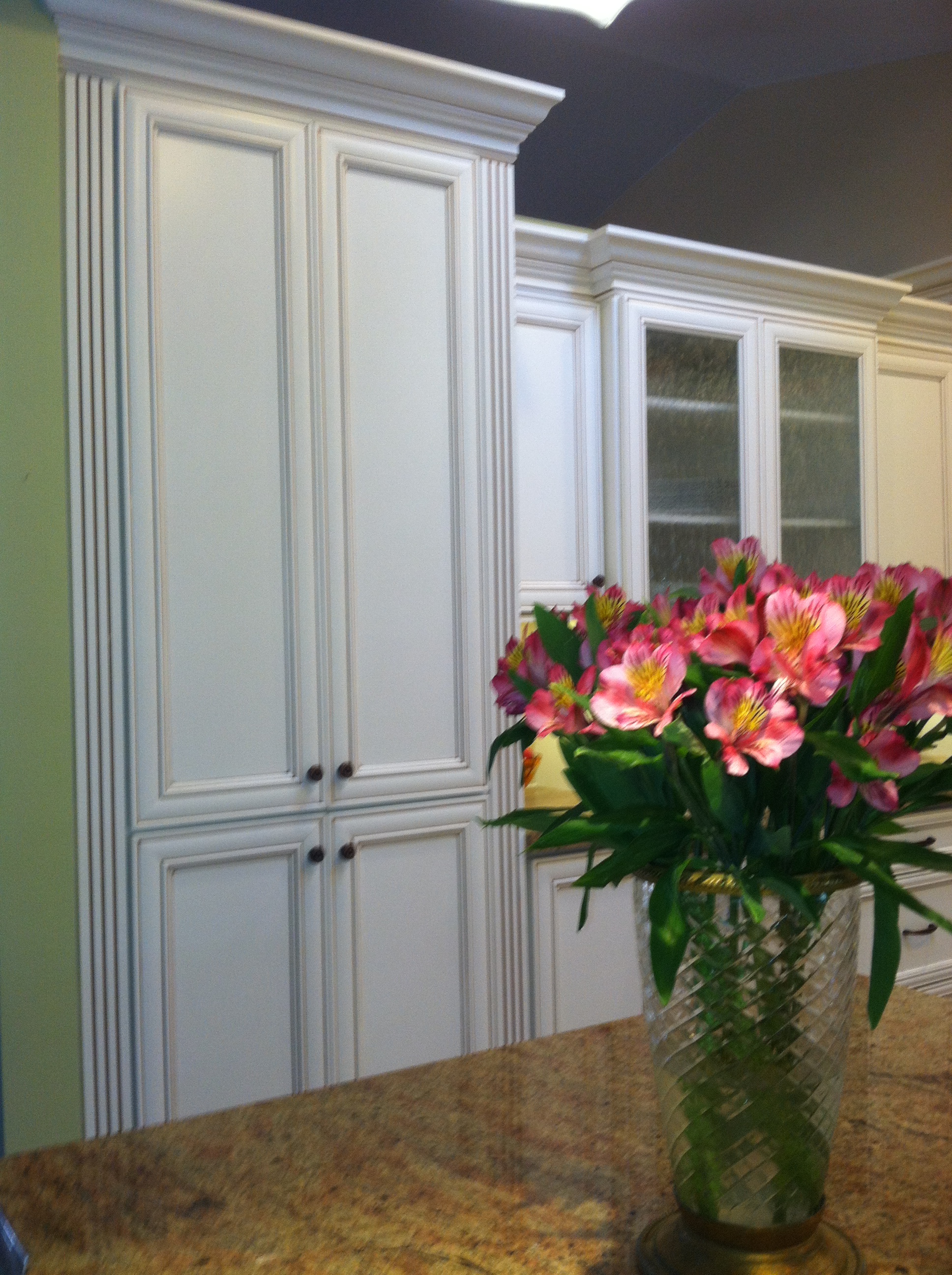
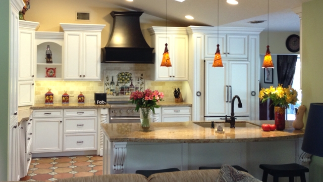 That FAB box on the counter is a nifty gift for our client, gourmet salts that magnetically attach to pull out next to range. They are something like this.
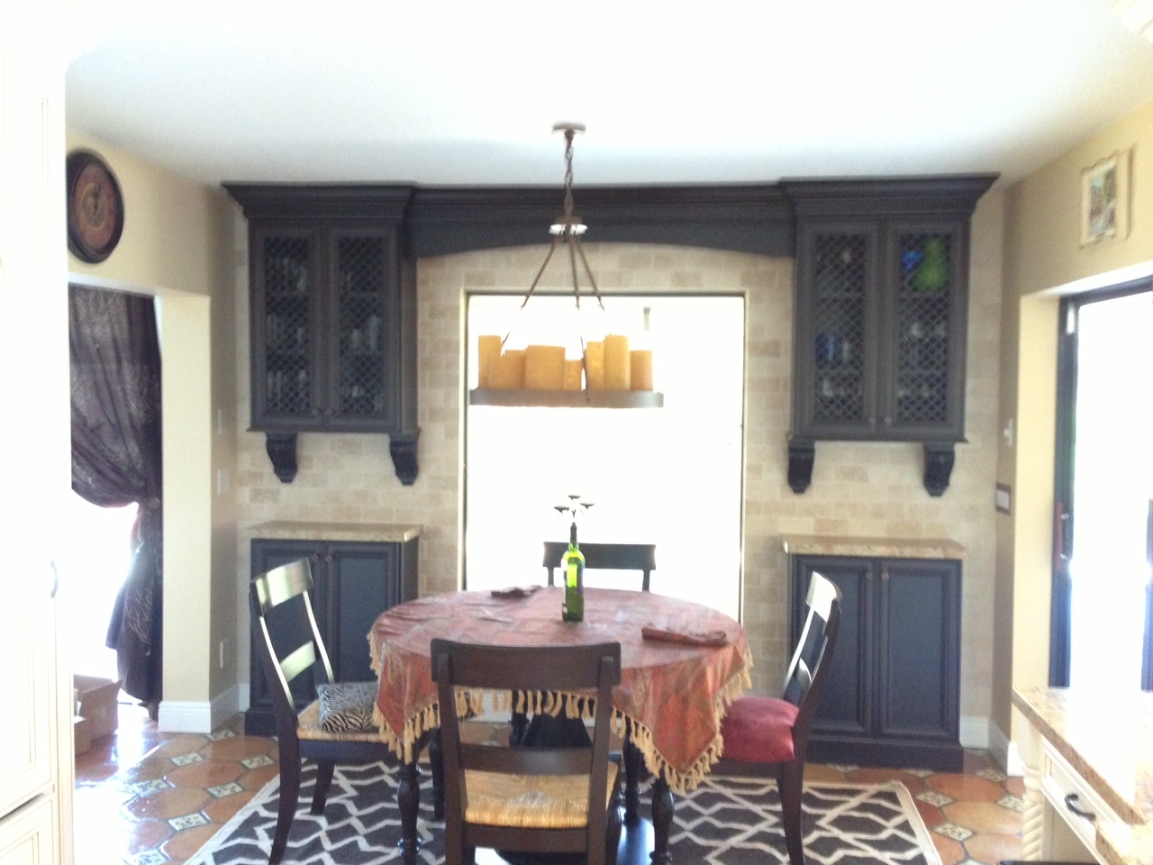 This client had a clear direction from day one which really helped keep the project on track. This very traditional design comes with a maximum of detail and I'm happy to say we have left a very happy couple to enjoy years of romantic dinners in their new kitchen.Design was a collaboration between the client and myself. Cabinets by Kith Kitchens, counter tops by Stone Palace, appliances by House of Appliances and installation by Brendan Donovan Furniture & Cabinet Co. See local resources for more info and contact details.
GREEN WILL COLOR 2013
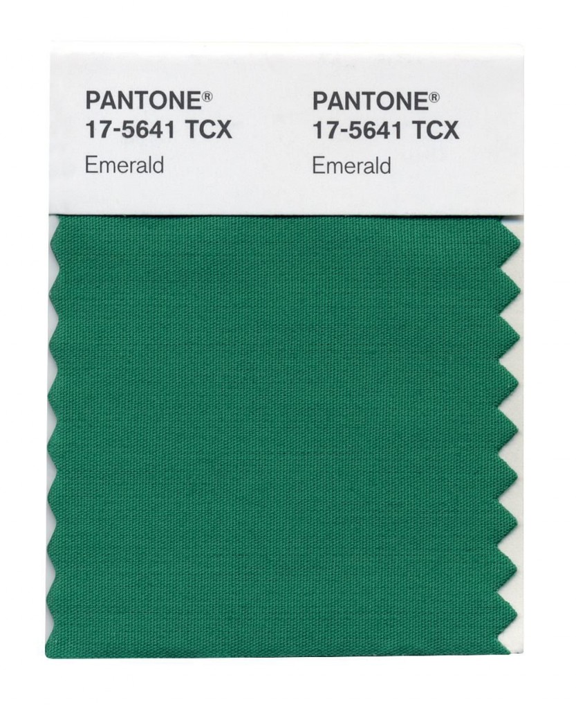
 It's official. The "color gods" have spoken. Who are these "color gods"? They would be an organization known as Pantone. Pantone, Inc. is the authority on color, provider of color systems and leading technology for accurate communication of color. The market leader in color has officially named Emerald THE color for the year 2013. When I think of emerald a number of things come to mind including: my birthstone, mermaids, deep sea, summer AND then I think about all the other greens and how we use them in our interior environments. One thing I love about green is that it brings outside in. As Pantone notes here it represents regeneration, healing and unity.
 Just for fun I thought I'd share with you some of my fave Houzz.com ideabook finds containing the color green.
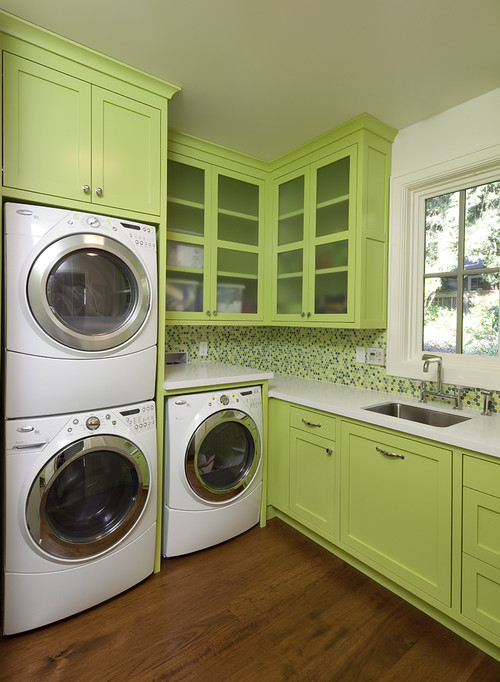
This is another kind of green that I love. It almost makes me want to wash clothes.
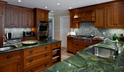
These green marble tops definitely bring the lovely outside in. Hints of brown tie in the warm wood cabinets.
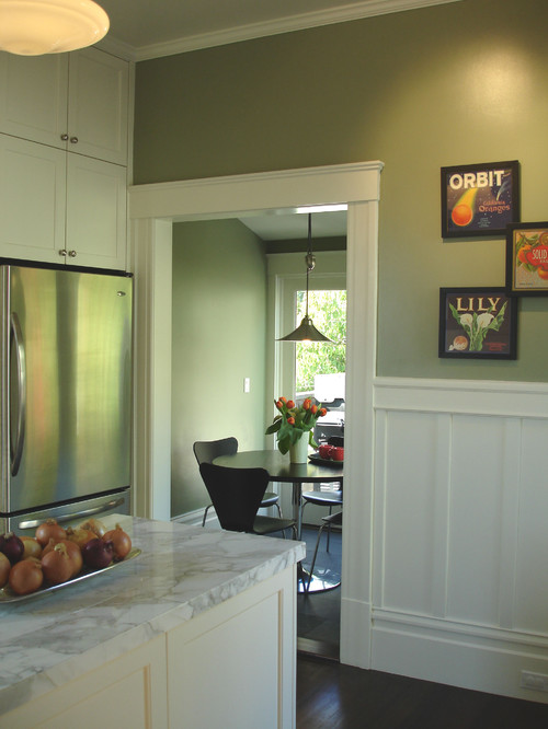
White cabinets are the rage and what better way to highlight them but with a clever shade of green on the walls?
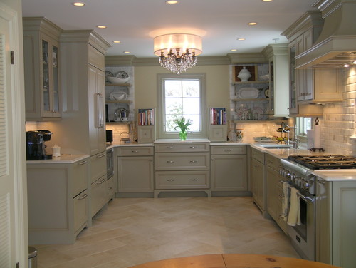
Here's the same color palette, warm wood and green marble. As you can see, it works equally well whether the theme is contemporary or traditional.
5 STEPS TO A MINDFUL KITCHEN REMODEL
 One of my favorite magazines, Cooking Light, contains a very interesting article that I love this month. It’s about something called “mindful eating”. I agree that we, as a culture, me included, eat way too much because we don’t do it mindfully. Simply put it just means that if you make yourself 100% present and focused at the task at hand (eating) during mealtime you will enjoy your food more and you won’t feel the need to eat as much. I happen to believe that you can easily carry this concept over to the kitchen design and remodel process. These days when we are trying to get the most out of every dollar we want to know that every aspect of the complicated process of remodeling a kitchen has been well thought out. Here are five ways you can do it.
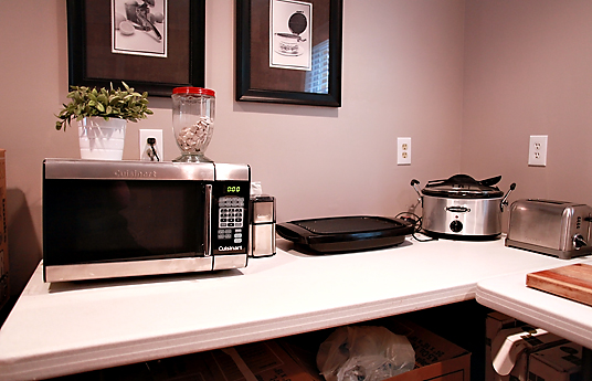 3) Prepare for the downtime- Always insist on a schedule for your project. This is NOT to say it won’t have to be tweaked from time to time but it’s always best to have a starting point. It helps keep all the players on the same page. A big part of this is to plan how you’re going to get by when you’re without a kitchen. Where are you going to put the refrigerator? Do you have convenient place to put your microwave? How close is your temporary set up to a sink? Keep most used cups and utensils easy to access.
  4) Pick your battles- Everyone has a budget and most of us can’t have it all. That said, there are usually a couple of areas in which a judicious splurge can make all the difference. One biggie is springing for a counter depth model refrigerator which is nearly flush with your counter top. This makes a big difference in a small space. Although they’re more expensive they’re still a lot less than the super high end true built-in models.
  5) Don’t rush to judgement- If you are living on site during your remodel, resist the impulse to go into a seizure over every nick or crooked drawer front. Again, it’s a process with a million details and steps. At this point you should be trusting (if you did step 2) your professionals to do what they do. Typically all doors and drawer fronts will be aligned before your installation is finished. It is also typical practice for you and your designer to get together on a punch out list so all concerns, including touch ups are addressed before completion.If you have a question about your kitchen design or remodel I’d love to hear from you!
RED PLUS BLUE EQUALS PURPLE IN THE KITCHEN!
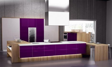
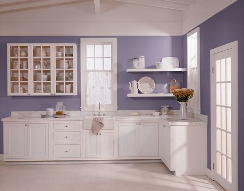
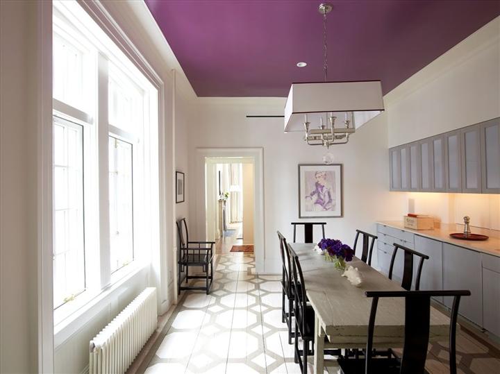
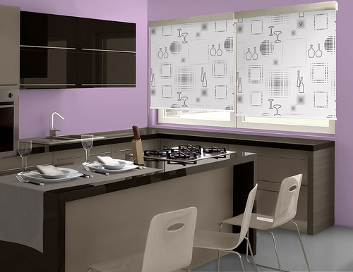
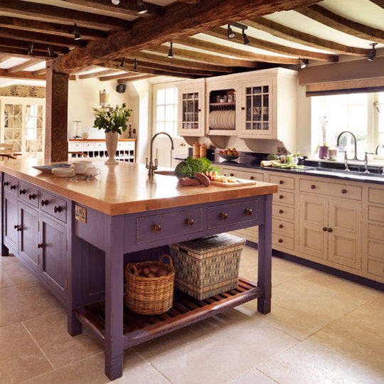
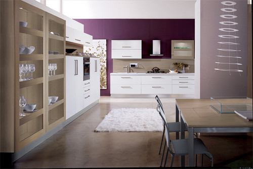
After a long election I’m sure you’re in the mood for something TOTALLY different. Me too. Congrats to the winners and may we mend our fences and make up with all the friends we temporarily (hopefully) blocked on Facebook. As someone who is passionate about art, I am always looking at color and the effect it has on our environment. As a nod to the red and the blue states today I’m showing what they can make together, purple! Is purple a viable color in the kitchen? If you love it, here are some ways you can incorporate a little lavender, lilac, plum, fuscia or just plain ole purple whether you are conservative, transitional or uber modern. If you hate it, at least it’s something completely different!