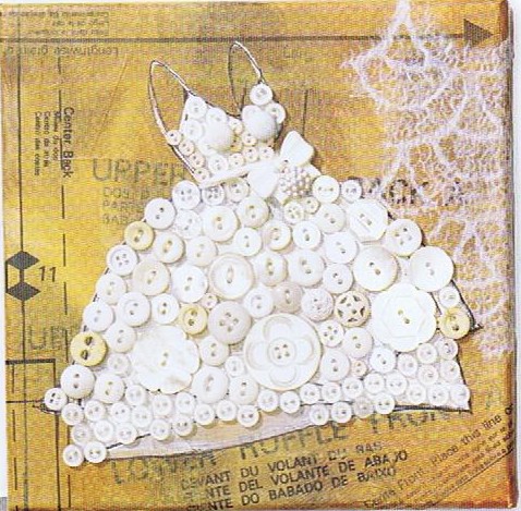
 Today's Let's Blog Off topic queries the source of our ideas. Where does creativity reside? Is it within or is it outside and all around awaiting discovery? For me the answer is both. Yes, it's all around us, for sure, but it also requires the eye of the beholder to breathe life into it. Here is a recent example in my life of something I saw which inspired a blog post.You may have the panache to pull off a monochrome white room that invites and stimulates the senses but for most of us going all the way with white runs the risk of BORING. Since white is so "white hot" at the moment, especially in the kitchen, I’m going to share with you the secret of how to make white pop.One thing to remember is white is a team player, it’s all about the colors around it. As you know, I love art (a big source of inspiration). I recently came across this image in Cloth Paper Scissors Magazine which is a perfect example of how white can glow when surrounded by the right color. I see it work time and again. White cabinets plus color equals stunning. If your taste runs more to the conservative think camels, taupes or warm beige walls to create the contrast.
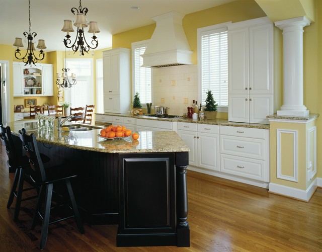 If you’re more daring go for Apple Martini Green or Sky Blue. The nice thing is if you want to go for the gusto paint is a safe bet. It’s one thing you can change fairly easily and reasonably.
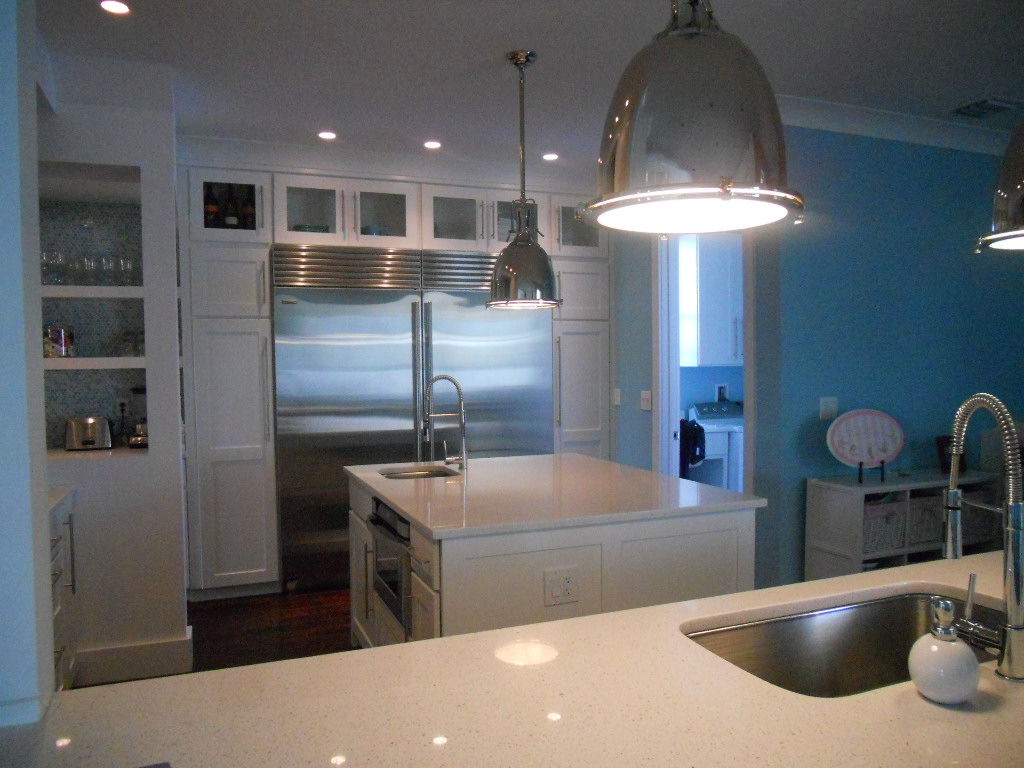 Another thing to remember about white is that it’s just not white. There are probably hundreds of whites and they all read differently depending on your lighting and location. The lesson here is to test your whites on site. Consider the color for a full 24 hours so you can see how it looks as lighting changes throughout the day.
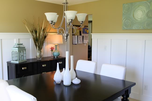
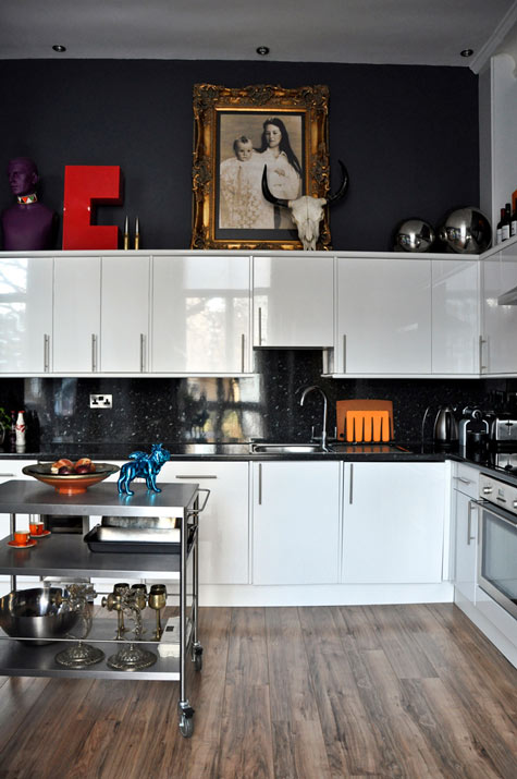 Many times wherever you find white you will also find black. You can tastefully mix black and white cabinets or if you have guts and great lighting the walls could be black, as in this example. This photo also serves as a great inspiration for many of the newer homes we have in my area with cathedral ceilings but short stumpy cabinets (thank you Mr. Builder). If you can't afford to change the cabinets take advantage of the great space above for art. Here, it carries the eye upwards taking attention away from shorty cabinets.
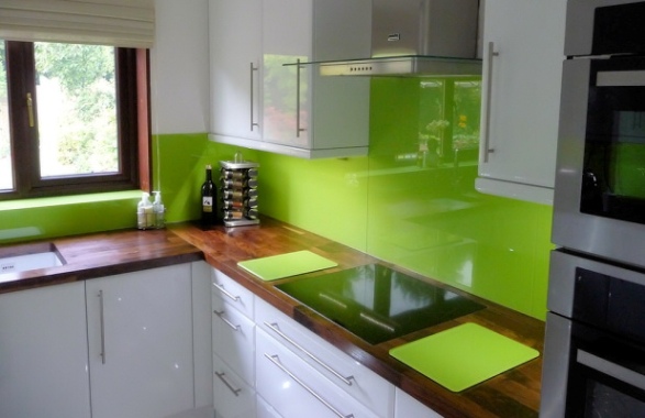 This stunning Apple Green back splash looks like glass but it's actually a colored plastic by Opticolor! So there you have it, inspiration of the day all inspired by a whimsical little piece of art!
Happy (Kitchen Design) Endings
It's been one of those weeks. I'm happy to be busy but struggling to keep up! I have been working on a big traditional kitchen design for a client trying to recreate her favorite kitchen back in Toronto. Since lots of walls are being removed to create a large open space we ended up with a situation which will locate the end of the refrigerator in the hallway! One of the most unsightly kitchen endings would be the side of a refrigerator. Who wants to look at that?
With the enduring popularity of the open kitchen plan we are faced with including a seamless transition between the "kitchen proper" and the adjacent living area. Even if you opt to spend a little extra for a decorative finish to the sides or backs of cabinets that are fully exposed there are some other creative solutions. This got me thinking about how to end it all, in a happy way, of course. I decided to employ a technique I have used previously.
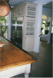 |
| We accomplished this fine ending with less than 12" of space. I will use this solution in my new design |
If you're short on space, you can implement this solution with only 6" of extra space. Make the top doors glass for a place to display a collection or if you can squeeze out 12" in depth, use solid doors and you have a handy pantry. Don't forget you'll have to finish side of the end cabinet so it looks great from the front too.
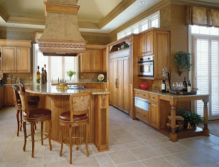 |
| Photo courtesy of Holiday Kitchens |
This traditional example by Holiday Kitchens, becomes warm and inviting with the addition of an attractive end unit which, not only creates a beautiful spot to display that special something, but it's also a great way to transition from kitchen to living area.
 |
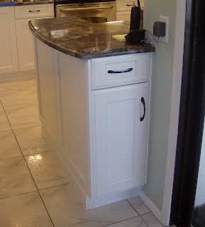
| Mini peninsula placed at the end adds counter, storage and visual appeal |
 |
|
| Easy access to BBQ tools from porch |
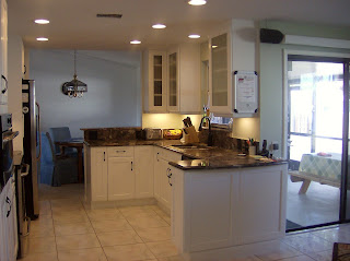
Here's a handy solution for a client with a smallish kitchen who was looking for a little extra counter space as well as a handy place to store his barbeque paraphanalia. The back of the cabinet opens right at the opening to a sliding glass door leading to his barbeque on the porch. It also visually defines the end of the kitchen.
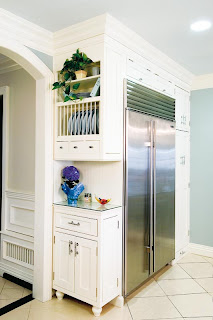 |
| This solution by Holiday Kitchens uses 12" deep cabinets and offers a little extra counter space |
