Tile Tuesday: In Valencia Art is a Way of Life
Welcome to today's installment of Tile Tuesday! The second half of my adventure with Tile of Spain took us to Valencia, location of Cevisama the annual trade show held to showcase the latest innovations introduced by the Spanish tile industry. We traveled by train east from Sevilla to Valencia, which is situated on the coast about 300 miles south of Barcelona. At first glance Valencia appears to be very modern with a predominance of what I call “the new Spanish architecture” featuring waves, curves and a visually interesting asymmetry.
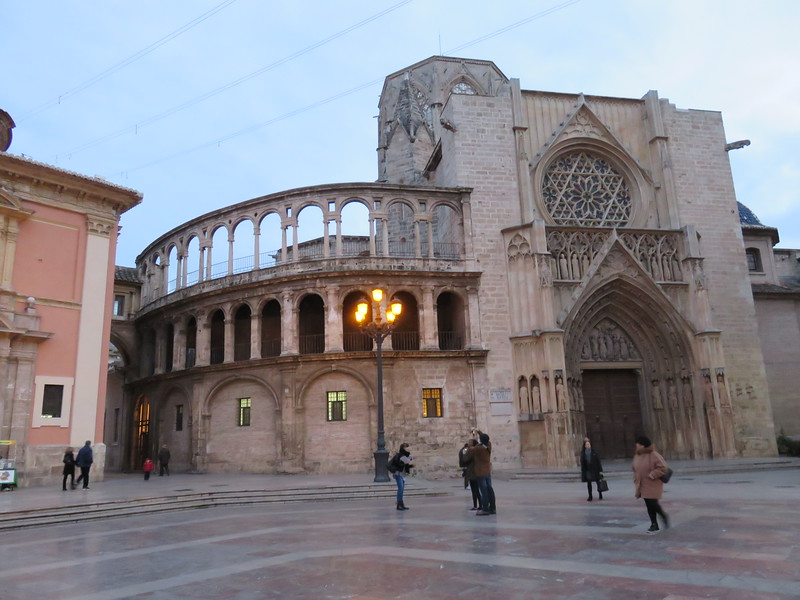 But there is an older Valencia to explore as well. The heart of the city features structures such as The “Iglesia de San Juan del Hospital” which dates back to the 1200s! The current city grew from this center. What a crazy combination of styles! You can see Roman, Gothic, Renaissance and more because different sections were constantly added to the original structure.
 Again we had a passionate knowledgeable tour guide who did not allow us to leave one inch of Valencia uncovered!
 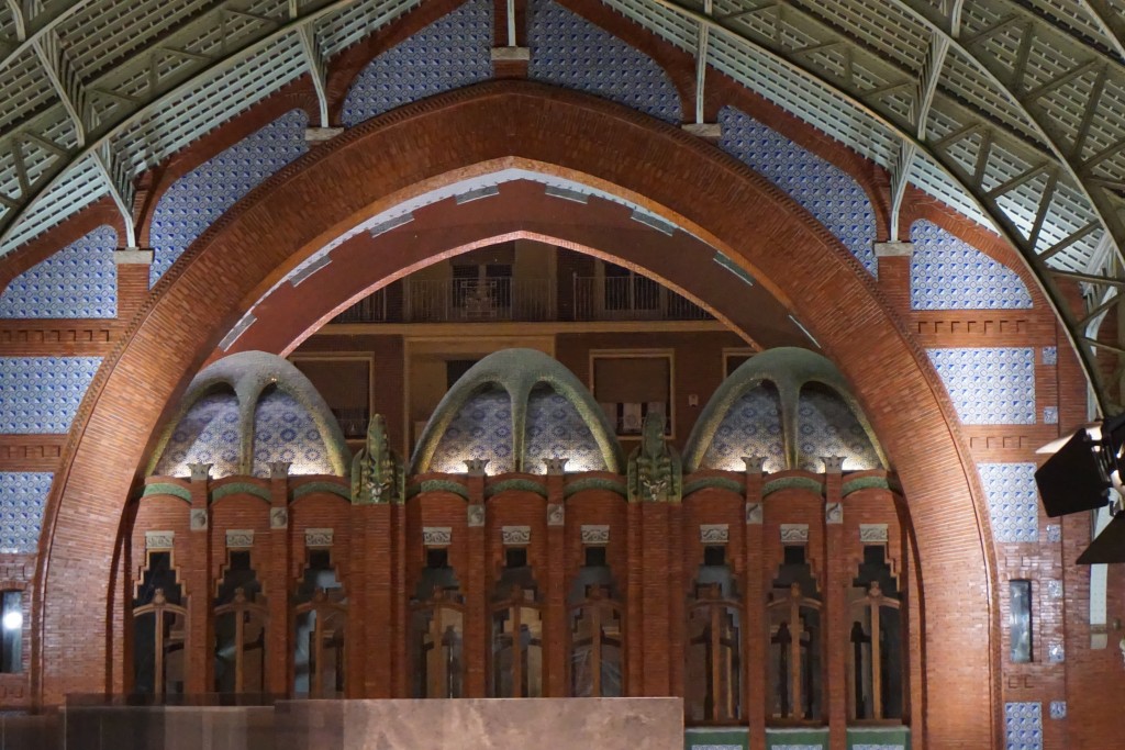 One of my favorite spots was the Mercado de Colón, a beautiful example of the Art Nouveau style. Glass and tile adorn this early twentieth century marketplace, now a gathering place full of interesting bars and restaurants.
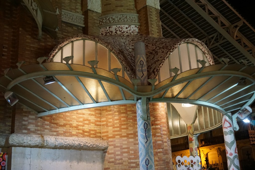 Hallmarks of the Art Nouveau style include free flowing organic shapes, rich earth tones and lots of tile! At the turn of the nineteenth century there was no aspect of living that was not touched by the movement. It was a global trend as well. In Germany it was known as Jugendstil, in Spain Arté Joven and Secession in Austria. The American version evolved into the what we know as the Arts and Crafts Movement, a simplified, more linear version. According to Art Nouveau philosophy, art should be a way of life. No wonder I'm always intrigued by it!
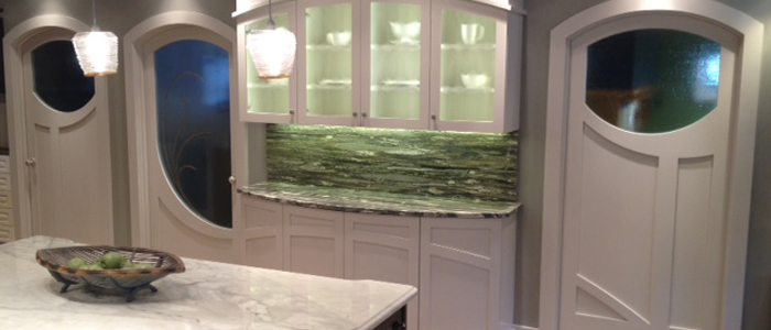 If you're looking to "Nouveau" your kitchen here are somethings you can include:-Rich brown wood stains-Green, green and green
-Some curvy shapes (more affordable to do this with your counter top than with cabinets)-Oak wood floors or cabinets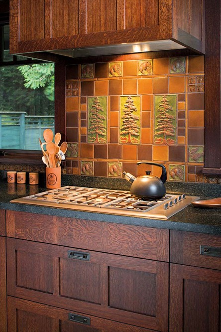 -Certain flora and fauna like the dragonfly, the ginko leaf and the thistle are all images often seen in Art Nouveau styling-Ceramic tile backsplashes (preferably with the above motifs)Next Tile Tuesday: More Cevisama and the future of tile.
Getting Creative at Cavastone
Time to switch from "turkey talk" to tile! Hope you had a great holiday. If you haven't found the new Kitchens for Living page on Facebook, please check it out and give me some love (ok I'll settle for a like). Today I'd like to highlight a local resource that you should definitely know about if you live in South Florida.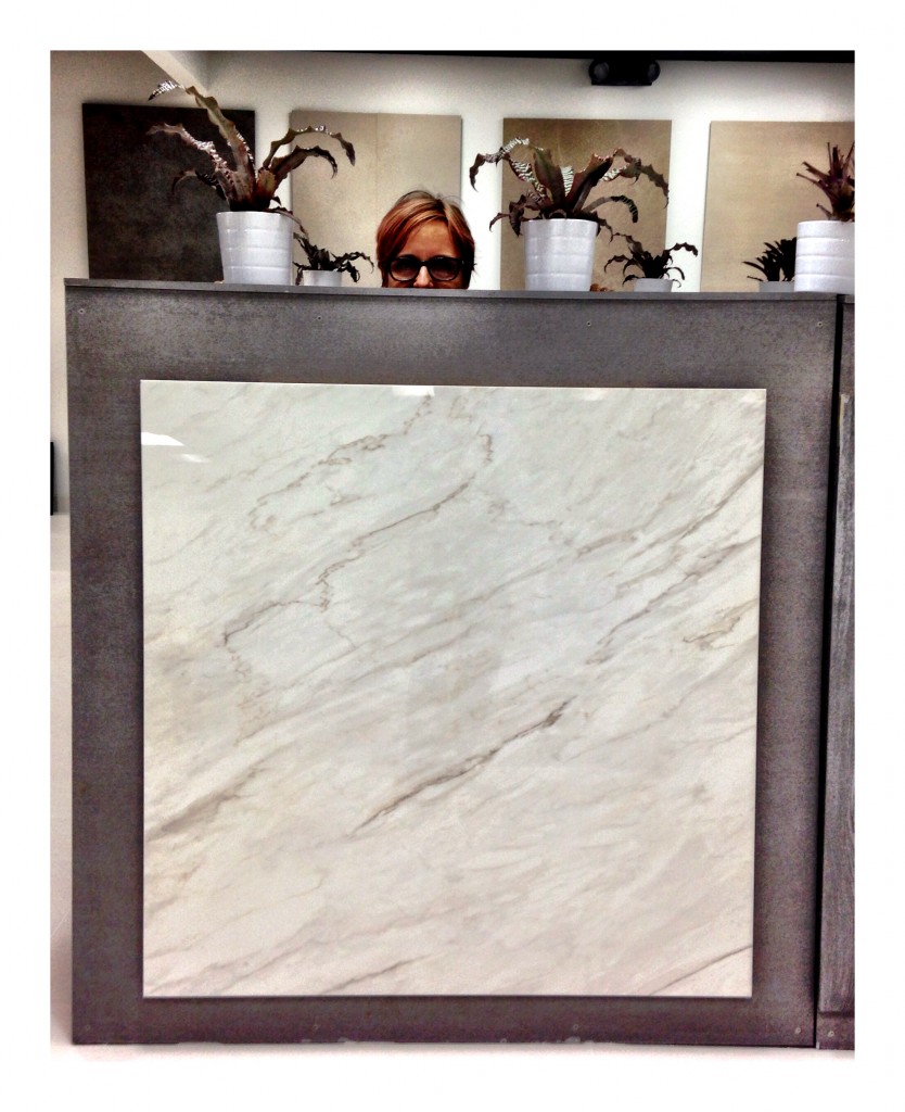 Cavastone is located in Boca Raton. I've worked with them before but I was recently in the neighborhood so I decided to make a pit stop and check out the latest in the world of tile. The showroom is stunning, sophisticated, and well lit which allows you to view the products to their full advantage. I was most impressed with the options they have for porcelain tile but there is also a large assortment of granite and marble slabs.
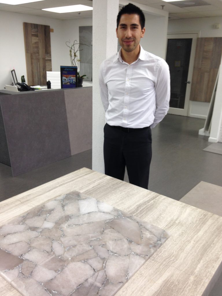 The tile above is gorgeous! It's a natural semi-precious stone accented with silver! Makes me think of a decadent boudoir or dressing area.
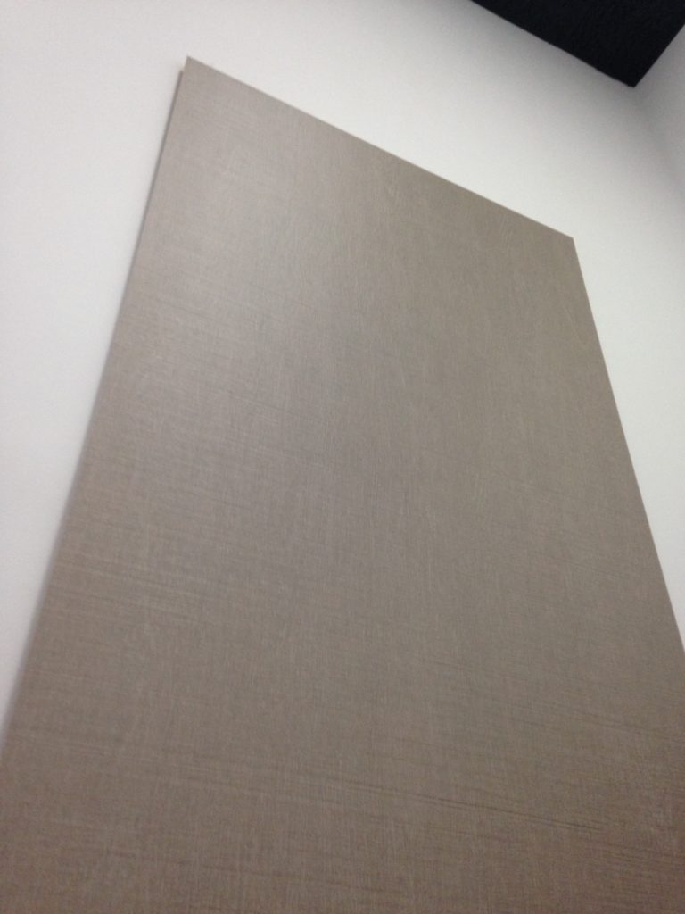
 Digital printing technology allows for an infinite number of options when it comes to porcelain tile. They've got the natural look down! The nice thing is if you ever need more it can be made for you. Those large sizes (see top) also come in 25" by 25" in case your abode is not quite that large.
  This dimensional look is also a big trend, used for walls in both interior and exterior applications. You can find all Cavastone info right here on the Kitchens for Living Local Resources page. If you've got a great local resource clue me in. I'd love to hear about it!
Spain Takes the Stage at Cersaie 2014
Tile of Spain, a collective of 90 Spanish ceramic wall and floor tile manufacturers, recently showcased new collections and innovations at the Cersaie 2014 show. Held last month in Bologne, Italy, Cersaie is THE yearly international exhibition of ceramic tile.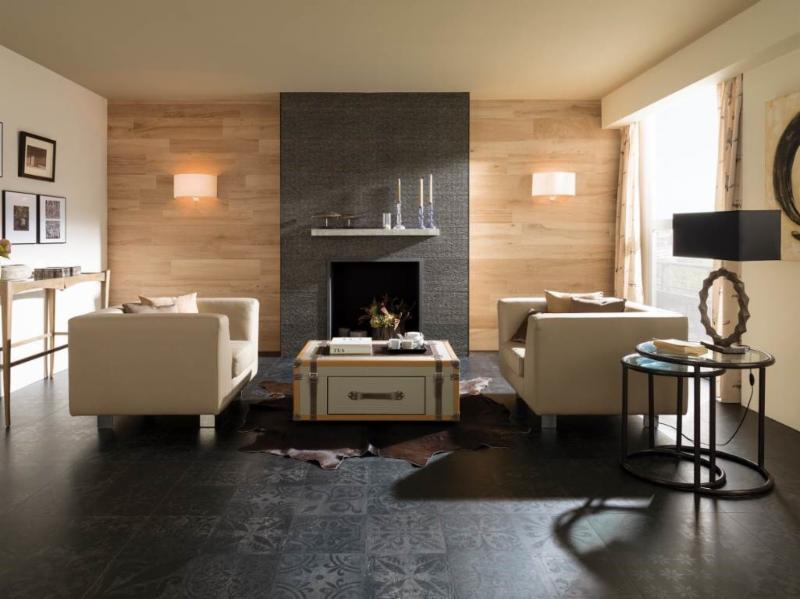 I love to note the trends at this show as they are a barometer of what we’ll be seeing here in the near future. It’s not only the tile itself but how it’s being used that intrigues me and can offer us a wealth of design ideas.Tile has been used in building as far back as 3000BC in ancient Greece. First used to replace thatch roofs, they were desired for their fire resistance. Today tile finishes are vast, varied and constantly reinvented through the advent of new technologies affecting both performance and aesthetics.This year Spanish manufacturers, reflecting the latest design trends, showed vintage styles, hexagon shapes, three dimensional profiles and more.Here are some of my favorites from Tiles of Spain showcased at Cersaie 2014Porcelanosa (above) makes a complete contemporary statement with this combination of tiles. I especially like the subtle injection of Old World suggested by the matte black floor tile.
 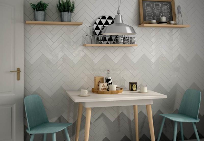 Other than the fact that chevrons are always cool, I love the gradient shades of grey shown here by Equipe Ceramicas, so original! The grey and white are also neutral and easy to design around.
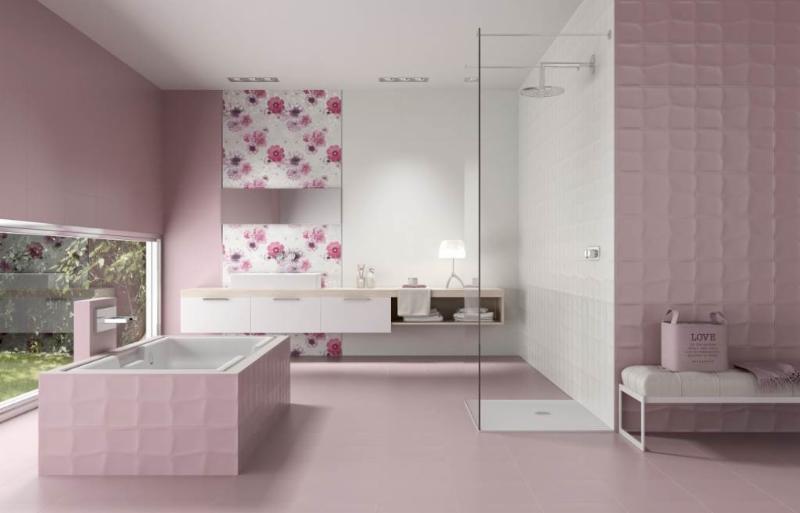 Think pink! A lot of chick-pad-pink from Unicer (above). It's all tile, the white, the print the textured and the matte. Would you?
 If you're going to use tile in the kitchen, go big! It really makes a statement.For more ideas check out the Tile of Spain USA Inspiration Gallery.
The Rest of the "Hot Pepper" Kitchen Story
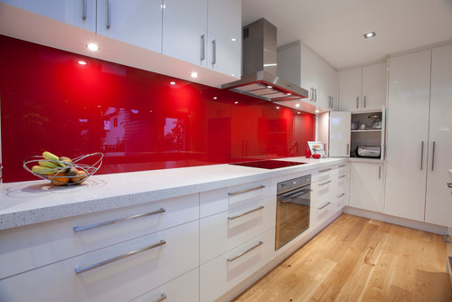
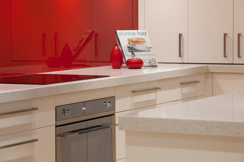
Happy new year peeps! Back at the drawing board this week after a nice holiday break. I got a lot of annoying little things done AND spend a little time in the studio but that's another story. Last post I told you about my dream kitchen. I don't know about you but I'm still dreaming and that was just enough to pique my interest. The lovely Shannon Pepper of Shannon Pepper Design in New Zealand, YES, New Zealand (who knew they were rocking such awesome design down under?) shared some of her musings with me:
KFL: What parameters were you given before designing this kitchen?Shannon: The kitchen needed to be very functional for a busy family of 5. The kitchen is very much centralised in the home so it also needed to be very " good looking " for better words. There needed to be space to tuck things away like appliances etc to keep the space tidy.KFL: What was the biggest challenge of the project?Shannon: Hmmm, I'm not sure there were any real challenges in this project as the client was very easy to deal with and realistic. The space was very proportional and easy to plan. I say that but originally, in the plans from the architect, there was a window on the hob (stove) wall which we were trying to work around. After much thought the client decided that since the space would only look out onto a hedge and wouldn't offer much light we opted to remove the window and add under cabinet lights to keep the space light.
KFL: Is there anything you'd have done differently if you could?Shannon: Not really, I love this kitchen and loved working with this client.KFL: Can you describe they type of client you were designing for? Shannon: The clients were both doctors and they have 3 children under 12. The family is busy with extra activities after school for the children and wanted a space that was functional and easy to maintain.KFL: What brand of cabinets did you use?Shannon: The cabinetry used is a Dezignatek vinyl wrapped (known here as thermofoil) product. The colour is white gloss and the profile of the doors and drawers is Milan. This product is great for giving you a painted finish look but without the chipping and scratching possibilities of paint.Not only is this a dream kitchen but it sounds like it was an all-around dream job too. Check out Shannon's website for more pics of her beautiful projects.
Tip #3: Where can I save money and what items are worth the splurge?
Many of our clients begin kitchen remodeling projects in the summer. Kids are out of school and our commitments tend to be less (for some of us) in the summer months. Today's client query is one that I hear a lot. Naturally we all want to get the most for our money in all our investments but where can you save money in a kitchen remodel and what items are worth the splurge?The answer to that is largely subjective as we all have differing needs and priorities. That said, there are some principles that should never be compromised and those include efficient use of space, safety and the best quality you can afford.
SplurgeI must confess, there are some standards in the kitchen industry that are just plain wrong. One of them is the standard depth refrigerator. A standard base cabinet depth is 24" (25" including doors). A standard refrigerator is about 33" deep! It might look perfect standing solo at the appliance store but it could look like a beast in your kitchen! Yes, they stick out. Depending on the layout of the kitchen we can sometimes work around the depth by surrounding the fridge with extra deep side panels and a cabinet above pulled forward. But if you're tight on space it is worth investing in what's known as a counter, or cabinet depth refrigerator. This means that the cabinet box will be flush with your counter top and your "stick out" will just be the thickness of the door. It makes a big difference. Here GE shows the difference between standard, or free-standing and counter depth. A standard GE french door refrigerator would be about 26 cubic feet and retails at about $2,100 vs. a comparable counter depth model which is around 21 cubic feet and retails at $2,700.00. Yes, you will have less cubic footage with a counter depth fridge and I suggest keeping the old fridge in the garage if that's an option. If the kitchen is large enough you can add a beverage cooler. When water, soda, beer and wine are taken out of the main fridge you get all kinds of space. There is also a third category if you've got the big bucks and that is true built-in or integrated. Those are even shallower but they are also more than a foot taller to compensate. Whether you opt for Sub Zero or GE. a built-in refrigerator is pricey but the most visually seamless, particularly if you add matching cabinet panels.
SaveYou can save money on your cabinets if you can keep to standard, or stock, sizes. Simpler cleaner lines with minimal molding can also save you enough money to splurge on that refrigerator! There are just two things to keep in mind. Make sure the quality of the cabinetry you buy is sound and backed by a warranty.SplurgeMany professional kitchen designers will be happy to consult with you on the layout and selections for your kitchen. An hourly fee is well worth it to have your plan validated by a pro. In many cases, if you purchase your cabinetry through your kitchen designer, design services are included.
SaveI love unique artsy cabinet handles as much as the next person but did you know that you can spend anywhere from $1.99 to upwards of $50 a piece for them? Aim towards the $5-$10 for really good quality knobs or pull. If you happen to fall in love with one of the $50 buggers maybe you can use just a couple for a special area.
Next up, Tip#4: Granite or Quartz?

