DESIGN AND THE MODERN KITCHEN


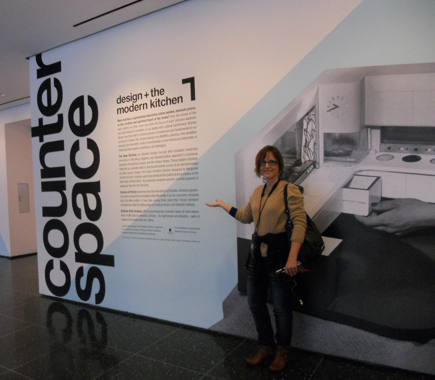
Granted I'm biased, but I have to say that Counter Space:   Design and the Modern Kitchen is the most engaging exhibit I have had the pleasure of attending.  It opened at the Museum of Modern Art September 15th and closes on March 11th.  The thing about this show is that we can all identify and connect with the topic of kitchens.  They are an integral part of how we live but we seldom give thought to exactly how they came about.  You can find just about all there is to know right here.


The only critique I have is that I wish they would have included commentary post midcentury.  The concepts of the kitchen are so dynamic and there is a lot to be said with regard to the last half of the 20th century.   Nevertheless, especially for a kitchen professional or enthusiast this is an absorbing and engaging experience.  The exhibit is divided into three main segments.


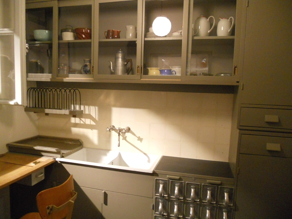
"Toward the Modern Kitchen" examines the early research in efficiency and time management that culminated in the design of the Frankfurt kitchen in 1928 by Margrete Schutte Lihosky.   A post World War I housing crisis provided the impetus for such reasearch resulting in what is thought to be the first "modern" kitchen.  You can read more about this history on a previous post here.     It was believed that by transforming daily life at the level of he kitchen behavioral change and social well being would result.  Good old German efficiency and practicality were at the heart of these inventions and it was two women in particular who made the biggest contributions, researcher Christine Frederick, as well as architect Margrete Schutte Lihosky.


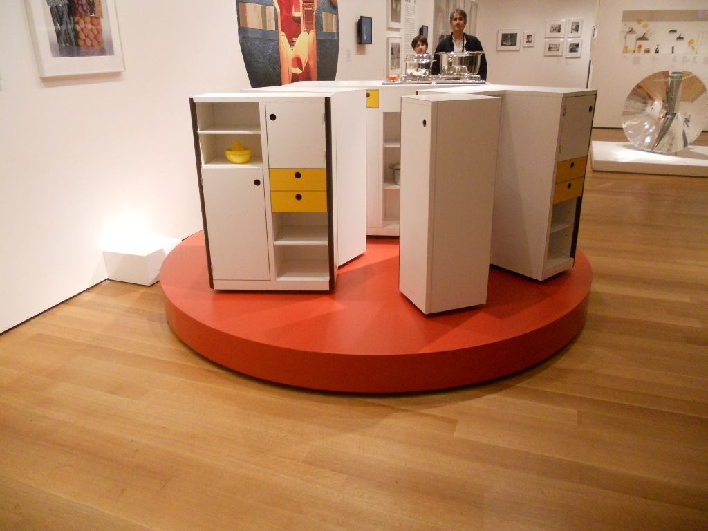
The second part of the show is "Visions of Plenty"  and deals with the post-war kitchens in America.  It was then that the ergonomic considerations begun by Ms. Lihosky were further refined and a standard counter height of 36" was established.  This was based on the average height of a woman at the time.  Kitchens also began to evolve into living areas at this time and were very influenced by food restrictions brought about by the second world war.In addition myriad everyday objects are on display throughout the show.  We never think about where the things we use everyday come from but they have a history and were shaped by our culture and time.The final part of the exhibit is entitled "Kitchen Sink Dramas" which deals with kitchens as they are portrayed in the media as a rich subject for artistic expression.If you would like to know more about this exhibit and rich history you can purchase a hard cover edition catalogue of Counter Space produced in conjunction with the exhibit and available by clicking here One final note that I have not seen mentioned is that this show was  sponsored by Silestone Quartz Surfaces.  I'm headed back home to the drawing board today with visions of tupperware and proto-type kitchens dancing in my head!

Dream Kitchens Made In Italy

Daniele Busca lives for Scavolini.  After spending an hour chatting with him and touring the showroom and US headquarters in Soho I can understand why.  Daniele is the Manager and Creative Director who makes it all work on this side of the pond.  The new location which has been open since last October is enjoying a brisk business and I think it's largely due to Daniele's knack for tweaking this Italian product for an American market.  "American kitchens are generally bigger", he says, "and where you would have an island in America we might have a kitchen table instead in Italy."  Another major difference is the appliances.  American refrigerators are almost always bigger."  White still reigns.I thought it was interesting to hear that home owners are requesting glossy finishes and architects prefer the matte look.  A artful mixing of textures, both tactile and visual,  is also important.  I asked Daniele to define a trend.  He says, "in the end a trend is what sells." The showroom spans two floors.  Displays were designed in Italy and re-designed by Daniele for an exact fit both in size and taste for the US market.  "Americans also tend to prefer symmetry in kitchen design," he added.  Scavolini is a family business based in Pesaro, Italy and has been the largest cabinet manufacturer in Italy since 1984 with 40 dealers  in the US.  This year marks the company's 50th anniversary.  Clientele for the New York location is largely an international group who keep an apartment in New York City as well as elsewhere.  This year Scavolini will roll out seven new models.  Four new displays are already in the works for this new showroom.  The Tetrix line, as seen at IDS,  designed by internationally-famous British designer Michael Young, is also being featured.  Tetrix is not yet on display here but Daniele's sending me some pix to share with you.  Designers may be interested to know that Scavolini has developed their own design and pricing program.  Scavolini is very involved in the Green movement.  I was surprised to hear that the manufacturing facility in Italy is 85% powered by solar panels and they are planning to make it 100% by the end of the year.  All cabinet boxes and door panels are made from 100% recycled fire retardant and water resistant wood.  All lacquers used are water-based.  Scavolini is involved in the local community offering the showroom for fund raising events  organized by trade associations and design schools.  Generally speaking, a Scavolini kitchen can be yours for from about 10K to upwards of 90K.   Thank you to Daniele for hosting my visit.  I really enjoyed chatting with him.  I asked a million questions and he was up to the task, warm and most gracious.  If you're ever in Soho stop in and see for yourself.  Tomorrow I will be back with more from New York.

SPACES FOR SPICES

In my last post we began to look at the challenge of creating an organized kitchen to cut down on stress and save time.  Now that we have the pot ;)/pots organized let's look at some creative ways to store your spices.  I love to experiment with cooking Indian food (lots of spices) and there is nothing more frustrating than digging in the back of a cabinet for the garam masala!

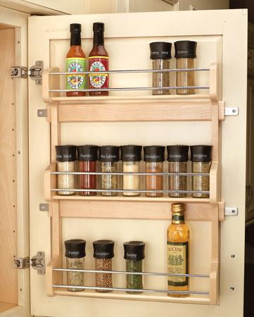
SPICES should be stored away from heat and moisture, so right over your cooking surface may not be the best option.  A spice rack behind the door of an a cabinet close to your food prep area or stove is a good choice.

I like the ones with adjustable shelves.  If you are adding one to an existing kitchen make sure that the shelves inside the cabinet are not going to get in the way when you shut the door.  Hopefully, if your shelves are adjustable, you can work your way around that.  Incidentally I also love to use these types of spice racks for storing over-the-counter and prescription medicines in the kitchen or bathroom.

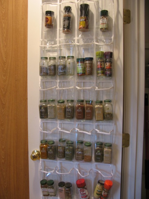
Another way to utilize the back of a cabinet or pantry door for spice storage is to use a simple shoe rack!

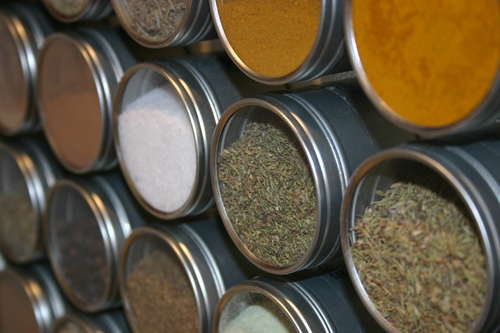
My absolute FAVORITE way to store spices is the magnetic spice rack preferably on the back of a door as well.  Containers are not very deep so they shouldn't interfere with cabinet shelves.  You can see everything clearly and you can even make one yourself!  Click here to find out how to make one. Is this cool or what?!

Next up, sorting out the tupperware nightmare,  making your utensils behave and your chance to win a "kitchen enhancing" accessory!

STEP ONE, ORGANIZE YOUR KITCHEN

Happy new year!  Thank you for showing up here at Kitchens for Living where my new year's resolution is to continue to bring you the latest in products, trends and  kitchen related (mostly) tidbits as they cross  my path as a professional kitchen designer.  Whether you are planning a new kitchen, thinking about planning a new kitchen (someday) or just want to make the one you have better you're in the right place.  I am here to help as little or as much as you want!

Do you feel like these babies? Quite often we come to the conclusion that we need help when we realize how powerless and out of control our lives have become.  Well, guess what?  This happens in the kitchen too.  Do you want to have more time, less stress?  Organizing what you have in your kitchen is definitely a step in the right direction.  Here's how you can start.

DOWNSIZE

One of the number one trends for 2011 is downsizing in all aspects.  This includes not only your waistline but your schedule, your closet and yes, your kitchen.  Gone are the "McMansion" days.  Today we are learning about living smaller with quality instead of quantity.  The smaller the space the more each element counts and the more organization matters.  The Intuitive Kitchen philosophy agrees with 19th century creative William Morris who said, "Have nothing in your house that you do not know to be useful, or believe to be beautiful."


One of my favorite books about downsizing, prioritizing and organizing your life is Susan Susanka's The Not so Big Life.  She uses the metaphor of a house and its architecture and interior to show us a different way of looking at how we live.  She's actually written a whole series on this theme but this is the one I know.

SITUATE WHAT YOU HAVE

Now that you're down to the nitty gritty, the point is to store it so we can see it.  This is necessary for the items we use on a daily basis.  There is also what I call remote storage, or the hard to reach or up high areas which are ideal for storing seasonal items.  The biggest organizational day to day kitchen challenges are pots and pans, especially the lids, (according to my clients), spices, tupperware and cutlery.  Today we'll start with  solutions for pots and pans.

POTS & PANS


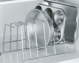
Seriously, you can easily get into a fight with your kitchen cabinets over pots.  I like to store mine in a deep drawer.  I keep the flat pans under the range but I love tray dividers or vertical partitions for storing cookie sheets, pizza pans, cutting boards and serving platters.  This type of cabinet can be located over a wall oven or better yet it's the best solution for a small base cabinet.


If you thought the space over your windows was wasted, think again.  An over-the window-hanging-pot-rack can be convenient adding visual interest at the same time.

Now a word about those lids.  They do make door racks to hold them but my favorite solution is this nifty chrome rack that fits in an upper cabinet or in a deep drawer.  It's great for the lids or other items and you can get one at  organize-it.com for $9.99

So now you have some idea how to stash your pot pots for easy access.  Next post we'll organize your herb spices and cutlery.  ALSO COMING UP IS A GIVEAWAY! Yes Kitchens for Living is going to give one lucky winner some kitchen love!!  (I'm not really a pot head.  It was just funny so I had to run with it.)


SPIRAL WINE CELLARS?

I received an email from one of my fave clients the other day.  She is contemplating a dream kitchen for 2011 (Maybe you should too!) Anyway she sent me some of these amazing photos. Check out this dreamy spiral-trapdoor-otherworldly-cool wine cellar!  Was this an internet hoax, an urban legend, I wondered?

NO!  It's for real and you can check out the UK firm that builds them here.  The appeal is not only novelty but efficient design.  The concept was designed in 1978 by a Frenchman (of course).  It's not a basement, as I first thought, but an actual hole in the ground!

It's not only space efficient but it's Green as well.  They claim the temperature stays constant at 55 degrees.  Ok, so it's probably still only a dream for us in Florida.  If you dug that deep under my kitchen you'd have an undersea wine cellar.  Now there's an idea!

THE KENNEDY GREEN HOUSE

Kennedy Green House: Designing an Eco-Healthy Home from the Foundation to the Furniture
For many years I have been pleased to work with cabinetry by Holiday Kitchens, Inc.  The Robin Wilson Home Custom Cabinetry by Holiday has been incorporated in the renovation of the private residence of Robert F. Kennedy Jr. The cabinets are featured in three spaces including the kitchen, kitchenette and main laundry room.  The Kennedy Green House includes maximum energy and water efficiency fixtures, low VOC paints, reclaimed building materials and durable goods with low impact on the environment and indoor quality.  Robin Wilson is a bright and innovative designer who I had the pleasure of meeting at last year's Kitchen & Bath Industry Show (KBIS).  She has written a book about the experience called Kennedy Green House: Designing an Eco-Healthy Home from the Foundation to the Furniture. If you're looking for some green alternatives Holiday Kitchens  is a great resource for cabinets! Click here to see a video about the project