Tear Sheet Tuesday: Creative Closet Design Tips

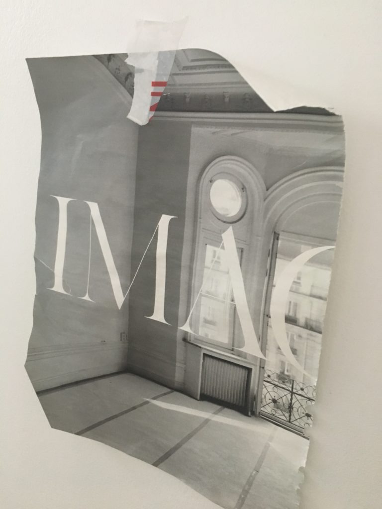
It's time for another Tear Sheet Tuesday where the tears are never sad, just the basis for inspiration.  Today's tears are a collage of sorts. The fun dress shape and typography were torn from the pages of Metropolis (because they send me free magazines ;) along with one of my very own closet renderings. The image of the dress + the idea of customization inspire me to write about the one area that everyone can and should customize, your closet!

TearSheetTuesdayClosetsArtfulKitchens


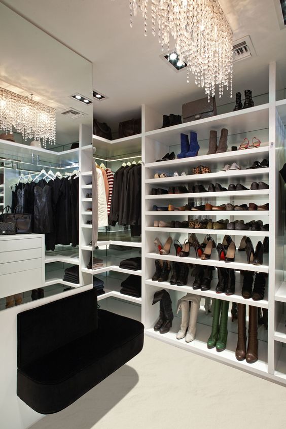
I think a luxurious closet is any gal's version of the man cave.  It's a space that must be completely personalized and, of course, you must feel pampered in it or else you won't keep it neat ;).  THIS closet pic below is consistently one of the most popular on my Pinterest. If you've been following The Big Move you know I am currently in the midst of a ginormous condo makeover and I CANNOT wait to get to the closet!

HouseBeautiful Closet

If you've been thinking about customizing your own dream closet considering these closet design tips will get you on your way to divine. 

How's it Hanging?

The first thing you need to do is take a look at your stuff.  The second is to get rid of (any means possible) anything you truthfully have not touched in a year.  I'm being generous here, what with the seasons and all... Really do it. Less is now.  Once this is done, look at what you've got left.  Some people hang, some fold.  Marie Kondo famed author of  The Life-Changing Magic of Tidying Up: The Japanese Art of Decluttering and Organizing is a fan of hanging.  The reason, she says, is because it allows your garments to air out and let go of wrinkles.  It's also easier to find what you're looking for.  


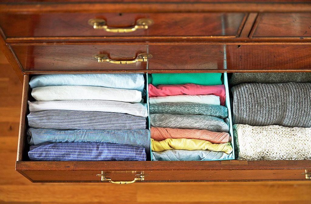
If you're a fan of folding, you can do it like this.  I recommend it. I do it myself and have been for a year and a half. It works and you can see all your stuff so you don't end up wearing the same three pairs of undies over and over because you didn't see and forgot about the other 30, right? Kondo is quirky, no doubt, but she has a point and it has worked for me with a few tweaks.

one_kings_lane_catescloset_folded shirts drawer


In your closet, you'll need to allocate space for double hanging (shirts, shorts, skirts, folded over slacks), medium hanging (dresses, robes), and long hanging for long dresses. Figure out, based on what you have left after step one, how much you need of each.

The Shoes & the Bags

You'll find an abundance of shoe organization situations out there but my favorite is shelves plain and simple.  I'm not a fan of the slanty shelves simply because they take up more space and well frankly, they are only good for shoes.  If you opt for an open shelf unit, make sure you've got plenty of shelves spaced approx. 8 or so inches apart.  Different types of shoes will require different spacing so adjustable/removable shelves are perfect.  Shelving is the most versatile storage option.  You can also combine shoes and handbags in this area.

TearSheetTuesdayClosetDesign

How About Some More Shelves?

Some people gonna be folders, especially for items like sweaters and maybe jeans so if you are a folder make sure you plan for enough shelving.  Keep in mind that shelves are less expensive than drawers and you can always use containers or baskets on shelves to group smaller items and make them look neat and tidy.

Drawers

If you have space, every closet definitely warrants a few drawers.  Take into account drawers you have outside the closet in your dresser.  If you have enough (who ever does?) you may be good to go (not).  One thing to remember about drawers is that they are the easiest way to add $$$$$ to the cost of your closet.

Hamper Options

Sometimes there's room for the hamper in your bathroom but if not, you can always leave space for one in your closet.  I love to locate them at the end against a wall for easy access. This one is from Dot & Bo and doubles as extra storage. Whatever I'm designing I always look for products and methods that are versatile. It's nice to have choices, no?

DotandBoHampers


Light it Luxuriously

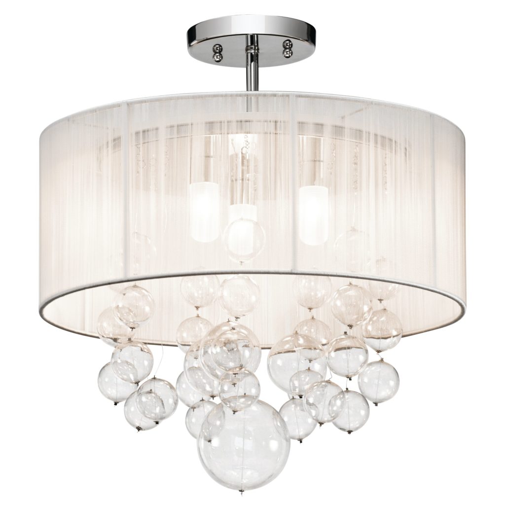
When you're in the closet it always helps to see what you're doing and today there are SO many lighting choices including recessed ceiling fixtures (hi hats), track lighting and even concealed LED lighting in your closet rod!  My favorite idea for lighting is a girly chandelier or ceiling fixture.  I guess I'm shy because that is the only place I'd have one. 


ElanImbuiaSemiFlushMount


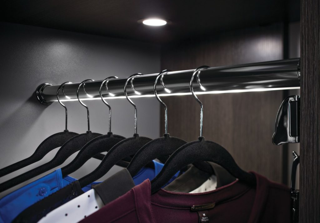
That lighted closet rod is pretty awesome too.  It's LED lighting inserted right into the center to offer a nice even light all the way through your closet.  No more navy vs black issue for the well lit walk-in!

LEDClosetRod,Hafele,Loox,ArtfulKitchens

Sometimes a Lady Just Needs to Sit Down

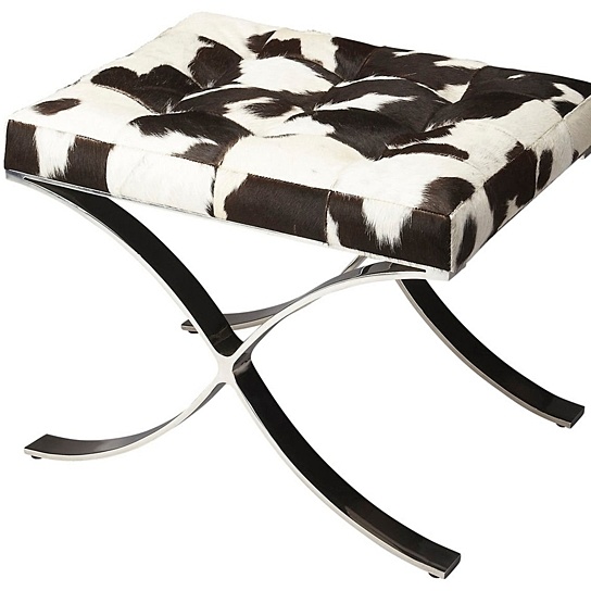
If you have the space a seating situation is a must! Not only is is convenient for putting your shoes on it can also be a lovely accent piece to play off of that fabulous light fixture.  Why can't we aim for beautiful as well as functional? 

ButlerCortairaHaironHideVanityStool


So there you have it!  If there's anything here that inspires you to dig into your closet I'd be happy to collaborate with you!  Please comment below and don't forget to subscribe to my blog so you never miss a beat. xoxo


Tear Sheet Tuesday: Summer recipes, NYC X Design & Furniture Porn

Welcome to another edition of the occasional series I call Tear Sheet Tuesday.  We launched last Tuesday.   If you want to catch up you can do that right here.  In a nutshell, I tear what strikes my fancy throughout the week and I share that with you here.  It could really be anything. It's all inspiration!

TearSheetTuesday


Perhaps today's tears will inspire you to cook, lounge by the pool or get busy creating an office you really want to work in!  Let's get started.  First off, my Cooking Light hit this week.  I wanted to be good and feature this...

TearSheetTuesday TheArtoftheSalad CookingLight

However, THIS is what really looks yummy to me.  Both are super summer meal inspirations and can be found in the current May 2017 issue of Cooking Light.

Cooking Light, Creamy Poblano Tacos TearSheetTuesday

In addition to recipe fantasies you can indulge in a little design dreaming this week if you happen to be in the Big Apple.  NYC X Design is going on right now and it's open and free to the public through May 24th.  This is the fifth year of this international event where you can attend talks, product launches, exhibitions and more all over NYC.  For more info click here

Needless to say I have plucked some coolness from the pages of The Official Guide to NYC X Design, from the Editors of Metropolis.


I guess I'm into the walnut wood  finishes with a little lounging mixed in these days.  Mark my words, beautiful stained wood grains will be the next big cabinet look, as soon as white Shaker runs its course (which could be never). 

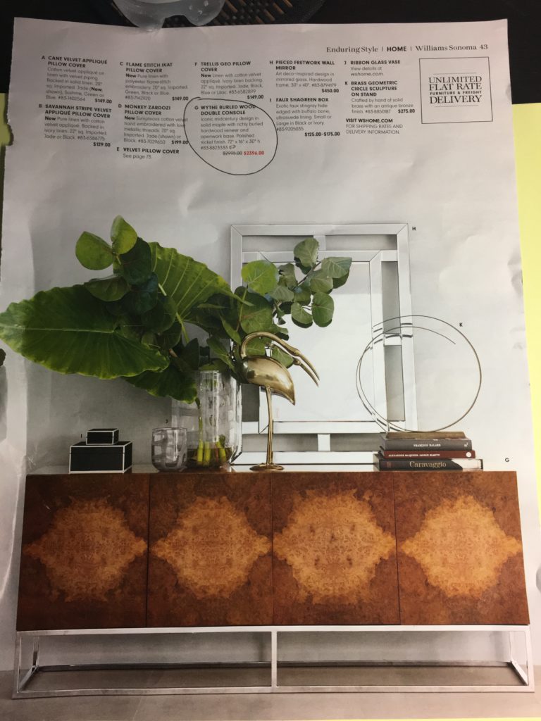
Last but not least, I know you didn't forget the furniture porn I promised you ;).  I have been eyeing this incredibly beautiful burled wood console for a really long time.  This week's sale catalog from Williams Sonoma came in the mail and BAM!! There it is on sale.  Should I? I really love it.

Williams Sonoma, Wythe burled wood console

So that's what I have for you this week.  Please send me YOUR tears so that I can see what's inspiring you and feature it right here. Also, don't forget to leave a comment.  I'm getting lots of emails and I'd love for you to share your kind words right here.

Don't miss a post.  Sign up (upper right) to have them personally delivered to your inbox.


Introducing Tear Sheet Tuesday

Real paper newspapers and magazines are ALMOST a thing of the past. Obviously digital formats have their advantages but Pinterest, indispensable as it is, is just not the same as a good old fashioned tear sheet. I’m dating myself here, no?

According to our friends at Google the definition of a tear sheet is:

Metropolis Magazine,TearSheetTuesday

"a page that can be or has been removed from a newspaper, magazine, or book for use separately"

In my life as a designer I am always looking for inspiration. When catalogs, magazines and interesting stuff on paper comes my way I want to make a note of it and perhaps share it. 

Welcome to Tear Sheet Tuesday, An Occasional Series. Tear Sheet Tuesday blends two mediums, print with digital, best of both worlds. I also want to encourage you to share your paper tears with me. They can be recipes, art, design, food for thought or any inspiration. If you have one to share, scan it or take a photo and email to Gloria@ArtfulKitchens.net to be featured in the series.

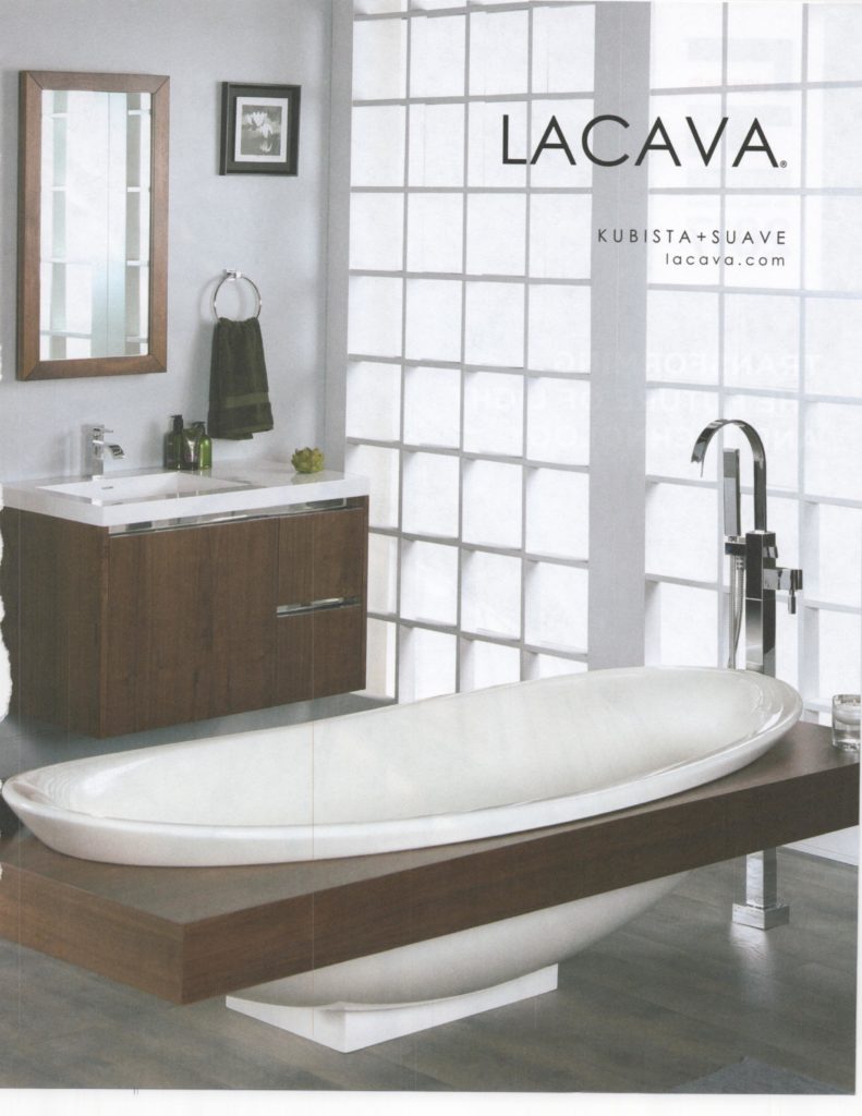
Today’s eye candy comes to you from our friends at Metropolis who gift me monthly with an unsolicited subscription. I’m glad they do.  These two tubs, from the April issue, caught my eye. I love the entire balanced composition of the LaCava Ad, a nice mix of white and wood, something we all strive for, no?

TearSheetTuesday LaCava bathtub

Speaking of bathtubs, there was another in the same issue.  This one, by Victoria+Albert, simply oozes sublime.  Organically inspired, this volcanic limestone tub is the epitome of artfulness for the bath.

Victoria+Albert bathtub


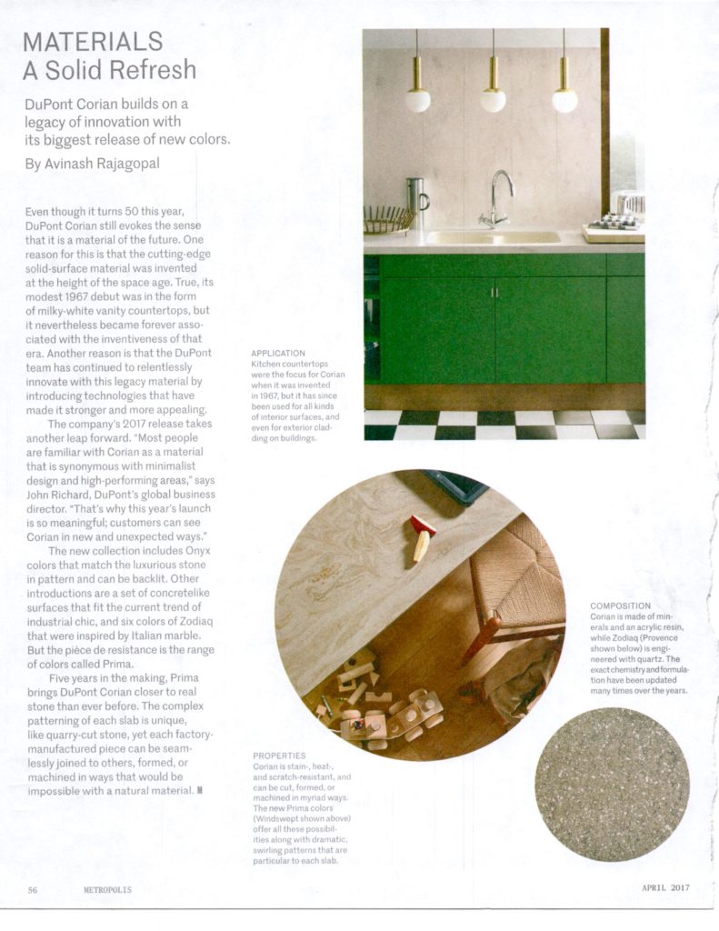
Last but not least from Metropolis this week is this article about DuPont Corian.  I remember Corian as that new alternative to Formica back in the 90s (?) With the subsequent popularity and availability of granite and now quartz, Corian, in recent years has become somewhat of a relic in kitchen and bath design.  Not so fast.  I actually had a client REQUEST Corian the other day so I was interested to see that DuPont has launched some new and innovative finishes including Onyx and concrete colors that couldn't be more on point.  Worth checking out perhaps. 

DuPontCorian2017 Metropolis

PS If you don’t want to defile, you don’t have to tear, just take a photo. Your local library has plenty material but we wouldn’t want to vandalize the goods. ;)

Tear Sheet Tuesday content is curated for your enjoyment I am not paid or compensated by any of the brands in this series.  I'll let you know if that changes!