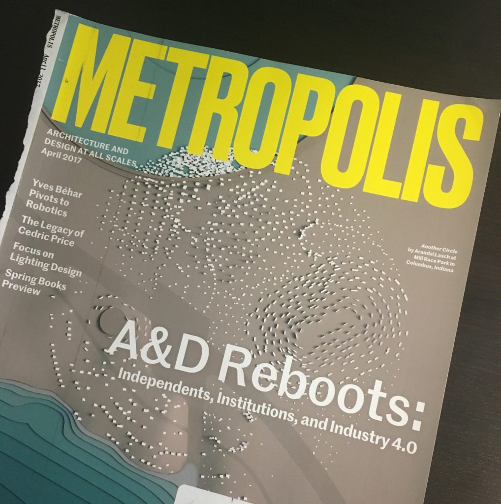
Introducing Tear Sheet Tuesday

Real paper newspapers and magazines are ALMOST a thing of the past. Obviously digital formats have their advantages but Pinterest, indispensable as it is, is just not the same as a good old fashioned tear sheet. I’m dating myself here, no?

According to our friends at Google the definition of a tear sheet is:

Metropolis Magazine,TearSheetTuesday

"a page that can be or has been removed from a newspaper, magazine, or book for use separately"

In my life as a designer I am always looking for inspiration. When catalogs, magazines and interesting stuff on paper comes my way I want to make a note of it and perhaps share it. 

Welcome to Tear Sheet Tuesday, An Occasional Series. Tear Sheet Tuesday blends two mediums, print with digital, best of both worlds. I also want to encourage you to share your paper tears with me. They can be recipes, art, design, food for thought or any inspiration. If you have one to share, scan it or take a photo and email to Gloria@ArtfulKitchens.net to be featured in the series.

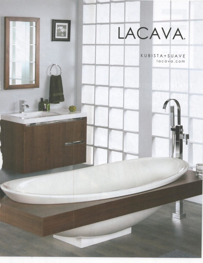
Today’s eye candy comes to you from our friends at Metropolis who gift me monthly with an unsolicited subscription. I’m glad they do.  These two tubs, from the April issue, caught my eye. I love the entire balanced composition of the LaCava Ad, a nice mix of white and wood, something we all strive for, no?

TearSheetTuesday LaCava bathtub

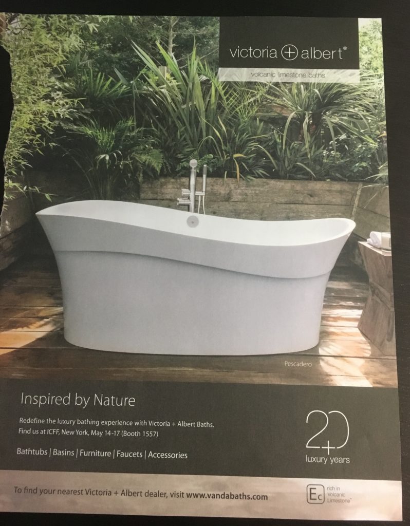
Speaking of bathtubs, there was another in the same issue.  This one, by Victoria+Albert, simply oozes sublime.  Organically inspired, this volcanic limestone tub is the epitome of artfulness for the bath.

Victoria+Albert bathtub


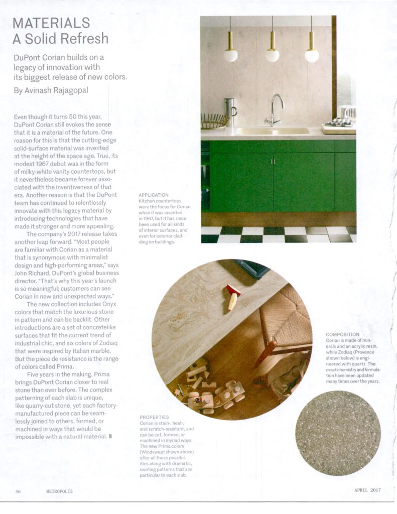
Last but not least from Metropolis this week is this article about DuPont Corian.  I remember Corian as that new alternative to Formica back in the 90s (?) With the subsequent popularity and availability of granite and now quartz, Corian, in recent years has become somewhat of a relic in kitchen and bath design.  Not so fast.  I actually had a client REQUEST Corian the other day so I was interested to see that DuPont has launched some new and innovative finishes including Onyx and concrete colors that couldn't be more on point.  Worth checking out perhaps. 

DuPontCorian2017 Metropolis

PS If you don’t want to defile, you don’t have to tear, just take a photo. Your local library has plenty material but we wouldn’t want to vandalize the goods. ;)

Tear Sheet Tuesday content is curated for your enjoyment I am not paid or compensated by any of the brands in this series.  I'll let you know if that changes!

The Best of KBIS 2016

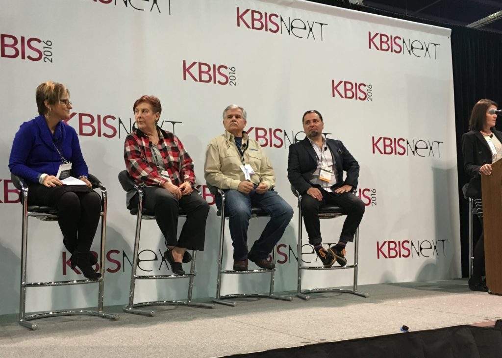
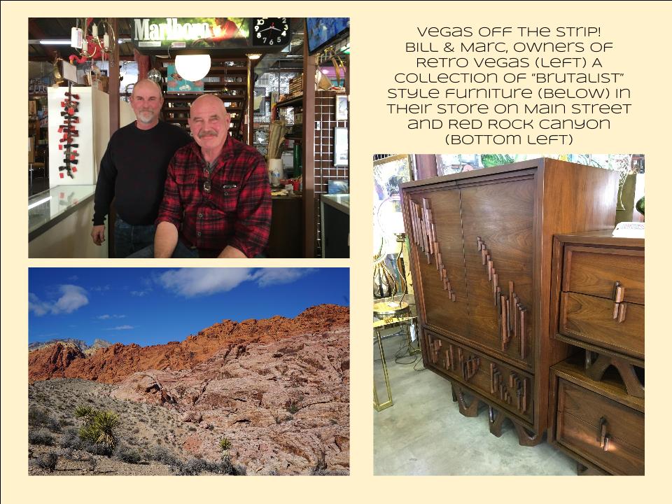
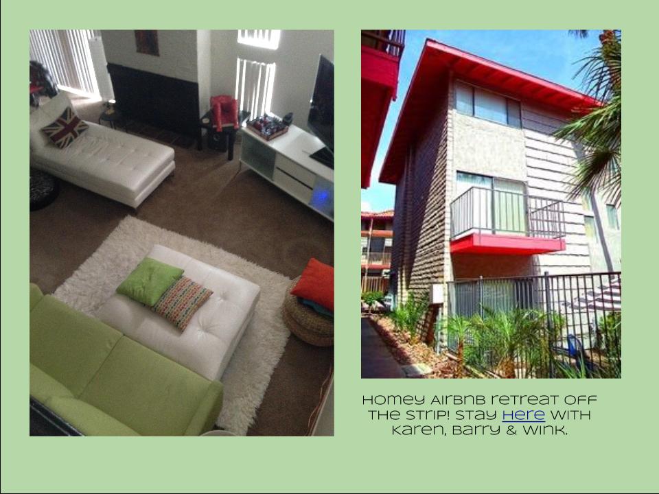
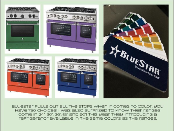
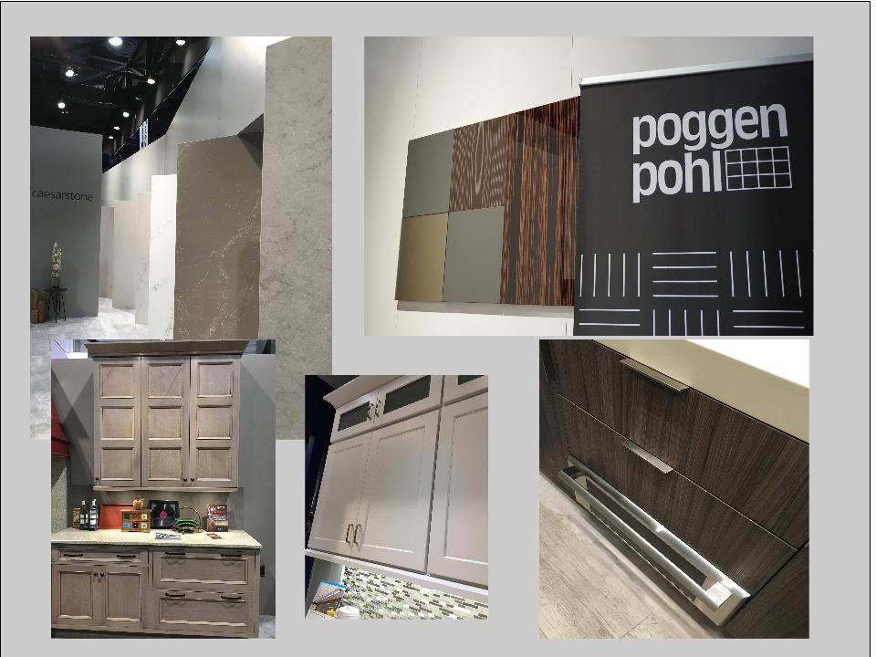
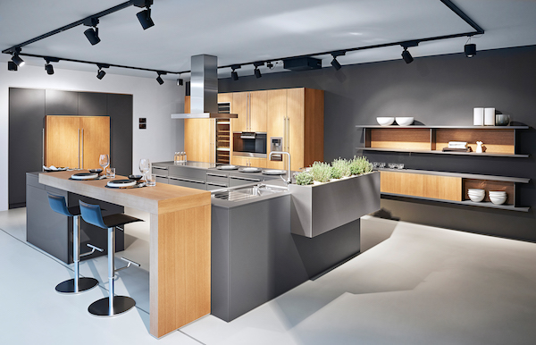
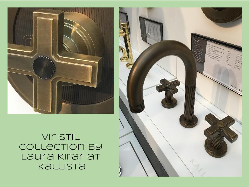
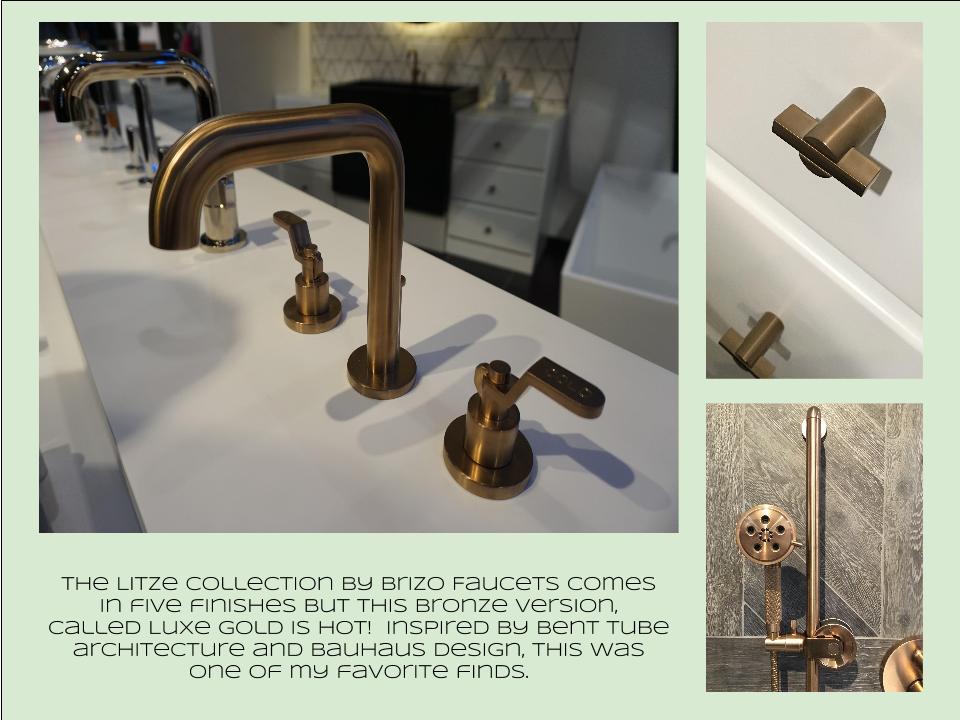
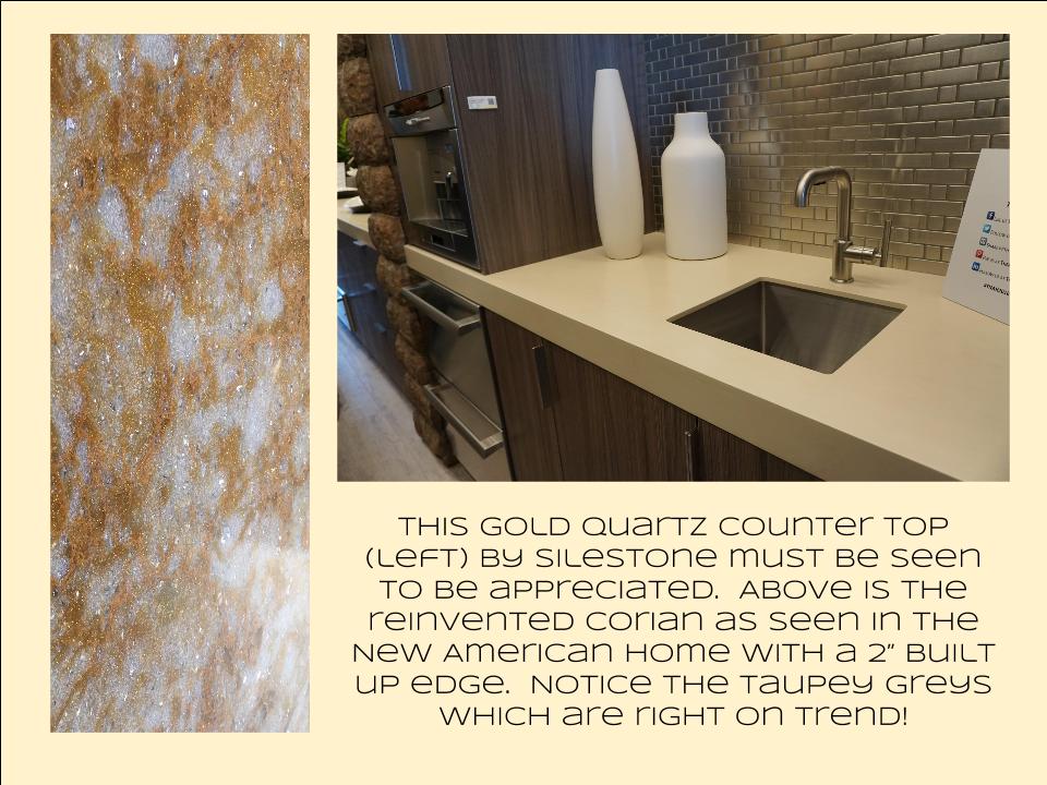
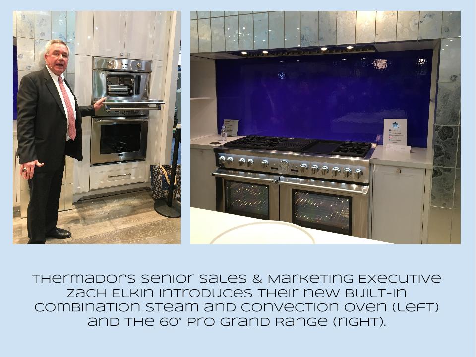
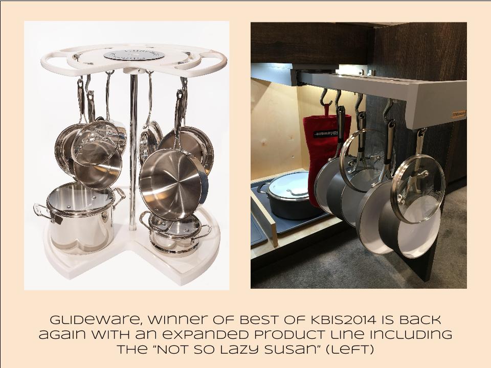
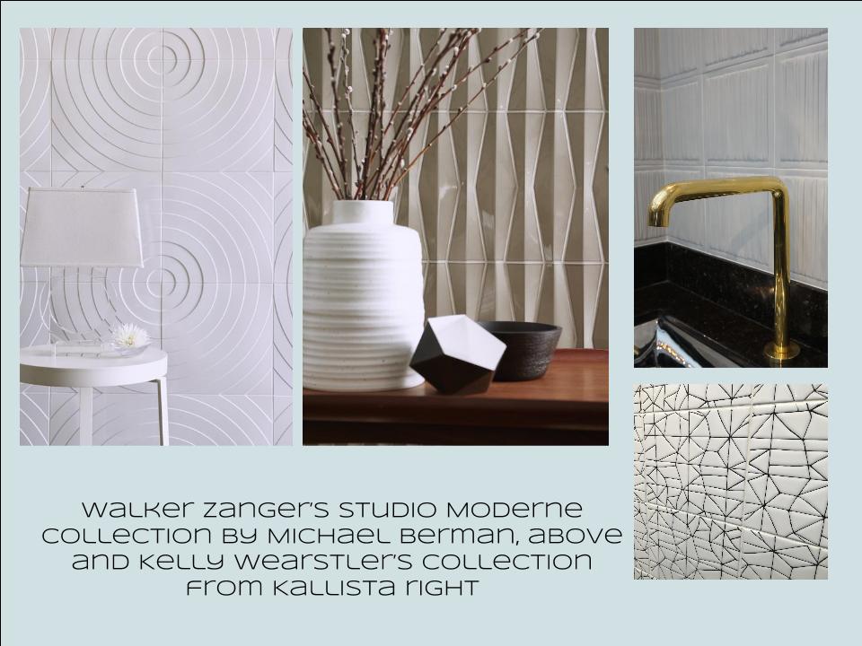
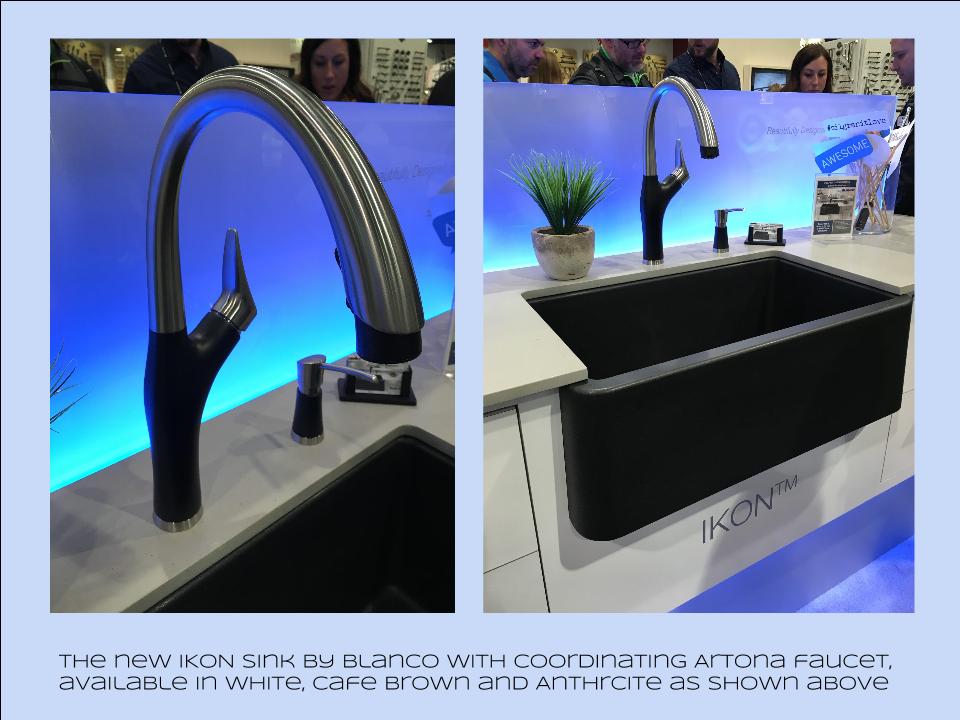
Bam!  Another show is in the books and although it's been a busy week "back at the ranch", I've been dying to share my finds with you right here on Artful Kitchens.2016-01-19_184543141_4F428_iOS (2)Las Vegas was host to three days of networking and education for the best of the Kitchen & Bath industry.  As a member of the Kitchen & Bath Business Magazine's Advisory Board,  I had the pleasure of appearing on the KBIS Next stage as a part of the panel discussion entitled Trials & Tribulations-Solutions to Your Biggest Kitchen & Bath Challenges. It was an exciting exchange of ideas between both the pros on the panel as well as a savvy and engaged audience.Vegas Off the Strip Karen (1)I also had the opportunity to spend some time in the Las Vegas I like best, off the strip! I hiked in the Red Rock Canyon and visited my friends at Retro Vegas on Main Street. My digs for this trip were with my dear pals Karen, Barry & Wink.  They live in a midcentury modern gem that, rumor has it, was briefly home to Lucille Ball!  They are avid Airbnb'ers and wonderful hosts.  Check it out if you find yourself in Vegas. This location is so convenient to the Convention center I could walk, which I did, once.  Mostly I Ubered. Enough walking happens on the show floor!  So without further ado, here's my recap of the biggest and most notable trends and products that caught my eye at KBIS2016. ColorWhite still reigns.  In fact paint giants Benjamin Moore and Sherwin Williams have both selected shades of white as their color of the year.  You know I am a huge white fan. It is always the best backdrop for art and design. It also continues to be the favorite cabinet color in my area.  Remember white is not just white, there are an infinite number of varieties you can have fun with.  If you need more punch in your kitchen you could find some great options at the big show.  I saw bright saturated colors in several appliance brands including Bertonazzi, Viking and BlueStar which offers 750 colors!  color (2)Grey has not left the stage.  The newest versions are warm, venturing into taupe territory. Textured wood grains such as cerused oak are really popular. Wood-Mode showed both traditional and contemporary versions of ribbon Mahogany.Cabinets Poggenpohl_Diamond Grey_Oak Honey BrownThe Perfect TouchTouch latch technology was EVERYWHERE!  If you prefer a sleek, uninterrupted look for your cabinets and appliances this is for you, a gentle nudge will open your cabinets. This is nothing new but it's taken off.  I also loved the button that allows you to close this cabinet when you're done without resorting to dangerous acrobatics (I'm short).Untitled drawing (5)Feeling BrassyActually brass, copper, bronze and myriad versions are hot for plumbing fixtures and hardware.  My favorites were the new BauHaus inspired Litze collection by Brizo Faucets. and Kallista's Vir Stil collection.LitzeNot Your Grandma's CorianIf you're like me Corian has been dead to you since about 1998.  That sentiment has now ended in my book.  I saw a 2"thick sleek contemporary version of Corian that was perfectly at home in The New American Home.  The other exciting thing I saw in counter tops was this quartz by Silestone.  Yes, it's GOLD!  I just wish the photo could capture it's sparkly beauty.CountersThrills from ThermadorAppliance brand Thermador held a press conference on the show floor to introduce a couple of impressive new products, the 60" pro range available with steam and a double oven featuring steam and convection.  These are firsts in the industry.ThermadorOrganize ItJust when I thought we had it all the category of organization it goes to the next level. There was a great representation of brands ranging from Hafele to Rev-A-Shelf to Hardware Resources but Glideware is taking the market by storm.  If you've got a mess lurking somewhere I guarantee there's a way to make it neat and accessibleRev A ShelfGlidewareTile StyleMy two tile favorites were Michael Berman's Collection from Walker Zanger and, of course, Ann Sacks who are featuring a new line by L.A. design maven Kelly Wearstler. Love!Tile (1)I can IKONIf you read my blog you know I love me my Silgranit sinks, meet IKON the apron front version which easily works in any style kitchen from Traditional to Contemporary. Their Artona  faucet perfectly complements the Silgranit sink.-BlancoStikwood Rocks!

Stikwood’s line of lightweight, real-wood planking offers designers and DIYers a peel-and-stick solution to achieve that perfect, sought-after blend of rustic and modern. It can be used on walls and ceilings and comes in tons of colors, even prints! I'm thinking this could be great on the back of a kitchen island.

stikwood

Believe me, all this is just the tip of the proverbial iceberg.  There was so much more to see and learn about at KBIS 2016.  Check out this year's winners of Best of KBIS for more info and of course if you'd like any more info on what you see here email me at artfulkitchensbyglo@gmail.com