Going Topless...In Your Kitchen

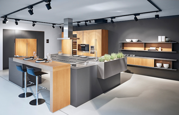
Unless you've been living under a rock you know that the less-is-more look of the topless kitchen is hot!! When I say topless I mean no upper cabinets. There are certainly pluses and minuses to this design decision. But "how can I live without half my kitchen", you ask.  Fear not. Today we will examine the possibilities.

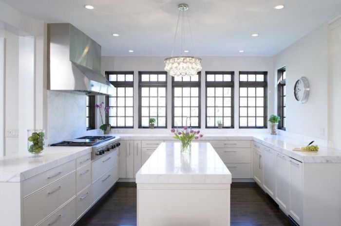
white kitchen, traditional kitchen, stainless steel hood, island, white countertop, kitchen windows, crystal chandelier,no upper cabinets

white kitchen, traditional kitchen, stainless steel hood, island, white countertop, kitchen windows, crystal chandelier,no upper cabinets

Less is Now

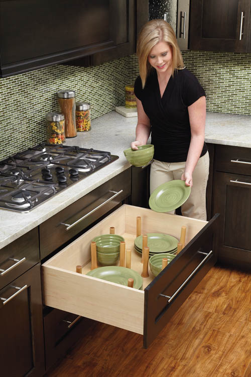
No complaining if you haven't done a thorough kitchen purge in the last year.  We all have "stuff" and if it never sees the light of day it's stagnant energy taking up real estate that could be otherwise useful or beautiful.But what about dishes? They always go in the upper cabinets. Actually, dishes work perfectly in drawers if you have this drawer peg system.  You'll find that they're easier to access too, particularly if you're short like me ;)

Dish drawer, dish pegs, black plates, drawer cabinet

Dish drawer, dish pegs, black plates, drawer cabinet

Clever Corners

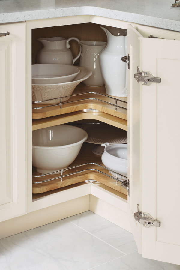
Another way to maximize the space you have below deck is to use the corner space.  My favorite way to do this is with a base lazy susan cabinet. It's versatile storage for almost anything. Just be sure to get this type, without the pole.  With trays mounted on shelves, you won't lose things to the Twilight Zone if they fall over.  (Chrome rails are optional) The only caveat is that you will need 36" on both sides of the corner to make this work.

base corner cabinet with lazy susan chrome rails

base corner cabinet with lazy susan chrome rails

If you can't swing the 36" in each direction you can perhaps use the Cloud which fits in a blind corner cabinet.  We can discuss more when you call me to help you with your new kitchen.

white cabinets, contemporary, chrome, blind corner cabinet, revashelf

white cabinets, contemporary, chrome, blind corner cabinet, revashelf

Ultimate Simplicity

The most simple solution of all is the open shelf.  They are both feared and widely popular.  Some feel like it would look way too messy but I say it doesn't have to be all or nothing.  A few open or floating shelves can add a lot of lightness and visual interest as well as storage above the counter in lieu of cabinets.

farmhouse kitchen, HGTV, white cabinets, apron sink, open shelves

farmhouse kitchen, HGTV, white cabinets, apron sink, open shelves

Artful Arrangement

In the photo below, they actually did not eliminate uppers entirely but it feels like it.  Here they are using the shortened uppers for remote storage, i.e. the stuff you don't need to access every day. The "go to" storage is in tall pantry cabinets.  That's right, you don't have to use the pantry only for food, they are great for everything.  If your pantry is full depth, like these, rollouts work great for easy access and to avoid items getting lost in the back. If you're observant you'll also notice the last cabinet sits on top of the counter.  If you have the counter space this is a great way to conceal countertop items for less clutter.

contemporary kitchen Dekton wood cabinets pantries

contemporary kitchen Dekton wood cabinets pantries

Creative Compromise

As we've seen, one does not necessarily need to banish the upper cabinet entirely to score an updated and functional result.  Here is a loft kitchen I recently designed.  My clients were in love with the idea of floating shelves and this look worked for their urban vintage style. Since space was at a premium in this condo we did opt to keep a few good sized upper cabinets.  The look is actually a blend of contemporary and transitional. A full pantry also would've worked to the right of the refrigerator but my clients preferred this arrangement which is very symetrical and offers a bit of extra counter space.  Hey, I always say the best jobs are good collaborations. :)

ArtfulKitchens 3DRendering kitchendesign

ArtfulKitchens 3DRendering kitchendesign

.

No matter what your situation, creativity can offer you choices. In over 20 years I have found that there is always a solution that will work in your space and I would love to help you find it.

Tear Sheet Tuesday: Creative Closet Design Tips

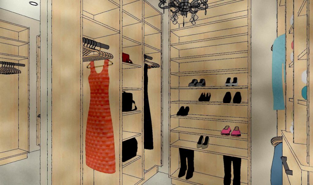
It's time for another Tear Sheet Tuesday where the tears are never sad, just the basis for inspiration.  Today's tears are a collage of sorts. The fun dress shape and typography were torn from the pages of Metropolis (because they send me free magazines ;) along with one of my very own closet renderings. The image of the dress + the idea of customization inspire me to write about the one area that everyone can and should customize, your closet!

TearSheetTuesdayClosetsArtfulKitchens


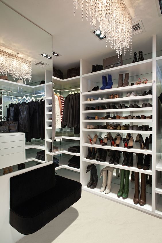
I think a luxurious closet is any gal's version of the man cave.  It's a space that must be completely personalized and, of course, you must feel pampered in it or else you won't keep it neat ;).  THIS closet pic below is consistently one of the most popular on my Pinterest. If you've been following The Big Move you know I am currently in the midst of a ginormous condo makeover and I CANNOT wait to get to the closet!

HouseBeautiful Closet

If you've been thinking about customizing your own dream closet considering these closet design tips will get you on your way to divine. 

How's it Hanging?

The first thing you need to do is take a look at your stuff.  The second is to get rid of (any means possible) anything you truthfully have not touched in a year.  I'm being generous here, what with the seasons and all... Really do it. Less is now.  Once this is done, look at what you've got left.  Some people hang, some fold.  Marie Kondo famed author of  The Life-Changing Magic of Tidying Up: The Japanese Art of Decluttering and Organizing is a fan of hanging.  The reason, she says, is because it allows your garments to air out and let go of wrinkles.  It's also easier to find what you're looking for.  


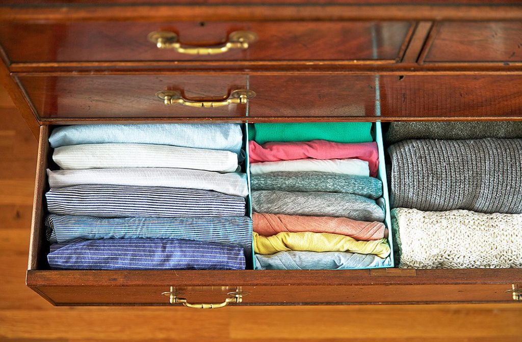
If you're a fan of folding, you can do it like this.  I recommend it. I do it myself and have been for a year and a half. It works and you can see all your stuff so you don't end up wearing the same three pairs of undies over and over because you didn't see and forgot about the other 30, right? Kondo is quirky, no doubt, but she has a point and it has worked for me with a few tweaks.
one_kings_lane_catescloset_folded shirts drawer


In your closet, you'll need to allocate space for double hanging (shirts, shorts, skirts, folded over slacks), medium hanging (dresses, robes), and long hanging for long dresses. Figure out, based on what you have left after step one, how much you need of each.

The Shoes & the Bags

You'll find an abundance of shoe organization situations out there but my favorite is shelves plain and simple.  I'm not a fan of the slanty shelves simply because they take up more space and well frankly, they are only good for shoes.  If you opt for an open shelf unit, make sure you've got plenty of shelves spaced approx. 8 or so inches apart.  Different types of shoes will require different spacing so adjustable/removable shelves are perfect.  Shelving is the most versatile storage option.  You can also combine shoes and handbags in this area.

TearSheetTuesdayClosetDesign

How About Some More Shelves?

Some people gonna be folders, especially for items like sweaters and maybe jeans so if you are a folder make sure you plan for enough shelving.  Keep in mind that shelves are less expensive than drawers and you can always use containers or baskets on shelves to group smaller items and make them look neat and tidy.

Drawers

If you have space, every closet definitely warrants a few drawers.  Take into account drawers you have outside the closet in your dresser.  If you have enough (who ever does?) you may be good to go (not).  One thing to remember about drawers is that they are the easiest way to add $$$$$ to the cost of your closet.

Hamper Options

Sometimes there's room for the hamper in your bathroom but if not, you can always leave space for one in your closet.  I love to locate them at the end against a wall for easy access. This one is from Dot & Bo and doubles as extra storage. Whatever I'm designing I always look for products and methods that are versatile. It's nice to have choices, no?

DotandBoHampers


Light it Luxuriously

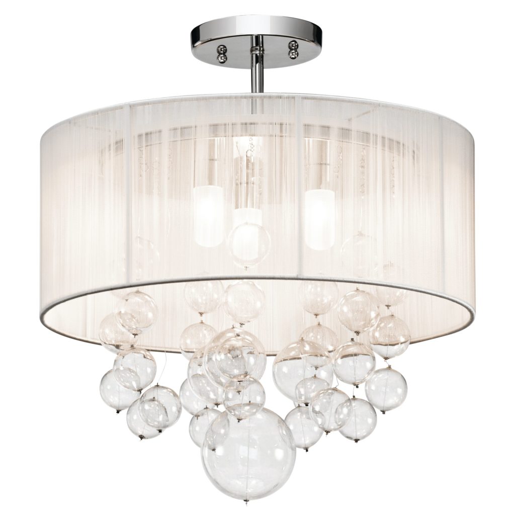
When you're in the closet it always helps to see what you're doing and today there are SO many lighting choices including recessed ceiling fixtures (hi hats), track lighting and even concealed LED lighting in your closet rod!  My favorite idea for lighting is a girly chandelier or ceiling fixture.  I guess I'm shy because that is the only place I'd have one. 


ElanImbuiaSemiFlushMount


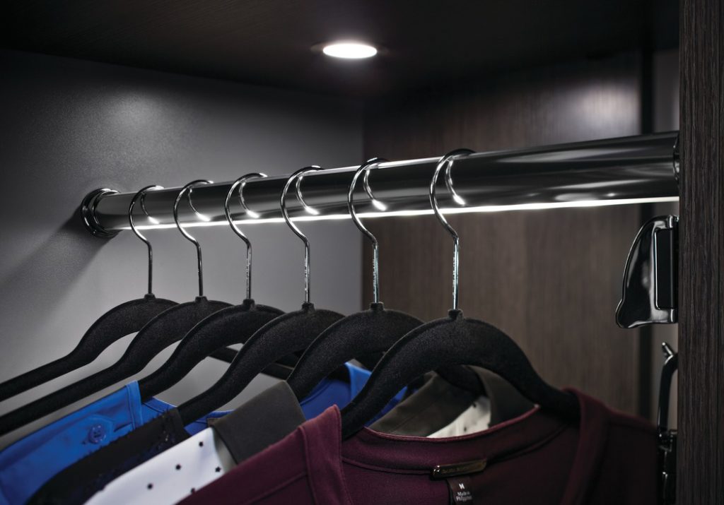
That lighted closet rod is pretty awesome too.  It's LED lighting inserted right into the center to offer a nice even light all the way through your closet.  No more navy vs black issue for the well lit walk-in!

LEDClosetRod,Hafele,Loox,ArtfulKitchens

Sometimes a Lady Just Needs to Sit Down

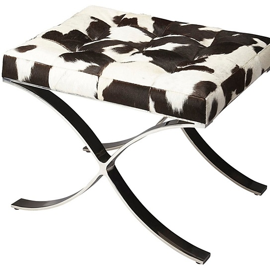
If you have the space a seating situation is a must! Not only is is convenient for putting your shoes on it can also be a lovely accent piece to play off of that fabulous light fixture.  Why can't we aim for beautiful as well as functional? 

ButlerCortairaHaironHideVanityStool


So there you have it!  If there's anything here that inspires you to dig into your closet I'd be happy to collaborate with you!  Please comment below and don't forget to subscribe to my blog so you never miss a beat. xoxo


Tear Sheet Tuesday: Wine Storage

Welcome to another edition of the occasional series I call Tear Sheet Tuesday.   If you want to catch up you can do that right here  and here.  In a nutshell, I tear what strikes my fancy and I share that with you here.  It could really be anything. It’s all about what inspires me.

CookingLight-wine-rosé-winestorage-ArtfulKitchens


Now I'm all inspired to share with you some tips and ideas for storing your liquid treasure, wine! Here are some things to keep in mind along with some wine storage eye candy curated just for you. 

Climate Control

If you want to be technical about it wine should be stored at the perfect temperature with a touch of humidity.  The sweet spot for white wines is about 45 degrees Fahrenheit.  I'll admit it, I love an ice cold glass of white wine but my preference may be costing me when it comes to flavor.  Your refrigerator, by the way, is probably chilling in the thirties.  It is often said that red wine is served and stored at room temperature.  That could be true if you live in northern France but they definitely don't mean Florida!  The room temperature they refer to is 55 degrees Fahrenheit.  Sunlight and heat are deadly enemies of the vino. Many people store wine in the kitchen but that's not necessarily the best place for it.  If you do store it there, make sure to keep it out of the sun, away from heat and anything that is going to cause vibration, no matter how subtle.  There is an abundance of wine cooler appliances on the market in price ranges from the hundreds to several thousand dollars.  Call me for a wine cooler consult to make sure you get one that fits and will work in accordance with specifications. 
Sideways


Sideways is Not Just a Movie 

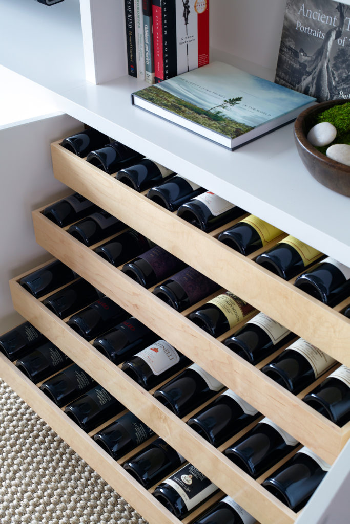
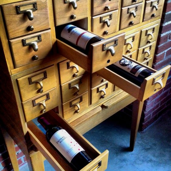
Wine is traditionally stored sideways to keep corks from drying out BUT if you're going to drink it soon it doesn't really matter. I'm sure you've noticed a lot of wine these days doesn't even come with a cork.  That used to be anathema to a wine aficionado but no more. Increasingly, winemakers "prefer screw caps for white wines and reds meant to be drunk young," says Dave McIntyre, a wine writer whose columns appear in The Washington Post. For more on the cork vs screw top check out this interesting article. One big benefit of storing sideways is storage, it makes the most efficient use of space.

06.-West-Village-Waterfront-by-Chango-Co.-Living-Room-Millwork-Wine-Drawer-Detail-View, wine storage

Clever or Kitchy?  You Decide

KRJHomeSweetHome, wine storage


Looks like a great idea to me, anything that suggests books and includes wine is a win!

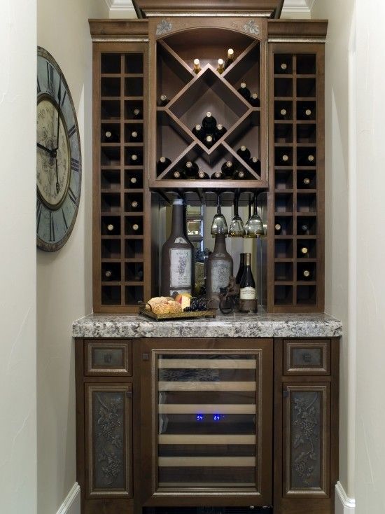
Breaking with Tradition

wine storage


I'm not a traditional gal and am one to prefer interesting asymmetric balance but there's just something about the perfect symmetry and classicism of this that rocks my world.  I am not alone.  This image has 5400 saves on Pinterest!


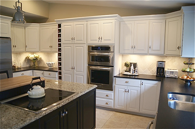
A Spot for Wine

theyellowcapecod, wine storage


If you're planning a new kitchen and you find yourself with an extra six inches you've got a spot for wine.  Notice it's insulated from the ovens by a decently sized pantry cabinet away from heat.  It's also not too close the window.


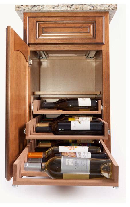
Retrofit Your Wine

This wine storage system by Wine Logic can be inserted into your existing cabinetry.  Sounds logical to me! 

wine storage, wine logic
                                                                     By A Direct Cabinet Distributor Corp East Patchogue - See more Home Design Photos
 
Amazing what can come out of one image torn from a magazine, huh?  Please share your tears with me and don't forget to subscribe to Artful Kitchens.  There's a lot of excitement around the corner!
 
NEXT UP:  Part I of The Big Move, follow my journey as a new empty-nester with a behind-the- scenes look at what it takes to sell a house in the suburbs, remodel and downsize for the good life.

Design Tips Inspired by The French Chef

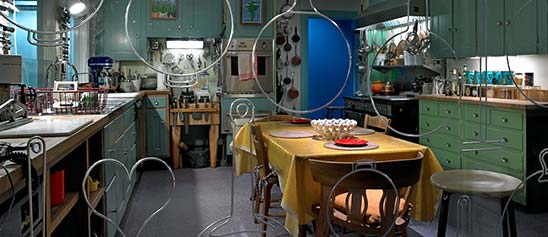
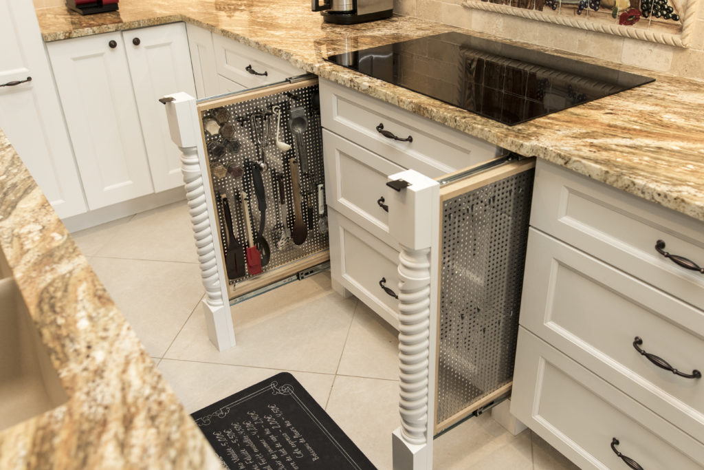
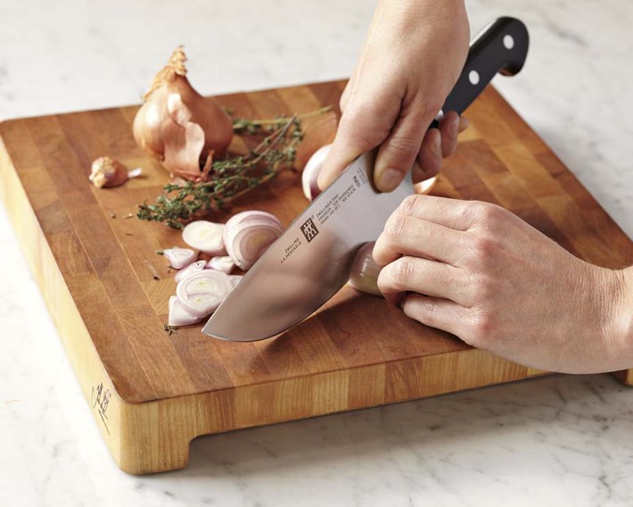
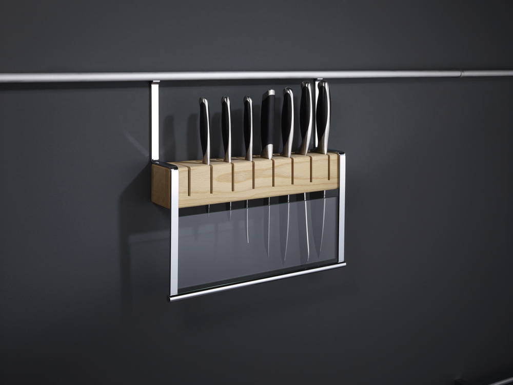
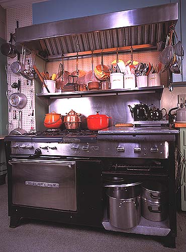
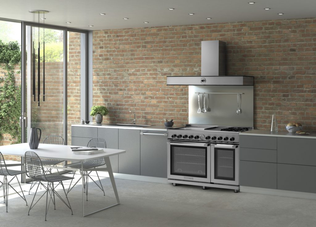
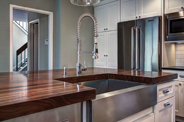
Julia Child was a pioneer in the world of haute cuisine at a time when celebrity "chefdom" was a decidedly manly occupation.  She didn’t care.  The kitchen was her natural habitat and she had her own ways of making it work for her whether she was whipping up a soufflé or flaming a creme brûlée. The French Chef, Julia Child   Child is credited with bringing French cuisine to America in the 1960s and was host of The French Chef on PBS which aired from 1963-1973.   Interestingly, she did not learn to cook until she met her husband Paul Child, an American diplomat with a refined palate. Julia also worked for the government during WWII as a research assistant in the Secret Intelligence division of the OSS (Office of Strategic Services). It was in this capacity that she created her first recipe which was for shark repellent! It worked and is still in use today.  After the war the couple settled in Paris where Paul worked for the US Foreign Service and Julia attended the renowned Le Cordon Bleu cooking school.  She had fallen in love with French cuisine.  Julia stood 6’2”, never had any children and left this world in 2004, two days shy of her 92nd birthday.  She was quoted as saying, “with enough butter, anything is good”.  Apparently her health was none the worse for it. Julia Child kitchen, National Museum of American History Julia’s real life kitchen was donated, moved and reassembled in the Smithsonian's National Museum of American History in 2001. The layout was devised by Julia and her husband and customized to her cooking needs, including higher counter tops to accommodate her height. Pots and cooking utensils are all placed exactly as they were in her home.   Today Julia would be utterly amazed at the advancements in appliances, materials and new storage options. Although her kitchen goes back 50 years she had ideas and practices that are very relevant today.  Here is what I think today’s kitchen would look like through the eyes of The French Chef. Peg Board system by Rev A Shelf Organization and Easy AccessJulia was known for her handy and efficient peg board system.  Companies like Rev-A-Shelf have taken this concept and expanded it so that it doesn’t have to be on the wall.  Moving pegs allow these inserts to be customized.  This is especially handy for dish storage in new kitchens that feature fewer upper cabinets.  A "Julia kitchen" includes a place for everything and everything in it’s place. Rev A Shelf peg boardTo Make the Cut You Must Have Great KnivesA self-proclaimed knife freak, Julia collected them all her life and never met one that was sharp enough for her! Check out this delightful anecdote from the New England Historical Society and you'll see what I mean.  I agree that there is nothing more frustrating in the kitchen than dull knife. The winner in my book is J.A. Henckels International 8" Classic Chef's Knife in terms of quality and value for the money.J A Henckels pro chef knifeHaving a great knife is half of the equation, now we have to store them.  Julia preferred to house them on a magnet attached to the wall.  Today she would love this railing system by Clever Storage that allows you to take advantage of the space between upper and lower cabinets.  It's safe, attractive and accessible.  Win! Wooden Knife Block by Clever Storage The Mother Ship of RangesJulia used a 1950s six burner used commercial gas range by Garland.  This company is still in business so you can get a modern version today but I’m betting Julia would fall for the TriFuel range by Tecnogas Superiore for its state of the art versatility.  In fact, it was just announced Product Innovator Award winner for 2016 by Kitchen & Bath Business Magazine.  It features dual gas burners plus four induction zones and an electric griddle. Below are dual gas ovens equipped with two convection fans and a broiler.The Garland Commercial Range in Julia Child's kitchen in Cambridge, Massachusetts Trifuel Range by Tecno Superiore The Beauty of Butcher BlockThe French Chef was fond of her extra high maple counter tops for food preparation.  You may not want an entire kitchen with wood tops but, if you can, it's great to have a section of it for food prep.  Wood butcher block counters are a natural eco-friendly choice, absorb noise, are gentle on dishes and can be refinished.  In addition to this, wood has inherent antibacterial qualities and can add a beautiful warmth to your kitchen. If you're going to use your counter for food prep it should have an oiled finish which does need to be maintained. Walnut counter tops by J. Aaron  Last but not least never enter the kitchen without a sense of humor and adventure Child was never without it!  She said, “in cooking you’ve got to have a what-the-hell attitude!”-If you'd like to experience cooking like a French chef  you can stay at what was once Julia and Paul's part-time residence in Provence, France courtesy of Airbnb.
The Best of KBIS 2016

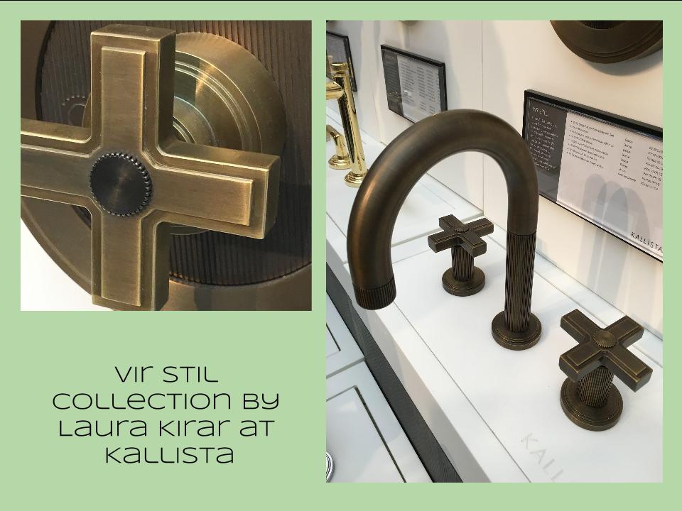
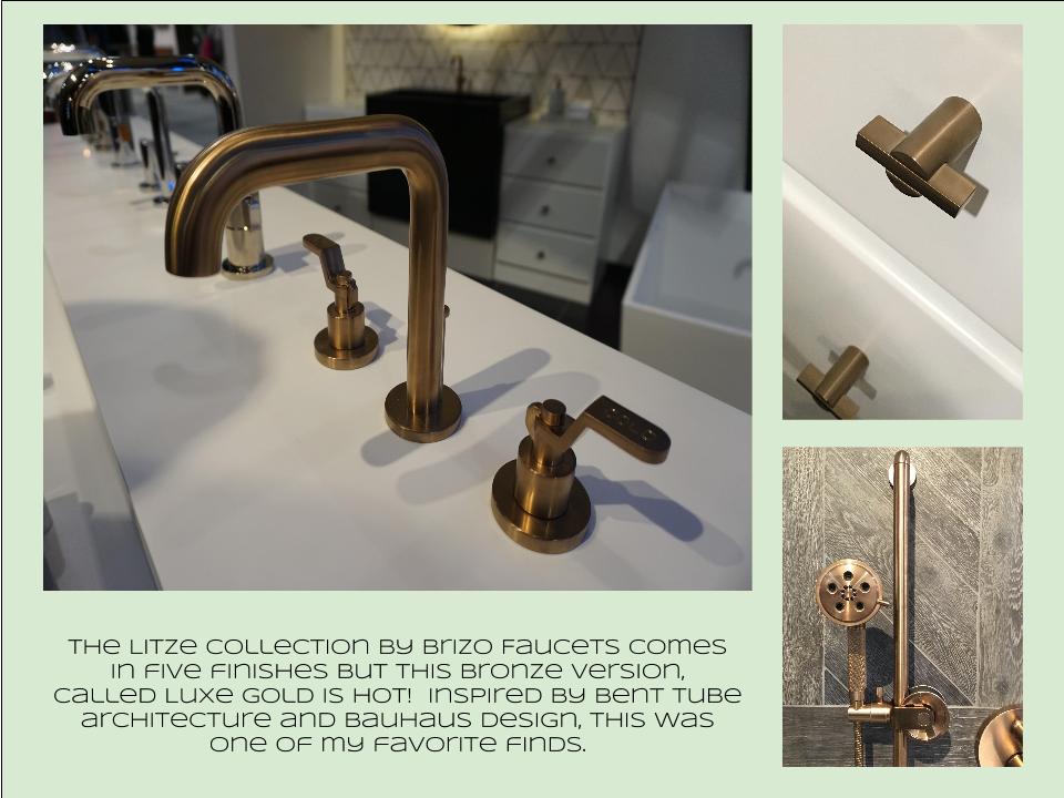
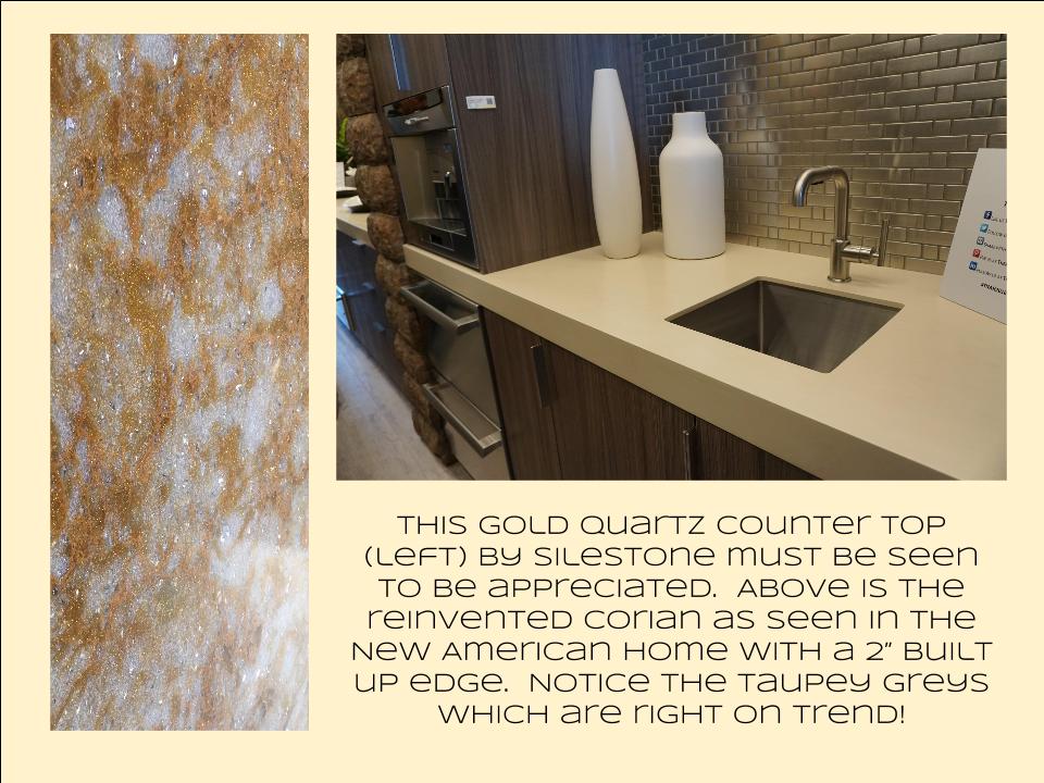
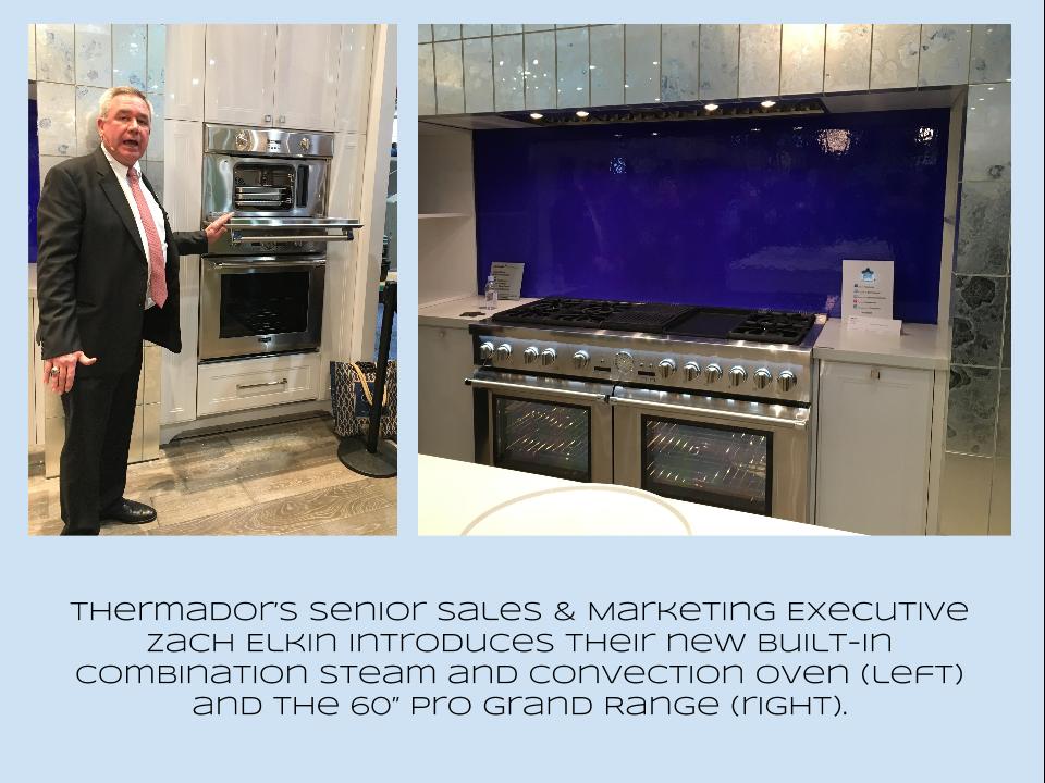
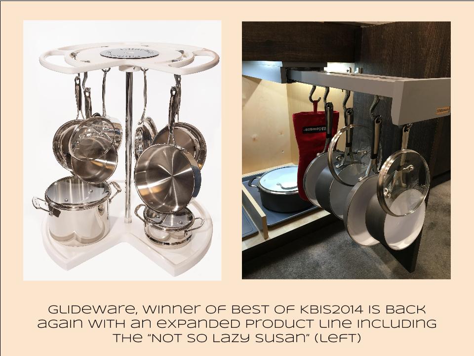
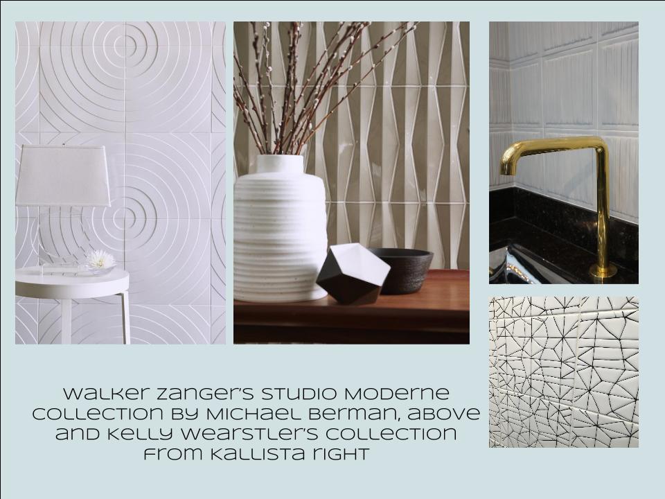
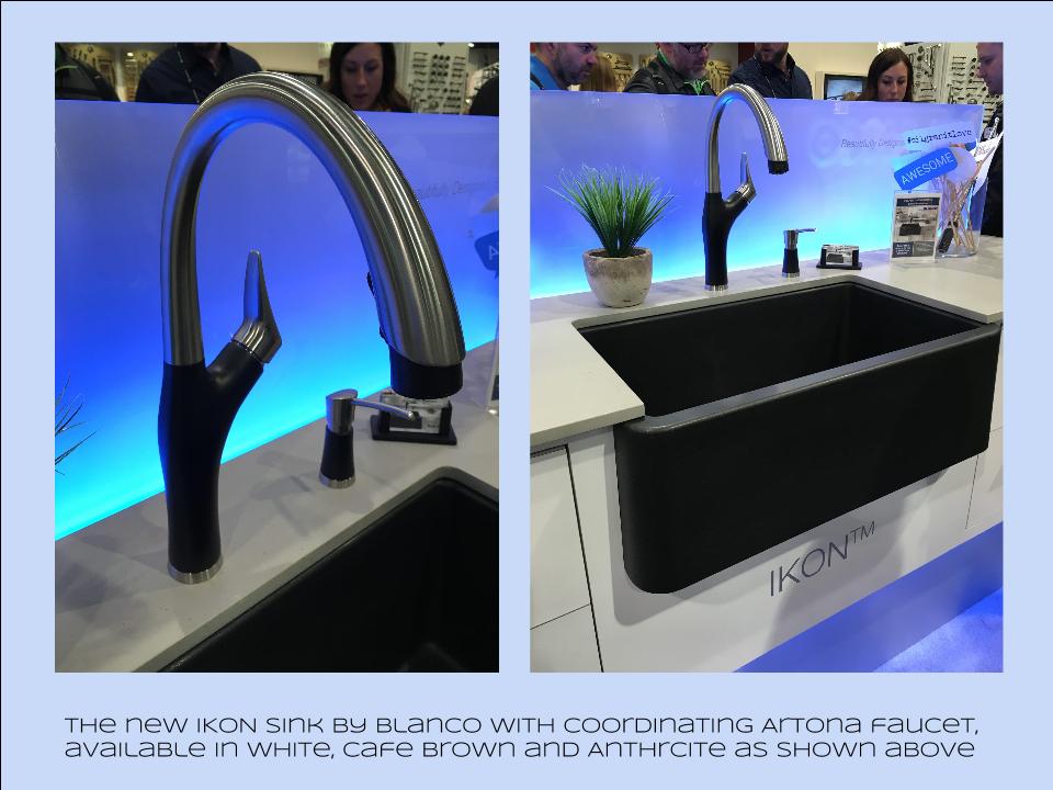
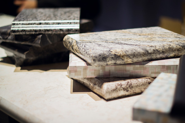
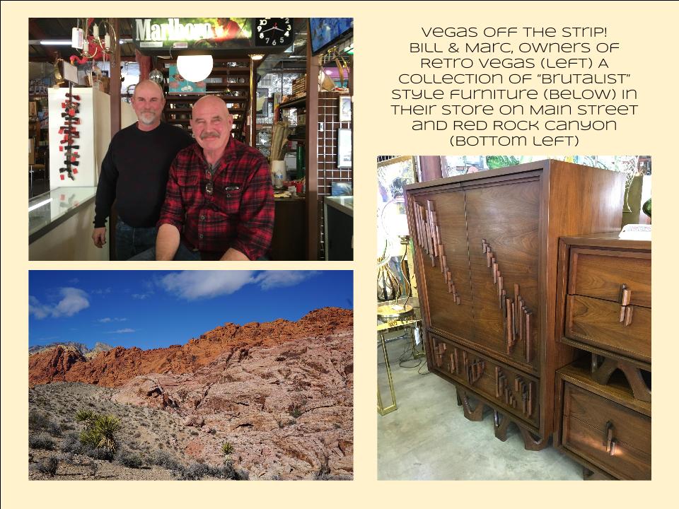
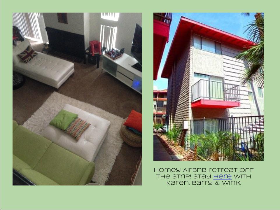
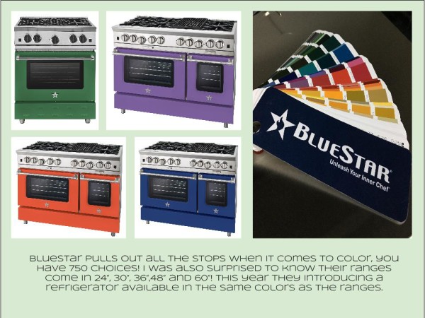
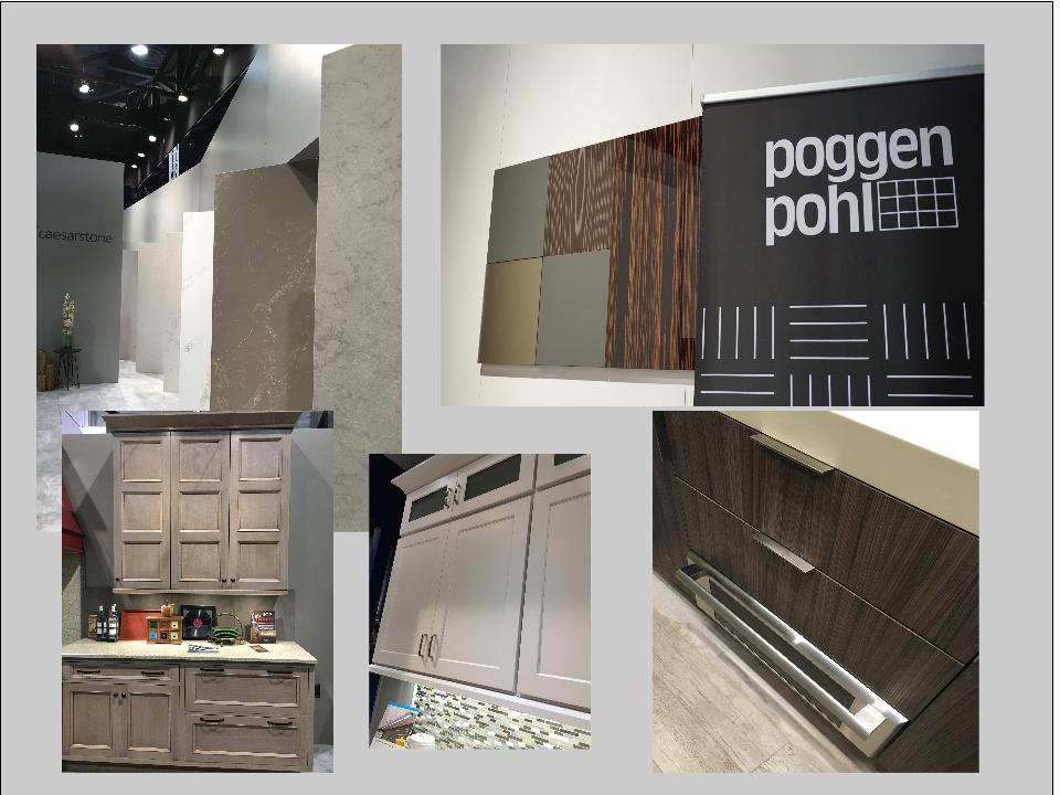
Bam!  Another show is in the books and although it's been a busy week "back at the ranch", I've been dying to share my finds with you right here on Artful Kitchens.2016-01-19_184543141_4F428_iOS (2)Las Vegas was host to three days of networking and education for the best of the Kitchen & Bath industry.  As a member of the Kitchen & Bath Business Magazine's Advisory Board,  I had the pleasure of appearing on the KBIS Next stage as a part of the panel discussion entitled Trials & Tribulations-Solutions to Your Biggest Kitchen & Bath Challenges. It was an exciting exchange of ideas between both the pros on the panel as well as a savvy and engaged audience.Vegas Off the Strip Karen (1)I also had the opportunity to spend some time in the Las Vegas I like best, off the strip! I hiked in the Red Rock Canyon and visited my friends at Retro Vegas on Main Street. My digs for this trip were with my dear pals Karen, Barry & Wink.  They live in a midcentury modern gem that, rumor has it, was briefly home to Lucille Ball!  They are avid Airbnb'ers and wonderful hosts.  Check it out if you find yourself in Vegas. This location is so convenient to the Convention center I could walk, which I did, once.  Mostly I Ubered. Enough walking happens on the show floor!  So without further ado, here's my recap of the biggest and most notable trends and products that caught my eye at KBIS2016. ColorWhite still reigns.  In fact paint giants Benjamin Moore and Sherwin Williams have both selected shades of white as their color of the year.  You know I am a huge white fan. It is always the best backdrop for art and design. It also continues to be the favorite cabinet color in my area.  Remember white is not just white, there are an infinite number of varieties you can have fun with.  If you need more punch in your kitchen you could find some great options at the big show.  I saw bright saturated colors in several appliance brands including Bertonazzi, Viking and BlueStar which offers 750 colors!  color (2)Grey has not left the stage.  The newest versions are warm, venturing into taupe territory. Textured wood grains such as cerused oak are really popular. Wood-Mode showed both traditional and contemporary versions of ribbon Mahogany.Cabinets Poggenpohl_Diamond Grey_Oak Honey BrownThe Perfect TouchTouch latch technology was EVERYWHERE!  If you prefer a sleek, uninterrupted look for your cabinets and appliances this is for you, a gentle nudge will open your cabinets. This is nothing new but it's taken off.  I also loved the button that allows you to close this cabinet when you're done without resorting to dangerous acrobatics (I'm short).Untitled drawing (5)Feeling BrassyActually brass, copper, bronze and myriad versions are hot for plumbing fixtures and hardware.  My favorites were the new BauHaus inspired Litze collection by Brizo Faucets. and Kallista's Vir Stil collection.LitzeNot Your Grandma's CorianIf you're like me Corian has been dead to you since about 1998.  That sentiment has now ended in my book.  I saw a 2"thick sleek contemporary version of Corian that was perfectly at home in The New American Home.  The other exciting thing I saw in counter tops was this quartz by Silestone.  Yes, it's GOLD!  I just wish the photo could capture it's sparkly beauty.CountersThrills from ThermadorAppliance brand Thermador held a press conference on the show floor to introduce a couple of impressive new products, the 60" pro range available with steam and a double oven featuring steam and convection.  These are firsts in the industry.ThermadorOrganize ItJust when I thought we had it all the category of organization it goes to the next level. There was a great representation of brands ranging from Hafele to Rev-A-Shelf to Hardware Resources but Glideware is taking the market by storm.  If you've got a mess lurking somewhere I guarantee there's a way to make it neat and accessibleRev A ShelfGlidewareTile StyleMy two tile favorites were Michael Berman's Collection from Walker Zanger and, of course, Ann Sacks who are featuring a new line by L.A. design maven Kelly Wearstler. Love!Tile (1)I can IKONIf you read my blog you know I love me my Silgranit sinks, meet IKON the apron front version which easily works in any style kitchen from Traditional to Contemporary. Their Artona  faucet perfectly complements the Silgranit sink.-BlancoStikwood Rocks!

Stikwood’s line of lightweight, real-wood planking offers designers and DIYers a peel-and-stick solution to achieve that perfect, sought-after blend of rustic and modern. It can be used on walls and ceilings and comes in tons of colors, even prints! I'm thinking this could be great on the back of a kitchen island.

stikwood

Believe me, all this is just the tip of the proverbial iceberg.  There was so much more to see and learn about at KBIS 2016.  Check out this year's winners of Best of KBIS for more info and of course if you'd like any more info on what you see here email me at artfulkitchensbyglo@gmail.com

BigTrends from KBIS2015 Part I

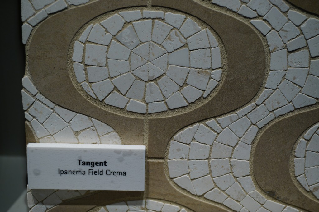
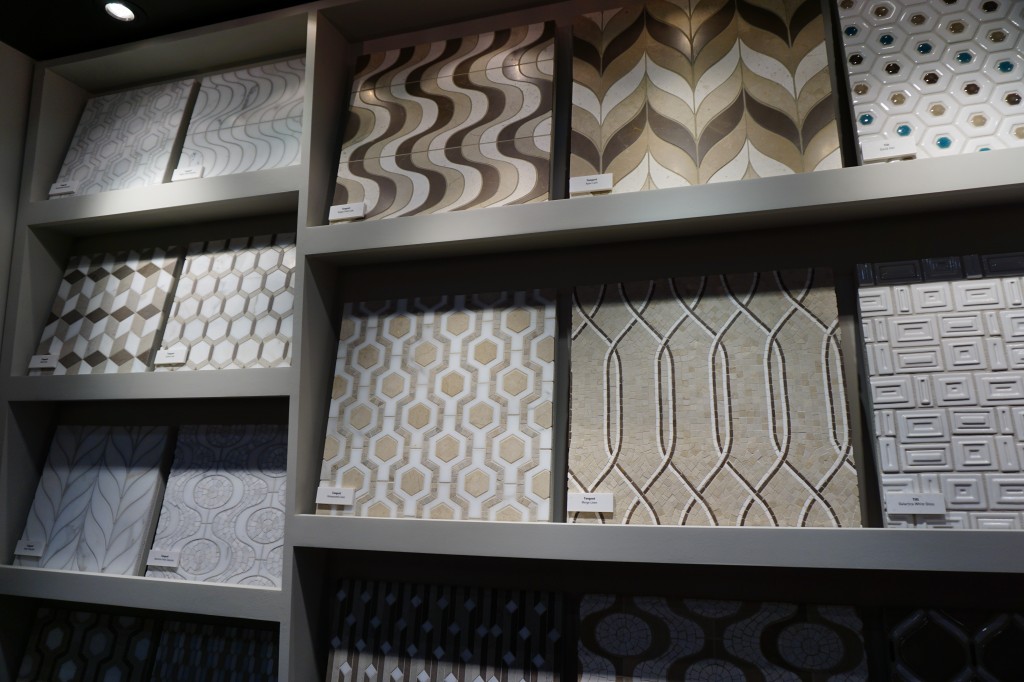
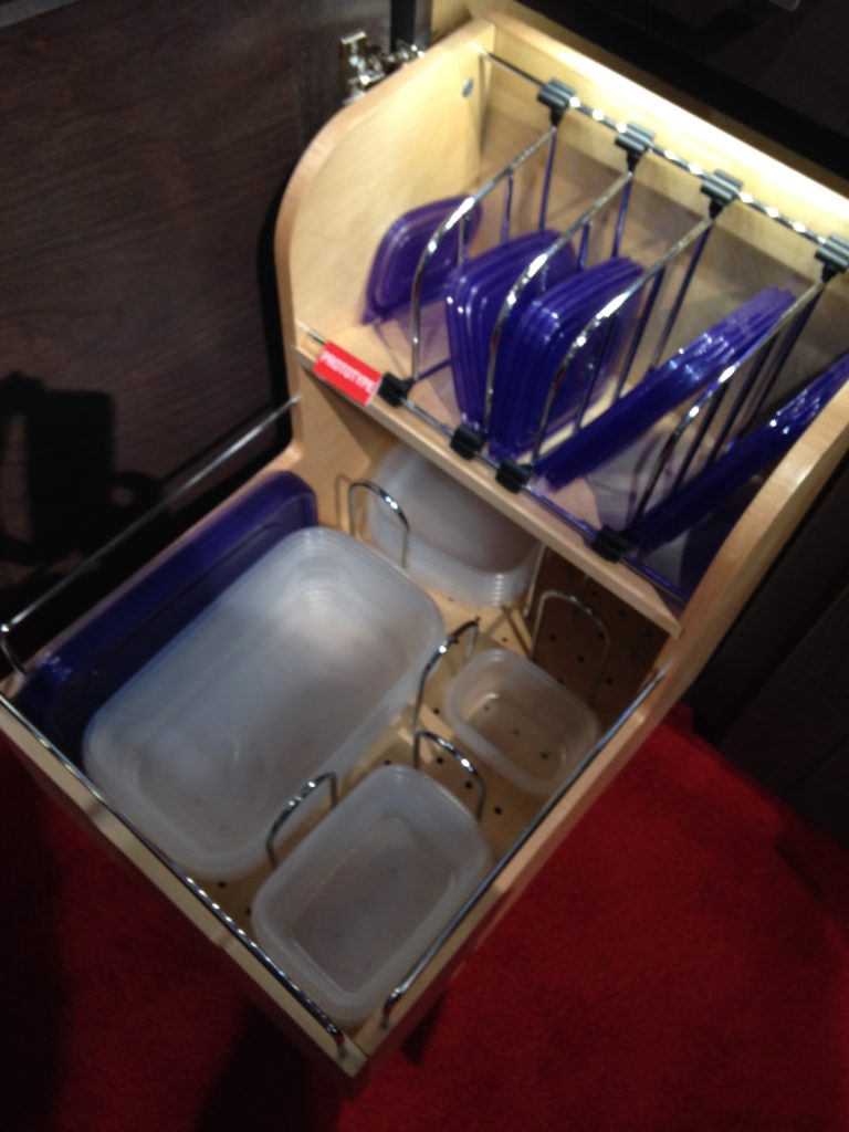
Day two of the Modenus Blog Tour was opening day for the  51st annual Kitchen and Bath Industry Show (KBIS).  The Bloggers were given an inside peek into many of the booths at the show and as we toured,  trends most certainly did emerge.New laminates by Wilsonart are not your grandma's counters! "There is a three year lag between Europe and North America when it comes to trends", says Warren Ramsland, President of Top Knobs. Taking that into account, there were many differences between what I saw here and what I witnessed in Italy at Euro Cucina last year.  Perhaps the biggest European influence that continues to pick up steam is contemporary design for both the kitchen and bath.KBIS2015,Wilsonart,#blogtourvegas,ModenusLaminates are enjoying a serge in popularity.  This material is more widely used and experimented with by our friends across the pond but we're picking up speed.  I was wowed by the offerings at Wilsonart who debuted their "Spirit of Mindfulness" collection of  27  exciting laminate colors and textures.   Also introduced were a line of quartz counter tops in a great assortment of neutral, workable hues.  By late spring, a selection of 50 patterns will showcase a full range of colors, textures and four structures: Fine and Small Scale, Medium Scale, Large Scale, and Veining and Movement. That is one of the things I love about quartz, the wide variety of pattern, or no pattern at all! I was impressed not only by the innovative product development at Wilsonart but also their philosophy.  This press release statement says it all:"Fueled in part by a turbulent economy, today’s more budget-savvy and eco-conscious consumers have responded by making their homes the calm eye in the storm of life. For many, this translates to finding a spirit of mindfulness within themselves and expressing it in their surroundings."Wilsonart Quarts, blogtourvegas,modenus,kbis2015One of the new Wilsonart quartz options showing beautiful veining. Photo courtesy of WilsonartCheck out the Wilsonart Visualizer to help you pick your counter top color.  It's easy, fun and very helpfulTechnology is also taking the kitchen and bath world by storm.  There were numerous examples but two stood out for me.  A company called TechTop took home the Best In Show Award for their counter top charging technology.  Simply place your phone, tablet etc. on the counter top and viola' it will charge, no plug-in required.  Untitled drawing (2)This great idea is from LG Hausy, yes it's the same "Life's Good" LG that makes appliances.  They make counter tops too. I also loved this Solna articulating faucet by one of my favorite brands, Brizo.  How convenient, right?!Fifty Shades of Gray has moved on to what I call "greige".  It's the new warm toned beigey-gray which I saw everywhere! Palettes are definitely neutral.  A great example is the Tangent collection by Walker Zanger.  Love the mid-century inspiration which I also saw a lot of at the show. This is Ipanema from the Tangent stone mosaic collection by Walker ZangerWalker-Zanger  deals in tile, marble and stone artistry.  Their collections are arguably the most innovative I've seen.  Case in point is their Sterling Row collection, inspired by menswear and a favorite at the show.   I found it to be extremely sophisticated, eye catching and innovative.  The collection was a favorite at the show. Walker Zanger was rocking the neutrals with innovative patterning and designSterling Row Collection, porcelain tile by Walker ZangerWe saw more of the Sterling Row Collection later on the blog tour in The New American Home, so there's more to come!Perhaps the BIGGEST trend of the show was personalization.  I mentioned this in the last post about Thermador but they were not alone.  Here are a few more pics highlighting the concept.  Frigidaire's SpaceWise Custom Flex refrigerators allow you to totally customize the shelves inside by moving the drawers and shelving to your desired configuration.2015-01-20 11.27.20 How about this great storage system by Rev-A- Shelf?  I know we all want this level of organization in our lives, yes? Right now this is a prototype but the response from the industry was good so I think we can expect to see this in the coming year.RevaShelf's prototype organizerEnough for now?  Well there's more to come.Up next:   KBIS 2015 Part II where I'll tell you about all my great finds for the bath and more.