Tile of Spain, a collective of 90 Spanish ceramic wall and floor tile manufacturers, recently showcased new collections and innovations at the Cersaie 2014 show. Held last month in Bologne, Italy, Cersaie is THE yearly international exhibition of ceramic tile.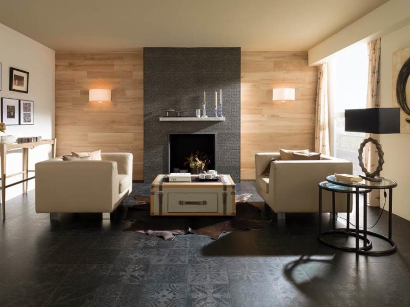 I love to note the trends at this show as they are a barometer of what we’ll be seeing here in the near future. It’s not only the tile itself but how it’s being used that intrigues me and can offer us a wealth of design ideas.Tile has been used in building as far back as 3000BC in ancient Greece. First used to replace thatch roofs, they were desired for their fire resistance. Today tile finishes are vast, varied and constantly reinvented through the advent of new technologies affecting both performance and aesthetics.This year Spanish manufacturers, reflecting the latest design trends, showed vintage styles, hexagon shapes, three dimensional profiles and more.Here are some of my favorites from Tiles of Spain showcased at Cersaie 2014Porcelanosa (above) makes a complete contemporary statement with this combination of tiles. I especially like the subtle injection of Old World suggested by the matte black floor tile.
 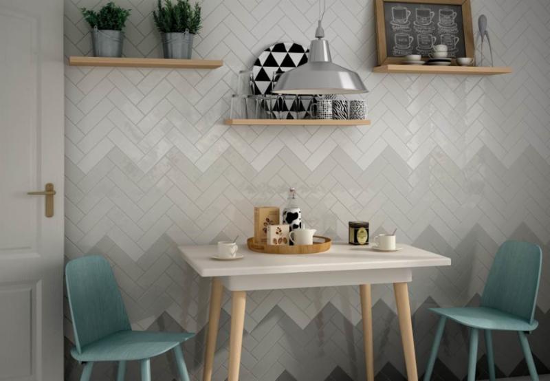 Other than the fact that chevrons are always cool, I love the gradient shades of grey shown here by Equipe Ceramicas, so original! The grey and white are also neutral and easy to design around.
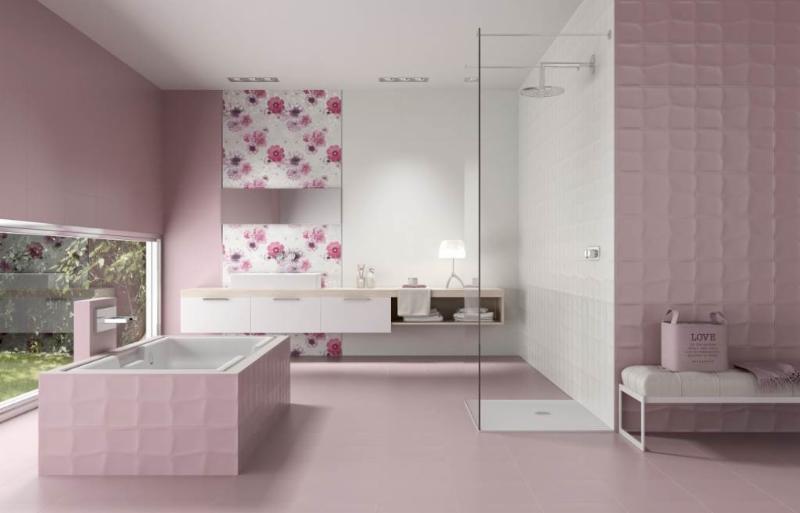 Think pink! A lot of chick-pad-pink from Unicer (above). It's all tile, the white, the print the textured and the matte. Would you?
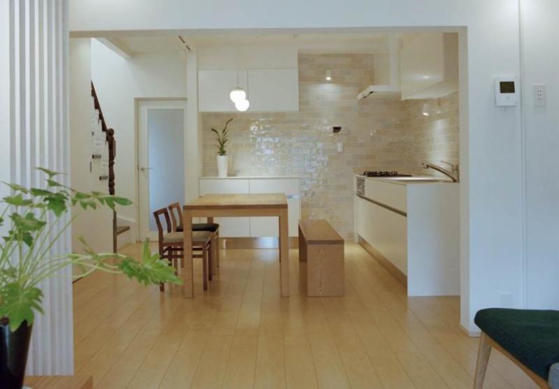 If you're going to use tile in the kitchen, go big! It really makes a statement.For more ideas check out the Tile of Spain USA Inspiration Gallery.
The New English Kitchen
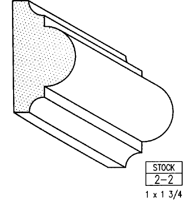
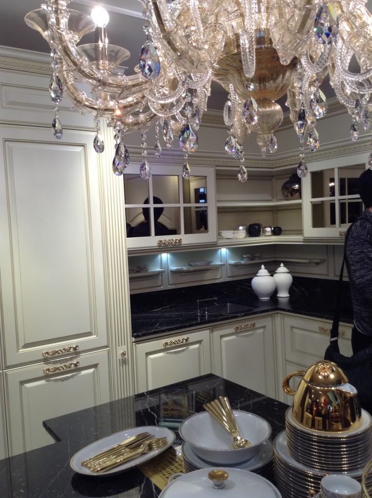
A bazillion years ago (circa 1994) when I first began my adventure in this business, the “English Kitchen” was all the rage in the high end market. I learned to design, by hand, in metric and things like astragal mouldings (yes moUldings with a “u”) were all the rage. Distressed, fly specked finishes were hot and no one wanted a white kitchen unless it was encrusted with glazing. I learned the English style by apprenticing with a true Englishman and gentleman who I shall be forever grateful to.
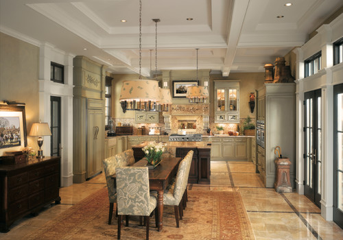
Those kitchens looked something like these photos from Houzz.com. Back in those days I did not work for a top notch custom shop like Brendan Donovan's. I worked for a top notch cabinet dealer so we actually imported this type of cabinetry from the UK. This came with its own set of challenges, to say the least. Just think of how long it would take to get a parts order and how expensive it was to transport! Charming and beautiful in their own way, these kitchens are full of detail and working on something like this was good training ground for a budding kitchen designer such as myself. That was then. 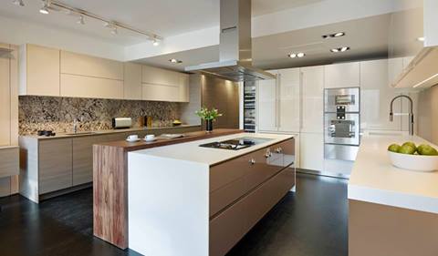 This is now.
 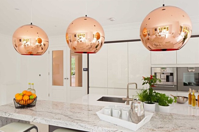 Today ground zero for the latest in high end kitchen design in London is located in the West End, in and around Wigmore Street. It's home to exclusive brands such as Bulthaup, Poggenpohl and the Nicholas Anthony showroom featuring the latest by SieMatic.
  The new English style is exactly that, new! Cleaner more modern design utilizing the latest technologies are now the order of the day. With the advent of the internet I believe it really is a small world. Ideas and trends fly over the web at the speed of light. We all influence each other cross pollinating our designs but there is still an appeal in wanting what the other peeps have. Many of us here want the new, slick, Euro styled kitchen and, dare I say, many Euros and Brits are amazed at our American sized appliances, namely the quintessential 36” refrigerator!
 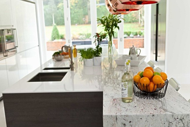 I feel the advances in technology when it comes to laminates and counter top material lend themselves to these new clean- lined looks. Decorative detail is found in interesting wood grains and the random markings of stone rather than from moldings and corbels. So what do you think? Are you yearning for the "olde world" look again? Do you think it's coming back or are we here to stay for the time being?
Euro Cucina 2014
I'm home and just about recovered from my jet lag. All pics are up for your perusal. It was a fabulous trip and my heartfelt gratitude goes out to the golden peeps at Blanco, including travel mate Christy Emens as well as Lori Dolnick of Frank Advertising. I was honored to be included with fellow bloggers Marilyn Russell (DesignMagnifique), Kelly Morisseau (KellyMorisseau.com) and Grace & Ken Kelly of (kitchendesigns.com). Having been to many trade shows in the US over the years, I've always wanted to experience the bigger, global picture. Now I have and it was amazing.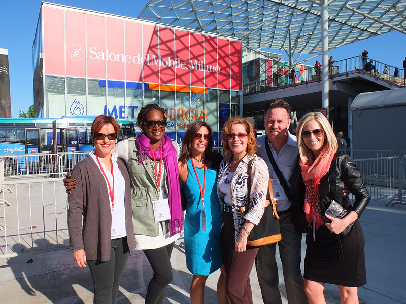 I arrived on Monday morning ready to explore. Lori and I took a stroll and stumbled upon a delicious lunch and a very cool design museum but first things first. I'm dying to tell you about all the products and trends I saw at the big show. Euro Cucina only comes along every two years as a part of the Salone del Mobile. Milano. There is also a whole section devoted to the bath called Salone Internazionale del Bagno. Kitchen gadgets and appliances are shown in the FTK section. I did a pretty good job of covering those but I estimate that was only about 20% of the entire show, the rest being furniture and other aspects of design. Here's what caught my eye.
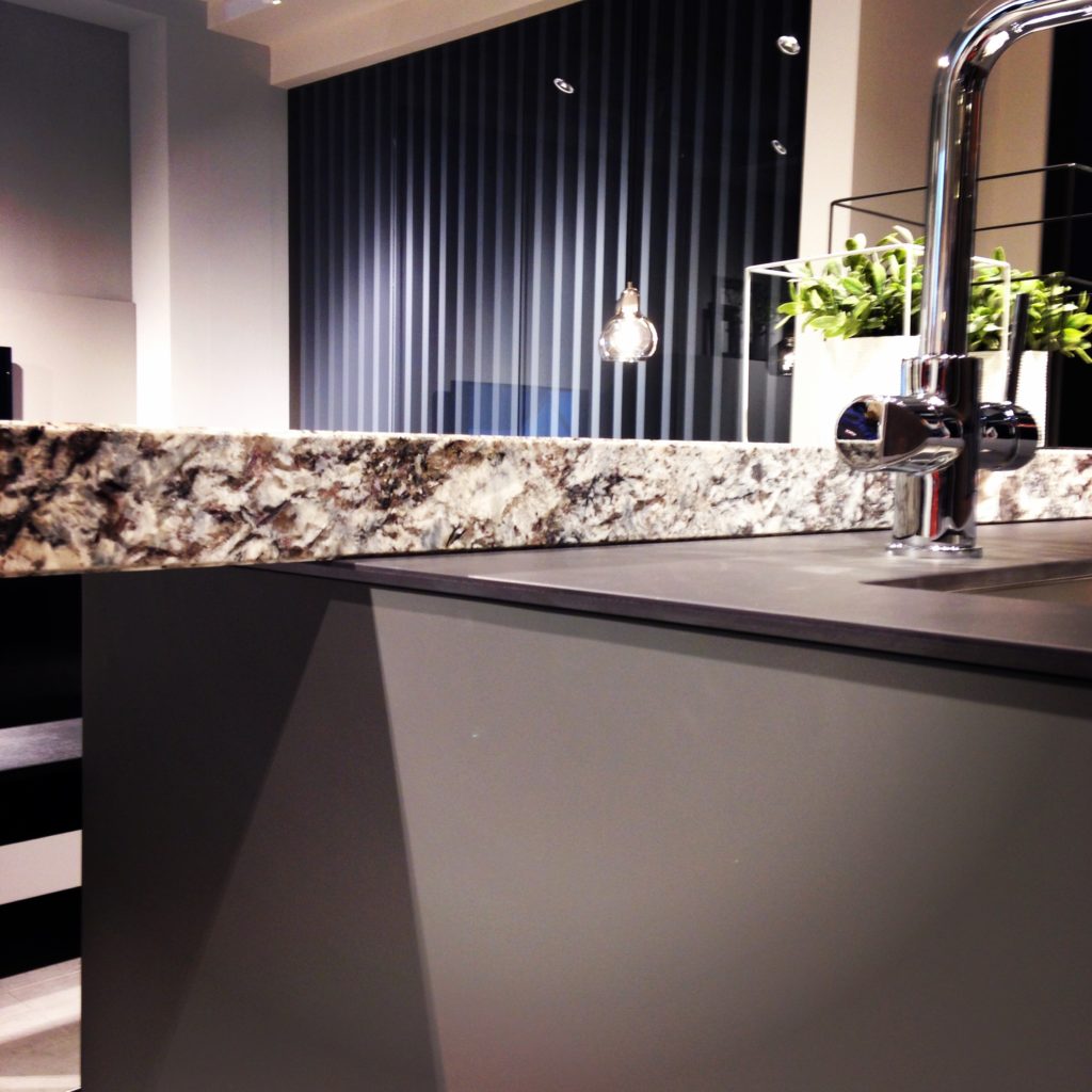
Counter tops were either very thin or chunky, like 1/2" for the thin and 3" for the chunky. I saw a lot of mixing of materials, in fact, that was probably the one biggest trend I saw for both counter tops and cabinets. It is also one that can easily be adapted to our US market. Counter top materials are much more adventurous than the usual granite or quartz that we are used to here. I saw wood, Corian, recycled composite material and more. The overlapping installation here was also quite common. The kitchen sink saw some new innovations including lots of accessories and different methods of installation. The inset style above, by Blanco, is factory installed by Leicht for a perfect fit. This particular one is not available to us in the US but we can get the Precision model with the distinctive square corner interior for undermount applications.
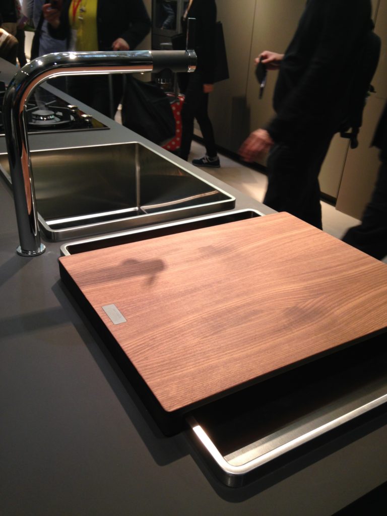
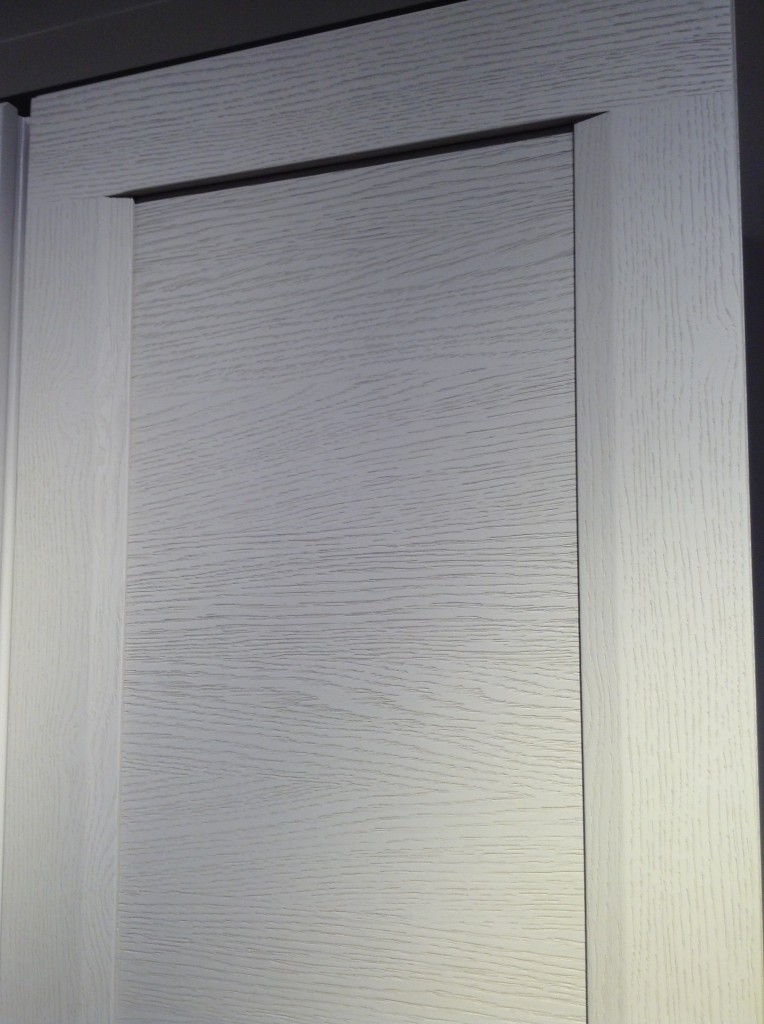
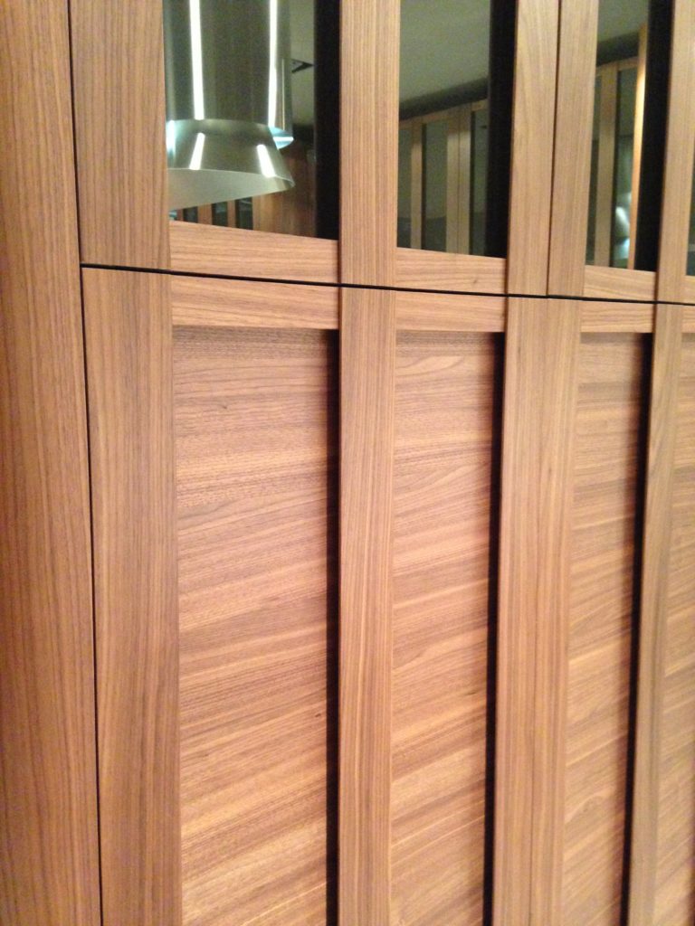 Cabinets featured lots of defined graining in woods such as white oak, rosewood and walnut in both horizontal and vertical directions, sometimes on the same door. I also saw some interesting variations on the popular slab and Shaker silhouettes.
 This is just the first in a series of posts about Milan and Salone Internazionale del Mobile. Upcoming posts will include our visits to Acheo and Poggenpohl showrooms and much more. So what do you think of these kitchen trends so far? I think some will make it over the pond but you can always know that whatever we do, we'll do it with an Americano twist. More later :)Click here for a peek at all my Milan photos!

