Every now and then I like to get out and about and mingle with the peeps in my industry. Last week I ventured a little outside of the bounds of strictly kitchen and bath design to experience The New Look of Luxury event held at the Design Center of the Americas (DCOTA).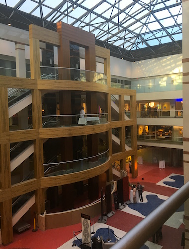 Suffice to say I was not disappointed. DCOTA is also home to luxury cabinet superstars SieMatic and Poggenphol. They were not open for this cocktail hour event but it was fun just to peek in the windows!
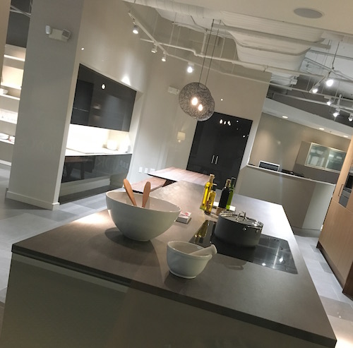
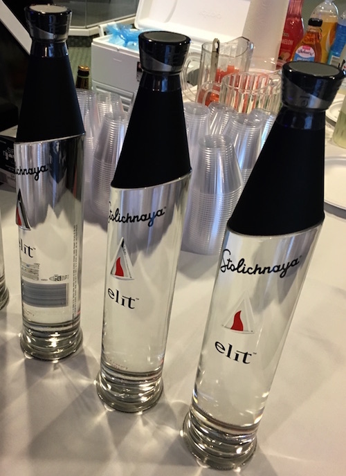
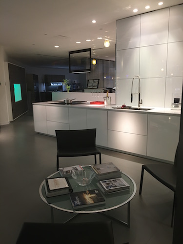 Refreshments were served to compliment the visual yumminess! High design even in this Elit vodka bottle by sponsor Stolichnaya.
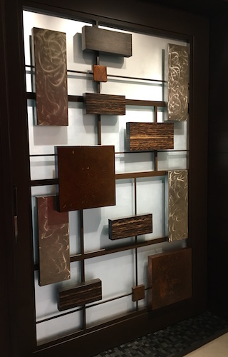
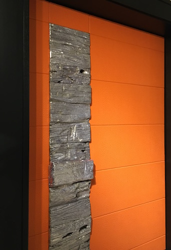
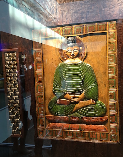
 First stop, Inside The Art of Craftsmanship. THESE DOORS! OMG, stunning in both scale and creativity. You would have to have just the right space for one of these, preferably BIG. Surprisingly there is not much info out there on this Florida based company. Suffice to say it’s very exclusive… I started snapping pics with wild abandon before I noticed the “no photography” signs. Sorry.
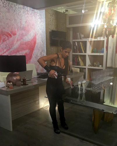
 The DCOTA is located on the outskirts of Miami and you don’t go to Miami without paying respects to Versace. Their designs can be over-the-top but the Versace Home showroom was very tasteful, even including coordinated sales associates and the requisite champs.
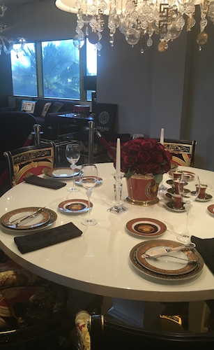
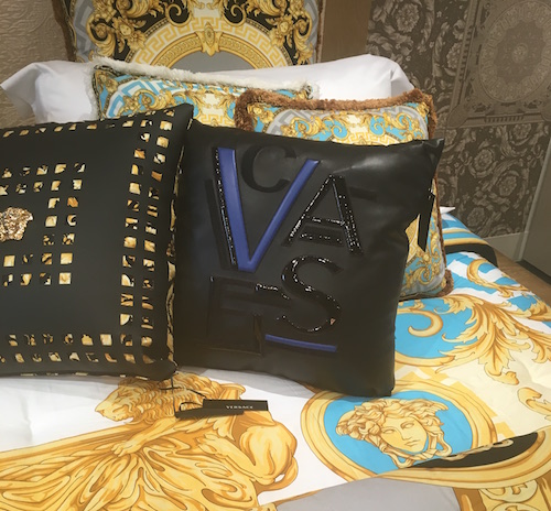
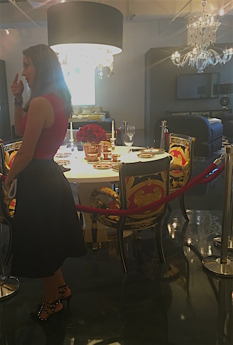 My absolute favorite item at Versace was this super cool leather cushion which sells for $4,000, worth every penny (maybe)
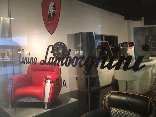
  Luxury has a sleek masculine look as well at Lamborghini Tonino Casa at FORMITALIAd. If you’re not partial to the Lamborghini look they offer Aston Martin and Mercedes Benz inspired furniture too.
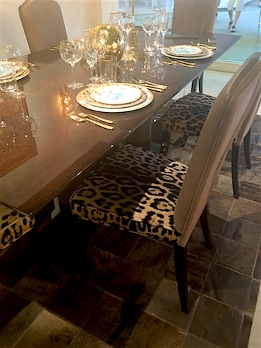
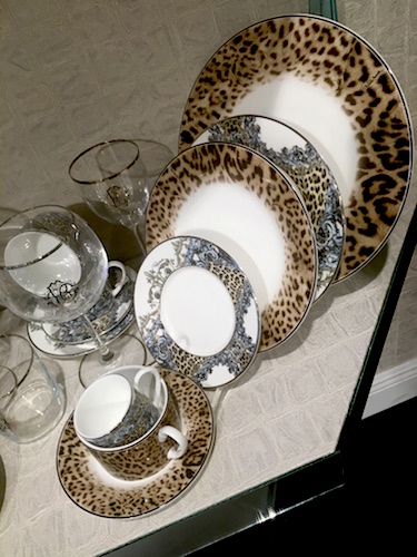
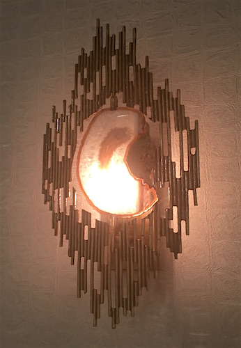
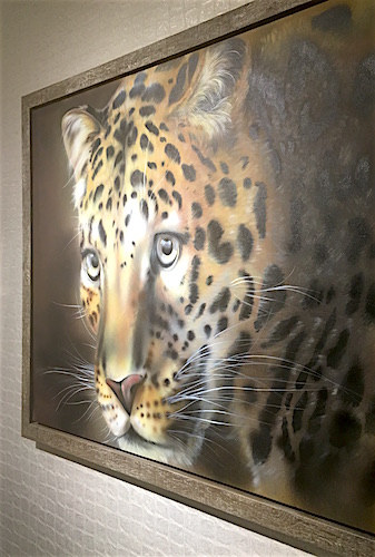
 Next on the tour was Casa Collezioni/Roberto Cavalli Home Interiors. I was looking forward to this as I loved their showings at last year’s Maison et Objet Americas. It’s elegant and edgy at the same time.
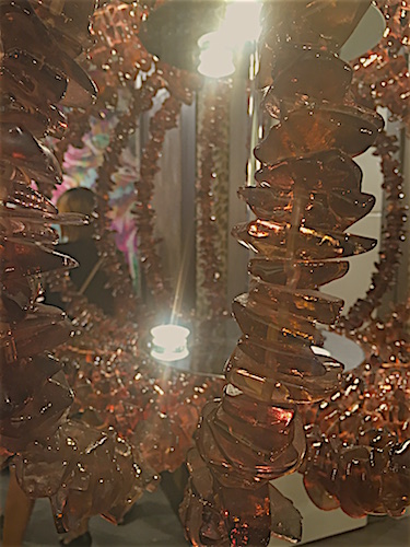
 Dedon, known as the premiere luxury furniture brand is innovative, colorful and comfy. All you need is the beach!
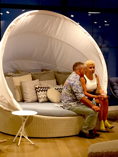
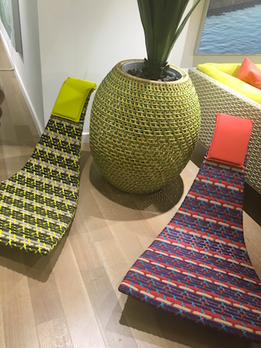 Last but certainly not least we got lost in the world of E.M. Soberon. They focus on high end architectural furniture. They also happen to be known for harvesting wood from fallen trees, mostly in Mexico. This is a unique approach that also yields one of a kind results. Mr. Soberon designs most of the products but they will also work with clients and designers visions to create the perfect piece.
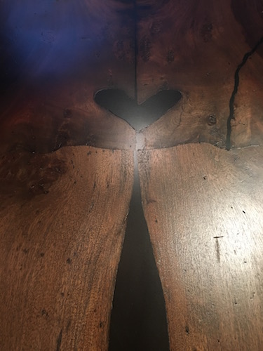 I’m so glad I went to this event. A big thank you to Casa Collezioni for the invite. The big takeaway from this evening is that I need to continue to get out there and see what is possible. Who knows, perhaps it can inspire me to create the formerly impossible... DCOTA http://dcota.com/dcota-information/ is open to- the-trade Monday –Friday 9-5. If you are not “trade” you can still check it out if you are accompanied by a design professional.
The Best of KBIS 2016
Bam! Another show is in the books and although it's been a busy week "back at the ranch", I've been dying to share my finds with you right here on Artful Kitchens.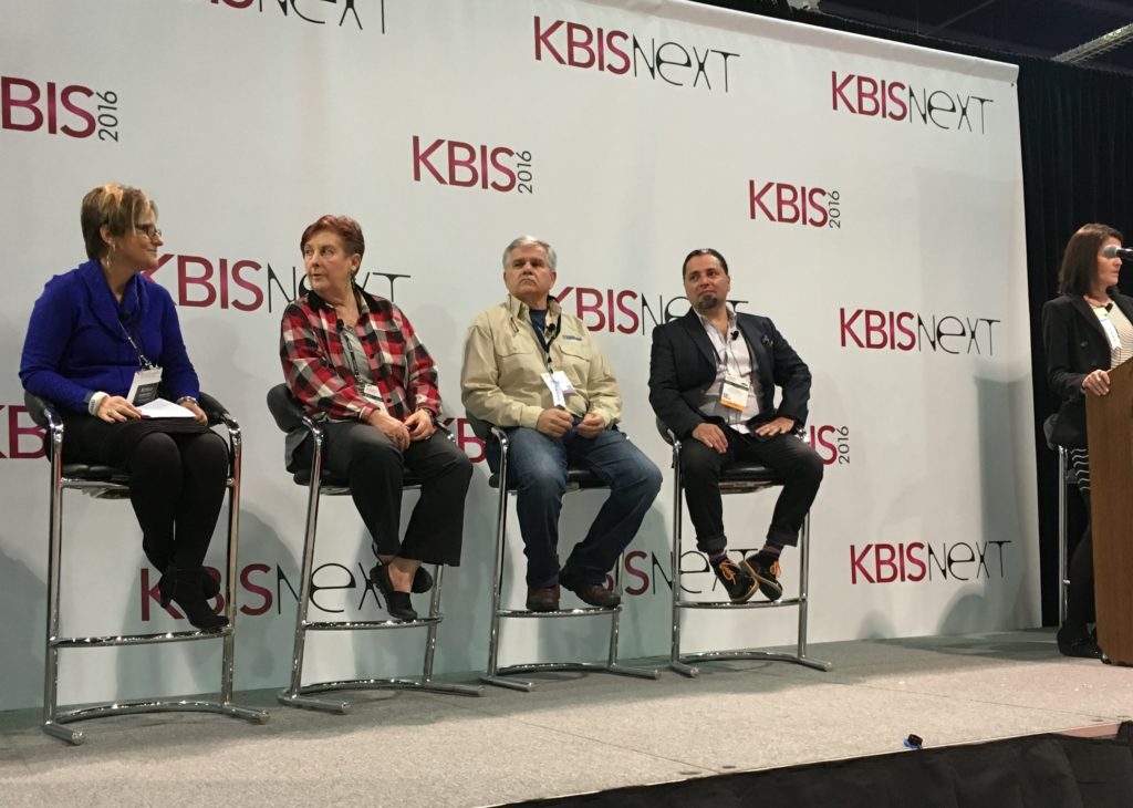 Las Vegas was host to three days of networking and education for the best of the Kitchen & Bath industry. As a member of the Kitchen & Bath Business Magazine's Advisory Board, I had the pleasure of appearing on the KBIS Next stage as a part of the panel discussion entitled Trials & Tribulations-Solutions to Your Biggest Kitchen & Bath Challenges. It was an exciting exchange of ideas between both the pros on the panel as well as a savvy and engaged audience.
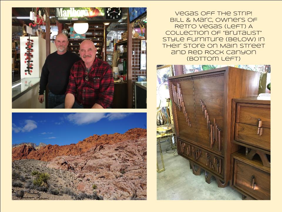
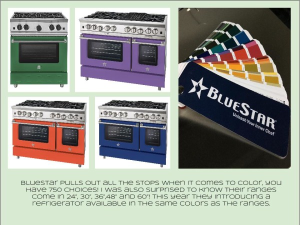
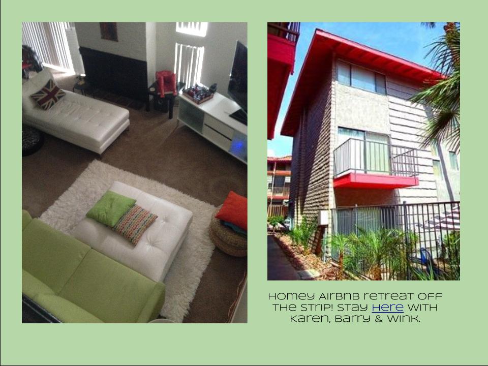 I also had the opportunity to spend some time in the Las Vegas I like best, off the strip! I hiked in the Red Rock Canyon and visited my friends at Retro Vegas on Main Street. My digs for this trip were with my dear pals Karen, Barry & Wink. They live in a midcentury modern gem that, rumor has it, was briefly home to Lucille Ball! They are avid Airbnb'ers and wonderful hosts. Check it out if you find yourself in Vegas. This location is so convenient to the Convention center I could walk, which I did, once. Mostly I Ubered. Enough walking happens on the show floor! So without further ado, here's my recap of the biggest and most notable trends and products that caught my eye at KBIS2016. ColorWhite still reigns. In fact paint giants Benjamin Moore and Sherwin Williams have both selected shades of white as their color of the year. You know I am a huge white fan. It is always the best backdrop for art and design. It also continues to be the favorite cabinet color in my area. Remember white is not just white, there are an infinite number of varieties you can have fun with. If you need more punch in your kitchen you could find some great options at the big show. I saw bright saturated colors in several appliance brands including Bertonazzi, Viking and BlueStar which offers 750 colors!
  Grey has not left the stage. The newest versions are warm, venturing into taupe territory. Textured wood grains such as cerused oak are really popular. Wood-Mode showed both traditional and contemporary versions of ribbon Mahogany.
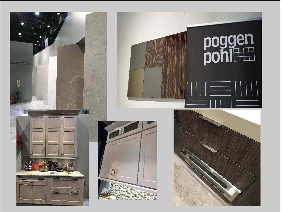
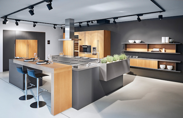 The Perfect TouchTouch latch technology was EVERYWHERE! If you prefer a sleek, uninterrupted look for your cabinets and appliances this is for you, a gentle nudge will open your cabinets. This is nothing new but it's taken off. I also loved the button that allows you to close this cabinet when you're done without resorting to dangerous acrobatics (I'm short).
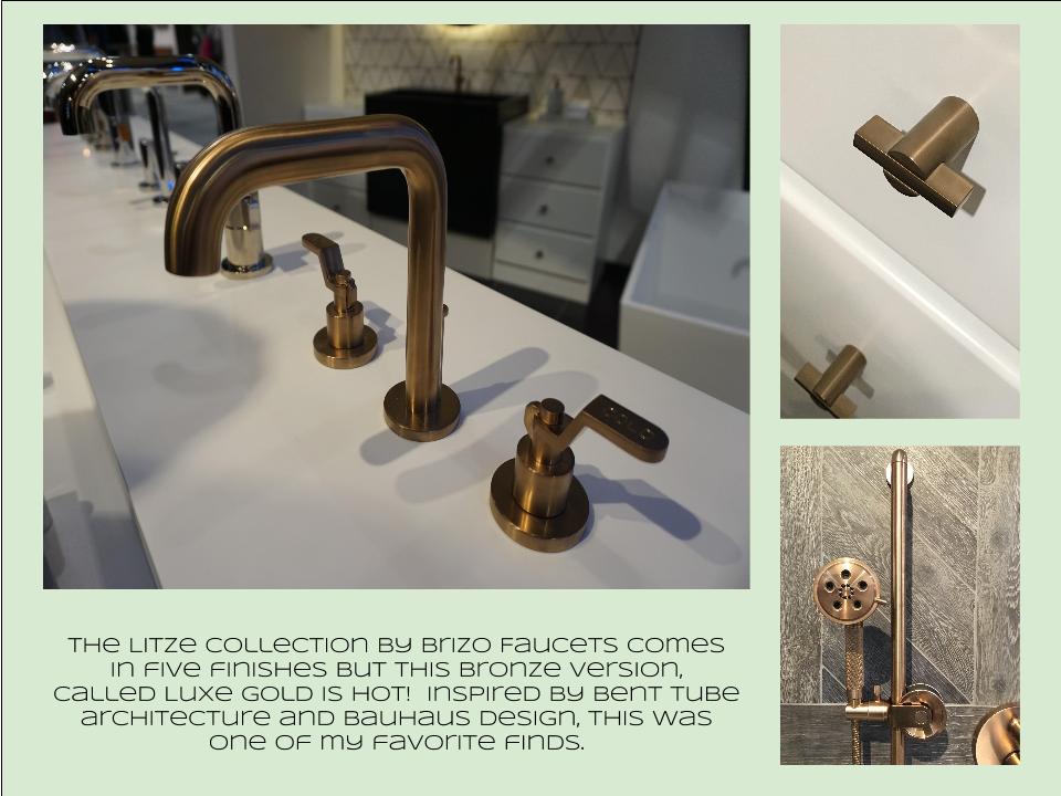
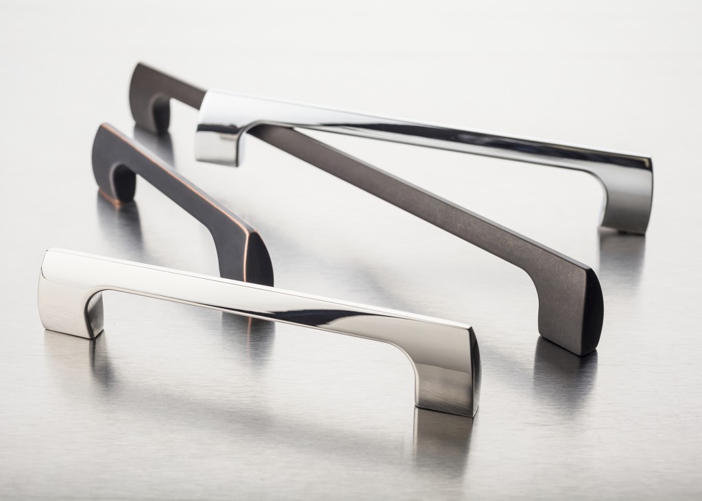
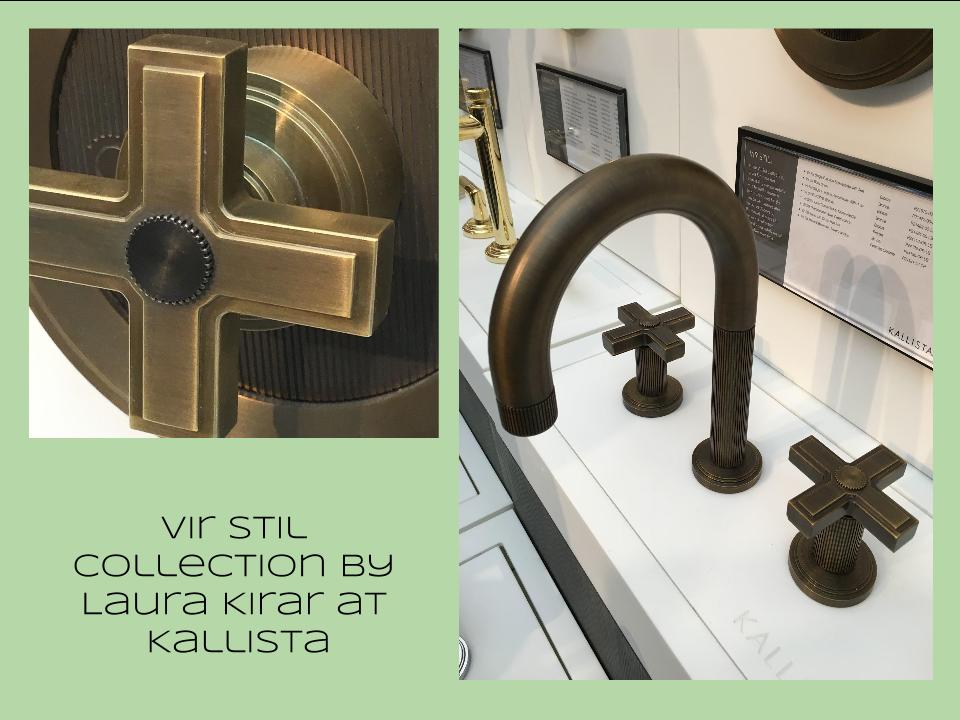 Feeling BrassyActually brass, copper, bronze and myriad versions are hot for plumbing fixtures and hardware. My favorites were the new BauHaus inspired Litze collection by Brizo Faucets. and Kallista's Vir Stil collection.
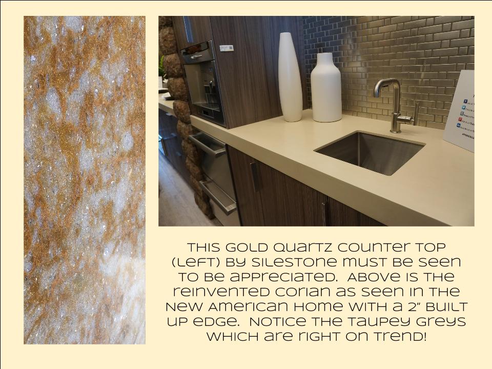
 Not Your Grandma's CorianIf you're like me Corian has been dead to you since about 1998. That sentiment has now ended in my book. I saw a 2"thick sleek contemporary version of Corian that was perfectly at home in The New American Home. The other exciting thing I saw in counter tops was this quartz by Silestone. Yes, it's GOLD! I just wish the photo could capture it's sparkly beauty.
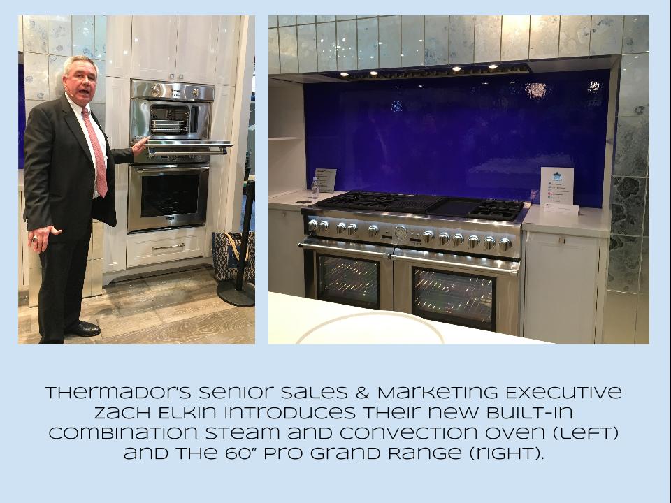
 Thrills from ThermadorAppliance brand Thermador held a press conference on the show floor to introduce a couple of impressive new products, the 60" pro range available with steam and a double oven featuring steam and convection. These are firsts in the industry.
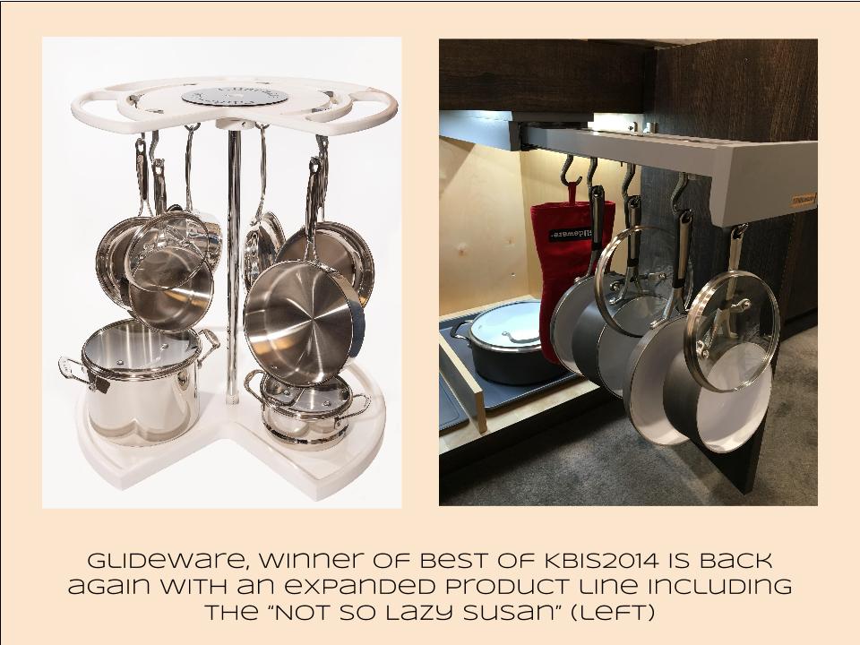
 Organize ItJust when I thought we had it all the category of organization it goes to the next level. There was a great representation of brands ranging from Hafele to Rev-A-Shelf to Hardware Resources but Glideware is taking the market by storm. If you've got a mess lurking somewhere I guarantee there's a way to make it neat and accessible
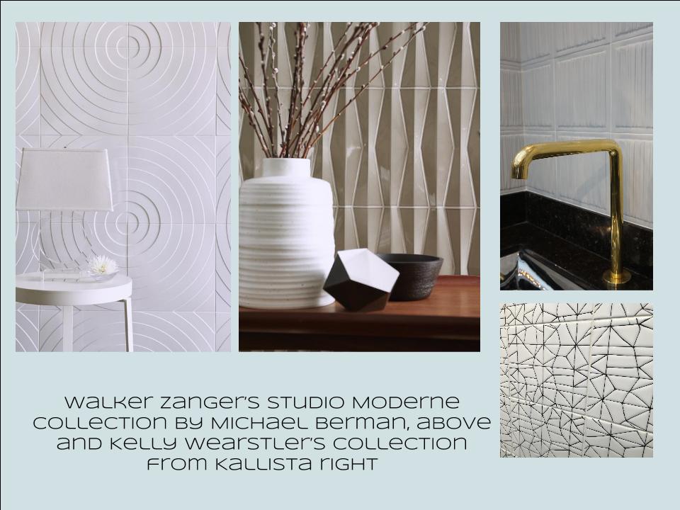
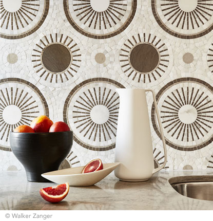
 Tile StyleMy two tile favorites were Michael Berman's Collection from Walker Zanger and, of course, Ann Sacks who are featuring a new line by L.A. design maven Kelly Wearstler. Love!
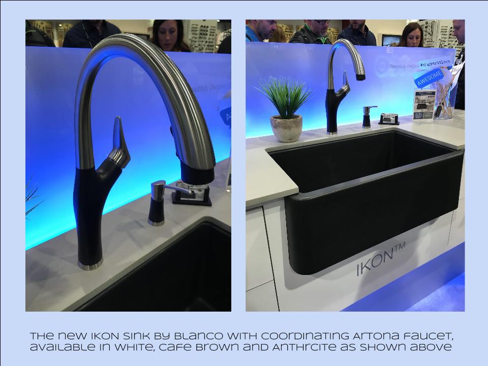
 I can IKONIf you read my blog you know I love me my Silgranit sinks, meet IKON the apron front version which easily works in any style kitchen from Traditional to Contemporary. Their Artona faucet perfectly complements the Silgranit sink.
 Stikwood Rocks!
Stikwood’s line of lightweight, real-wood planking offers designers and DIYers a peel-and-stick solution to achieve that perfect, sought-after blend of rustic and modern. It can be used on walls and ceilings and comes in tons of colors, even prints! I'm thinking this could be great on the back of a kitchen island.
Believe me, all this is just the tip of the proverbial iceberg. There was so much more to see and learn about at KBIS 2016. Check out this year's winners of Best of KBIS for more info and of course if you'd like any more info on what you see here email me at artfulkitchensbyglo@gmail.com
Perfect Party Mix: Poggenpohl, Blanco and More
One of the most delightful experiences I had on the recent Modenus Blog Tour during Design and Construction Week in Las Vegas (which I'm sure you've all been following on social media) was a penthouse cocktail party located in the Residences at Mandarin Oriental. 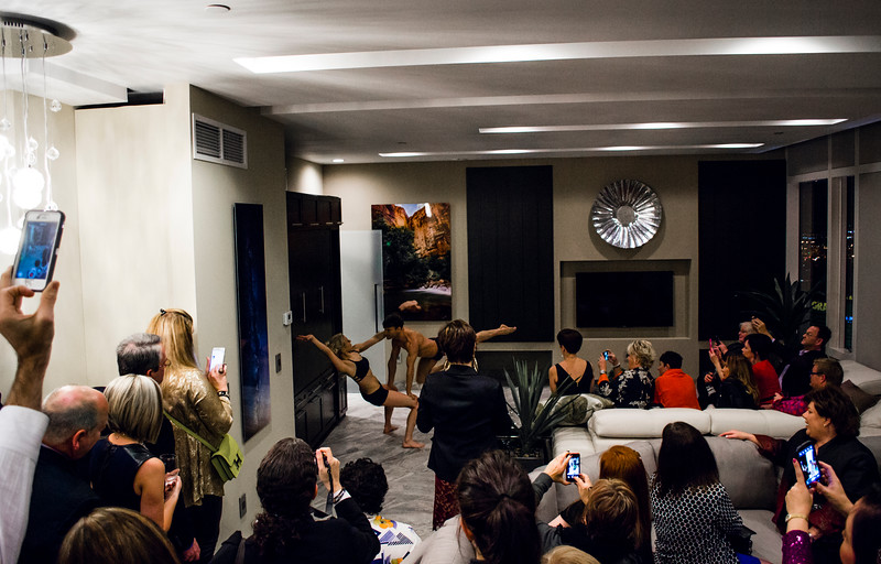 We toured three suites in the sky, more than forty floors up, all featuring products by Blanco, Poggenpohl and Cosentino, makers of Silestone and Dekton. These exclusive residences were host to private events for the press and the design community.
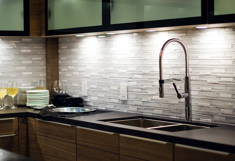 The theme of the evening was "The Art of Performance". Products were complemented by elegant bronze sculptures by California-based contemporary figurative artist Richard MacDonald.
 We also had living sculptures in the form of two very talented (and flexible) dancers.
 Blanco's Precision Steel Art sinks were on show along with their edgy Culina faucets. Incidentally this popular sink style comes in a 16" smaller size perfect for prep or bar sinks.
 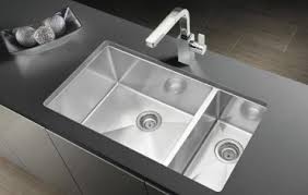 It features angular lines, something really original and different from your standard stainless steel sink.
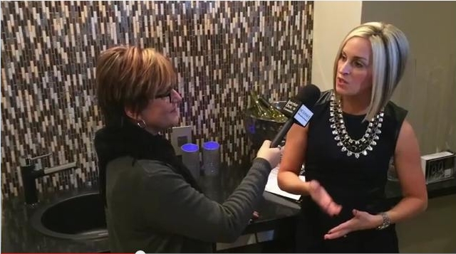 I had the pleasure of interviewing the lovely Christy Emens, Communications and Marketing Manager of Blanco. She touts "livable design" which is Blanco's version of personalization. This involves not only a variety of sink and faucet sizes, but also accessories to add convenience in the kitchen.
 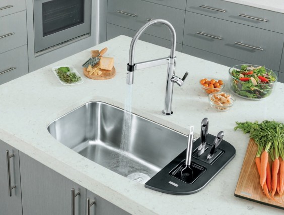 The Blanco One is a bit larger but still compact, plus you can trick it out with all kinds of goodies.Back to the party, The Art of Performance is all about how kitchens and baths can be beautiful as well as functional and I think they proved their point.
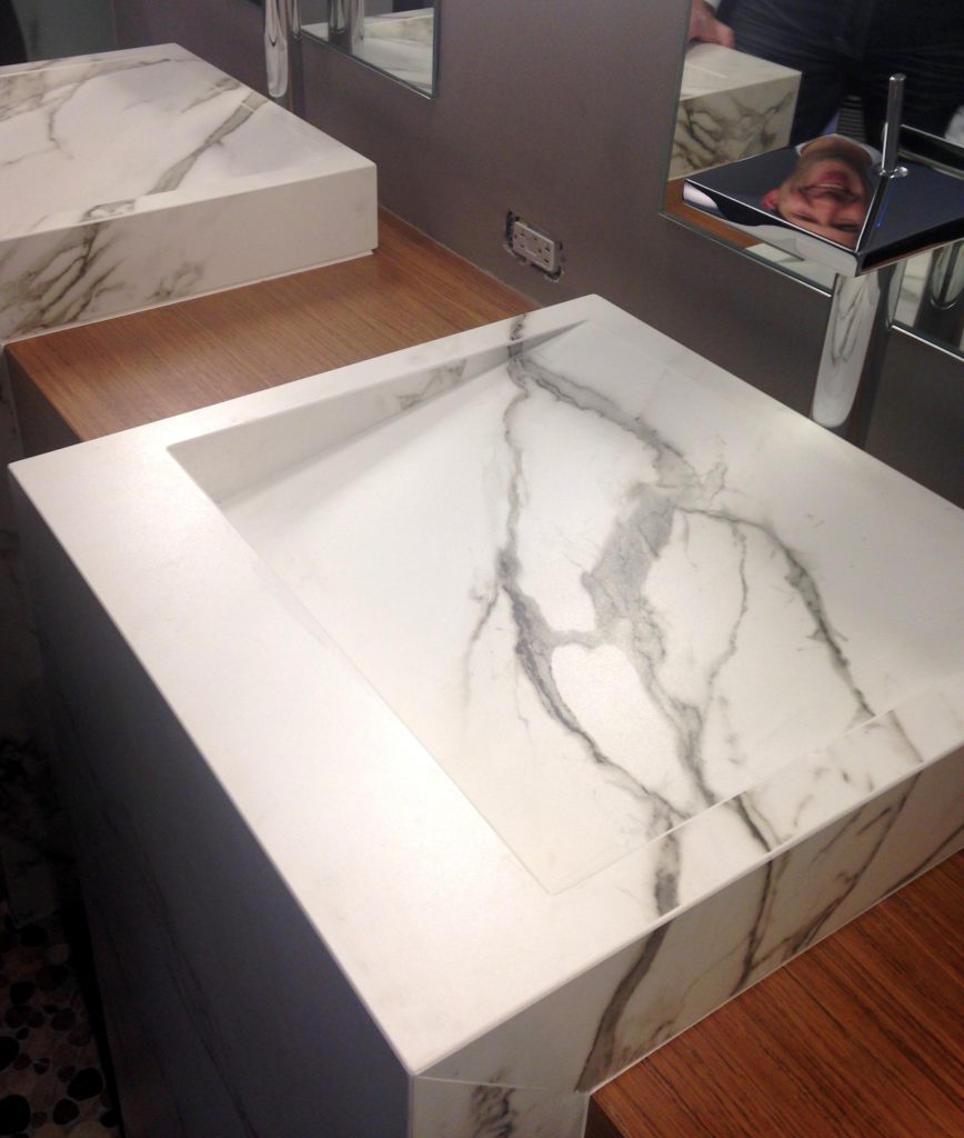 Cosentino showcased their new Dekton color, Aura. I love the continuous veining!
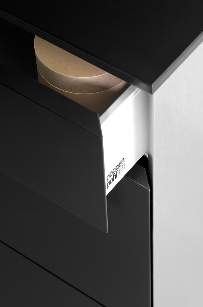
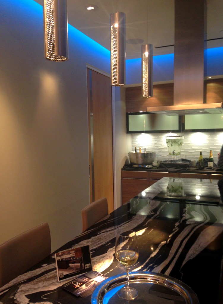 Poggenpohl's design statement continues the theme of "personalization", a major trend at the show. Your kitchen should be a reflection of your lifestyle.As a 123 year old company, Poggenpohl was instrumental in the development of the first modern day kitchens. The German company remains cutting edge in its design philosophy and use of materials. In 2014 they introduced Poggenpohl P´7350 Design by Porsche, the latest incarnation by Porsche Design Studio. The collection features a sleek new look achieved by the use of industrial mitering technology. Love!!
  Back to the party. Poggenpohl kitchen designer Anne Kramer, says “Our vision is to personalize each kitchen to the homeowner’s needs for entertaining, for cooking, for storage and for lifestyle. Unlike traditional homes, these residences are at the height of the Las Vegas strip. A rarified atmosphere where anything is possible." I think they succeeded. Next up: The Big Show: KBIS Trend Recap
Blog Tour Preview
As you know, I'll be heading off on Sunday to immerse myself in all the magic of KBIS2015, courtesy of super design site Modenus. This is a HUGE show for our industry and you can be sure I'll be partying taking careful notes and lots of pics to share with my blog peeps! 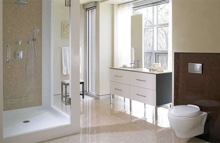 I'll be posting recaps here upon my return but if you'd like to follow along in real time please LIKE my new Face Book page, Kitchens for Living or you can follow me on Twitter and Instagram. If you're planning a new kitchen, listen up! We're about to unleash upon you all the latest product and design info you need to plan for your home.
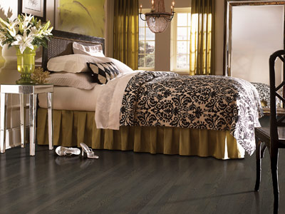 Don't forget to check Modenus to see what all the Blog Tour Bloggers are saying. These pics are a preview of the Blog Tour sponsor line up. That means that you'll be hearing more about this diverse group of industry favorites as I learn about them.
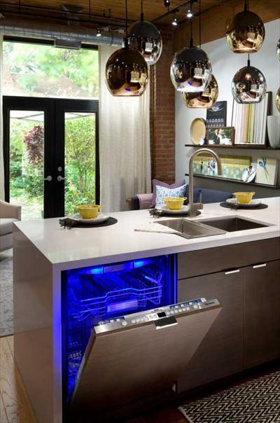
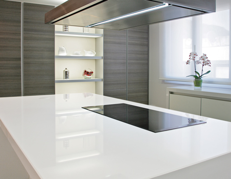
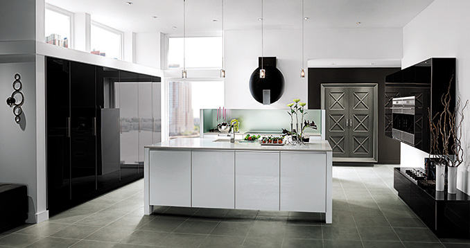
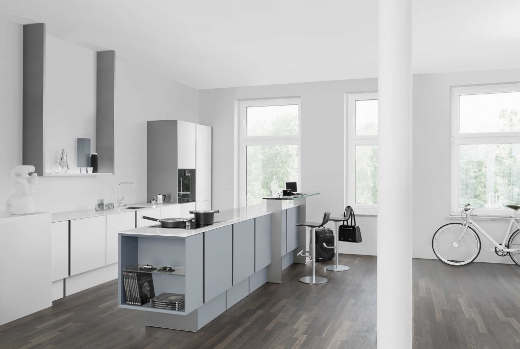
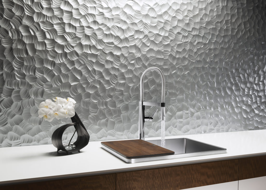 Now if you made it all the way to the end of this blog post, ladies (and certain gents), you shall be rewarded.
  Stay tuned for more about all these brands and more!
The New English Kitchen
A bazillion years ago (circa 1994) when I first began my adventure in this business, the “English Kitchen” was all the rage in the high end market. I learned to design, by hand, in metric and things like astragal mouldings (yes moUldings with a “u”) were all the rage. Distressed, fly specked finishes were hot and no one wanted a white kitchen unless it was encrusted with glazing. I learned the English style by apprenticing with a true Englishman and gentleman who I shall be forever grateful to.
Those kitchens looked something like these photos from Houzz.com. Back in those days I did not work for a top notch custom shop like Brendan Donovan's. I worked for a top notch cabinet dealer so we actually imported this type of cabinetry from the UK. This came with its own set of challenges, to say the least. Just think of how long it would take to get a parts order and how expensive it was to transport! Charming and beautiful in their own way, these kitchens are full of detail and working on something like this was good training ground for a budding kitchen designer such as myself. That was then. 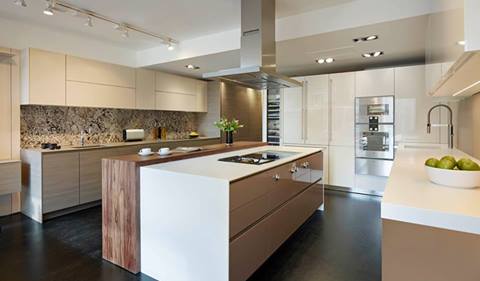 This is now.
 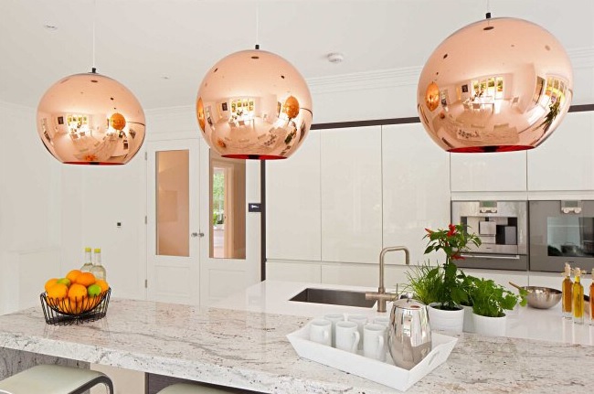 Today ground zero for the latest in high end kitchen design in London is located in the West End, in and around Wigmore Street. It's home to exclusive brands such as Bulthaup, Poggenpohl and the Nicholas Anthony showroom featuring the latest by SieMatic.
  The new English style is exactly that, new! Cleaner more modern design utilizing the latest technologies are now the order of the day. With the advent of the internet I believe it really is a small world. Ideas and trends fly over the web at the speed of light. We all influence each other cross pollinating our designs but there is still an appeal in wanting what the other peeps have. Many of us here want the new, slick, Euro styled kitchen and, dare I say, many Euros and Brits are amazed at our American sized appliances, namely the quintessential 36” refrigerator!
 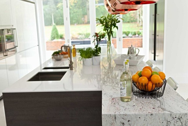 I feel the advances in technology when it comes to laminates and counter top material lend themselves to these new clean- lined looks. Decorative detail is found in interesting wood grains and the random markings of stone rather than from moldings and corbels. So what do you think? Are you yearning for the "olde world" look again? Do you think it's coming back or are we here to stay for the time being?
Kitchen Love, Italian Style at Acheo and Poggenpohl
Ok so you got me, Poggenpohl is not Italian. They are German, except when they're in Milan, then they're Italian. Good enough? I can hardly believe I’ve been home for over a week! Images and impressions are still swirling around in my head from the wonderful time I spent with Blanco and some fellow members of the Blanco Design Council in Milan. Design Week was not limited to the extensive exhibition at the Rho Fairgrounds but also included events all over town. We visited two memorable and cutting edge showrooms on our visit. 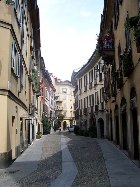 The first was Acheo (pronounced AH-kee-oh), located in the Brera district. Brera is also known today as the design district. It is also one of the few really old areas of Milan which saw 80% destruction during WWII. Acheo opened it’s showroom there in 2010. Today they are a showcase of quintessential contemporary Italian design for the kitchen.
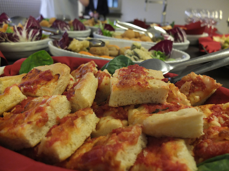
 They put on an impressive pre-dinner spread for us and the peeps from Modenus Blogtour Milan.
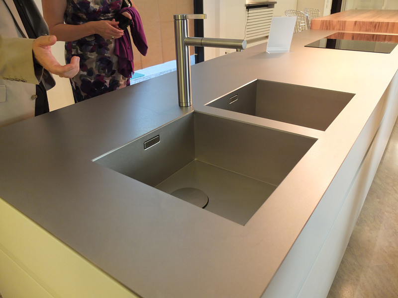
 All through our trip we saw many products not available here in the US. Some will become available, perhaps in other versions. One such item is this Durinox work top and sink (below) which is a part of the Blanco Steel Art collection. Think stainless steel on steroids!! Seriously, it is made with a finishing process used in the auto and aerospace industries so it is super scratch resistant and more than twice as hard as stainless steel. It is available, as shown, in Europe from Blanco in Germany. The sinks only will be available for undermount installation here in the US.
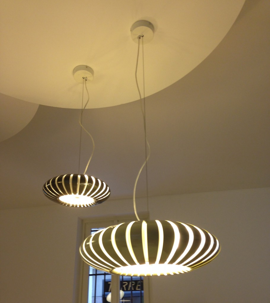
 We found that in Milan you could miss half the experience if you failed to look up! Look at these cool light fixtures at Acheo!
 The other showroom we had the pleasure of visiting during our visit was Poggenpohl. I think you could argue that they set the bar when it comes to innovation in contemporary cabinet design. As I mentioned, Poggenpohl is a German company and they claim to be the oldest kitchen brand in the world!
 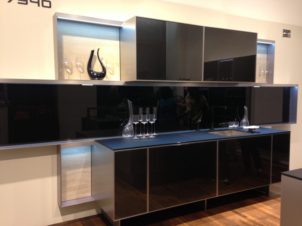 Some years ago Poggenpohl teamed up with the Porsche Design Studio to develop the P'7340 line of cabinets. Both companies focus their concentration on the overall line as well as providing unsurpassed quality of product. Above is a Porsche Design Kitchen P'7340 by Poggenpohl. It's hallmark is the aluminum frame which surrounds each box. Originally designed with men in mind, it has evolved into a brand appealing to discerning contemporary design devotees of either sex. Chief Poggenpohl designer Manfred Junker was on hand to explain the intricacies of design detail that go into the product including their trademark, no handle, fronts. In fact, he claims, they are the first to offer touch control on the refrigerator and dishwasher. Here's what they have to say about that on their website: "Handleless fronts emphasize the clean, uncompromised lines of the kitchen furniture."
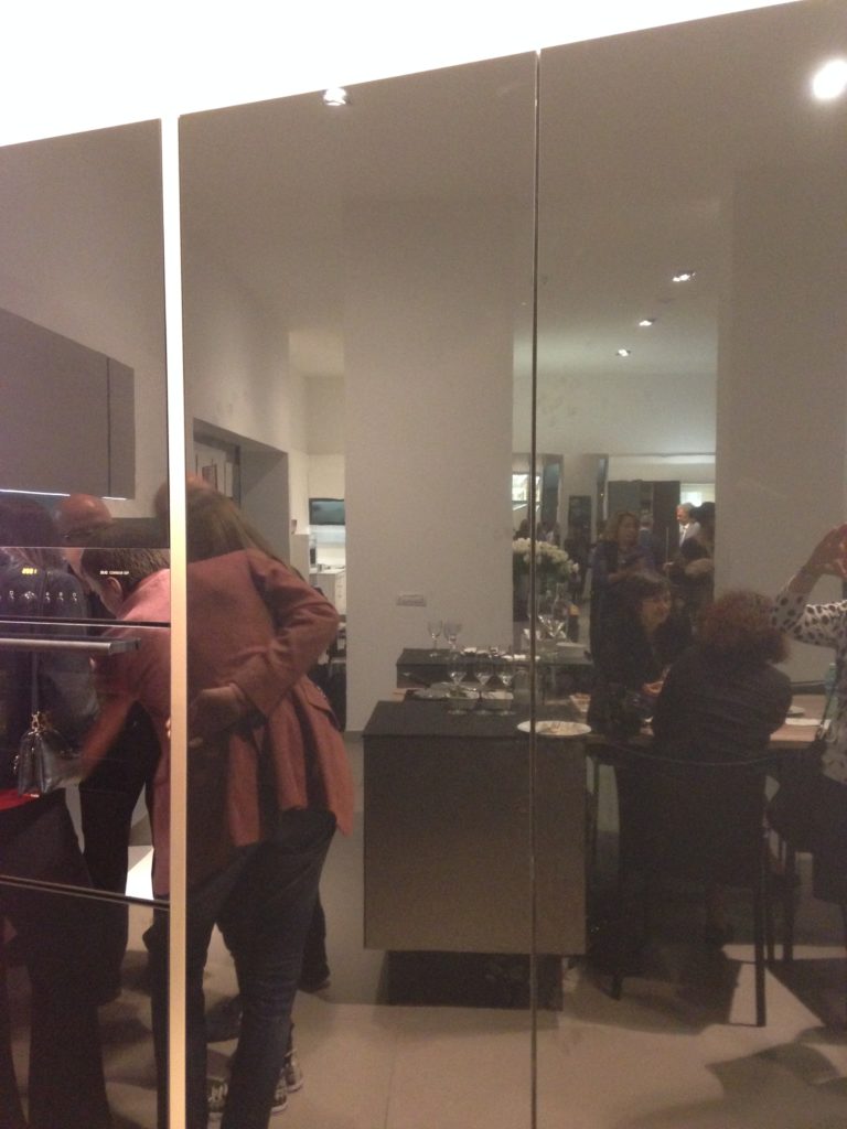 Poggenpohl took care of our tummies too. After all, design spotting can work up one hell of an appetite!
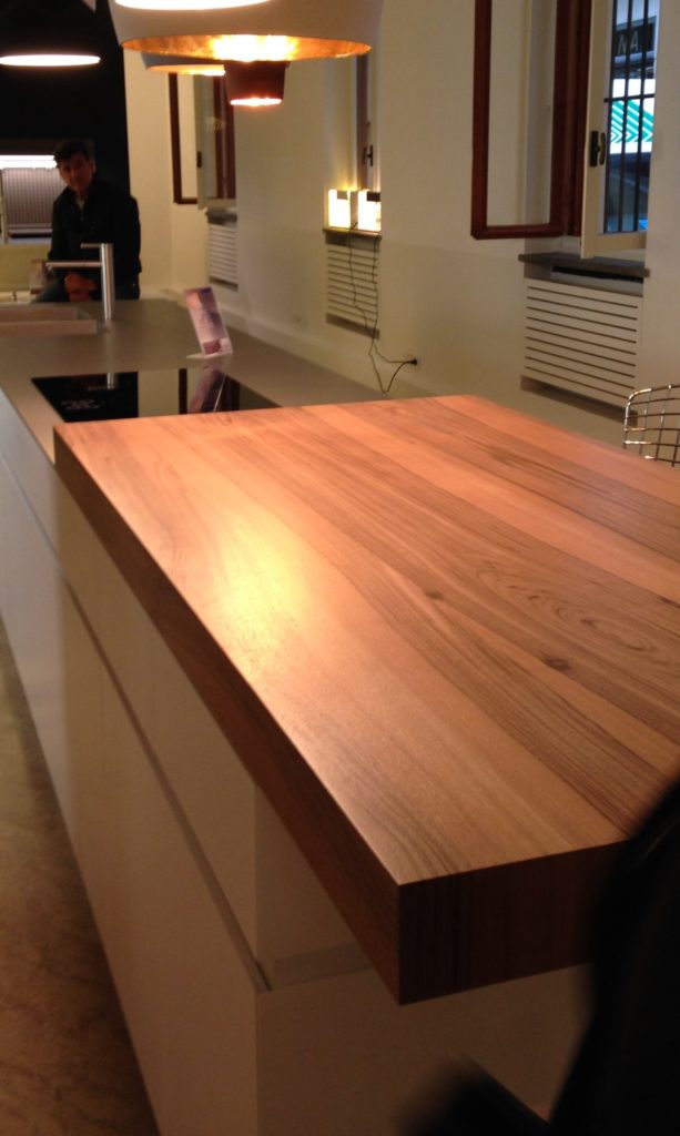
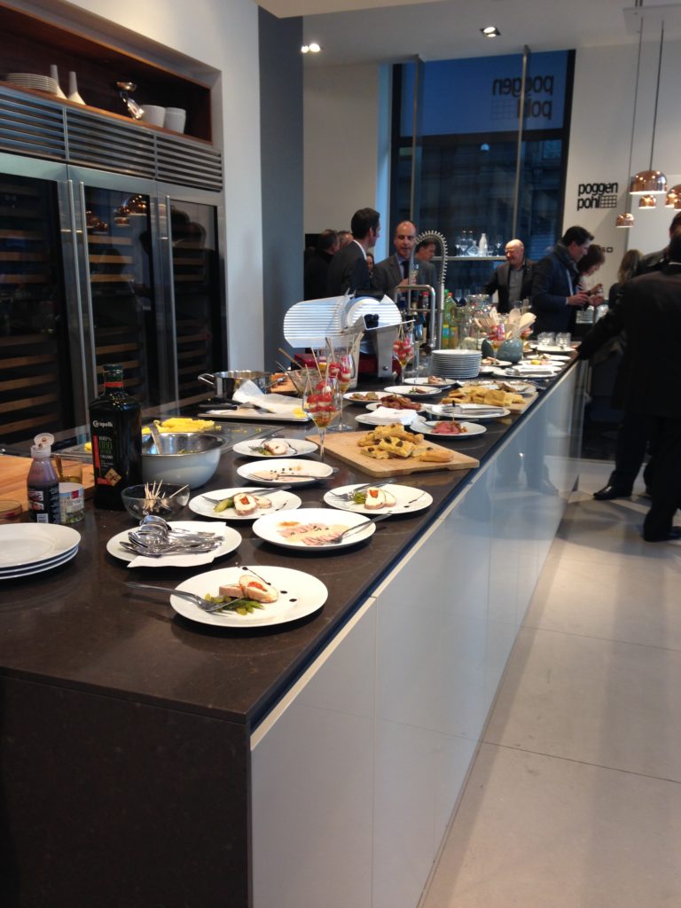 This newest version of P'7340 (see below) features a contrasting counter top inset made of solid New Zealand pine with a wire brushed finish.
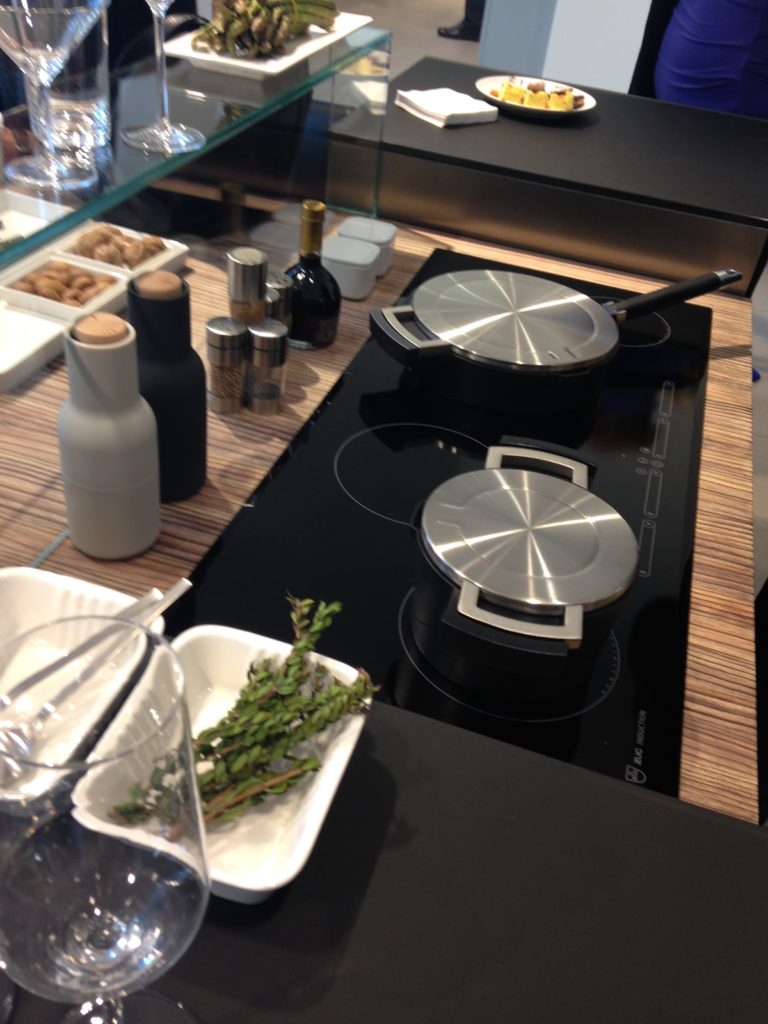 Next up: FTK (Technology for the Kitchen) This was the section of iSaloni featuring the latest trends and products in kitchen appliances.Click here for a peek at all my Milan photos!own and automatically completes the closing cycle


