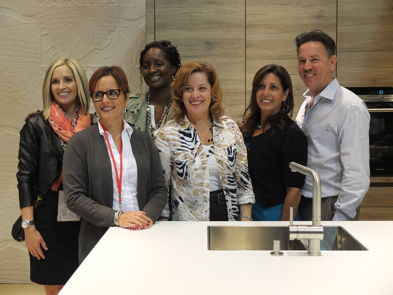
Let’s face it, things change. As we navigate those twists and turns of fate we can only hope to move forward, seeing new things with a fresh eye. Like it or not, change is a constant. You can dread it (understandable) or you can choose to embrace it. That said, it has been more than five years since I began my adventure as Kitchens for Living. I believe I have been true to my promise to share the latest design trends and product info for the heart of your home. We have frequently ventured out of the kitchen and even around the globe! I am so grateful for all the wonderful and talented kindred souls I have met along the way, fellow bloggers, designers and great organizations such as Modenus, Blanco, Brizo, Tile of Spain and many more. This blog has afforded me the opportunity to travel and bear witness to marvelous destinations and inspiring trade shows. Before this starts sounding too sad, let me tell you I have never felt so excited about the future and eager to explore new opportunities.
 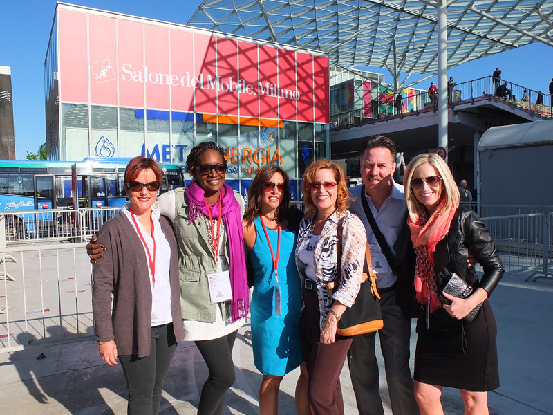 This will be the last post for Kitchens for Living. From now on I will be able to merge two of the things I love, kitchen design and art with my new site, Artful Kitchens. A big THANK YOU to Leslie Carothers of The Kaleidoscope Partnership for her guidance and insight which lead me to discover a new path full of promise and possibilities.
  Artful Kitchens will focus on all the ways you can use creativity to personalize your kitchen. Artful spaces reflect who you are and the way you live.
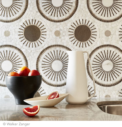
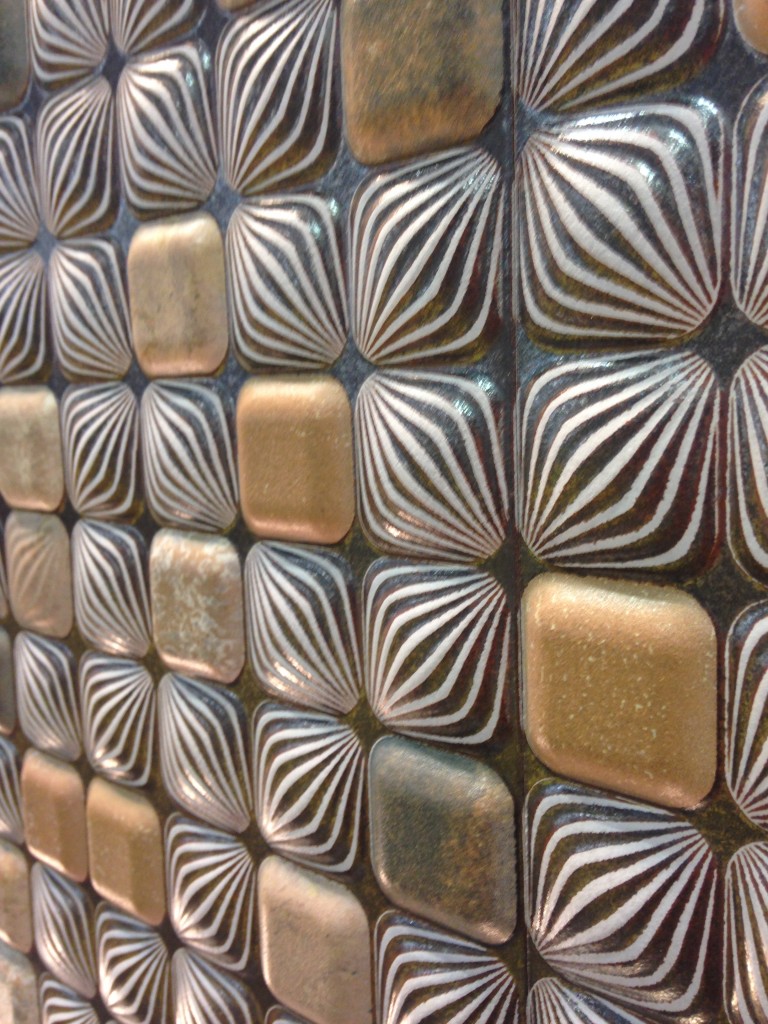
 The stunning tile above, by Walker Zanger, was featured at KBIS 2015 which I had the pleasure of attending with The Modenus Blog Tour Vegas.
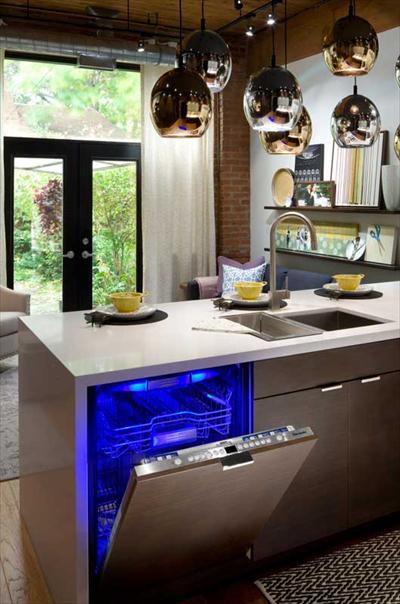
 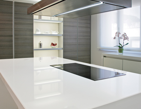 New products like this perfectly white quartz by Wilsonart enhance the kitchen with a feeling of crisp clean freshness!
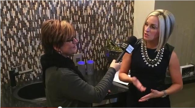
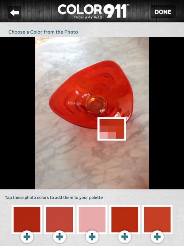
 Color is a primary element of the Artful Kitchen. We'll be talking a lot about that in an upcoming interview with Amy Wax of Color 911
 We will continue to incorporate new products and technologies as they emerge and we will explore all the artful ways of creating a kitchen that reflects who you really are. I’m so excited, I hope you’ll join me and spread the word. Last but certainly not least, whether you are a brand or a consumer, I want to collaborate with you!
  Continue the conversation on Face Book or email me at ArtfulKitchensbyGlo@gmail.com
Museum Inspirations, Italian Style
There are still a couple of amazing experiences I have not shared from my Milan adventure, as a part of the Blanco Design Council earlier this year. One of them was a visit to the Triennale di Milano Design Museum.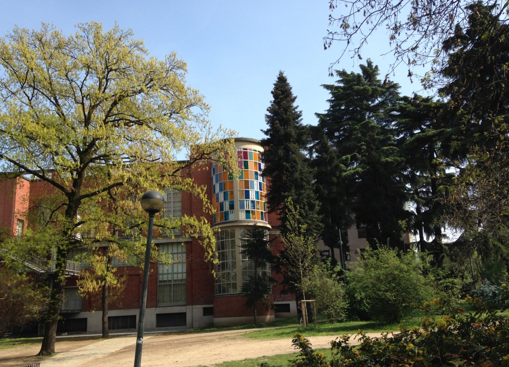 This center for contemporary art, architecture and design focuses on Italy's contribution to all these disciplines. Opened in 2007, rather than being a museum in the classical sense – one with a fixed collection – it is a space with continuously changing exhibitions. The building which houses the Triennale is located at the edge of the Parco Sempione and was built in 1933 by Giovanni Muzio. I discovered it on my first day in Milan whilst strolling in the park trying to shake off the last vestiges of jet lag. Wow!
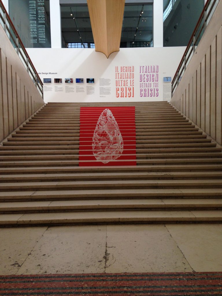
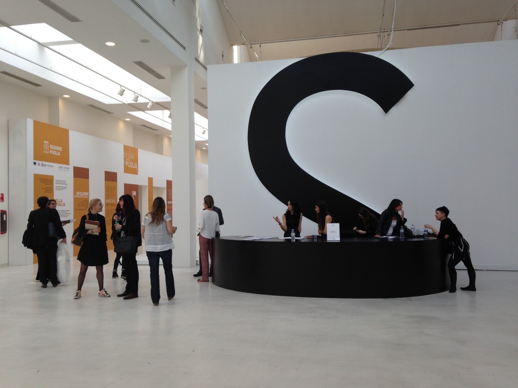
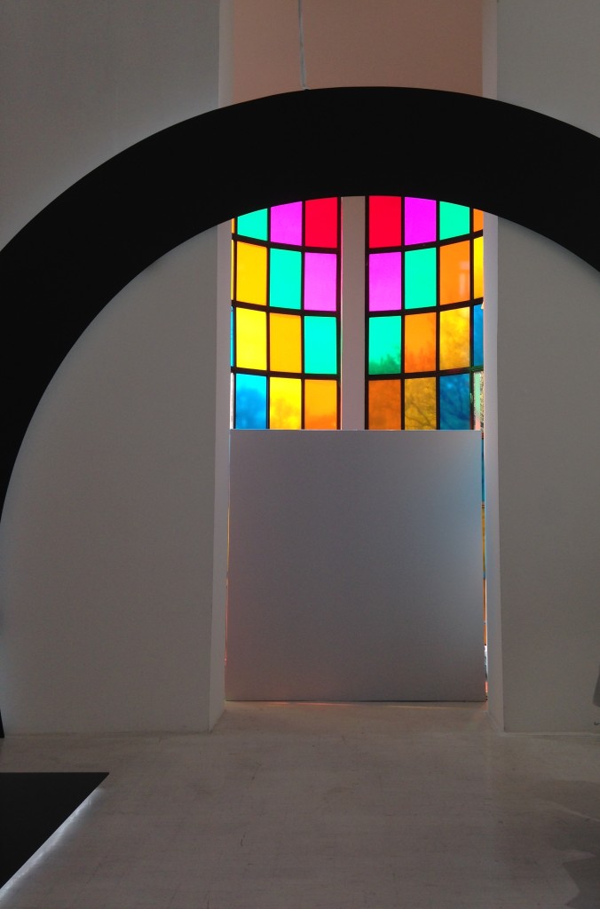 As I found my way to the second floor I discovered an exhibit called Constancy & Change in Korean Traditional Craft 2014. Why Korea you ask? Well Korea and Italy have a long history of diplomatic relations, 130 years.
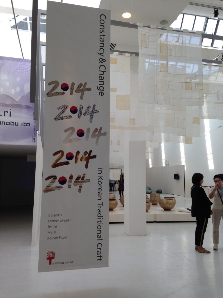 Korean culture has a 5000 year history to draw upon so the exhibit was vast and varied. Curated as a magical journey through time and space, the exhibit consisted of art works by twenty one prominent Korean artists. Although the media was so varied, the common threads were a conscious awareness and incorporation of nature, harmony, simplicity and sophistication.
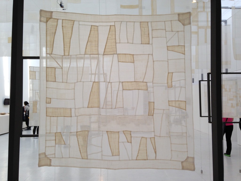
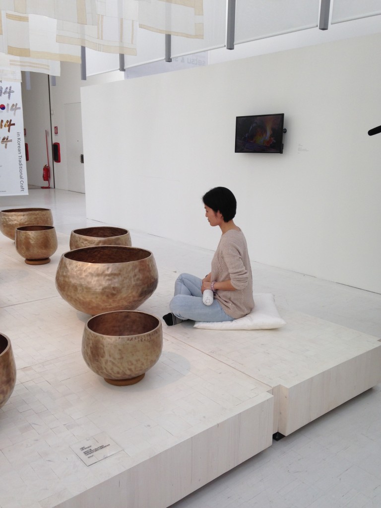 The theme of the exhibit was the five materials of traditional Korean craft: ceramics, hanji (Korean mulberry paper), textiles, metal and lacquer inlaid with mother-of-pearl. Displays were designed to enhance these materials.
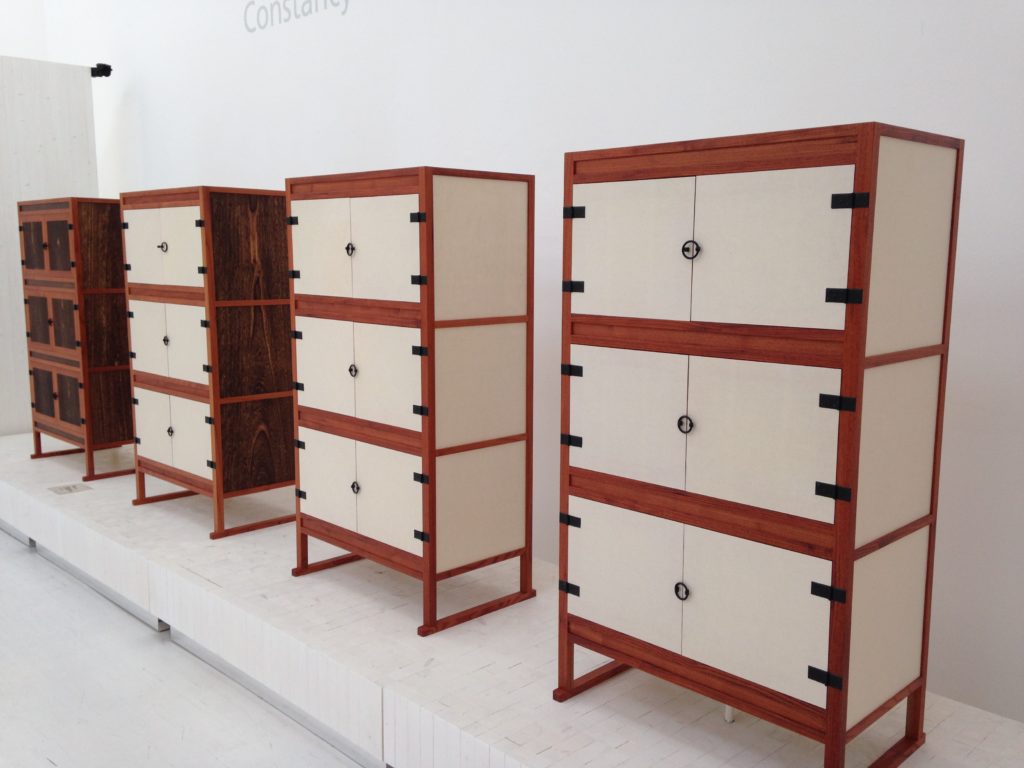
 I would be remiss if I didn't mention these stunning cabinets. These are actually book chests made from paulownia and chinaberry woods and hanji (mulberry paper), delicate and sturdy at the same time.
 Sometimes the best experiences are of the unplanned variety and that is especially true of this one. I guess the Triennale and I were meant to find each other. ;) More photos from this trip and my other travels visit Kitchens for Living on the Road
Last but not Least, il Bagno
We're finally coming to the end of my coverage of Design Week Milan as a part of the Blanco Design Council. I still have a couple other experiences to relate and will surprise you when you least expect it. For now let me tell you about the Salone Internazionale del Bagno, also known as the International Bath Show, a part of the bigger show held in Milan last month. I can't believe it's actually been nearly a month!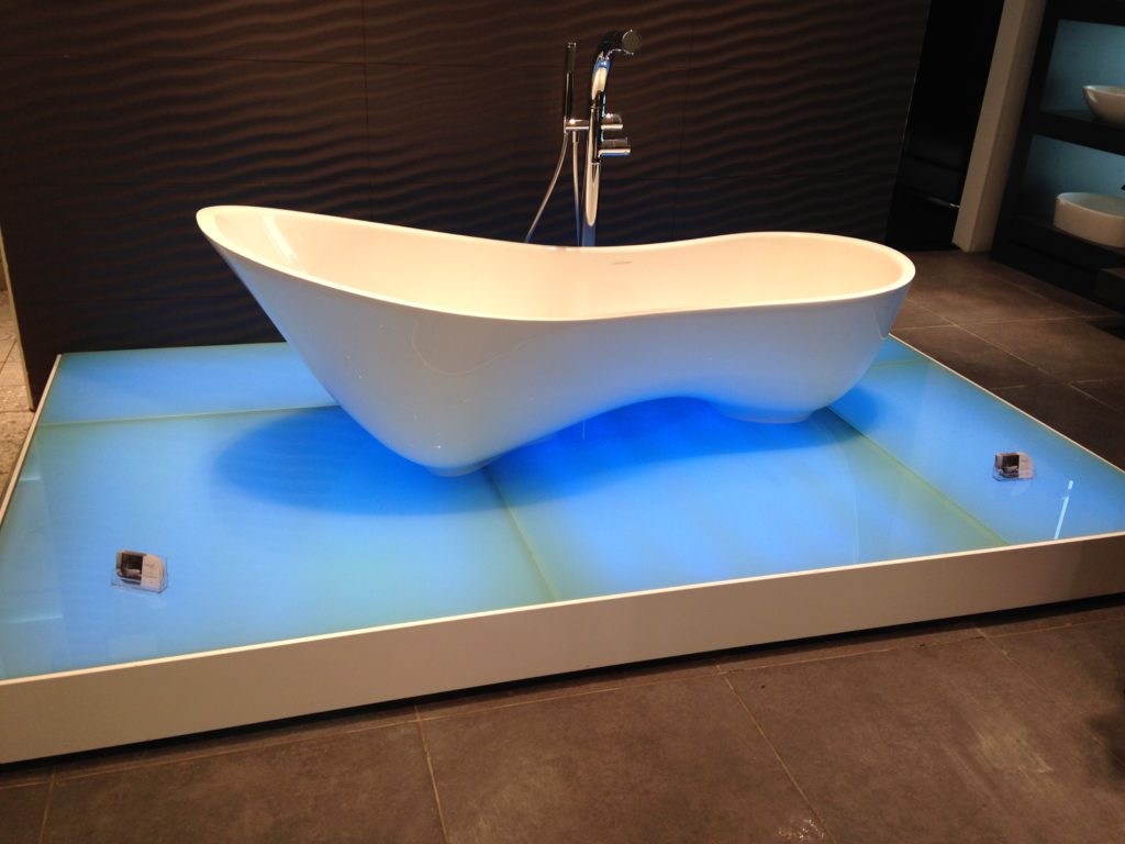 For the most part, I noticed lots of bathroom drama. Luxury was the order of the day and although much of it probably won't end up in your bathroom, it was fun to consider. Bathroom vanities were few and far between. The ones I did see were of the floating variety with vessel sinks. There were a lot of pedestal sinks too. The overall trend in the bath continues to be the creation of a spa-like atmosphere. This is done by constructing a totally sensory experience including lighting, sound and creative, invigorating options for the shower and tub. It's all about relaxation and having a place to escape the stress of our increasingly crazy lives. Conscious water use and conservation also continue to be at the forefront and I think it's always destined to remain so. Here are just a few sights that piqued my interest. If you'd like to view all the loveliness I captured in Milan you can find all the pics here.
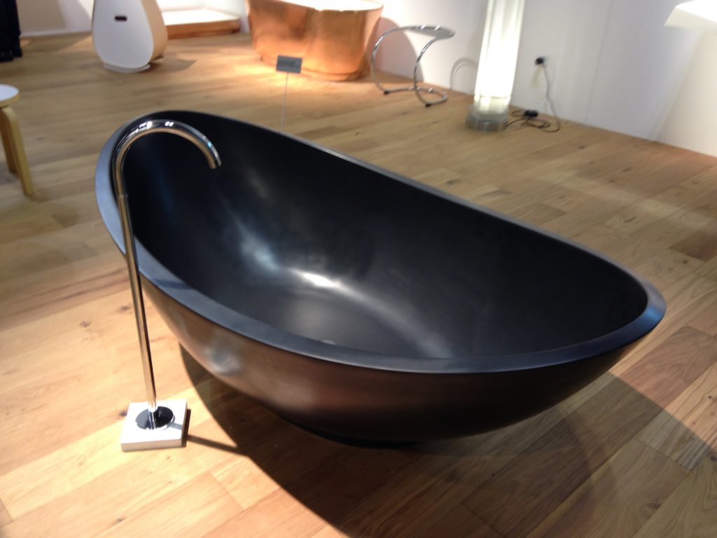
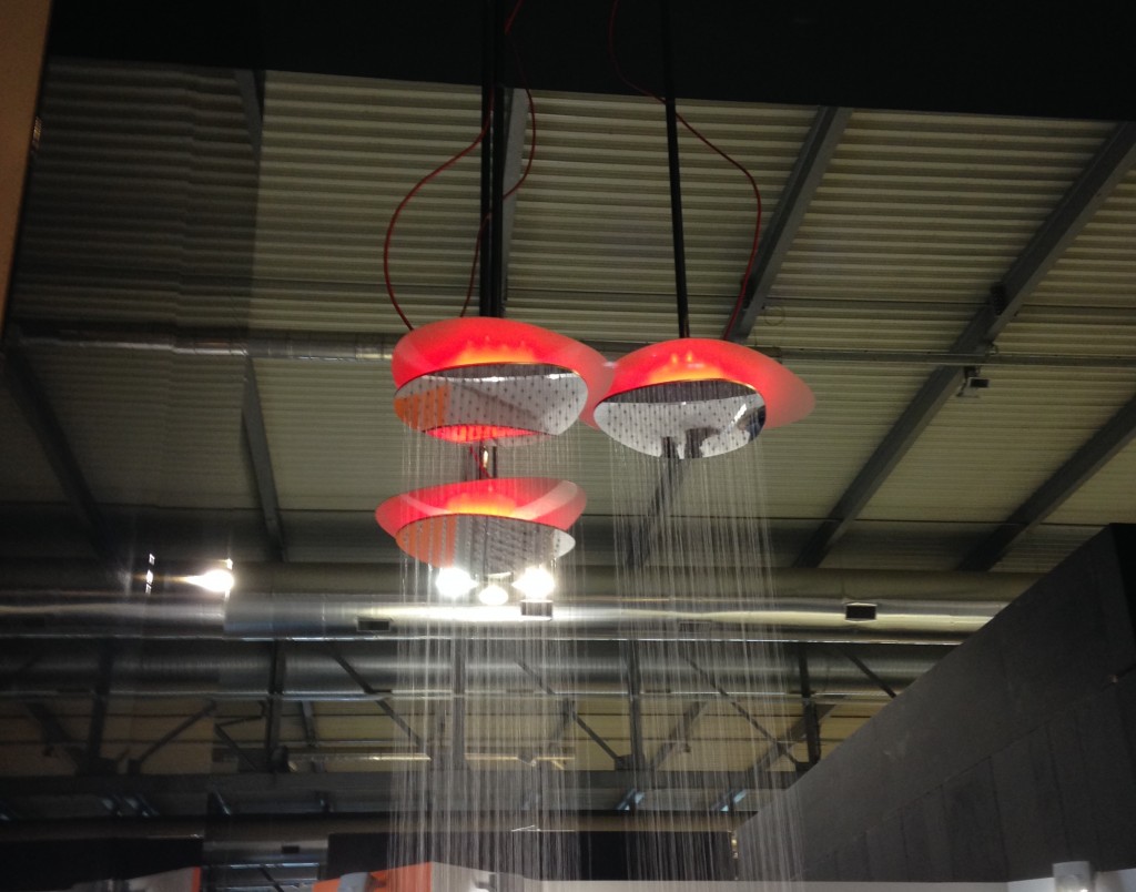
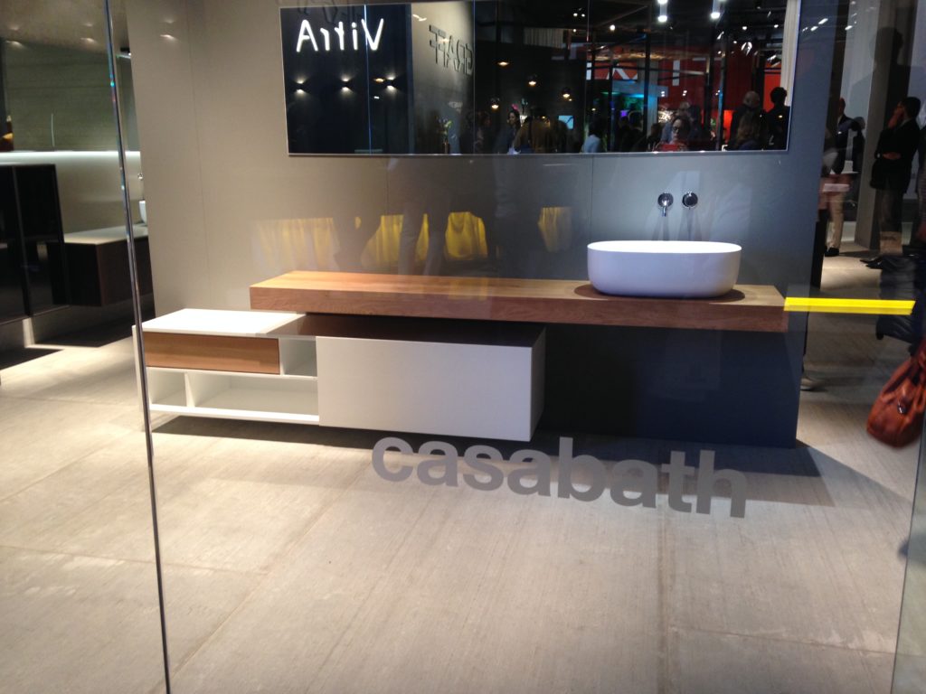

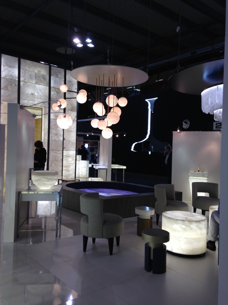
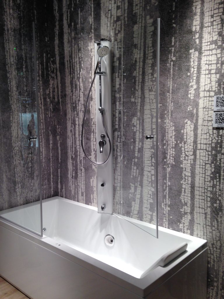
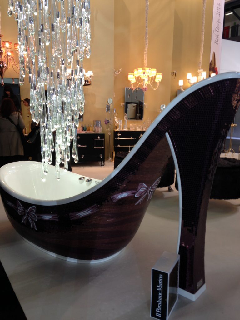
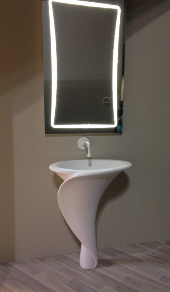 Click here for a peek at all my Milan photos!
Kitchen Love, Italian Style at Acheo and Poggenpohl
Ok so you got me, Poggenpohl is not Italian. They are German, except when they're in Milan, then they're Italian. Good enough? I can hardly believe I’ve been home for over a week! Images and impressions are still swirling around in my head from the wonderful time I spent with Blanco and some fellow members of the Blanco Design Council in Milan. Design Week was not limited to the extensive exhibition at the Rho Fairgrounds but also included events all over town. We visited two memorable and cutting edge showrooms on our visit. 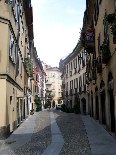 The first was Acheo (pronounced AH-kee-oh), located in the Brera district. Brera is also known today as the design district. It is also one of the few really old areas of Milan which saw 80% destruction during WWII. Acheo opened it’s showroom there in 2010. Today they are a showcase of quintessential contemporary Italian design for the kitchen.
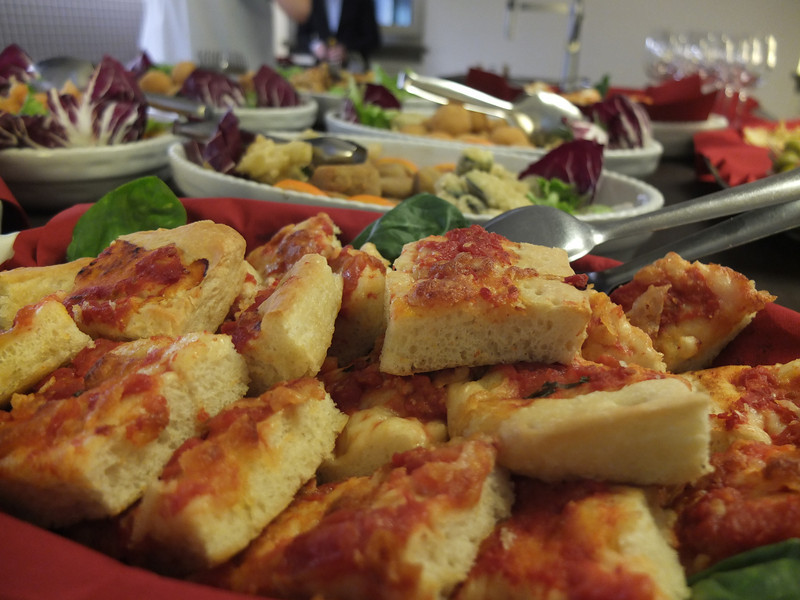
 They put on an impressive pre-dinner spread for us and the peeps from Modenus Blogtour Milan.
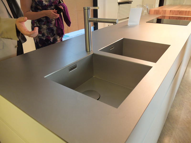
 All through our trip we saw many products not available here in the US. Some will become available, perhaps in other versions. One such item is this Durinox work top and sink (below) which is a part of the Blanco Steel Art collection. Think stainless steel on steroids!! Seriously, it is made with a finishing process used in the auto and aerospace industries so it is super scratch resistant and more than twice as hard as stainless steel. It is available, as shown, in Europe from Blanco in Germany. The sinks only will be available for undermount installation here in the US.
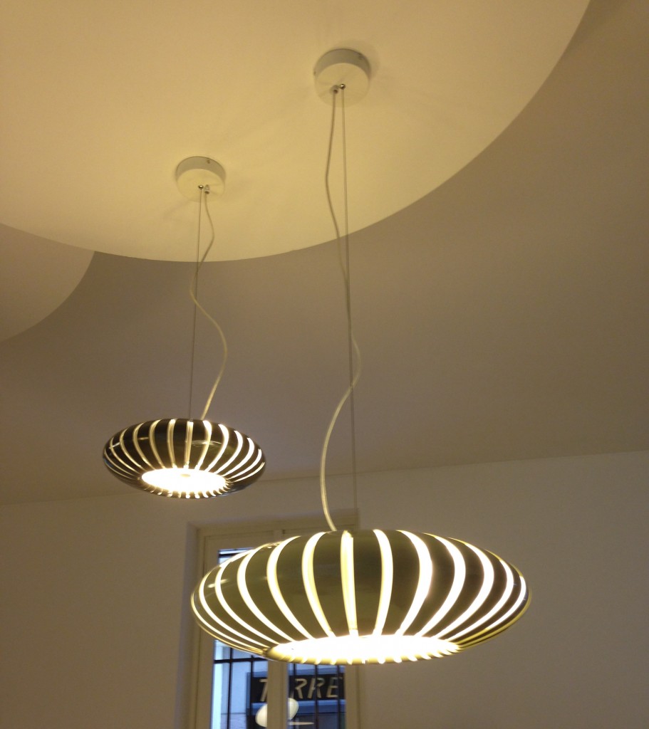
 We found that in Milan you could miss half the experience if you failed to look up! Look at these cool light fixtures at Acheo!
 The other showroom we had the pleasure of visiting during our visit was Poggenpohl. I think you could argue that they set the bar when it comes to innovation in contemporary cabinet design. As I mentioned, Poggenpohl is a German company and they claim to be the oldest kitchen brand in the world!
 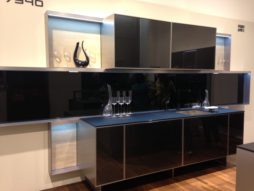 Some years ago Poggenpohl teamed up with the Porsche Design Studio to develop the P'7340 line of cabinets. Both companies focus their concentration on the overall line as well as providing unsurpassed quality of product. Above is a Porsche Design Kitchen P'7340 by Poggenpohl. It's hallmark is the aluminum frame which surrounds each box. Originally designed with men in mind, it has evolved into a brand appealing to discerning contemporary design devotees of either sex. Chief Poggenpohl designer Manfred Junker was on hand to explain the intricacies of design detail that go into the product including their trademark, no handle, fronts. In fact, he claims, they are the first to offer touch control on the refrigerator and dishwasher. Here's what they have to say about that on their website: "Handleless fronts emphasize the clean, uncompromised lines of the kitchen furniture."
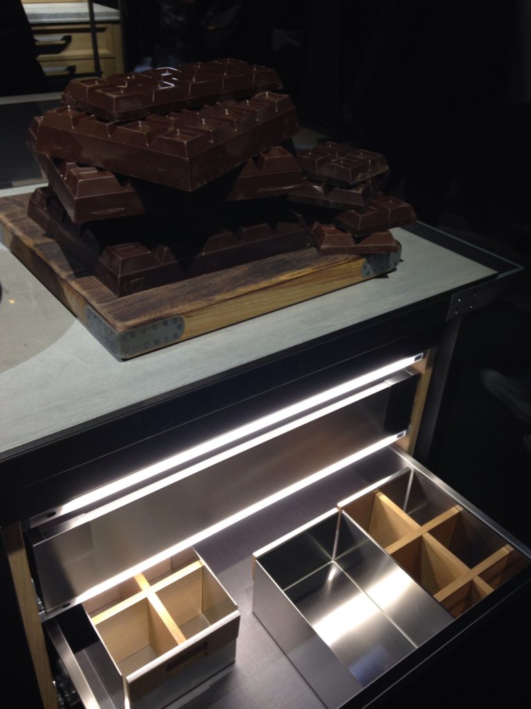
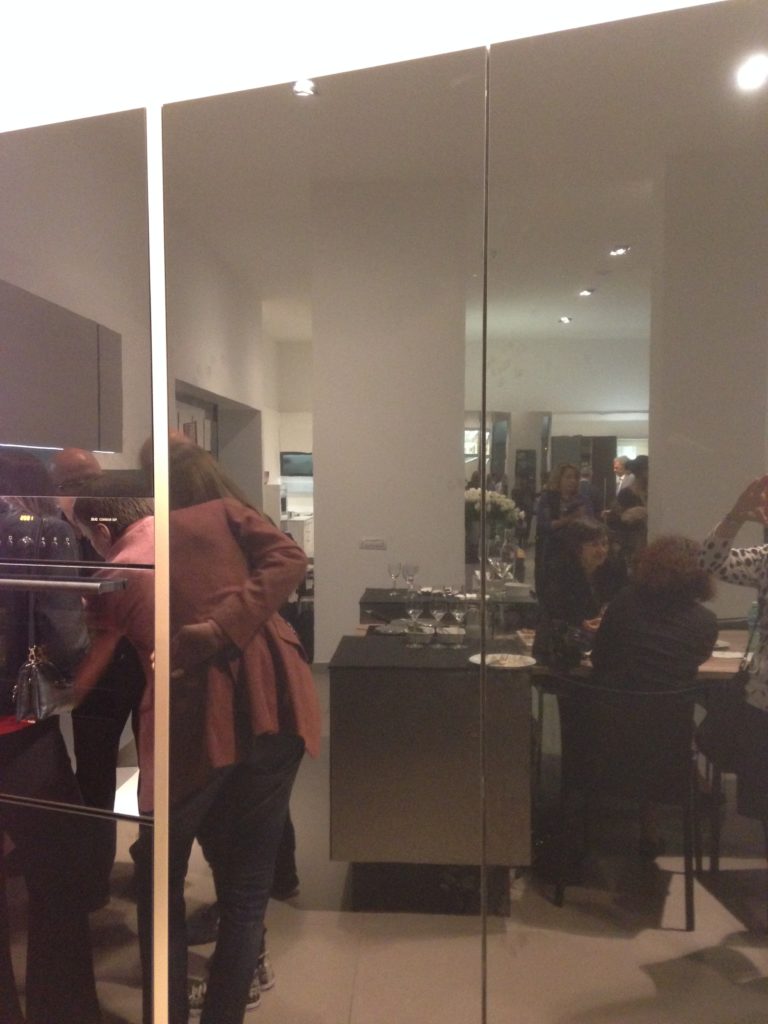 Poggenpohl took care of our tummies too. After all, design spotting can work up one hell of an appetite!
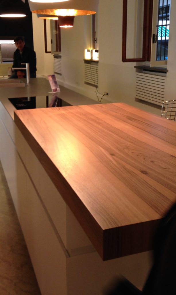
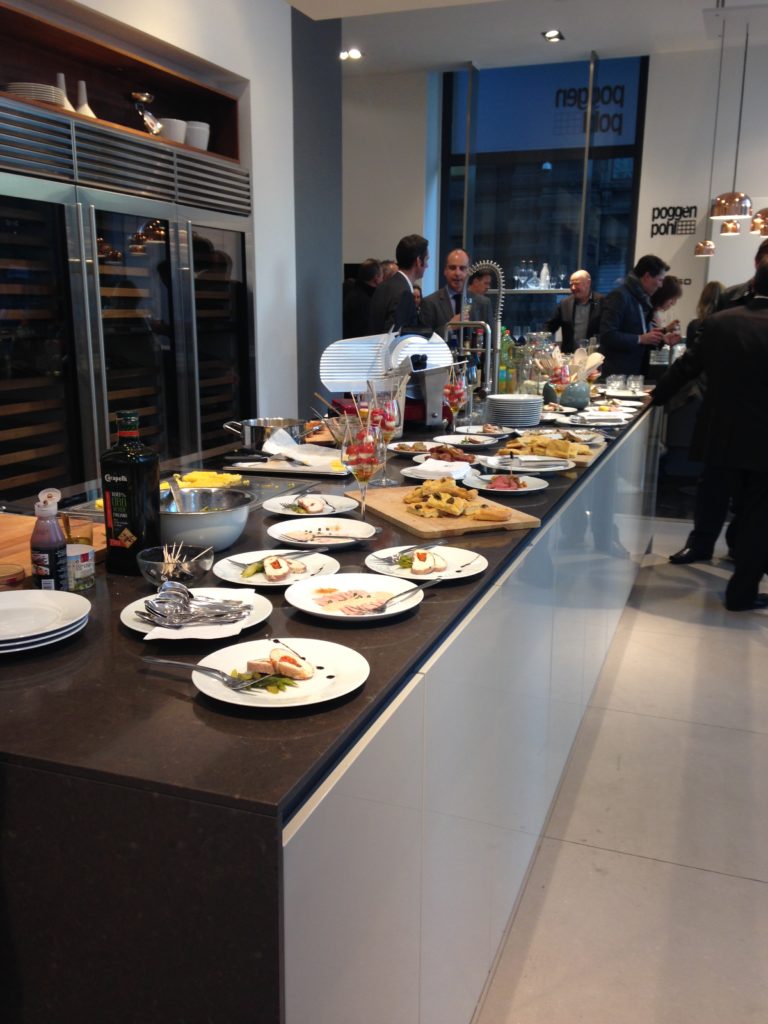 This newest version of P'7340 (see below) features a contrasting counter top inset made of solid New Zealand pine with a wire brushed finish.
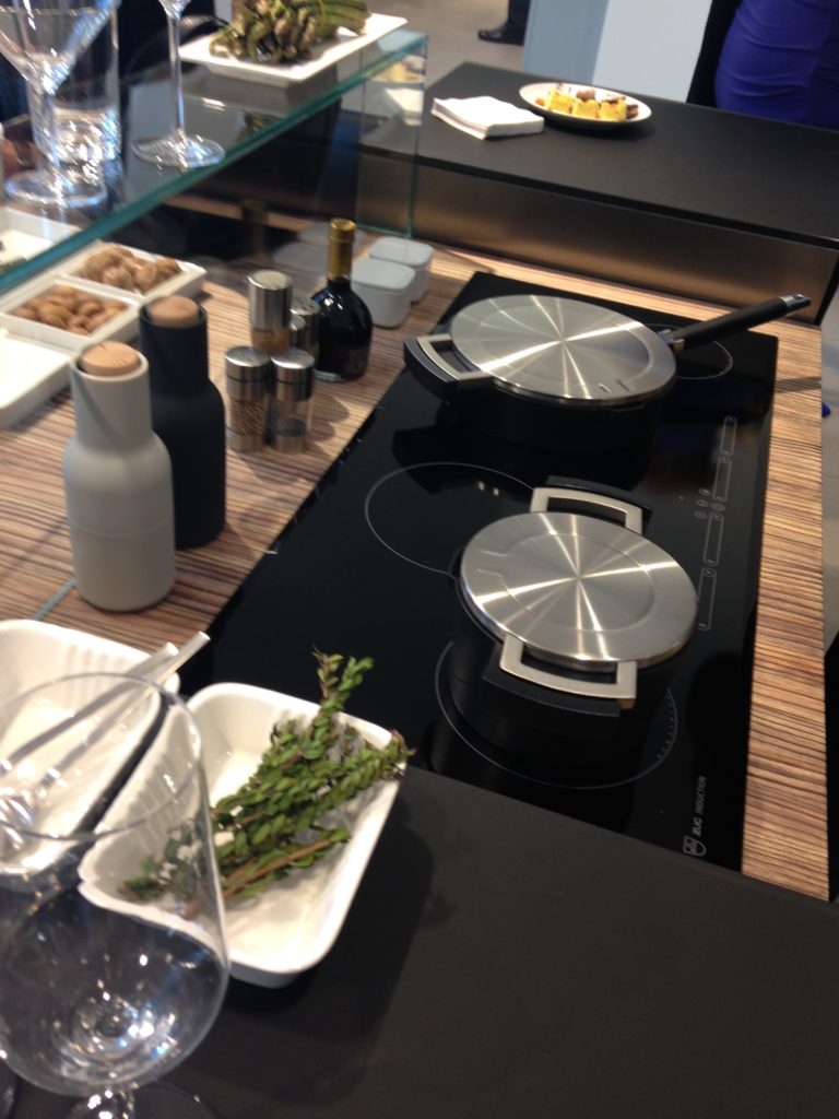 Next up: FTK (Technology for the Kitchen) This was the section of iSaloni featuring the latest trends and products in kitchen appliances.Click here for a peek at all my Milan photos!own and automatically completes the closing cycle
Pinterest Style Search Results are in!
This just in!!! Pinterest Style Search results are in! Good news and bad news. I tied for first place with KandracKole, We had 56 interactions each BUT KandracKole won the grand prize (iPad Mini) in a random drawing/tie-breaker.  So close! I came in second place which means I do win a Nesspresso coffee maker (which I don't have). My heartfelt appreciation to all of you who shared the love. I wish I could've won that iPad for you but alas. In fact I feel so bad I will be randomly selecting three of you to receive a sweet surprise, Italian style.
Euro Cucina 2014
I'm home and just about recovered from my jet lag. All pics are up for your perusal. It was a fabulous trip and my heartfelt gratitude goes out to the golden peeps at Blanco, including travel mate Christy Emens as well as Lori Dolnick of Frank Advertising. I was honored to be included with fellow bloggers Marilyn Russell (DesignMagnifique), Kelly Morisseau (KellyMorisseau.com) and Grace & Ken Kelly of (kitchendesigns.com). Having been to many trade shows in the US over the years, I've always wanted to experience the bigger, global picture. Now I have and it was amazing. I arrived on Monday morning ready to explore. Lori and I took a stroll and stumbled upon a delicious lunch and a very cool design museum but first things first. I'm dying to tell you about all the products and trends I saw at the big show. Euro Cucina only comes along every two years as a part of the Salone del Mobile. Milano. There is also a whole section devoted to the bath called Salone Internazionale del Bagno. Kitchen gadgets and appliances are shown in the FTK section. I did a pretty good job of covering those but I estimate that was only about 20% of the entire show, the rest being furniture and other aspects of design. Here's what caught my eye.
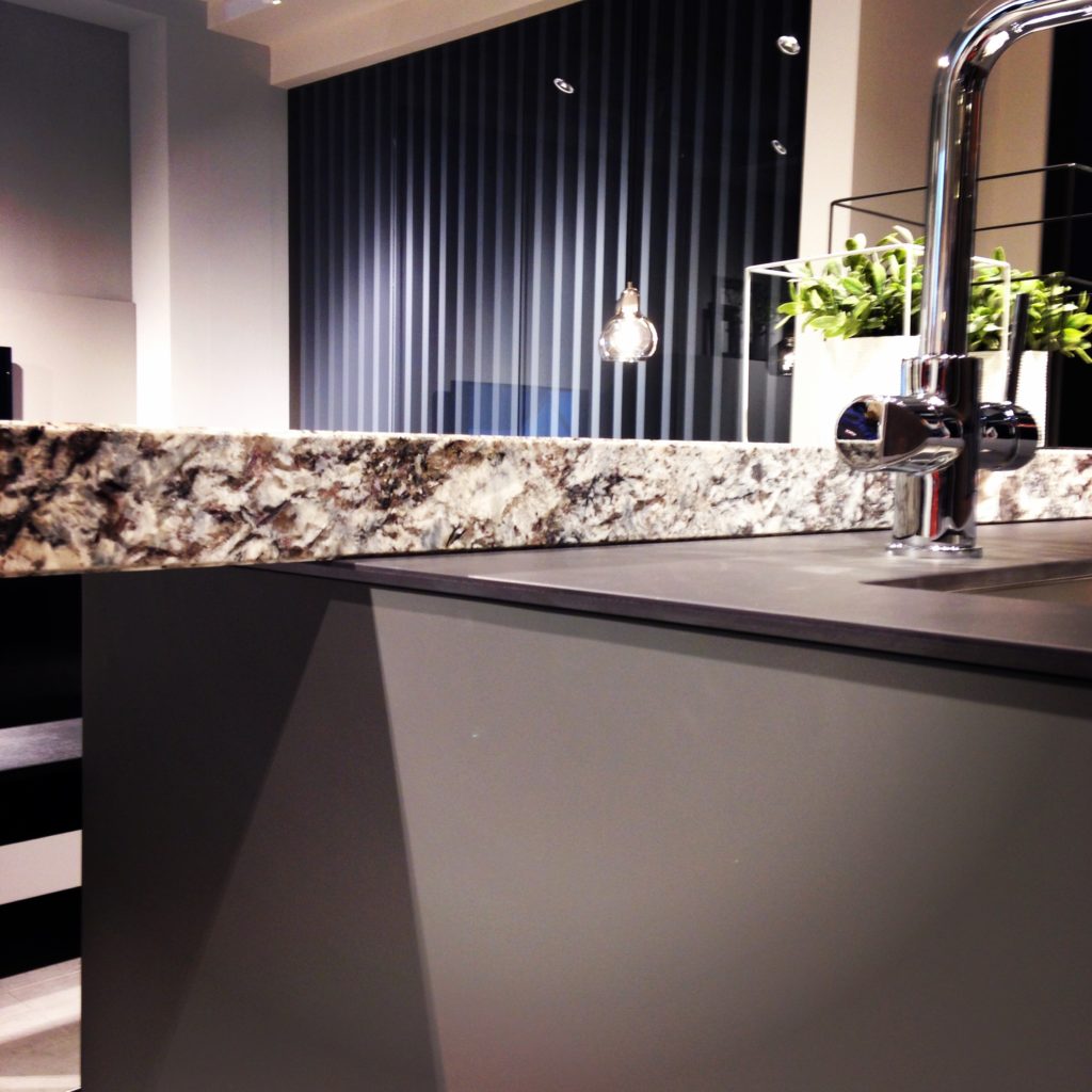
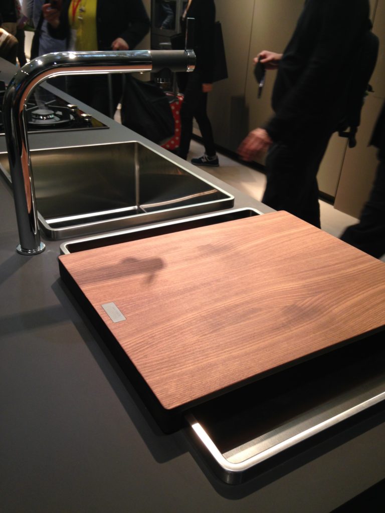
Counter tops were either very thin or chunky, like 1/2" for the thin and 3" for the chunky. I saw a lot of mixing of materials, in fact, that was probably the one biggest trend I saw for both counter tops and cabinets. It is also one that can easily be adapted to our US market. Counter top materials are much more adventurous than the usual granite or quartz that we are used to here. I saw wood, Corian, recycled composite material and more. The overlapping installation here was also quite common. The kitchen sink saw some new innovations including lots of accessories and different methods of installation. The inset style above, by Blanco, is factory installed by Leicht for a perfect fit. This particular one is not available to us in the US but we can get the Precision model with the distinctive square corner interior for undermount applications.
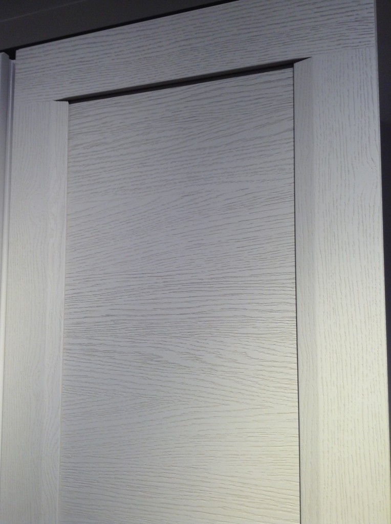
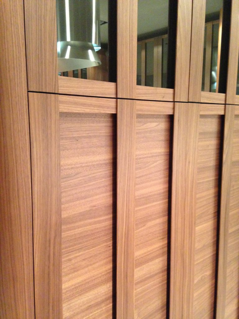 Cabinets featured lots of defined graining in woods such as white oak, rosewood and walnut in both horizontal and vertical directions, sometimes on the same door. I also saw some interesting variations on the popular slab and Shaker silhouettes.
 This is just the first in a series of posts about Milan and Salone Internazionale del Mobile. Upcoming posts will include our visits to Acheo and Poggenpohl showrooms and much more. So what do you think of these kitchen trends so far? I think some will make it over the pond but you can always know that whatever we do, we'll do it with an Americano twist. More later :)Click here for a peek at all my Milan photos!
