KITCHEN ISLAND TIME
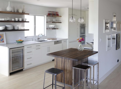
Hi there! I’m Joanna, a writer for Design Shuffle, an online portal for all things interior design from interior designer portfolios to engaging articles on the latest design trends. I am so lucky to be able to spend my days discovering the most beautiful interior design ideas on the web and bringing them to share on blogs such as this one. Thank you Kitchens for Living for allowing me to post today on kitchen islands.The center of activity in the kitchen often centers around the kitchen island, especially if it is designed to accommodate chairs or stools. This gathering place keeps the family and guests together with the home chef while he or she is preparing the meal. Kitchen islands come in as many varieties as cabinets and counter tops—practically endless choices. Take a look at some of my favorite kitchens and islands. Which do you like the best? A beautifully appointed kitchen boasts a lovely kitchen island paired with white leather and brad trimmed counter chairs. Wouldn’t it be so nice to take a seat and visit with the chef while he or she cooks?
 This rustic, gray island is given an industrial feel by equipping it with rollers. Another industrial element can be found in the aluminum work stool pulled up to the island.
 A massive kitchen island seats no less than six people. This is the perfect space for any meal. The woven chairs are so unusual and gorgeous. Getting any kitchen design ideas?
 A Tuscan kitchen features an extra large island flanked on either end by a traditional style lamp. For its size, it could accommodate more seating than just the three counter stools shown here.
 Love, love, love this style of kitchen island. It looks as if they took a small sideboard and just added an extended wood top to accommodate seating and an eating area. Lots of decorating ideas can be found here.
 Count them, not one but two islands! I love this look and would be as happy as apple pie to be the home chef of this kitchen. Does this inspire any decorating ideas?
 Wouldn’t you love to cook up your favorite recipe in this sleek and crisp white kitchen? The island and cabinetry feature the current design trend of brass hardware.
 This ornate kitchen island is as gorgeous as it is useful. The carving and robin’s egg blue of the ‘legs” fits so nicely with the rest of the tile and cabinetry in the space. Many of my favorite kitchen designs include lovely chandeliers like this one. Images 1 | 2 | 3 | 4 | 5 | 6 | 7 | 8Craving even more design inspiration? Then visit Design Shuffle! You can explore the history of interior design and browse through the portfolios of Boston interior designers and more!
Elements Converge In Dream Kitchen
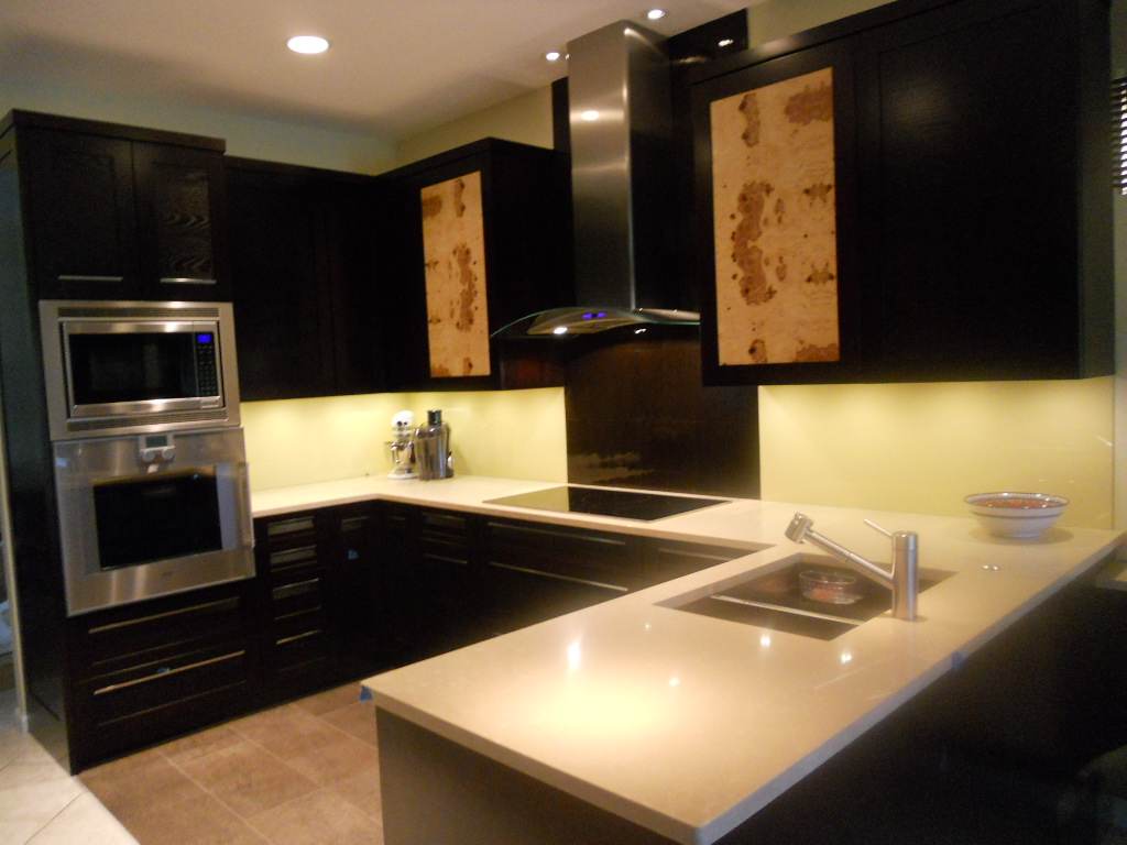
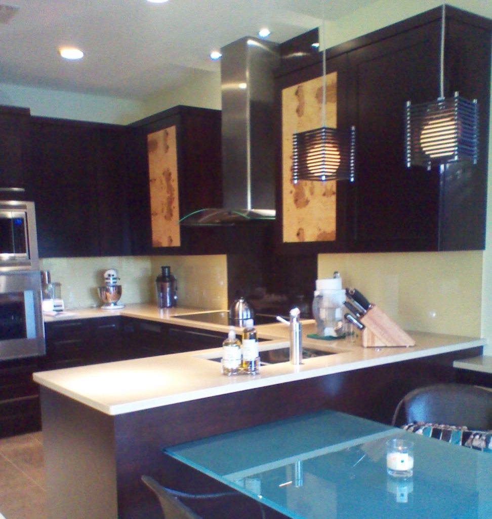 Another year is winding down. We have been blessed again with many interesting projects. As we are in “finishing up mode” I thought I’d share with you one of the best of 2011. This project was a true collaboration. Our clients, a couple of sweet snowbirds from Chicago, were very hands on which made it fun to see this kitchen take shape. The existing space was on the small side, the cabinets a little dated.
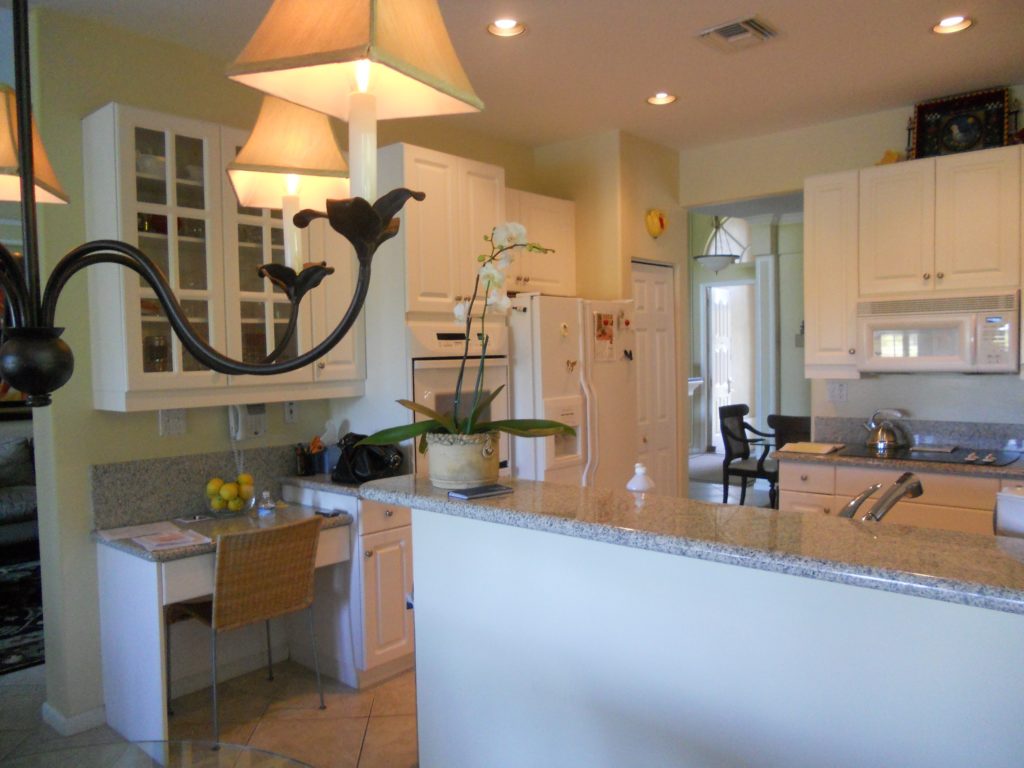
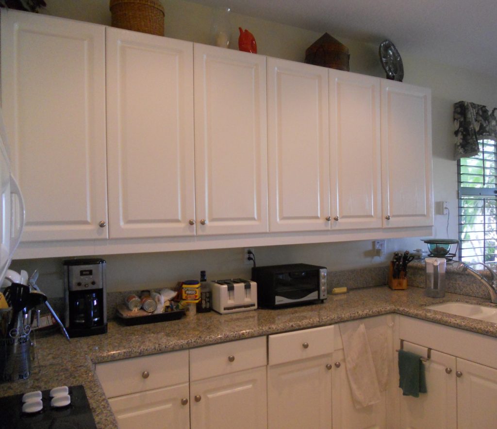 Our assignment was to add a whole range of state-of-the-art appliances and a clean unique contemporary feel that would flow into the existing family room. Naturally storage and function were also of the utmost importance but the real challenge was in fitting it all in!!
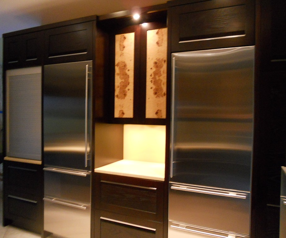
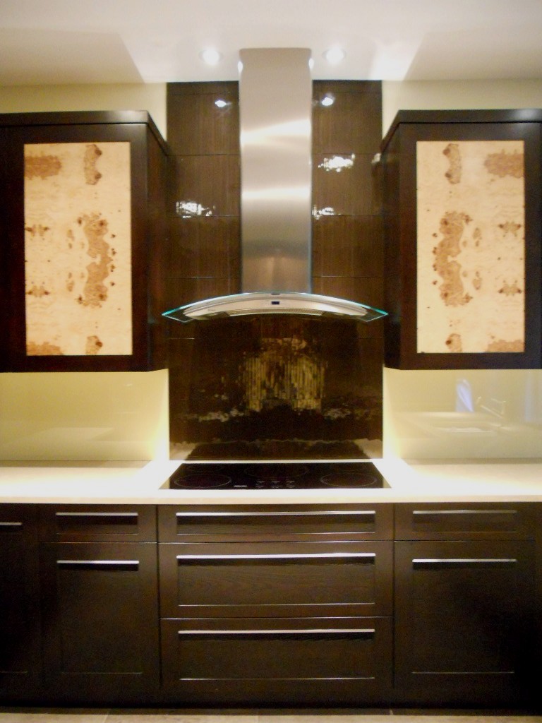
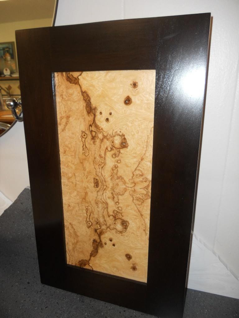
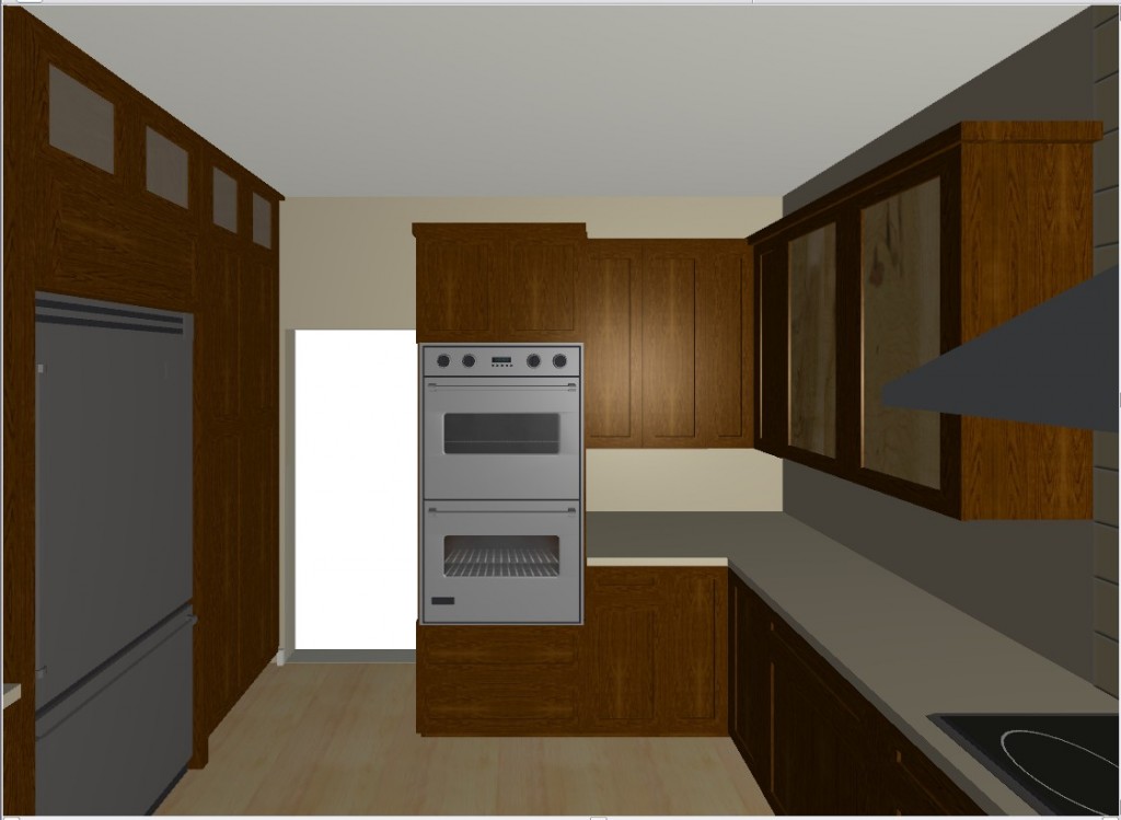 They chose a rich coffee bean stain for the cabinets to match existing cabinetry in the family room. The cabinet fronts were not ordinary doors, no way. Together, with our clients, we designed the Soldono and the Soldono Pacifica Doors just for this job. The Soldono custom door features a cherry frame around a horizontal grained oak center panel all stained in a rich espresso color. The center panel is beveled on one end with stainless steel grip strip inset on the frame. No hardware sticking out in this kitchen! A select few of the upper cabinets sport the Soldono Pacifica custom door which received center panels in olive ash burl veneer for a huge shot of “unique”.
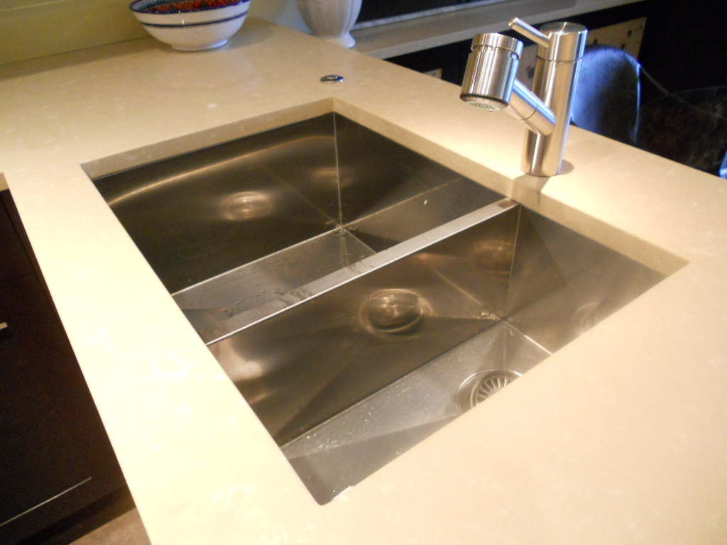
  Stainless steel serves as an accent finish and is found in the appliances and in the monster-multi-functional Hafele appliance garage. Refrigerators are Subzero, ovens are by Gaggenau, cooktop is by Miele and the dishwasher drawers are by Fisher Paykel. Thank you to Linda Roberts at House of Appliances for her guidance. Counter tops are Caesarstone quartz by Stone Palace and the backsplash is painted glass by Florida Shower Door & Mirror, Inc. Clearly they do much more that shower doors! Perhaps the "piece de resistance" however is the glass tile behind the hood. It truly looks like water cascading down the wall behind the hood! The sink is a Precision by Blanco and the glass theme is picked up again with the glass table. You can find a listing of all the trades on the Local Resources page here at Kitchens for Living.
SOMETIMES LESS IS MORE IN KITCHEN DESIGN
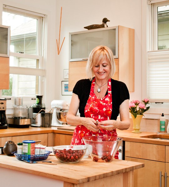 I'm loving this kitchen featured on thekitchn.com. Looks like she's having way too much fun, huh? Of course I can't help noticing the design. (Maybe that's what she's so happy about.) There is a great idea here. Open space. In this case there is a window in the way which does not allow for an upper cabinet. Even if the window was 15" or so further to the left that corner area is very difficult to reach. One solution is to put open shelves there or, nothing! It's okay to have some open spaces in the kitchen when they make sense. It can even create an opportunity for art, which is always a good thing!If you'd like to read about these hip-home-owning-kitchen-lovers click here.
KITCHEN FAVORITES GUEST POST
Today’s guest post is from Susi, a writer for Arcadian Lighting, a must-shop resource for beautiful light fixtures. Susi is sharing some favorite kitchens, from traditional to contemporary, cottage to penthouse. There is a wide range of styles, fixtures, cabinets, flooring and lighting in these kitchens. We hope you see something that will inspire you. What is your favorite kitchen?

Pinterest via
Love the greenhouse feeling to this kitchen. The cream cabinets and countertops blend seamlessly with the architecture. Pantry & appliances are tucked further back so they don’t disrupt the view.

Pinterest via
This cottage kitchen is one of our favorites because of the island that feels like a farmhouse table. Classic white subway tiles are classic for a reason…they’re timeless.

Apartment Therapy via
Small doesn’t mean unstylish. Love this eat-in-kitchen that is small on space but large on style. High gloss cabinets reflect the light to make the room feel bigger. The pendant light over the table adds a stylish touch.

Fresh Home via
Colored cabinets are not a new trend but we love the high gloss aqua on these metal cabinets. Everything feels sleek and polished in this contemporary kitchen.

House and Home via
Luxury finishes and quality materials make this kitchen a favorite. Dramatic dark cabinets and contemporary lighting make this kitchen feel sophisticated.

Abode Love via
This white kitchen is anything but sterile. Grey veined white marble, dark floors and punches of orange from the counter stools keep it lively. Love the kitchen pendant lights.

Shatter Boxx via
While many of our favorite kitchens are light and airy, we do love the drama of dark cabinets paired with dark floors. The island sink also makes this a fave, as does the professional range.

A Note on Design via
This contemporary farmhouse kitchen is a gorgeous blend of new and old. Love how the design incorporates the stone wall with contemporary cabinets and pendant lightsContent provided by Arcadian Lighting, a site that specializes in top quality lighting fixtures at extremely affordable prices. If you like this post, be sure to stop by the Arcadian Lighting blog and let us know you saw us here!
MY DESIGN PROCESS: A CASE STUDY
I write about a lot of varied things on this blog. Today I'm going to open my mind to you so you can step inside the creative (or whatever you want to call what goes on in there) process, as it pertains to cabinet design. The thing about designing kitchens and baths is that it doesn't only require vision in the aesthetic sense but also in the functional sense. We have to be creative in terms of the space constraints while being very aware of function.
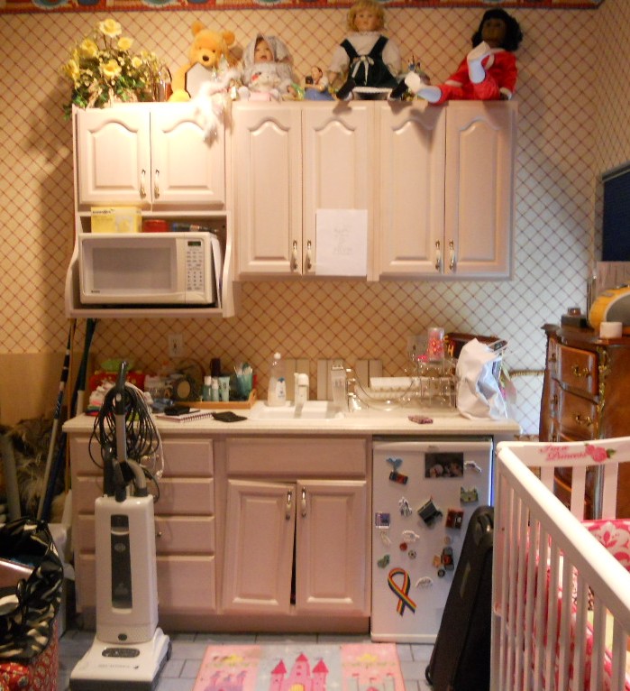 WHAT HAVE WE HERE? This is a nursery equipped to serve the nanny. She's got an under the counter refrigerator to store bottles, baby food and
 wine whatever she wishes for herself. In addition there is a small sink and a microwave. There is also storage and counter top work space (underneath all the debris). That's a lot of function packed into less that six lineal feet! The lucky owners of this oceanfront abode are away for the summer, as is the custom in Palm Beach.MY ASSIGNMENTI have been asked to replace this set up but to keep the same foot print and function. The cabinets are to be more in keeping for this traditionally styled beach house.MY OBSERVATIONSThe backsplash (area between counter and upper cabinets) is really high, about 22". Not only does this mean less cabinet space but it's a bit of a stretch unless you're a very tall nanny. In addition, there is nothing tying the upper cabinets to the lower cabinets and since they do not go wall to wall it looks as if the uppers are just hanging out, hovering over the base cabinets, not a great look. In general the layout is off kilter. The microwave requires a deeper cabinet and it sticks out unattractively on the left.WHERE DO I START?The appliances are old and will appear even older surrounded by new cabinets. Remember that if you are investing in a new kitchen it's penny wise and pound foolish to try to build your new cabinets around your older appliances. I will suggest that we replace the microwave with a small built-in model in stainless steel. For this I know I must use a minimum of 24" out of the 70" I have available. The refrigerator is important too. This one is old and it's an odd size, about 19". The new one will have to be 24" and I will reccommend that we build it in for a more custom look and to unify the small space. These types of built-in panel- accepting- under- the- counter refrigerators are either 15" wide or 24" wide. I certainly can't detract from the function by going smaller so I will give them more refrigerator space by going with 24" wide. Now that I know what I'm doing with the appliances I will work the cabinet layout around that. Here's phase one showing the larger ref, a built-in micro and an attempt to even things up and connect the uppers to the bases but it's still not quite there yet. I usually draw a free-hand sketch to work out my initial thoughts. The final solution (I drew it using Chief Architect) is to use 42" upper side cabinets instead of the existing 30" uppers. Then since the microwave needs a deeper cabinet (15"), I moved it to the middle and raised it up to create some design interest and to take advantage of the tall ceiling. I made the side backsplashes 16" high with the center at 19". I centered the 24" upper microwave over a 21" wide sink cabinet which allows the bigger refrigerator on the right and does not lessen the size of the existing drawers on the left. I'll need a minimum of 3/4" panel to the right of the ref. That makes a total of 24 3/4" with ref and panel. I will duplicate that on the left making the 4 drawer cabinet 24 3/4" wide as well. This allows the upper side cabinets to be equal at 23 1/4" each. Last but not least, I am going to suggest using matching wood beadboard above the 4" backsplash to tie the uppers to the lowers and add a small crown moulding on the top to finish it off.
 PRODUCTSHere are the goods and why I picked them:Kholer faucet K7342 in brushed nickel finish- It's a traditional faucet in a finish that will blend with the stainless steel of the microwave. The height makes it user friendly yet it will fit perfectly in the space.
Kohler undermount entertainment sink K5848- I love the shape of this sink. I double checked the size and it fits in our 21" wide cabinet. It's a more updated undermount model but it's still cast iron. I'm specifying Biscuit to go with the cabinets but I will also suggest a stainless option which would also work.
SHARP R1214OVER THE COUNTER MICROWAVE- This model fits into our 24" wide space. It requires a 15" deep cabinet, check. It has a light below and I happen to know that Sharp makes a kick-ass microwave. CABINETS BY HOLIDAY KITCHENS- flat panel with applied moulding. Finish, selected by designer, to be Snowdrift paint with Mink Wash. I chose Holiday cabinets because we have some custom size requirements and I can order Holiday in fractional increments. They also offer a wide array of finishes and door styles which is important in a higher end application.
 U-Line Under the counter refrigerator - This model offers an overlay trim kit option which will allow us to apply a door panel to match the cabinets.What do you think? You see there's no mystery behind the magic of design. Those are the steps in a nutshell. I would love to walk you through the steps of your own potential magic. It's really a lot of fun when it all comes together, kind of like solving a puzzle AND you get to continue to enjoy it everyday!


