Tip 2: New Cabinets, All or Nothing?

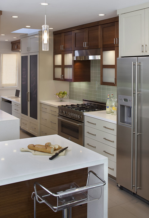
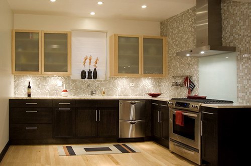
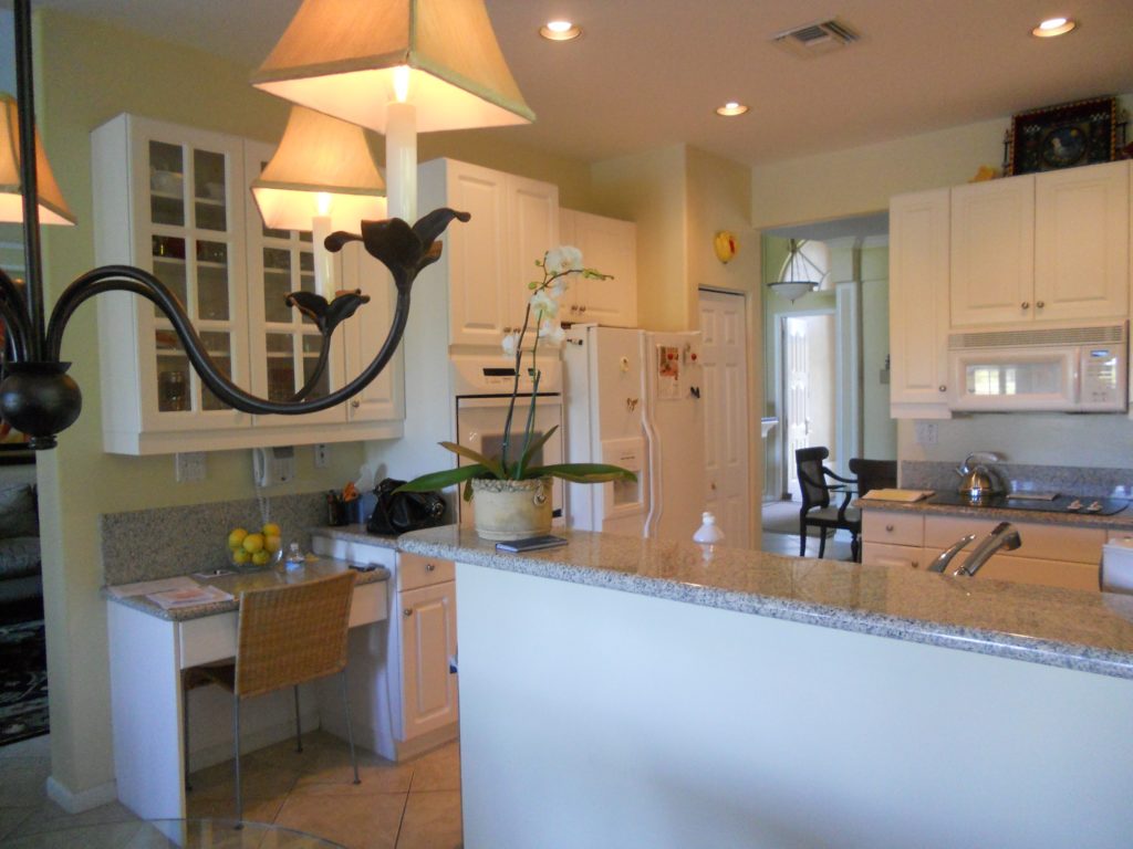
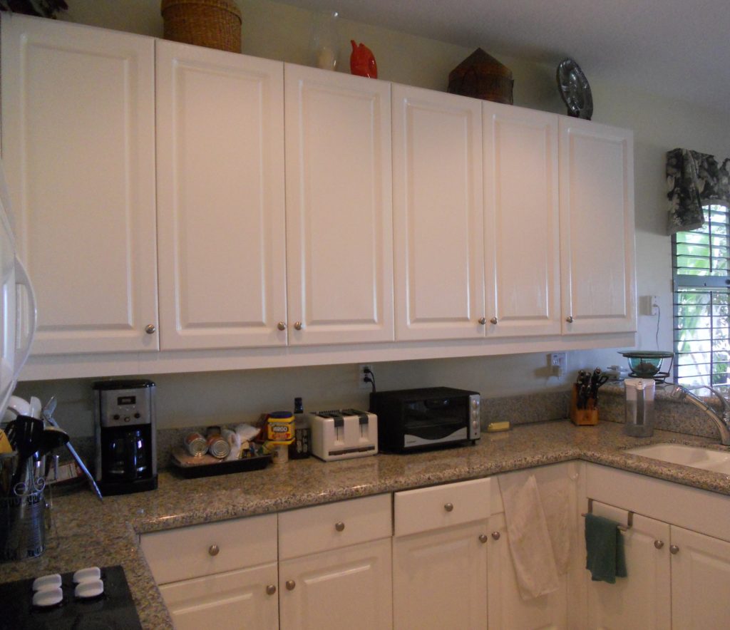
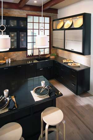
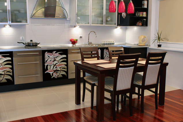
 Anyway where were we??  Ah yes, I was sharing with you five big questions I get from clients.  The first post in the series was about under cabinet lighting and here is number 2:2) Some of my cabinets are still really good, can I save money and just get more to match? While at first thought this may seem like a great way to save money, usually it's not.  Even if your cabinet doors are simple, chances are you've had them a long time so the color may have changed.  Also, each cabinet manufacturer makes their products slightly different so unless you can locate the original cabinet maker matching will be a challenge.  Styles also get discontinued.  If you're going to use a custom cabinet maker to replicate what you have you might as well just get new cabinets (unless he's a very very good friend).  If you work within standard sizing parameters you can get some very good quality cabinets in today's competitive market.  That said, there are some situations in which you can have the best of both worlds.  Two toned kitchens are very popular.  If you are replacing some cabinets, consider getting something totally different but complimentary to what you already have.  Every situation is unique and it's worth investing in a little consultation with a kitchen design professional to see what can work for your case. The design solution below works because the lighter maple of the upper cabinets is picked up in the flooring.  Usually I  prefer to see a darker finish on the bottom rather than on the top.  Darker colors are visually "weightier" so there is a "grounding" effect when you use them on the bottom. The operative word is "usually".  Never say never as shown in the photo above.  I love it. It works beautifully in this design. Lesson is don't be rigid.  Think outside the box, pardon the pun! 

A word about refacing- Refacing your cabinets means you will be replacing your drawer fronts and doors.  The cabinet boxes themselves will remain including the drawer boxes.  The thing to consider is that most of the cost of a cabinet is in the doors and drawer fronts.  Along with that all exposed surfaces such as the ends and the frame around the front will have to be veneered or laminated to match the new doors.  Depending on your existing cabinets, this could be a very labor intensive process resulting in less savings than you would have thought.  One situation where I would recommend reface instead of replace is if you have already have great countertops which you now have a vested interest in saving. Then perhaps it would be worth it.  Also, bear in mind, a reface doesn't allow you to improve your layout or add drawers. Whether new cabinets or just new doors and drawer fronts, remember that a clean simple flat slab style door is always the easiest on the wallet.Next up:  #3: Where can I save money and what items are worth the splurge?    

A Kitchen With A Happy Ending!

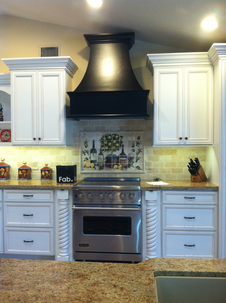
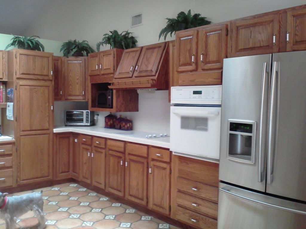
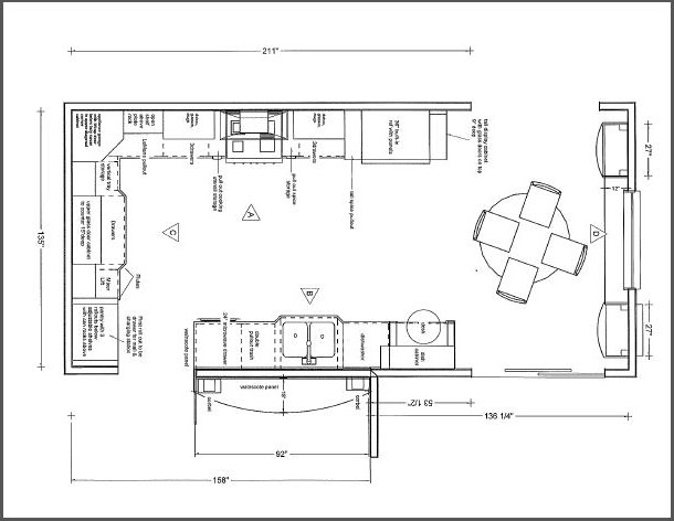
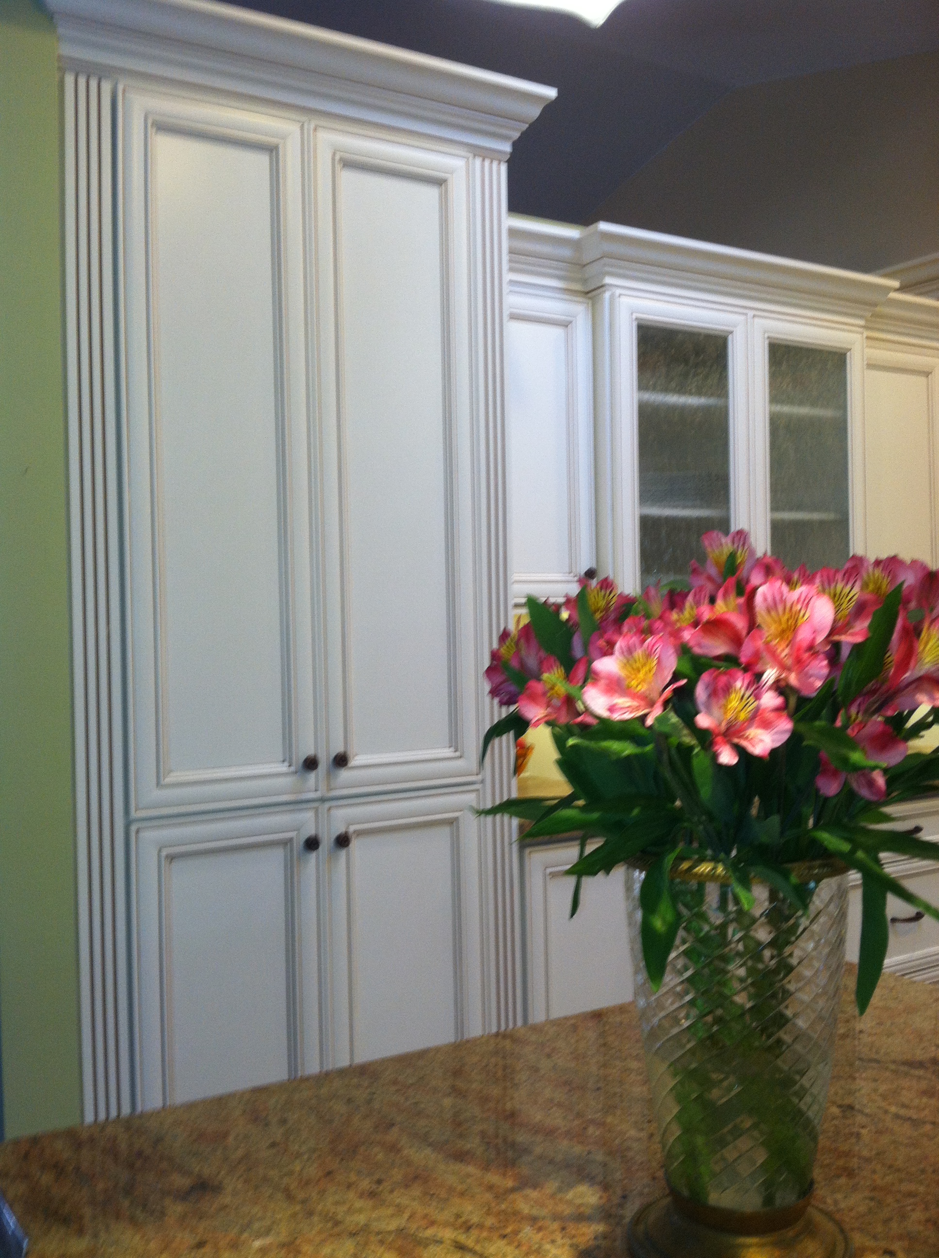
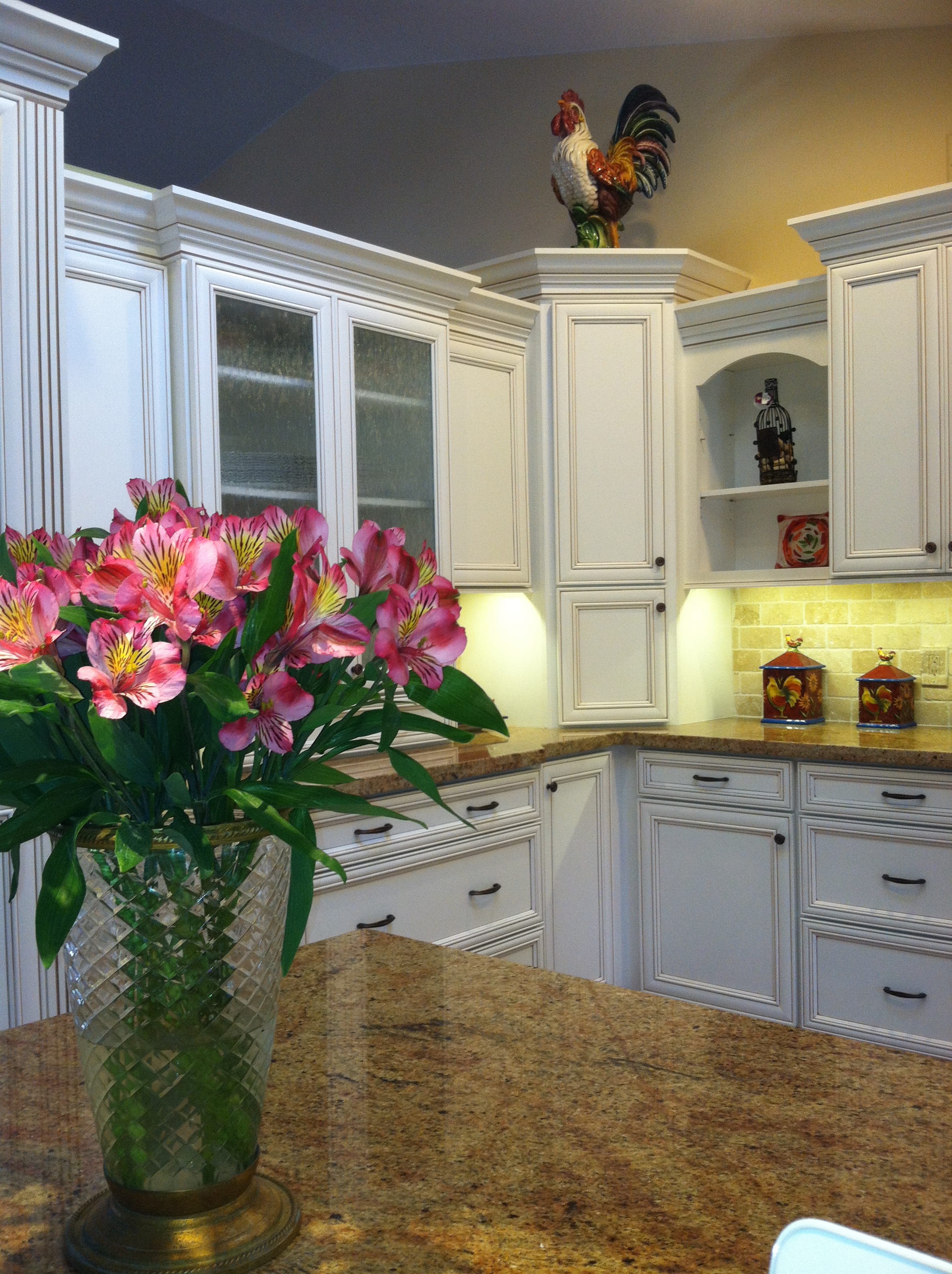
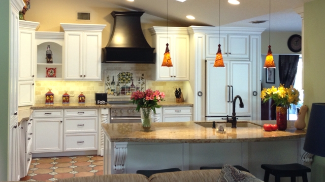
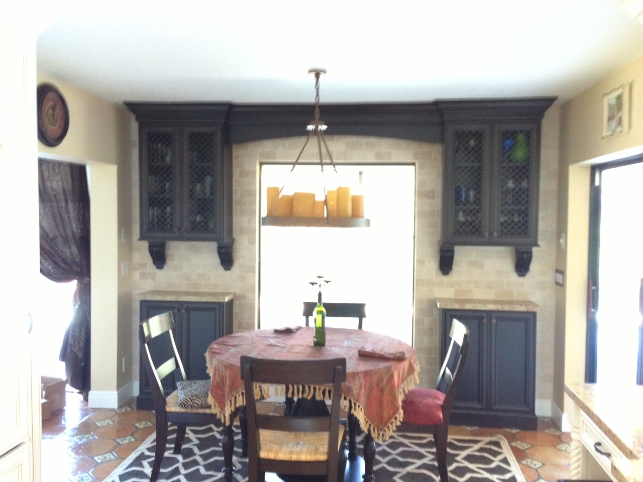
This was my client's vision.Today we wrapped up some final details in this new kitchen.  The client was going for a Mediterranean vibe, elegant but at the same time warm and inviting.  She loves to entertain so the kitchen had to be a focal point for her guests and it had to tell the story of her vision.  All these bells and whistles can really run up the price of your cabinets but we were able strike a good deal with Kith Cabinets.  Here's what she had.  We knew we could improve the function, incorporating her appliance wish list in the style she was dreaming of.  An added challenge was that we had to incorporate the existing floor because it had to stay.  She selected white painted cabinets with a warm brown glaze which really worked well.Here's the planWe were able to include a range by Viking, a Dacor microwave drawer, a beautiful Silgranit sink by Blanco, and some really nifty accessories including a mixer lift which she uses to store her juicer.  We devoted one roll out in the pantry to be used as a charging station and a place to throw the mail so the lovely counter can remain clutter free.  Notice that we also incorporated some gentle curvy shapes with the counter top and the wood hood.This pantry has the charging station as well as racks on the doors for can storage.2013-01-23 09.42.18

IMG_7653That FAB box on the counter is a nifty gift for our client, gourmet salts that magnetically attach to pull out next to range.  They are something like this.IMG_5935This client had a clear direction from day one which really helped keep the project on track.  This very traditional design comes with a maximum of detail and I'm happy to say we have left a very happy couple to enjoy years of romantic dinners in their new kitchen.Design was a collaboration between the client and myself.  Cabinets by Kith Kitchens, counter tops by Stone Palace, appliances by House of Appliances and installation by Brendan Donovan Furniture & Cabinet Co.  See local resources for more info and contact details.

Elements Converge In Dream Kitchen

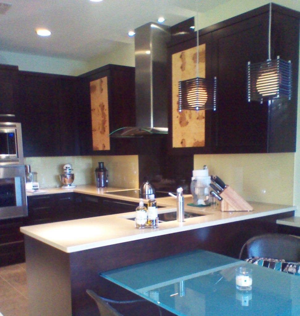
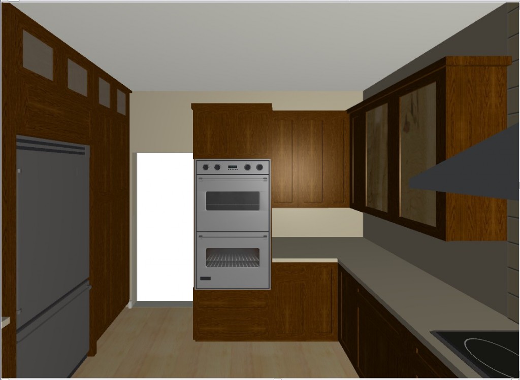
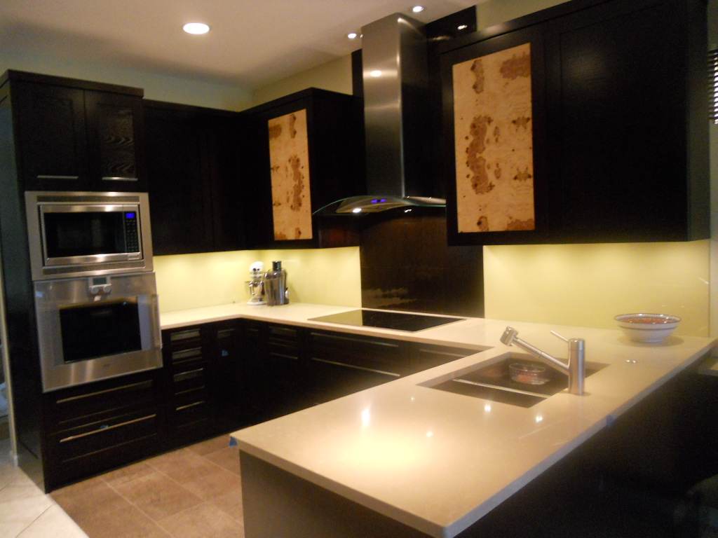
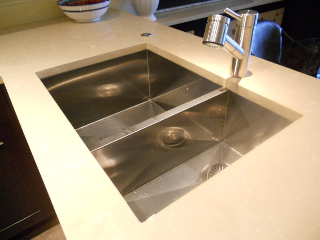
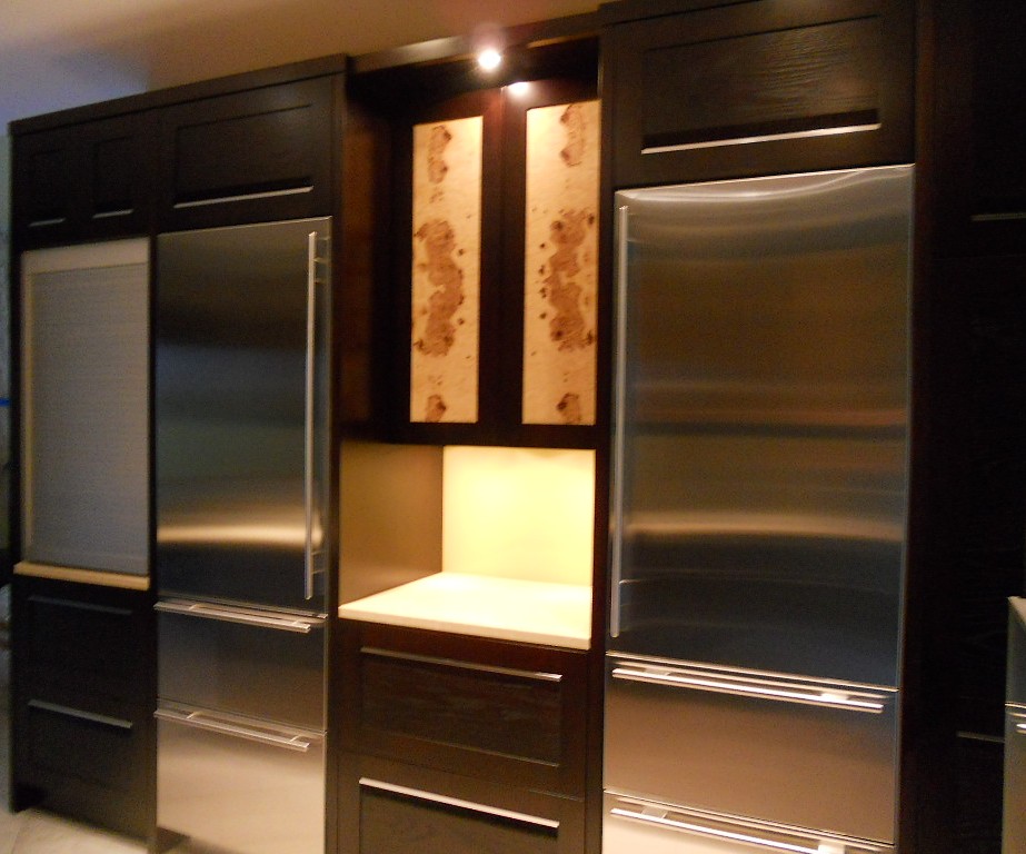
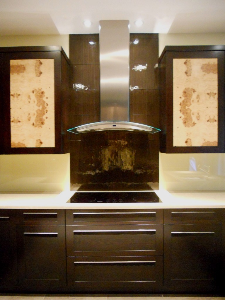
Another year is winding down.  We have been blessed  again with many interesting projects.  As we are in “finishing up mode” I thought I’d share with you one of the best of 2011.  This project was a true collaboration.  Our clients, a couple of sweet snowbirds from Chicago, were very hands on which made it fun to see this kitchen take shape.  The existing space was on the small side, the cabinets a little dated. Our assignment was to add a whole range of  state-of-the-art appliances and a clean unique contemporary feel that would flow into the existing family room.  Naturally storage and function were also of the utmost importance but the real challenge was in fitting it all in!!They chose a rich coffee bean stain for the cabinets to match existing cabinetry in the family room.  The cabinet fronts were not ordinary doors, no way.  Together, with our clients, we designed the Soldono and the Soldono Pacifica Doors just for this job.  The Soldono custom door features a cherry frame around a horizontal grained oak center panel all stained in a rich espresso color.  The center panel is beveled on one end with stainless steel grip strip inset on the frame.  No hardware sticking out in this kitchen! A select few of the upper cabinets sport the Soldono Pacifica custom door which received center panels in olive ash burl veneer for a huge shot of “unique”. Stainless steel serves as an accent finish and is found in the appliances and in the monster-multi-functional Hafele appliance garage.  Refrigerators are Subzero, ovens are by Gaggenau, cooktop is by Miele and the dishwasher drawers are by Fisher Paykel.  Thank you to Linda Roberts at House of Appliances for her guidance.   Counter tops are Caesarstone quartz by Stone Palace and the backsplash is painted glass by Florida Shower Door & Mirror, Inc. Clearly they do much more that shower doors!  Perhaps the "piece de resistance" however is the glass tile behind the hood.   It truly looks like water cascading down the wall behind the hood!  The sink is a Precision by Blanco and the glass theme is picked up again with the glass table.  You can find a listing of all the trades on the Local Resources page here at Kitchens for Living.


THE BEST OF KBIS

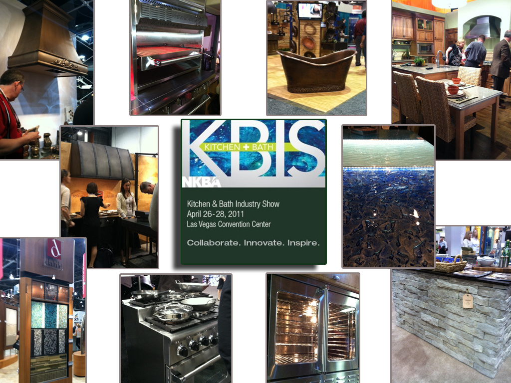
Our annual Kitchen & Bath Industry Show known as KBIS  was held last month in Las Vegas.  I’m hearing that attendance was much improved over the anemic showing of the last couple years.  This show is traditionally where new products and design trends for the kitchen and bath are introduced to the world at large.  Here are some of my new faves from the show!


One of the most exciting debuts this year is  Bornholm Cabinets,  conceived of and created by fellow blogger Susan Serra and her daughter.     They are a couple of smart cookies who know what’s both hot now as well as basic and unique enough to be timeless.  The line is Scandanavian inspired but American made.  Simple yet elegant and designed to blend into and enhance any environment.  I think we’ll be seeing more of this.  You can see more here.I also love this beautiful bit of black.

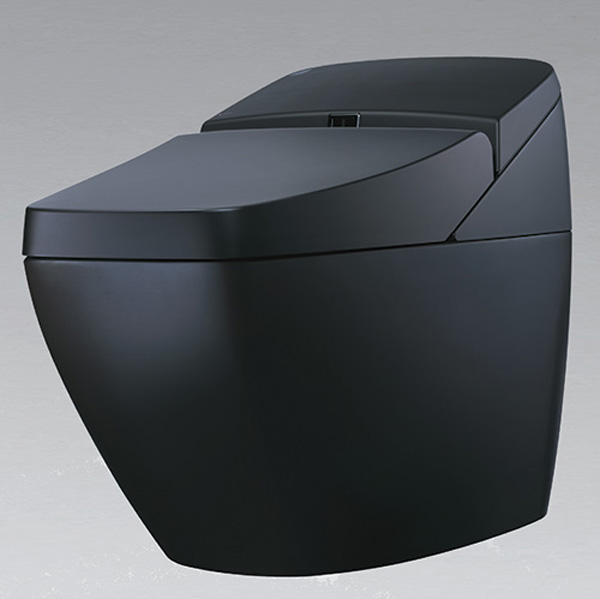
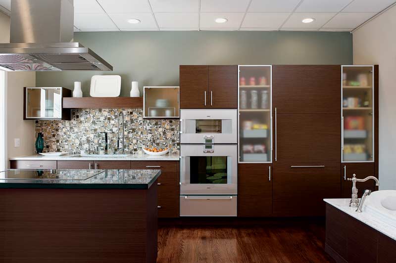
Yes it’s a toilet!  When it comes to commodes the Japanese have definitely got it going on and this example is no exception.   We all know what a "smart" phone is, well meet the "smart" toilet!  The REGIO by Inax  features a sound system, heated seat, double power deodorizing, automatic seat and flushing, and dual nozzle bidet. Geez, what more could you want?  Oh, yeah it’s also environmentally responsible. Check it out here Here’s a new fun way to add a little glow to that backsplash area between your cabinets and counter top.The °eluma RGB DecoSplash illuminated backsplash is the first fully customizeable color changing LED backsplash.  You can change your color as you change your mood from fuschia to lime green!  This LED light is dimmable and you even have your choice of decorative inserts.  Find out more here.Dark rich wood finishes continue to be a popular choice.  I just love the Asian vibe (of course!) of this kitchen by Wellborn Cabinets.Click here to see the rest of The Best of KBIS!

BEAUTY IS SKIN DEEP ON NEW VENEER DOORS

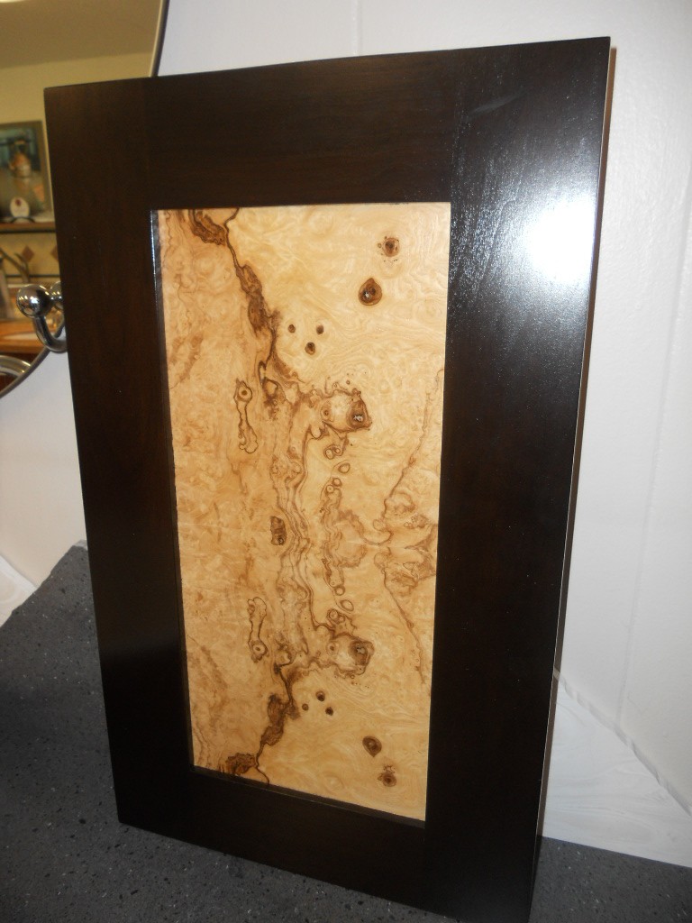
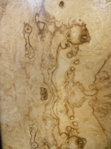
Brendan has done it again!  One of our favorite clients has been exploring exotic wood veneers as a way to add unique beauty to their new dream kitchen. (See previous post about wood veneers here).  They chose Olive Ash  Burl veneer and here are the doors we've come up with.  The first is a dark stained cherry frame around a natural Olive Ash Burl veneer center panel.

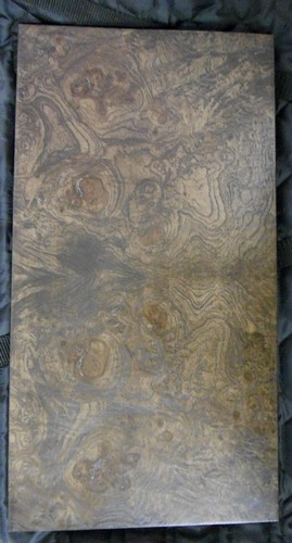
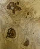
The swirls of the burl are stunning.  They stimulate the imagination.  With every glance a new shape emerges.  Maybe this would be a good tool for psychlogists! Keep in mind that a little goes a long way here.   I probably wouldn't use these for every single door in your kitchen.  Use them as a focal point.  Not only will it have just the right amount of impact but you'll save money by mixing it up with a basic.The second door is slab-styled with a dark stained Olive Ash Burl veneer face.  The edge banding is a smooth dark stained cherry to match.  They are going to become part of our standard offering here at Brendan Donovan Furniture & Cabinet Co. and shall be named!  Any good ideas?  I'm open to suggestions.  Oh and by the way, this veneer comes from various parts of Europe, in case that influences your decision.Don't forget to check out the Tip of the Day at Blanco by Design as we count down to Earth Day.  You can find mine featured today!

SHOW SOME SKIN IN YOUR KITCHEN


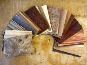
Don't get excited. Skins are what we sometimes call  wood veneers, or super thin sheets of material used to cover cabinet doors or panels instead of using solid wood.  As clean lines and contemporary styling continues to increase in popularity, surfaces themselves become the ornamentation and focal interest in a kitchen.  The use of interesting wood grain veneers  which are both beautiful and unique, is an excellent  way to make a simple slab door stand out.
Many of my clients are surprised to learn that this is can actually be a more expensive option compared to a solid wood door.  There are a couple of reasons for this.  One is that these veneers, or skins, are often made from exotic wood and secondly this can be a labor intensive process, thus the increased cost.  The advantage being you can "control" the wood grain, so to speak, creating patterns that match up with each other.  So if the unexpected randomness of natural wood grain makes your pits sweat this could be a good alternative for you.Another option if exotic wood veneers are too rich for your blood is something called "engineered wood veneers".  These are man made skins that replicate the exotics using not-so-exotic woods. The material cost is a lot less and in many cases it's hard to tell the difference.If you still love more traditional styling, veneers can still be useful for you.  A traditional 5 piece door benenfits greatly from a center panel that is veneer rather than solid wood.  The reason is that the veneer is applied to a dense MDF substrate that will not expand and contract the way solid wood does, thus the center panel will not ever swell cracking open the seams or shrink resulting in a lose rattling center panel.One of my favorite traditional doors made here at Brendan Donovan Furniture & Cabinet Co. is this Sapele Mahogany door with a Rosewood veneer center panel.Another way to get the look without blowing your budget is to mix it up.  Just use the veneer on, for example, your upper cabinet doors.  The more intricate the graining the stronger the statement.  In other words, a little goes a long way.  Too much and it becomes busy and you lose the concept of focal point.


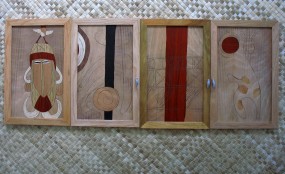
If your kitchen design involves round radius shapes it's going to involve wood veneer which can be bent and moulded to conform as needed.  Another beautiful effect can be achieved through the use of marketry, or inlay.  In researching this post I came across the amazing work of Juli Morsella.  Talk about adding a little art to your kitchen!  In addition, Juli is committed to using reclaimed woods, eco-friendly materials and she donates 10% of her earnings to environmental causes.


If you're interested in using wood veneers (or not) for your kitchen I would love to hear from you!  Congrats to Amy Parrag of Eye See Pretty.  She is the winner of the Orgaline drawer organizer giveaway!