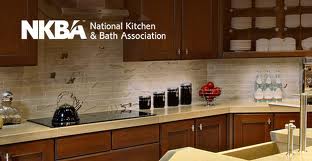
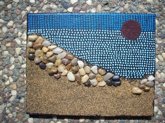
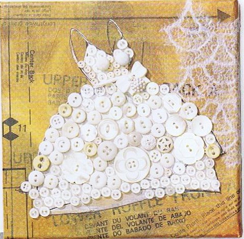
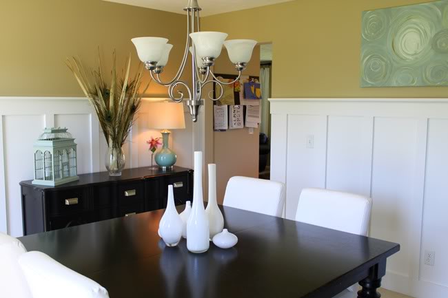
 Today's Let's Blog Off topic queries the source of our ideas. Where does creativity reside? Is it within or is it outside and all around awaiting discovery? For me the answer is both. Yes, it's all around us, for sure, but it also requires the eye of the beholder to breathe life into it. Here is a recent example in my life of something I saw which inspired a blog post.You may have the panache to pull off a monochrome white room that invites and stimulates the senses but for most of us going all the way with white runs the risk of BORING. Since white is so "white hot" at the moment, especially in the kitchen, I’m going to share with you the secret of how to make white pop.One thing to remember is white is a team player, it’s all about the colors around it. As you know, I love art (a big source of inspiration). I recently came across this image in Cloth Paper Scissors Magazine which is a perfect example of how white can glow when surrounded by the right color. I see it work time and again. White cabinets plus color equals stunning. If your taste runs more to the conservative think camels, taupes or warm beige walls to create the contrast.
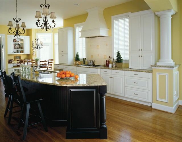 If you’re more daring go for Apple Martini Green or Sky Blue. The nice thing is if you want to go for the gusto paint is a safe bet. It’s one thing you can change fairly easily and reasonably.
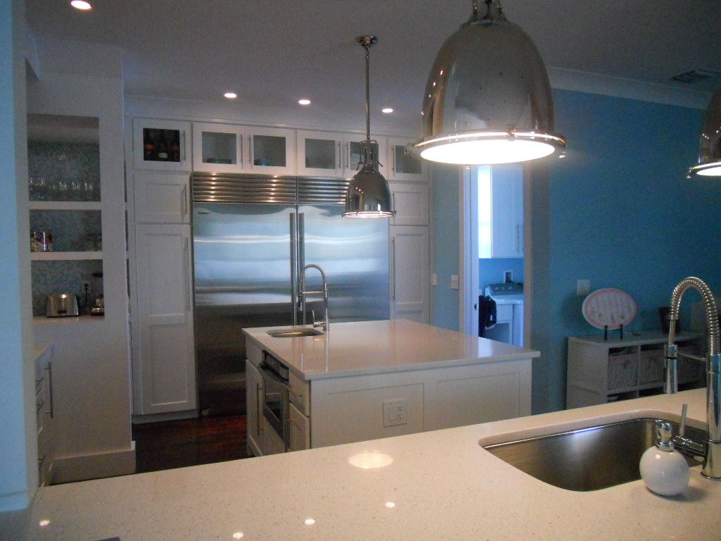 Another thing to remember about white is that it’s just not white. There are probably hundreds of whites and they all read differently depending on your lighting and location. The lesson here is to test your whites on site. Consider the color for a full 24 hours so you can see how it looks as lighting changes throughout the day.
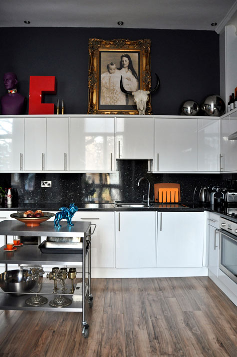 Many times wherever you find white you will also find black. You can tastefully mix black and white cabinets or if you have guts and great lighting the walls could be black, as in this example. This photo also serves as a great inspiration for many of the newer homes we have in my area with cathedral ceilings but short stumpy cabinets (thank you Mr. Builder). If you can't afford to change the cabinets take advantage of the great space above for art. Here, it carries the eye upwards taking attention away from shorty cabinets.
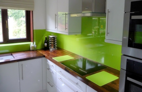 This stunning Apple Green back splash looks like glass but it's actually a colored plastic by Opticolor! So there you have it, inspiration of the day all inspired by a whimsical little piece of art!
TIPS TO AVOID KITCHEN REMODEL RIPPOFFS
Seems like the consumer is a little leery lately. Everyone's radar is on high alert looking to avoid the big RIPOFF. I can only speak for myself but I'm confident that I am in the majority. All we kitchen and bath industry professionals want is to make you happy. Do we have to eat? Yes, and so do all the hard working people that make your life possible. That said, I do understand where you're coming from. After all, I am a consumer too. With that in mind I have come up with a cheat sheet for you. Run through these 5 tips as a prelude to your decision making and you should be able to trust once again. Oh and remember there is a difference between cheap and value for the money. I know cheap is tempting but it isn't cheap anymore if you have to replace a product that doesn't make the cut.
1. KNOWLEDGE IS POWER- Today there is no excuse not to educate yourself before you go shopping. There is a wide array of media at your disposal. Use the internet and talk to people! Yes, people, in person (ok can be online too). Talk to the experts. Read blogs. Ask questions and talk to other consumers. One of the best ways to feel good about your choices is to know other people who have made them before you and been happy. No, you can never know for sure but the more knowledge you have the more equipped you are to make the right selection for yourself.
2. RESEARCH-This goes hand in hand with #1 but it is really the next step. Once you have defined the scope of your project you will be ready to select specific products such as appliances, counter tops, cabinets etc. that fit into the big picture. Research the choices. What are other people saying? How long has a company been in business? The National Kitchen & Bath Association (NKBA) Consumer Reports and the Better Business Bureau are good national and local resources and can indicate if you're headed in the right direction.
3. TO THINE OWN SELF BE TRUE- Take a little time to find out what your style is. Who wants to spend a butt-load of money on something they're going to hate looking at? The best way to find what floats your boat is to do something I call "kitchen scrap booking". Time to have fun. Collect images from magazines, catalogs and the internet. These don't even have to be photos of kitchens. They should be anything that appeals to you, a style, product or just a general ambiance. In this way you will begin to see the patterns and perhaps even discover some things you never consciously knew! For example you may find that 7 of 10 photos contain white cabinetry but maybe you never considered that. Getting what you love is good value. It just takes a little vision.
4. LET THE PROFESSIONALS DO THEIR JOB- A WORD OF CAUTION: Don't get carried away here. You've all heard "a little knowledge is a dangerous thing". It's true. Never succumb to thinking you know it ALL. That's why there are people who have studied and spend a large part of their waking lives becoming certified experts so they can get paid to help you. Use them.
5. COMMUNICATE FOR GOD SAKES! Once you've got some semblance of a plan in your head it's time to take it (along with your scrapbook) to the magician professional who can make it happen for you. This is not about money. You have to buy your products somewhere and that place should have a professional on hand to take your vision and translate it into your dream. That's all we do folks. It is my experience that the best projects are really good collaborations between client and designer. Getting what you want equates to good value for money invested. The NKBA is a good source for qualified professionals in your area. Many of us are also willing to work on a consultation basis, so ask!
DESIGN YOUR OWN WALLPAPER
ROLLOUT, the wallpaper!
As you may have heard, wallpaper is in vogue once again. I confess I am not naturally "wallpaper inclined" but what I saw recently in the intriguing Studio North & Prototype section at IDS11 in Toronto made me think again. After all, I am slavishly devoted to art and what better way to " art" than by utilizing the biggest canvas of all, your wall!
The innovative custom wallpaper manufacturer, ROLLOUT , featured eight designs, including new work by founder/designers Anita Modha and Jonathan Nodrick.
Not only was I impressed by their edgy designs but, get this, you can design your own wallpaper. It's pricey but that's so you keep your taste in check. Keep it to a focal wall such as in a powder room or dining room and you won't break the bank or run the risk of "too much of a good thing". This digitally printed eco-conscious wallpaper runs about $10 a square foot. Get your own art printed for about $8 per square foot plus set up charges. These premium, latex-based inkjet wallcoverings come in 36’’ wide rolls. Custom design projects are quoted upon request.
ROLLOUT was recently featured on Canadian lifestyle and design talk show Steven & Chris. Click here to see the show. The ROLLOUT section is at 12:30.
In addition to their presence at IDS 11, ROLLOUT was also asked to re-design a Vitra Panton chair that was auctioned off with the proceeds going to Casey House, the first free-standing HIV/AIDs hospice in Canada which offers support and care to those that are affected in their communities. 20 one-off chairs by some of Canada's leading designers and architects were auctioned off during the opening night of the event.
IDS11 is Canada's largest contemporary design fair that has served to inform and support the growing Canadian design industry for the past fourteen years. Thank you to Blanco for sending me to IDS 11!
ONE WEEK TO GO BEFORE THE DRAWING
Don’t forget to enter your chance to win a free Orgaline drawer organizer by leaving a comment on any post between now and February 15th! Click here to read January 14th post for details
FLORIDA KITCHEN CHARM
Thank you for the out pouring of love and concern for our family. No matter what happens the sun always rises again and we begin another day.
As you guys up in the northern regions are beginning to crank up the heat, I thought I'd share a little warmth from down here in sunny Florida. If you love warm tropical beaches, even when there's snow (instead of sand) on the ground, here's how you can bring this ambiance to your "anywhere" kitchen.
Blue & White will give you an instant feel of sun and surf. White cabinets are hot! Blue calls to mind the ocean and may be added to your backsplash, walls or even used as accent color for an island or hutch cabinet.
A sea view is a must and you can have one even if you don't live by the sea. Think art! That way you can choose the sea view of your choice. It can be a painting, a photograph or even something more abstract like a mixed media work of art.
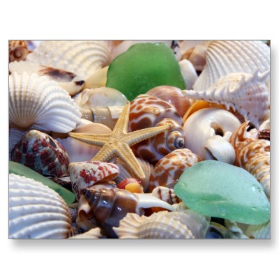
Gifts from the Sea are fun ways to add a beachy feel. Shells, starfish or even bits of beach glass are great accents. Try using a shiny glass tile backsplash for a watery feel or tiles with more of a honed finish look like glass that has been eroded by the sand over time.
- Burled Beach Corian countertop by Dupont
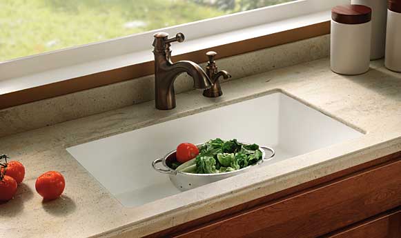
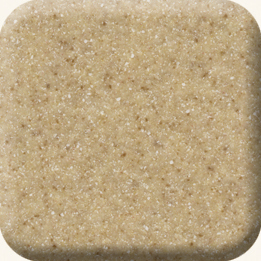
Throw some sand into the mix with solid surface counter tops in colors like Dijon from the Elements collection by Denova or Burled Beach by Dupont's Corian.
The nice thing is you can add a little or you can pull out all the stops. If you have "Floridified" your kitchen sent me pix. I would love to show and tell. Oh, and by the way, it's nice to be back!
SPELL IT OUT IN THE KITCHEN
Lately I've been reading a lot about something called TYPOGRAPHY which is the art and technique of arranging type, type design and generally playing around with letters, numbers and symbols. It's bold and exciting and can define your kitchen in a new way. You can buy unfinished letters which can be painted and creatively arranged to add a little intrigue to the heart of you home. Here are just a few ways you can bring typography into the mix for minimal investment.
Fun with food! There's nothing like a giant letter garnish to start a dinner conversation.
Just a few BIG letters strategically placed on a shelf or hung on the wall may be all you need.
How about an art print featuring your lucky number or favorite phrase?
Use a good old fashioned black board if you want to write your own text. This allows you to change it up. Invite the family to contribute. Heck, it could even be your grocery list. The point is that the writing is the decorative element. Make your own blackboard with chalkboard paint by Benjamin Moore.
Drop me a line and let me know your decorating type! (Sorry)
DESIGN STAR'S ON TO SOMETHING
 |
|
| Emily Henderson Design Star 2010 |
| An apartment that looks like Tom for the win! |
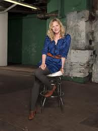
I don't know about you but I LOVE my HGTV. One of my favorite treats is the show Design Star, quickly followed by The Antonio Treatment, House Hunters International and sometimes Divine Design. I digress. The winning designer of Design Star gets their own HGTV show based on their unique concept. This season's recently crowned winner was Emily Henderson. Her concept is Style to Lifestyle, meaning she takes your own personal fashion statement and turns it into a lifestyle design statement. For the win she interpreted Tom's look into an apartment decor.
| Tom's Look |
It's all about the connection between fashion and interior design. Yes, it's all connected. One informs the other. Another great example of that is the stylish plumbing fixture manufacturer Brizo.
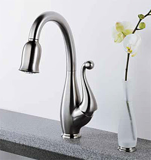 |
| Brizo's signature kitchen faucet (posing as a flirty little dress?) |
 |
| Jason Wu's flirty little dress! Get it? |
They are all about style and what better way to emphasize that than by connecting with the world of fashion design, which is just what they've done. Since 2006, Brizo has partnered with fashion designer Jason Wu, a finalist in the CFDA/Vogue fashion fund and the designer of Michelle Obama's Inauguration Ball gown. As part of this unique collaboration, Brizo sponsors Jason's shows at New York Fashion Week, and Jason has designed dresses used in Brizo advertising. Check it out at www.brizo.com There's no reason not to add a little fashion to your kitchen.


