MY KITCHEN & BATH FAVORITES

As a kitchen and bath designer I am constantly assaulted with images of products that are truly "drool-worthy", if I may coin that expression.  I am seduced by originality, great function and sometimes simply an undefinable- irrational- attraction (kinda like how I found my husband).  Anyway here's what I'm lovin today.Siderna Faucet by BrizoEveryone knows I've been a big Brizo fan ever since becoming a member of the exclusive Blogger 19 (2.0) last year.  Their Siderna bathroom faucet is simply sublime.  I love the glass handles and I love the shiny chrome.  I know that the popular taste, at the moment, is for brushed nickel but I have to stray from the pack for chrome.  The nice thing is, frequently, shiny chrome costs less than the more popular brushed finishes.Sharp Microwave DrawerI think the best microwave I ever owned was an over-the-range model by Sharp.  Now they offer a microwave drawer which I love for many reasons.   Although infinitely useful, who wants to look at a microwave?  The microwave drawer is unobtrusively located below the counter.  It's safer and accessible for the junior chefs in your family.  They come in 24" or 30" models which are installed into a base cabinet. Mosaics by Hot KnobsHot Knobs is a product of Portland Oregon based Aquila Art Glass.    Producing Art Glass Knobs and Pulls was a natural extension for this company known for the production of a variety of hand crafted art glass plates, bowls candle holders,  etc.   What a great piece of bling this would be for any cabinet.  Knobs as well as pulls (handles) are available.     The Green River Stone Company

Despite the serial killerish name, this is an awesome product.  I just love fossils.  There's something about all that antiquity in something you can actually see and feel. This is the ultimate in unique.  The Green River Stone Company offers the finest in natural art fossil fish and stone products. The material actually is fossil-rich calcium carbonate shale from their private quarry in Southwestern Wyoming. From this stone, deposited 50 million years ago as sediment in a large freshwater lake, they produce individual fossil specimens, artistic fossil murals, and other stone products for museums, private collectors, interior designers and architects.Aqua & Lime Anyone?

 Check this out!  Brendan was doing a little modification on these antique doors which I believe belong to an armoire.  Since they were done and awaiting delivery,  he propped them up in our very cool new greenish design studio and voila'!  It's like the chocolate and the peanut butter.  They just go together. Wish we could keep them.  Now we're looking to steal some doors off of another armoire.  I think we may be on to something.  Hmmmm 

FIVE LOW COST KITCHEN UPGRADES

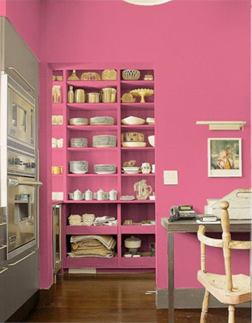
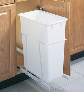
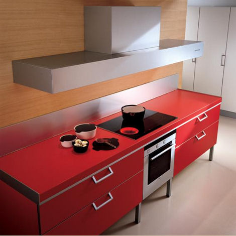
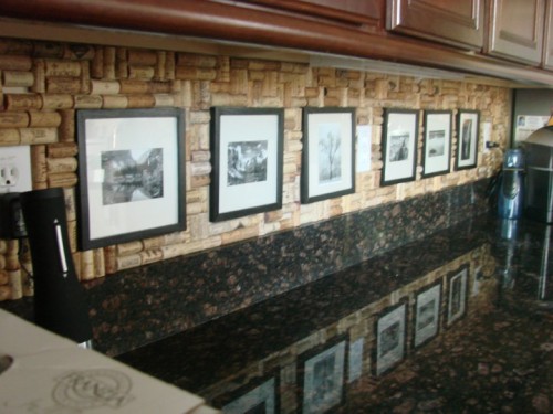
You’ve heard of Snakes on a Plane.  Well yesterday we had snakes in a Kitchen Design Studio.  Ok I exaggerate.  It was one snake, a juvenile black snake (according to Trevor’s iphone Googling).  I think he slithered in to tell me it’s high time I write a blog post so here I am with a topic that is especially near and dear to our hearts nowadays, saving money.If you don’t have thousands of dollars to invest in a new kitchen, there are some small tricks that can make a big difference.   Whether you just seek to make your tired dysfunctional kitchen great looking and user friendly, or you want to up the appeal for a potential buyer, these smaller upgrades fit the bill.Consumer Reports’ latest tests offers the home owner a variety of low investment ideas to freshen up the kitchen.    Here's my twist on what they had to say.Paint!“Every artist dips his brush in his own soul, and paints his own nature into his pictures.”- Henry Ward Beecher (Love the quote and was going to find a way to work it in here no matter what) SO, how about painting your nature in your kitchen?  Paint is the most inexpesive low-risk investment you can undertake to make a dramatic difference.  Most of us can even tackle the walls ourselves.  You can be bold as there typically isn't a whole lot of wall exposed in a kitchen (except this one!).  Don't forget to consider adjoining rooms and how colors will work together.  I prefer a satin or even a semi-gloss finish that is easy to wipe clean in the kitchen.  If you’re more ambitious and want to paint your cabinets, do it right.  Remove the doors, drawers and hardware, clean all surfaces, sand or de-gloss, use a primer and take your time! Make it work! (As Tim would say)You know what I’m talking about.  Are you tired of falling spice containers? Do you yearn for a convenient trash  receptacle?  If you’ve lived in your kitchen for a while you will probably have a few functional pet peeves.  Many of them can be addressed without breaking the budget.  There are all kinds of ways to store those unruly spices. Check out my previous post Spaces for Spices.     If you have a 15” to 21” wide cabinet to spare you can install a pull out trash container.  I’d say this is the number one accessory for a kitchen and every kitchen needs one!  How about roll out trays?  You can also purchase these and install them yourself if you’re handy. Counter solutionOne of the most visible elements in your kitchen is the counter top and a new one can make a world of difference.  Unless you’re going with a laminate, and there are some really nice selections out there,  you’re going to spend more than $1,000.  If that’s the case make sure your cabinets are worthy.  Check for damage, especially for water damage in and around the sink cabinet.  If the integrity of your cabinetry is compromised you certainly don’t want to set a butt load of money on top!  Did you know that once granite or quartz are installed no one will guarantee it can be removed without breakage? Create a splashThe back splash is another visible element with a lot of impact.  Here you can get even more creative than with the counter top because it’s purely decorative!  Other than being cleaner- friendly it doesn’t have to do anything but look pretty.  Tile, tin panels, or even wine bottle corks can make a unique statement on your back splash. Floor itWood flooring is hot at the moment and that’s because it’s a great look and it goes with almost everything but here’s the best kept secret in kitchen flooring.        Traffic Master Allure Ultra Resilient Flooring. It looks great, it’s pet proof, kid proof and water proof.  It’s really easy to install.  I know, my hubs installed it for us and it still looks great after five years!No excuses.  I find that even the smallest project completed yields such a sense of accomplishment.  These are even things you can do to tide you over until you have saved enough for the full Monty!  (At which time you will call me) In the meantime, send me pix.  I want to see what you can do. 

MY DESIGN PROCESS: A CASE STUDY

I write about a lot of varied things on this blog.   Today I'm going to open my  mind to you so you can step inside the creative (or whatever you want to call what goes on in there) process, as it pertains to cabinet design.  The thing about designing kitchens and baths is that it  doesn't  only require vision in the aesthetic sense but also in the functional sense.  We have to be creative in terms of the space constraints while being very aware of  function.


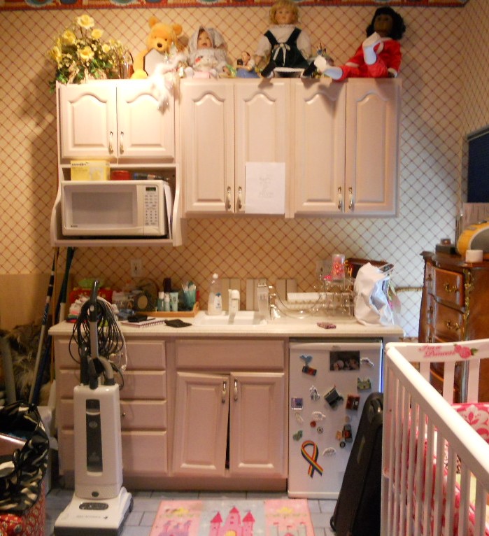
WHAT HAVE WE HERE? This is a nursery equipped to serve the nanny.  She's got an under the counter refrigerator to store bottles, baby food and wine whatever she wishes for herself.  In addition there is a small sink and a microwave.  There is also storage and counter top work space (underneath all the debris).  That's a lot of function packed into less that six lineal feet!  The lucky owners of this oceanfront abode are away for the summer, as is the custom in Palm Beach.MY ASSIGNMENTI have been asked to replace this set up but to keep the same foot print and function.  The cabinets are to be more in keeping for this  traditionally styled beach house.MY  OBSERVATIONSThe backsplash (area between counter and upper cabinets) is really high, about 22".  Not only does this mean less cabinet space but it's a bit of a stretch unless you're a very tall nanny.  In addition, there is nothing tying the upper cabinets to the lower cabinets and since they do not go wall to wall it looks as if the uppers are just hanging out, hovering over the base cabinets, not a great look.  In general the layout is off kilter.  The microwave requires a deeper cabinet and it sticks out unattractively on the left.WHERE DO I START?The appliances are old and will appear even older surrounded by new cabinets.  Remember that if you are investing in a new kitchen it's penny wise and pound foolish to try to build your new cabinets around your older appliances.   I will suggest that we replace the microwave with a small built-in model in stainless steel.   For this I know I must use a minimum of 24" out of the 70" I have available.  The refrigerator is important too.  This one is old and it's an odd size, about 19".  The new one will have to be 24" and I will reccommend that we build it in for a more custom look and to unify the small space.  These types of built-in panel- accepting- under- the- counter refrigerators are either 15" wide or 24" wide.  I certainly can't detract from the function by going smaller so I will give them more refrigerator space by going with 24" wide.  Now that I know what I'm doing with the appliances I will work the cabinet layout around that. Here's phase one showing the larger ref, a built-in micro and an attempt to even things up and connect the uppers to the bases but it's still not quite there yet.  I usually draw a free-hand sketch to work out my initial thoughts.  The final solution (I drew it using Chief Architect) is to use 42" upper side cabinets instead of the existing 30" uppers.  Then since the microwave needs a deeper cabinet (15"), I moved it to the middle and raised it up to create some design interest and to take advantage of the tall ceiling.  I made the side backsplashes 16" high with the center at 19".  I centered the 24" upper microwave over a 21" wide sink cabinet which allows the bigger refrigerator on the right and does not lessen the size of the existing drawers on the left.  I'll need a minimum of 3/4" panel to the right of the ref.  That makes a total of 24 3/4" with ref and panel.  I will duplicate that on the left making the 4 drawer cabinet 24 3/4" wide as well.  This allows the upper side cabinets to be equal at 23 1/4" each.  Last but not least, I am going to suggest using matching wood beadboard above the 4" backsplash to tie the uppers to the lowers and add a small crown moulding on the top to finish it off.

PRODUCTSHere are the goods and why I picked them:Kholer faucet K7342 in brushed nickel finish- It's a traditional faucet in a finish that will blend with the stainless steel of the microwave.  The height makes it user friendly yet it will fit perfectly in the space.

Kohler undermount entertainment sink K5848- I love the shape of this sink.  I double checked the size and it fits in our 21" wide cabinet.  It's a more updated undermount model but it's still cast iron.  I'm specifying Biscuit to go with the cabinets but I will also suggest a stainless option which would also work.

SHARP R1214OVER THE COUNTER MICROWAVE- This model fits into our 24" wide space.  It requires a 15" deep cabinet, check.  It has a light below and I happen to know that Sharp makes a kick-ass microwave.CABINETS BY HOLIDAY KITCHENS- flat panel with applied moulding. Finish, selected by designer, to be Snowdrift paint with Mink Wash.  I chose Holiday cabinets because we have some custom size requirements and I can order Holiday in fractional increments.  They also offer a wide array of finishes and door styles which is important in a higher end application.U-Line Under the counter refrigerator - This model offers an overlay trim kit option which will allow us to apply a door panel to match the cabinets.What do you think?  You see there's no mystery behind the magic of design.  Those are the steps in a nutshell.  I would love to walk you through the steps of your own potential magic.  It's really a lot of fun when it all comes together, kind of like solving a puzzle AND you get to continue to enjoy it everyday!  

DEBUT OF THE FOUR DOOR REFRIGERATOR

 It seems like the refrigerator is one kitchen appliance that is always changing and evolving.  After all, it has risen from being a literal "ice box" to an electronic device that can be temperature controlled by area for your unique needs.  The latest innovation is the four door model.  Sounds like a car but it's a fridge.  They look like the popular French door models but with an extra drawer.  Consumer Reports recently reviewed three models, by Samsung, Kenmore and LG.  The highest rated model was the Samsung which is also the priciest of the three retailing at $2,600.  They liked the functionality of the extra drawer which has something called a FlexZone.  It can be temperature adjusted for meat, drinks, kids' snacks etc. The Kenmore model rated highly too with its most appealing feature being an outside water/ice  dispenser and a built-in filtration system.  The Kenmore model retails for $2,400.  The LG model did not fare as well as it has the least usable space and is the least energy efficient.  It is however, the least expensive starting at $2,200.00.  Incidentally Consumer Reports does reccommend several French (3 door) models at $1,000 or less.  

A LOOK AT LOOX BY HAFELE


Hafele is one of my favorite resources for kitchen hardware and functional, fun accessories.  Known for quality and efficient German engineering it seems they are always coming out with something "wow-worthy".  Our ever faithful local rep, Pat Flatley, keeps me in the loop on their latest products.  I just found out about this one which I'm dying to share with you.  It's call Loox.  Does it sound like a Dr. Seus character?  Sure.  Is it a seriously kick-ass lighting option for your home?  Definitely.   Whether it's task lighting or just an ambient after glow you're looking for, Loox has the answer.  Loox is a low-voltage LED lighting system.  You can read about the technical details here.What I love is the great functionality of having a light inside a drawer or in the nooks and crannies of the closet.  Check out this handy Loox Room Configurator.  Simply click on the type of room you want to view and you can turn on and off all the various light fixtures that illuminate the room.  Hours of fun!  (Ok maybe not hours)  When you're a kitchen designer it's the little things that come together to make a fantastic whole!

DESIGN AND THE MODERN KITCHEN


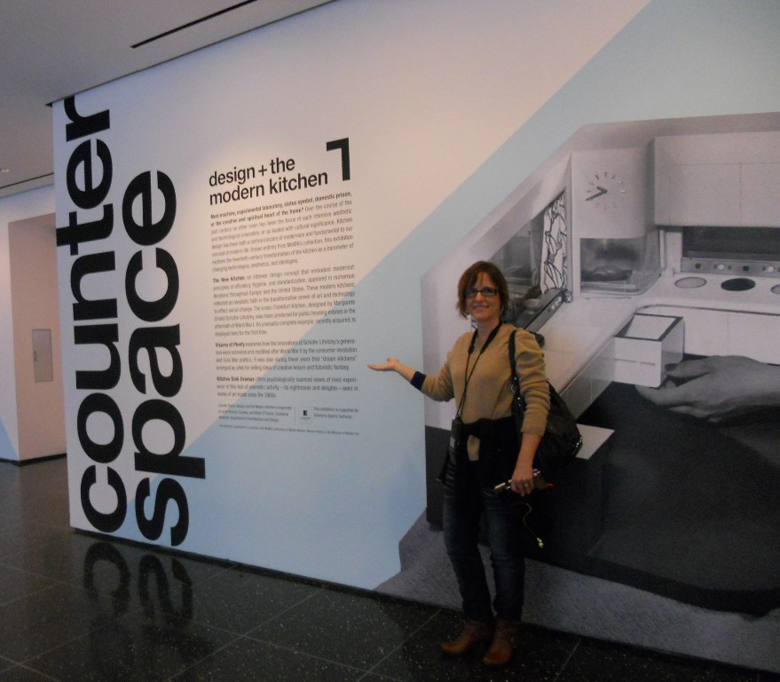
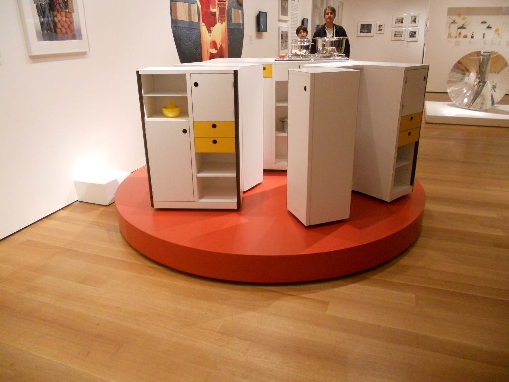
Granted I'm biased, but I have to say that Counter Space:   Design and the Modern Kitchen is the most engaging exhibit I have had the pleasure of attending.  It opened at the Museum of Modern Art September 15th and closes on March 11th.  The thing about this show is that we can all identify and connect with the topic of kitchens.  They are an integral part of how we live but we seldom give thought to exactly how they came about.  You can find just about all there is to know right here.


The only critique I have is that I wish they would have included commentary post midcentury.  The concepts of the kitchen are so dynamic and there is a lot to be said with regard to the last half of the 20th century.   Nevertheless, especially for a kitchen professional or enthusiast this is an absorbing and engaging experience.  The exhibit is divided into three main segments.


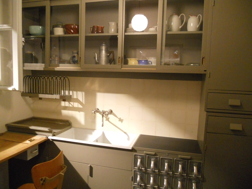
"Toward the Modern Kitchen" examines the early research in efficiency and time management that culminated in the design of the Frankfurt kitchen in 1928 by Margrete Schutte Lihosky.   A post World War I housing crisis provided the impetus for such reasearch resulting in what is thought to be the first "modern" kitchen.  You can read more about this history on a previous post here.     It was believed that by transforming daily life at the level of he kitchen behavioral change and social well being would result.  Good old German efficiency and practicality were at the heart of these inventions and it was two women in particular who made the biggest contributions, researcher Christine Frederick, as well as architect Margrete Schutte Lihosky.


The second part of the show is "Visions of Plenty"  and deals with the post-war kitchens in America.  It was then that the ergonomic considerations begun by Ms. Lihosky were further refined and a standard counter height of 36" was established.  This was based on the average height of a woman at the time.  Kitchens also began to evolve into living areas at this time and were very influenced by food restrictions brought about by the second world war.In addition myriad everyday objects are on display throughout the show.  We never think about where the things we use everyday come from but they have a history and were shaped by our culture and time.The final part of the exhibit is entitled "Kitchen Sink Dramas" which deals with kitchens as they are portrayed in the media as a rich subject for artistic expression.If you would like to know more about this exhibit and rich history you can purchase a hard cover edition catalogue of Counter Space produced in conjunction with the exhibit and available by clicking here One final note that I have not seen mentioned is that this show was  sponsored by Silestone Quartz Surfaces.  I'm headed back home to the drawing board today with visions of tupperware and proto-type kitchens dancing in my head!