 Great to be back! Had a great time deep in the heart of the Catskills for my bro-in-law's 50th b-day. No cell phone connection but plenty of family connection so it was all good, even the 10,000 hours of planes, buses and automobiles. Anyway more on that later, much more! Today I'm dying to share Deck Two with you. Deck Two is a graffiti artist from Paris. Actually he's a human dynamo specializing in motion design, illustration, VFX (?) and especially LARGE graffiti. His latest work was completed just last month in New York, not on the street but, you guessed it, in a kitchen! Everyone knows how hot white kitchens are but this is a white kitchen plus. The work is called Global City and it features landmarks from all over the world. The remarkable thing about all this is he remained true scale in all his proportions drawing over walls and cabinets to cover the entire room. I guess whatever he does he tends to cover the whole thing. You know how I love to see art in the kitchen :) A big thanks to Vicki Perez for the heads up on Deck Two! Check out video below showing some of how it was done.
CRAZY KITCHEN AWARD
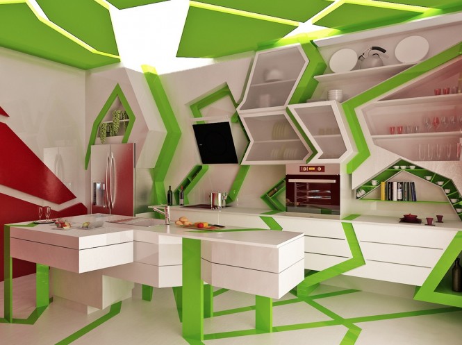
Welcome to Kitchens for Living's first annual CRAZY KITCHEN AWARD. Criteria include impracticality, power to confuse and disorient and of course creativity. With that in mind this one takes the prize. The Cubism Art Movement was the inspiration behind this wacky design by Gemelli Design Studio, out of Sofia, Bulgaria, of course. Here's the rationale:"Often the kitchen design is mainly aimed to its ergonomics. However this can lead to loss of its originality. Our goal was to create a glamorous kitchen combining multiple perspectives as a masterpiece of art affected by the cubism and surrealism styles. We believe that this advanced kitchen is a part of a more coloured, spectacular and interesting world and, at the same time functional." Really? What can I say? You know I'm always striving to insert anything to do with art into this blog. As Marlene Dietrich once said, "I can't help it."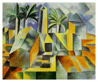
WOOD YOU FAUX THE DIFFERENCE?
Today I would like to introduce one of the star players behind the scenes at the busy, bustling Brendan Donovan Furniture & Cabinet Co., of which I am proud to be a part. Meet Serf ( I won't mention his last name cause I can't spell it and you wouldn't be able to say it anyway). Serf is our finisher in residence. Not only does he finish all our custom cabinetry, he is an artist as well. I never really knew that until today when I visited him at work on site. The project is to magically transform white painted wood doors into knotty pine to match an existing den. At first I thought, why would anyone want to do that? It can't look that good. Wowzer was I wrong! Check it out. It was one of those moments where I was just not expecting to find a blog post. I only had my crappy cell phone camera but I think you can see what I mean. It's simply amazing. Serf starts by making a template, of sorts, out of nothing more than a piece of cardboard! Here's the before.
 Here's the after where he's captured the wood grain, the depth and the knots of the knotty pine.
This door, which started like this, took about three days to complete. First he lays down a base coat, then he paints in the knots followed by the graining and two colors of varnish for visual depth. Whattayathink??
ALL THAT GLITTERS COULD BE GLASS!
You've heard me talk about glass before and it's place as a progressive material used in all sorts of innovative ways in the 21st century kitchen. The following is a press release I recently received for a company called Think Glass.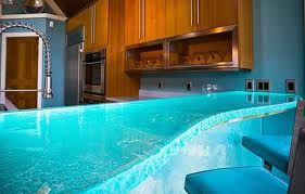 "One of the coolest products just unveiled at the National Kitchen Bath Show in Las Vegas was a stunning 4-inch glass countertop that looked like the luminescent ocean and actually glowed from within. The powerful LED lights embedded inside gave the glass countertop a radiance. ThinkGlass offers a variety of light colors and even the ability to create a “light show” via remote control with special effects such as flashing and fading lights to create an ambiance.ThinkGlass has quickly become a leader in the thermoforming industry by pioneering a versatile technique that allows the creation of new or repetitive textures at a very low molding cost. This process allows the creation of glass slabs without thickness constraints opening the door to all kinds of design possibilities that far exceed anything that can be accomplished with stone, granite or marble."This truly is a revolutionary break through. Previously the thickest counter top any sane glass expert would offer is 3/4". When glass reaches a thickness of 1.4" it becomes hard as stone and it is naturally antibacterial because of its totally nonporous nature.
 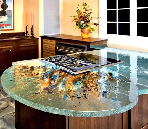 ThinkGlass has been around for about 11 years and here's how they do it. The process begins with 8' by 11' sheets of 1/2" glass which is cut to size according to project specs. The glass is stacked and placed on a bed of sand in an oven. Any desired texture or design is drawn into the sand before the glass is placed on it. The glass is then baked for one day for every 1/2" of thickness. The finished product is then polished by hand. Pretty cool, huh? The sand is even reused so there is no waste.The addition of LED lighting for illumination really takes glass to the next level and is sure to deliver lots of "wows". Glass is easy to clean and the addition of a texture is a crafty way to hide finger prints.If you'd like just a little wow that's good too and can be enough. How about a raised glass top on your island? If you go this route make sure to employ a qualified professional who will know the best way to install and secure your top. Last but not least, don't forget that if you are a follower of Feng Shui, glass is a great way to add the water element to your kitchen. The element of water is said to attract wealth and health!
SHOW SOME SKIN IN YOUR KITCHEN
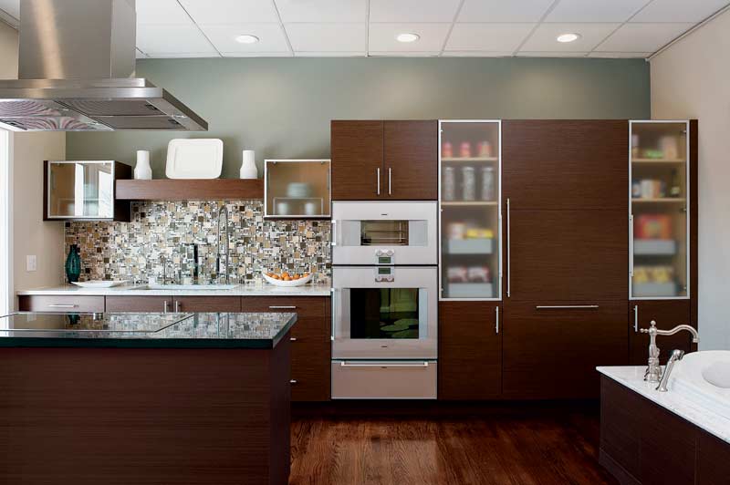 Don't get excited. Skins are what we sometimes call wood veneers, or super thin sheets of material used to cover cabinet doors or panels instead of using solid wood. As clean lines and contemporary styling continues to increase in popularity, surfaces themselves become the ornamentation and focal interest in a kitchen. The use of interesting wood grain veneers which are both beautiful and unique, is an excellent way to make a simple slab door stand out.
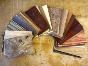
 Many of my clients are surprised to learn that this is can actually be a more expensive option compared to a solid wood door. There are a couple of reasons for this. One is that these veneers, or skins, are often made from exotic wood and secondly this can be a labor intensive process, thus the increased cost. The advantage being you can "control" the wood grain, so to speak, creating patterns that match up with each other. So if the unexpected randomness of natural wood grain makes your pits sweat this could be a good alternative for you.Another option if exotic wood veneers are too rich for your blood is something called "engineered wood veneers". These are man made skins that replicate the exotics using not-so-exotic woods. The material cost is a lot less and in many cases it's hard to tell the difference.
 If you still love more traditional styling, veneers can still be useful for you. A traditional 5 piece door benenfits greatly from a center panel that is veneer rather than solid wood. The reason is that the veneer is applied to a dense MDF substrate that will not expand and contract the way solid wood does, thus the center panel will not ever swell cracking open the seams or shrink resulting in a lose rattling center panel.One of my favorite traditional doors made here at Brendan Donovan Furniture & Cabinet Co. is this Sapele Mahogany door with a Rosewood veneer center panel.Another way to get the look without blowing your budget is to mix it up. Just use the veneer on, for example, your upper cabinet doors. The more intricate the graining the stronger the statement. In other words, a little goes a long way. Too much and it becomes busy and you lose the concept of focal point.
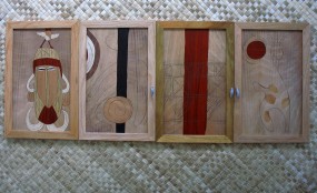
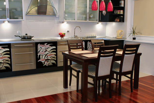
 If your kitchen design involves round radius shapes it's going to involve wood veneer which can be bent and moulded to conform as needed. Another beautiful effect can be achieved through the use of marketry, or inlay. In researching this post I came across the amazing work of Juli Morsella. Talk about adding a little art to your kitchen! In addition, Juli is committed to using reclaimed woods, eco-friendly materials and she donates 10% of her earnings to environmental causes.
 If you're interested in using wood veneers (or not) for your kitchen I would love to hear from you! Congrats to Amy Parrag of Eye See Pretty. She is the winner of the Orgaline drawer organizer giveaway!
TIPS TO AVOID KITCHEN REMODEL RIPPOFFS
Seems like the consumer is a little leery lately. Everyone's radar is on high alert looking to avoid the big RIPOFF. I can only speak for myself but I'm confident that I am in the majority. All we kitchen and bath industry professionals want is to make you happy. Do we have to eat? Yes, and so do all the hard working people that make your life possible. That said, I do understand where you're coming from. After all, I am a consumer too. With that in mind I have come up with a cheat sheet for you. Run through these 5 tips as a prelude to your decision making and you should be able to trust once again. Oh and remember there is a difference between cheap and value for the money. I know cheap is tempting but it isn't cheap anymore if you have to replace a product that doesn't make the cut.
1. KNOWLEDGE IS POWER- Today there is no excuse not to educate yourself before you go shopping. There is a wide array of media at your disposal. Use the internet and talk to people! Yes, people, in person (ok can be online too). Talk to the experts. Read blogs. Ask questions and talk to other consumers. One of the best ways to feel good about your choices is to know other people who have made them before you and been happy. No, you can never know for sure but the more knowledge you have the more equipped you are to make the right selection for yourself.
2. RESEARCH-This goes hand in hand with #1 but it is really the next step. Once you have defined the scope of your project you will be ready to select specific products such as appliances, counter tops, cabinets etc. that fit into the big picture. Research the choices. What are other people saying? How long has a company been in business? The National Kitchen & Bath Association (NKBA) Consumer Reports and the Better Business Bureau are good national and local resources and can indicate if you're headed in the right direction.
3. TO THINE OWN SELF BE TRUE- Take a little time to find out what your style is. Who wants to spend a butt-load of money on something they're going to hate looking at? The best way to find what floats your boat is to do something I call "kitchen scrap booking". Time to have fun. Collect images from magazines, catalogs and the internet. These don't even have to be photos of kitchens. They should be anything that appeals to you, a style, product or just a general ambiance. In this way you will begin to see the patterns and perhaps even discover some things you never consciously knew! For example you may find that 7 of 10 photos contain white cabinetry but maybe you never considered that. Getting what you love is good value. It just takes a little vision.
4. LET THE PROFESSIONALS DO THEIR JOB- A WORD OF CAUTION: Don't get carried away here. You've all heard "a little knowledge is a dangerous thing". It's true. Never succumb to thinking you know it ALL. That's why there are people who have studied and spend a large part of their waking lives becoming certified experts so they can get paid to help you. Use them.
5. COMMUNICATE FOR GOD SAKES! Once you've got some semblance of a plan in your head it's time to take it (along with your scrapbook) to the magician professional who can make it happen for you. This is not about money. You have to buy your products somewhere and that place should have a professional on hand to take your vision and translate it into your dream. That's all we do folks. It is my experience that the best projects are really good collaborations between client and designer. Getting what you want equates to good value for money invested. The NKBA is a good source for qualified professionals in your area. Many of us are also willing to work on a consultation basis, so ask!

