THE BEST OF KBIS

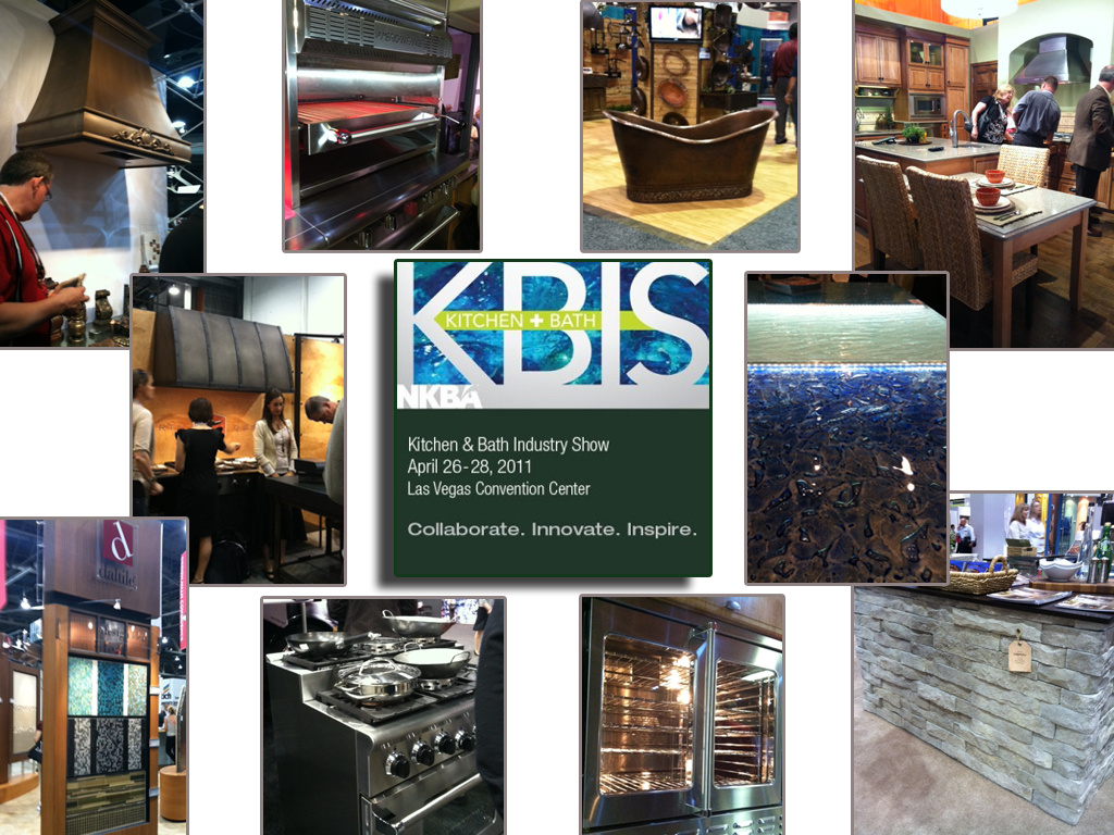
Our annual Kitchen & Bath Industry Show known as KBIS  was held last month in Las Vegas.  I’m hearing that attendance was much improved over the anemic showing of the last couple years.  This show is traditionally where new products and design trends for the kitchen and bath are introduced to the world at large.  Here are some of my new faves from the show!
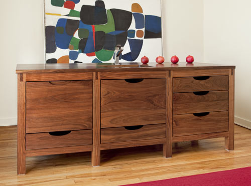
 

One of the most exciting debuts this year is  Bornholm Cabinets,  conceived of and created by fellow blogger Susan Serra and her daughter.     They are a couple of smart cookies who know what’s both hot now as well as basic and unique enough to be timeless.  The line is Scandanavian inspired but American made.  Simple yet elegant and designed to blend into and enhance any environment.  I think we’ll be seeing more of this.  You can see more here.I also love this beautiful bit of black.

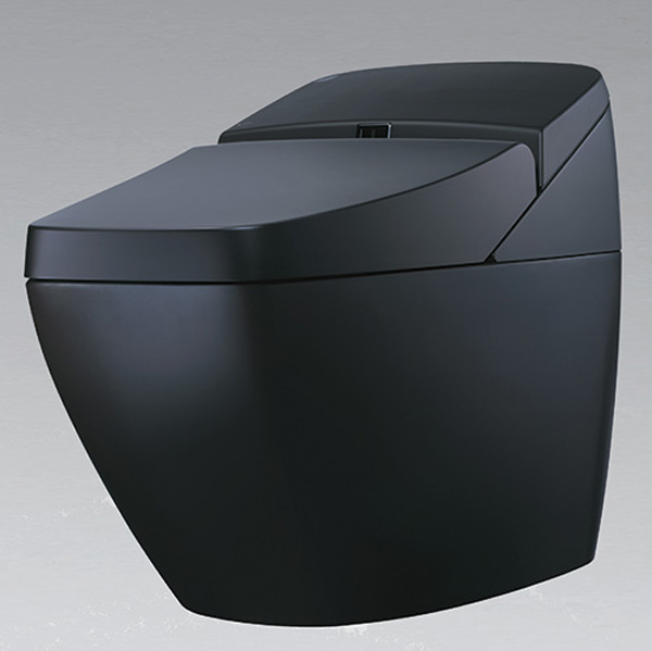
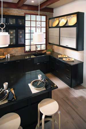
Yes it’s a toilet!  When it comes to commodes the Japanese have definitely got it going on and this example is no exception.   We all know what a "smart" phone is, well meet the "smart" toilet!  The REGIO by Inax  features a sound system, heated seat, double power deodorizing, automatic seat and flushing, and dual nozzle bidet. Geez, what more could you want?  Oh, yeah it’s also environmentally responsible. Check it out here Here’s a new fun way to add a little glow to that backsplash area between your cabinets and counter top.The °eluma RGB DecoSplash illuminated backsplash is the first fully customizeable color changing LED backsplash.  You can change your color as you change your mood from fuschia to lime green!  This LED light is dimmable and you even have your choice of decorative inserts.  Find out more here.Dark rich wood finishes continue to be a popular choice.  I just love the Asian vibe (of course!) of this kitchen by Wellborn Cabinets.Click here to see the rest of The Best of KBIS!
LATEST PRODUCTS TAKE THE STAGE

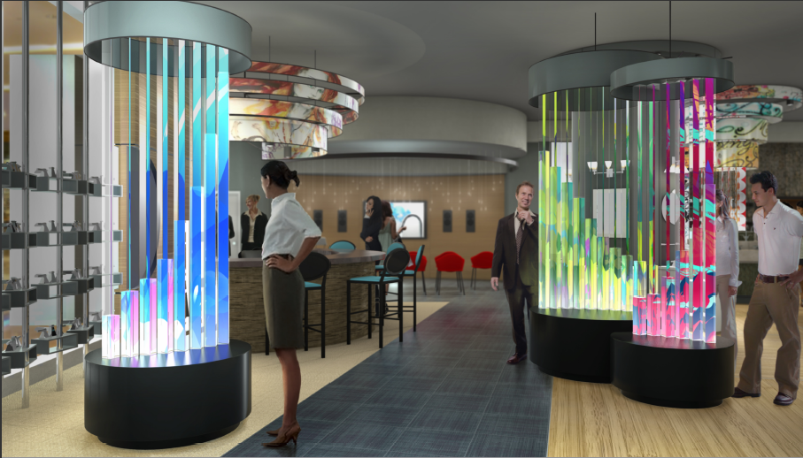
I’m finally feeling better, thank you, after being laid low by a vicious virus last week. You know the one, right? I won’t bore you with the details. Suffice to say, while I was out going viral (and not in the way I would wish) here’s what’s been happening far and wide. Delta Faucet Company unveiled its flagship DREAM2O(SM) showroom, located in Chicago's Merchandise Mart, during a private grand opening event on Thursday, May 5.   (You’ll remember my amazing experience with them last year in New York.  If not, click here for a flashback.)  The new 3,097 square-foot design center is a hands-on, interactive environment where architects, designers, and homeowners can experience more than 90 fully-functioning faucets and fixtures from the Delta® and Brizo® brands.  What makes this showroom unique is not only the fact that it is the first and only showroom of its kind, but also the innovative displays which are just a perfect way to showcase their cutting-edge products. Read more about it here.

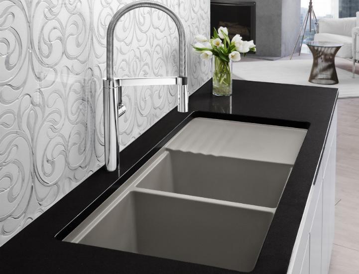
If you’re in  NYC this weekend you can visit the International Contemporary Furniture Fair or ICFF held at  New York City’s Jacob K. Javits Convention Center  through May 17th.  Sink manufacturer extraordinaire, Blanco (another flashback here) is officially launching two new collections including the Silgranit II Truffle Sink and the Culina faucet.

Italian kitchen cabinet manufacturer Scavolini is introducing the new quartz surface Santa Margherita on May 16th from 6-9pm in their Soho gallery.  If you'd like to attend contact Daniele Busca  212-209-0910 as this is an invitation only event.

CREATING AN INSPIRING WHITE KITCHEN

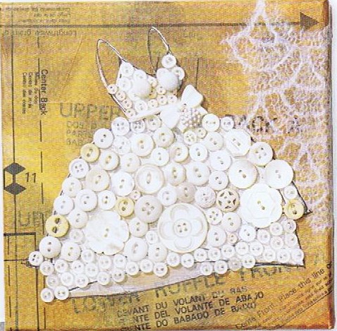
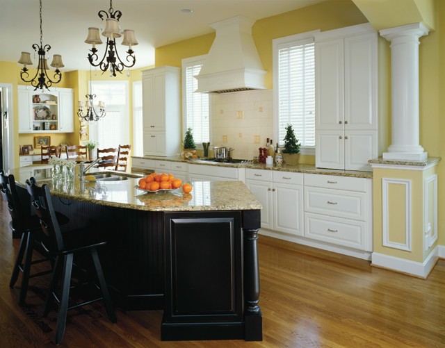
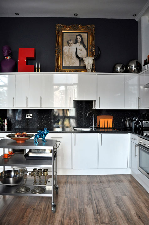
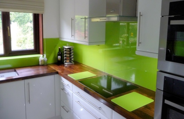
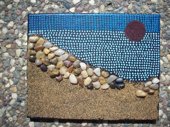
Today's Let's Blog Off topic queries the source of our ideas.  Where does creativity reside?  Is it within or is it outside and all around awaiting discovery?  For me the answer is both.  Yes, it's all around us, for sure, but it also requires the eye of the beholder to breathe life into it.  Here is a recent example in my life of something I saw which inspired a blog post.You may have the panache to pull off a monochrome white room that invites and stimulates the senses but for most of us going all the way with white runs the risk of BORING.  Since white is so "white hot"  at the moment, especially in the kitchen, I’m going to share with you the secret of how to make white pop.One thing to remember is white is a team player, it’s all about the colors around it. As you know, I love art (a big source of inspiration). I recently came across this image in Cloth Paper Scissors Magazine which is a perfect example of how white can glow when surrounded by the right color.  I see it work time and again. White cabinets plus color equals stunning.  If your taste runs more to the conservative think camels, taupes or warm beige walls to create the contrast.If you’re more daring go for Apple Martini Green or Sky Blue.  The nice thing is if you want to go for the gusto paint is a safe bet.  It’s one thing you can change fairly easily and reasonably.Another thing to remember about white is that it’s just not white. There are probably hundreds of whites and they all read differently depending on your lighting and location.  The lesson here is to test your whites on site.  Consider the color for a full 24 hours so you can see how it looks as lighting changes throughout the day.Many times wherever you find white you will also find black.  You can tastefully mix black and white cabinets or if you have guts and great lighting the walls could be black, as in this example.  This photo also serves as a great inspiration for many of the newer homes we have in my area with cathedral ceilings but short stumpy cabinets (thank you Mr. Builder).  If you can't afford to change the cabinets take advantage of the great space above for art.  Here, it carries the eye upwards taking attention away from shorty cabinets.This stunning Apple Green back splash looks like glass but it's actually a colored plastic by Opticolor!  So there you have it, inspiration of the day all inspired by a whimsical little piece of art!  

ONE FLORIDA KITCHEN WITH A TWIST

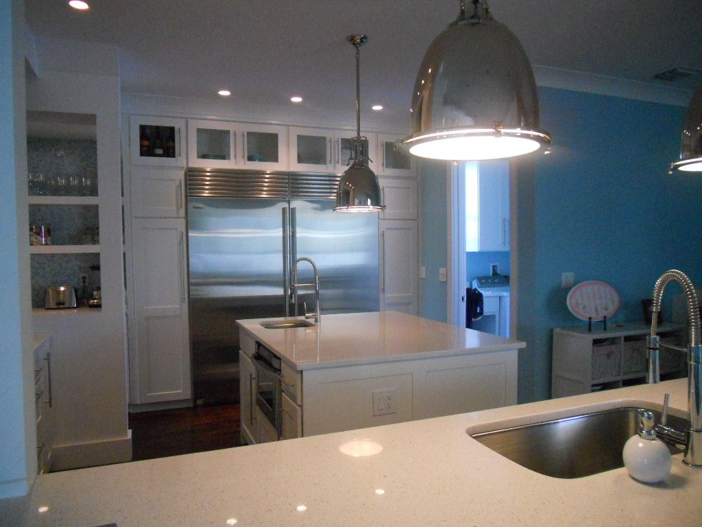
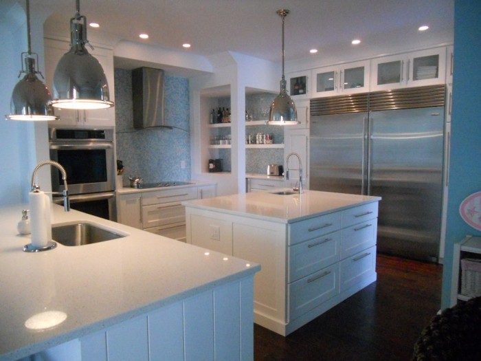
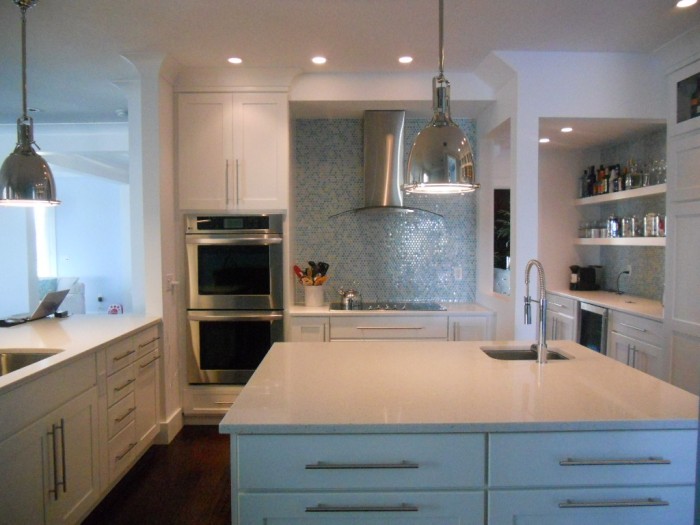
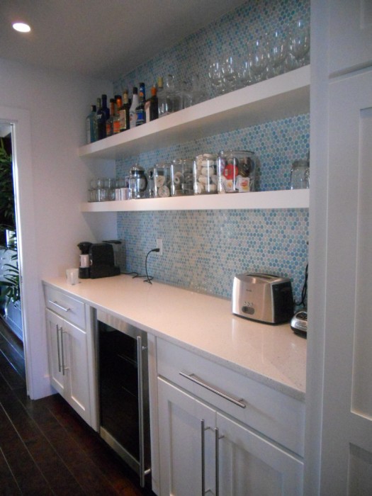
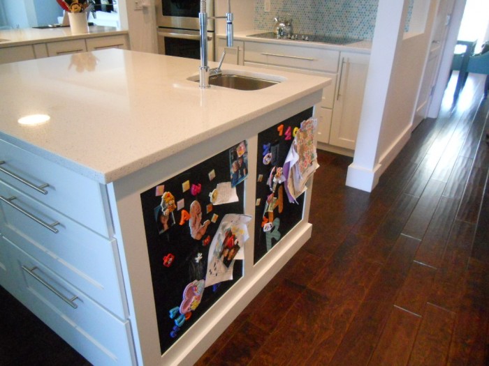
I can’t believe I’ve been back a week already!  I guess it’s time to refocus on Florida.  What better way than to share this kitchen from my portfolio? Yes, it is the quintessential “Florida” kitchen but you don’t have to live in Florida to have one.  If you have a yearning for the tropics year-round, this could be the perfect storm (poor choice of words) solution for you.   This combination of white, stainless and shades of blue green that call to mind the ocean make this a Florida dream kitchen that you can apply to your own home.I always say the best projects are the result of great collaboration and this beautiful kitchen was certainly the result of that.  The house is located in a new development and came with a builder-grade offering of unremarkable cabinetry.  The new design includes a few tweaks.   One priority for this young mom was to have a very open feel to her kitchen.  We even wanted to remove the wall between the kitchen and butler’s pantry.  That was not to be as it turned out to be structural.  Plan two was to open it up so that you could at least see through it.  I think you’ll agree it worked really well.


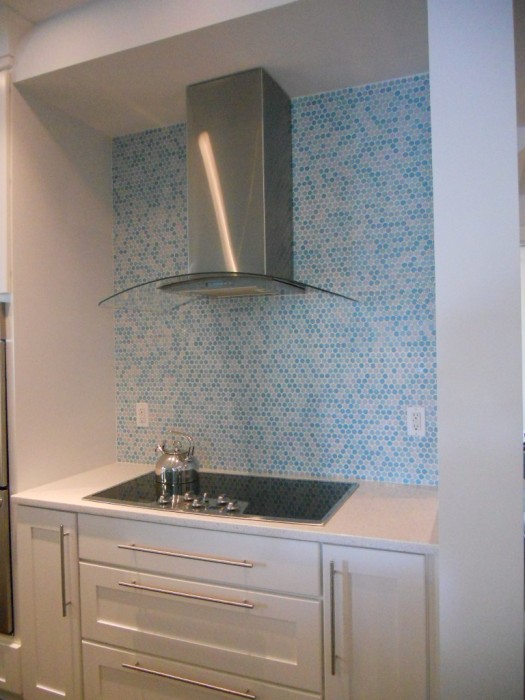
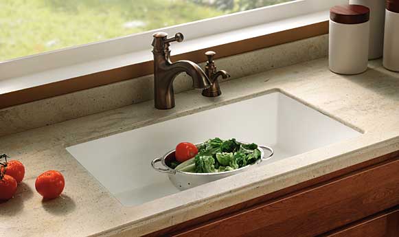
 The cabinetry is by Holiday Kitchens, Inc.  The door style is called Seattle and it is wood with white paint.  Counter tops are white quartz and the dramatic backsplash is penny tile.  A penny tile is a round penny-sized mosaic tile that comes in sheets for easy installation.  Appliances include a full sized 36” refrigerator and freezer by SubZero, a built-in wall oven and a handy microwave drawer by Sharp.  Now all you need is a sturdy pair of flip flops and a stylin pair of  shades to complete the ensemble.


FLORIDA KITCHEN CHARM

Thank you  for the out pouring of love and concern for our family.  No matter what happens the sun always rises again and we begin another day.


As you guys up in the northern regions are beginning to crank up the heat,  I thought I'd share a little warmth from down here in sunny Florida.  If you love warm tropical beaches, even when there's snow (instead of sand) on the ground, here's how you can bring this ambiance to your "anywhere" kitchen.

Blue & White will give you an instant feel of sun and surf.  White cabinets are hot!  Blue calls  to mind the ocean and may be added to your backsplash, walls or even used as  accent color for an island or hutch cabinet.


A sea view is a must and you can have one even if you don't live by the sea.  Think art!  That way you can choose the sea view of your choice.  It can be a painting, a photograph or even something more abstract like a mixed media work of art.

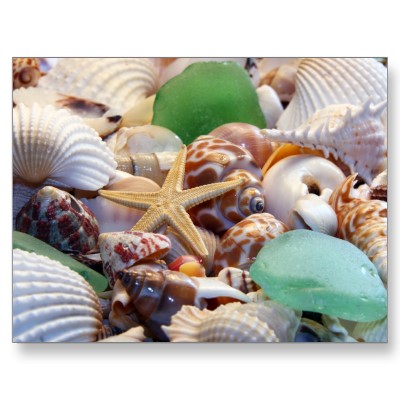
Gifts from the Sea are fun ways to add a beachy feel.  Shells, starfish or even bits of beach glass are great accents.  Try using a shiny glass tile backsplash for a watery feel or tiles with more of a honed finish look like glass that has been eroded by the sand over time.

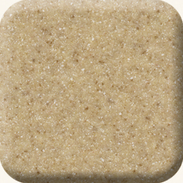
Burled Beach Corian countertop by Dupont

Throw some sand into the mix with solid surface counter tops in colors like Dijon from the Elements collection by Denova or Burled Beach by Dupont's Corian.

The nice thing is you can add a little or you can pull out all the stops.  If you have "Floridified" your kitchen sent me pix.  I would love to show and tell.  Oh, and by the way, it's nice to be back!


SPELL IT OUT IN THE KITCHEN


Lately I've been reading a lot about something called TYPOGRAPHY which is  the art and technique of arranging type, type design and generally playing around with letters, numbers and symbols.  It's bold and exciting and can define your kitchen in a new way.  You can buy unfinished letters which can be painted  and creatively arranged to add a little intrigue to the heart of you home. Here are just a few ways you can bring typography into the mix for minimal investment.


Fun with food!  There's nothing like a giant letter garnish to start a dinner conversation.


Just a few BIG letters strategically placed on a shelf or hung on the wall may be all you need.


How about an art print featuring your lucky number or favorite phrase?


Use a good old fashioned black board if you want to write your own text.  This allows you to change it up.  Invite the family to contribute.  Heck, it could even be your grocery list.  The point is that the writing is the decorative element.  Make your own blackboard with chalkboard paint by Benjamin Moore.

Drop me a line and let me know your decorating type! (Sorry)