The Rest of the "Hot Pepper" Kitchen Story

Happy new year peeps! Back at the drawing board this week after a nice holiday break. I got a lot of annoying little things done AND spend a little time in the studio but that's another story. Last post I told you about my dream kitchen. I don't know about you but I'm still dreaming and that was just enough to pique my interest. The lovely Shannon Pepper of Shannon Pepper Design in New Zealand, YES, New Zealand (who knew they were rocking such awesome design down under?)  shared some of her musings with me:

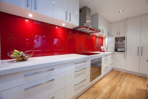
 KFL:  What parameters were you given before designing this kitchen?Shannon:  The kitchen needed to be very functional for a busy family of 5. The kitchen is very much centralised in the home so it also needed to be very " good looking " for better words. There needed to be space to tuck things away like appliances etc to keep the space tidy.KFL: What was the biggest challenge of the project?Shannon:  Hmmm, I'm not sure there were any real challenges in this project as the client was very easy to deal with and realistic.  The space was very proportional and easy to plan. I say that but originally, in the plans from the architect, there was a window on the hob (stove) wall which we were trying to work around. After much thought  the client decided that since the space would only look out onto a hedge and wouldn't  offer much light  we opted to remove the window and add under cabinet lights to keep the space light.

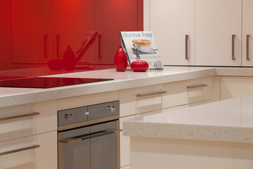
 KFL:  Is there anything you'd have done differently if you could?Shannon: Not really,  I love this kitchen and loved working with this client.KFL:  Can you describe they type of client you were designing for? Shannon:  The clients were both doctors and they have 3 children under 12. The family is busy with extra activities after school for the children and wanted a space that was functional and easy to maintain.KFL: What brand of cabinets did you use?Shannon:  The cabinetry used is a Dezignatek vinyl wrapped (known here as thermofoil)  product. The colour is white gloss and the profile of the doors and drawers is Milan. This product is great for giving you a painted finish look but without the chipping and scratching possibilities of paint.Not only is this a dream kitchen but it sounds like it was an all-around dream job too.  Check out Shannon's website for more pics of her beautiful projects. 

Dreaming of a White Kitchen...

I’m always designing, writing about and thinking about kitchens.  It’s what I do.  Today I started thinking about what MY dream kitchen would look like and thanks to our uber talented design pals over at houzz.com I think I found it.

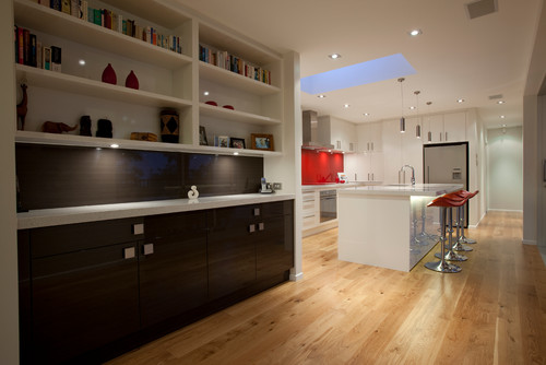
It’s this stunning kitchen by Shannon Pepper Designs in New Zealand.  Not only is it a visual pleasure, but it would also be a blast to cook in!  It features glossy white cabinetry with contemporary slab fronts, white marble counters and a stunning red painted glass backsplash.  I’m loving how the red is picked up by the bar stools too.  I love, love, love.  I wonder if she calls this “Pepper Red”?  If not, she should!  

I also love the contrasting cabinetry in the adjacent bar. Now for me I must confess I would tweak just a couple of things because that’s what I do.  I take a dream and I tailor-make it to suit YOU.  But wait we were talking about me today!  I would have run that HOT “Pepper Red”  backsplash all the way up behind the hood and I would have lowered those upper cabinets because I’m short and because it would give me more storage.  Something like this:dreamAs they say, a girl can dream.  Wishing you and yours a very Merry Christmas, Happy Holidays and tons of beauty, love, health and prosperity in the new year!! Thanks for reading Kitchens for Living.  XOXOXOX 

Poggenpohl, Ultimate Form and Function

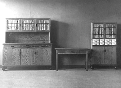
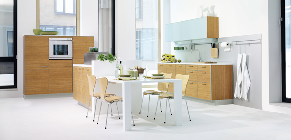
Poggenpohl new ash wood veneerWhether your in the market for a new kitchen or you're in the business of selling kitchens one of the first questions that comes up is, “what’s your style?” Are you traditional, transitional or contemporary?  If the answer is contemporary, the elements to look for include seamless integration, totally efficient function and clean sleek lines.  These happen to be the standards at Poggenpohl, founded over 120 years ago as the first German kitchen brand and now  the best known kitchen brand in the world – present in more than 70 countries around the globe.  Poggenpohl can show you what true European contemporary design is all about.1892_01Today they continue to think outside the box (pun intended) to offer some of the   most cutting edge cabinetry in the industry.          

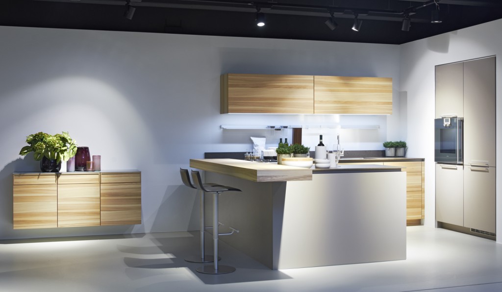
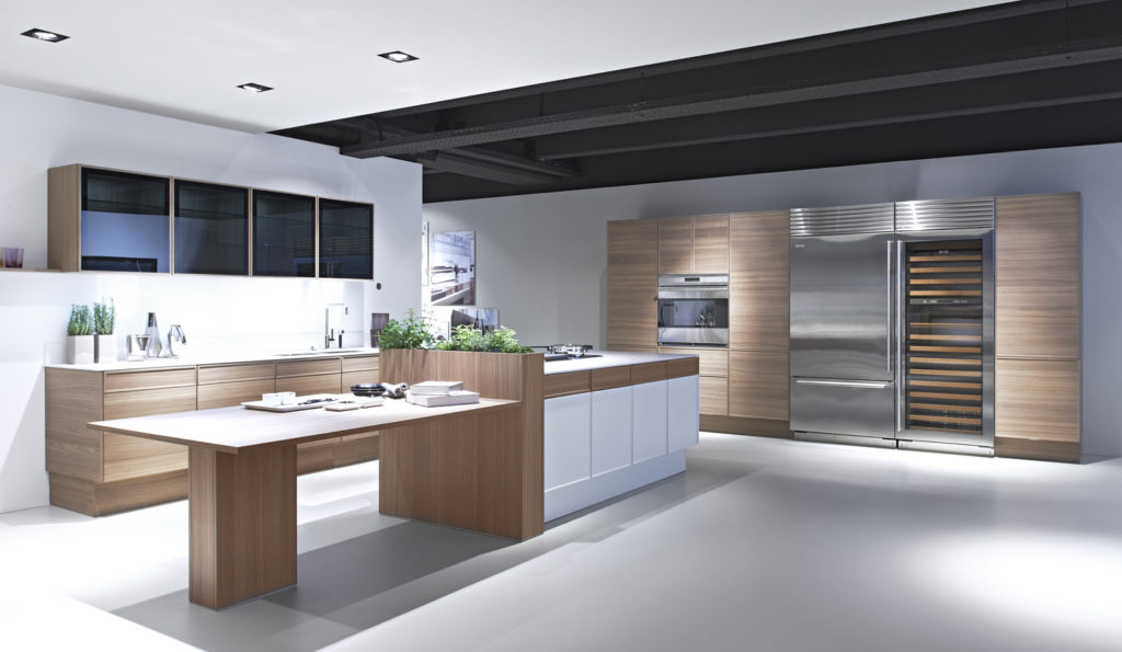
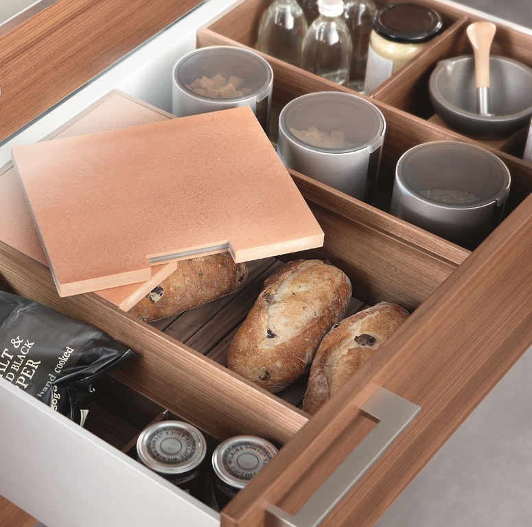
The new +EDITION collection from Poggenpohl combines the best of both worlds, crisp clean white lacquer with warm natural walnut wood veneer.  It is available in flat panel or thin frame detail door styles. New black glass upper wall cabinets include the same thin frame details with finished interiors and LED lighting.Behind the scenes storage is also a Poggenpohl hallmark.  A wide range of  available drawer inserts can be customized to your needs.  These kitchens are not designed, they’re engineered!  This includes not only cabinets but thin counter tops, offered in glass or stone, and even integrated glass front cooking appliances!  One can be sure that their kitchens are as pleasurable to look at as they are to work in.  I also love that although the elements are integrated they seem to also stand alone as individual sculptural statements.  (Spoken like a true kitchen designer channeling her inner artist.)A tricked out backsplash eliminates counter clutterA modern European kitchen utilizes the easy to reach back splash area under the upper cabinets.  Other elements to notice include horizontal graining, mid-height cabinetry and a mix of texture and materials. I enjoyed learning about Poggenpohl and their design philosophy as a part of the Modenus Blog Tour New Orleans.Next up:  We’re gonna get steamy at KFL!  Adding luxury and health benefits to your bathing experience with Mr. Steam

RED PLUS BLUE EQUALS PURPLE IN THE KITCHEN!

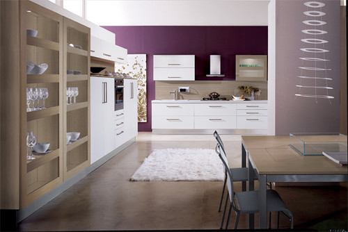
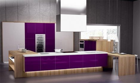
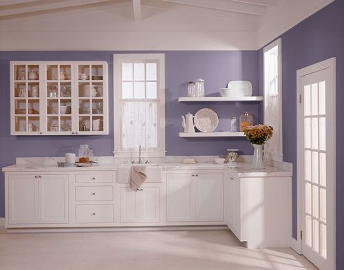
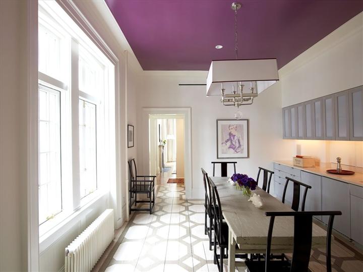
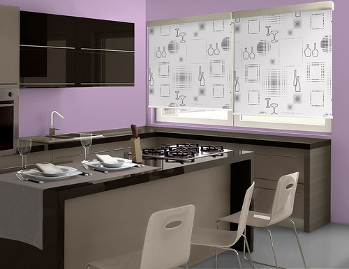
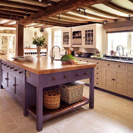
After a long election I’m sure you’re in the mood for something TOTALLY different.  Me too.  Congrats to the winners and may we mend our fences and make up with all the friends we temporarily (hopefully) blocked on Facebook.  As someone who is passionate about art, I am always looking at color and the effect it has on our environment.  As a nod to the red and the blue states today I’m showing what they can make together, purple! Is purple a viable color in the kitchen?  If you love it, here are some ways you can incorporate a little lavender, lilac, plum, fuscia or just plain ole purple whether you are conservative, transitional or uber modern.  If you hate it, at least it’s something completely different!