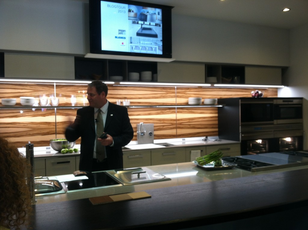
 For the last few years I have been honored to be a member of the Blanco Design Council. This means I’m on the main line when it comes to inside information about their products. BLANCO, of course, is the German manufacturer of finely crafted sinks and faucets. Their SILGRANIT II sinks are a particular favorite of mine and you should definitely know about them if you’re considering a kitchen remodel. If you don’t know about SILGRANIT II, see my previous post here. As a kick off to KBIS2013, I got to see the newest BLANCO happenings in New Orleans with a Cajun-styled experience called The Kitchen Unmasked. This joint venture featuring Blanco, Poggenpohl and Silestone was held at the beautiful Nordic Kitchens showroom and was one of our stops on the Modenus Blog Tour.
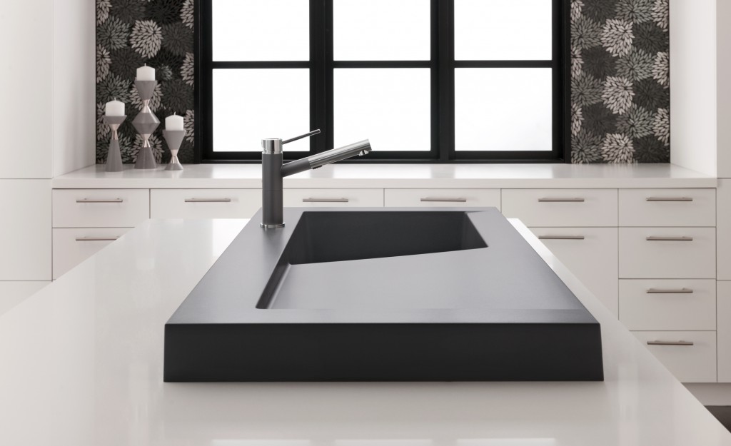
The latest SILGRANIT II color, Cinder, is all the rage. It’s a stormy striking combo of dark gray with some black and rich brown thrown into the mix. I think it’s the perfect color to go with all the new luscious shades of gray we’re seeing. It’s on trend yet neutral at the same time. The new SILGRANIT II series of sinks also includes HYGIENIC+PLUS™ a patented formula that acts as a shield against dirt and bacteria. Independent laboratory tests confirm that the unique built-in hygiene protection reduces bacterial growth by an average of 98%.My favorite addition to the SILGRANIT II collection is the Modex sink (at top). The next kitchen I design for myself (hoping) will have this sink. I love it. It adds a bit of architecture to the kitchen! Modex features a unique 3” profile that sits on the counter and includes a large integrated cutting board. It’s not just a sink, but a workstation.Speaking of work, did you know your faucet is the most abused item in your kitchen? BLANCO's well known German engineering ensures that you have a product that will stand up to the test. BLANCO also launched a new line of water saving faucets including Grace II, Alta, Highland and Napa. 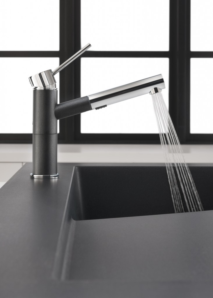
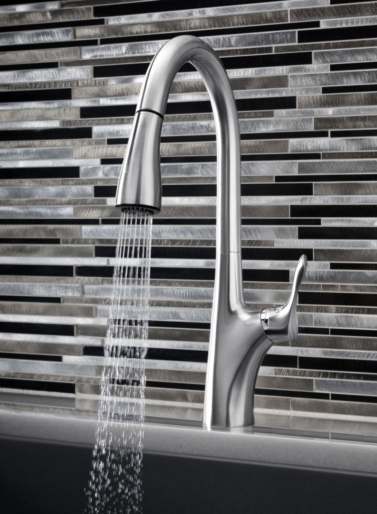
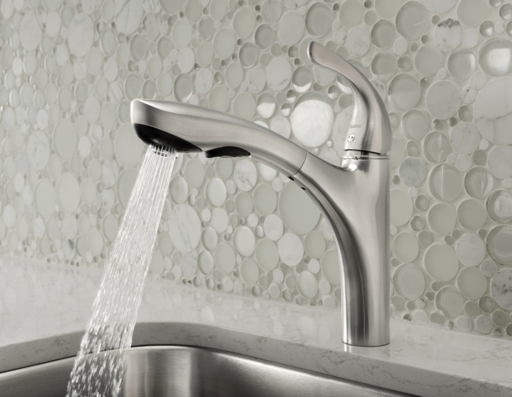
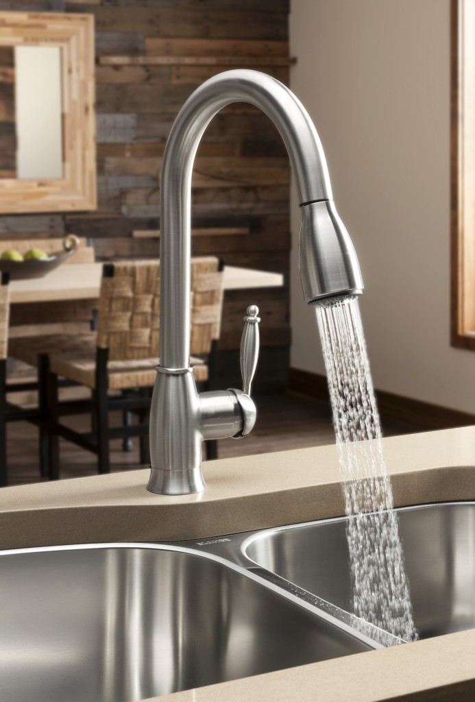 “Our latest collection of faucets offer livable style,” stated Tim Maicher, Director of Marketing for BLANCO. “When we say livable style, we are referencing style that leads trends while integrating into any kitchen design. At the same time, we are talking about the faucets’ functionality. We engineer BLANCO faucets to last, to use less water, to provide unmatched cleaning and to be as easy to use as they are to maintain.” I’ve had a blast telling you about all the products I learned about on the Modenus Blog Tour. A big thank you to Veronika Miller and her team at Modenus as well as all the fabulous sponsors including Blanco, Poggenpohl, Cosentino, National Kitchen & Bath Association, Kitchen & Bath Industry Show 2013, Mr. Steam, TOTO and Du Verre Hardware. It truly was a most memorable and enjoyable experience to see New Orleans in this way. To me, the best part of all was the people, both meeting the sweet good- natured, perservering locals as well as enjoying the community of those who I’m honored to call my peers. I hope you’ve enjoyed following along and have learned a thing or two in the process that will help you know what to look for when shopping for kitchen and bath products. Click here to see ALL my photos and commentary from Blog Tour NOLA!

