The New Farmhouse Kitchen

If you're a die-hard traditionalist the trend towards contemporary and transitional design may leave you feeling lost for fresh new inspiration in the familiar classic look you love, but no more!

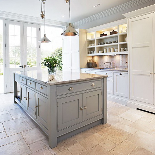
4-kitchens-ideas-modern-designers-Tom-Howley

As they say, everything old is new again and that couldn't be more true for Traditional design. If you yearn for that farmhouse feel you're right in step with what's going on in the design world right now.  Today's country kitchen has been reinvented with design details that reflect the cleaner lines and stepped-up function of today with the welcoming warmth you want.  Here's how you can update without selling the farm.


New Direction for Paneling

Traditional beadboard runs vertically.  It's called beadboard because in between each plank there is this detail which is called a bead in molding lingo.


The new look is called shiplap and it goes horizontal instead of vertically for a fresh new interpretation.  For a cleaner look, you can even remove the bead and have a v-groove or a nickel sized space between planks.  This works for coastal looks too since it's actually inspired by ship design details, thus the name shiplap.

Aprons Rule

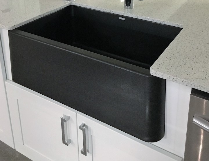
Apron sinks, also called farmhouse sinks, are all the rage and they come in a large variety of materials from the original cast iron and clay to the newer stainless steel and granite composite versions.  They can also be under mounted so you can wipe those crumbs right off the counter and into the sink. Don't overlap the sink edge though or you'll have a concealed seam underneath between sink and counter that can get pretty gross and be hard to clean.

ArtfulKitchensIKONsmall


Less is More

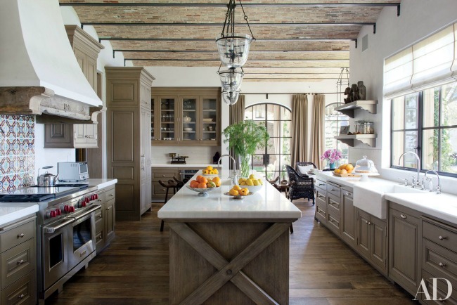
One of the hallmarks of a traditional farmhouse kitchen is lots of moldings, legs, bun feet etc. It used to be the more the merrier but that has changed.  You can still have your legs and even corbels but they are simplified and clean lined.  Speaking of clean, these less detailed versions of the originals are much easier to keep clean.  Less detail can also be easier on the wallet. Win win!

modern farmhouse-Architectural Digest

Time for Recess

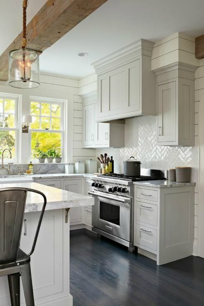
Attractive and innovative framed doors are the perfect choice for the new farmhouse kitchen and we are seeing flat recessed panel doors as a popular alternative to the traditional raised panel styles.  In fact simply switching from a raised panel door to what we call a flat panel door is an instant update.  If you want to take it even further consider a flat, or slab drawer front which allows you complete freedom when it comes to selecting your pulls or knobs.

Decorpad-modern farmhouse kitchen

More Inspiration

I found these books which are right on topic.  Add them to your library if you are looking for more tips and inspiration on how to achieve the new farmhouse look in the kitchen and other areas of your home. A Touch of Farmhouse Charm: Easy DIY Projects to Add

a Warm and Rustic Feel to Any Room features easy DIY projects for all parts of your home. The Farmhouse: New Inspiration for the Classic American Home has great examples how to add updated farmhouse details to new or existing homes.  Last but not least City Farmhouse Style: Designs for a Modern Country Life is my personal favorite as it adds a touch of sophistication that could make your farmhouse look totally at home in city or country. This book is not out for a few months yet but if you can't wait, check out Kim Legget's website for a preview.


Now for the Cow

Art can also be a style defining element of your kitchen. Nothing says farmhouse like the quintessential cow.  Are you cow A, or are you the more minimalist modern version that is cow B ? 

The Farmhouse cows are available through my affiliate Dot & Bo.  The books can be found on Amazon. Purchases through the links above can help fund my blog. If you choose to indulge I thank you for your support. 


Please keep in mind this is one approach and is reflective of what I'm seeing in the design world.  The best advice I can give you is to always design to the style of your home and your heart that way you will never go wrong.  It's your investment and you get to choose what you like and leave the rest.  I can help you make the best choices for your own unique situation and would love to hear from you. Email me at Gloria@ArtfulKitchens.net to explore how we can work together.

Coming Friday: Parts III & IV of The Big Move  

Subscribe above to catch all the episodes!


Design Tips Inspired by The French Chef

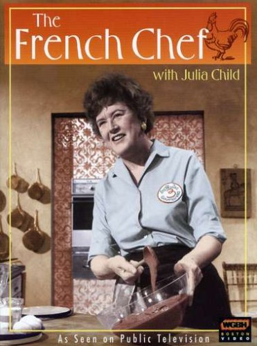
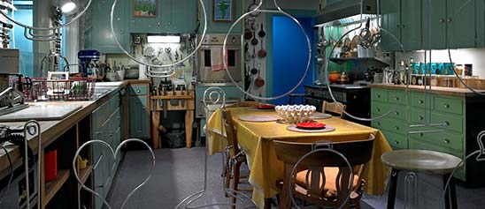
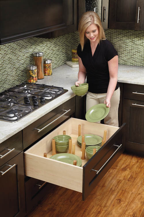
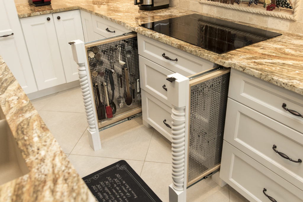
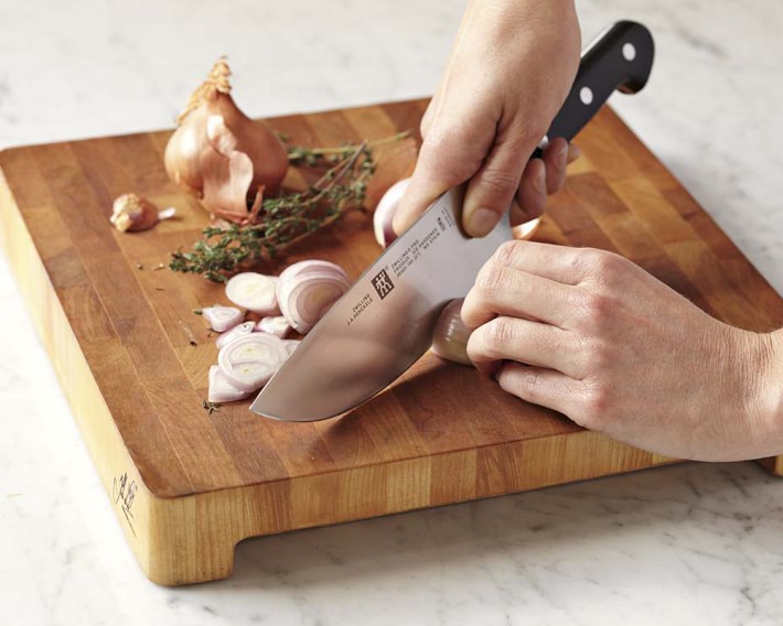
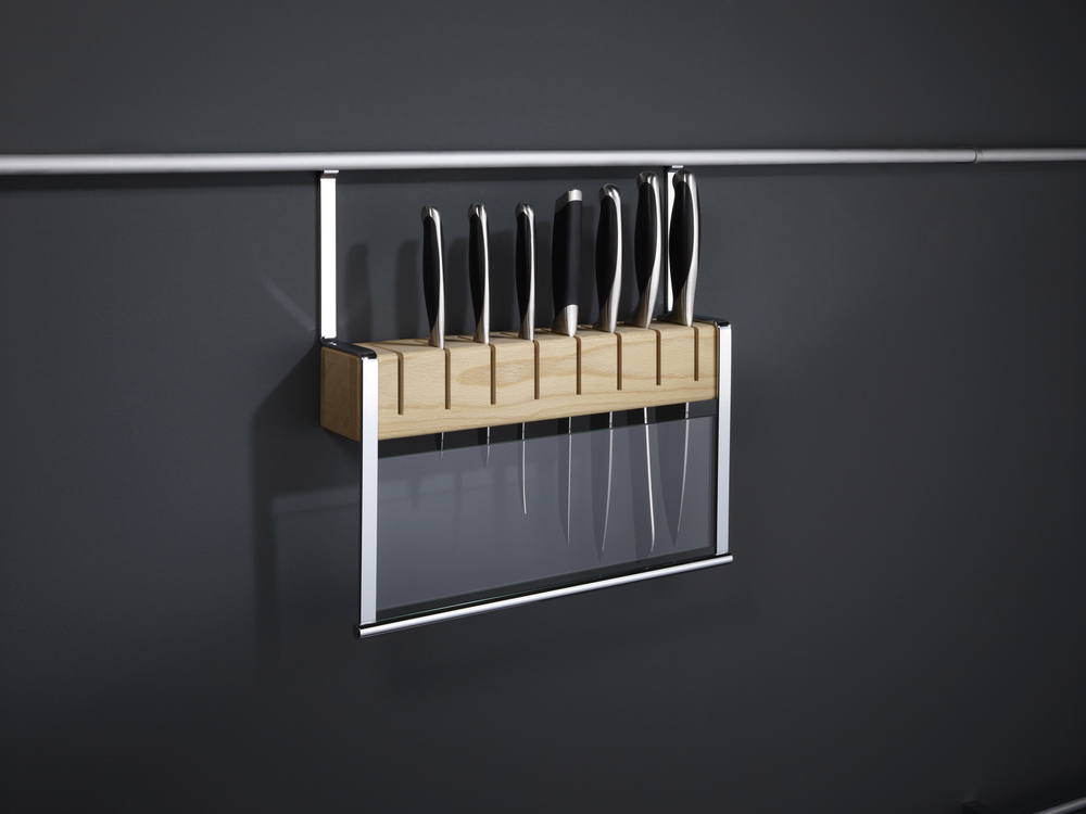
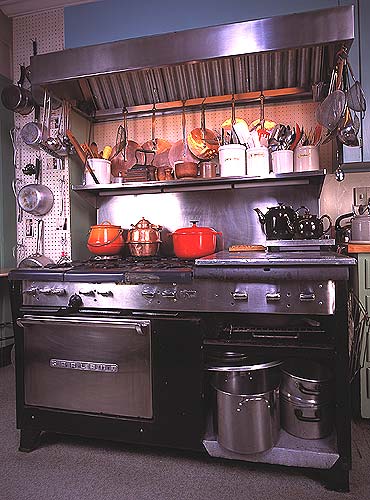
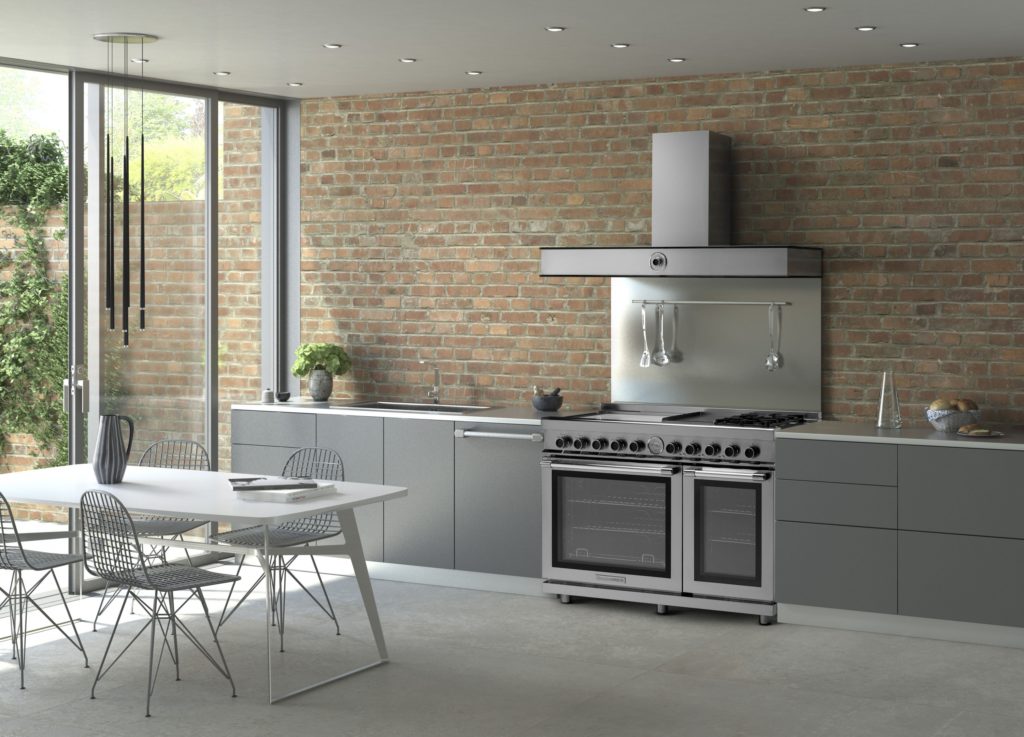
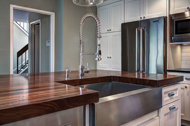
Julia Child was a pioneer in the world of haute cuisine at a time when celebrity "chefdom" was a decidedly manly occupation.  She didn’t care.  The kitchen was her natural habitat and she had her own ways of making it work for her whether she was whipping up a soufflé or flaming a creme brûlée. The French Chef, Julia Child   Child is credited with bringing French cuisine to America in the 1960s and was host of The French Chef on PBS which aired from 1963-1973.   Interestingly, she did not learn to cook until she met her husband Paul Child, an American diplomat with a refined palate. Julia also worked for the government during WWII as a research assistant in the Secret Intelligence division of the OSS (Office of Strategic Services). It was in this capacity that she created her first recipe which was for shark repellent! It worked and is still in use today.  After the war the couple settled in Paris where Paul worked for the US Foreign Service and Julia attended the renowned Le Cordon Bleu cooking school.  She had fallen in love with French cuisine.  Julia stood 6’2”, never had any children and left this world in 2004, two days shy of her 92nd birthday.  She was quoted as saying, “with enough butter, anything is good”.  Apparently her health was none the worse for it. Julia Child kitchen, National Museum of American History Julia’s real life kitchen was donated, moved and reassembled in the Smithsonian's National Museum of American History in 2001. The layout was devised by Julia and her husband and customized to her cooking needs, including higher counter tops to accommodate her height. Pots and cooking utensils are all placed exactly as they were in her home.   Today Julia would be utterly amazed at the advancements in appliances, materials and new storage options. Although her kitchen goes back 50 years she had ideas and practices that are very relevant today.  Here is what I think today’s kitchen would look like through the eyes of The French Chef. Peg Board system by Rev A Shelf Organization and Easy AccessJulia was known for her handy and efficient peg board system.  Companies like Rev-A-Shelf have taken this concept and expanded it so that it doesn’t have to be on the wall.  Moving pegs allow these inserts to be customized.  This is especially handy for dish storage in new kitchens that feature fewer upper cabinets.  A "Julia kitchen" includes a place for everything and everything in it’s place. Rev A Shelf peg boardTo Make the Cut You Must Have Great KnivesA self-proclaimed knife freak, Julia collected them all her life and never met one that was sharp enough for her! Check out this delightful anecdote from the New England Historical Society and you'll see what I mean.  I agree that there is nothing more frustrating in the kitchen than dull knife. The winner in my book is J.A. Henckels International 8" Classic Chef's Knife in terms of quality and value for the money.J A Henckels pro chef knifeHaving a great knife is half of the equation, now we have to store them.  Julia preferred to house them on a magnet attached to the wall.  Today she would love this railing system by Clever Storage that allows you to take advantage of the space between upper and lower cabinets.  It's safe, attractive and accessible.  Win! Wooden Knife Block by Clever Storage The Mother Ship of RangesJulia used a 1950s six burner used commercial gas range by Garland.  This company is still in business so you can get a modern version today but I’m betting Julia would fall for the TriFuel range by Tecnogas Superiore for its state of the art versatility.  In fact, it was just announced Product Innovator Award winner for 2016 by Kitchen & Bath Business Magazine.  It features dual gas burners plus four induction zones and an electric griddle. Below are dual gas ovens equipped with two convection fans and a broiler.The Garland Commercial Range in Julia Child's kitchen in Cambridge, Massachusetts Trifuel Range by Tecno Superiore The Beauty of Butcher BlockThe French Chef was fond of her extra high maple counter tops for food preparation.  You may not want an entire kitchen with wood tops but, if you can, it's great to have a section of it for food prep.  Wood butcher block counters are a natural eco-friendly choice, absorb noise, are gentle on dishes and can be refinished.  In addition to this, wood has inherent antibacterial qualities and can add a beautiful warmth to your kitchen. If you're going to use your counter for food prep it should have an oiled finish which does need to be maintained. Walnut counter tops by J. Aaron  Last but not least never enter the kitchen without a sense of humor and adventure Child was never without it!  She said, “in cooking you’ve got to have a what-the-hell attitude!”-If you'd like to experience cooking like a French chef  you can stay at what was once Julia and Paul's part-time residence in Provence, France courtesy of Airbnb.

Kitchen Work Centers, the New "Triangle"

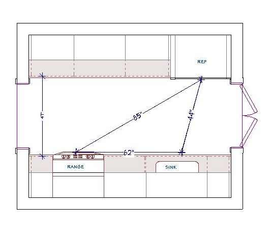
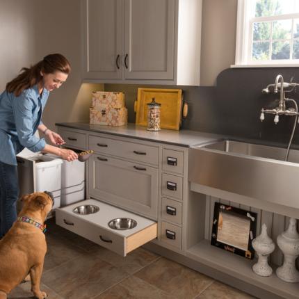
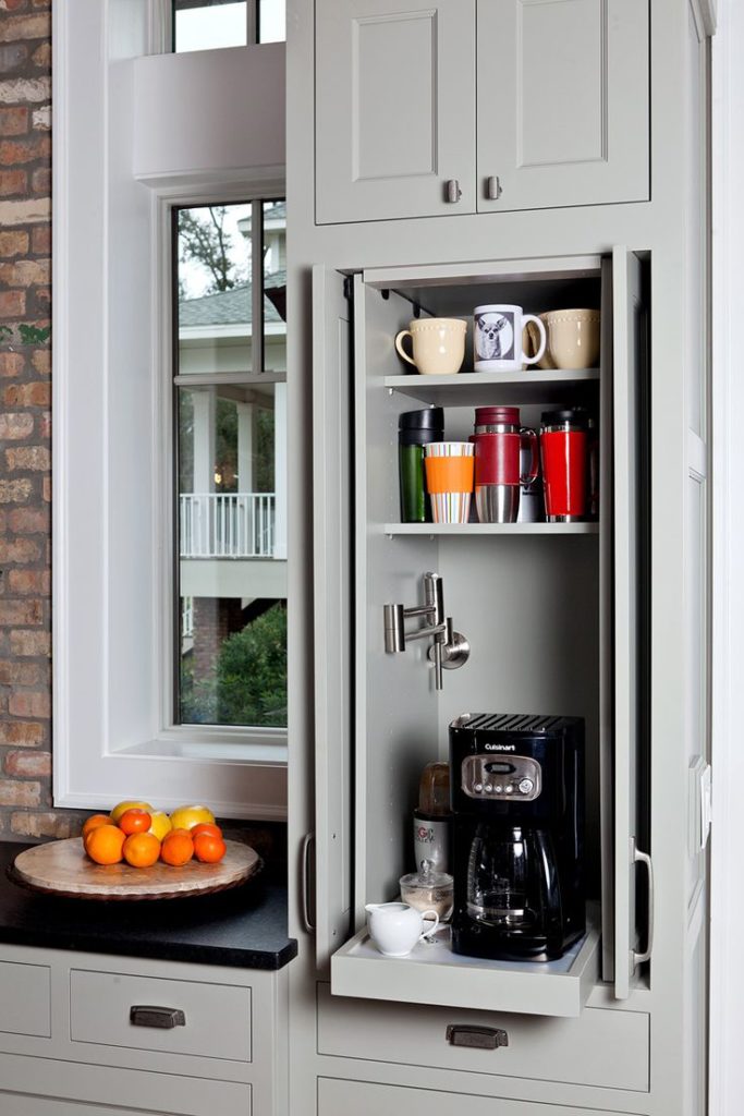
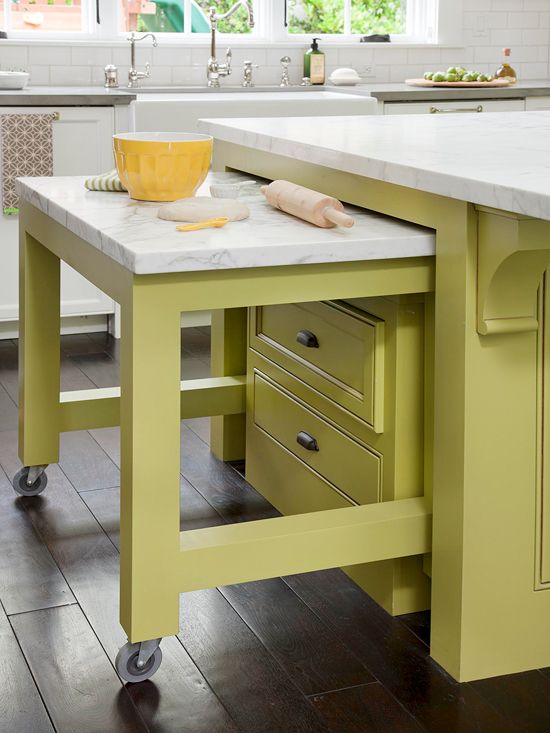
Whether you are a design professional or an educated homeowner you’ve probably heard the term “kitchen work triangle”. In fact it’s probably one of the first things you learn when endeavoring to create a new kitchen. Who thought this up? It is actually the result of a study made at the University of Illinois in the 1950s! If you’re wondering if it could be outdated, just think of how much kitchens have changed since then in terms of products, appliances and how we use them.The National Kitchen and Bath Association (NKBA) defines the kitchen “work triangle” an imaginary straight line drawn from the center of the sink, to the center of the cook top, to the center of the refrigerator and finally back to the sink.Speaking of TRIANGLES, I thought this was really artfulThe NKBA suggests the following guidelines for determining a work triangle:- The sum of the work triangle's three sides should not exceed 26 ft. and each leg should measure between 4 ft. and 9 ft.Triangle- The work triangle should not cut through an island or peninsula by more than 12 inches.- If the kitchen has only one sink, it should be placed between or across from the cooking surface, preparation area or refrigerator.Yes, this makes kitchen design sound a bit like solving a puzzle and, actually, it really is. I know my design is “right” when the layout works from every angle in terms of safety, ease of function and, of course, aesthetics.{29B28645-DCE3-4BC1-A625-A85A38654059}Img400Some of the design solution is just good sound common sense but much of it should be directed by the individual needs of the client. I don’t “do” the triangle as a rule. Today we have multiple cook kitchens and no end of possible appliances. Modern kitchens are so unlike those of 60 years ago, so I use the more updated concept of “work centers”. The basic ones are food prep, cooking, clean up and storage. The Pet Parlor concept can be built into your laundry or utility roomSo while efficiency is still at the forefront, the thinking is a bit more evolved to address twenty first century needs.In a perfect world, work centers should be situated to allow someone to work in one area without getting in the way of someone using another. However, let’s face it, in a very small kitchen that is just not going to happen! The focus then is twofold: enough storage and enough counter space.64a6706c99de3aa50964a366b524c19fThe types of work centers you can have is only limited by your imagination. Here are some good ones:-Beverage center- It can be coffee/tea, smoothies, wine or cocktails-Media center-It can be sit down area for menu planning, computer, charging station or TV-Baking center- You can trick this area out with customized storage for bake ware, bowls, utensils and a marble top for rolling dough.This baking center only comes out when you need it! Photo courtesty of BHGRemember that an “artful kitchen” employs what I call “practical creativity”. Function is the infrastructure, beauty comes next, the art is getting both just right.

Frida, Diego and Their Kitchen

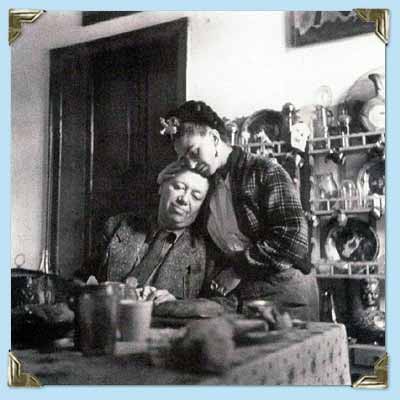
There’s new exhibit in town and I’m excited!   Frida Kahlo and Diego Rivera from the Jacques and Natasha Gelman Collection & 20th Century Mexican Art from The Stanley and Pearl Goodman Collection  opened Wednesday at the NSU Art Museum in Fort Lauderdale.Frida Kahlo's self-portrait "Diego En Mis Pensamientos" (Diego On My Mind) Frida Kahlo and husband Diego Rivera are arguably the most well known twentieth century Latin American artists.  This exhibit draws on their popularity to introduce us to some other names in Mexican art we should know.  These include Lenora Carrington (1917-2011), Gerhard Gerzso (1915-2000), José Clemente Orozco (1883-1949) and many more.   Works on show consist of paintings, sculptures, photographs and works on paper.  The exhibit runs through May 31st.  I am planning on going on March 27th  when Kahlo scholar Dr. Salomon Grimberg will be speaking on Frida Kahlo: The Still Lifes-But let's talk about the kitchen! Frida at her easel from here. There are many published photos of Frida's kitchen which got me to wondering what it would look like today.  Wouldn't it be great to have her essence around when you're making enchiladas? What are the elements you could include to give you that vibe?gallery_couple_5 Frida learned to cook for Diego, oddly enough, from Diego's previous wife! She became an accomplished cook but also spent leisurely mornings in the kitchen reading the newspaper with Diego. 

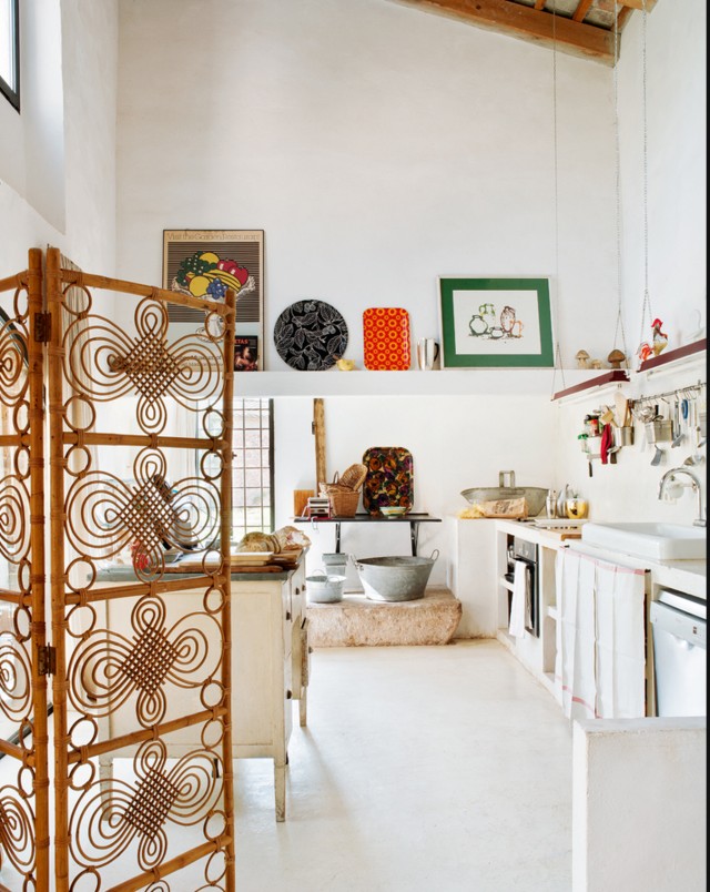
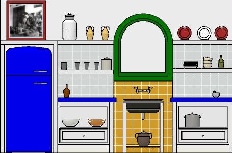
 This kitchen is located in La Casa Azul, a home Frida was born in and continued to return to throughout her turbulent life. You can tour it if you find yourself in Coyoacán, Mexico City. Check out this  article if you'd like to know more. A kitchen with "Frida elements"The rustic simplicity, white walls, high ceilings, windows and use of rustic materials make me think of Kahlo.FridaKitchen2 In this fantasy kitchen  I used bright colors with a few contemporary twists in homage to the Mexican diva.  Design elements of a "Frida kitchen" include the following:-Liberal use of tile-Open shelf storage-Bright colors-White walls-Rustic wood-Lots of light!If you've never seen the movie Frida, don't stop, click here immediately and get it!! Today I leave you with my favorite scene from the movie.  I must warn you it's hot, steamy and not for the feint of heart.  Consider yourself warned and enjoy ;) Happy Friday and have a fantastic weekend. 

Mad For Mid Century

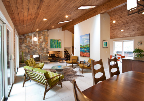
A small mid century collage by yours truly. I call it "Embracing Routine".  6"by 6" by 2" canvasIf you're a Mid Century product of Florida, like me, you probably grew up in what's fondly known as a "ranch style house".  Our friends over at Wikipedia define the ranch abode as " a domestic architectural style  originating in the United States. The ranch house is noted for its long, close-to-the-ground profile, and minimal use of exterior and interior decoration. The houses fuse modernist ideas and styles with notions of the American Western period working ranches to create a very informal and casual living style."   In addition to the above, the Florida ranch house  usually came in pastel colors with what we call a "Florida room".  This is kind of like a family room with lots of windows. 

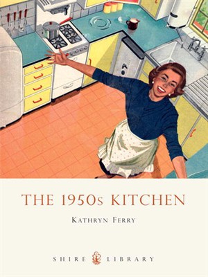
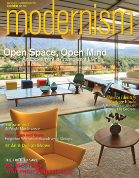
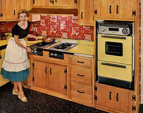
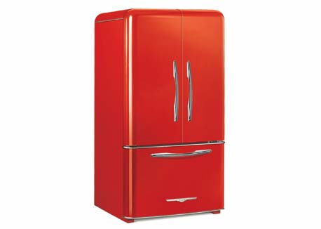
 Although not as grand as the house above, my childhood home shared several elements.  Our Florida Room ceiling had a similar wood treatment and it also had a stone feature wall.  We had lots of green and brown and that EXACT furniture.  The authentic flooring would have been terrazzo, like ours.  I never knew it was cool then but now it's all the rage.  Think about it, there are lots of these houses still around!  Mid-Century has firmly established its niche in design history and has left its mark on our culture.  We've got MadMen, Modernism Magazine, the website Atomic Ranch and numerous blogs. MOD_CVRIf you're looking for that 50s vibe in the kitchen, keep it simple.  Door styles were just flat and were either a warm wood finish or painted.  Guess what? Wall ovens with a separate cook top were much more common in the typical Mid Century kitchen.  Today most homes have ranges.1950s ad for Caloric ovens (bad name, huh?) atomicpattern2Throw in a little atomic patterning and you're there.  If you are really embracing this you can get the vintage look for your refrigerator.elmira_lg(2)Elmira Stove Works has introduced the latest addition to its retro Northstar collection, the French-door refrigerator.  By combining iconic 1950s-style with the modern amenities of contemporary appliances, this new model is larger capacity than previously available in the line.  It comes in a full-depth model as well as counter-depth.  You don't have to get red.  It comes in nine standard colors OR you can even get it custom-colored (for a price, I'm sure). 

KITCHEN ALA-MOD

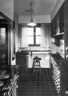
The Frankfurt Kitchen 1926 Wikipedia
So where were we?  As I recall, we were examining the roots of the heart of the home (Click on Part I here.) to see just how we got from our origins to where we are now.  Today I will show you the first MOD(ERN) kitchen.
Although cooking made it to the indoors pretty quickly, water pipes in cities were not commonly laid until the end of the 19th century. Open shelves were the original go-to storage and coal fired stoves ruled. Cupboards, or cabinets, were first used by the upper classes to protect contents from dust, steam and smoke.  The middle class kitchen was were the family lived with the living rooms and studies saved for special times.  Sound familiar?
The first standardizations for the kitchen came from the German brand Poggenphol (est. 1892).  In case you ever wondered, this is where we got the ergonomically pleasing counter top height of 36".  These new guidelines were the result of time-motion studies  known at Taylorism.  As women increasingly found the need to aquire factory jobs, the need for efficiency in the kitchen increased and the Frankfurt Kitchen was born in 1926. I guess you could call its creator, Margarete Schutte-Lihotzky the first kitchen designer!  The design was influenced by railway dining cars of the day with two main objectives, to save precious time and make modern convenience affordable to the masses. These two priorities still endure so we'll keep them.  What can we chuck?  Maybe the closed-in tight quarters and the limited counter space?
The pre-historic Chemex Coffee Maker also on show at the MOMA

Margarete's Creation on Exhibit at the MOMA
Check out this exhibit which opened September 15th at the MOMA in NYC.  This examination of modern food prep is called Counter Space: Design and the Modern Kitchen. spanning the last century of Western cookery -- from the architecture of the kitchen itself to the introduction of newer and stranger gadgets, like Chemex coffee pots and even Tupperware!  The show runs until March 11, 2011, and yes I'm already planning another jaunt to the B.A.!!