UPDATE 1/24/13 After I wrote this post, local reporter Christine Davis delivered some very interesting and juicy tidbits regarding Whitehall! Here's what she had to say:
Mary Lily (Henry's wife) supposedly moves plates around, so a guide told us once. The story goes she was poisoned! You can read an intriguing account of that theory here.
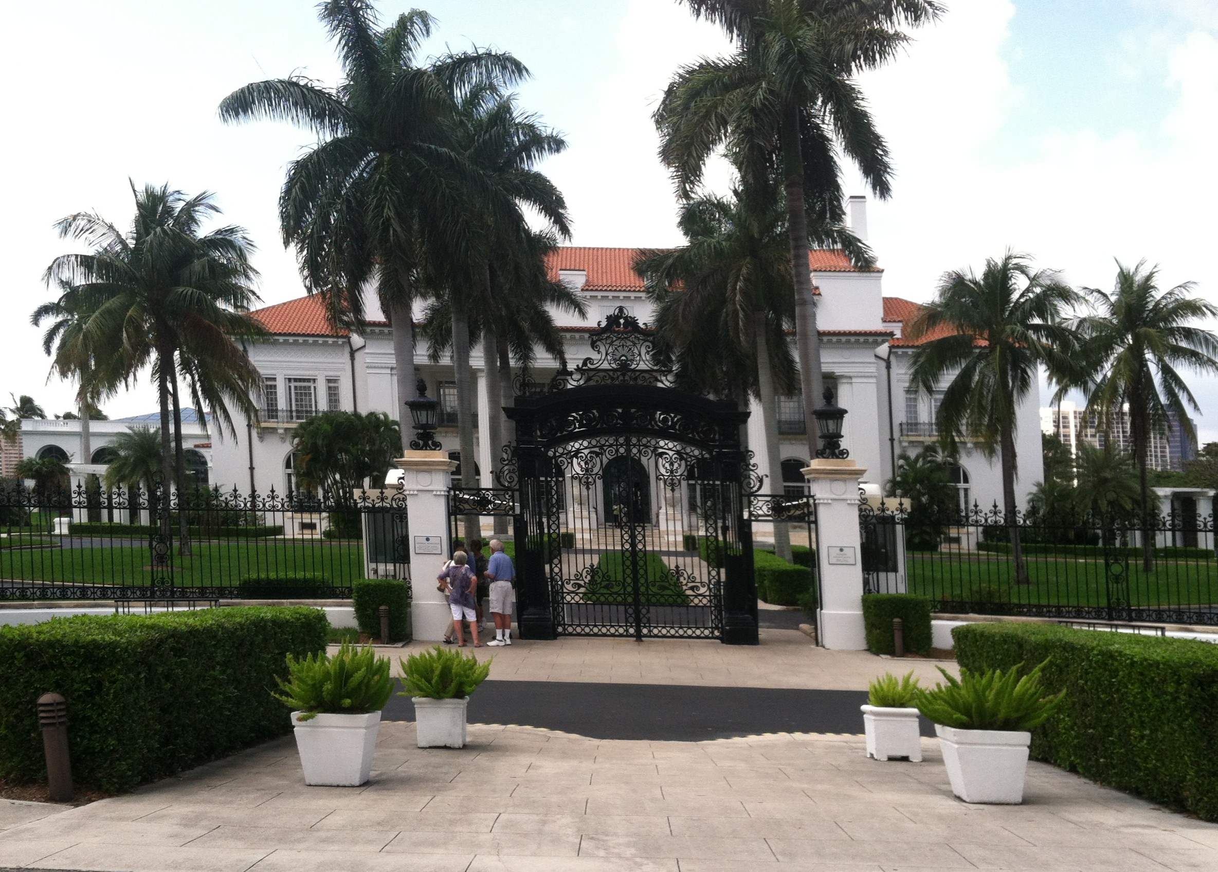
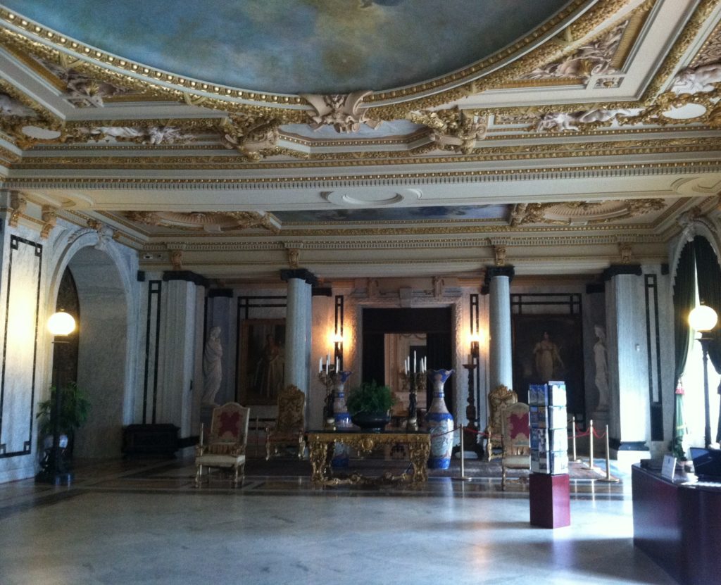
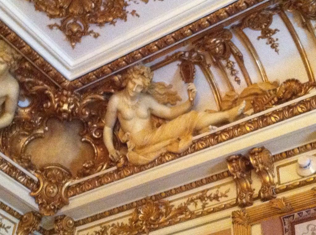
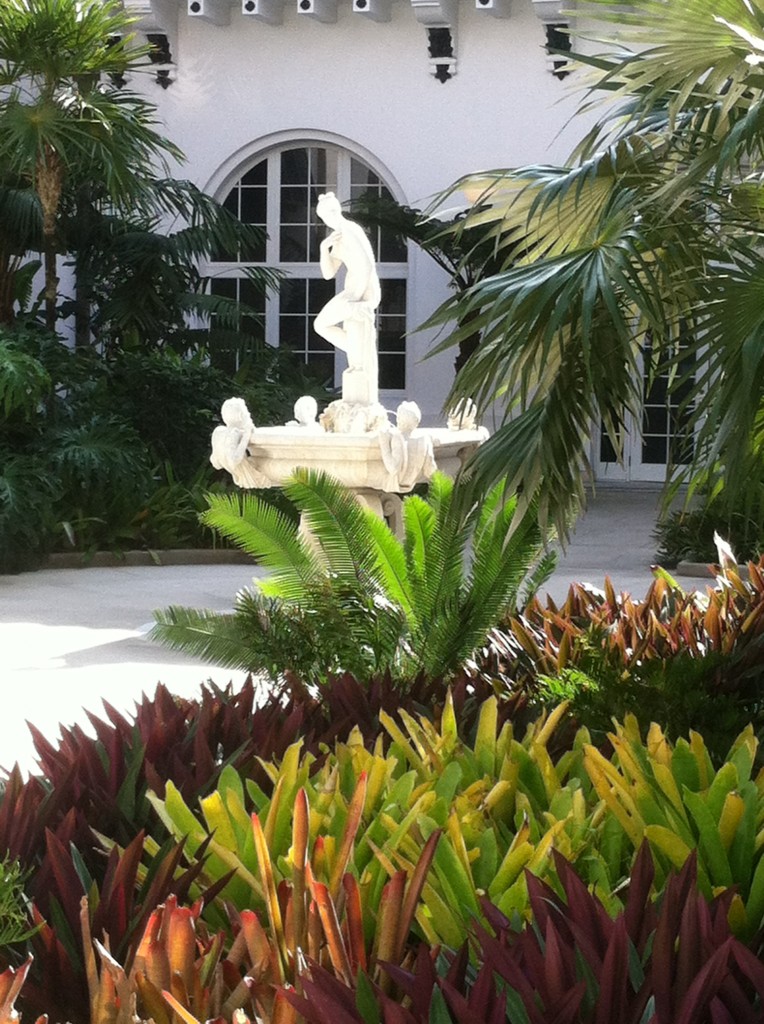
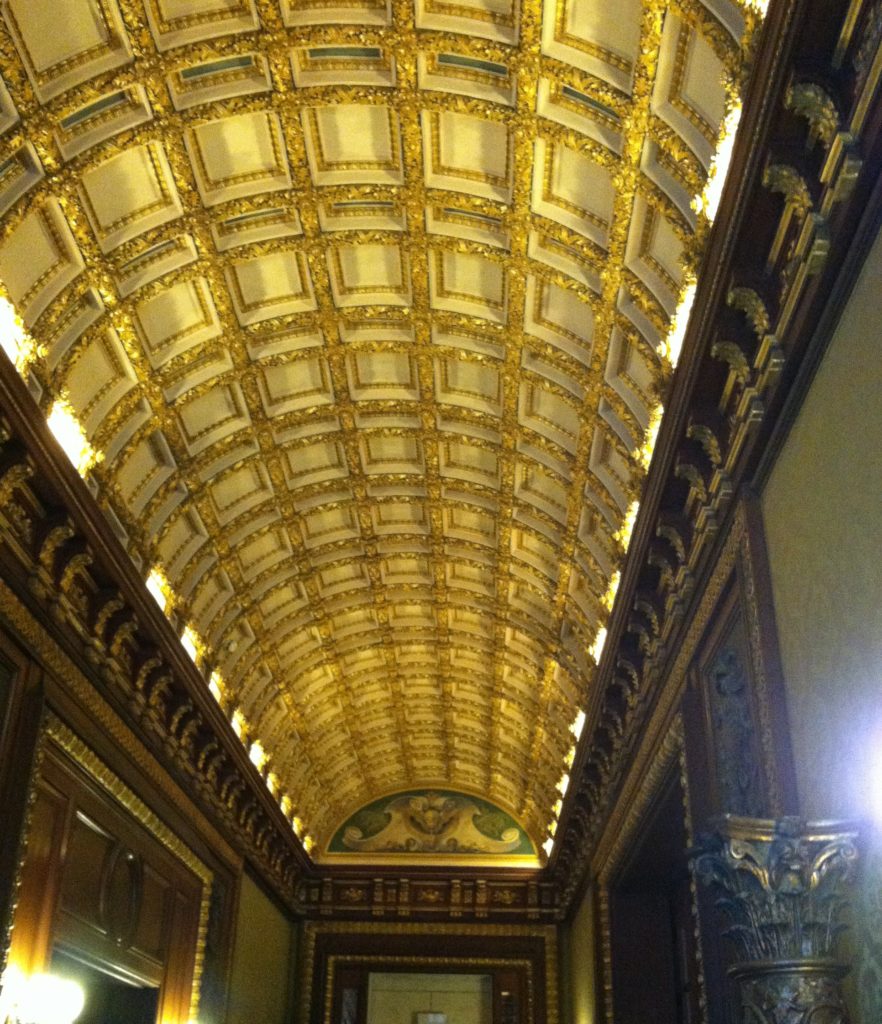
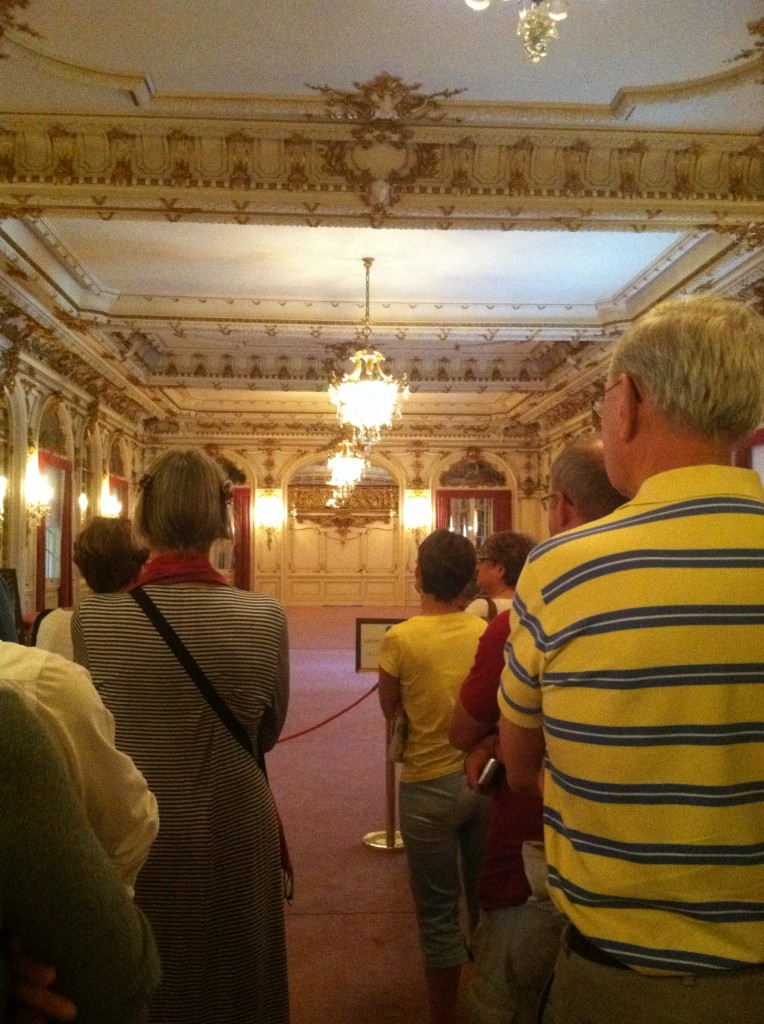
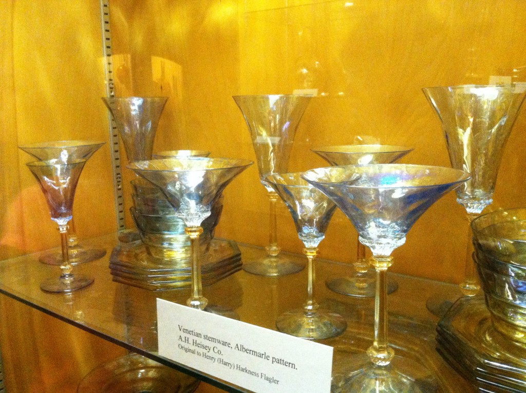
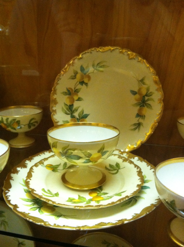
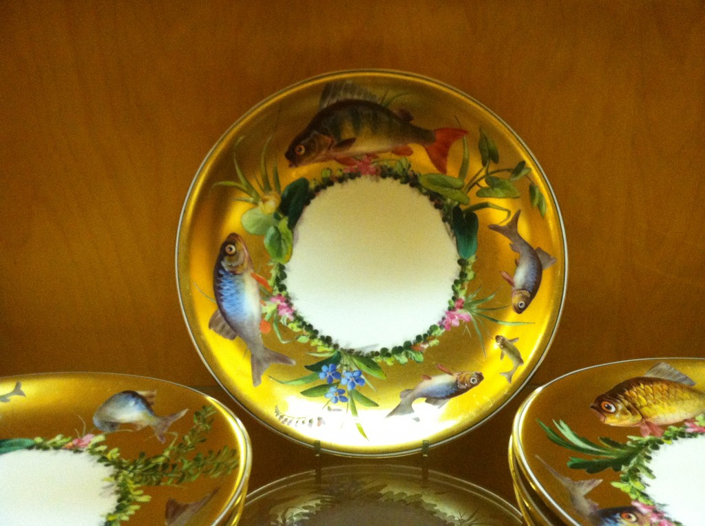
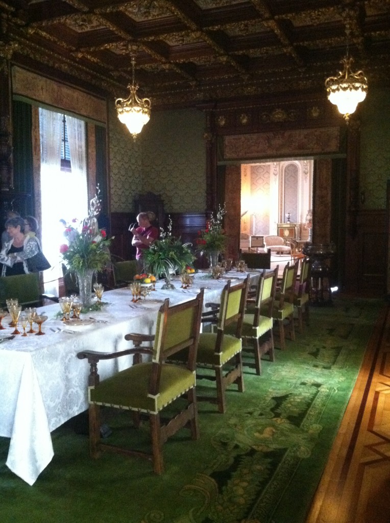
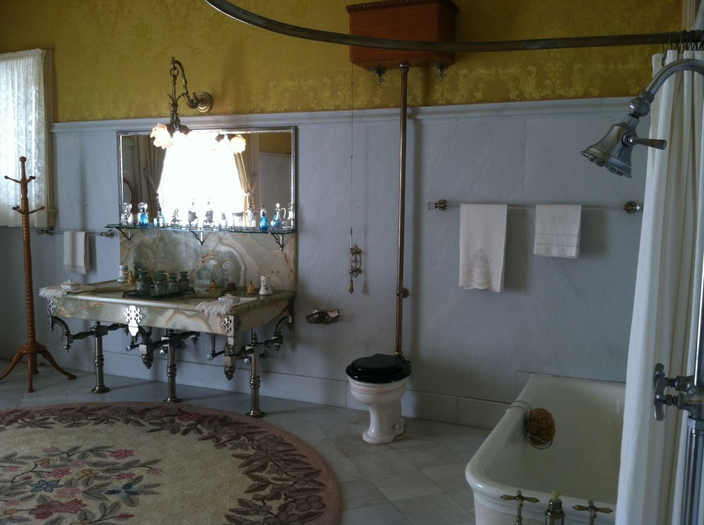
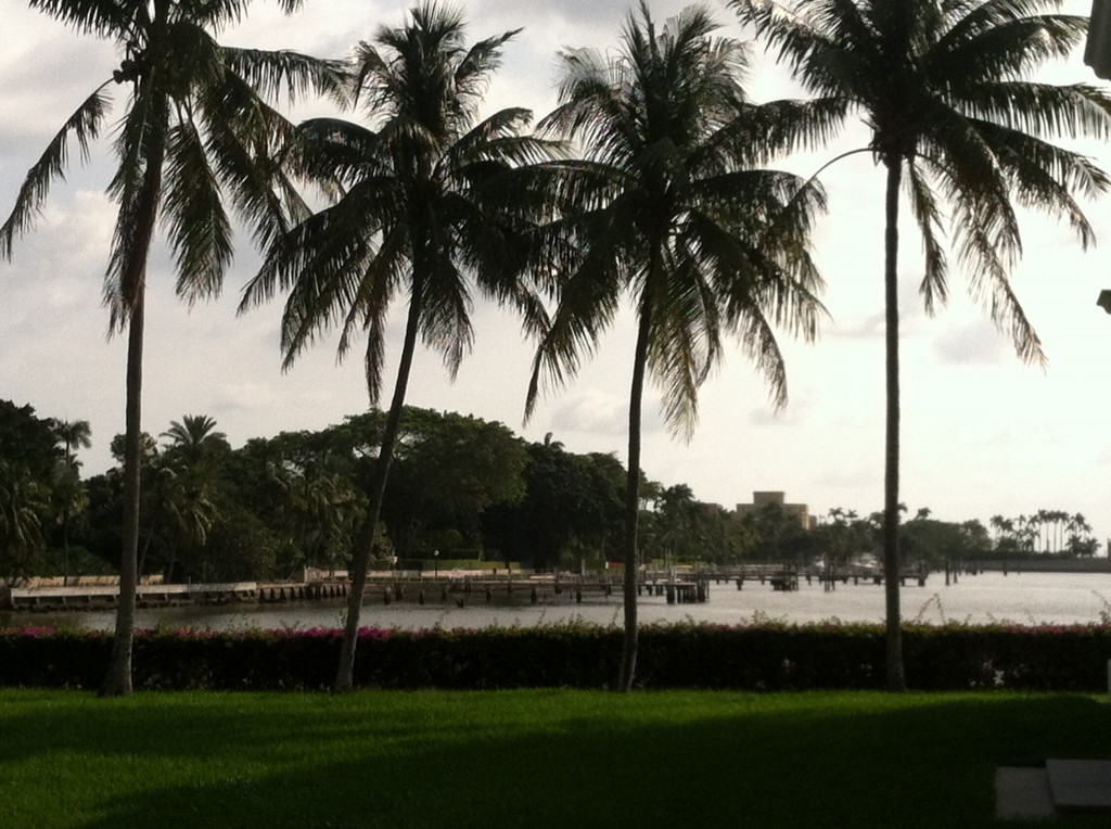
There's another bizarre story about her that is always denied. It has to do with her being "kept" by Flagler before they were married. From what I remember when I was doing the research, the guy who reported this killed himself. He wasn't taken seriously, although it was said he was a serious historian. I can't remember his name. I asked Mr. Ponce about both incidences. he said his dad was an undertaker so he doesn't believe in ghost stories, and he said Flagler would never had put Mary Lily up at the Seagull Cottage. It was on the lawn of the hotel, and far too visible. He says it just would not have been done...I recently enjoyed a fabulous blog post by the talented Linda Merrill of Surroundings. Through her blog, she can show you homedecor and make you feel like you’re right there in the house! In this particular post she featured famous homes of the Gilded (Downton Abbey) Age. Read her post here. With a nod to her, I thought I’d give you a little taste of the Gilded Age, Palm Beach style! It has been ages since I visited Whitehall a.k.a. The Henry Morrison Flagler Museum in Palm Beach. So, in keeping with my new year’s resolution to infuse KFL with some local flavor, I give you Whitehall. Whitehall was constructed in Palm Beach in 1902 by Oil magnate Henry Flagler as a wedding present for his third wife Mary Lily Kenan (37 years his junior ;). It sits on the banks of the Intracoastal across the street from our famous Breakers Hotel which is located on the ocean side. Besides being massive, this private home boasted modern plumbing and electricity. In fact, Thomas Edison was one of the original electrical contractors! (And you thought he just sat around in his workshop and played with light bulbs.) Whitehall also supposedly had the only telephone located in the Master Bath!
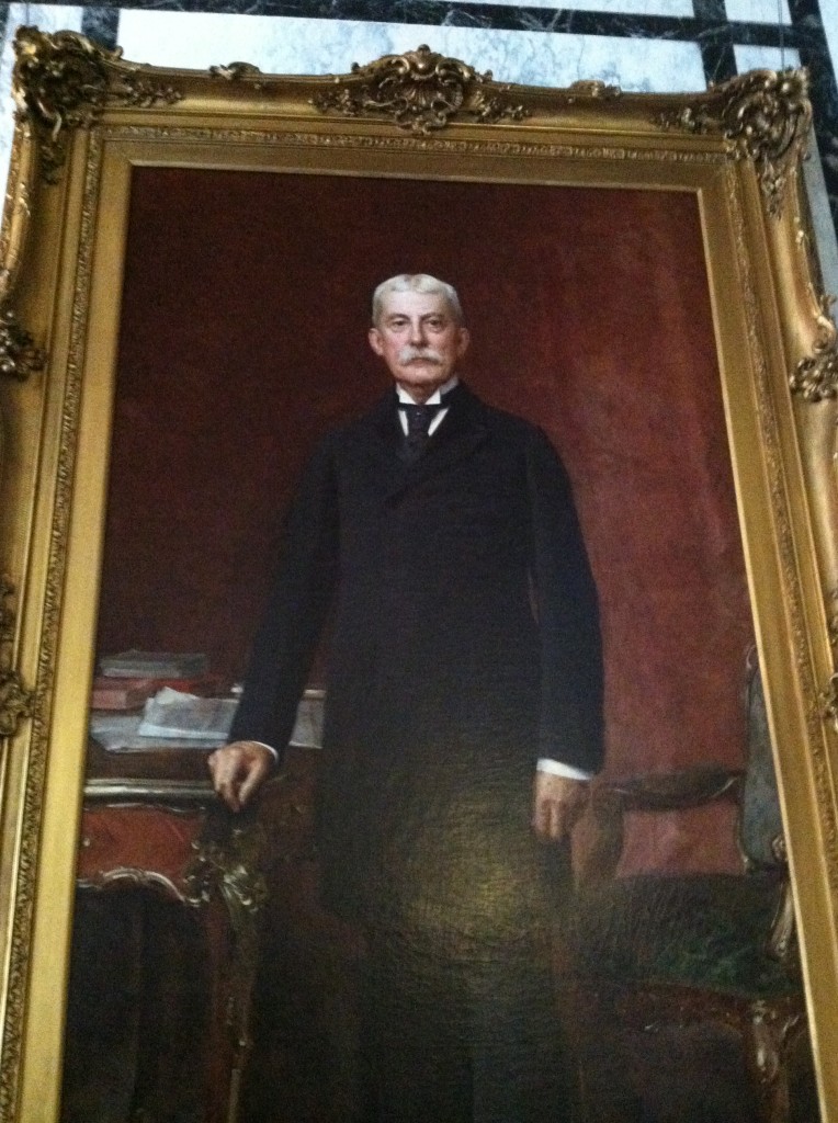
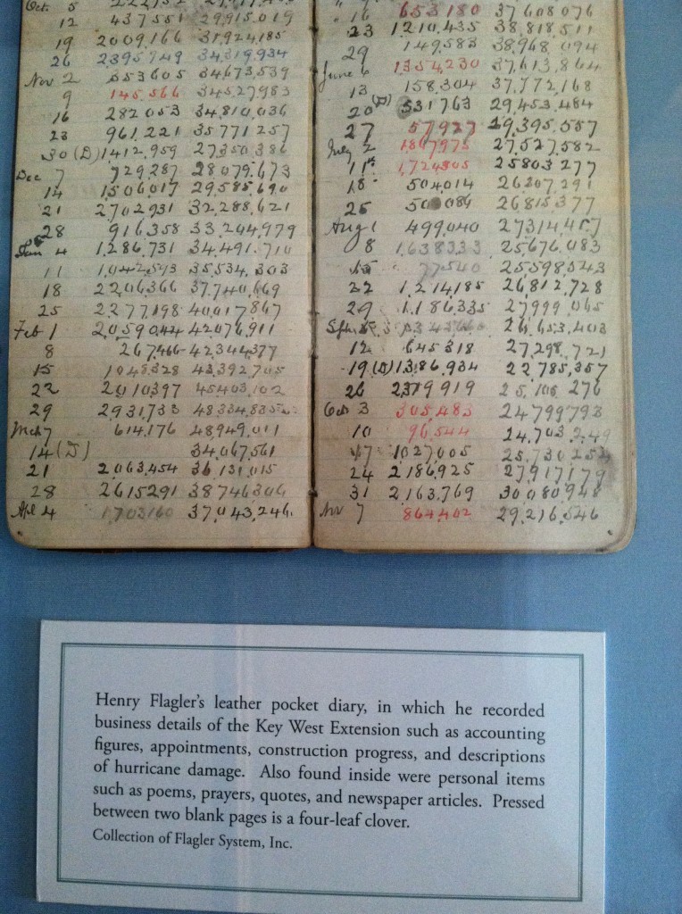
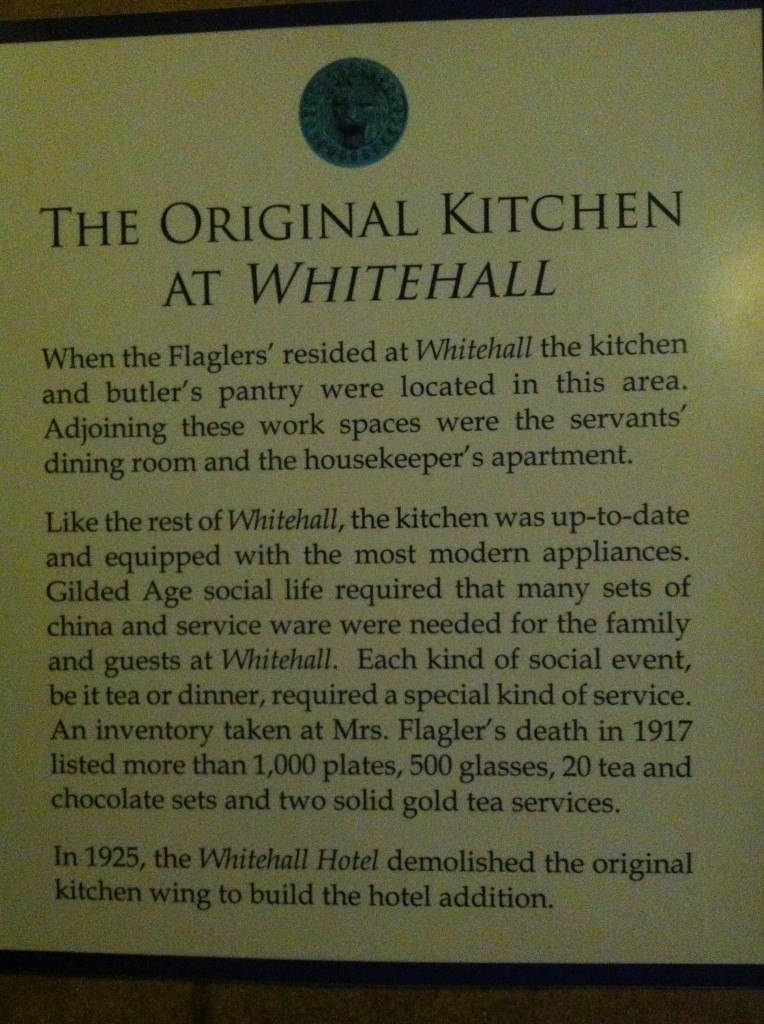
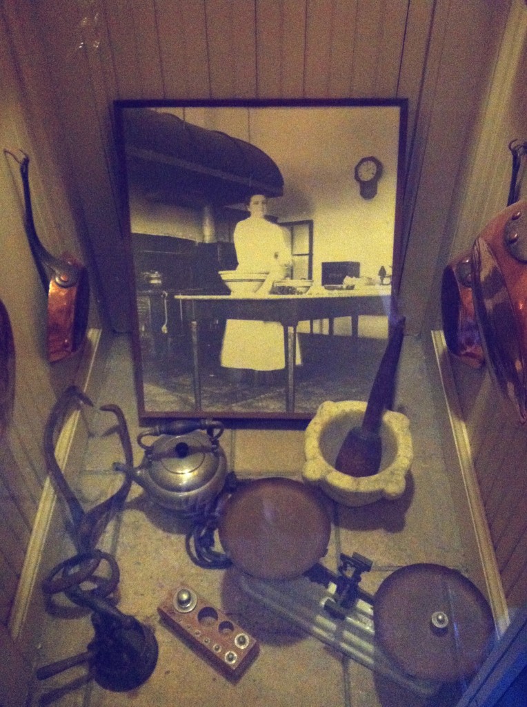
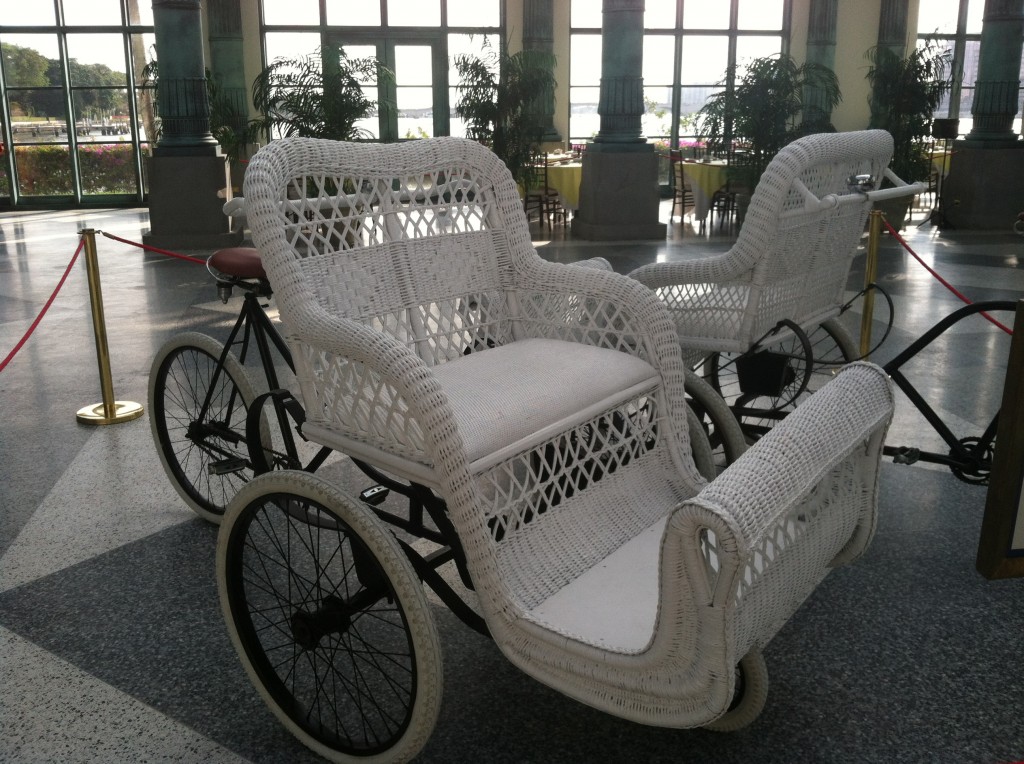
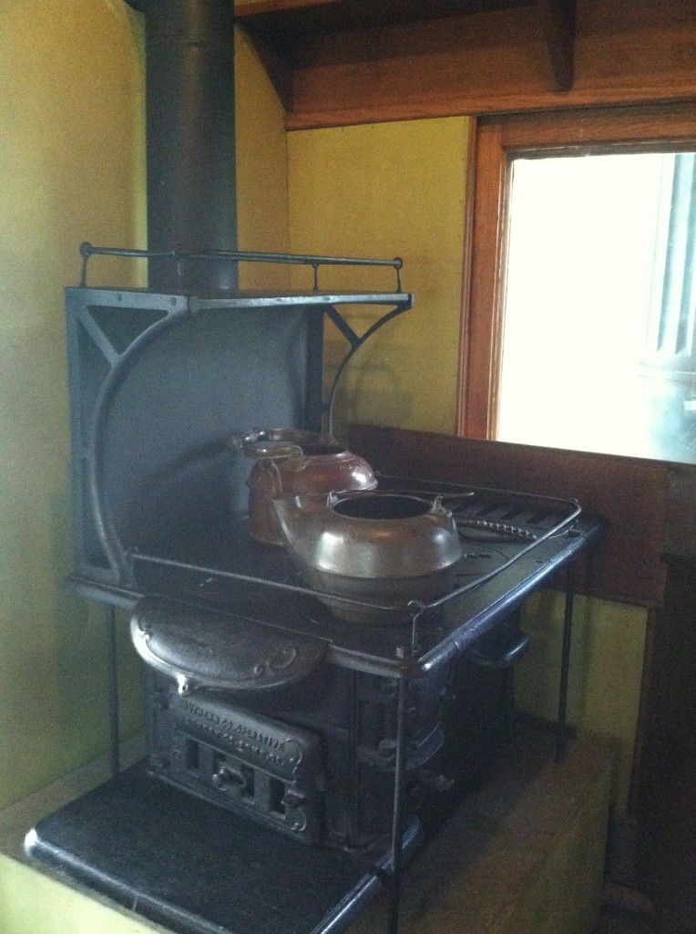
 This is a story of the neauveau riche. Flagler, born in 1830, was the son of a minister who was savvy enough to partner with John D. Rockefeller and Samuel Andrews to found Standard Oil. Voila a bazillionaire is born! He also established the Florida East Coast Railroad with train service from Jacksonville to Key West. Incidentally, when approached, Mr. Rockefeller wanted nothing to do with the project, “Why build a railroad for a bunch of mosquitoes?” he said! Good thing Henry didn’t listen. You could say he fathered the tourism industry in Florida by making our corner of Paradise accessible. Speaking of accessible, once you got here, the only means of transportation on the island were boats and something called a bicycle chair. I really wanted to show you the kitchen but sadly it did not survive the transition from home to hotel to Museum.


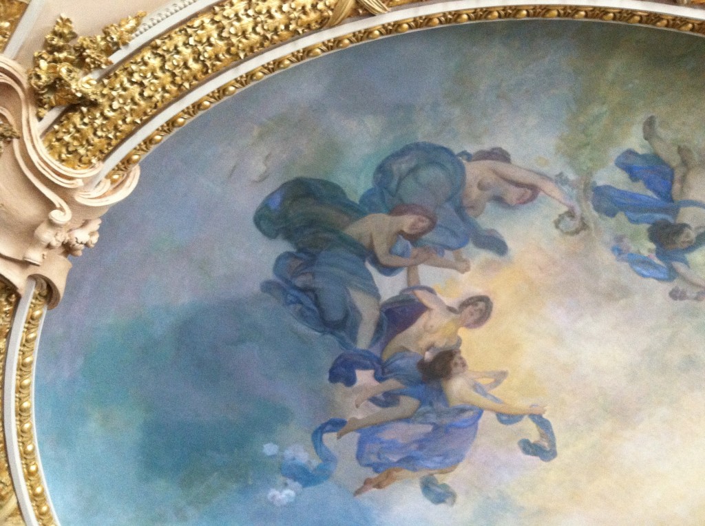
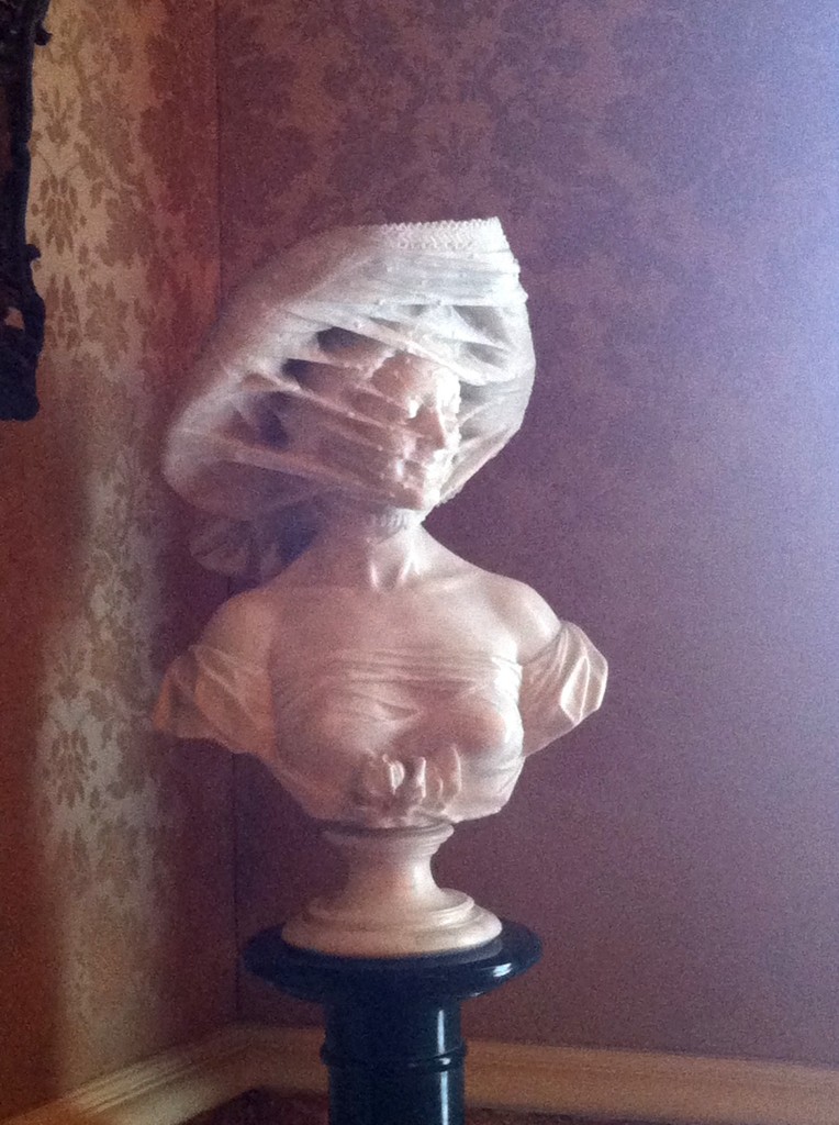
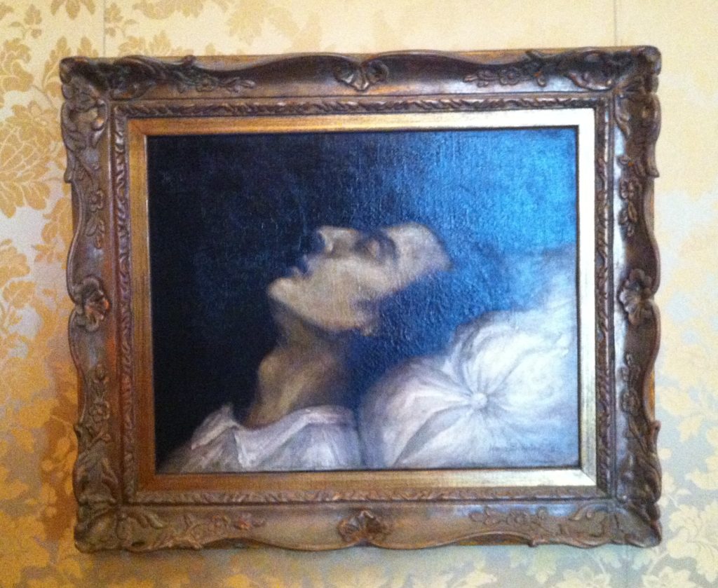
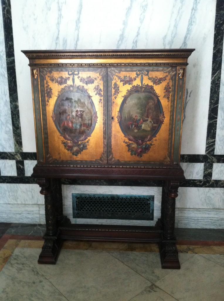
 Mr. Flagler was a patron of young unknown artists and actually founded an artist colony in St. Augustine. So much of the art found in Whitehall is the product of this venture.


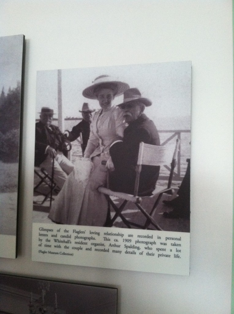
 Here's what it says below the photo: "Glimpses of the Flaglers' loving relationship are recorded in personal letters and candid photographs. This ca. 1909 photo was taken by the Whiteall's resident organist, Arthur Spalding, who spent a lot of time with the couple and recorded many details of their private life." Kind of creepy if you ask me, no?
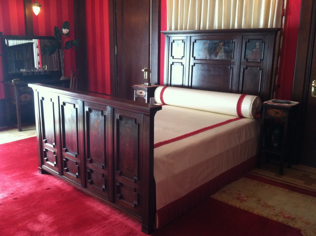
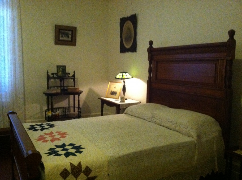
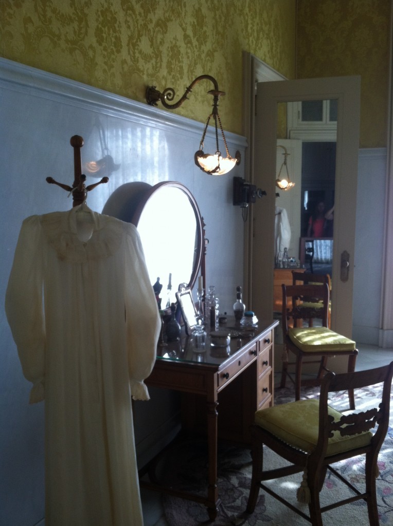
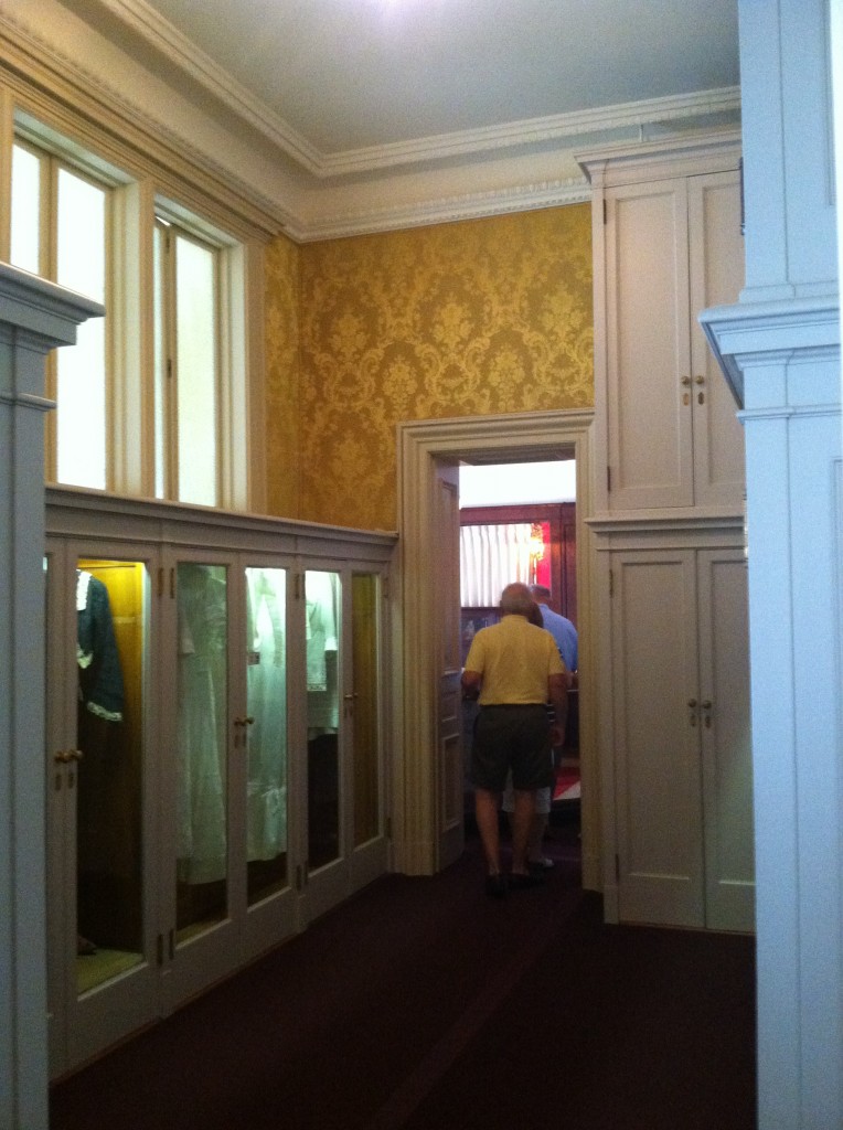
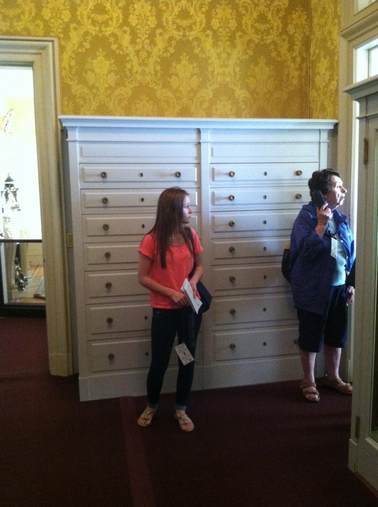
 The second floor was devoted to private living space for the Flaglers as well as guests and staff. In addition to the Master Suite there were originally 14 guest bedrooms, 13 servants rooms, 17 bathrooms and Mrs. Flagler's sitting room (yes you had to have one of those).


After the Flaglers' deaths, a relative sold the estate to investors who built a large addition and turned it into the Whitehall Hotel in 1925. By 1959 things weren't going so well. The tourism industry was booming but there were also, by this time, many hotels and resorts competing for the business. It was at this time that Henry Flagler's granddaughter, Jean Flagler Matthews purchased the property and opened the The Henry Morrison Flagler Museum, Inc., a nonprofit corporation. It has been open to the public since 1960.


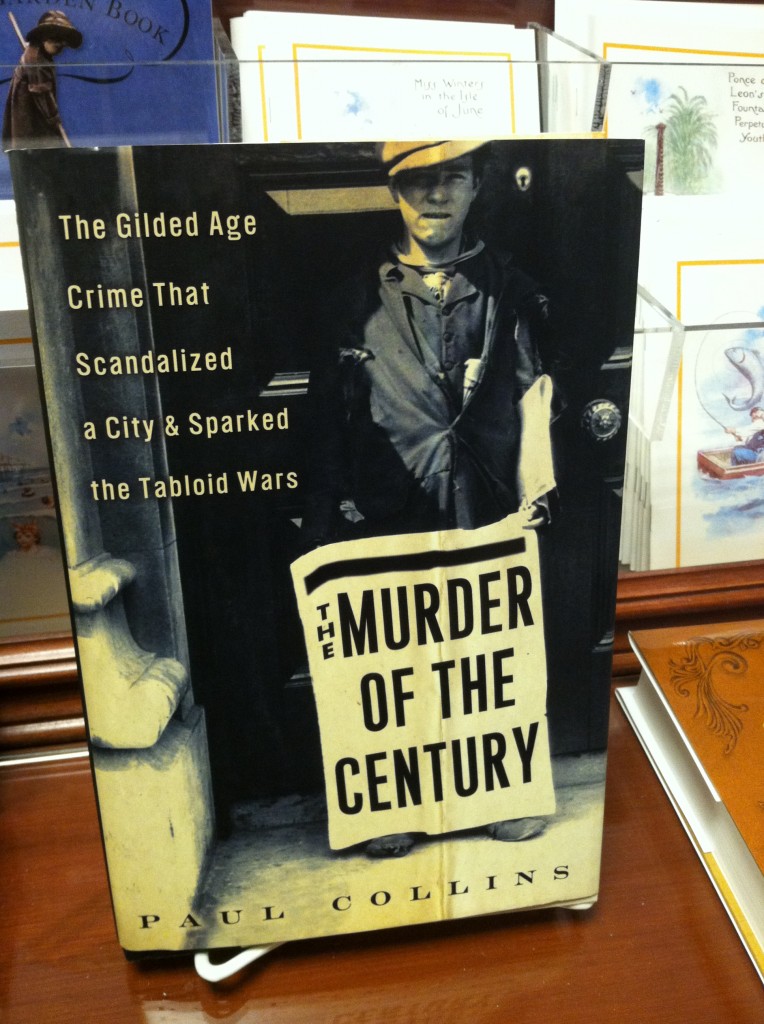
Here's a link to that book

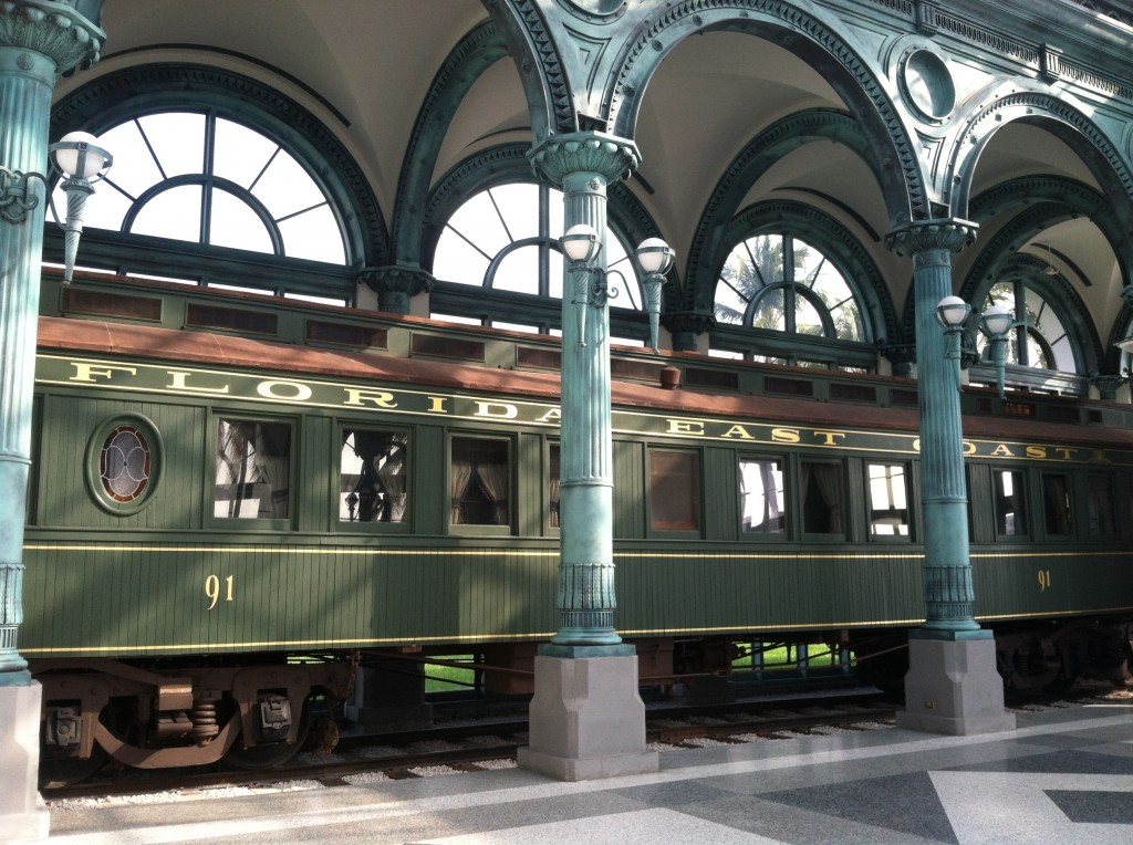
Upon exiting the estate we came upon the Flagler Kenan Pavilion featuring Flagler's private railcar, a.k.a. Railcar No. 91. He traveled in this car down to Key West via his Overseas Highway in 1912 to celebrate its completion.


 Thanks for taking this little Sunday afternoon tour with me! If you'd like more info on The Henry Morrison Flagler Museum, Inc., click here.
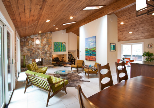
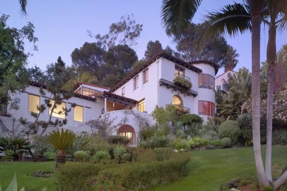
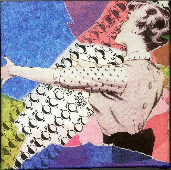 If you're a Mid Century product of Florida, like me, you probably grew up in what's fondly known as a "ranch style house". Our friends over at Wikipedia define the ranch abode as " a domestic architectural style originating in the United States. The ranch house is noted for its long, close-to-the-ground profile, and minimal use of exterior and interior decoration. The houses fuse modernist ideas and styles with notions of the American Western period working ranches to create a very informal and casual living style." In addition to the above, the Florida ranch house usually came in pastel colors with what we call a "Florida room". This is kind of like a family room with lots of windows.
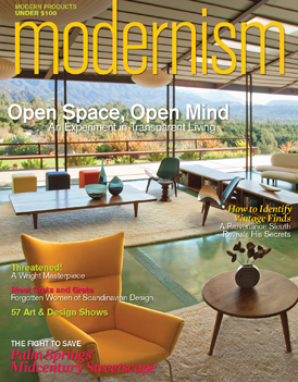 If you're looking for that 50s vibe in the kitchen, keep it simple. Door styles were just flat and were either a warm wood finish or painted. Guess what? Wall ovens with a separate cook top were much more common in the typical Mid Century kitchen. Today most homes have ranges.
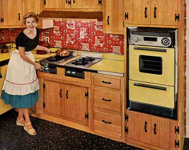
 Throw in a little atomic patterning and you're there. If you are really embracing this you can get the vintage look for your refrigerator.
 Elmira Stove Works has introduced the latest addition to its retro Northstar collection, the French-door refrigerator. By combining iconic 1950s-style with the modern amenities of contemporary appliances, this new model is larger capacity than previously available in the line. It comes in a full-depth model as well as counter-depth. You don't have to get red. It comes in nine standard colors OR you can even get it custom-colored (for a price, I'm sure).
