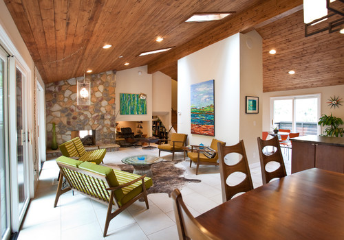
 If you're a Mid Century product of Florida, like me, you probably grew up in what's fondly known as a "ranch style house". Our friends over at Wikipedia define the ranch abode as " a domestic architectural style originating in the United States. The ranch house is noted for its long, close-to-the-ground profile, and minimal use of exterior and interior decoration. The houses fuse modernist ideas and styles with notions of the American Western period working ranches to create a very informal and casual living style." In addition to the above, the Florida ranch house usually came in pastel colors with what we call a "Florida room". This is kind of like a family room with lots of windows.
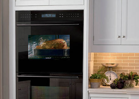
Although not as grand as the house above, my childhood home shared several elements. Our Florida Room ceiling had a similar wood treatment and it also had a stone feature wall. We had lots of green and brown and that EXACT furniture. The authentic flooring would have been terrazzo, like ours. I never knew it was cool then but now it's all the rage. Think about it, there are lots of these houses still around! Mid-Century has firmly established its niche in design history and has left its mark on our culture. We've got MadMen, Modernism Magazine, the website Atomic Ranch and numerous blogs. 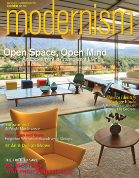 If you're looking for that 50s vibe in the kitchen, keep it simple. Door styles were just flat and were either a warm wood finish or painted. Guess what? Wall ovens with a separate cook top were much more common in the typical Mid Century kitchen. Today most homes have ranges.
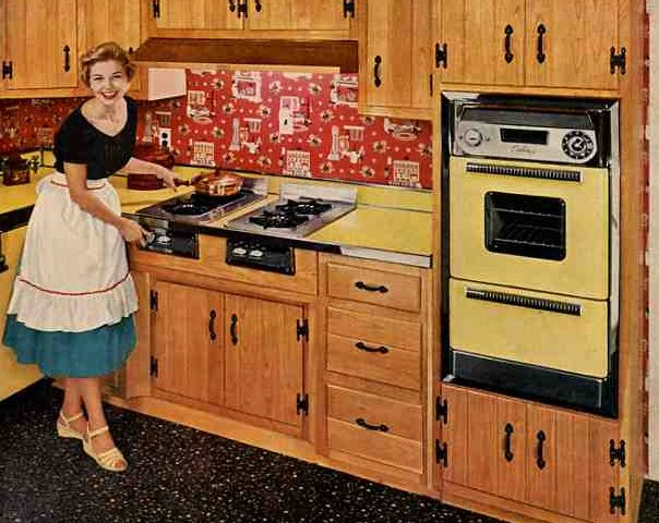
 Throw in a little atomic patterning and you're there. If you are really embracing this you can get the vintage look for your refrigerator.
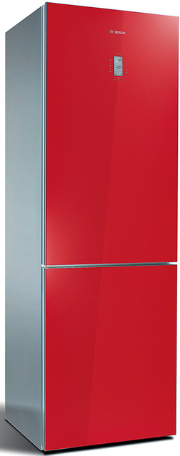
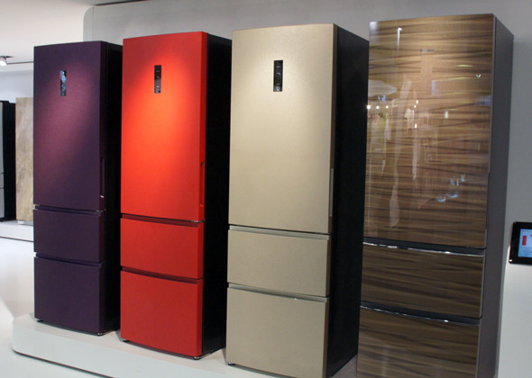
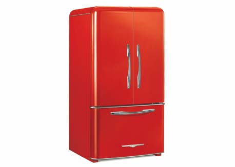 Elmira Stove Works has introduced the latest addition to its retro Northstar collection, the French-door refrigerator. By combining iconic 1950s-style with the modern amenities of contemporary appliances, this new model is larger capacity than previously available in the line. It comes in a full-depth model as well as counter-depth. You don't have to get red. It comes in nine standard colors OR you can even get it custom-colored (for a price, I'm sure).



 A beautifully appointed kitchen boasts a lovely kitchen island paired with white leather and brad trimmed counter chairs. Wouldn’t it be so nice to take a seat and visit with the chef while he or she cooks?
 This rustic, gray island is given an industrial feel by equipping it with rollers. Another industrial element can be found in the aluminum work stool pulled up to the island.
 A massive kitchen island seats no less than six people. This is the perfect space for any meal. The woven chairs are so unusual and gorgeous. Getting any
  A Tuscan kitchen features an extra large island flanked on either end by a traditional style lamp. For its size, it could accommodate more seating than just the three counter stools shown here.
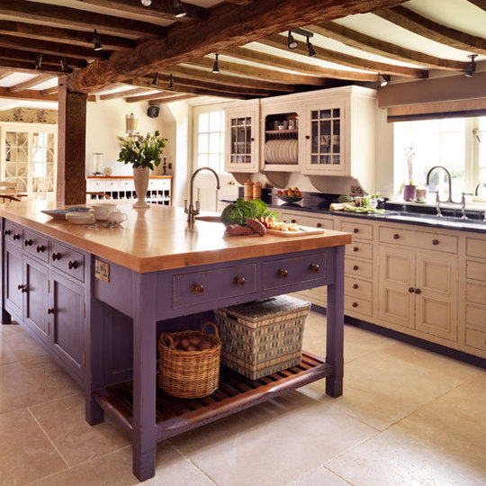
 Love, love, love this style of kitchen island. It looks as if they took a small sideboard and just added an extended wood top to accommodate seating and an eating area. Lots of decorating ideas can be found here.
 Count them, not one but two islands! I love this look and would be as happy as apple pie to be the home chef of this kitchen. Does this inspire any decorating ideas?
 Wouldn’t you love to cook up your favorite recipe in this sleek and crisp white kitchen? The island and cabinetry feature the current design trend of brass hardware.
 This ornate kitchen island is as gorgeous as it is useful. The carving and robin’s egg blue of the ‘legs” fits so nicely with the rest of the tile and cabinetry in the space. Many of my favorite